Jack Daniels is one of the world’s largest whiskey brands, holding a legacy deep within the cultures and traditions of America. Its promise of smooth Tennessee whiskey has marked the brand as the pinnacle of quality and craftsmanship across the globe. Here in this article we are going to explore how the Jack Daniels logo has evolved, its cultural and historical significance, and how it has adapted to the digital age. Modern AI tools help brands to create timelessness in logos that work for their audience.
Part 1: History and Evolution of Jack Daniels Logo
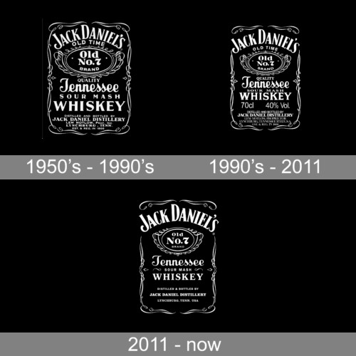
Jack Daniel’s labels have changed gradually over time. Many details have altered. In general, with each new edition, the black background becomes darker, and the ornaments are less complex. The middle section of the current label has an oval-shaped shape with a rope wound around it. In the center of the oval is “Old No. 7’s” logo. A square-shaped bottle is quite iconic enough as a label.
What is Jack Daniel?
Jack Daniels is one of the most recognized whisky brands in the United States. It was established in 1975 in Tennessee. Currently, the brand’s whiskey, owned by Brown Forman, sold all over the world.
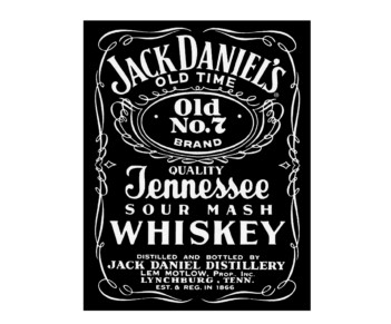
1950s – 1990s
This early version appears to be the common blackboard sign in front of various stores. The frame design of this blackboard is slender and ornate. The company name written in an arch at the top, and it’s all in uppercase with a wedge-shaped serif font. Below that is “Old Time” in a simpler, smaller font. The elliptical element below also has a similarly complex design frame. Apart from “Old No.7 Brand” mentioned on the oval, the label features other additional information like a street address as well as opening date.
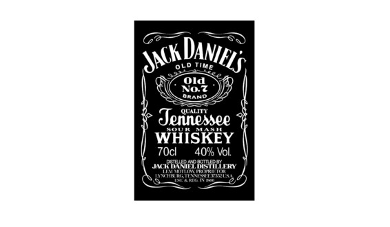
1990’s – 2011
The period saw the company putting an accent on the company name. The more the letters were scaled out of the frame, the more the designer removed some of the decorative frames. The ellipsis, the letters of “Old Time” above it, and a few lines below it became smaller, the names were further emphasized, and many other characters became prominent. More information was added to the latter. Unless you are a supporter of this brand and memorize all the lines, the brand image did not change at all in this version.
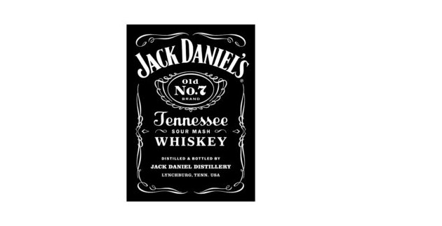
2011 – Present
After more than half a century after the creation of the first logo, the logo of the company had nearly the same visual identity. It was changed only the small details, without the style or overall view. The company has minimized the details of the logo, which is in accordance with the latest trends and forces the viewer to read everything in the emblem. However, this mainly touches the thin line at the bottom, and the upper two-thirds of the logo has hardly changed.
Part 2: Font and Colors in Jack Daniel Logo
In this section we are going to explain the font and colors used in Jack Daniels logo with the passage of time. Look concise overview of these:
Font
There are several unique typefaces. The company name is written on top of the label in big capital letters. The second biggest “Whiskey” character is also in caps and another font is used for it. Tennessee “looks like handwriting.”
Color
The mark of a Jack Daniel’s symbol is the difference in color between the two. Since it was first revealed to the world in 1911, this emblem has changed many times; however, its color is the same up to this day. From the very first day to till now it has same color.
Part 3: Jack Daniels Logo as Emblem
The latest update to Jack Daniel’s Tennessee Whiskey logo made by Minneapolis-based brand design company Cue. In the new version, the white filigree of the iconic label remains intact and changes are made to the way the element looks. The letters on the front of the label are short. The side of the label has changed even more. They tell a new version of the product story. This modified version is balanced and conveys both the premium quality and the independent spirit of the iconic product.
Part 4: Modernization of the Jack Daniel’s Logo
Learn how Jack Daniel’s balanced tradition with innovation, modernizing its logo to appeal globally while preserving timeless design elements that continue to resonate with audiences worldwide.
The Transition to a More Contemporary Design
In the late 20th century, the Jack Daniels logo was further modernize to appeal to a global audience. Maintaining its traditional characteristics, the logo became clean and minimalistic. Typography logo was streamlined, and ornamental details were refined to improve scalability across a broad range of media.
The Role of the Logo in Global Marketing
The Jack Daniels logo became more of a marketer’s dream and helped the product to expand even more internationally: the design did well in identifying a strong graphic image, especially with the recognizability factor in bars and stores and any advertisements around the world.
Key Design Elements That Have Remained Consistent
Despite numerous updates, certain elements of the Jack Daniels logo have remained constant, such as the “Old No. 7” badge and the ornate flourishes. These elements serve as a bridge between the brand’s rich history and its modern identity, ensuring continuity and recognition.
Part 5: Cultural and Historical Significance
The Jack Daniels logo is branding beyond the ordinary, as this symbol represents and gives a deeper sense of an American heritage influence from pop culture, unique collaboration that celebrates brand storied history.
The Logo’s Representation in Popular Culture
The Jack Daniel’s logo, which was originally a simple symbol of the brand, has transformed into a cultural icon. The logo was in movies, in music videos, and it decorated products-those symbols were there to stand for the freedom-loving and bold lifestyle. Even pop culture included reference to the famous Jack Daniel’s with the help of celebrities and artists.
The Connection Between the Logo and American Heritage
A staple brand of American heritage and history is Jack Daniel’s. The very logo speaks in the lines of the old-timers with classic design and timeliness. One feels a throwback, something which takes it back to a particular era about Lynchburg, Tennessee, by evoking consumer nostalgia.
Collaborations and Special Edition Logos
Over the years, Jack Daniel’s has released limited-edition bottles with unique logo variations. These collaborations mark milestones, events, and partnerships, celebrating the brand’s adaptability while maintaining its core identity.
Part 6: The Jack Daniel’s Logo in the Digital Age
Adaptable and versatile, the Jack Daniel’s logo evolves for digital platforms with interactive features and consistent representation across media, ensuring relevance in the modern digital landscape.
Adaptations for Digital and Social Media Platforms
Jack Daniel’s has so customized their logo in the digital age to ensure consistency and flexibility. The logo perfectly optimized for social media, websites, and mobile application use whereby it does not lose in clarity and impact due to variations in screen size.
Interactive and Animated Versions of the Logo
In their quest to interact with the youthful audience, the Jack Daniel’s brand has tried using interactive and animated logos. Since they are aesthetically appealing, they tend to make the brand visually live in the rapid digital world.
Brand Consistency Across Different Media
Brand consistency helps in retaining brand identity. Therefore, the Jack Daniels logo is uniform, as seen on its digital campaign materials and product materials. Such adherence helps strengthen recognition and trust over the brand.
Part 7: Arvin AI: Enhancing Logo Design for Modern Brands
Arvin AI is the new advanced tool to make it easier and enrich the design of logos for the modern world. It uses customizable templates and offers real-time feedback with smooth iterations towards a unique, professional look. The service helps businesses develop logos that would better communicate the business’s identity in the marketplace, while staying apart in a very competitive world.
Key Features
- AI-Powered Design: Arvin AI designs professional, bespoke logos with the help of smart algorithms, which ensures that each logo is unique and brand-sensitive.
- Customization Options: Fonts, colors, icons, and layouts can be customized so that users have control over the final design to meet their unique vision.
- Real-Time Feedback: The site provides instant feedback so that adjustments made rapidly and efficiently to produce a fine logo.
- High-Resolution Exports: Arvin AI ensures that final logos are prepare in high resolution, suitable for digital and print usage.
- Industry-specific templates: There are templates specifically for different industries. This saves time and provides inspiration for designing.
- User-friendly interface: Arvin AI has an easy-to-use interface, thus it is friendly and accessible to everyone from professionals to beginners.
Steps for Using Arvin AI to Create a Logo that Reflects the Jack Daniels Flavor
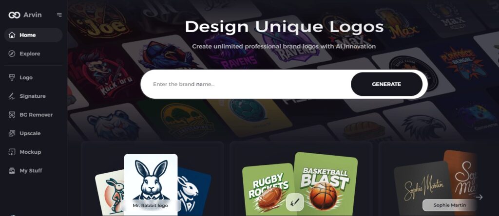
Step 1: Visit the Arvin AI Website
Open your chosen browser and enter Arvin AI to create a logo which reflects your company’s brand character.
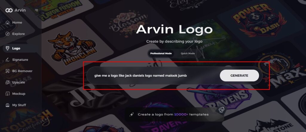
Step 2: Input Your Company Details
Enter your company’s name and category. For a design reminiscent of the Jack Daniels logo, specify your preference for a bold, vintage, and iconic theme. Providing these details ensures the AI generates a design tailored to your brand’s identity.
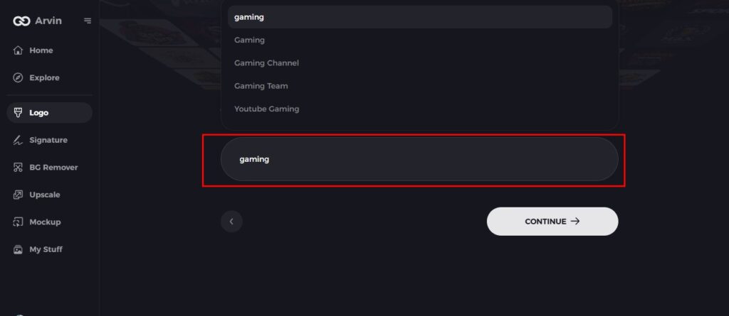
Step 3: Select Your Industry
Select an industry that fits your business. This allows the AI to suggest styles that reflect your brand’s core values and niche, much like how Jack Daniels’ logo reflects its whiskey heritage.
Step 4: Select a Style
Select a design style from the lists. If desiring an older or classic appearance like the Jack Daniels logo, select a design style that demonstrates sophistication and heritage. Or default to “no style” and surprise yourself with AI.

Step 5: Finalize Logo Design Concepts
Arvin AI will generate multiple logo designs based on the details provided. Browse through the suggestions and look for a design that mirrors the timeless elegance of the Jack Daniels logo.

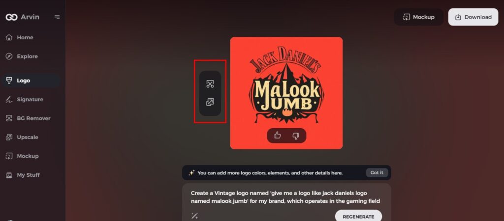
Step 6: Customize Your Logo
Fine-tune the selected logo by adjusting elements such as colors, fonts, and layout. Opt for bold typography and a sleek monochromatic color palette to achieve a logo reminiscent of Jack Daniels’ iconic branding.
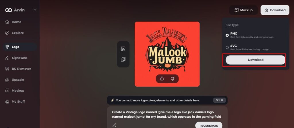
Step 7: Download Your Logo
Once you’re happy with your final design, download it in versatile formats like PNG or SVG. Whether for websites, social media, or print, your professional logo will ensure your brand leaves a lasting impression.
Conclusion
The Jack Daniels logo, as a result of the evolutionary process, talks about how the brand evolved from a small Tennessee distillery to a global whiskey powerhouse. In such a highly competitive marketplace, a strong visual identity increases in importance. Using the tools like Arvin AI, brands can design a logo that’s beautiful to the eye but truly represents its heritage and values. With new-age technology, they’ll get that classic appeal and evoke an emotion within the masses like Jack Daniel’s mange and improve his brand identity in the market with a powerful logo.
FAQs about Jack Daniels Logo
What was the original Jack Daniel’s logo design?
The old logo had the brand name, “Old No. 7,” and flourishes with a touch of elegance and tradition.
What font is used on Jack Daniels label?
Its wordmark “Jack Daniel’s”was designed using a serif font, which is very similar to a font called Black No. 7 designed by Stefan Huebsch. The font used for the cursive “Tennessee”is very similar to a font called Jackie_regular Alternative by Dario Muhafara.
What design elements are central to the Jack Daniel’s logo?
Key features: “Old No. 7” badge, ornate curlicues, brand name in the special font
How can Arvin AI help in designing logos similar to Jack Daniel’s?
Arvin AI offers AI-driven tools, options for customization and instant feedback so that a professional, unique logos can be prepared.

