Internet Explorer is one of the most revolutionary technologies ever invented. It was a browser that developed by Microsoft in 1995. Because of this, it has been documented in history books and further developed that constitutes minimum standards that may be anticipated through a given web browser application. One very important feature of its identity was that its logo represented visually what it stood for and how it was innovated. Here we analyze how the Internet Explorer logo emerged as a hallmark of the new digital age and remains an iconic symbol in internet history.
Part 1: History and Evolution of Internet Explorer logo
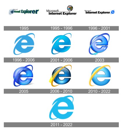
The Internet Explorer icon first appeared as part of the browser logo created in 1996. Today it is one of the most recognizable emblems in the world, but before its birth there were two visual identity versions that not many people remember.
1995
The first Internet Explorer logo designed in 1995 and featured an image of the Earth and a wordmark logo of Microsoft Internet Explorer. The earth colored with blue, white and grey color, and letter “Internet Explorer” – dark blue and green shadow. On the right-hand side of the globe, the letter “Microsoft” inserted.

1995-1996
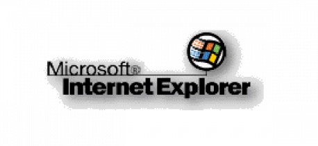
Next version designed much later in the year on basis of Visual Identity of Microsoft. The logo was a two-stage word mark and an appropriate right emblem. An elegant typeface of Microsoft on the upper stage, “Microsoft,” and “Internet Explorer” on the lower part with an ultra-thick sans serif. The emblem is a circular enclosure of four flags symbolizing Microsoft.
1996 – 2001
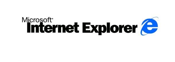
1996 The Internet Explorer logo was accompanied by the now iconic emblem. On the right-hand side of the wordmark is a bold bright blue lowercase “E” crossing diagonally to intersect it and a trajectory to represent “I” which is short for “Internet”.
1996 – 2006
The official logo of the IE icon appeared in 1996. The color was lightened to light blue and the outline of the emblem was slightly perfected. Internet explorer logo of this period shows the modernity in the digital world.
2001 – 2006
In 2001, the logo became even more three-dimensional and the gradient of blue made thicker. Vibrant and clear impression gives out a warm welcome feeling. New icon has accompanied the browser for five years.
2003
The company already tried the look of the test in the last couple of years with the addition of shadows and volumes. This time, the logo almost has three dimensions, and the emblem is purplish and shiny, just like it should have been from the early 2000s.
2005
The 2004 refresh version was even cooler by its bright, three-dimensional Internet Explorer logo that functioned for a mere couple of months. The shiny purple lowercase “E” entirely recreated the outline of the former badge, but this orbit was closed and filled with a true line. This character featured a rather intriguing “glass” surface like that of candy. Lower part of the letter is rendered in light blue gradient and replicates the tints of the two preceding badges.
2006 – 2010
The logo changed the second time in 2006, the same year in which Microsoft branded IE Windows Internet Explorer. The letter E “became darker and sported a black outline, while the orbit turned yellow.
2010 – 2022
Another version which is still being used currently was developed in 2012. It is a light-blue flat icon-again, as the abovementioned 1997 one, the shape was slightly improved on and the blueness was enhanced. Yellow, of course isn’t used in this one.
2011-2022
The 2011 color scheme was the same, but both colors lightened and the orbit changed. The “E” font also differed, it turned into a modern and refreshing feel. The 2011 logo still utilized in Windows 7/10 and 8x. Part 3: Symbolism and Branding in the Internet Explorer Logo
Part 2: The Transition from Internet Explorer to Microsoft Edge
When competition for the browser market grew, Internet Explorer began to lose its leadership. Other contributing factors include poor performance and lack of compatibility. In a bid to counter this, the company formed a new direction for its browser development, and this is how Microsoft Edge came about in 2015.
Introduction of the Edge logo and its differentiation from IE.
The Edge logo had the “e” in it but with a new, fresh design. It was sleekly wave-like in design and stood for innovation and forward thinking. This was going to be the first time for Microsoft’s browsers since the classic IE logo was going to usher in a new era.
Reflection on how the transition marked the end of an era for IE
Internet Explorer to Microsoft Edge was more than a rebranding exercise, but rather it symbolized the end of an era. Over two decades ago, IE became the cornerstone of the internet experience. Its retirement marked a new shift towards advanced and efficient web technologies.
Part 3: Arvin AI: The Ultimate Logo Creation Tool
Arvin AI is an AI-powered logo and branding solution which enables businesses to create stunning professional logos that symbolize their individuality. Some of the primary features are AI-prompted suggestions, custom templates, and real-time feedback that make design a little easier. Suitable for startups and established brands alike, Arvin AI ensures your logo speaks to your audience and remains ahead of the curve in respect to design trends.
Key Features of Arvin AI
- AI-Powered Design Suggestions: Arvin AI analyzes your brand’s values and generates design recommendations tailored to your needs.
- Customizable Templates: Choose from a wide range of templates and personalize them to reflect your brand’s personality.
- Color Palette Optimization: Ensure your logo uses colors that resonate with your target audience and evoke the desired emotions.
- Scalability: Create logos that look great on everything from business cards to billboards.
- Real-Time Feedback: Get instant feedback on your designs to make improvements on the fly.
Steps to Design a Logo Using Arvin AI
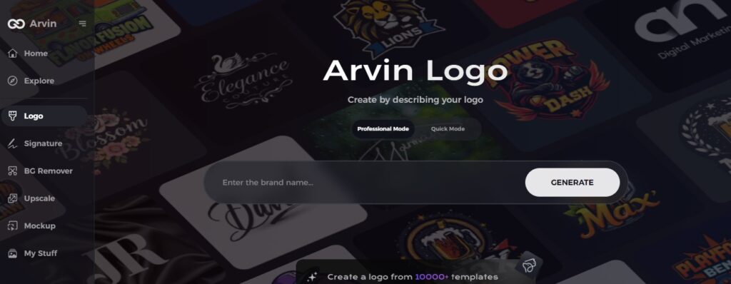
Step 1: Go to the Arvin AI Website
Open your browser and go to Arvin AI to start designing your unique company logo, including the option to make it transparent.
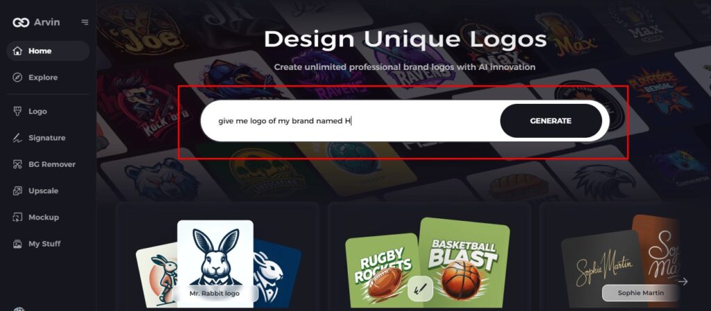
Step 2: Enter Your Company Information
Enter your company’s name, select its category, and request a transparent logo. These details help Arvin AI generate designs that align with your company’s image and values.
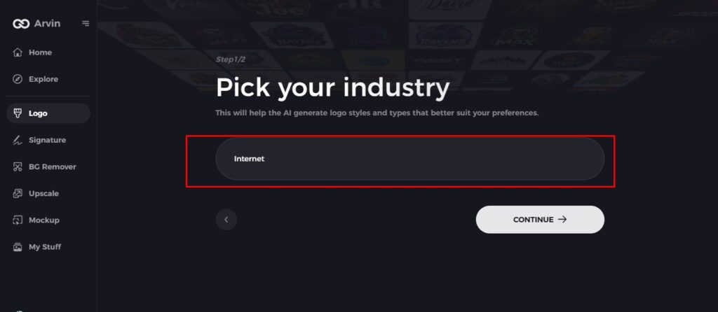
Step 3: Choose Your Industry
Choose the industry that best represents your business. This means the logo designs AI produces will match your brand’s niche and core values.
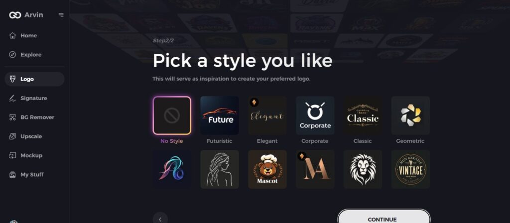
Step 4: Choose a Design Style
Picking a style from the options provided or keeping it as “no style” for the system to surprise you with something unique, this sets off in the right direction for the design.
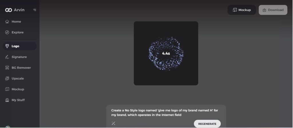
Step 5: View Logo Concepts
Arvin AI will create several logo designs based on the details you have given. Browse through the designs and pick one that best suits your brand identity.
Step 6: Finalize Your Logo
Customize your chosen logo by changing colors, fonts, and icons to ensure it reflects your brand’s personality and aesthetic. Perfecting the details will ensure a logo that truly represents your company.
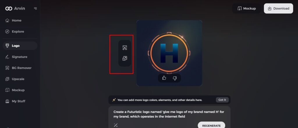
Step 7: Download Your Logo
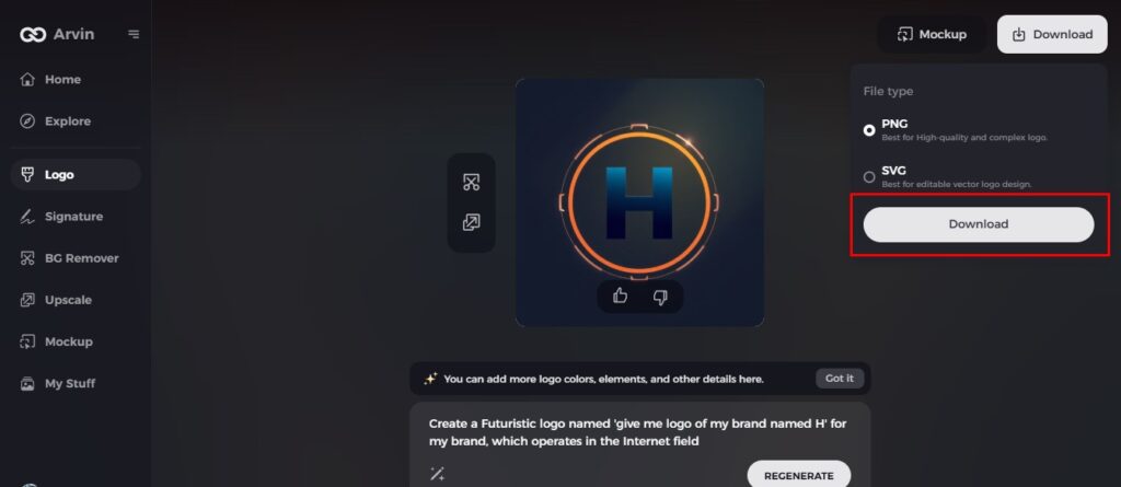
Once you satisfied with the design, download your logo in formats such as PNG or SVG. These formats are ideal for use across various platforms, from websites to social media and print materials.
Conclusion
The story of the Internet Explorer logo is that of technological evolution and master branding. From minimalism to iconicity and from that into the digital age, it didn’t let go. It simply depicts how rapid the progression has been in terms of web technology and the preferences of the user. When it comes to company to design a professional logo with AI. Tools such as Arvin AI used to design memorable logos, gives a glimpse of the future. With AI power at their fingertips, companies can create logos that distinguished and speak to their target market.
FAQs
Why is the Internet Explorer logo so iconic?
The Internet Explorer logo was iconic as it represented one of the first widely used web browsers, with its recognizable “e” symbolizing exploration and connectivity.
What replaced the Internet Explorer logo?
The Microsoft Edge logo replaced the Internet Explorer logo, marking the start of a new era in the web browsers developed by Microsoft.
How can I create a modern logo like the Internet Explorer logo?
You can use designs like Arvin AI, with AI design features, to come up with a professional logo according to your brand.
What is the significance of the “e” in the Internet Explorer logo?
The “e” stands for “explorer,” which is just the purpose of this browser-to explore and link users to the internet.

