The Instagram logo is a symbol of creativity and connection of modern branding. It isn’t just a sign of trends changing in the world of design but rather a way of telling you that Instagram has been growing into a global storytelling platform. Here we will look at the history, design philosophy, and role of the Instagram logo, examining why it is so important to the branding arena. And we’ll also learn lessons for business when creating a logo could inspire a beautiful visual identity for their brands – like, at least, through Instagram’s logo design journey.
Part 1: The Evolution of the Instagram Logo
The evolution of the Instagram logo represents the dynamic development of the platform. In 2010, it started as a vintage Polaroid-style camera, representing the photography focus of Instagram in the early years. The simplification and flexibility brought through redesigns finally resulted in the gradient logo in 2016. This is a transformation that signifies the growth of Instagram into a global platform for creativity and storytelling in line with modern design. You may like to learn about minimalist fonts: how to choose the perfect style for your brand.
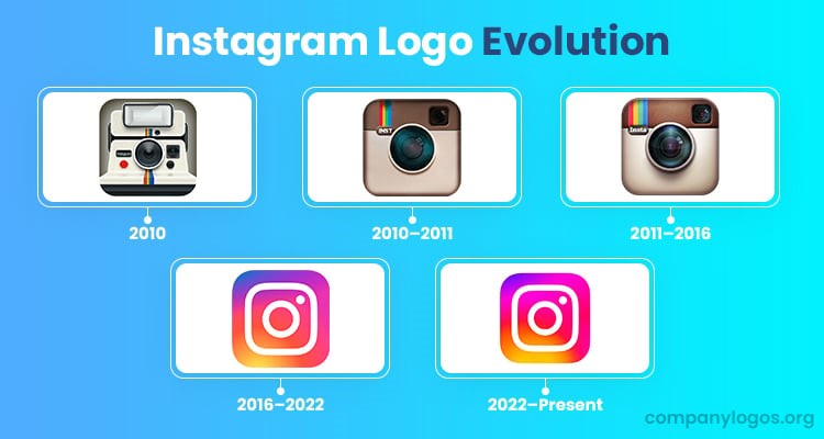
Early Versions of the Instagram Logo
When Instagram launched in 2010, it also came with a logo featuring a retro-style Polaroid camera. Designed by co-founder Kevin Systrom, this logo encapsulated the idea of Instagram’s original mission: It was meant to allow people to share beautiful photos, filter-enhanced, that are taken. The detail, including a rainbow stripe, lens, and viewfinder, seemed to appeal to early users who are attracted to the nostalgia and artistic quality of analog photography. Although visually striking, the original logo was complex and less adaptable to various digital formats, which eventually necessitated redesigns to better suit the growing platform.
Key Redesigns Over the Years and Their Significance
In 2011, the logo received its first update in the form of a refinement of the camera icon by Cole Rise. Cole Rise polished and detailed the camera icon to make it look more professional, versatile, and even more nostalgia-tinged than the first version. Although the 2016 redesign initially caused quite a controversy, it was eventually one of the key features that defined Instagram’s identity. The minimalist design and gradient colors symbolized modernity and inclusivity, helping Instagram stand out in a competitive digital landscape.
Current Logo: A Minimalistic yet Colorful Design
The new logo for Instagram is a wonderful example of minimalism with vibrancy. The abstract camera design coupled with the warm and cool tone gradient makes it quite simple yet very powerful. The overall versatility ensures it is fantastic in all contexts-from mobile devices, websites, and other promotional material. This gradient creates the emotions of warmth, creativity, and energy, totally fitting for what Instagram does-that is to make connections happen through visual storytelling.
Part 2: The Design Philosophy of the Instagram Logo
The Instagram logo embodies the mission of the platform in creating creativity and connection. Its design philosophy is simple and modern, hence universally appealing. The logo is a very simple yet colorful, with the values of inclusivity and innovation, showing that impact doesn’t necessarily require complexity. Here you can learn about the Power of Red Logos: Design Insights and Examples. In terms of relevance and adaptability, it truly shows how thoughtful design can elevate a brand’s identity.
Instagram’s mission and values
In Instagram you can connect with people through photos, videos and creative content. The logo is about the creativity of this mission, the inclusiveness. The warm colors of the gradient hinting connection and positivity and the abstract camera is a wink to Instagram’s photography origins. This shows that the logo represents 3 major imageries of Instagram i.e. simplicity, creativity and community. It has such an aspect of guaranteeing the appeal to international masses, then to the feelings of everybody worldwide.
Simplicity in its design
The new design in 2016 took the trend of flat and minimalist design, which became quite prevalent. It is a function and adaptability oriented design approach that allows the logo to be flexible to be used in different kind of devices and resolutions. A simpler logo also has more room to focus on the emotional value it triggers rather than distracting with unnecessary details. The modern style of the Instagram logo, therefore, keeps it modern even in the ever-evolving digital world. And this simply shows that, when simple, the effect of adding impact allows it to reach a wide population.
Part 3: The Impact of the Instagram Logo on Branding
The Instagram logo is one of its strongest branding elements, universally recognizable. Its colourful visual on one hand makes its a great identity marker and on the other hand a way to connect with any audience. Branding through Instagram acts as inspiration to businesses in creating their marketing material promoting and increasing engagement, but trust. At the same time, it is also proven that companies need a good effectual visual branding in the domain of the digital world to be recognized on an international level.
Instagram’s Global Recognition
The Instagram logo is immediately identifiable around the world. This looks nice and clean, has vivid colors, and draws connection to creativity, connecting these values instantly in its user’s minds. Serving the purpose of a brand worldwide recognized symbol, this marks on identification for Instagram in most promotional aspects within marketing and communication purposes. The flexibility of the logo also maximizes its branding power: whether in a small scale as an application icon or enormous as a billboard, it remains effective and consistent with clarity and vibrancy.
Branding Through Logo-Inspired Marketing
Many businesses have successfully implemented Instagram’s branding elements in their marketing strategies. The use of Instagram’s gradient colors or abstract design motifs in creating content makes it look consistent with the aesthetic of the platform. For instance, companies like Nike and Starbucks use Instagram-inspired visuals to appeal to younger, tech-savvy audiences. This not only makes a brand more visible but also strengthens connections with those for whom the creativity in modernity matters.
Part 4: Fun Facts about the Instagram Logo
In the Instagram logo, diversity, creativity, and photographic features are embedded. The extensive prototyping process behind creating such a logo has been designed in a way that not only incorporates user feedback but also represents design innovation. As for its gradient, inspiration is taken from the hues of sunset, while a camera symbol is a direct reference to its photographic inspiration.
Hidden Meanings or Interpretations of the Logo
While the Instagram logo appears simple, it carries deeper symbolism. The gradient represents diversity and inclusivity, reflecting the wide range of users and content shared on the platform. The abstract camera design serves as a tribute to Instagram’s roots in photography while remaining versatile enough to represent the platform’s broader mission. The gradient also reflects the dynamic and fluid nature of the content on Instagram. It gently suggests that there is something to explore, something which can be pursued endlessly through the eyes of Instagram users.
Designer Insights and Lesser-Known Trivia
The 2016 redesign was led by Ian Spalter, who at the time was Instagram’s head of design. Spalter said the redesign process required several hundred prototypes to whittle down before starting the current logo. Sunsets were inspiration for the gradient, something warm and creative and transforming. Finaling the design was also helped by user feedback. The team did a great deal of testing to make sure that the new logo would be loved by all the different people who followed Instagram and was true to the brand.
Part 5: Color and Symbolism of the Instagram Logo
The use of colors in the Instagram logo gives it its appeal. The warm and cool tones gradient signify creativity, inclusivity, and positivity. The abstract camera design ties back to Instagram’s roots in visual storytelling while embracing modern aesthetics. All these come together in creating a logo that is not only visually appealing but also richly representative of Instagram’s mission to connect people through creative expression.
The Importance of Colors Used in the Logo
The Instagram logo gradient passes through pink, orange, yellow, and purple shades. For each of the colors selected, there was an emotional reason behind their choice; purple stands for creativity, pink represents warmth and approachability, yellow means optimism, and orange contributes energy and excitement. The overall sense in their joint presence is that of vibrancy and inclusiveness. The gradient design sets Instagram apart from the competition. Whereas most social networking sites sport a monochrome logo, the use of color gives Instagram a flair of brightness, friendliness, and vibrancy.
Camera and Rainbow Symbol in the Context
The abstract camera is a tribute to where Instagram began as a photo sharing application, and the rainbow gradient refer to the diversity, the stories. With these features, together they are able to express the mission of the platform, that being the ability to connect people with similar experiences and creative expression.
Part 6: The Instagram Logo in the Context of Other Social Media Logos
When compared to other social media sites, the Instagram logo has caught everyone’s attention by standing out with its vibrant gradient and minimalist design. From a solid blue Facebook icon to Twitter’s simplistic bird icon, this one captures the user’s attention through its dynamic colorful appeal. Its unique design ensures that people will remember it as something more emotional and will mark it as a creative icon of innovation in a busy digital space.
Instagram Logo Beyond Other Digital Brands in Visual Impact
The Instagram logo is unique, with minimalism and vibrancy blended together. The logo’s flexibility will guarantee that it will continue to get recognized, whether it’s a smartphone screen, or a billboard. The logo’s gradient, by its very nature, is dynamic so it conveys movement and life for the brand Instagram, which is all about creative storytelling.
Part 7: Arvin AI – Your Professional Logo Creator
A memorable logo will do better to represent your brand through the proper visual elements involved, Arvin AI becomes the key game-changer for businesses and makers looking to build their successful visual identity. An advance Artificial Intelligence-based logo-making instrument that streamlines making aesthetically pleasing logos professionally. As a small entrepreneur, a marketer, or content developer, the feature of Arvin AI affords everything ranging to giving life to the creativity expressed about the brand in thought to what all the visual elements the audience may connect with its values and services.
Key Feature about Arvin AI
- Personalization with AI: Arvin AI uses artificial intelligence to provide you with personalized logo suggestions based on your brand name, industry, and preferences.
- Extensive Design Templates: There is a huge library of design templates available on the platform, which is ideal for a number of industries and styles.
- Customization Options: You still get to customize the design that the AI generates. You can modify colors, fonts, icons, and layouts to make sure that the final logo will be what you have in mind.
- High Resolution Output: All logos designed by Arvin AI are outputted in high resolution so that it will be sharp and clear on all media, whether social media or print.
- Branding Integration: Arvin AI allows you to create complete branding kits, including color palettes, typography guides, and logo variations, to maintain consistency across your digital and physical branding efforts.
- User-Friendly Interface: The platform is designed for users of all skill levels. Its intuitive interface ensures that even those with no prior design experience can create professional-quality logos quickly and efficiently.
Steps to create professional logo
Step 1: Sign Up and Log In to Arvin AI
Visit the Arvin AI website, sign up, and log in to access the logo design features.
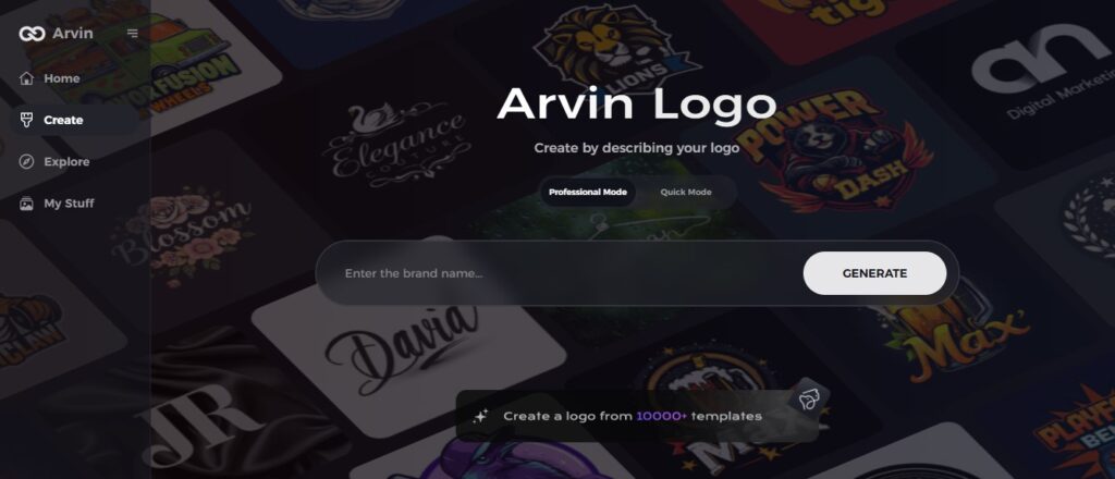
Step 2: Enter Your Brand Details and Preferences
Enter all the necessary details such as your brand name, slogan, and industry. Add any design preferences, including specific font styles or image themes, to guide the AI.
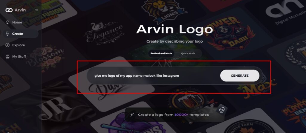
Step 3: Choose Your Industry
Choose the industry corresponding to your brand. This will enable AI to come up with logo ideas suited to your niche and the style.
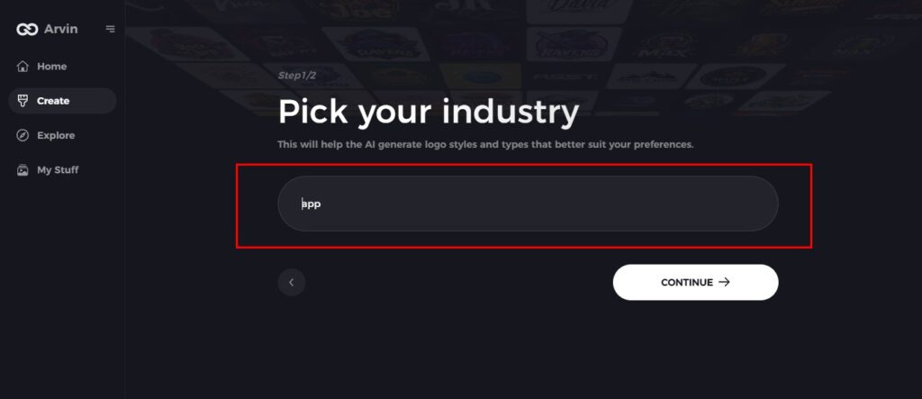
Step 4: Style Choice
Choose a style based on the options available which matches your brand’s persona. This will determine your inspiration for the logo.

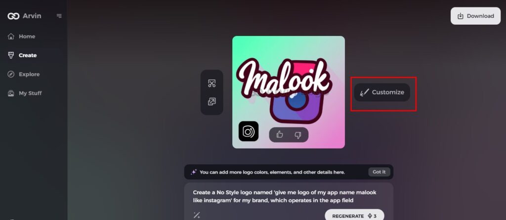
Step 5: Customize Your Logo
Use the customization tools in Arvin AI to refine your logo. Adjust elements like font style, layout, and symbol placement to create a design that perfectly fits your vision.
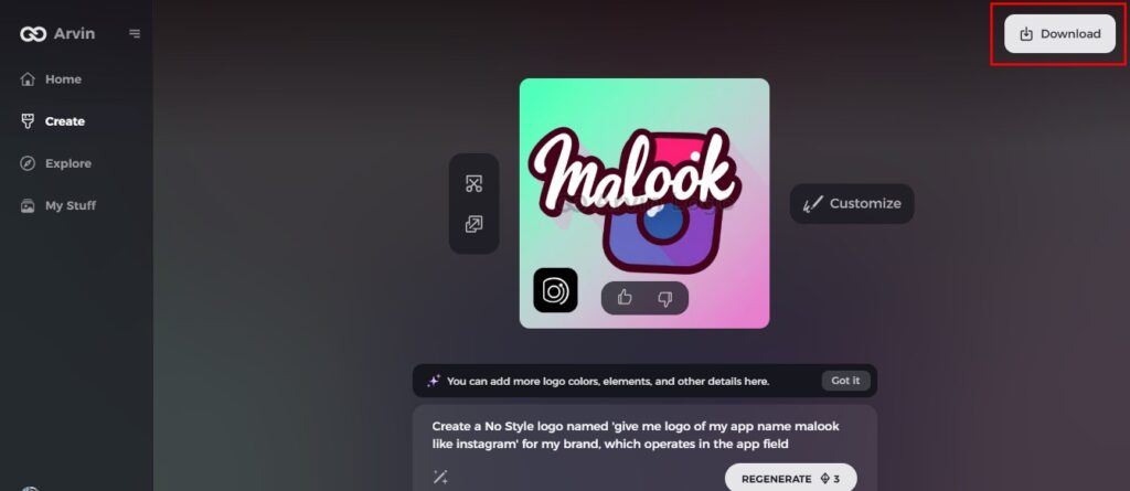
Step 6: Save and Download Your Logo
Preview the final version of your logo. Once satisfied, save it in a high-resolution format suitable for both digital and print use.
FAQs
How has the Instagram logo changed over time?
The Instagram logo changed from a detailed Polaroid-style camera in 2010 to a polished vintage camera in 2011 and finally to the minimalist, vibrant gradient design in 2016, reflecting its growth and versatility.
Why is the Instagram logo so effective?
Its simplicity, vibrant gradient, and abstract camera design make it versatile, memorable, and emotionally resonant, perfectly encapsulating Instagram’s values of creativity and inclusivity.
How Can Businesses Use the Instagram Logo for Branding?
Businesses can align their visuals with Instagram’s aesthetics, use its gradient colors in marketing, and create content that reflects its creative and community-driven identity.
How Can Arvin AI Help Improve Instagram Branding?
Arvin AI provides AI-generated tools to design modern logos and branding kits that deliver consistency, professionalism, as well as appeal, ideal for Instagram branding.
Conclusion
The Instagram logo is a great example of how thoughtful design can be used in digital branding. With such tools as Arvin AI, businesses and the creative people can easily do their logos and brand their identity with their desired sense of expression. Featuring state-of-the-art AI attributes, customizable choices, and easy-to-use operations, Arvin AI enables each and every one of its users to seek professional branding. Maybe through inspiration of the Instagram icon or setting an identity to break through all trends, Arvin AI helps bring any possible idea into reality, elevating a presence online.
Read More
Types of Logos: How to Select the Right Logo for Your Business

