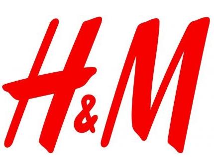
H&M is a global fashion retailer known for its affordable yet stylish clothing. A brand’s logo is very pivotal in giving its identity, working essentially as a representation visually of values and what the company stands for. In this article, we are going to look into the history, design, and meaning of H&M logo. We are going to examine how it has evolved over time and what it says about the company’s approach to fashion and customer connection.
Part 1: The Origins of the H&M Logo
Hennes & Mauritz, founded in Sweden in 1947, created a logo initially simple enough-to write only one word-“Hennes”-since the firm, at first, was oriented mainly towards the dress of women; when men were added, their logo evolved into “Hennes & Mauritz.”. It allowed the creation of H&M as a modern and accessible brand by providing a very early design; keeping the logo clear and direct played an important role in creating the identity.
Part 2: Evolution of the H&M Logo over the Years
The H&M logo has been updated through the years to suit the growth of the brand and the issues at hand. In this section, how the H&M logo has been developed over time, the justification for such evolution, and the way in which each development had helped the brand survive in a competitive world of fashion.
1947 — 1968
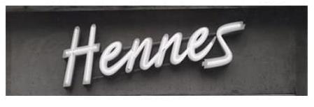
The first logo create for the company was in time when H&M was simply named Hennes, and that looked like this. It used simple word mark of a letter type in strong penmanship where words were at angle, as letters were also titled, looking friendlier but mighty. A really simple logo from the old Hennes is kept in color of black and white.
1968
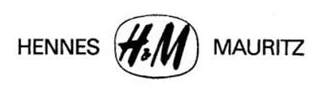
In 1968, Hennes merged with Mauritz Widforss to create Hennes & Mauritz. The logo reflecte the new name, using a simple sans-serif wordmark in which the two parts of the name were separate by an “H&M” monogram in a rounded frame. The letters in the frame were similar to the old “Hennes” style but used cleaner, simpler lines. It was only good for a few months before the brand shortened its name to simply “H&M.”
1968 — 1999
In 1968, the house unveiled a fresh new logo made up of an orange-red colored “H&M” monogram. The frameless version took the same script font as it used before with two bold capitals, but contained a small, red-colored ampersand separating the two bold capital letters, and the general feel was friendlier and easier on the smooth lines.
1999 — Today
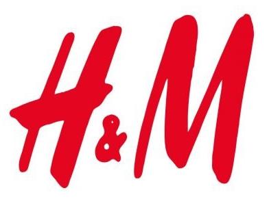
In 1999, the H&M logo was updated. However, this was not really a full-scale rebrand but rather a slight update. The red color became a bit darker, making it look more serious and luxurious. The shape of the letters changed to straighter and sharper lines, which would make them, appear clearer and more professional.
Part 3: Symbolism and Meaning of the H&M Logo
The H&M logo represents more than visual elements because it serves to express the sincere heart of the brand and its core values. In this section, we will break down elements that make up the logo, including colors, typography, and overall design, to better understand what they represent and how they relate to the mission and goals of H&M.
Exploration of red and white in the logo
The red and white color used in the logo of H&M is a prime element of identification. The brand energy matches its symbolism in red since this color expresses both energy and passion and excitement which represent the brand’s youthful focus and trendsetting ideas. The logo grabs viewers’ attention thus making it highly visible.
The importance of the typography
The typography of the H&M logo is bold and simple, and the letters are clear and readable. This style of design was used to ensure that the logo would be remembered and recognized. The plain font indicates that H&M believes it should be accessible to everyone and have a human-like experience.
Minimalist approach
The minimalist approach that H&M uses in its logo says a lot about the brand itself. Elegant practice consists of simplicity in cleanliness because it allows essential elements to stand out while removing distracting red herrings. It also reflects the characteristic of a modern and forward thinking attitude by the company itself.
Part 4: The H&M Logo in Popular Culture
The H&M logo is more than a symbol of a retail brand; it is an iconic image in the fashion world and beyond. In this section, we shall describe how the H&M logo is recognized all over the world, its influence on the fashion world, and its role in marketing and the internet presence of the brand.
How the logo is recognized across the world
The H&M logo is always famous all over the world due to the spread of the brand in more than 70 countries. The brand became known for very affordable and fashionable clothing. In Europe, North America, or Asia, the red and white logo is prominent in shopping centers, on windows in stores, and on advertisements.
Influence of the H&M logo on fashion
The H&M logo has also had a major impact on how other fashion brands approach their own logos and branding strategies. H&M’s clean, modern design has influenced many other retailers, especially in the fast-fashion industry. The boldness and direct nature of the H&M logo epitomize ease and accessibility- a benchmarking for other fashion brands looking for an audience range.
Examples of successful marketing campaigns
H&M has been using its logo in many successful marketing campaigns throughout the years, which shows how powerful strong branding can be. One of the most notable examples is H&M’s collaboration with high-fashion designers such as Balmain and Alexander Wang.
Part 5: Arvin AI: A Powerful Tool for Logo Design and Branding
Arvin AI helps businesses to come up with unique logos and strong brand identities by applying simple yet effective ways. Using AI technology the platform generates original logo concepts which originate from the business name along with core principles and preferred design aspects. Whether it’s creating a new brand or giving an old logo a new face, Arvin AI quickly does the whole design process and creates a quick turnaround.
Key Features of Arvin AI
There are following key features of Arvin AI:
- Helps businesses and designers create logos: Arvin AI simplifies the logo design process, making it easier for both businesses and designers to create professional logos.
- AI-powered design suggestions: The platform offers logo ideas based on your business name, values, and target audience, ensuring it matches your brand.
- Easy-to-use interface: Arvin AI’s simple design makes it easy for anyone to navigate and start creating logos without confusion.
- Customization options: You can adjust colors, fonts, and layouts to create a logo that feels unique and true to your brand.
- Fast results: The tool generates logo designs quickly, saving time while still offering a range of creative options.
- Affordable and accessible: Arvin AI provides a cost-effective solution for small businesses and startups that need professional logo design without high costs.
Steps on How to Utilize Arvin AI to Create an H&M-Inspired Logo
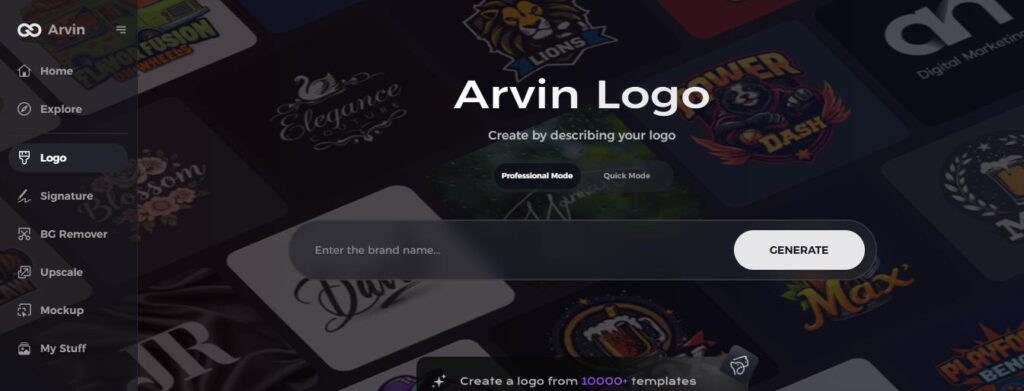
Step 1: Sign up and log in to Arvin AI
Visit the Arvin AI logo maker website, sign up, and then log in to access the feature of designing logos.
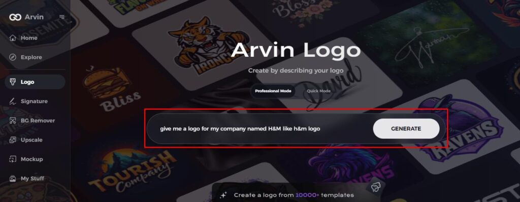
Step 2: Enter your brand information and preferences
Brand name, slogan, and industry, please. Now, select design preferences such as font styles or image themes for the AI to guide your logo creation.
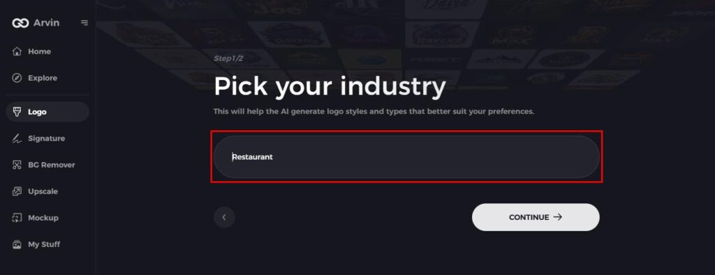
Step 3: Select an Industry
Choose your industry to give the AI the best sense of your brand and what style might work best. For example, fashion or retail.
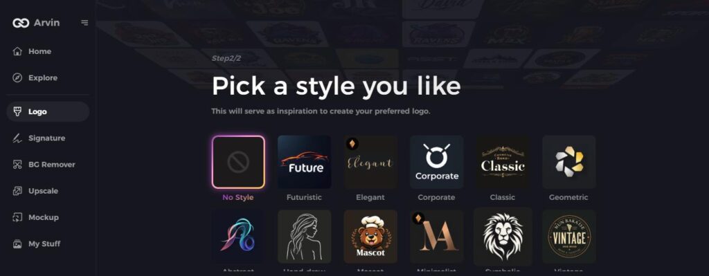
Step 4: Choose a Style
Choose a style that fits your brand. This will be the base of the logo design, determining the look and feel of your final logo.
Step 5: Personalize your logo with Arvin AI tools
When Arvin AI creates your logo, you can customize elements like font style, layout, and symbol positioning with the customization tools. Experiment with different variations until you find the perfect design.
Step 6: Save your final logo as a downloadable
Preview your final H&M logo and save in high resolution ready for print or digital use.
Conclusion
The H&M logo has transformed with time, maintaining a very simple yet powerful look that characterizes the brand’s identity and values. It is very indicative of the need for simple yet effective logo design. Success through time comes from powerful brand identity because it creates meaningful cultural relevance in the H&M logo. For companies that would like to make a logo that ‘speaks,’ Arvin AI is the best tool to help design your own perfect-fit logo.
FAQs
Why has H&M used the same logo design for so long?
H&M’s logo has been the same over the years simply because it is simple, malleable and has allowed the brand to stay consistent in other markets around the world.
How does the H&M logo capture the company’s values?
The bold, straightforward design and color of red symbolize H&M’s focus on modern, easily accessible fashion while its simplicity portrays the brand values of sustainability and broad appeal.
How can Arvin AI help in logo design for small businesses?
Arvin AI gives small businesses access to an easy-to-use platform which enables professional logo creation according to their particular identity and individuality.
How do I know if my logo design is effective?
A good logo is simple, memorable, and reflects the values of your brand. Using Arvin AI tools helps you maintain standard-approved logos which stay linked to your customer base.
