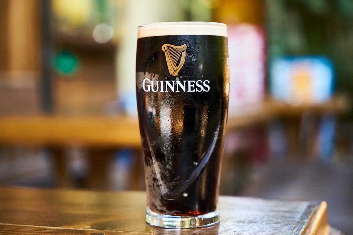
Much like the distinct 119 seconds it takes for the three-part pour of a perfectly served pint of Guinness, the brand’s identity has been meticulously crafted over centuries. This wait, culminating in the first sip, mirrors the thoughtful care behind Guinness’ visual elements, including its iconic harp and playful Toucan.
Guinness Logo History
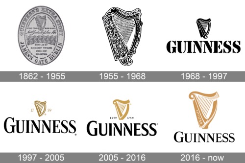
1. The Original Harp (1862–1955)
The Guinness harp was first introduced in 1862 by Benjamin Lee Guinness and was deliberately modeled after Brian Boru’s Harp, the oldest surviving Gaelic harp, which is preserved in Trinity College Dublin. The harp was depicted with intricate strings, ornate carvings, and a realistic shape that closely resembled the physical instrument. The accompanying cursive script featuring Arthur Guinness’ signature lent a sense of personal craftsmanship to the logo.
This choice was no coincidence; the harp was already a powerful cultural symbol of Ireland, making it a fitting emblem for a brand deeply rooted in Irish identity.
However, its highly detailed design made it less adaptable for broader branding uses, which influenced subsequent simplifications.
Ready to design a logo rooted in your brand’s heritage? With Arvin AI Logo Designer, craft timeless designs that honor your story—just like Guinness did with its iconic harp. Start your journey now!
2. Mid-20th Century Minimalism (1955–1968)
By the mid-20th century, simplicity became the dominant design trend, and Guinness responded accordingly. In 1955, the harp underwent a significant transformation. Gone were the intricate carvings and embellishments; instead, the harp was reimagined with bold, clean lines, and a monochromatic black-and-white palette.
The shape of the harp was also modernized, with thicker and more streamlined strings and a flat, symmetrical outline, laying the groundwork for its use in diverse media formats.
3. Modernism (1968–1997)
In 1968, Guinness embraced the era’s fascination with modernism and introduced gold into the logo’s color scheme. The harp was now rendered in dark gold, signifying luxury, quality, and premium craftsmanship. The shape of the harp was further refined, with softer curves and a reduction in visual complexity and became a hallmark of the brand’s identity.
4. The Wordmark (1997–2005)
The 1997 redesign was a pivotal moment for Guinness. For the first time, the harp was paired with a bold wordmark. The typeface chosen was a custom serif stencil font, characterized by sharp, angular serifs and clean, bold lettering. The use of all capital letters, with an enlarged “G,” lent the logo a sense of authority and sophistication.
Another significant addition was the inclusion of “EST. 1759,” commemorating the year Arthur Guinness founded the brewery, establishing Guinness as a heritage brand.
5. The Artisanal Craftsmanship Era (2005–2016)
The redesign in 2005 marked a deeper exploration of Guinness’ artisanal roots.
The harp was given a three-dimensional appearance with enhanced texture and shading, creating the illusion of depth. This update was spearheaded by Design Bridge, a London-based agency, which sought to emphasize the logo’s tactile and crafted qualities.
The harp’s design was inspired by stamped lettering found on the ironwork at the Guinness Storehouse in Dublin. Additionally, New North Press, an artisan letterpress studio, collaborated on the project to ensure the harp’s curves and contours retained an organic, hand-crafted feel.
Typography also played a key role in this redesign. The wordmark was updated with a slightly more modern serif font, while maintaining the bold, stencil-like structure that had become synonymous with Guinness. The harp itself featured 15 strings, a deliberate reduction from earlier versions to streamline the design further without losing its essence.
6. Contemporary (2016–Present)
The most recent iteration was introduced in 2016.
The wordmark was also updated with a new typeface featuring elongated, sharpened serifs. These subtle changes give the logo a slightly vintage yet contemporary feel, perfectly balancing its historical legacy with modern design aesthetics. The harp now has 12 strings.
Guinness Logo Design
At its core lies the harp, an emblem deeply rooted in Irish culture. The harp design, modeled after Brian Boru’s Harp, the oldest surviving Gaelic harp, was first adopted in 1862 by Benjamin Lee Guinness. By choosing this iconic symbol, the brand not only celebrated Ireland’s rich cultural and musical heritage but also established a connection to national pride that endures to this day.
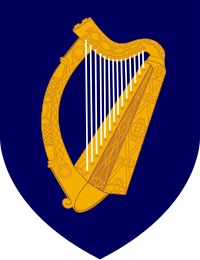
Interestingly, the Guinness harp distinguishes itself from Ireland’s official national emblem, which is also a harp. While both symbolize Irish culture, the Guinness harp is always depicted with its straight edge, or soundboard, on the left, whereas the government’s harp faces the opposite direction.
Earlier iterations of the logo featured intricate detailing that mirrored traditional artistic styles. However, as design trends shifted, the harp’s appearance was refined, with adjustments such as reducing the number of strings for a cleaner, more modern look. The most notable transformation came in 2005, when London-based design agency Design Bridge spearheaded a comprehensive redesign.
The 2005 redesign process involved meticulous collaboration with artisans and designers to elevate the harp’s form. Design Bridge partnered with the artisan letterpress studio New North Press to imbue the logo with a tactile and organic quality. The team drew inspiration from stamped lettering found in the ironwork of the Guinness Storehouse, connecting the design to the brand’s physical and historical roots. To enhance its authenticity, the typography was hand-drawn, drawing influence from Guinness’ vintage print advertisements of the 1920s.
Guinness Logo Toucan
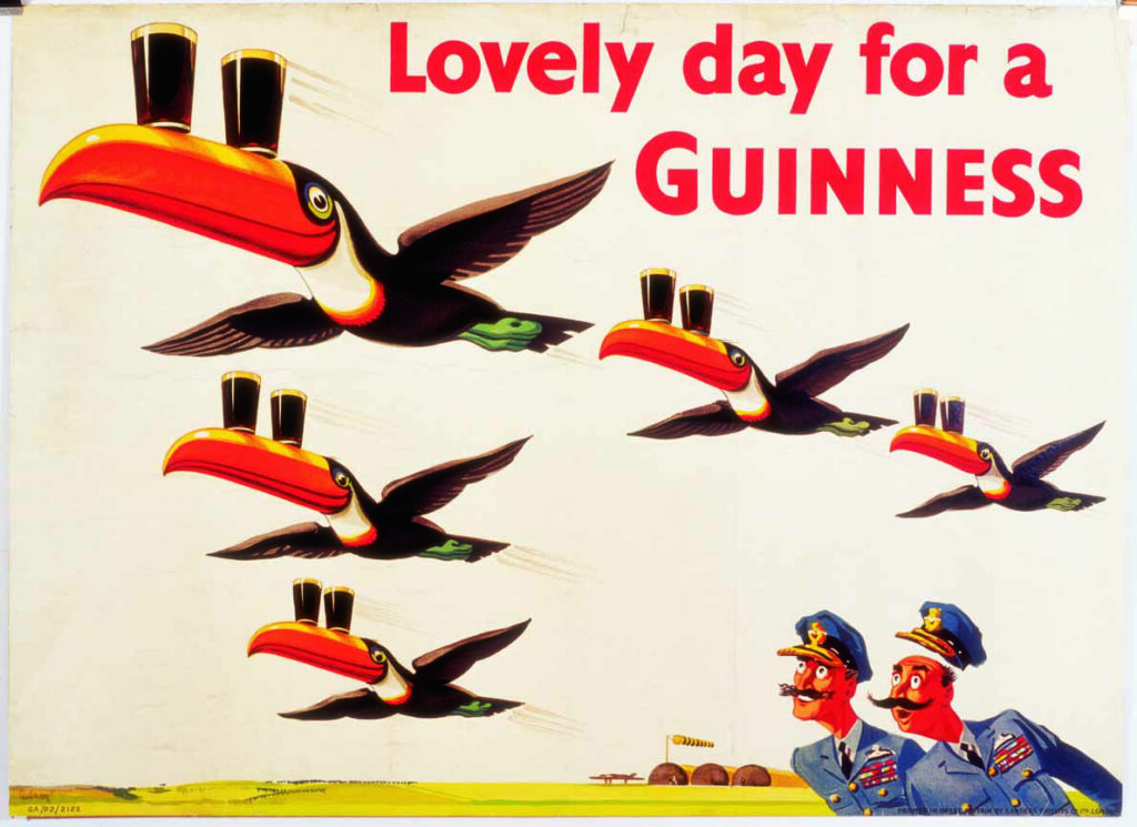
The Guinness Toucan is one of the most memorable and whimsical symbols associated with Guinness’ branding history. Introduced in the 1930s, the toucan was a part of a creative marketing campaign.
Want to create a logo as bold and memorable as the Guinness Toucan? Let Arvin AI Logo Designer bring your playful ideas to life with unique, eye-catching designs.
1. The Origin of the Toucan
The story of the Guinness Toucan began in 1928, when Guinness entrusted its advertising to the renowned agency S.H. Benson. It was during this time that John Gilroy, a young and highly creative artist, became the lead designer for Guinness’ campaigns. Gilroy’s work would go on to define the brand’s image for decades. While Guinness already had strong advertising campaigns like “Guinness for Strength,” Gilroy sought to expand the brand’s appeal by introducing a more playful and universal tone.
As the story goes, Gilroy’s inspiration for the Toucan came after a night at the circus. Struck by the idea of incorporating animals into Guinness’ marketing, Gilroy developed a campaign featuring a variety of zoo animals, each depicted in humorous and imaginative scenarios. This approach allowed the brand to break away from conventional beer advertising and connect with audiences in a fresh and engaging way.
2. The Toucan’s Design and Slogans
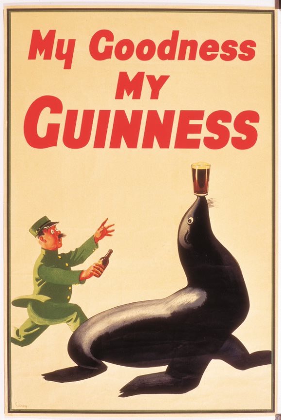
The Toucan made its first appearance in autumn 1935 as part of the “My Goodness, My Guinness” campaign.
From the very beginning, the Toucan stood out due to its vibrant design and whimsical personality. The illustration, created by John Gilroy, featured the bird with a pint of Guinness balanced precariously on its brightly colored beak. This clever visual not only captured attention but also made the Toucan instantly memorable.
In addition, the campaign was accompanied by playful and catchy slogans, such as:
“It’s a Lovely Day for a Guinness”
“If he can say as you can, Guinness is good for you, how grand to be a Toucan—just think what Toucan do!”
“My Goodness, My Guinness”
Guinness Logo Bird
The Guinness Toucan quickly became a favorite among consumers, standing out from the other animals featured in the campaign, such as sea lions, ostriches, and turtles. Not only did it appear on posters, but the Toucan’s imagery also made its way onto merchandise like coasters, bar mats, and even clothing.
What made the Toucan particularly effective was its ability to transcend cultural and demographic boundaries. While other beer advertisements of the era often targeted a specific audience, the Toucan’s universal appeal resonated with everyone, from loyal beer drinkers to families who enjoyed the whimsical imagery. Moreover, the Toucan returned to the spotlight in 1953 and later in the 1980s, appearing in a series of humorous television commercials that brought the character to life for new generations.
Today, the Guinness Toucan remains an enduring symbol of the brand’s history and creativity. Visitors to the Guinness Storehouse in Dublin can explore the legacy of this beloved character as part of an immersive journey through the brand’s advertising history. The Storehouse features original Toucan posters, memorabilia, and behind-the-scenes insights into the creation of these iconic campaigns.
The Artistic Philosophy of John Gilroy
When asked about his approach to creating advertisements, John Gilroy famously said:
“The hoardings are the Museum of the Masses. They hoard the art treasures of the man-in-the-street. But the man-in-the-street is usually in a hurry to catch a bus or to avoid being caught by a bus: he has no time for contemplation. My posters are, therefore, a kind of aesthetic meal-in-a-minute.”
Guinness Logo Font
| Time Period | Font Style | Characteristics |
|---|
| 1862–1955 | Handwritten/Script | – Featured Arthur Guinness’ signature in cursive style. |
| 1955–1968 | Serif Font | – Clean and bold letterforms. – Simplified design to complement the minimalist harp logo. |
| 1968–1997 | Hobbs Serif | – Custom serif typeface developed by Bruce Hobbs. – Bold structure with sharp serifs. – Highly legible. |
| 1997–2005 | Refined Hobbs Serif | – Elegant version of the Hobbs font. – Slightly elongated serifs. – Integrated “EST. 1759” tagline. |
| 2005–Present | Custom Modern Serif | – Sleek, bespoke serif font. – Elongated, sharp serifs. – Polished, clean, and bold design. |
Final Words
The Guinness pint takes 119 seconds to pour; which is undeniably a long time to pour a drink. However, this doesn’t mean that all good quality products take a long time to develop.
With Arvin Logo Maker, designing a logo that resonates with your brand’s story is simple and intuitive.
Whether you’re starting a new venture or redefining your identity, Arvin Logo Maker provides the tools to craft a logo that stands out and tells your unique story. Start your design journey today and create a logo that becomes a timeless symbol of your brand.
FAQ
The bird associated with Guinness, specifically the Toucan, became a prominent symbol through a creative advertising campaign in the 1930s. It was designed by John Gilroy as part of the “My Goodness, My Guinness” campaign.
The symbol on Guinness is a harp, modeled after Brian Boru’s Harp, the oldest surviving Gaelic harp, preserved in Trinity College Dublin. First adopted in 1862, the harp represents Guinness’ deep connection to Irish heritage and culture. Interestingly, the harp on Guinness’ logo is always depicted with its straight edge on the left, distinguishing it from Ireland’s national emblem.
The harp logo was chosen in 1862 by Benjamin Lee Guinness to symbolize the brand’s Irish heritage. The harp, a national emblem of Ireland, represents tradition, artistry, and cultural pride. Its use by Guinness connects the brand to its Irish roots while also serving as a distinctive and elegant icon in its branding.
Guinness has been brewed in Africa since the mid-20th century, with Nigeria being one of its largest markets. The brand’s popularity in Africa is due to its rich taste and association with strength and vitality, resonating with local consumers. Today, Guinness is produced in over 10 African countries, making the continent a vital part of its global success.

