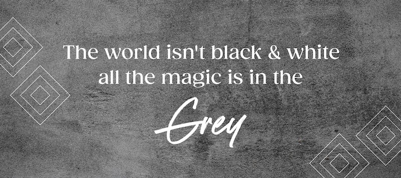
Selecting the right color for your brand’s logo is a very strategic decision. Color plays much in how a customer views your business. Bold and brilliant colors may be the first attention-grabbers, but gray has emerged as a great, sophisticated, versatile color used for building trust and authority and above all, timeliness. Would a gray logo work best for your business? Learn the meaning of gray logos, why a business chooses a gray logo over any other option, and the ways businesses employ them to help in creating great brand identities.
Part 1: The Meaning Behind Gray Logos
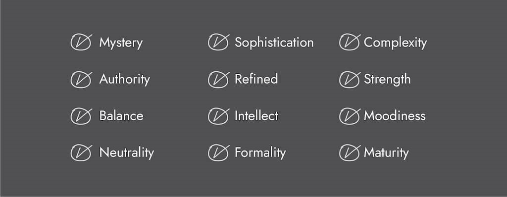
The Psychology of Gray in Branding
Colors take on a significant psychological impact in how people tend to interpret brands. Gray is unique because it is neutral, balanced, and sophisticated, sitting between black and white as a compromise of professionalism and timeless elegance. Unlike bright logo colors, which stir strong emotions, gray has a sense of calm and control. That is why so many tech, finance, and luxury brands opt for gray for their logos: t’s associated with intelligence, authority, and reliability.
Why Businesses Opt for Gray in Their Logos
Many businesses choose gray logos because this color is versatile and time-less. It fades very well with almost any color and can be used to produce modern, minimalistic, and advanced designs. Gray is a neutral color and, therefore, very good for companies that want to appear unbiased and professional. It also symbolizes balance, which is very useful for businesses looking to convey stability and dependability.
Misconceptions About Gray Logos
A gray logo can look too pale or lifeless, but in fact, gray is a neutral color and may still be eye-catching if done correctly with design elements. Great typographic logos, unique icons, and accents in colors that complement it will make the logo look amazing. Another drawback is that gray may not pop enough. But many successful brands use different shades of gray, gradients, and metallic finishes to add depth and make their logos more dynamic and eye-catching A gray logo will create a great and long-lasting impression if applied correctly while retaining a sleek, professional look
Part 2: Industries That Commonly Use Gray Logos
Gray Logos in the Technology Industry
Gray is a neutral color that tech firms use to say innovation, braininess, and future. The cleanness and the minimalism are very well complemented by cutting-edge technology and minimalist product designs. The biggest tech brands, such as Apple, Sony, and LG, have gray logos or branding elements that demonstrate elegance and simplicity. For example, Apple has a gray metallic-looking logo that best describes its premium and futuristic products.
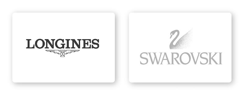
Gray Logos in Luxury Market
Exclusivity, sophistication, and class are the luxury brand elements. Whether it’s a high-class car company or luxury fashion brand, it adds that touch of timelessness and prestige. Brands like Lexus, Swarovski, and Longines use gray to represent their high-quality craftsmanship and superior reputation. The delicate and subtle look of gray helps to support the idea that these brands are exclusive and premium.
Gray Logos in Finance and Corporate Businesses
The finance industry requires trust, authority, and professionalism to reassure the customers that their money and investments are in good hands. Gray logos are most popular among the banks, financial institutions, and corporate firms. This is because the color has the ability to project stability, maturity, and wisdom. Grey color is very prominent in brands such as Forbes, PwC, and HSBC that signify strength and credibility. This color also offers a simple, business-like look that appeals to serious investors and businesspeople.
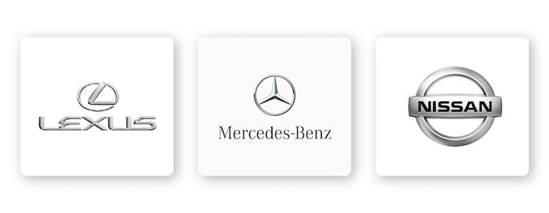
Gray Logos in Automotive Design
The majority of automobile manufacturers embrace gray logos because the color is associated with strength, opulence, and cutting-edge innovation. In design, gray expresses the cool kind of emotions that come from iron and aluminum. Because of this, car names have long been using it as a classic color. Luxury car manufacturers like Nissan, Mercedes-Benz, and Volkswagen incorporate gray into their logos to create an image of power, durability, and class. The metallic look often associated with gray enhances the high-tech and high-performance aspects of their vehicles.
Gray Logos in Entertainment and Media
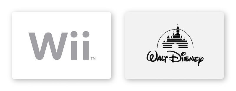
While entertainment brands love colorful hues, many companies find the color gray fitting for professional, timeless branding. Gray can work quite well paired with black or silver to provide an upscale feel in design. For instance, Walt Disney Pictures, Wii, and Universal Pictures have maintained a classic and trustworthy look through their use of gray tones in branding. It helps them to appeal to a large audience while keeping a professional sense.
Gray Logos in Photography and Creative Businesses
Photography and creative businesses require a modern, artistic, and professional logo. A gray logo is great because it offers a neutral background where other design elements, such as typography and imagery, will pop out. Many photography logo ideas and creative agencies use gray since it epitomizes elegance and timelessness. It also helps photographers as well as artists who want to show their work without distractions, letting their portfolio speak for itself.
Is a gray logo for you?
Now that you have an idea about the meaning and impact of a gray logo, it is high time you should make up your mind whether it’s suitable for your brand or not. You want to show professionalism, sophistication, and reliability through your brand; then gray will be your answer. This article is about the steps you can use in designing an appealing gray logo, and also, how Arvin AI will easily help you out. You can make your gray logo stand out with strong typography, contrasting colors, or even unique icons while still looking sleek and timeless. To start with, you are searching for that easy and straightforward way to create a professional gray logo – such as an Arvin AI AI-powered logo making – that just fits well with the identity of your brand.
How To Design A Brilliant Standout Gray Logo & Create with Arvin AI
A gray logo is a timeless, elegant, and versatile choice for businesses in various industries. Whether you are in tech, luxury, finance, or media, gray can help establish trust, sophistication, and professionalism. However, designing a standout gray logo requires careful attention to typography, shapes, color combinations, and balance. This article will outline the process of how to design a catchy gray logo and how Arvin AI can help you easily design one.
Part 3: How to Design a Standout Gray Logo
Choosing the Right Typography for a Gray Logo
Typography is one of the most important elements in defining the personality of your logo The right font can bring more elegance and professionalism to gray, making the logo more memorable and pleasing to the eye. Serif Fonts Serif fonts, such as Times New Roman or Garamond, have a classic, traditional feel to them. Luxury, finance, and law firms often use them to create a sense of heritage and trust.
Shapes and Icons that complement gray logos
Shapes do psychological effects in shaping how people regard your brand. The right kind of shape will always help determine the meaning and therefore intensify your brand identity.
- Circles: Symbolize unity, balance, and continuity. Innovation and stability are imbued in the circular gray logos of many brands, including LG and Volvo.
- Squares and Rectangles: Strong, professional, and reliable are some of the qualities that squares and rectangles convey. Most corporate and finance companies tend to use grey logos with structured shapes.
- Triangles: These are typically associated with power, success, and ambition. Generally, they would go well for tech startups and engineering firms who want to look distinct.
- Animal Imagery: Adding an animal icon to your gray logo will evoke mystery, strength, or elegance, depending on which animal is chosen
Best Color Combinations for Gray Logos
Gray is very versatile, and with varying colors, it blends quite well. This means that adding a color which is complementary to this color will make your logo very visual and standout.
- Gray and Black: Eternally classic and corporate. Adding depth to gray, the black provides a strong, bold, and authoritative look on the logo.
- Gray and Blue: This is a popular choice for corporate and tech brands. Blue makes the otherwise gray-looking color trustworthy and reliable.
- Gray and Red: This is a very bold and dynamic combination. Red is full of energy and passion in your logo, which makes it bold in an otherwise competitive marketplace.
- Gray and Gold: This is a classy and luxurious combination. Gold is warm and exclusive, which makes it a great choice for premium brands.
The right color can be paired with gray to help communicate the exact brand personality and values you want to communicate.
Mistakes to Avoid When Creating a Gray Logo
Even though gray can be rather sophisticated, it becomes rather useless if applied incorrectly for a brand. Here are some examples of mistakes in its usage:
- Using the wrong shade: the light shades make the product appear weak or faded, while the dark shades may look serious and overpowering on others. Choose a balanced shade that reflects your brand’s essence.
- Lack of Contrast: Sometimes, gray can blend with the background, which would mean the logo is not readable. Always ensure there is enough contrast between text, icons, and background.
- Overuse of Gray: Gray is the color with the maximum usage, but overuse will make your design look less interesting and unappealing. Its combination of accent colors or in bold type breaks monotony and adds visual interest.
Avoiding all this will help you get a gray logo that is pretty strong visually appealing and interesting at the same time.
Part 4: Creation of a Wow Gray Logo with Arvin AI
Since you have gained knowledge about a gray logo’s design, here’s how it can be simple with Arvin AI.
Why Prefer Arvin AI for Logo Creation?
Arvin AI is an advanced logo maker powered by artificial intelligence that has made it really easy for brands to create professional quality logos. Armed with smart features, you design a custom grey logo that makes perfect sense for the brand identity.
Key Features of Arvin AI for Logo Design
Key features of Arvin ai for logo design are as:
- User-Friendly Interface: even if you know nothing about the design, then Arvin AI will make it easy and possible to generate a logo on its intuitive drag-and-drop interface.
- AI-Based Suggestions: Receive smart recommendations for the best fonts, colors, and design elements for your industry.
- Customization Options: Make changes to the fonts, icons, and layout to give a unique, finished look.
- Live Previews: Preview changes instantly, fine-tune, and then lock in your gray logo.
- Print and Digital Files: Download your logo in high-resolution, print-ready and digital files for all of your branding applications.
Steps to Use Arvin AI for making Logo
Step 1: Visit Arvin AI’s Website
Open your browser and navigate to the Arvin AI logo design page at logo.arvin.chat to begin crafting your logo.
Step 2: Enter Your Business Information
Provide key details such as your business name and category. This helps the AI tailor the designs to match your brand’s identity.
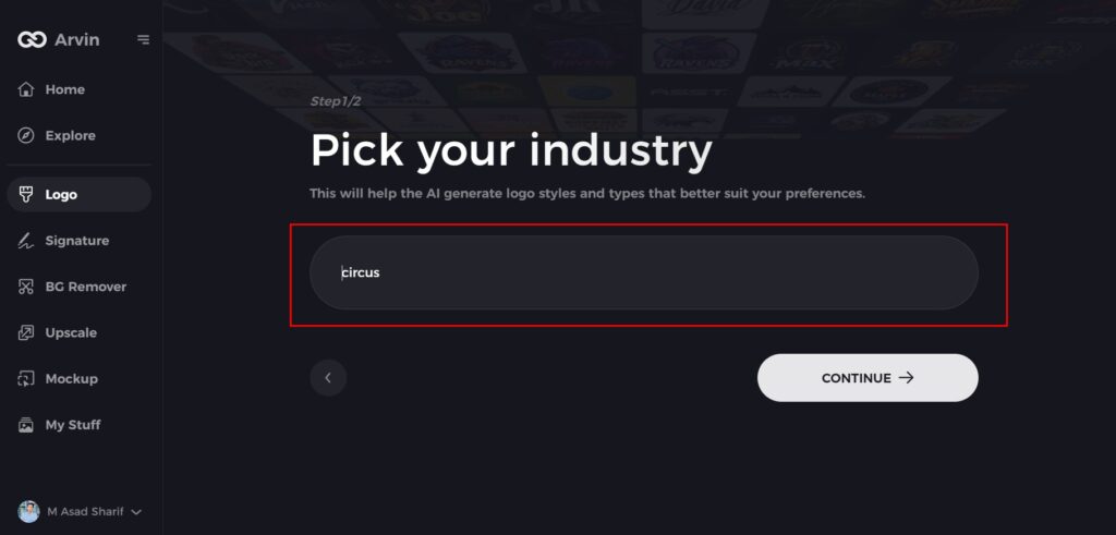
Step 3: Choose Your Industry
Select the appropriate industry from the list. This will help the AI focus on logo styles and options best suited for your field.
Step 4: Select a Logo Style
Browse through the available styles and pick one that aligns with your brand’s vision. If unsure, you can skip this step, and the AI will suggest a default design.
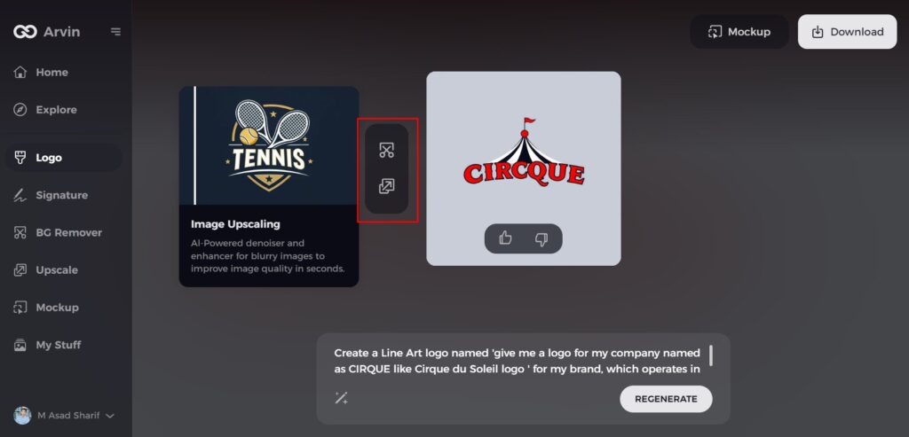
Step 5: Generate Logo Ideas
The AI will create a variety of logos based on your inputs. Review these options to find the one that best represents your brand.
Step 6: Customize Your Logo
Refine your selected design by adjusting elements like colors, fonts, icons, and layouts to fit your preferences.
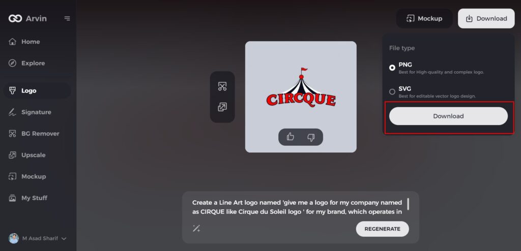
Step 7: Download Your Logo
Once satisfied with the final design, download your logo in formats like PNG or SVG. These formats ensure your logo is ready for use on websites, social media, and print.
Conclusion
A well-designed gray logos can elevate your brand, enhance credibility, and make a lasting impression. The right choice of typography, shape, and color combinations are the keys to making it stand out. Using Arvin AI will design a high-quality, custom gray logo for you without much time and money being spent. Create your perfect gray logos today. Try Arvin AI and take your brand to the next level!
FAQs About Gray Logos
Should I have a gray logo for my brand?
Yes! Gray logos are ideal for brands looking to portray professionalism, sophistication, and stability. It works best with tech, luxury, finance, and automotive industries.
What color goes well with a gray logo?
Gray is a color that can work well with contrast and visual appeal when used in combination with black, blue, red, or gold.
Can I use AI to design my gray logo?
Absolutely! With AI-powered tools such as Arvin AI, creating logos is fast, simple, and professional.
How can I make a gray logo bright?
Use bold typography or something unique in design plus contrasting colors to make it visually appealing.
