The Google logo has become one of the most iconic symbols in the world, evolving alongside the company’s journey from a search engine startup to a global tech giant. Logos are powerful branding tools in the sense that they portray the identity of a company, along with its core values. Google’s logo has changed many times since it was first designed in 1998, due to the growth of the company, technological advancements, and design trends. This article delves deeper into the google logo history, tracing the changes from a simple design to modern and innovative symbols defining the brand today.
Part 1: The Birth of Google First Logo (1997)
In 1997, Larry Page and Sergey Brin founded Google with the goal of organizing the world’s information. As they worked on their search engine project, they needed a logo to represent their new company. The first Google logo was simple and hand-drawn, created by Sergey Brin using free software. Here we have compiled the 50 Cool Logos and Free Cool Logo Maker for Your Brand you must read.
In 1997, Larry Page and Sergey Brin, two PhD students at Stanford University, founded Google with the goal of organizing the world’s information and making it universally accessible and useful. Their project began as a research initiative, where they developed a search engine algorithm that ranked web pages based on their relevance through links.
Overview of the First Logo Designed by Sergey Brin
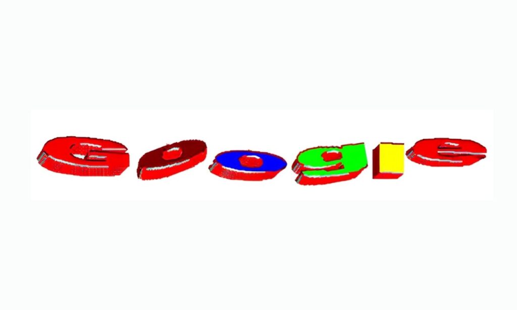
The first Google logo was designed by Sergey Brin using the free graphic software GIMP. The logo was a simple, hand-drawn design that emphasized the word “Google” in a playful, approachable manner. The letters were colorful, featuring a vibrant mix of primary colors that were typical of the internet’s early design trends. Beautiful Fonts: Top Picks for Stunning Graphic Design Projects.
The first Google logo prominently featured the word “Google” in a bold, colorful typeface. This wordmark, despite its simplicity, would become one of the most recognized in the world. Along with the wordmark, the logo carried the tagline “BackRub,” referencing Google’s original name, which was inspired by the search engine’s focus on backlinks for ranking pages.
How the Logo Represented the Company’s Early Vision?
The first Google logo was much more than a simple design; it represented the company’s core principles. The logo’s clean, simple appearance mirrored the company’s early vision of providing a straightforward, user-friendly search engine experience. Google was not interested in flashy, complicated designs like many of its competitors.
Part 2: The First Major Update (1998-2000)
Google logo history covers its first major update from 1998 to 2000.During this time, Google redesigned its logo and made key changes to make the logo more polished and professional. It had a new cleaner font and color scheme, which defined an important milestone in forming Google’s ever-growing identity as a firm that was reliable and innovative.

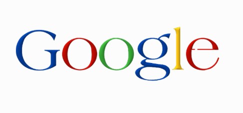
In 1998, Google updated its logo, making it more polished and professional.The new design showed a more polished and fresh font instead of the handmade style of the original. Along with that, this logo also incorporated primary colors—blue, red, yellow, and green. These primary colors became something of the standard visual aspect of Google.
Transition to a more professional logo design
This logo update marked a significant shift from the simple, hand-drawn style to a more polished and professional design. The new logo wasn’t a funny, fun twist on the company identity but rather a move forward toward portraying Google as an honest and authoritative brand. It had a cleaner and readable font with smoother curves, which were more precise than the previous one.
The significance of the logo in Google’s initial growth phase
The updated logo was not just a cosmetic change; it was an essential part of Google’s brand evolution during its initial growth phase. The cleaner and more professional logo showed the company’s growing credibility as a reliable search engine. During this time, Google started getting more attention, particularly as its search engine began to significantly outperform other competitors. Here the Logo Shapes and Impact on Brand Identity: Design Trends and Tips.
Part 3: Introduction of the “Doodle” Concept (2000s)
In the 2000s, Google introduced the “Doodle” concept as a fun way to celebrate holidays, special events, and anniversaries. These custom logos personalized the Google homepage, which in turn made it more interesting for users. Doodles became a unique identity for Google in no time and evolved over time. They grew more creative and interactive while maintaining the simplicity of the brand.
The beginning of the Google Doodle
In the early 2000s, Google introduced the concept of “Google Doodles” as a way to celebrate holidays, special occasions, and important events. The first doodle appeared in 1998 to commemorate the Burning Man festival, where Larry Page and Sergey Brin had attended. The idea was simple: customize the Google homepage to reflect a specific theme.
The introduction of Google Doodles personalized the search engine’s homepage, transforming it from a static platform into something dynamic and engaging. Each Doodle was designed to reflect the mood of a special occasion, giving users a reason to return to the homepage regularly. This customization added a human touch to the otherwise minimalistic design of Google.
Part 4: The 2010-2013 Redesign – Simplifying the Logo
In 2010, Google introduced a significant change to its logo, making it simpler and more modern. The redesign was to make it look cleaner and more professional as the company was growing. Focusing on a streamlined design, Google improved the readability and visual appeal of the logo. Here the best tips to make your circle logo.
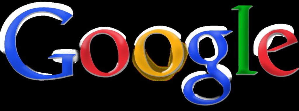
In 2010-2013, Google made a significant change to its logo, shifting towards a cleaner, sleeker, and more modern look. This simplified design of typography was now neat and clear, balancing and looking great visually. The former letters were made simple; hence the complexity of shadows of the letters reduced and also made the logo look newer.
The use of flat design principles
The 2010-2013 redesign embraced the growing trend of flat design, which favored simple, two-dimensional visuals without intricate gradients or textures. Google eliminated the drop shadows and 3D effects that had previously been used, resulting in a cleaner, more straightforward logo. This shift was in line with the minimalist design trend, offering better readability and a more streamlined aesthetic, especially on mobile devices.
Impact of the Redesign on Google’s Overall Branding
The 2010-2013 logo redesign had a significant impact on Google’s overall branding strategy.By choosing a cleaner, modern logo, Google reaffirmed its commitment to innovation and user-centric design. Simplifying the logo helped create a more professional image in the eyes of the client, thereby attracting a diverse audience.
Integration of the new logo
One of the key elements of the 2010-2013 logo redesign was its seamless integration across a wide range of platforms and devices. As Google’s services expanded, from search to Gmail to YouTube, the new logo had to maintain its clarity and impact on different screen sizes. The simplified design allowed for easy scalability.
Part 5: The 2015 Overhaul – Google’s Bold New Look
In 2015, Google introduced a major redesign of its logo, marking a bold new direction for the brand. It included a cleaner, more modern look with a new sans-serif font. This update indicated Google’s growth as a leader in the tech world and its shift toward a user-friendly, mobile-optimized design. The 2015 logo overhaul was one of the key steps for the brand to remain relevant in the fast-evolving digital world.
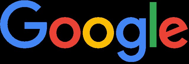
Introduction of the new sans-serif logo
In 2015, Google unveiled a completely redesigned logo. The new design had a sans-serif font, known as Product Sans, and was thus fresh and modern-looking. The new font was in-house designed by Google to match the brand’s image of forward-thinking and technological leadership. The sans-serif style made the logo friendlier and more accessible to a global audience, matching Google’s focus on user-centered design.
Rationale for the Change
The redesign was Google’s growth from a search engine into a technology leader and leader in products and services. The geometric font stood for innovation, adaptability, and the evolution beyond just one product. Using the new look was, for Google, a way of presenting its versatility and relevance to today’s tech landscape.
Optimized for Mobile
The 2015 logo overhaul was designed with the digital age in mind. It was optimized to look great on all devices, from large desktop screens to small mobile displays. The simplicity of the sans-serif font ensured readability and consistency across various screen sizes and resolutions. Additionally, the new design allowed for seamless integration into Google.
Part 6: Future of Google’s Logo
In the digital age
As the digital landscape evolves, Google’s logo is likely to undergo further changes to stay relevant and appealing. With the rapid advancement of technologies such as artificial intelligence (AI), virtual reality (VR), and augmented reality (AR), Google may design a logo that reflects its commitment to innovation and technological leadership..
In New technologies like AI and virtual reality
Google may incorporate elements of AR and VR into its branding, potentially creating a logo that interacts seamlessly with these platforms. For example, a 3D or animated version of the logo could appear in virtual environments, providing a more immersive brand experience. AI-driven design adjustments may allow the logo to change finely based on user context, maintaining its core identity while offering a personalized touch.
In future Google innovations
As Google delves further into fields like quantum computing and advanced machine learning, the symbol of those innovations might well rest in the company’s logos. Google will, after all, stay a showcase for innovative and agile work in a digital age changing by the day through modern design trends in branding.
Part 7: The Role of Typography in the Google Logo
Google logo is dynamic and typography is also used in the pattern and design to make google logo unique in every year. From its early use of the Actual typeface to the introduction of Product Sans, the choice of fonts has reflected Google logo history. The typography of the logo is clean, approachable, and easily recognizable across the globe. This section will discuss how the fonts used in Google’s logo have contributed to its consistency.
The choice of letters and Fonts
Typography has been central to the google logo history. Initially, it represented the Actual typeface which gave it that one distinctive, classical look of a logo. This serif font embodied the playful yet professional image Google sought in its early days. However, as the company expanded its services and platforms, it changed to a more modern style.
The influence of fonts
The introduction of Product Sans in 2015 marked a significant milestone. This sans-serif font is clean, geometric, and versatile, reflecting Google’s transformation into a tech leader with a focus on simplicity and accessibility.
Typography has played a vital role in making Google logo history recognizable. The consistent use of bold, primary colors combined with clean fonts ensures that the logo remains distinctive and easy to identify across different languages and cultures. This consistency in typography has solidified Google’s place as a trusted global brand.
Part 8: The Google Logo and Its Branding Evolution
The Google logo history has evolved significantly over the years, reflecting the company’s growth and changes. As Google expanded its services and reach, the logo adapted to stay relevant. It mirrors the company’s mission of innovation, simplicity, and accessibility. This part explores how the logo’s design has shaped and been shaped by Google’s branding over time.
Making the Google Brand
The Google logo has taken a very dramatic turn as the company grew from simple search engines to a global tech goliath. Early logo versions reflected the humble beginnings of the company, with playful and informal designs. As the service expanded, the logo became increasingly professional and polished, presenting innovation and reliability.
The relationship between logo design and Google’s mission
The Google logo has always been tied to the company’s core values of innovation, simplicity, and accessibility. Early logos mainly focused on the intent of the company to make the search engine user-friendly. The logo has changed as the brand has grown, but these principles have always been there. The simplicity of the logo’s design mirrors Google’s goal of making complex information accessible to everyone.
Part 9: Arvin AI as a Professional Logo Maker
Arvin AI Advanced logo making using artificial intelligence. It offers tools that make designing professional logos accessible to everyone irrespective of the design experience of the individual. Much like Google’s approach to innovation in technology. Arvin AI is focused on empowering the user by automating complex tasks and providing intuitive tools. With advanced AI-driven capabilities, it enables users and businesses alike to create logos that express their brand identity with little effort.
Key Features of Arvin AI
- AI-Driven Design: Utilizes advanced artificial intelligence to generate custom logo designs that align with user preferences, branding goals, and industry trends.
- User-Friendly Interface: Designed for accessibility, the platform is easy to navigate, making it suitable for individuals with no prior design experience.
- Real-Time Adjustments: Enables users to see immediate previews of changes, allowing for precise and efficient customization of designs.
- High-Resolution Output: Delivers logos in multiple high-quality formats, ensuring they look professional on both digital and print media.
- Cross-Industry Templates: Includes a diverse collection of logo templates suitable for businesses across various industries, from tech to retail.
- Collaborative Tools: Supports multi-user collaboration, making it easier for teams to work together on branding projects
- Affordable and Scalable: Offers cost-effective solutions that cater to individuals, small businesses, and large enterprises, ensuring scalability for diverse needs.
Steps to Use Arvin AI for Logo Creation
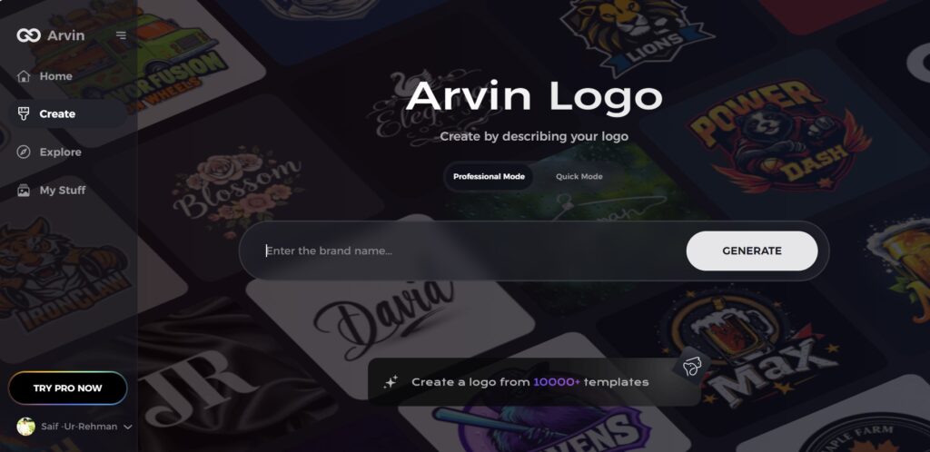
Step 1: Visit the Arvin AI Website
Go to the logo.arvin.chat page in your browser to begin designing your logo.
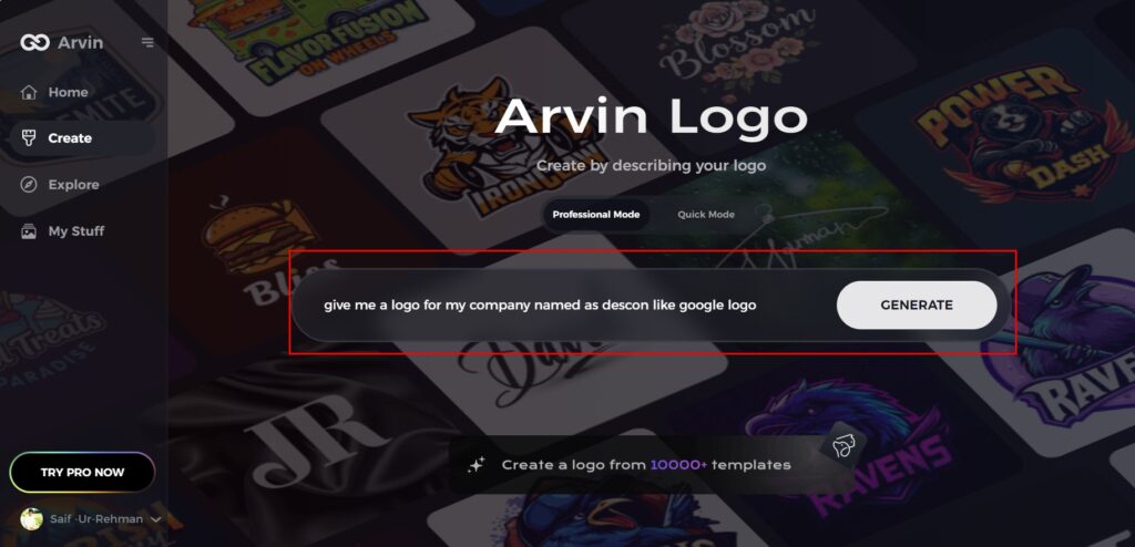
Step 2: Enter Your Business Details
Provide essential details like your business name and category. This helps the AI generate designs tailored to your brand.
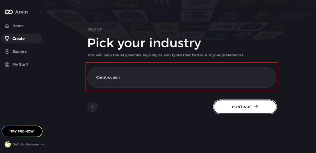
Step 3: Select Your Industry
Choose your industry from the provided options. This step allows the AI to customize logo styles to fit your field.
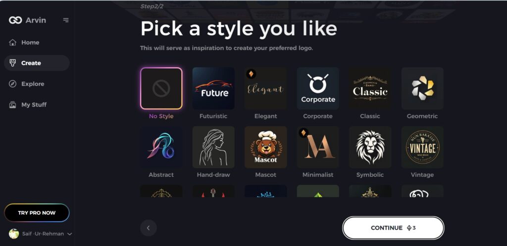
Step 4: Choose a Style
Browse through the suggested styles and select one that matches your brand. If undecided, skip this step, and the AI will proceed with its default inspiration.
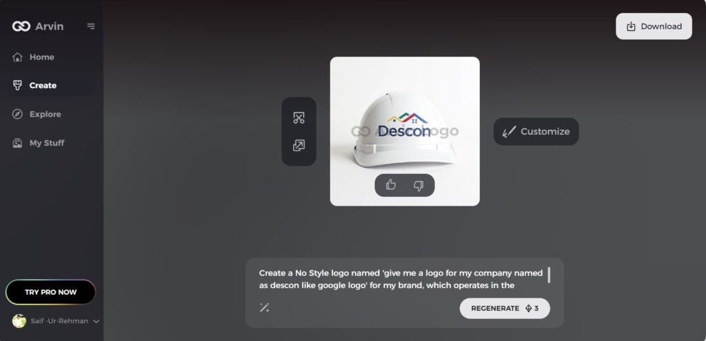
Step 5: Explore Logo Ideas
The AI will generate a variety of logo designs based on your input. Review the options and find one that fits your brand image.
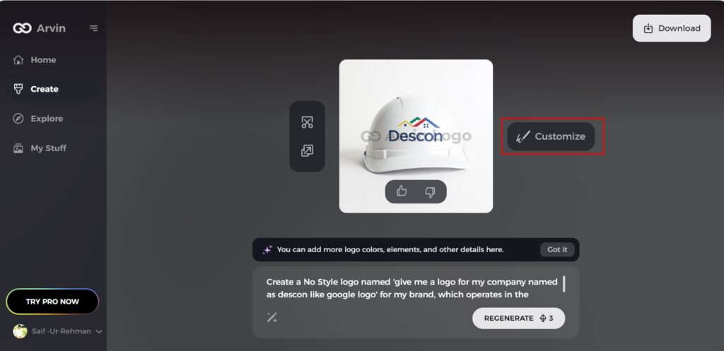
Step 6: Customize Your Logo
Make adjustments to the selected design, such as tweaking colors, fonts, icons, or layouts, to better reflect your style.
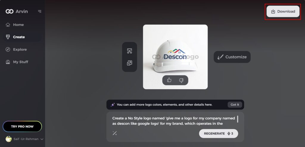
Step 7: Download Your Logo
Once you’re satisfied, download the logo in formats like PNG or SVG for use on websites, social media, or printed materials.
Conclusion
The google logo history was an expression of the element of change and innovation in branding. This all implies that as a symbol of Google logo history and its future vision, the logo shows not only simplicity but also approaches towards availability and user-experience. Similarly, innovative tools such as Arvin AI are changing the perspective of how businesses create a logo. With its capabilities in AI-driven design and user-friendly interface, along with real-time customization features, the Arvin AI allows a business of all sizes to create professional logos that could be aligned to their identity. Whether inspired by Google’s branding or looking to build a unique identity.
FAQs About Google Logo History
Why has Google changed its logo multiple times?
Google has updated its logo multiple times to keep pace with evolving design trends and ensure that the logo is in tandem with the company’s growth and innovation. The updates mostly reflect the need for a modern.
How do Google Doodles relate to the company’s branding?
Google Doodles give a different and personal touch to the branding of the company. They celebrate holidays, people, and milestones, so the Google homepage is culturally relevant and more engaging.
What inspired the 2015 Google logo redesign?
The 2015 redesign was driven by Google’s need to modernize its identity in response to its transformation into a diverse tech conglomerate. The new sans-serif font (Product Sans) was designed to be versatile and adaptive, especially for mobile.
How does Google’s logo impact its brand recognition?
The logo of Google is a significant feature in both creating and sustaining brand awareness. Its simplicity, colorful, and global nature makes this logo easily identifiable across countries. This high visual value leads to customer devotion.

