The food logos of a restaurant often serves as a visual appetizer. They give potential diners a taste of what to expect before they even set foot inside. Much more than just an emblem, a well-designed restaurant logo can subtly communicate key aspects of the dining experience. From the type of cuisine and ambiance to the price range and target audience. By incorporating specific elements like color schemes, fonts, and iconography, a logo can provide clues. Be it about the restaurant’s culinary style, dining environment, and even the level of formality of the service.
This initial impression is crucial in attracting the right clientele and setting the stage for what they can anticipate during their visit. For example, food logos featuring elegant silverware against a stark black background might hint at a fine dining experience, suggesting sophistication and a higher price point, while a vibrant, cartoonish pizza slice could indicate a casual, family-friendly atmosphere.
Ready to translate your kitchen’s flavors into a visual feast? Design your own logo with Arvin AI’s Logo Maker and give your restaurant the brand identity it deserves.
Italian Food Logos
Olive Garden
Olive Garden is an iconic name in the landscape of American casual dining, primarily known for its Italian-American cuisine. Established in 1982 in Orlando, Florida, Olive Garden was originally a unit of General Mills Inc. It has since blossomed into a major segment of the Darden Restaurants, Inc. portfolio, which spun off as a standalone company in 1995. Today, Olive Garden operates over 800 locations globally. They serve up a variety of Italian staples. This includes pasta dishes, soups, and salads, all centered around its famous slogan, “When you’re here, you’re family.”
The logo utilizes a soft yet vibrant shade of green that embodies freshness and organic quality, essential attributes for a restaurant specializing in Italian cuisine. The green color is symbolic of olives and olive gardens, directly linking to the restaurant’s name and Italian culinary traditions.
The Olive Garden logo features a custom script typeface for the name “Olive Garden,”. This adds a personal, hand-crafted touch to the brand’s visual identity. The script is fluid, with varying stroke widths that create a dynamic rhythm. The “Italian Kitchen” subtext uses a simpler, sans-serif typeface, which contrasts with the main script.
Above the text, the food logos incorporate an olive branch with three olives, rendered in a minimalistic style. Smooth lines and rounded forms stylize the branch, enhancing the logo’s friendly and approachable feel.
Prezzo

Prezzo is a well-known British chain specializing in Italian cuisine. It offers a broad menu that includes pizza, pasta, and a variety of other Italian-inspired dishes. Founded in 2000 by Jonathan Kaye, the company was part of a family’s legacy in the restaurant business. Kaye’s family was involved in creating other popular restaurant chains like Ask and Zizzi. With its first location opened in Central London, Prezzo quickly expanded, operating over 180 branches across the UK.
It features a minimalist design with a stark black-and-white color scheme that highlights modern elegance. A distinctive feature of the logo is the thin red line above the letter “e,”. This adds a subtle flair and a touch of color to the otherwise monochrome palette. This red accent is strategic, reflecting the vibrant flavors of Italy. And perhaps subtly nodding to the Italian flag in its color choice.
Carluccio’s
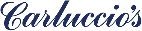
Carluccio’s, a renowned name in the UK restaurant scene, epitomizes the charm and authenticity of Italian dining. Founded by Antonio Carluccio in 1999, the restaurant initially started as a combination of a simple Italian restaurant. It was also a small shop selling high-quality products from Italy. Over the years, Carluccio’s expanded its operations to include multiple outlets across the UK. They each promote the “MOF MOF” philosophy. It stands for “Minimum of Fuss, Maximum of Flavour”, which Antonio Carluccio himself championed.
Carluccio’s logo utilizes a custom script typeface that lends an elegant and personalized touch.It reflects the authenticity and traditional values of the restaurant. The script displays sophistication with dynamic flourishes, particularly noticeable in the capital ‘C’ and the apostrophe. This adds a sense of flair and uniqueness to the design. This font style recalls traditional hand-painted Italian signage.
Mexican Food Logos
Taco Bell
Taco Bel is a major player in the fast-food industry. It is renowned for its Mexican-inspired fare such as tacos, burritos, and quesadillas. Founded by Glen Bell in 1962 in Downey, California, Taco Bell has grown to become a global brand.
The Taco Bell logo features a distinctive bell shape, which directly plays off the brand name. Inside the bell, the negative space forms a stylized eye. The logo uses a deep purple hue, which is relatively unique in the fast food industry. Purple, often associated with creativity and originality, aligns with Taco Bell’s image as an innovator within its market. The color choice sets Taco Bell apart. Especially from the typical reds and yellows commonly used by other fast food chains, reinforcing its unique brand identity.
Chipotle
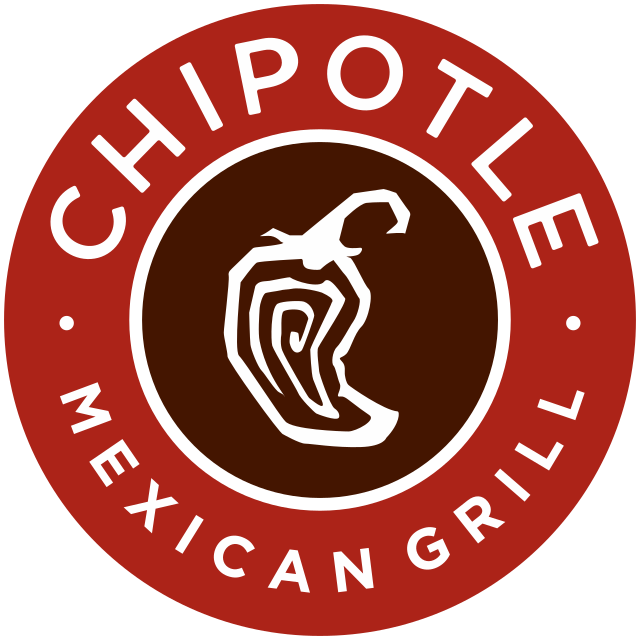
Founded in 1993 by Steve Ells in Denver, Colorado, Chipotle emphasizes ethical food practices. This includes the use of organic ingredients and naturally raised meat. This approach has helped to pioneer and popularize the trend of fast-casual dining with a focus on health and sustainability.
At the heart of the Chipotle logo is a stylized chili pepper. This is fitting given that “chipotle” refers to a smoked, dried jalapeño chili pepper. The logo predominantly features a deep, earthy red, evoking warmth, passion, and a hint of spiciness. Perfectly in line with Mexican cuisine. Red, a color often used to stimulate appetite, makes it a strategic choice for a restaurant logo. The white and dark gray used for the text provide a sharp contrast against the red background, ensuring that the logo is bold and readable.
Begin building your culinary legacy by designing a distinctive logo with Arvin AI’s Logo Maker. Start crafting a visual identity that tells your food’s story.
Chili’s
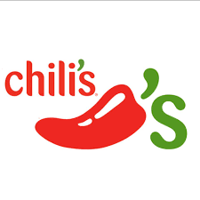
Chili’s Grill & Bar is a popular American casual dining restaurant chain. Known for its lively atmosphere, and a diverse menu that includes everything from spicy wings and burgers to hearty salads and Tex-Mex favorites. Larry Lavine founded Chili’s in 1975 in Texas with the vision of creating a full-service restaurant that offers a casual dining feel. Plus, an emphasis on hamburgers in a southwestern-inspired setting.
The Chili’s logo prominently features a chili pepper, which is central to the brand’s identity. The stylized pepper remains easily recognizable. It has a bold red color that catches the eye and emphasizes the “chili” in Chili’s. The green used in the apostrophe ‘s’ adds a contrast that is visually appealing and reinforces the freshness of the ingredients used in their dishes.
Chinese Food Logos
Din Tai Fung

Din Tai Fung is a globally renowned Taiwanese restaurant chain. They are famous for their delicate and meticulously prepared xiao long bao (soup dumplings). Yang Bingyi founded the restaurant in 1958 as a cooking oil retail business. However, it transitioned into a full-fledged restaurant in 1972 due to shifting market demands.
Originally a small eatery in Taipei, Din Tai Fung expanded its menu to include a variety of dim sum dishes. They eventually gained international acclaim for their high-quality ingredients and precise cooking techniques. Today, Din Tai Fung has branches worldwide, consistently earning praise for its refined approach to traditional Chinese dishes.
The logo for Din Tai Fung features traditional Chinese characters in a classic red color. This is a choice deeply rooted in Chinese culture. Red is considered auspicious and symbolizes good fortune and joy. Aligning with the dining experience the restaurant aims to provide. The characters “鼎泰豐” translate to Din Tai Fung, where each character carries significant cultural and qualitative connotations:
- 鼎 (Ding) refers to an ancient Chinese cooking vessel, symbolizing fine cuisine and cultural heritage.
- 泰 (Tai) translates to peace and stability, reflecting the restaurant’s commitment to providing a consistently exceptional dining experience.
- 豐 (Fung) means abundant, (of) the richness and quality of the flavors.
The use of calligraphy in the logo adds an element of authenticity and elegance.
Are you eager to showcase your culinary artistry? Create a logo that’s as unique as your dishes with Arvin AI. Start designing now and see how your ideas come to life!
PF Chang’s
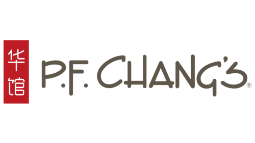
P.F. Chang’s is an American-based, Asian-themed restaurant chain. It’s known for its stylish, bistro-like environment and a menu that blends traditional Chinese cuisine with American-style cooking. Paul Fleming and Philip Chiang founded the restaurant in 1993 with the aim of offering an upscale dining experience that leveraged the popularity of Chinese food in the United States while introducing innovative fusion dishes that appealed to American tastes. The name P.F. Chang’s itself is derived from a combination of both founders’ names, adding a personal touch to the brand identity.
The logo of P.F. Chang’s features the restaurant name in a stylized, serif font that has a dynamic and somewhat informal look. The main color featured in the logo is a deep, rich red, which is a powerful color in Chinese culture symbolizing luck, joy, and prosperity.
Accompanying the Latin script, the logo incorporates Chinese characters “长發” vertically placed next to the name. These characters, which translate to “long prosperous” in English, add a touch of authenticity and cultural reference, resonating with the restaurant’s Chinese culinary roots.
Haidilao
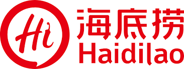
Haidilao is a renowned Chinese hotpot restaurant chain celebrated for its exceptional service and innovative dining experience. Founded in 1994 in Sichuan Province, China, by Zhang Yong, Haidilao is named after a mahjong term. The term signifies the final move in the game to snatch victory. This symbolism reflects the founder’s strategic business vision and the restaurant’s dedication to winning customer satisfaction through a meticulous focus on service quality.
The Haidilao logo features the name in both Chinese characters “海底捞”. And an abbreviated form “Hi” in Latin script cleverly plays on the English greeting to add familiarity and approachability. The script is bold and rounded, giving it a modern and friendly appearance. This dual-language approach not only caters to international and domestic audiences but also reflects the brand’s global aspirations. The Chinese name “海底捞” translates to “fishing from the bottom of the sea,” metaphorically suggesting “seeking fortune” which ties back to the restaurant’s origins.
Japanese Food Logos
Benihana
Skilled chefs prepare the food on a steel grill in front of customers in Benihana. Founded by Rocky Aoki in 1964 in New York City, Benihana was one of the first restaurants to introduce Japanese cuisine and cooking theater to American diners. It created an interactive and entertaining dining experience that combines culinary craftsmanship with performance.
The Benihana logo features a distinctive red flower emblem that resembles a chrysanthemum. Thisis a symbol of the Japanese Imperial family and often associated with longevity and rejuvenation in Japanese culture. Red, deeply embedded in Japanese culture and used both in the text and the icon, symbolizes good fortune, energy, and strength.
Wagamama
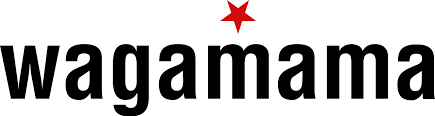
Wagamama is a British restaurant chain that specializes in Asian-inspired cuisine, particularly Japanese dishes. Founded in 1992 by Alan Yau in Bloomsbury, London, Wagamama quickly became known for its sleek, minimalist interiors and its innovative approach to service, with meals prepared quickly and served as soon as they are ready, irrespective of the traditional course order.
The Wagamama logo features lowercase, sans-serif typography that conveys a modern, approachable, and informal vibe. The choice of a clean, straightforward typeface reflects the brand’s emphasis on simplicity and efficiency, mirroring the minimalist aesthetic of its restaurant interiors.
Sushiro
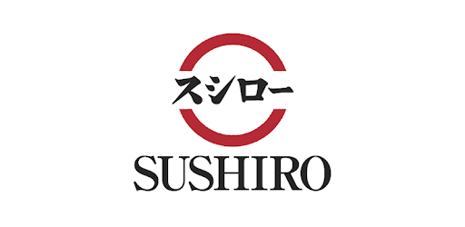
Sushiro is a well-known Japanese sushi restaurant chain, famous for its conveyor belt sushi dining experience. Founded in 1984, Sushiro has grown to become one of the largest kaiten sushi chains in Japan. It offers a wide variety of sushi and other Japanese dishes at affordable prices.
The Sushiro logo features both Japanese Kanji and Roman letters. Central to the logo is a red circle that symbolizes the Japanese flag. It conveys a strong sense of national identity and authenticity. The circle is a universal symbol of unity and perfection, resonating with the circular nature of the sushi conveyor belts used in the restaurants.
First impressions count, especially in food. Design a logo with Arvin AI that diners will crave as much as your dishes.
Indian Food Logos
Moti Mahal
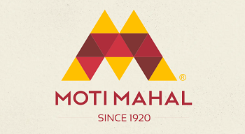
Moti Mahal is a legendary name in Indian cuisine. They are renowned globally for their historical significance and pivotal role in popularizing dishes such as tandoori chicken and butter chicken. Founded in 1920 in Peshawar, then part of British India and now in Pakistan, by Kundan Lal Gujral, Moti Mahal moved to Delhi after the partition of India. The restaurant revolutionized Indian cuisine by introducing the tandoor oven to mainstream cooking.
The logo features a geometric pattern composed of triangles in shades of red and gold. It creates a stylized representation of the iconic tandoor flames. This design not only resonates with the heat and passion associated with Indian cooking but also symbolizes the rich flavors and warmth of Indian hospitality. Red is a vibrant color that is often associated with energy and power, while gold represents luxury, quality, and tradition.
Saravana Bhavan
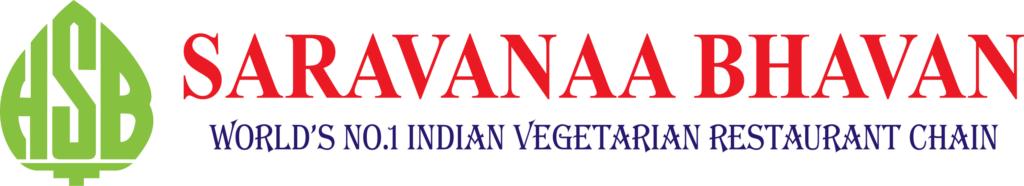
Saravana Bhavan is renowned globally as one of the largest and most popular Indian vegetarian restaurant chains. Founded in 1981 by P. Rajagopal in Chennai, India, Saravana Bhavan has built its reputation on providing high-quality vegetarian cuisine. It emphasizes authentic South Indian flavors.
The logo features a unique emblem made of three stylized leaves or petals, which form an abstract representation of a lotus flower. This symbol is culturally significant in India, representing purity, beauty, and spiritual awakening.
French Food Logos
Paul
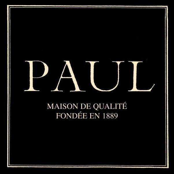
Paul is a renowned French bakery and café chain known for its artisanal bread, pastries, and savory lunch offerings. Founded in 1889 in Croix, Northern France, by Charlemagne Mayot, Paul has grown to become a symbol of French culinary tradition, boasting over 670 locations in more than 30 countries.
The Paul logo prominently features the name “PAUL” in a classic serif font, which conveys elegance and tradition. The typeface is sophisticated, featuring well-defined serifs that add a touch of refinement and a formal quality to the brand’s visual identity.
Below the main name, the logo includes the phrase “MAISON DE QUALITÉ FONDÉE EN 1889” which translates to “house of quality founded in 1889.” This tagline emphasizes the long-standing history and credibility of the bakery, enhancing the brand’s image as an established purveyor of quality.
American Food Logos
The Cheesecake Factory
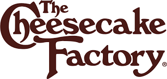
The Cheesecake Factory is renowned for its extensive menu, distinctive décor, and most notably, its wide array of cheesecakes. Established in the 1970s, the brand has grown to become a staple in American casual dining, offering a diverse range of dishes alongside its signature desserts.
The Cheesecake Factory logo features a unique, custom script that is both elegant and playful. The script is fluid and artistic, with large, looping letters that convey a sense of indulgence and flair. This typographic style reflects the luxurious, over-the-top experience of dining at the restaurant, where the presentation and variety of food are key aspects of its appeal.
Barbecue Food Logos
Franklin Barbecue
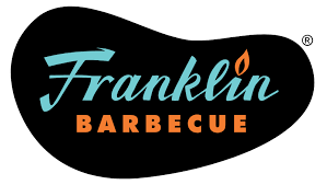
Franklin Barbecue, based in Austin, Texas, is famously known for its exceptional smoked meats and has become a cultural landmark for barbecue enthusiasts. Aaron Franklin founded the restaurant, which has gained national acclaim for its meticulous approach to smoking meat, particularly its brisket, celebrated as one of the best in the country.
The Franklin Barbecue logo features an elliptical shape with the restaurant’s name stylishly scripted across it. The inclusion of a flame icon above the letter ‘i’ in “Franklin” cleverly emphasizes the barbecue aspect of the restaurant, symbolizing the fire and smoke integral to the cooking process. The flame adds a dynamic element to the design, suggesting the passion and energy that Franklin Barbecue brings to its food preparation.
Pecan Lodge
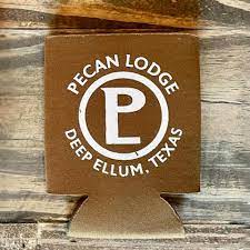
Located in Deep Ellum, Texas, Pecan Lodge is a well-known barbecue restaurant celebrated for its dedication to traditional Texan smoking techniques and its robust, flavorful meats. The establishment has garnered a strong following for its hearty dishes, which include smoked brisket, ribs, and homemade sausages, all embodying the rich culinary heritage of Texas barbecue.
Gogi Gui Korean BBQ
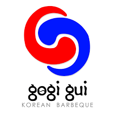
The logo features a graphic that resembles the Korean taegeuk, the traditional circle found in the center of the South Korean flag, symbolizing balance and harmony. The taegeuk consists of two swirling sections—one red and one blue—that represent opposing cosmic forces in traditional Korean philosophy. This symbol is particularly fitting for a Korean BBQ restaurant, reflecting the balance of flavors and the heat (red) and coolness (blue) that are essential elements of Korean cuisine.
Fine Dining Food Logos
Osteria Francescana
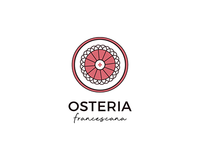
Osteria Francescana is an acclaimed restaurant located in Modena, Italy, and is celebrated for its innovative approach to Italian cuisine. Under the leadership of Chef Massimo Bottura, Osteria Francescana has earned three Michelin stars and has been repeatedly recognized as one of the best restaurants in the world.
Central to the logo is a stylized image that resembles a rosette or a mandala, often seen in traditional Italian art and architecture. This circular motif could represent a plate, symbolizing the culinary focus of the restaurant, or it could be seen as a metaphor for the holistic and intricate nature of Chef Massimo Bottura’s culinary creations.
Your recipes are exceptional. Shouldn’t your logo be as well? Click here to access Arvin AI’s Logo Maker and start designing a logo that’s as appetizing as your menu.
Fast Food Logos
In-N-Out Burger
In-N-Out Burger is a highly celebrated fast-food chain originating from California, USA, known for its simple and fresh menu, primarily focusing on hamburgers, fries, and shakes. Founded in 1948 by Harry and Esther Snyder, In-N-Out is famous not only for its food but also for its customer service and unique business culture that emphasizes quality and employee welfare.
The In-N-Out Burger logo prominently features an arrow pointing to the right, which symbolizes the restaurant’s fast service and the concept of getting your food quickly, either dining in or on the go.
Jollibee
Jollibee is a highly popular and iconic fast-food chain based in the Philippines, known for its joyful, family-friendly atmosphere and diverse menu that includes burgers, spaghetti, fried chicken, and more. Founded in 1978, Jollibee has grown to become a beloved brand not only in the Philippines but also internationally, symbolizing a taste of home for many Filipinos around the world.
The Jollibee logo features a red and white bee character, which is not only the brand’s namesake but also a symbol of joy and activity. The character’s face is friendly and welcoming, with a big smile and inviting eyes.
Rustic Food Logos
Blue Hill at Stone Barns

Blue Hill at Stone Barns, located in Pocantico Hills, New York, is a pioneer in the farm-to-table movement and is renowned for its innovative approach to sustainable agriculture and cuisine. The restaurant, part of a working farm and education center, emphasizes a deep connection to the land and seasonal cooking, with ingredients often sourced directly from its own fields and pastures. Led by chef Dan Barber, Blue Hill at Stone Barns offers a unique dining experience that highlights the complex flavors of locally sourced ingredients through a constantly evolving menu.
The logo uses a simple black and white color scheme, which contributes to its clean, sophisticated appearance. This choice not only ensures versatility across various media but also aligns with the restaurant’s minimalist aesthetic, which focuses on the purity and natural beauty of its ingredients.
St. John Bread and Wine
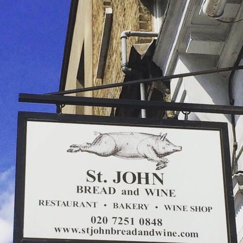
St. John Bread and Wine is a renowned restaurant located near London’s Spitalfields Market, celebrated for its commitment to the “nose-to-tail” eating philosophy advocated by chef Fergus Henderson.
The logo prominently features an illustration of a pig, depicted in a detailed, classic etching style. This image is direct and impactful, symbolizing the restaurant’s focus on using the whole animal and its dedication to ethical meat consumption.
“St. John Bread and Wine” is written in a traditional serif font, conveying a sense of heritage and reliability. The classic typeface complements the vintage style of the pig illustration, reinforcing the restaurant’s dedication to timeless British culinary practices.
Seafood Food Logos
J Sheekey
J. Sheekey is an iconic seafood restaurant located in the heart of London’s West End. Established in 1896, it has long been a favorite among the city’s theatregoers and celebrities, renowned for its elegant dining experience and exceptional seafood dishes.
The name “J. SHEEKEY” is presented in a bold serif font, which lends a classic and timeless feel to the logo.
Tsukiji Market (Tokyo, Japan)

Tsukiji Market, formerly known as the world’s largest wholesale fish and seafood market, is located in Tokyo, Japan. Although the wholesale market has moved to the new Toyosu Market, Tsukiji is still home to a bustling outer market that continues to attract locals and tourists alike for its array of fresh seafood, produce, and unique culinary experiences.
The logo for Tsukiji Market features a stylized representation of fish fins or waves, created using vertical bars in red and blue. This graphic element cleverly symbolizes both the aquatic nature of the market’s offerings and the dynamic movement of water, reflecting the lively and fluid environment of the market. The use of abstract geometric shapes gives the logo a modern and universal appeal, making it easily recognizable.
Wild Game Food Logo
The Jugged Hare
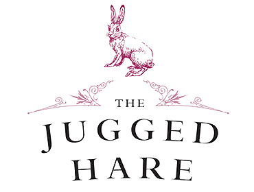
The Jugged Hare is a prominent gastropub located in London, UK, known for its focus on game and seasonal British fare. The venue is named after a traditional British dish.
Saddle Peak Lodge

Saddle Peak Lodge, nestled in the picturesque Malibu Canyon in California, USA, is a unique dining destination known for its rustic ambiance and gourmet American game cuisine. The restaurant, housed in a building that dates back to the early 1900s, has a rich history as a hunting lodge and has evolved into a culinary retreat offering a distinctive blend of comfort and luxury. Saddle Peak Lodge is celebrated for its emphasis on game meats and exceptional service, providing a unique dining experience amidst the tranquility of the Santa Monica Mountains.
The logo of Saddle Peak Lodge features a stylized image of a mountain, which is representative of its Malibu Canyon location. Below the mountain graphic, the name “SADDLE PEAK LODGE” is displayed in a clean, serif typeface.
The logo utilizes a monochromatic color palette, often rendered in black or dark tones against a light background. This color choice is sophisticated and versatile, fitting well with the lodge’s theme of rustic elegance.
L’Enclume
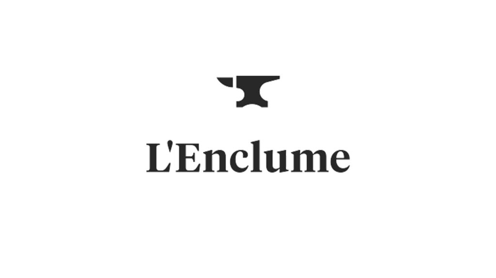
L’Enclume is a celebrated restaurant located in Cartmel, Cumbria, UK, renowned for its innovative approach to British cuisine. Established by chef Simon Rogan in 2002, L’Enclume has earned a reputation for its focus on seasonal and local ingredients, many of which are sourced from its own farm.
The logo features a simple yet elegant anvil icon above the restaurant’s name. An anvil (“enclume” in French) cleverly represents the restaurant’s name and signifies strength and craftsmanship.
Food Logo Design Free
If you’re on the hunt for a unique and captivating food logo but want to keep your expenses in check, Arvin AI is just the ticket! With Arvin AI, you can dive into the world of logo design with an easy-to-use interface that welcomes everyone!
Hiring a professional designer might not be in the budget, especially for small businesses or startups. That’s where Arvin AI comes into play. It offers you a treasure trove of design tools and templates at no cost. This way, you can play around with different logo ideas without worrying about your wallet.
Final Words
For those ready to create their own distinctive food logo without the steep costs associated with professional design services, Arvin AI offers an exciting solution. With Arvin AI’s Logo Maker, you can access a wealth of design tools and templates that make it easy and fun to develop a logo that truly represents your brand. This platform is perfect for restaurateurs, food truck operators, and food marketers who want to craft an iconic logo while keeping budget considerations in mind.
In conclusion, a thoughtfully designed logo is more than just the face of your brand; it’s a crucial marketing tool that captures the culinary spirit of your business and communicates it effectively to your potential customers. By using Arvin AI’s Logo Maker, you can ensure your restaurant not only attracts the palate but also visually engages your desired clientele from the first glance.
FAQ
Creating a food brand logo involves understanding your brand’s identity, target audience, and the message you want to convey. Start by brainstorming ideas that reflect your brand’s values and cuisine type. Consider factors like color psychology, typography, and imagery that resonate with your food offerings. Utilizing design software or working with a professional designer can help refine your ideas into a polished logo.
Monogram logos, wordmarks, pictorial marks, abstract logo marks, mascots, combination marks and emblem logos.
Apple, McDonald’s Nike, Coca-Cola, Google, Microsoft, Facebook, Adidas, Amazon and Samsung
A well-designed food logo can communicate much about the type of cuisine, the quality of food, and the ethos of the brand (such as eco-friendliness or luxury).
