Firefox is perhaps one of the world’s most widely used web browsers. Millions of people make use of it for changing and shaping their digital experience. It is highly speedy and is privacy-conscious and fully adheres to an open-source development model. It also implies a new concept in the domain of browser markets, thus, innovation. The evolution of Firefox logo shows the history of growth of brand and its values as well as closeness to its users. Here in this guide you will know about its history, redesigns and what Firefox Logo represent which is all about transformation of that image into official mascot of a Web that is open and friendly.
Part 1: The Origins of the Firefox Logo
The Firefox logo is very closely related to the identity of the browser. Knowing its origin and early design decisions will give insight into the message and goals that the brand wanted to convey.
A Historical Overview of Firefox’s Inception and the Original Logo
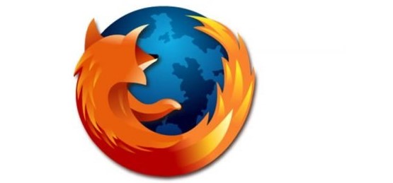
When Firefox was first launched in 2002, it was an open-source project with the mission to provide a faster, safer alternative to Internet Explorer. Initially called “Phoenix,” the browser was rebranded to Firefox to avoid trademark issues. The original Firefox logo, designed by Joe Wilcox and later modified by others, featured a stylized fox wrapped around a globe—symbolizing global access to the web and Firefox’s commitment to speed and security.
The Need for a New Logo in 2002
Mozilla’s branding team understood that the first logo, although emotive. It is developed further to symbolize the larger ideals of Firefox. The fast-changing world of technology required that the logo depict not only the technical superiority of the browser. But also its user-centric approach. The design of the early logo had to change to appeal to a wider and more diverse audience.
The original Firefox logo
The original logo involved a fox encircling a globe, representing rapid and efficient world browsing. The fox was not merely an animal; it represented wisdom, swiftness, and agility-things that the Firefox was striving to become. The globe depicted global access and international appeal towards the internet browser. This theme was the root of making Firefox a tool opening up the world of the web to users in every corner.
Part 2: Redesigning the Firefox Logo
As Firefox gained popularity and functionality, a refreshed and more modern logo was needed. This section details the redesign process that marked a turning point in the brand’s visual identity.
The Process of Redesigning the Firefox Logo in the Early 2000s
With Firefox picking up pace and user base expanding, the branding team felt that the logo had to change in tandem with the evolution of features and the browser itself to be more refined and sophisticated. A mid-2000s redesign took logo shape with the intention of being more refined, streamlined, and making the logo more iconic, modern, and scalable for all media.
Design Choices and Decisions: The Shift towards a More Modern and Clean Logo
The Firefox logo was redesigned in 2009 to be much cleaner and aesthetic. The shape of the fox was simplified by removing the detailed illustration and morphing it into a more minimalistic look. As changes began to integrate vibrant oranges and reds as much into the overall palette, they ensured the inclusion of a more sweeping curve for the tail of the fox to set out both distinctive characteristics in an ever-growing, web of users both old and small.
How the Changes Reflected Firefox’s Growing User Base and Its Position in the Market
This was also useful due to the fact that Firefox gained much more popularity. And it became an opponent to such browsers as Internet Explorer and Google Chrome. The new logo was, therefore, in a position to embrace the new position of Firefox as a player on the international market and change from basically being an option to a popular browser. The streamlined new appearance was further evidence of browser as a technologically evolved, versatile and professional tool, not restricted to its earlier niche audience.
Part 3: The Current Firefox Logo: What It Represents
As part of the rebranding process that occurred in 2019, Firefox released the contemporary emblem and stripped the browser of many unnecessary features. This evolution speaks more about Firefox as a product and firm that has embraced innovation. Here, however, we will be discussing some of the components of the existing logo and what they symbolize.
Detailed Analysis of the Current Firefox Logo
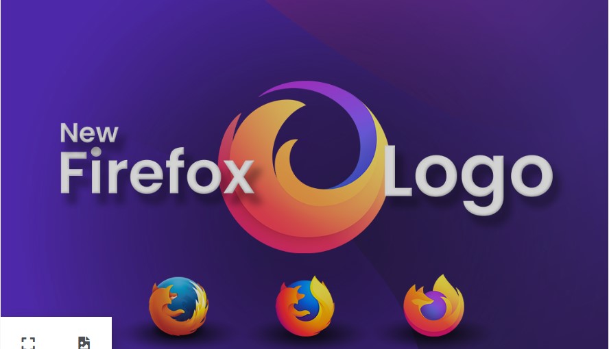
The Firefox logo was redesigned in 2019 to be more minimalist and streamlined. The new logo still features the fox but with softer curves and brighter colors. The change from a detailed image to a simple one reflects how Firefox has transformed into a faster, more efficient browser.
The Color Scheme, Typography, and the Significance of the Simplified Design
The logo currently has a vibrant color scheme, mainly orange and blue. The orange symbolizes energy, warmth, and friendliness, and the blue undertones signify trust and security. These are essential values that Firefox promotes. Simplification of the design removes the unnecessary clutter to give more precise brand identification in different media and platforms.
Why the Fox Now Encircles the Globe, Emphasizing Firefox’s Global Reach
One of the most striking elements of the 2019 logo is the fox that wraps around the globe. This logo signifies Firefox’s wanted to appeal to users globally and promotes the browser as being for the entire world. It emphasizes how the browser focuses on making web available accessible and secure for anybody, anywhere.
The Logo’s Alignment with Firefox’s Values
This sleek and clean design is not only aesthetic. It also corresponds to the values of Firefox: agility and speed with the fox, and influence on the whole world with the globe. It reflects the idea of the fast and secure browsing experience for the user while remaining friendly and user-centered.
Part 4: The Evolution of Firefox’s Branding Strategy
The Firefox logo is not just a visual identity—it’s an integral part of its broader branding strategy. From its early days to today, Firefox’s branding journey has been about growth, consistency, and innovation. In this section, we’ll explore how Firefox’s branding has evolved, focusing on its logo’s role in that evolution.
How the Firefox Logo Has Been a Part of Its Overall Branding Journey
From the beginning, the Firefox logo was a vehicle to communicate what was core about the browser itself-speed, security, and openness. Through several versions, it changed to be relevant to contemporary design trends yet still retain something users came to expect from the logo. Every update is a result of increasing confidence from the brand regarding being a prime browser in an aggressive market.
Branding Consistency: How Firefox Has Used the Logo Across Various Platforms
Firefox has managed brand consistency in applying its logo across all devices, including the website, application, and print or electronic advertisement. Brand consistency, therefore helps build trust among users and confirms the identity of the brand. Whether on the Web or on advertisements, it is the identifier that once stands out as telling the browser’s respect for user’s privacy and the quality delivery of browsing functionality.
Comparison with Other Browser Logos
When compared to other browser logos, such as Chrome’s multi-colored circle, Safari’s globe, or Edge’s sleek modern design. Firefox’s logo stands out due to its warmth and dynamic motion. The fox symbol, a unique choice, conveys both speed and cleverness. Helping Firefox carve a distinct identity in the crowded browser market.
Part 5: How the Firefox Logo Reflects Its Mission and Vision
Ever since Firefox was created its goal has been to prevent the web from being closed and controlled. The logo expand in a way that correlates to this mission statement and represents the browser’s purpose. In this specific section, we will look at the role of the logo in the Firefox browser including its reflection of the vision, mission. And role in making the users trust Firefox.
How the Logo Aligns with Firefox’s Mission of Keeping the Web Open and Accessible
The Firefox logo is an emblematic expression of the browser’s mission. The globe at the center of the logo means an open, interconnected world. The motion of the fox in encircling the globe depicts inclusiveness and universal accessibility. This is how Firefox aims to protect the open web and give users free access to it while ensuring security from any form of restriction.
The Evolution of Firefox’s Goals as a Browser and How It’s Reflected in Its Visual Identity
From the onset Firefox has always aimed at delivering a browsing experience that was based on three key pillars that include privacy, freedom and efficiency. This is evident by the logo evolvement. Starting with cumbersome early iterations and all the way to the clean, minimalistic logo of the modern brand, Firefox’s logo evolved in parallel with the company’s increasing focus on privacy and speed, thus underlining its User Focus. The Firefox, therefore, influences the perception that users have about them as well as the confidence arising from the perception.
The Impact of Firefox’s Logo on User Perception and Trust
The current simplicity and modernity of the Firefox logo have an enormous influence in how users perceive the brand. The clean design makes trust and reliability, and the familiar fox motif ensures that Firefox will remain a trusted and beloved browser for any users who really care about privacy and security. This logo helps form Firefox’s identity as a trusted, user-focused brand in a competitive online landscape.
Part 6: Create Amazing Logos with Arvin AI like Firefox
Arvin AI is a future-forward platform. It is basically a logo designer that uses Artificial Intelligence to provide easy design works and smart recommendation for creativity that reduces decision fatigue. Whether one is a knob or even an expert, using this tool puts one in charge of creating exceptional, professional-grade logos with ease. Arvin AI caters to your needs, guiding you in making the most compelling and meaningful logos for your brand that represent the core values and mission.
Features of Arvin AI
- AI-Driven Insights: Arvin AI gives real-time, data-driven insights on your design and provides you with what is hot at the moment so you will make the correct decisions.
- Automatic Design Adjustments: The platform automatically adjusts proportions, color palettes, and fonts to ensure a well-polished final product.
- Efficient Customization Options: You can easily tweak the logo by customizing every element to perfectly fit your brand’s identity.
- Smart Logo Suggestions: Based on your preferences, Arvin AI suggests the best layouts, colors, and icons, saving you time in the design process.
- Seamless Integration with Branding Tools: Arvin AI integrates seamlessly with other branding tools, thus helping in maintaining the consistency of your design assets.
Steps to Use Arvin AI for making Logo
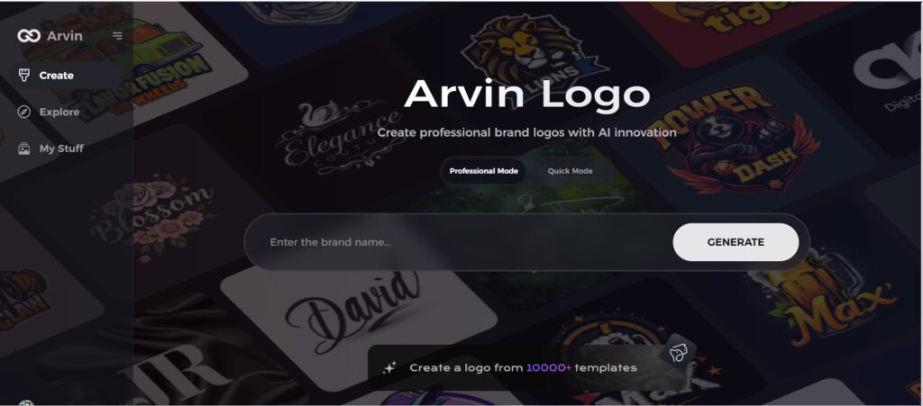
Step 1: Create an account and log in on Arvin AI
Visit the website of Arvin AI, open an account, and log in for the logo design feature.
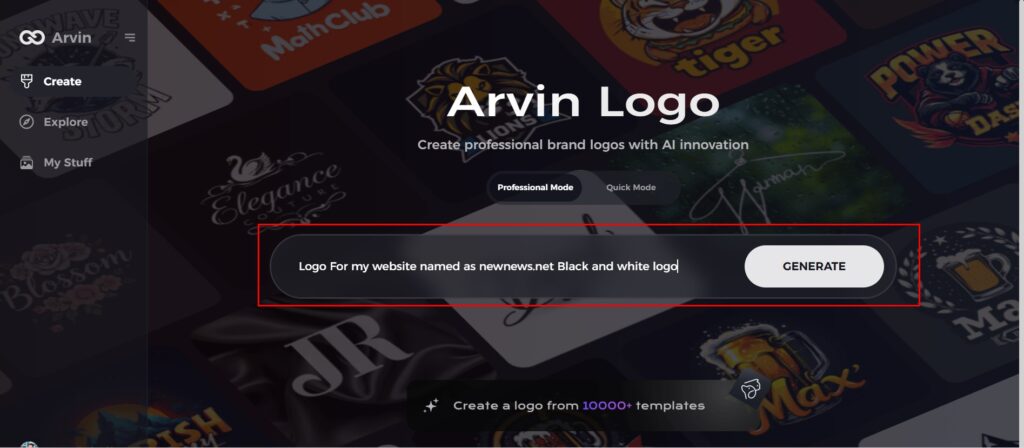
Step 2: Input your brand information and preferences
Input your brand name, slogan, and industry. Specify all your design preferences, which may include font styles or images themes.
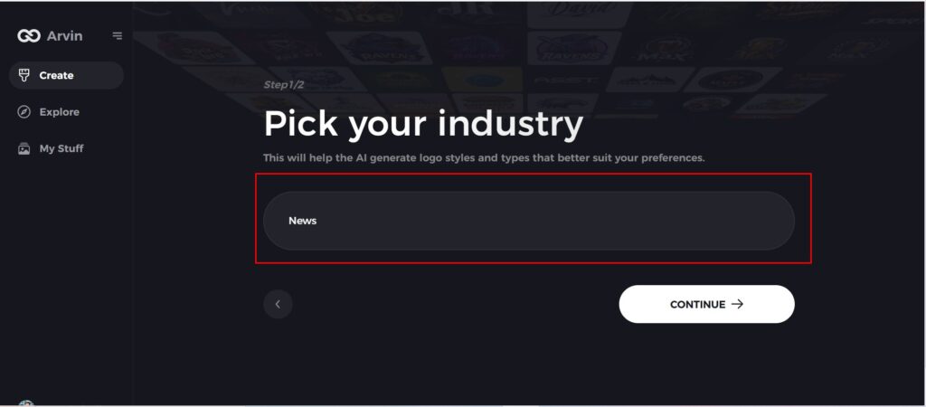
Step 3: Pick your industry:
Now select your industry related to your niche. This will help the AI generate logo styles and types that better suit your preferences.
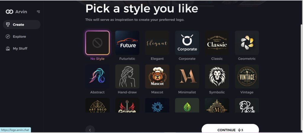
Step 4: Select Style:
Now select a style which you would like and continue. This will serve as inspiration to create your preferred logo.
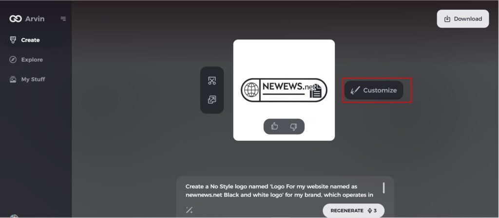
Step 5: Design Personalize through the tools of Arvin AI
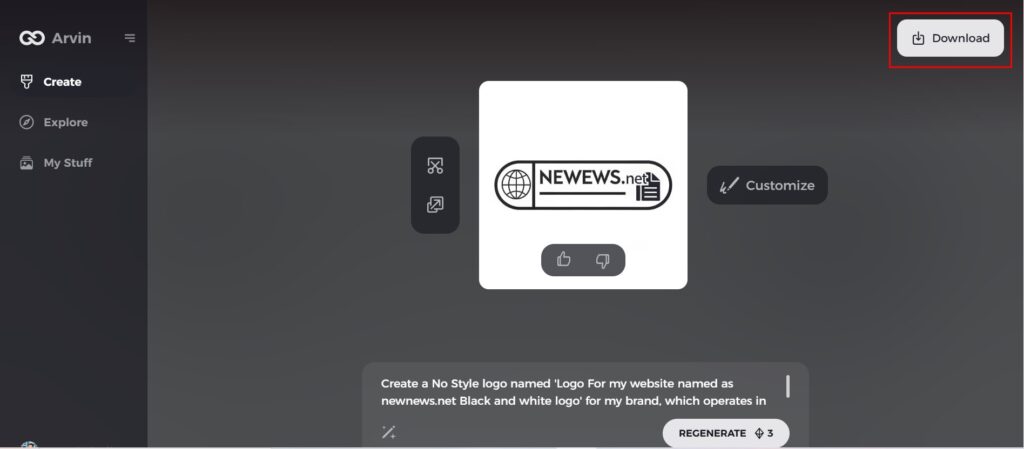
After Arvin AI gives create your logo, you can customize those logos with the tools that have elements such as font style, layout, and the positioning of symbols. Experiment on different designs until you like what you see.
Step 6: Save and download the final logo
Preview the finished logo and save it in a high-resolution format for both print and digital uses.
Conclusion
The Firefox logo evolution was on par with that of the brand’s growth and innovation spirit. Simple at the start, it gradually transformed into a streamlined, modern shape that symbolized Firefox’s growth towards being the best web browser in terms of speed, privacy, as well as open standards. These values are reinforced in the logo itself, a circle with a fox that represent speed, agility, and respect for user privacy. Arvin AI caters to your needs, guiding you in making the most compelling and meaningful logos for your brand that represent the core values and mission.
FAQs
Why did Firefox change its logo in 2019?
The firfox logo changed in 2019. The changed firfox logo changed the strategic direction, as they have taken a minimalist and modern design. The change of rebranding was connected with a set of Firefox’s commitments regarding privacy, security, and an open web in general.
What does the fox in the firfox logo symbolize?
The fox in the Firefox logo symbolizes speed, agility, and a sense of cleverness. The animal’s quick movements mirror the browser’s emphasis on fast browsing and performance.
How Does the Firefox Logo Reflect Its Mission of Privacy and Security?
With their clean and fresh design, this would be one aesthetic choice. Nevertheless, the actual underlying value behind their brand lies on the issues regarding privacy and security. Simple is beautiful; if that simplicity contains bold colors.
Am I Able to Use This Firefox Logo On My Project?
It is illegal for you to apply the logo as you please within your commercial and personal projects. So you go to Mozilla in order to inquire about guidelines surrounding how the use of their logos should be.

