FedEx Corporation (or simply FedEx) is the largest logistics operator established in the United States in 1971. Today, Fedex delivers reliable and timely packages and cargo shipments to over 220 countries and regions. Fedex has become a brand in the business circles not only as a professional participant with a strict reputation but also as an inventive logo concept marking the beginning of a new era for visual identity designs. The FedEx logo known as the most successful example of commercial use of negative space.
Part 1: Meaning of the FedEx logo
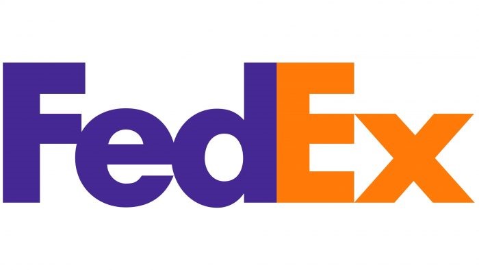
Those kind of iconic logos such as FedEx logo which represents the high quality of the company’s services, in particular the speed and accuracy of delivery, represented by white arrows drawn in the negative space between “E” and “X”. This badge also expresses energy and confidence by the shape and tone of the letter.
Hidden symbols in the FedEx logo
It’s no longer common knowledge that the FedEx logo isn’t as simple as it looks. The lettering of this stable geometric sans-serif contains a hidden symbol, a white arrow pointing to the right, located in the negative space between the “E” and “X”, meaning “Express”.
Meaning behind the FedEx logo colors
The visual identity of Fedex consists of purple and orange, where purple represents stability and professionalism, and orange is the color of energy, movement, and speed. Therefore, the combination of shades of FedEx badges indicates that this is one of the cute logos for your brand recognition.
What type of logo is the FedEx logo?
The FedEx logo is a wordmark, but considering that the graphic elements are hidden in the lettering. The FedEx badge can also called a combination type logo with both wordmark and graphic.
Part 2: Influence on FedEx logo design
The FedEx logo design is not only a result of creative inspiration. A combination of design principles, color psychology, and characteristics unique to the shipping industry influenced this. Let’s explore those factors contributing to today’s iconic design.
Design principles that shaped the FedEx logo
One of the main design principles that created the FedEx logo is simplicity. However, by making removal of irrelevant details and incorporating clean lines combined with minimalist style it represents professionalism. This simplicity also makes the logo recognizable and memorable at a glance.
Role of colors in the FedEx logo
The colors used in the FedEx logo are not optional. Purple is a color reminiscent of creativity and innovation, reflecting FedEx’s commitment to finding new ways to push boundaries and deliver exceptional service. The combination with energetic and bright orange, which represents energy and enthusiasm, expresses FedEx’s dynamic and positive character.
Part 3: FedEx: Evolution as a Global Logistics Leader
From its early days as a small start-up in 1971, FedEx transformed into the biggest logistics company, changing the landscape of delivery systems around the globe. Fedex represents its resilience through its early financial crises and its expansion in innovation and partnerships, which led the company to the position of transport leadership.
FOUNDING ERA (1971-1994)
Founded in 1971 as an ambitious start-up for night parcel delivery, FedEx follows the path of expanding to ground transportation and global logistics, and reaching its current position as a transport leader who invests billions of dollars to make its vast business carbon neutral over the next 20 years.
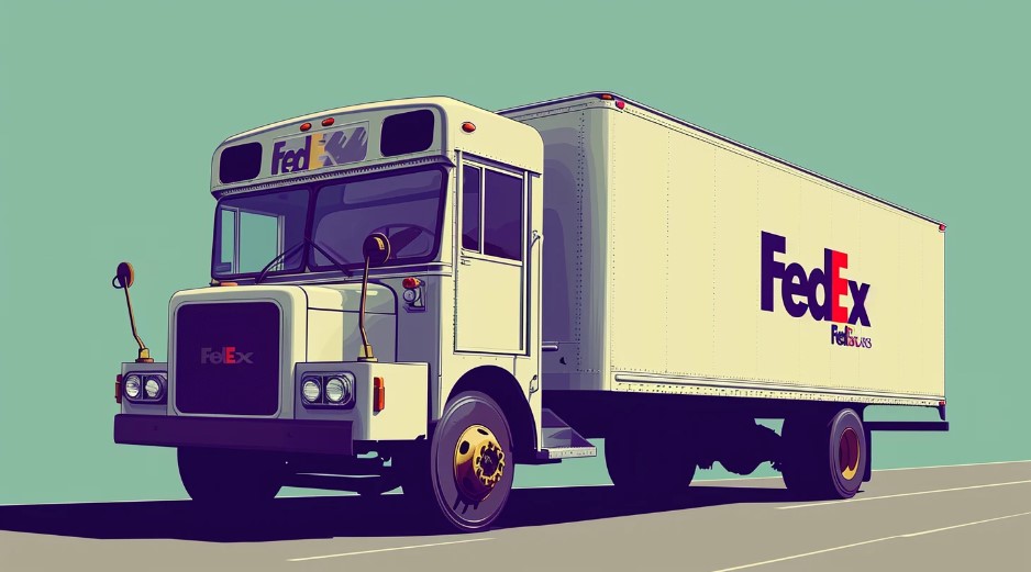
- 1971: Night delivery: Frederick W. Smith devised the idea of a night delivery service in a semester paper.
- 1973: Incorporated: Incorporated Federal Express in Little Rock, Arkansas. In April, he started his business in Memphis, Tennessee.
- 1975: Beginning of Hardship: He was driven to the brink of bankruptcy, but he managed to survive by raising additional capital.
- 1979: Aircraft Expansion: Purchased several Boeing 727 aircraft and expanded the aircraft materials.
- 1983 – $1 billion: As a start-up company that does not use M&A, it is rapidly growing and achieved annual sales of $1 billion.
- 1988: Goods Carrier: Acquired the airline Flying Tigers for $880 million. At that time it was the world’s largest freight carrier.
- 1994: FedEx: The “FedEx” brand was adopted as the name of Federal Express, which had been used informally for many years.
RAPID GROWTH ERA (1994-2006)
The period between 1994 and 2006 was transformative for FedEx, involving strategic reorganizations, major acquisitions, and significant partnerships. It expanded the portfolio of services, rebranded under a unified identity, and further solidified its position as the global logistics leader.
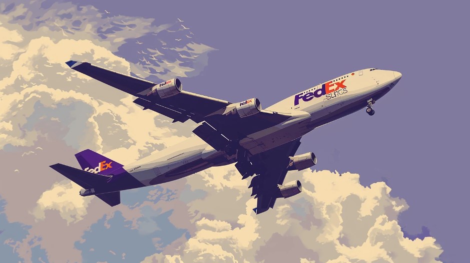
- 1997: Ground Operations: We reorganized our business divisions under a new holding company called FDX Corporation.
- 2000: Logo Change: FDX Corporation’s holding company has been renamed FedEx Corporation.
- 2001: USPS Partnership: Acquired an exclusive contract for express freight transportation by the U.S. Postal Service.
- 2004: Kinko’s: Acquired Kinko’s for $2.4 billion. More than 1,200 retail stores are rebranded as FedEx Kincoz stores.
- 2005: Expand USPS: Newly acquired USPS air freight contract for 7 years and $9 billion. Expanded USPS’s relationship as an exclusive provider of express mail.
- 2006: Nationwide Expansion: Expand ground delivery capacity in the western United States. Acquired Florida-based Watkins Motor Lines.
Recent years (2006-present)
FedEx has evolved throughout the years embracing technological advancement, sustainability initiatives and modern logistics requirements. The firm had renamed its printing service, it also entered onto the international market through the acquisition of the TNT Express.
- 2008: Print Services: With the decrease in printing services, FedEx Kincose renamed FedEx Office.
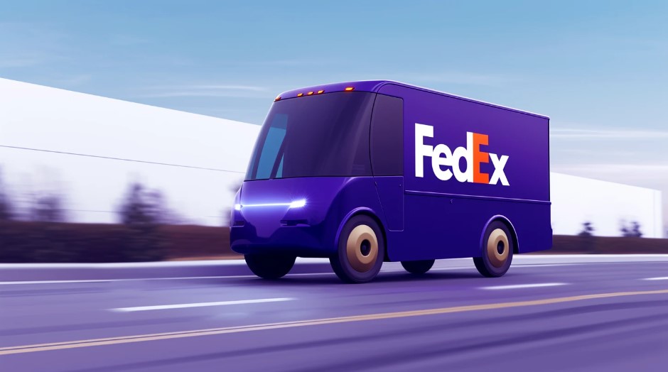
- 2011: EV Shipping: To reduce the environmental impact, we started introducing all electric transport vans. Hybrid trucks and electric trucks tested for ground delivery routes.
- 2015: TNT Express: Acquired Dutch courier company TNT Express for $4.8 billion. The merger with TNT will bring FedEx express delivery services across Europe, asia and african markets.
- 2018: Impact of NRA: FedEx broke up with its client, the National Rifle Association, under public pressure. Stakeholders focus on strengthening social responsibility.
- 2020: E-commerce Boom: Acquired the e-commerce platform ShopRunner to support online shop customers.
- 2021: Carbon Neutral Recruit: Committed to carbon neutrality by 2040. Invested $2 billion in vehicle electrification and renewable energy.
- 2022: Smith Leaves: Fred Smith, the founder of FedEx, announced his resignation from the CEO position in 1971.
Part 4: Historical Journey of the FedEx Logo
In the mid-1960s, Frederick W. Smith at that time a Yale University alumnus, proposed a new method of safely delivering emergency cargo. Six years later, in 1971, Fedex officially established in Memphis, Tennessee. In 1973, Fedex started with 14 aircraft and 389 employees. The same year, the first advertisement campaign called The World On Time developed for FedEx as a company.
1973 – 1994
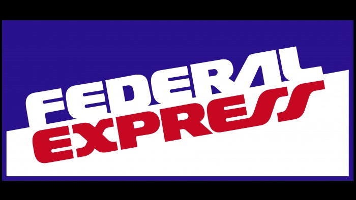
The initial FedEx logo reflected FedEx’s company name, Federal Express. Founder Fred Smith chose this company name mainly because he wanted to win the Federal Reserve as a customer. The term “federal” also includes vestiges of patriotism and the quest to give back to the economy of the country. The logo was a diagonal rectangle divided into two fields. The top field was purple, and the bottom field was orange. This shows that logo colors are most important in branding.
1991 – 1994
With the acquisition of the Flying Tigers network, Federal Express has become the largest full-service all-cargo carrier to ship to more than 20 countries. This new status has made it clear that FedEx needs to revamp its brand identity. One of them was the new short company name, and the other was the FedEx logo. Between the original logo and the iconic “white arrow” wordmark, Fedex used a transient version that combined the elements of both for three years.

1994-Present
The legendary “white arrow” logo was designed by Lyndon Lieder. At the time, he worked as a senior design director at a brand consultancy at Landor Associates. The leader, who prefers clean and neat designs, was greatly influenced by the 1980s catalog of Smith & Hawken, the most popular garden lifestyle brand at the time. On the one hand, the minimalist design with more than 30% of the margins was supported by many clients.
Part 5: Designing process of FedEx Logo
Lyndon Reader is said to have produced more than 200 iterations before reaching the final version. The use of negative spaces was an inspiration from minimalist design principles and even the logo of Northwest Orient Airlines, which uses overlapped letters for its shape.
Color
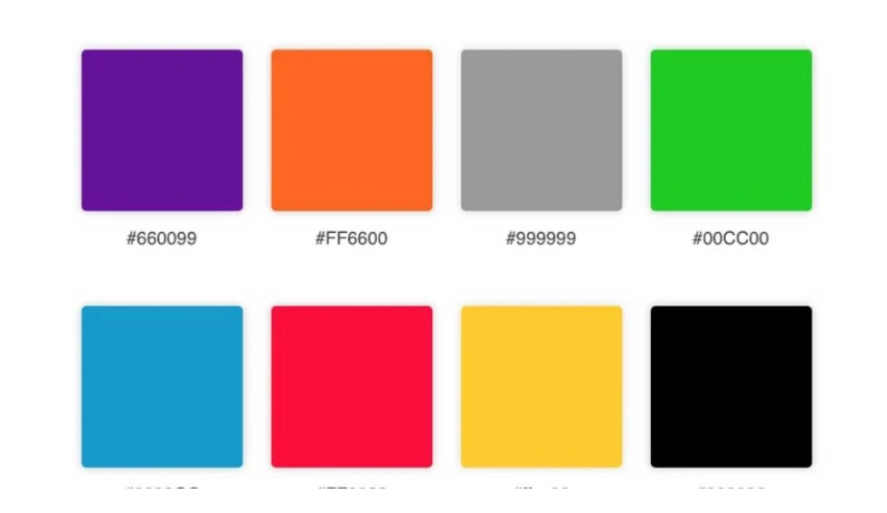
The bright, eye-catching color combination indicates which company’s logo it is. For example, if the letter “Ex” is orange, then the letter “Fedex Express” is used, the green “Ex” is used for the Fedex Ground, and the red “Ex” is used for the Fedex Flight. The other two business units use blue “Ex” (office) and yellow “Ex” (trade network).
Font
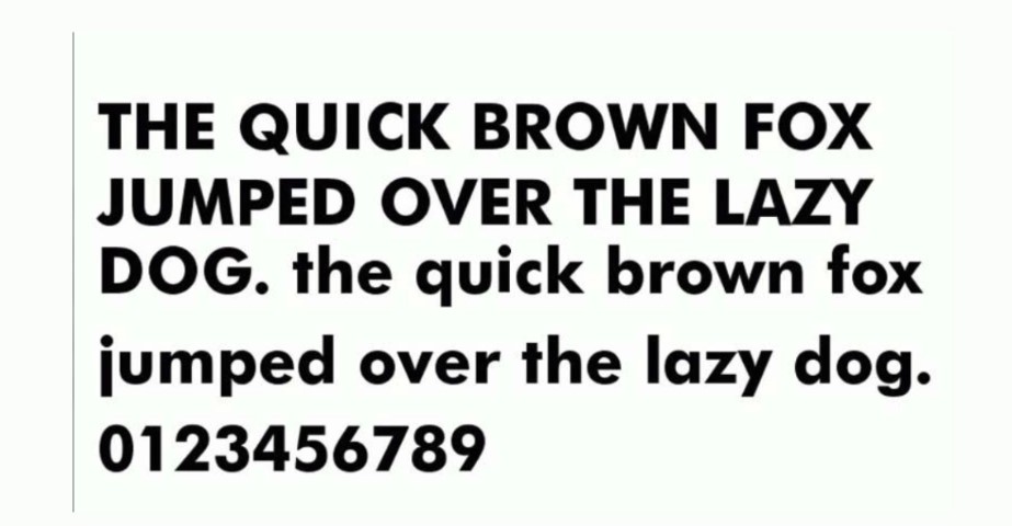
This font is a mix of two fonts customized: Univers 67 and Futura Bold. Lyndon Lieder recalls that these logo fonts were his favorite fonts in the 1990s. They embrace many experimental functions like changing the area between the characters and, creating a distinct contrast for the upper and lower cases. Once he noticed a negative arrow between “E” and “X”.
Part 6: Why WE Choose Arvin AI for Your Logo Design Needs?
If a business is interested in creating logos that make the maximum impact, then Arvin AI offers the solution to their various needs. Business is a unique tool that developed for cooperation which can also help to increase the quality of branding. With its high-tech features, it allows companies to create logos that are very true to their value statements.
Key Features of Arvin AI
- High-Tech AI Capabilities: Processes data and makes operations smoother for all businesses regardless of size.
- Marketing Optimization: Increases customer interaction and analyzes market trends for efficient strategy.
- Innovative Design Help: Innovates and provides groundbreaking tools to create distinctive logos and branding elements.
- Brand Consistency Tools: Branding integration with different multiple stages and channels seamlessly.
- User-Friendly Interface: Easy navigation, intuitive features with an easy-to-use platform.
- Scalability: Solutions for startups to large enterprises, scaling and adapting with business growth.
Steps to Use Arvin AI for making Logo
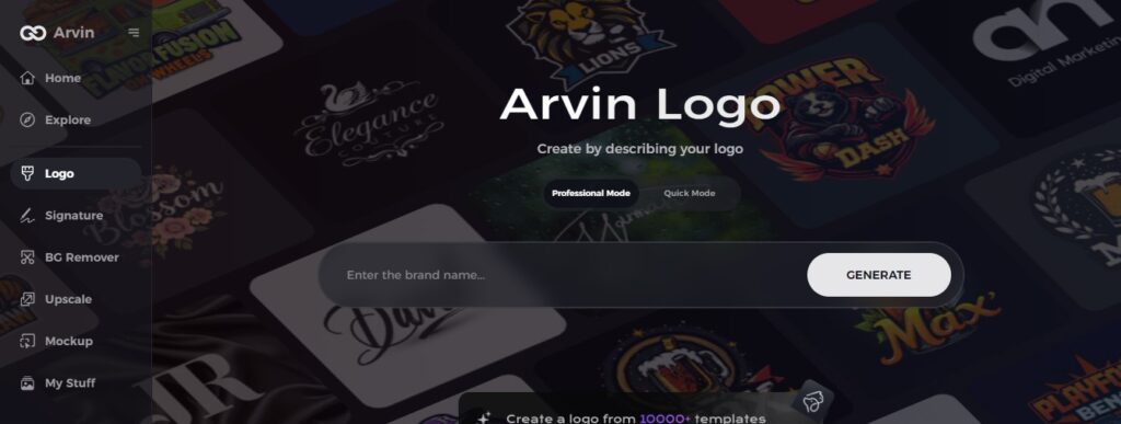
Step 1: Access the Arvin AI Logo Maker
Visit the Arvin AI website using your web browser and navigate to the Arvin AI Logo Maker to begin your creative journey.
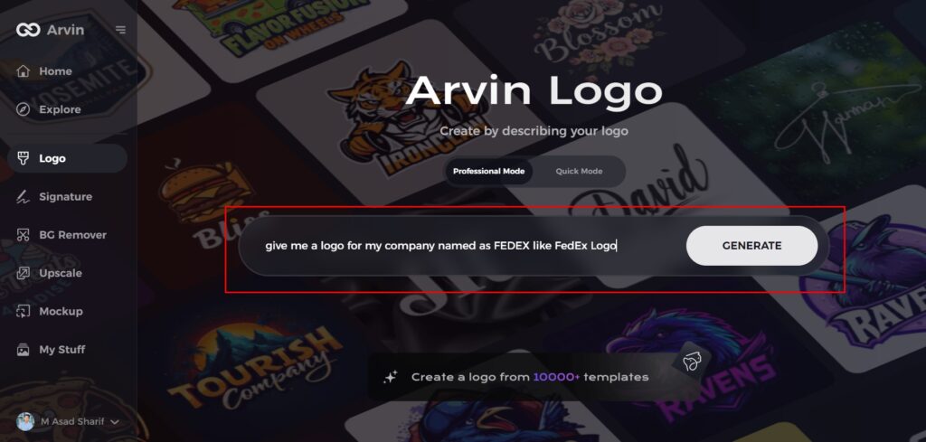
Step 2: Enter Your Business Details
Provide key information about your business, such as the name and category. This helps the AI tailor designs that align with your brand identity.
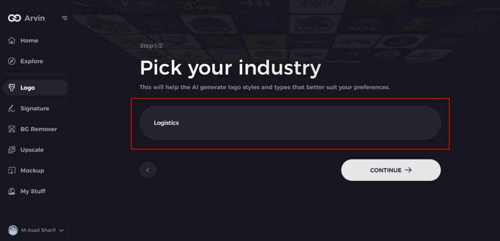
Step 3: Select Your Industry
Choose your industry from the list provided. This step enables the AI to narrow down styles and themes most relevant to your business sector.
Step 4: Choose a Design Style
Explore the available style options and select one that resonates with your brand vision. If you’re unsure, skip this step and let the AI generate inspiration.
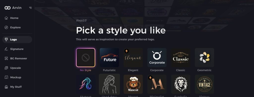
Step 5: Review Logo Suggestions
The AI will generate multiple logo ideas based on your inputs. Browse through the options and pick designs that reflect your brand’s essence.
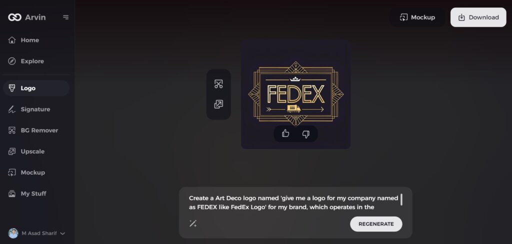
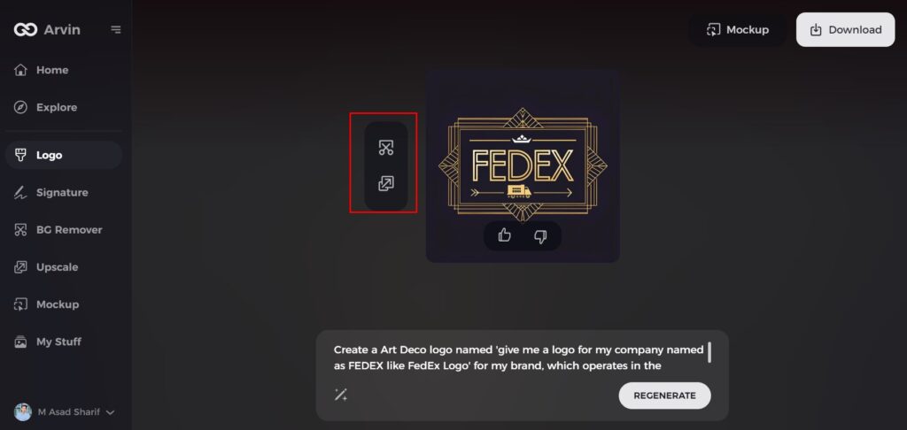
Step 6: Customize Your Logo
Fine-tune your selected design by adjusting colors, fonts, icons, and layouts to ensure it fully represents your business’s personality.
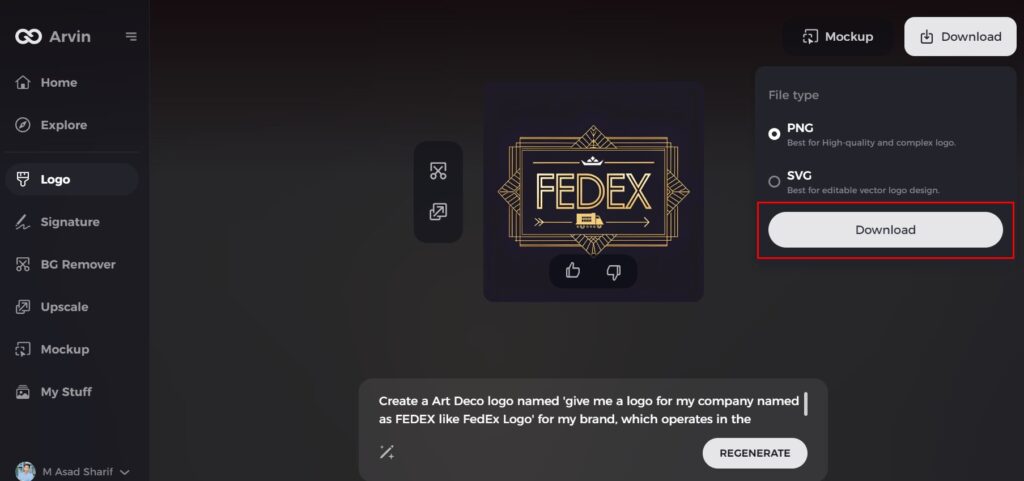
Step 7: Download Your Final Design
When satisfied with your customized logo, download it in high-quality formats like PNG or SVG. These formats are versatile for online, print, and marketing use.
Conclusion
FedEx logo is probably one of the best works in the field of the logo with elements of ease and uniqueness as well as the meaning of the shipment. It’s an experience within a company, in which there are trading business operations with such values as speed, accuracy and trust in the customers. For business purpose to do the same with their branding, tools like Arvin AI offer expert solutions that can create an impact and uniqueness in design.
FAQs about the FedEx
What are the two symbols hidden in the FedEx logo?
The FedEx logo makes clever use of figure-ground ambiguity to create an “invisible” arrow in the background space between “E” and “x”.
What is the meaning of the FedEx logo?
The Famous FedEx Logo and its Hidden Meaning. Most people are aware of the tricky optical illusion behind the FedEx logo. If one looks closely between the letters E and X, they’ll notice a white arrow, depicting speed, motivation, strive for excellence, and perseverance in reaching goals.
What is the difference between green and orange in FedEx logo?
The logo produce in different colors, each representing a different department within the company. The orange stands for FedEx Express, green for ground and home delivery, grey covers their supply chain services, and the blue stand for “custom critical”.
How does Arvin AI benefit businesses in improving their marketing strategy?
Arvin AI increases productivity, refines marketing efforts, and helps enhance engagement, thus it is important for survival in competitive markets.
