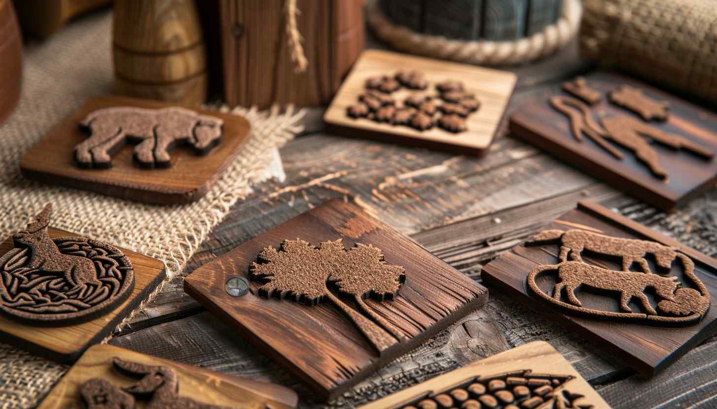
As one of the oldest professions, farming dates back to the Neolithic era and has continually evolved to meet the needs of modern society. From traditional crop cultivation to cutting-edge GMO technology, agriculture remains a cornerstone of human progress, just like the farm logos that represent it.
However, in today’s competitive marketplace, products often seem indistinguishable from one brand to another. This makes branding, specifically a distinctive logo, essential for standing out.

Think about it: Why do you reach for a well-known brand of toothpaste instead of the generic option? The same principle applies to farm products. A memorable logo can define your agricultural business and create a lasting impression.
Farm Logos With Names
King Ranch
The King Ranch logo embodies rustic authenticity and a deep connection to its ranching heritage. It takes the form of an oval patch, with a rich, brown background textured to resemble aged leather, enhanced by stitching details along the edges.
These elements evoke a sense of craftsmanship and tradition, reflective of the ranch’s storied history. A bold black border frames the design, making it visually striking. At the center, the words “King Ranch” appear in a serif font, their elegant curves and sharp edges conveying sophistication and legacy. Above the text, a wavy brand mark resembling cattle horns, a direct nod to the ranching industry, is prominently featured.
Fair Oaks Farms
The Fair Oaks Farms logo takes a minimalist yet professional approach, focusing on clean lines and a modern aesthetic. The text “Fair Oaks” appears in bold, black serif font against a stark white background, with the initial letters “F” and “O” slightly enlarged to establish prominence.
The word “Farms” appears just below in a smaller font size, ensuring balance and clarity. Beneath the text lies a stylized graphic of a black leaf and stem, its sharp, angular edges symbolizing growth, agriculture, and the farm’s dedication to sustainability.
This simple yet effective logo communicates Fair Oaks Farms’ commitment to innovative practices, animal welfare, sustainability, and transparency. Their motto, “Where sustainability meets transparency,” perfectly aligns with the logo’s straightforward and environmentally conscious design. Their thought and care into the design makes it one of the best farm logos.
Harris Ranch
The Harris Ranch logo exudes heritage, quality, and a touch of luxury through its bold and elegant design. A striking black oval forms the backdrop, framed by a thin double border in a rich gold tone that symbolizes premium quality.
At the center, the word “HARRIS” dominates in bold, block serif font, rendered in a cream or light gold hue that contrasts sharply against the dark background. A vibrant red rectangular banner with rounded edges encloses the word “Ranch,” with its white text standing out as a defining feature of the design, making it one of the best farm logos.
The inscription “Est. 1937” appears in a small gold serif font at the top of the oval, adding a historical touch that highlights the brand’s long-standing reputation in the agricultural and beef industries.
Dole Plantation
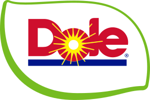
The Dole logo is one of the most recognizable farm logos in the world. It is a carefully crafted visual identity that communicates freshness and vitality. The wordmark “Dole” is executed in a bold, sans-serif typeface with rounded edges, ensuring readability and approachability.
The vivid red hue of the letters symbolizes energy, passion, and the ripe nature of the brand’s produce. A stylized yellow sunburst, integrated above the “o,” radiates outward to evoke warmth and the nurturing aspect of sunlight in agriculture.
The lower portion of the logo is encircled by a green swoosh, a dynamic curved element that represents growth, nature, and sustainability. The swoosh smoothly transitions into a horizontal blue bar beneath the wordmark, anchoring the design and symbolizing water which is essential for cultivation.
Earthbound Farm
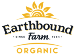
The Earthbound Farm logo blends organic branding, balancing rustic charm with professional clarity. The bold, serif-inspired font of the primary wordmark “Earthbound” features subtle curvature, creating an artisanal and approachable look. Below it, the smaller, clean typeface of the word “Farm” establishes a clear visual hierarchy.
Horizontal wavy lines frame the text, mimicking the contours of rolling fields and reinforcing the brand’s connection to agriculture. Above the wordmark, a graphical golden sunburst with rounded, abstract rays provides a focal point, suggesting growth, life, and sustainability.
The word “ORGANIC” appears prominently below the main text in uppercase orange typography, standing out clearly.
Vermont Creamery
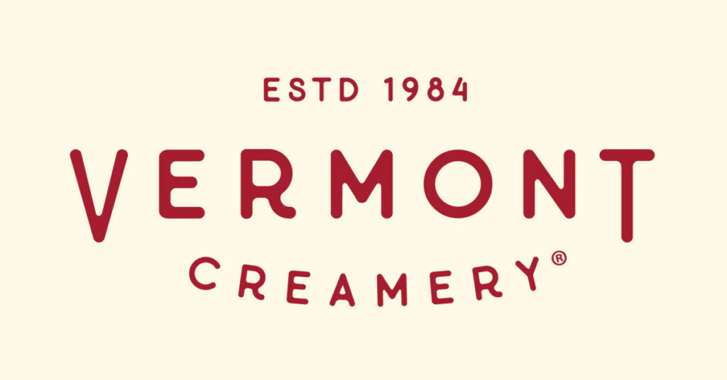
The Vermont Creamery is one the most modern farm logos out there that uses a minimalist approach. The primary wordmark features the text “VERMONT CREAMERY” rendered in a custom serif typeface with clean, precise lines.
The uppercase “VERMONT” dominates the composition, with slightly extended kerning to create a sense of elegance and openness. The word “CREAMERY” curves subtly in an arc below, forming a semi-circular alignment that visually balances the larger text above. The warm burgundy red type evokes richness and tradition while maintaining subtle sophistication.
At the top, the text “ESTD 1984” appears in smaller uppercase characters, using a condensed serif font to indicate the brand’s long-standing heritage.
Gopal Farm
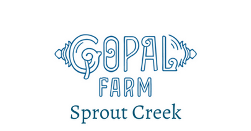
The Gopal Farm logo is a favorite, with the farm logos exuding a playful and natural aesthetic, reflecting its focus on community and sustainability. The hand-drawn word “Gopal” serves as the central element of the design, rendered in a whimsical and organic typeface with artistic flourishes, including decorative swirls and shapes that resemble farm tools or plant life.
This detail creates a sense of craftsmanship and ties directly to the brand’s connection to nature. The word “FARM” appears below the primary text in a clean, block-style sans-serif font, creating contrast and enhancing legibility.
The additional descriptor “Sprout Creek” appears beneath it in a traditional serif typeface, adding sophistication and grounding the logo in a modern, approachable design. The overall use of soft blue tones reinforces themes of trust, calmness, and environmental consciousness.
Rogue Creamery
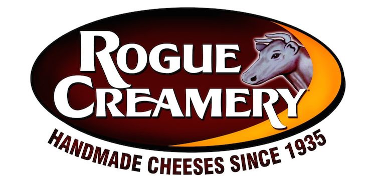
The Rogue Creamery logo is a bold and dynamic visual identity that celebrates its artisanal heritage and expertise in handmade cheeses. The wordmark “Rogue Creamery” dominates the design, written in a custom serif font with thick, clean lines and strong curves that convey both tradition and boldness. The text sits within an oval-shaped background that transitions from dark brown to warm orange, symbolizing richness and the golden tones of dairy products.
Adding a distinctive element, the logo features a stylized profile of a cow in a subdued gray tone, with detailed shading that adds depth and highlights the brand’s focus on cheese craftsmanship.
The tagline “HANDMADE CHEESES SINCE 1935” curves upward below the oval in uppercase letters, using a simple sans-serif font to emphasize the brand’s long-standing reputation and dedication to quality. The sharp contrast between the bold text, cow illustration, and warm color palette creates an impactful, memorable design.
White Oak Lavender Farm
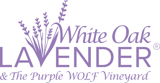
The White Oak Lavender Farm logo exudes elegance and serenity, embodying the calming essence of lavender. The sophisticated serif font with smooth, rounded edges displays the wordmark “White Oak Lavender,” emphasizing refinement and approachability. The lavender-colored typography reinforces the brand’s association with its namesake flower, creating an immediate visual link to the product.
Above the word “Lavender,” there is a graphic representation of lavender sprigs, rendered with delicate stems and small flower clusters that give a natural and organic touch. The playful yet elegant script font below features the tagline “& The Purple WOLF Vineyard,” adding a whimsical character while maintaining the overall harmonious design.
The use of purple tones throughout the logo reflects the tranquility and aromatic allure of lavender, tying the branding closely to the sensory experience the farm offers.
Emerald Organics
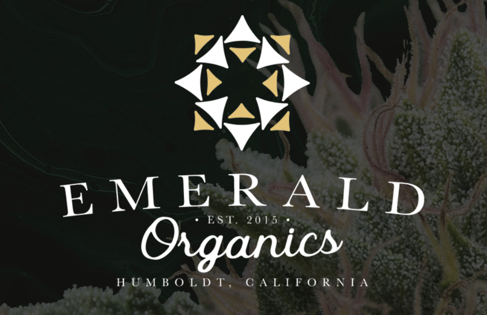
The Emerald Organics logo, being one of the most classic farm logos, blends modern design with natural sophistication, reflecting its roots in sustainable and high-quality organic products. At the center of the design is a stylized geometric motif resembling a star or compass, made up of alternating white and golden triangular shapes. The sharp angles and symmetry of the icon convey precision and attention to detail, while the golden accents symbolize premium quality and sustainability.
The bold, uppercase serif font showcases the wordmark “Emerald” below the emblem, exuding elegance and authority. Beneath it, the flowing cursive script presents “Organics,” adding a softer, approachable contrast to the boldness of the primary text.
The tagline “Est. 2015” subtly nests above “Humboldt, California,” complementing the luminous gold and crisp white elements while highlighting the brand’s connection to nature and its organic ethos.
Viknesh Dairy Farm
The Viknesh Dairy Farm logo emphasizes its focus on dairy farming and heritage. At the center of the logo is an illustration of two black-and-white dairy cows, depicted in a naturalistic yet slightly stylized manner.
One cow is standing protectively over a calf, reinforcing themes of care, family, and nurturing—a fitting representation for a dairy brand. Their black patches create a distinct, high-contrast design against the white background, ensuring visibility. Surrounding the cows is a curved text banner reading “VIKNESH DAIRY” in a bold, uppercase serif font, lending the logo a traditional and reliable aesthetic.
Below the cows, the word “FARM” appears in smaller text with decorative dashes on either side, adding a touch of refinement. The tagline “Singapore’s Renowned Dairy Farm” encircles the entire design in a smaller, curved font, emphasizing the farm’s reputation and geographical roots, making it one of the most standout farm logos from the country.
Hay Dairies
The Hay Dairies Goat Farm logo features a bold blue color palette, symbolizing trust and reliability, which aligns with the brand’s emphasis on producing high-quality goat milk.
The logo incorporates a unique monogram-like element—a silhouette of a goat framed within the uppercase letters “H” and “D.” This clever integration of imagery and typography makes the logo visually engaging and memorable. To the right of the monogram, the text “Hay Dairies” is written in a sans-serif font, maintaining a clean and approachable feel.
The words “Goat Farm” appear below in smaller text, reinforcing the brand’s niche focus.
John Deere
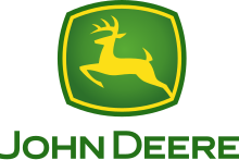
The John Deere logo is a globally recognized emblem of agricultural and construction machinery excellence. At its center is the iconic silhouette of a leaping deer, poised mid-air as if in motion, symbolizing agility, innovation, and strength. The deer is rendered in bright yellow against a deep green shield, a color palette that represents growth, reliability, and the natural environment.
The shield features a slightly beveled, three-dimensional border in yellow, giving the logo depth and a modern touch. Below the emblem, the text “JOHN DEERE” is written in a bold, sans-serif typeface in green, ensuring clarity and legibility.
Case IH
The Case IH Agriculture logo is a strong, industrial design that embodies the company’s focus on power, reliability, and advanced agricultural technology. The word “CASE” is written in bold, black, uppercase sans-serif letters, creating a commanding presence. The weight of the typography conveys strength and durability, essential qualities for agricultural machinery.
Adjacent to “CASE,” the letters “IH” appear in red, with vertical red bars separating the two letters, symbolizing progress and innovation. Below the main text, the word “AGRICULTURE” is placed in uppercase, white sans-serif letters on a horizontal red band, emphasizing the brand’s specialization.
Fendt
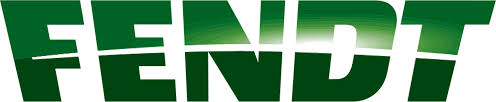
The Fendt logo is one of the boldest and most contemporary designs in farm logos that reflects agricultural machinery and technology.
The logo features the word “FENDT” in a large, uppercase sans-serif font with clean, sharp edges that convey strength and precision. The text is colored in a gradient green, transitioning from a darker tone at the base to a lighter, almost metallic green at the top, giving it a polished and dynamic appearance.
The subtle reflection and shading on the letters create a three-dimensional effect, evoking a sense of modernity and innovation.
Sunkist Growers
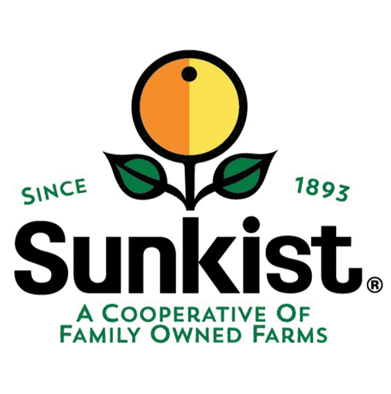
The Sunkist Growers logo is vibrant, fresh, and deeply rooted in the brand’s citrus farming heritage.
At its center is a stylized orange, split vertically into two segments with warm orange and yellow tones, representing the fruit’s juicy vibrancy. The orange is encircled by a thin black outline and features a small black dot near the top, symbolizing a stem or the fruit’s natural imperfection. Below the orange, two symmetrical green leaves extend outward, creating a visual representation of growth and nature. Surrounding the central graphic are the words “SINCE 1893” in a curved layout, written in a clean, green sans-serif font to celebrate the brand’s long-standing history.
The word “Sunkist” is displayed prominently in bold, black, lowercase letters with a rounded sans-serif typeface that feels approachable and modern. Beneath it, the tagline “A Cooperative of Family Owned Farms” is written in a smaller, uppercase green font, emphasizing the brand’s collective ethos and commitment to family farming and the natural quality of Sunkist products.
Archer Daniels Midland (ADM)
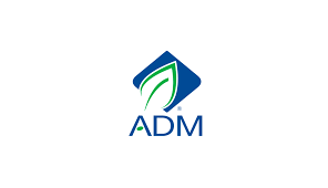
The Archer Daniels Midland (ADM) logo embodies simplicity and sustainability, reflecting the company’s role in global agriculture and food production.
The logo features a diamond-shaped design tilted at an angle, symbolizing progress and innovation. Within the diamond, a stylized green leaf emerges, outlined by a flowing blue line that mimics a stem or growth path, representing nature and the company’s agricultural roots.
The colors green and blue are prominent, symbolizing sustainability, environmental consciousness, and trust. Beneath the emblem, the letters “ADM” appear in a modern sans-serif typeface, colored in a deep navy blue to convey professionalism and stability.
Monsanto (Now part of Bayer)
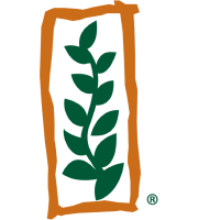
The Monsanto (Now Part of Bayer) logo communicates its agricultural focus through a blend of natural and minimalistic elements. The central feature is a vertical green stem adorned with evenly spaced, symmetrical leaves that grow outward on both sides, making it a standout in farm logos.
This plant-like design symbolizes growth, nature, and the company’s emphasis on agricultural biotechnology. The stem is encased in a bold, freeform orange rectangular border with uneven edges, giving the logo a hand-drawn, organic feel.
The green color of the stem represents vitality and environmental commitment, while the orange border adds warmth and approachability.
Smithfield Foods
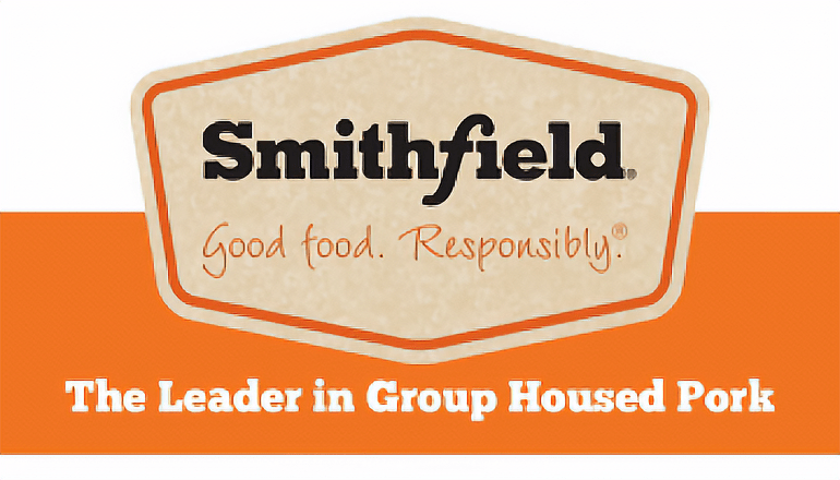
The Smithfield logo reflects a traditional and trustworthy branding style, synonymous with quality food production.
The logo features the word “Smithfield” in bold, black serif typeface, exuding a sense of heritage and reliability. The typography sits within a tan, textured background that mimics natural kraft paper, suggesting sustainability and a connection to farming traditions. This is further framed by an orange outline in the shape of a badge or label, evoking the idea of certification or premium quality.
Below the brand name, the tagline “Good food. Responsibly.®” appears in an elegant script font, reinforcing the company’s commitment to ethical and sustainable practices. The design is completed with a bold orange band at the bottom, showcasing the phrase “The Leader in Group Housed Pork” in clean white text.
Del Monte Foods
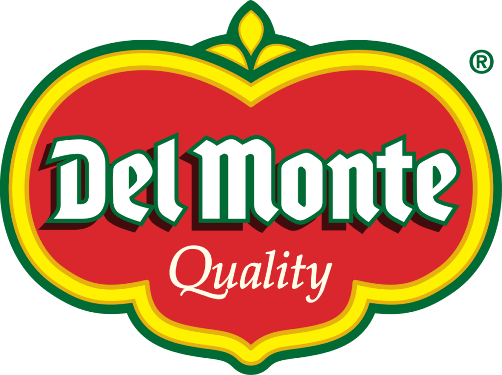
The Del Monte Foods is also one of the most iconic and beloved farm logos. It is vibrant and visually striking, reflecting freshness and quality. The logo is dominated by a bright red shield-like background with a yellow outline that adds vibrancy and warmth. The shield is bordered by a double-layered green and yellow trim, symbolizing growth, nature, and excellence.
At the top, a green leaf motif with a subtle golden accent emerges, representing the company’s focus on natural produce and sustainability. The brand name “Del Monte” is displayed prominently in bold white text with green shadows, giving the words a three-dimensional effect that enhances their visibility.
Below the brand name, the word “Quality” is written in a delicate, cursive white font. The entire composition conveys freshness, heritage, and premium quality, qualities long associated with Del Monte Foods.
Tillamook Creamery
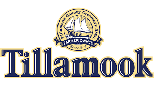
The Tillamook Creamery, similarly one of the most iconic farm logos, features a classic and timeless aesthetic. The word “Tillamook” is written in a bold serif typeface with slight curvature, giving it an authoritative yet friendly presence.
Above the brand name, an emblem of a sailing ship is enclosed within a circular badge. The ship is depicted in a simple, outlined style, representing the coastal heritage of the Tillamook region. The words “Farmer Owned Since 1909” encircle the ship.
Nature’s Path Foods
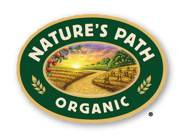
The Nature’s Path logo is vibrant and organic, encapsulated in an oval badge. The focal point is an idyllic landscape, featuring a pathway meandering through golden fields under a sunrise. Lush green foliage flanks the pathway, emphasizing the brand’s commitment to nature and sustainability.
The text “Nature’s Path” arches along the top in a bold, serif font, while “Organic” is prominently displayed below in uppercase and the green and gold color scheme reinforces eco-friendliness and agricultural richness.
The Wonderful Company
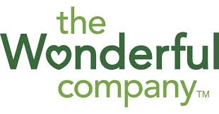
The Wonderful Company’s logo is clean and minimalistic, utilizing a modern sans-serif typeface. The word “Wonderful” is in lowercase letters, with the letter “o” replaced by a heart icon, symbolizing care and positivity.
The text “the” and “company” are written in smaller font sizes above and below “Wonderful,” creating a hierarchy of focus. The overall design reflects the company’s branding as approachable, health-conscious, and customer-centric. The soft green color palette evokes freshness and vitality.
Greenfields Farm
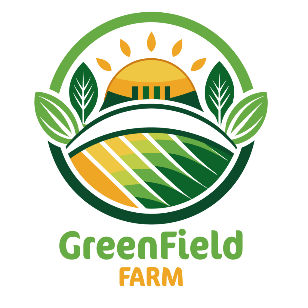
The Greenfields Farm logo is an intricate illustration contained within a circular emblem. At the center is a sunrise over stylized farmland, depicted through geometric layers of green and golden-yellow fields.
Surrounding the sunrise are leafy fronds that create a frame, adding an organic touch. The text “GreenField FARM” is placed below in a bold sans-serif font, with “FARM” highlighted in orange. This logo’s vibrant colors and detailed design communicate a strong connection to agriculture and sustainability.
Perdue Farms
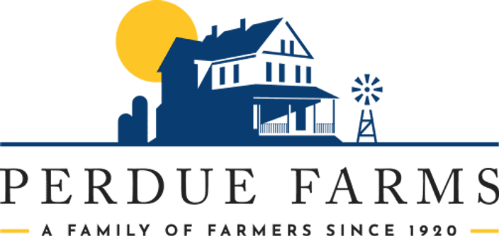
The Perdue Farms farm logos features a clean and structured design with a rustic feel. A two-tone blue silhouette of a traditional farmhouse is the central element, complete with a gabled roof, a wraparound porch, and a small windmill positioned to the right.
Above the house is a golden-yellow sun rising against a clear white background, symbolizing freshness and optimism. The text “Perdue Farms” is presented in bold, uppercase serif font, emphasizing the company’s long-standing heritage. Beneath this, a tagline reads “A Family of Farmers Since 1920” in smaller sans-serif text, flanked by thin yellow lines that mirror the sun’s color.
Hokkaido Dairy Farms
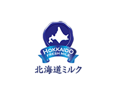
This logo integrates a deep blue color palette, evoking the purity and cold climate of Hokkaido. At its center is a bold depiction of Hokkaido’s island silhouette in white, housed within a circular shield-like emblem.
Beneath this, the words “Hokkaido Fresh Milk” are displayed in crisp white, accompanied by a ribbon graphic in the same deep blue, adding a sense of elegance and quality. The logo’s lower section features Japanese characters in black, directly tying it to its origin and cultural roots.
Organic Valley
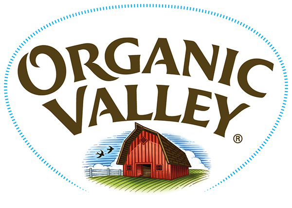
The logo is a harmonious blend of typography and illustration, presented within an oval frame. The text “Organic Valley” uses a custom serif font, angled slightly upward for a dynamic, uplifting feel.
Below the text, a detailed pastoral scene is depicted, showcasing a red barn, green rolling fields, and a clear blue sky dotted with clouds. This imagery conveys natural, wholesome farming. A light blue dotted outline surrounds the oval, adding depth and creating an inviting appearance.
Horizon Organic
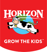
Horizon Organic’s logo is striking and modern. It prominently features a bold, red rectangular background, ensuring maximum visibility. At the center is a playful illustration of a cow peeking out from a green pasture under a blue sky with white clouds, all encased within a circular frame.
The brand name “Horizon” is written in large, white uppercase serif font, while “Organic” appears in a clean sans-serif font below. The tagline “Grow the Kids” adds an emotional touch, emphasizing the brand’s family-friendly values as one of the kid-centric farm logos.
Nuwara Eliya Tea Plantations
On the left side of the logo, a stylized lotus or tea leaf cluster is formed with overlapping geometric shapes. The design uses a gradient of green tones, ranging from light lime green on the outermost leaves to a rich emerald green toward the center. This layered approach adds depth, emphasizing freshness and the lush greenery associated with the Nuwara Eliya region, renowned for its scenic tea fields.
The typography on the right is clean and modern, using an all-capital serif font for “NUWARA ELIYA,” giving it a sense of tradition and sophistication. The word “INFO” beneath is written in a slightly smaller size, also in capital letters but with a narrower serif font, complementing the main title. The letters are colored in matching green tones, creating a unified and harmonious visual.
Flourish Flower Farm
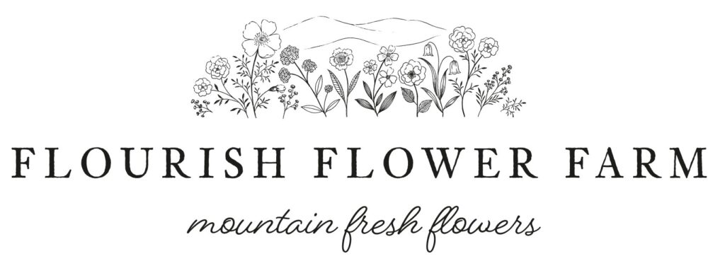
Flourish Flower Farm’s logo captures a delicate, artisanal aesthetic. The design features intricate, hand-drawn botanical illustrations, including various flowers and stems.
Above the floral imagery, the text “Flourish Flower Farm” is written in an all-caps serif font, exuding sophistication. Beneath it, the tagline “Mountain Fresh Flowers” appears in a handwritten script, adding a personal, rustic charm. The monochromatic black design ensures timeless elegance.
Anna Creek Station
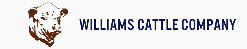
This logo is minimalist yet impactful. It features the text “Williams Cattle Company” in a bold, uppercase sans-serif font, symbolizing strength and dependability. To the left of the text, a detailed illustration of a cattle head, rendered in a sketch-like style, adds a traditional ranch aesthetic.
Bridestowe Estate Lavender Farm
The Bridestowe Estate logo features a clean and elegant design in shades of purple, synonymous with lavender fields. The word “Bridestowe” is rendered in a bold serif font with delicate curves, evoking sophistication and tradition. Below it, “Estate” is in an italicized, smaller serif typeface, adding a touch of refinement.
Sundrop Farms
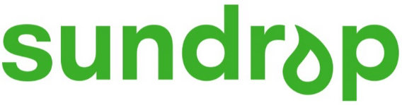
The Sundrop Farms logo uses a bright green modern sans-serif font, with a playful and organic aesthetic. The “o” in “sundrop” incorporates a water droplet graphic, tilted slightly for dynamism, suggesting the farm’s focus on sustainable and innovative agriculture.
Bruny Island Cheese Co.
This logo adopts a rustic, hand-drawn aesthetic, with two oversized, weathered rubber boots sketched in black and white, surrounded by a textured square frame.
The text “Bruny Island” is in a bold, sans-serif typeface above the boots, while “Cheese Co.” is in smaller text below. The imagery and typography combine to evoke artisanal craftsmanship and the rugged beauty of the island’s farming traditions.
Nga Rakau Nurseries
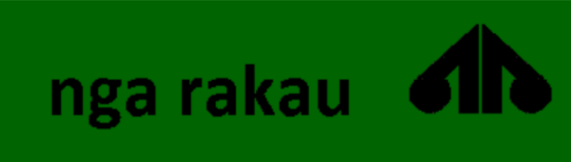
The Nga Rakau Nurseries logo is highly modern, utilizing minimalistic black text set against a deep green background. A graphic resembling a tree canopy with symmetrical, angular lines sits to the right of the text. The geometric design suggests precision and a commitment to nature, aligning with the nursery’s focus on growth and forestry.
Ripe Earth Winery
The Ripe Earth Winery logo incorporates thin, sans-serif typography in all uppercase letters. The wine bottle silhouette integrated into the text subtly emphasizes the brand’s focus on wine production. The minimal use of color and clean design exudes elegance and simplicity.
La Maison du Chocolat Plantation
The La Maison du Chocolat logo is a testament to Parisian luxury and craftsmanship. At its center is a sleek, minimalist “M,” shaped like a roof or an archway, symbolizing the maison, or “house,” of chocolate. The typeface is clean and modern, with evenly spaced letters that suggest precision and balance.
The words “La Maison du Chocolat” are written in a bold sans-serif font below the logo mark, with “PARIS” appearing in smaller text beneath to reinforce the brand’s French heritage. The monochrome black-and-white color scheme emphasizes sophistication, while the minimalist design speaks to the artisanal quality of the chocolate.
Blue Hill Farm
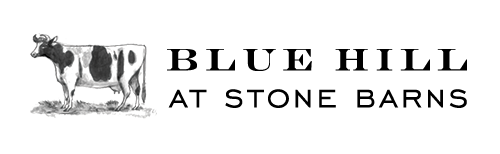
The Blue Hill Farm logo combines rustic charm with refined typography. A beautifully rendered sketch of a Holstein cow, depicted in black and white with fine details that highlight its texture and form, occupies the left side of the design. The cow stands on a subtle patch of grass, grounding the image in nature.
The brand name “Blue Hill” is written in an elegant serif font to the right, with “At Stone Barns” positioned below in smaller, capitalized text. The contrasting styles—artistic sketch and clean typography—create a harmonious balance that reflects the brand’s dedication to sustainable, artisanal farming practices.
Mischief Farms
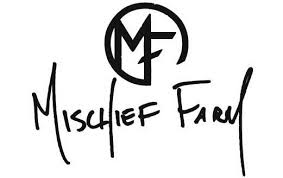
The Mischief Farms logo is bold and unconventional, using a hand-drawn aesthetic to convey creativity and individuality. A circular emblem encloses the letters “MF,” which are rendered in a rough, script-style font.
The full name “Mischief Farm” appears below the emblem in an uneven, playful script, reinforcing the brand’s free-spirited identity. The stark black-and-white color scheme adds to the logo’s modern, edgy appeal, making it memorable and unique.
The Eden Project
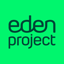
The Eden Project logo is vibrant and inviting, dominated by a bright neon green color that symbolizes growth, renewal, and sustainability. The lowercase sans-serif typeface is smooth and modern, with rounded edges that create a friendly and approachable feel. The text is clean and minimalistic, allowing the bold color to take center stage. This simplicity reflects the Eden Project’s focus on ecology and environmental education, making it both impactful and meaningful.
Farm Logos Ideas
Traditional Farm Logos

- Barn and Silo Illustration
A detailed barn and silo sketch with rolling hills in the background, framed in a circular or oval badge. This conveys a rustic, family-owned vibe. - Plow and Wheat
A vintage plow crossed with wheat stalks, symbolizing traditional farming methods and bountiful harvests. - Tractor Silhouette
A classic tractor silhouette set against a sunrise, representing hard work and the start of a new day. - Animal Silhouettes
Combine silhouettes of cows, chickens, and pigs in a circular badge, emphasizing diverse livestock farming.
Modern Farm Logos

- Minimalist Leaf
A single stylized leaf with clean lines and bold colors, ideal for organic or eco-friendly farms. - Geometric Shapes
Use geometric forms to create animals, crops, or landscapes for a modern, abstract touch. - Typography-Centric
A clean, sans-serif font combined with subtle farm-related symbols like a sprouting seed or a sunburst. - Negative Space
Create hidden shapes within the logo using negative space, such as a cow outline inside a leaf or a tractor within a wheat stalk.
Eco-Friendly Farm Logos

- Circle of Life
A circular logo featuring a cycle of growth: soil, plants, and a glowing sun, showcasing sustainability. - Water Droplet and Leaf
A water droplet merging with a leaf to symbolize renewable practices and irrigation. - Solar Panels and Fields
Stylized solar panels blending into crop rows to represent sustainable energy on farms. - Seedling in Hands
A pair of hands cradling a growing seedling, emphasizing care and environmental stewardship.
Animal Farm Logos

- Pasture Scene
A grazing cow or sheep set against rolling hills and a sunset. - Rooster and Sunrise
A proud rooster perched on a fence with a rising sun in the background. - Bees and Honeycomb
A honeybee flying over a hexagonal honeycomb pattern, perfect for apiaries. - Goat and Cheese
A stylized goat head with a cheese wheel in the background for dairy farms specializing in goat products.
Artistic and Whimsical Farm Logos

- Watercolor Fields
A watercolor painting-style logo with soft, blended colors depicting a farm landscape. - Children’s Storybook Farm
Cartoon-style animals and a charming red barn, perfect for family-friendly farms or agritourism ventures. - Heritage Typography
Old-world lettering combined with hand-drawn elements like vines or vintage tools for a nostalgic feel. - Scenic Silhouette
A silhouette of a farm framed by a crescent moon and stars, evoking peace and serenity.
Produce and Specialty Farms

- Fruit and Veggie Cluster
A cluster of brightly colored fruits and vegetables, arranged to form a circular badge or basket design. - Lavender and Herbs
Elegant lavender stalks or herb sprigs in a wreath-style design for aromatic or medicinal farms. - Dairy Focus
A milk bottle or block of cheese paired with a grazing cow or goat. - Vineyards and Wine
Grape clusters intertwined with vines, set against rolling hills or a wine barrel.
Inspirational Concepts

- “Farm to Table” Symbol
Combine a pitchfork with a dinner plate to represent fresh, local produce. - Sky and Earth Theme
A logo showing layered designs of the sky, crops, and soil to symbolize the connection between nature and farming. - Circular Crop Patterns
Inspired by aerial views of crop circles or farm fields for a unique and geometric aesthetic. - Seasonal Transitions
Elements representing all four seasons (spring bloom, summer sun, fall harvest, winter snow) to highlight year-round farming.
How to Design a Logo for Agriculture?
1. Define Your Brand Identity
Before diving into the design, clarify the brand’s values and message. Ask yourself:
- What does the business represent? (e.g., sustainability, innovation, tradition)
- Who is your target audience? (e.g., eco-conscious consumers, large-scale farmers)
- What emotions or qualities should the logo evoke? (e.g., trust, reliability, freshness)
Example: A farm specializing in organic vegetables might focus on themes like nature, health, and community.
2. Research Industry Trends and Inspirations
Study other successful agricultural logos to identify key design elements such as:
- Common motifs: Leaves, barns, tractors, grains, or sunrises.
- Color palettes: Greens, browns, yellows, and blues symbolize nature and vitality.
- Typography: Clean, legible fonts with either a modern or rustic feel.
Use this research to outline a unique direction for your logo.
3. Choose the Right Tools for Logo Creation
This is where Arvin AI Logo Designer comes in handy. Unlike generic design software, Arvin AI leverages advanced algorithms to provide tailored logo designs quickly and efficiently. You can input keywords like “farm,” “sustainability,” or “harvest,” and the AI generates options based on your vision.
Pro Tip: Keep some examples or rough sketches ready to guide the AI’s suggestions further.
4. Select a Shape or Symbol
Choose an agriculture-related symbol that resonates with your brand. With Arvin AI, you can:
- Browse a database of pre-designed icons.
- Experiment with custom symbols like fields, sunbursts, or plants.
For instance, a small dairy farm could use a cow silhouette framed by rolling hills, while a machinery company might incorporate gears and fields.
5. Decide on Colors and Fonts
Colors and fonts play a critical role in conveying your brand’s tone:

- Colors: Use earthy tones like green, brown, and yellow for warmth and natural appeal.
- Fonts: Choose fonts that align with your theme—serif fonts for a traditional feel, sans-serif for a clean and modern look.
Arvin AI simplifies this process by offering pre-matched color palettes and font recommendations based on your industry and style preferences.
6. Create Multiple Mockups
Use Arvin AI to generate multiple logo variations. The platform allows you to:
- Compare different layouts (horizontal, stacked, or emblem-style logos).
- Test combinations of symbols, colors, and fonts to see what works best.
Example: Create versions with and without a tagline like “Cultivating Sustainability” to test how it integrates with the design.
7. Test Your Logo for Versatility
A great logo should work across various platforms and sizes, from packaging to digital ads. With Arvin AI’s mockup feature, you can preview your logo on:

- Business cards
- Social media profiles
- Product labels
- Website headers
This step ensures your logo is scalable and visually appealing in all formats.
8. Get Feedback and Refine

Share your logo designs with a focus group or trusted audience to gather feedback. Arvin AI includes revision tools to tweak elements like color tones, alignment, or font sizes without starting from scratch.
9. Finalize and Export
Once you’ve chosen the perfect design, use Arvin AI to export your logo in multiple formats (PNG, JPEG, SVG) for various applications. Ensure you save vector files for high-resolution use, such as signage or large-scale printing.
10. Protect Your Logo
To safeguard your brand identity, consider trademarking your logo. This adds an extra layer of professionalism and security.
Why Use Arvin AI for Agriculture Logos?
- Customization: Tailor designs specifically to the agricultural industry.
- Speed: Create professional logos within minutes.
- Affordability: Avoid the costs of hiring a designer while maintaining high quality.
- Ease of Use: Even if you’re not a design expert, Arvin AI makes the process intuitive and straightforward.
Start designing your agriculture logo today with Arvin AI Logo Designer and bring your brand vision to life!
Final Words
A well-designed logo is more than just a visual; it’s the foundation of your agricultural brand’s identity. Your logo should communicate your values, connect with your audience, and set you apart from competitors.
Tools like Arvin AI Logo Designer make this process seamless, offering professional results tailored to your unique needs. Don’t miss the opportunity to make your mark in the agricultural industry with a logo that reflects the heart of your business. Ready to design? Let Arvin AI bring your vision to life today.
FAQ
The best colors for a farm logo are earthy tones like green, brown, and yellow, as they evoke feelings of nature, growth, and sustainability. Adding complementary colors like blue (symbolizing water and trust) or gold (representing quality and tradition) can further enhance the design.
The three circles in the State Farm logo represent the core services the company initially provided: auto, life, and fire insurance. This simple yet effective design communicates a broad scope of coverage while maintaining a clean and professional aesthetic.
You can use tools like Arvin AI Logo Designer to make this process seamless, offering professional results tailored to your unique needs.
