Logos are often designed to communicate a message or an idea to the audience. Sometimes, designers use hidden messages in logos to convey a deeper meaning. These hidden messages can be anything from subtle imagery to the clever wordplay that can be easily missed at first glance. The famous logos we encounter daily have a significant impact on how we perceive brands. From Nike to Apple, let’s uncover the secrets and significance of logos that have stood the test of time!
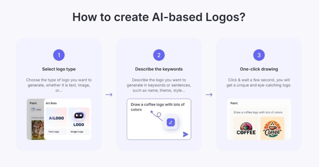
Looking for inspiration? Our AI logo maker can spark your creativity and generate endless logo possibilities in no time! Why wait? Design an eye-catching logo effortlessly with our AI logo maker. Start now and take the first step towards your brand’s success for famous logos! Get your new brand logo in 1-Click with Arvin, your AI-powered logo maker. Create the best logo with your unique brand identity!
Deciding on the perfect logo for your brand can feel daunting, but it doesn’t have to be. Discover how to decide what your logo should be by aligning your vision with effective design principles. They help you express your brand’s essence. A well-thought-out logo can set the foundation for your brand identity, just as it has for so many established companies.
Nike
Nike is one of the most famous logos that we can recognize globally. I think we’ve all felt inspired by the Nike Swoosh. It’s not just a design; it symbolizes movement, drive, and the energy to “Just Do It.”
The Nike logo, known as the “Swoosh,” represents movement, speed, and athleticism. Designed by graphic designer Carolyn Davidson in 1971, the Swoosh symbolizes the wing of the Greek goddess of victory, Nike.
Today, it has become one of the most recognizable brand logos in the world. And it is also the most valuable, having a worth of $26 billion alone. The Swoosh has appeared alongside the trademark “Just Do It” since 1988. Together, these two make up the core of Nike’s brand. And it has been the face of the company, with many high-profile athletes and sports teams around the world sporting the logos.
As you come up with different design ideas, consider how numbers can play a vital role in your logo’s uniqueness. Learn how to include numbers in your logo to convey significance and enhance its memorability. It is much like many well-known brands have done in their iconic designs. Numbers can add an extra layer of meaning that resonates with your target audience.
Apple
This logo that we all know. A bitten apple captures the essence of innovation and design excellence, instantly evoking thoughts of cutting-edge technology.
The Apple logo is a great example of brand identity embodied by visual design. Their new approach emphasized technological aesthetics as much as technological performance. They wanted to make their products desirable. So they used the biblical “bite of the apple” to express both desire and empowerment.
The principle of simplicity is applied to great effect. The bite could easily have left teeth marks. But Apple favored simple, minimalist linework that is more visually pleasing and uncomplicated, making it an instantly recognizable logo.

McDonald’s
We all recognize those Golden Arches—the ultimate beacon for quick, comforting meals and a reminder of McDonald’s welcoming places to gather. I think McDonald’s famous logos have attracted our attention. Once you see the logo, you can’t help walking into it.
The brand colors of yellow and red were a purposeful direction on the company’s part. Red represented energy and stimulation, while yellow is associated with happiness. Having the arches in yellow also led to its striking visibility. It allows people to spot the McDonald’s crest in an overcrowded road easily.
Overall, McDonald’s proves that the elusive secret recipe in achieving one of the most famous logos in the world is having a perfect union of shapes, colors, and simplicity. With these qualities in unison, it didn’t take much for people to remember such an easy, distinctive, and impactful design.
Coca-Cola
Whenever I see that flowing script logo, I think of Coca-Cola’s timeless refreshment. It’s something that’s been a part of countless celebrations.
Coca-Cola has one of the world’s most popular logos. And it is arguably the most iconic logos one in the world. The brand’s design has undergone several modifications before reaching the one that is current today. Its typography and double ‘C’ characteristic have remained unchanged since 1887.
Today, the typography and capitalized Cs are the same since their origins. Red was chosen as the primary brand color. Because the bottles needed to be painted red to distinguish them from alcohol during transit. Later on, Coca-Cola’s color would be enhanced using a combination of three different shades of red.
Ready to bring your vision to life? Try our AI logo maker now and watch your brand identity come together in minutes! Just describe the style, theme, and color you want to Arvin, our AI engine will give stunning combinations to choose in 1-Click.

Starbucks
The siren logo is one we all associate with Starbucks. It creates an irresistible call to enjoy a pause filled with rich coffee aromas. The inspiration behind the “Starbucks Siren” emblem logo design is very much based on epics and myth-making. The founders chose the name Starbucks based on Moby Dick’s most sensible character, Starbucks.
Incorporating niche characters into a logo gives personality and warmth to the design. It creates a deeper, richer brand persona to help your audiences connect and remember you. It could be a good idea to think about books you’ve read over the years. Would any of the characters relate to or symbolize your brand in some way? It might just be one aspect of their personality that your brand shares in its values that you’re looking for. As we see in the Starbucks logo, using cultural references in designs makes some of the most memorable logos.

To me, Google’s colorful logo is synonymous with endless discovery and innovation, reflecting the vibrancy of the internet itself. It is only expected that people would remember its logo as it is the first thing that pops up before making a web search.
The Google logo may seem like a simple and colorful wordmark on the surface. But these little details have important stories. Google is famous for altering its design according to important days or historical events. However, its primary imagery has barely changed over the years.
Using red, blue, and yellow is quite the conventional match on the color wheel, comprising all three primary hues. The green ‘L’ was a conscious decision on their part to portray Google’s drive to think out of the box.
Boost your browsing experience with instant AI assistance—edit, search, and automate directly from the google browser.
Amazon
Amazon’s smiley arrow is something we see and instantly associate with convenience and excitement for something new arriving at our doorstep. Amazon’s famous wordmark logo is straightforward with just the right touches of detail that express the brand identity.
The clean black and white, all lower space logo is easily legible. The arrow connects “a” to “z” with one swift move, just like your experience will be on the platform. This arrow is also sometimes called “the smile”, bringing a friendly touch to the logo. The curve below the “z” where the arrow lands is gently curved and brings motion to the design.
What’s even better is that it can all be condensed into the favicon. The icon that is sometimes on a URL, tab or webpage. Designing a logo that can be boiled down into a smaller icon is important, especially for a digital product.

That Instagram camera logo is like a little treasure chest of memories. It reminds us all of the visual storytelling moments we share daily. The Instagram logo is also its app icon and always was. This doesn’t sound that special since Instagram is and always was an app. But the fact is that this little symbol of a camera has represented the company through its massive growth is quite significant.
The camera symbol was initially modeled after a Polaroid camera because the app allowed you to take and share photographs instantly. The logo doesn’t look like it initially did. But it still has the shape of a Polaroid camera, it’s just a bit more symbolic and a bit less literal. The lesson here, once again, is that a great logo can represent the company’s goal and purpose in one small symbol.
And, use our FREE Instagram Caption Generator to get more inspiration or just generate an eye-catching headline. It will be your best assistant!
Mercedes-Benz
That classic three-pointed star makes me think of Mercedes-Benz’s legacy of luxury and cutting-edge automotive technology. The owners at the time chose Mercedes’s three-point star as their logo symbol because it meant something to them as a family. It was a symbol their late father had used to designate their family home. And it was also something that came to mean land, sea and air.
Even though the symbol of a star isn’t something that’s groundbreaking, it’s hard to deny that this isn’t simply a “star.” The Mercedes-Benz star design has very distinct shadings, that give it dimension and bring its 3d metallic form to mind, with all its angles and glimmers. It’s also enclosed in a circle which all its three points touch, giving the impression that this circle contains everything necessary.
Adidas
Whenever we see the three stripes, it’s clear we’re looking at Adidas—a brand that supports us through all our athletic endeavors.
And if there’s one constant you can always recognize, from the beginning of the history of adidas’ logos until now, it’s certainly the 3-Stripes. The world-famous trademark has come to represent quality product that’s rooted in sport. So, whether you’re throwing on some performance gear before a grueling workout or putting together an outfit from Originals that helps you express your style, you can feel proud sporting the brand with the 3-Stripes.
When thinking about the logos of iconic brands, one might wonder how to create a logo that stands out as effectively as those we admire. Understanding the art behind these symbols can inspire your creativity. For instance, if you’re looking to delve into the world of unique designs, here’s how to ask AI to make a shroom logo that can spark interest and the imagination of your audience.
Pepsi
I think Pepsi’s logo, with its vibrant colors, is a pop culture icon that’s full of energy and a refreshing twist.
The history of Pepsi’s logo has a lot to do with it having a competing product to Coca-Cola. This is an example of a logo that is successful because it does a great job of distinguishing the brand from its competitors. It initially also had a cursive style wordmark on its logo but later changed into a contemporary sans-serif to distinguish them from Coca-Cola. They kept their spherical symbol to show consumers that they were still the same brand as before, but new and improved, to maintain vital customer trust.
Microsoft
The Microsoft window logo is something we all recognize. It symbolizes the powerful software systems that open up a world of possibilities. Orange is the color of productivity and represents their Microsoft Office suite, green is the color of their X-Box and gaming division, representing leisure and entertainment, yellow is the color of Bing and represents speed and efficiency, while blue is the Windows color and conveys stability and reliability.
Color symbolism can say a lot about your business, but ensure that it is paired with simple geometric shapes. Clean squares that make windows create clear boundaries for the many colors and ensure that they have a confined space to play in.

IBM
IBM’s logo, with its structured stripes, makes me think of enduring reliability and groundbreaking technology advances.
IBM’s 8-bar logo has not changed since it was first created by Paul Rand (who has also created the logos for UPS, Enron, Westinghouse, among others). The stripes convey speed and dynamism, while the capital and bold serif letters convey confidence, authority and a strong sense of modern minimalism. At the time, using negative space with a font in this way was considered super innovative. Now, it leans more on the audiences’ sense of nostalgia for that period of time.
Toyota
We understand Toyota’s overlapping ovals as a symbol of quality and innovative spirit that’s road-tested and customer-approved. The Toyota logo shows how simple geometry, when combined, can create plenty of visual interest that sets it apart from competitors. The first oval — the bigger one — symbolizes a steering wheel, and the two interlocking ovals inside of it depict the unity between machine and driver.
The infinity symbol that it makes is no coincidence — it is meant to represent the ceaseless nature of innovation and advancement of automobiles in order to advance our lives. The sense of order that the interlocking ovals create conveys ideas of security, trust, and social responsibility.
Simple geometry with muted colors can speak louder than expressive icons with vibrant hues. They work to brand this car company as professional, reliable, and innovative.
Samsung
When I see that Samsung logo, I immediately think about cutting-edge technology and sleek, user-friendly designs.
If you’re going to break design rules, break them with intention. At first glance, the Samsung logo appears asymmetrical. The business name does not align with its encasing oval and the sides of the “S” and “G” appear to cross the boundary of the shape.
Yet there is meaning behind these design choices. The oval symbolizes the universe, while the name that crosses the boundary of the universe symbolizes Samsung’s mission of making appliances that are ubiquitous and universal, with every home having a Samsung product.
Blue brands a business as dependable, saying “you can rely on Samsung products to always deliver,” suiting a brand that is an industry leader and the standard for electronic development.
We recognize the Meta infinity symbol as a profound shift toward interconnected digital experiences, expanding what was traditionally Facebook. Using a single letter as the face of your branding material can improve brand awareness by making your brand synonymous with that letter. In the case of Facebook, whenever we see a blue “F” on web pages, we instantly recognize it as the Facebook share icon. This is a great way of making your company familiar and commonplace.
Facebook’s logo is just a simple write-up of the brand name in lowercase letters. Why lowercase? The style signifies Facebook’s easy-going nature because it is, after all, a casual social media platform to connect with people.
Lowercase letters give the impression of geniality and are used to show a friendly face to the world, while the blue color balances affability with a dose of professionalism and trust.
Visa
Every time I pull out my Visa, those simple blue and gold elements make me feel secure and globally connected. The business name slants to the right and the winged “V” expresses motion and speed that says “speedy transactions.”
Clarity and simplicity aid brand recognition, and the Visa logo abides by this principle to create an uncomplicated logo that has become one of the most recognized names in the financial sector. People trust what they know, and the easier it is for them to remember your brand, the easier it is to trust you.
Shell
We all know the bright Shell pecten—it’s a promise of reliability at service stations that’s fueled journeys far and wide. The logo is instantly recognizable as the Shell logo and sometimes appears without the name, just like the McDonald’s or Nike logos.
The thick red outline of the shell icon gives it boldness and a sense of authority that befits a leader in the oil and gas industry. This, along with the bright red and yellow color combination, ensures that the logo is salient on highways and lets drivers know where they can find a station.
Volkswagen
Those interwoven letters in the Volkswagen logo are iconic, representing a brand history built on reliability and innovation. Volkswagen, the German automaker, has come to be known affectionately as “VW,” and the abbreviation is emphasized in their branding. The “V” and the “W” interact seamlessly, showing off creative linework that is pleasing to the eye.
The evolution of the Volkswagen logo shows the company’s shift from a three-dimensional design to a two-dimensional one, favoring simplicity that has seen it become one of the most popular logos around.
Intel
Intel’s swirling logo reminds me of being on the cutting edge of technology, where each swirl could mean a leap in performance and capability.
Deep within the silicon realms, the Intel logo pulsates, representing the heartbeat of the modern tech era. Synonymous with microprocessing brilliance, this emblem stands for relentless innovation in the world of computing. Each time this logo flashes across a screen, it silently assures the user of unparalleled performance and a seamless digital experience.
Dove
Dove is a company that does so much good with their name and classic toiletries. The logo, created by Ian Brignell, combines elegant lettering with a gentle symbol of a Dove. Since its debut in 1955, it has always maintained an elegant appearance that encourages affordable self-care.
The brand colors – white, blue, and an intensified gold – are meant to evoke feelings of tenderness, clarity and luxury. These are all common visions to think about for a company that was a pioneer in using “real women” in their ads.
TikTok
TikTok‘s logo is a calling card for creativity and musical expression, sparking vibrant and entertaining moments for users worldwide.
Its note-infused logo speaks to spontaneous creativity, encouraging a hub of vibrant video interactions that redefine what it means to connect and create globally.

Lego
Did you know Lego’s name is derived from an abbreviation of the Danish words “leg godt,” meaning “play well.” Even as kids, logo associations begin to form in our tiny little brains.
After a slew of logo renditions since Lego’s start in 1932, the famous logo we know today was introduced in 1973. At this time, the company began to distribute its products to the U.S. from its native Denmark. They wanted to rebrand, and incorporated modern logo characteristics such as vibrant red and yellow colors, and clean typography into the design. These elements led to a more universal wordmark that would be highly visible to viewers of all ages.
In 1998, the logo was slightly refreshed by tightening its enlarged text and saturating the colors. The bubbled Lego letters relate to the structure of the product itself, recalling the playful simplicity of these beloved toys. No wonder it was named the toy of the 20th century.
World Wide Fund For Nature
Climate change and sustainability are finally at the forefront of conversations worldwide. While we’ve known these concepts for a while, never have we taken them as seriously as we are right now.
For the past 60 years, the World Wide Fund For Nature (WWF) has been addressing these issues with a single goal in mind: to help people and nature thrive.
WWF’s Panda is instantly recognizable as one of the most famous logos in the world. But why a panda? Why not any other animal or a collection of flora and fauna?
The logo is based on Chi-Chi, a panda at the London Zoo in 1961. For one thing, the black and white panda made the budget for printing much more affordable than a colored mascot. Second, pandas are beautiful and endangered — a fitting symbol for the environment in this day and age.
Incorporating Chi-Chi served both practical and symbolic purposes, and it worked out quite well, as the WWF Panda is a logo that almost anyone can identify!

FedEx
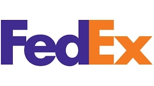
That hidden arrow in the FedEx logo is all about precision and speed—unseen yet ever-present as they deliver world-wide. A logo that features a visual metaphor for the business it represents makes a clever design that people will remember. In the case of FedEx, a package delivery company renowned for speed and reliability, using negative space to form an arrow is a great way of associating your business with movement, action, and determination.
Color is also used strategically, as the “Ex” part of the name changes in color depending on the part of the business it represents, be it express, freight, office, or other.
Disney
The Disney castle is something magical, sparking joy and fantasy that captivates people of all ages with its stories.
When a logo takes on the life of the brand it represents, you know you have a hit. In the case of Disney, a typeface that has the childlike appearance of crayon on paper, when paired with the icon of a fairytale castle, evokes feelings of playfulness and naive creativity that are synonymous with the brand.
Another way this famous logo creates meaning is by its mimicking the signature of its founder, Walt Disney. The company was built on the charismatic founder’s spirit of creative expression and imagination. And the font that resembles his stylized signature pays homage to this legendary man.
Audi
With four rings neatly in line, Audi’s logo brings to mind high-performance luxury vehicles and precision engineering.
With those four interlocking rings, Audi’s logo isn’t just about cars; it’s about the symphony between tradition and modernity, symbolizing the harmony of its four founding companies. Each ring represents a commitment to quality, innovation, and the exquisite design that defines the luxury automotive experience.
Netflix
I think of countless movie nights when I see the bold, red Netflix logo. It’s a staple of home entertainment for many.
It has redefined home entertainment, becoming a gateway to thrilling narratives, heartwarming dramas, and shared moments around our favorite series and films.
HP (Hewlett-Packard)
The simplicity of HP’s logo speaks back to its trustworthy presence in tech that we’ve all encountered at some stage.
It’s synonymous with decades of trusted solutions in computing, embodying the balance between technology and usability that has touched both enterprises and personal users alike.
Rolex
Who doesn’t associate the crown logo with Rolex, radiating prestige and classic elegance with every tick?
The majestic crown atop a Rolex watch is more than just a logo; it’s a symbol of prestige, timeless sophistication, and meticulous craftsmanship. It’s what one wears when moments need to be distinguished, capturing the essence of legacy and luxury with every second that ticks by.
Spotify
Every time I see that logo, I know it’s time for a soundtrack to my moments, thanks to Spotify’s world of music.
The Spotify icon is a gateway to a world of sound tailored to you. Its presence on my device means endless playlists and podcasts that accompany every mood and moment, transforming silent journeys into harmonious personal soundtracks.
The little bird, Larry, takes me to a place where thoughts fly fast, connecting people instantly across the globe—it’s the spirit of Twitter.
Larry, Twitter’s little blue bird, embodies the freedom and speed of real-time communication. It’s a symbol of ideas taking flight, news spreading in seconds, and a global conversation that knits the world together in 280 characters or less.

MasterCard
Those interlocking circles make me think of Mastercard’s commitment to seamless transactions and global trust. Those overlapping red and yellow circles tell a story of seamless connectivity and mutual trust, allowing us to navigate transactions and cross boundaries with ease. It’s a brand built on facilitating the smooth movement of commerce worldwide.
Louis Vuitton
Whenever I encounter the iconic LV, I see a legacy of luxury and fashion-forward thinking that’s simply unmatched.
The LV monogram is a hallmark of luxury and innovation in fashion. It’s not just a logo; it’s a statement of timeless elegance and sophisticated craftsmanship, forever pushing the envelope in trendsetting design.
Nokia
Seeing the Nokia logo takes me back to the pioneering days of mobile phones, embodying reliability and simplicity.
It’s reminiscent of the days when mobile technology became personal and accessible, championing simplicity and pioneering communication.

LG
The friendly face in LG’s logo is a nod towards their promise of smart, people-focused innovations that brightly impact our lives.
The LG smile reflects their cheerful mission of putting “Life’s Good” at the forefront, designing technology that meets genuine human needs and aesthetically compliments our lives.
Honda
The Honda “H” stands for products that perform with trust and excellence, something we appreciate on multiple levels.
More than a badge of reliability, Honda’s “H” represents a wide-ranging commitment to engineering excellence and environmental efficiency, spanning motorcycles, vehicles, and beyond.
Chanel
The intertwining C’s are synonymous with Chanel—a hallmark of elegance in haute couture that’s simply exquisite. Created to reflect the initials of her name, the logo combines geometric, clean lines that form a subtle oval shape denoting the timelessness of the brand.
Need a logo quickly? Let our AI logo maker streamline the process—create, customize, and download your logo in just a few clicks to create your personal famous logos!
Sony
The Sony logo lights up thoughts of creativity, technology, and innovative entertainment experiences over the years.
Sony’s logo evokes innovation across entertainment realms. From gaming to films, and tech innovation, it stands as a testament to creativity and making what was once thought impossible, possible.
Puma
Puma’s agile cat leaps through, conveying a sense of speed and athletic spirit. It’s a brand that pounces on style and functionality.
Puma’s logo, with its leaping feline, is not just about athletic wear; it’s about capturing the heart of agility and performance, offering empowerment through style and functionality with every leap and bound.
Yamaha
Yamaha’s tuning fork symbol twists my thoughts towards musical perfection and unmatched engineering prowess.
Its tuning fork logo isn’t just a nod to its musical heritage but a symbol of precision and excellence, resonating with creativity whether in musical instruments or powerful motors.
PlayStation
PlayStation’s logo denotes adventure and endless entertainment, a portal to virtual worlds where imagination takes flight.
The PlayStation logo is synonymous with adventure, capturing imaginations through immersive gameplay. It’s a gateway to worlds where creativity knows no bounds, offering endless opportunities for players to experience stories in interactive formats.
BP (British Petroleum)
The sunburst logo of BP is recognizable for capturing the energy sector’s forward momentum and environmental consciousness.
BP’s sunburst design doesn’t just represent energy; it reflects evolution within the sector, hinting at a commitment to greener solutions and forward-thinking environmental stewardship.
KFC
Colonel Sanders’ smile in the KFC logo feels like a warm invitation to enjoy that famous, finger-licking good chicken.
The friendly face of Colonel Sanders in KFC’s famous logos invites us to partake in culinary tradition. That tradition involves generations of secret recipes and memorable dining experiences.

Pandora
The Pandora logo, understated yet elegant, hints at the customizable journey each unique piece of jewelry creates.
Pandora’s simple yet elegant logo represents the brand’s ability to create personalized jewelry journeys. It offers pieces that tell unique stories and celebrate special moments.
Reebok
Reebok’s logo is motivation for movement; it’s there when you push your limits and achieve more in every step.
The vector logo embodies energy. It is a testament to pushing boundaries and achieving goals, encouraging athletes and enthusiasts to step into a realm of limitless possibilities.
Unilever
The Unilever “U,” with its woven icons, makes me see a vast portfolio of products improving daily life globally.
The multifaceted “U” logo of Unilever captures the essence of an organization that touches billions of lives daily, bringing health, hygiene, and happiness through its diverse range of trusted products.
Jaguar
Seeing the sleek leaping cat of Jaguar brings to mind powerful luxury vehicles that capture attention and imaginations.
The leaping Jaguar logo is not just an emblem of automotive luxury but an embodiment of power and grace on the road, turning heads with its stylish assertiveness.
Prada
Prada’s simplistic yet striking logo reminds us of an elegant legacy in fashion, each piece a statement in itself.
The Prada logo evokes minimalist elegance. It represents a legacy of sophisticated fashion that balances tradition with forward-thinking design, producing pieces that are art in themselves.
Delta Air Lines
Delta’s triangular symbol always makes me think of new horizons and their unmatched commitment to connectivity and travel comfort.
The Delta triangle points toward the sky. It signifies horizons broadened and an enduring commitment to elevate the journey, connecting people through impeccable airline service.
Conclusion
The 50 famous logos we’ve explored are not only iconic. And they tell compelling stories about the brands they represent, reflecting their values, missions, and histories. Each logo, from the simplicity of Apple’s apple to the dynamic spirit of Nike’s Swoosh, has left an indelible mark on our collective consciousness.
Don’t settle for ordinary! Generate a unique logo that captures your brand’s personality with our powerful AI logo maker.
FAQs
The Nike logo is one of the most famous logos in the history of design. The Nike swoosh is a simple yet powerful emblem that symbolizes victory.
An iconic logo is an image that is so ubiquitous in society that it is associated with certain emotions. Iconic logos are built on the principles of simplicity and reproducibility, communicating in simple visual terms. Some of the most famous iconic logos include McDonald’s, Nike, and Apple.
A memorable logo is simple, unique, and instantly recognizable, often embodying the brand’s identity. It uses distinctive colors and shapes to create a lasting impression, evoking emotions or values associated with the brand. Iconic examples include Apple’s apple, Nike’s swoosh, and McDonald’s golden arches, each resonating deeply with consumers.
While many logos convey their messages overtly, some hold hidden secrets. They are subtle, cleverly embedded elements that require a closer look to uncover. These hidden elements are like encrypted messages waiting to be deciphered, adding depth, intrigue. And it is often a touch of playfulness to a brand’s visual identity.

