One of the major highlights or you can say important thing in the Formula One is F1 logo which represents prestige of motor racing. Arguably one of the more recognizable logos in the entire world of racing, this one symbolizes speed, competition and cutting-edge technology. Formula One, or simply F1, is an exciting motorsport that has grown in popularity over the years and loved by millions around the world. This article explores the history, meaning, and impact of the iconic F1 logo.
PART 1: History and Evolution Of F1 Logo
The F1 logo has evolved steadily over the years, moving on with modern logo while retaining its racing spirit. Every redesign is a milestone in Formula One’s journey, a symbol of its evolution. From its early minimalistic designs to the ultra-modern logo of today. The F1 logo history represents the never-ending innovation of the sport.
Early Beginnings (1950–1987)
The F1 logo history goes back to the early days of Formula One. In 1950-1987, the first official Logo appeared in Moto GP. It was simple but functional, as it symbolized the racing contest. In the years before that, in the late nineties, as the branding of F1 was in its infancy, the logo gradually became modern. Going from traditional badge to this aerodynamic, speed-influenced design was a multi-decade evolution.

Transitional Period (1987–1993)
From 1987 to 1993, Formula One went through dramatic branding revision as it transitioned towards a more contemporary and visually appealing identity. This transitional period saw the way opened for the much-loved 1993–2018 version by testing with more assertive typography and graphics. While not as immediately logo-like as they would become in subsequent iterations, the late 1980s and early 1990s logos set up the international character Formula One soon came to form. This phase saw F1 start its change towards a commercially oriented and sleeker branding model.

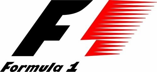
The Iconic F1 Logo in 1993-2018
The most famous logo introduced in 1993 and used until 2018. Designed by Carter Wong, this logo included a slanted “F” and speed lines that formed a hidden “1” in negative space. As red and black are colors that conveys power, passion, and intensity. Formula One had been the loser until this design, which is now probably one of the most recognized and avante of all sport logos on earth. The red represented energy and excitement, and the black gave a feeling of sophistication and authority.
2018-current
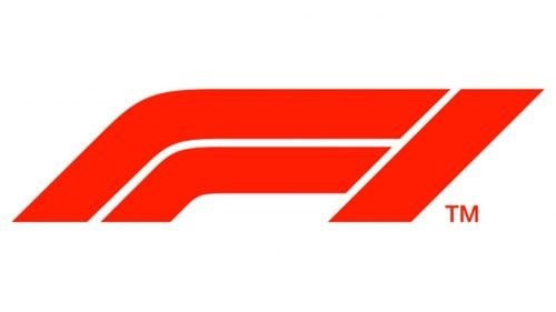
Formula One was bought by Liberty Media in 2018 who initiated an overhaul of the branding of the sport. In achieving this transformation, the reworked F1 logo was also played with. Fans and industry aggregrated reaction was mixed to changing the logo. Some respondents praised the modern aesthetic, while others missed the old design. And while the 2018 logo was highly controversial upon release, it did a fantastic job of establishing itself as a modernized, dynamic representation of the sport.
PART 2: Meaning and Symbolism of the F1 Logo
In fact, the F1 logo isn’t simply a brand image; it represents something much deeper: the spirit of motorsport. It’s designed around speed and finesse, and merciless competition. The acute lines and aerodynamic volumes not only suggest motion. But embody the relentless pursuit of perfection found in Formula One. The focus on a clean package accentuates the high-tech electronics and engineering developments that the sport has become known for and underscores its position within the development mold of top level racing.
The Role Of Colors in F1 Logo
The colors used also help to establish the brand identity. This slider-shift shapes the red focal point of the center of the window, which is the predominant red color in this layout. The addition of white and black offer contrast, as well as clarity, and sophistication, to make sure the logo remains bold and recognizable. The balance of these colors provides a strong visual statement that is befitting the competitive world of Formula One and the high-performance machine that is the Formula One car.
PART 3: F1 Logo Font and Color Psychology
Logos, typography and color scheme (F1 logo in this case) are not random. They evoke emotions and maintain the identity of the brand. It symbolizes strength and acceleration through a bold font and uses intense red, black, and white shades to evoke passion, dynamism, and nobility. And here’s how these accoutrements augment the F1 brand.
Typography and Font
The F1 logo also depends heavily on typography. This logo designed with a bold, sleek and futuristic font that embodies the form of flawless. And high-tech technology and progress it stands for, which is what Formula One is all about. Custom lettering style, carefully crafted to mimic to the brand’s identity. So that the logo is instantly identifiable, regardless of the application. The typographic logo is also uniquely styled, adding to dynamic, high-paced, high-class look, capturing the essence of the sport perfectly.
Color Psychology
The F1 brand is not just on the race track—it’s on merchandise, marketing materials, and digital properties everywhere, and it’s making its mark. Incorporating a bright red hue into the logo represents passion, excitement, and an insatiable desire to win. While the bold black hints at sophistication, prestige, and professionalism. The F1 identity is authoritative and features prominently on all media and fan touch points globally. This dynamic pairing elevates their presence and appeal.
Part 4: The team behind the F1 logo
There’s a visionary behind every great logo. Darren Wright carved the spirit of motorsports through design, shaping the F1 logo into what we recognise today. From Carter Wong’s iconic creation circa 1993 to Wieden+Kennedy’s contemporary 2018 rebranding. This section pays homage to the geniuses behind F1’s aesthetic.
Carter Wong and the 1993–2018 Design
To help build upon its identity, they’ve brought in the designers behind the F1 logo. The version from 1993 to 2018, an iconic symbol of Formula One, was by Carter Wong. The design, with its dynamic and sleek appearance, was renowned for the incorporated hidden negative space “1,” which symbolized speed and movement It merged with call to action of the Formula One community, which further enhanced the brand and underlined the position of Formula One as the most popular of any sport `vertical’..
F1 Logo Redesign 2018 Wieden+Kennedy
Wieden+Kennedy, the advertising agency responsible for some of the most iconic branding campaigns, executed the 2018 redesign. Their intention was to establish a lean, contemporary, versatile logo that will feel seamlessly embedded in all digital and promotional environments. This re-design signified a bigger approach with Formula One’s new new global strategy, which would become more aspirational, a little more modern and a little more digital-friendly culture to reach a new generation of fans whilst also paying homage to the existing fans that helped build the sport.
PART 5: The F1 Logo & Trademark Protection
As an internationally-known brand, Formula One is also very protective of its logo and does not take lightly to unauthorized usage. This segment explores the methods by which Formula One audits and secures its intellectual property rights in order to sustain exclusivity regarding its identity.
Is the F1 Logo Trademarked?
The F1 logo is a great example of why trademark protection, and the many things that we as fans hold dear regarding integrity and exclusivity when it comes to the logo itself, is so important. The mark is one of the most recognizable sports logos on the planet and is legally protected against appropriation only official branding, sponsorships and merchandise may wear the insignia. We are also very aggressive in protecting these rights to maintain the logo’s elite status in the racing industry.
Safeguards Against Misappropriated Use
Due to the popularity of the logo, the Formula One Group actively protects their trademark rights and will pursue legal measure against any unauthorized uses of the F1 logo. Such enforcement protects the logo as a unique representation of the sport itself; it can only be used for official branding, sponsorships, and licensed merchandise. Defend its intellectual property, Formula One ensures that the essence of the logo is retained, remains clear and free from derogatory or unfair uses, and that the vast commercial value the logo brings to motorsports is maintained.
Part 6: The F1-Inspired Logo from Arvin AI
The process of making an F1-inspired logo is now easier than ever with the help of advanced AI-based design tools like Arvin AI. Arvin AI is a powerful new logo maker that simplifies the entire process so you can create a professional logo in just minutes. Arvin AI enables motorsports enthusiasts and businesses to design logos that convey speed, precision, and competition through its easy-to-use interface and a wealth of customization options.
Key Features of Arvin AI
Arvin AI offers a range of key features that set it apart as a top-tier logo design tool:
- Sleek and Modern Design: The F1 logo embodies speed, motion, and innovation with its minimalist yet dynamic structure.
- Bold Color Scheme: The use of red, black, and white represents passion, competition, and sophistication.
- Adaptability Across Platforms: The logo is designed for seamless integration across digital, print, and merchandise applications.
- Evolution Over Time: The F1 logo has undergone significant redesigns to stay modern while maintaining its identity.
- Strong Brand Recognition: As one of the most famous sports logos, it reinforces Formula One’s global presence.
Steps to Create Your Own Logo Using Arvin AI
Step 1: Sign up and log in on Arvin AI
Go to the website page of Arvin AI and sign up. Once signed up, sign in to access the feature of logo designing.
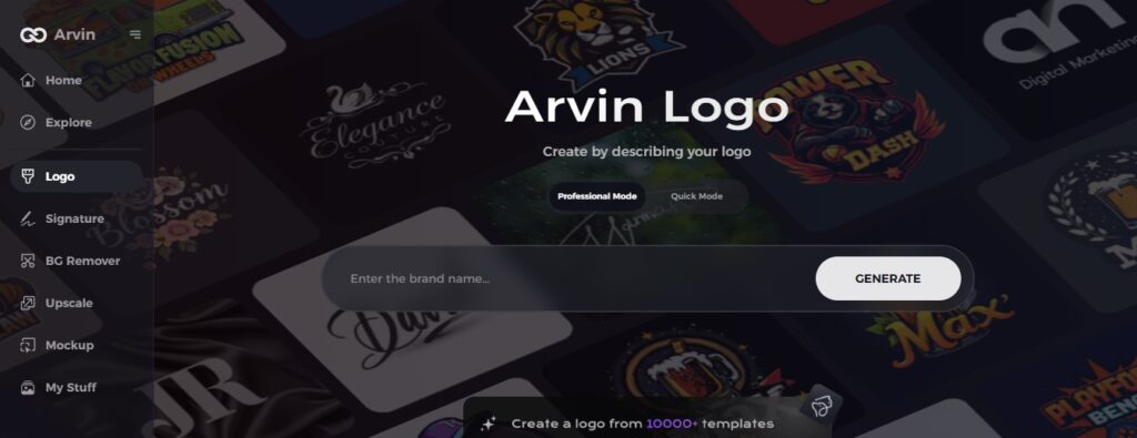
Step 2: Give your brand details and design preference
Please insert your brand name, slogan, and industry. You may also specify the type of design that you like and which type of font and what type of theme with images.
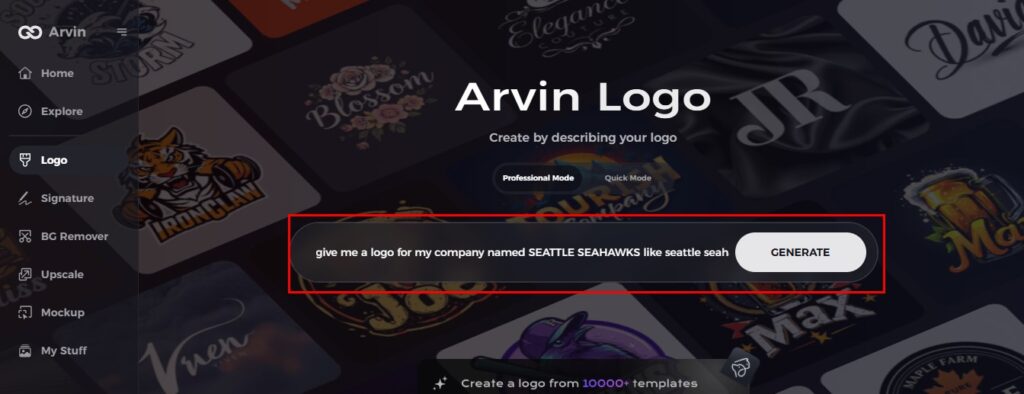
Step 3: Choose Your Industry
Please choose your industry or niche. This helps Arvin AI come up with suitable logo styles and design elements best for your brand’s needs.

Step 4: Pick a Design Style
Choose a style that resonates with you. This will provide the inspiration for your logo, guiding the AI in crafting your ideal design.

Step 5: Customize your design with Arvin AI tools
Once Arvin AI generates a logo, personalize it using various tools. Adjust font styles, layouts, and symbol placements until you satisfy with the result.

Step 6: Save and download your logo
Preview the logo. Save it in a high resolution for use in various digital and print applications.

Conclusion
Decades later, the F1 logo still symbolizes excellence in motorsports. Its journey highlights the ever-changing landscape of Formula One, striking a balance between evolution and adaptation. While remaining true to its roots. If you are seeking to design a logo that effectively represents the essence of speed and competition, then Arvin AI is the perfect tool for you. Users can easily bring brand vision to life with its powerful, AI-driven design capabilities.
FAQs
What does the F1 logo represent?
The F1 logo represents speed, innovation, and high-performance racing, which is the spirit of Formula One.
Who designed the new F1 logo?
The 2018 F1 logo was designed by Wieden+Kennedy as part of Formula One’s rebranding strategy under Liberty Media.
Can I use the F1 logo for personal or commercial use?
No, the F1 logo is trademarked, and unauthorized use can lead to legal consequences.
How can I create a custom racing logo like the F1 logo?
You can use Arvin AI, an advanced AI logo maker, to design a high-quality motorsports-inspired logo effortlessly.

