
Speaking of sports entertainment, the name of ESPN will come to mind. Over the years, ESPN’s logo design has become an iconic symbol in the world of sports broadcasting, creating the sympathy of fans and designers. Whether you’re a sports fan or a graphic design professional, the history and transition of ESPN’s logo design is an interesting glimpse into branding, creativity and visual identity. In this article, let’s explore the birth and transition of the ESPN logo design and stroll along the trail of memories.
Part 1: Meaning and History of ESPN logo
The current ESPN logo has been in use since 1985. These kind of iconic logos is written with a very modern signature font. The upper part of the letter is separated by a gap from the other part, and it is lined up to complement the rest. The simple design makes no doubt the effect of the ESPN logo. In most cases, the acronym is white or vice versa to red ground. Red symbolizes passion and power, white symbolizes purity and excellence.
1979 – 1985
Back in the late seventies, ESPN’s logo design was an extremely important event in the history of sports broadcasting and graphic design. ESPN logo design, which first saw the day on July 14, 1978, became a full-fledged attribute of TV programs on September 7, 1979, a visual clue for millions of sports lovers around the world. So what was so attractive about ESPN’s logo design from 1979 to 1985? The secret was minimalism and stunning logo colors usage.
1985 – Present
The history of logo design is full of twists and turns, but the logo design of ESPN is no exception. Since 1985, the current ESPN logo has become a globally recognized symbol. If you are a graphic designer, you already know the importance of choosing the right logo fonts. But the evolution of ESPN’s logo design in 1985 gave us an unforgettable lesson in how fonts redefine the brand’s image.
Part 2: Design Elements of ESPN Logo
Following are the main design elements of the ESPN logo:
Emblem
The first ESPN logo was announced on July 14, 1978, but it was first used on television on September 7, 1979. The original emblem was a slightly pale red color with the letters “ESPN.” This design was placed in a white ellipse with a thick orange edge. The current emblem was created in 1985. Although movement and dynamism have increased compared to previous versions, you can see the association with traditional logos.
Font
The 1985 logo was inspired by a typeface called “Stop” designed in 1971 by Aldo Novarese, a prolific typesetting designer who worked at Nebiolo. However, the author of the logo did not leave this typeface intact. The designer who chose the most impactful part, the white stroke above “E,” made the logo based on it. The white stroke was extended further and now extends to all characters. Of course, the glyph shape has been modified to fit the new visual concept.
Part 3: Evolution of ESPN logo design
ESPN logo redesign is not simply a matter of adjusting font and color, it’s a narrative full of tale of decades-long graphic design trend, ideology, and strategy. To place alongside the evolution of ESPN visual identity, we’ve seen such modifications which educate and inspire us. To understand the evolution of ESPN logo design, let’s consider five fundamental areas which bear witness to the creative potential of this legendary brand.
Adoption of minimalism
ESPN’s logo design began with a minimal approach of simple deficit on a white area wrapped in an orange ellipse. This refreshing design reflects the design trends of the time and became a powerful foundation for future iterations. Minimalism here was not just an aesthetic choice, but a clarity, simplicity, and direct expression.
Bold reinvention
The transition from early design to 1985 version was a bold step in rebuilding the brand without clinging to its previous identity. This stage of ESPN logo design using Stop fonts and unique crosslines shows how bold changes redefine brands and create new visual identities that call for audience empathy.
Typography as a storyteller
The 1985 selection of Stop fonts played an important role in storytelling, not just in aesthetics. Enlarged and slightly oblique, the font contributed to conveying movement, progress, and energy, an essential property for sports networks. ESPN’s logo design demonstrates how typography can be a powerful tool to tell the story of a brand.
Reflectivity and Innovation
The biggest feature of ESPN’s logo design, the white line across the red letters, is not limited to decorative designs. This innovative addition brought a new level of depth that symbolizes movement and speed, and matched the logo with the core values of the sports world.
Timeless charm
Since 1985, ESPN’s logo design has remained strong. With a balance of boldness, simplicity, innovation and friendliness, this logo continues to be loved over time. The evolution of ESPN’s logo design is an attractive case study that gives insight into the world of branding and design.
Philosophy and meaning in ESPN logo design
Symbols of movement and energy
ESPN’s logo design condenses the essence of sports by using skillful lines and angles. The white line intersecting the diagonal character reflects the dynamism and excitement inherent in the world of sports, creating a sense of movement and energy. It is a casually powerful way to harmonize the brand with its content.
Color psychology
It is not arbitrary that red is used consistently in the logo design of ESPN. Red is often reminiscent of passion, energy and action, but these are all important elements of the sport. The juxtaposition with white adds purity and simplicity, and the previous version of the orange ellipse adds an enthusiastic touch. The combination of these colors creates emotional connections between viewers.
Boldness and reinvention
The 1985 change was an extremely important moment to show the philosophy of boldness and reinvention. ESPN’s logo design was completely revamped, abandoned the old version, and stepped into a new era. The ability to embrace and innovate this change is a message that inspires both the industry and the audience.
Meaningful minimalism
Both the early ESPN logo design and the current ESPN logo design adopt a minimal approach. Just because it is simple proves that there is no depth. By carefully selecting fonts, colors and elements, ESPN’s logo design conveys rich messages without unnecessary complexity. It is a testament to the philosophy that “less is more.”
Timeless relevance
Since 1985, ESPN’s logo design has shown its philosophy of creating timeless relationships. The logo maintained its position between popular public trends and creativeständ innovative concepts which shielded it from modifications. ESPN’s logo design is not just a graphical representation of the brand, but also a narrative rich in symbolism, emotion and philosophy.
Part 4: What should we learn from ESPN logo design?
A designer can get lessons by watching established brands. The ESPN brand logo is a good source of design since it has a changing history and deliberate concept creation. The logo is a sports network brand image as well as a display of basic design concepts through being simple and symbolic. Designers need to know what from the ESPN logo design. The brand and design strategy has five significant points that are our guide.
Power of simplicity
The ESPN logo design tells us that complexity is not a prerequisite for impact. Both the initial and current versions of the logo emphasize simplicity and clarity, demonstrating that strong and minimal designs resonate deeply in the hearts of the audience. The lesson here is not too complicated.
Embrace bold change
What is impressive about ESPN’s logo design is the bold turn of 1985. He stepped fearlessly into something new without clinging to the past. This highlights the importance of choosing innovative designs with courage.
Strategic use of typography
The 1985 change to the Stop font was not just a style choice but a strategic one. By choosing a font that resonates with the brand’s identity and making it slightly oblique, ESPN’s logo design created a sense of movement and energy. When selecting fonts, it is important to match typography with the core message of the brand, as well as aesthetic sense.
Symbolism and Emotional Connections
The introduction of a white line intersecting with the red letter added a meaningful layer to the logo. This reminds us that all elements of the logo have symbolism and can connect emotionally with the audience. ESPN’s logo design gives design depth and teaches you how to tell stories that go beyond just visuals.
Creating timeless designs
Since 1985, ESPN’s logo design has emphasized the importance of creating timeless designs. It not only reflects the current of the times, but also teaches us to balance fashion and longevity by creating a logo that endures the trials of time. The challenge is to be contemporary without being temporary. ESPN’s logo design is more a comprehensive lesson in design philosophy than a well-trained emblem.
Part 5: Arvin AI – The Best Logo Creator for Trucking Business
A solid ESPN logo design is just one of the most important ingredients of branding for any trucking business. They communicate professionalism and build trust through recognition in an industry that becomes very competitive over time. Arvin AI has a great solution for the ease of logo creation. This AI-powered tool offers intelligent design recommendations, the most extensive customization options, and templates that conform to any industry.
Key Features of Arvin AI
- AI-Logo Generation: It uses smart algorithms to study your business requirements and produce unique, professional logo concepts.
- Large Templates Library: Pick a design from multiple supplied designs created specifically for the trucking industry.
- Customization Tools: Just tweak the icons, fonts, and colors to suit the identity of your company.
- Industry-Specific Icon: Suitable icon and font recommendations in line with trucking industry branding standards.
- Color Palette Recommendations: Best Color Schemes to match your brand consistently with expert curation.
Steps to Use Arvin AI for making Logo
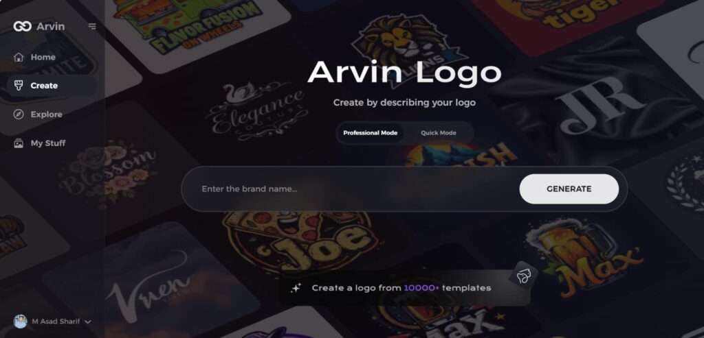
Step 1: Visit the Arvin AI Website
Open your web browser and navigate to the design page at Arvin AI to begin the process of creating your band’s logo.
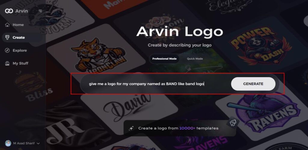
Step 2: Fill Out Your Band Information
Enter essential details such as your band’s name and music genre. This information helps the AI generate logo designs that align with your band’s identity and style.
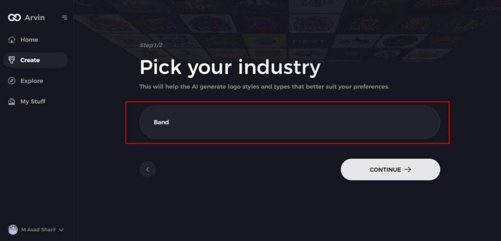
Step 3: Choose Your Genre
Select a genre from the list provided. This helps the AI refine the logo styles and designs based on your band’s specific genre and aesthetic.
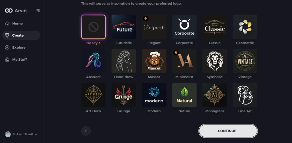
Step 4: Pick the Design Style
Browse through the available styles and choose one that best represents your band’s image. If you’re unsure, you can skip this step, and the AI will generate designs based on default inspiration.
Step 5: Review Logo Ideas
The AI will generate a variety of logo concepts based on the information you’ve provided. Review the ideas and select the ones that best capture your band’s spirit.
Step 6: Personalize Your Logo
Refine the selected design by adjusting elements such as colors, fonts, icons, and layout to match your band’s unique style.
Step 7: Download Your Logo
Once satisfied with your logo, download it in formats like PNG or SVG. These formats ensure compatibility for use across websites, social media platforms, and print materials.
Conclusion
The logo design process at ESPN demonstrates remarkable creative vision as well as innovative and perceptive qualities which contribute valuable knowledge to the field of graphic design. From its birth in 1978 to the timeless design still in use today, this logo is a testament to the power of simplicity, boldness and thoughtful symbolism. Those who want to construct brand identities with strong emotional meaning should read this text. Arvin AI lets you easily come up with great logos without design skills. It has smart design suggestions, customization options, and industry-specific templates.
FAQs
What is the meaning of the ESPN logo?
In 1985 they introduced the iconic ‘speeding’ design with the red streak, which is still recognizable today. It’s meant to reflect motion and energy, fitting for a sports network.
Why did ESPN change its logo in 1985?
ESPN redesigned its logo to have a stronger and more recognizable brand image. The new design made the logo more attractive and in sync with the network’s increased popularity.
Has the ESPN logo always been red?
No, it was originally black and white and less complicated. The currently iconic red added later to make it stand out more and to promote recognition.
Will ESPN change its logo in the future?
Since it has been decades when ESPN’s logo was not modified, some tweaks can be made for modern design. It won’t transform completely because the existing logo is well known and reputable.
