The branding world is an exciting world, and any logo reflects the face of the company. Among all the styles, one such niche is carved by emblem logo through their classic yet powerful look. These are able to integrate text with imagery through a single frame. Their designs mostly resemble badges or seals impressions, and that is also an advantage because they convey authority, heritage, and professionalism, and that always works. Companies seeking a balance between tradition and innovation often turn to emblem logos for their visual identity.
Part 1: What is an Emblem Logo?
Emblem logos are very distinct, as they integrate words and symbols into a single image with a frame surrounding them. Iconic brands such as Starbucks and Harley-Davidson have managed to be at the top, and this indicates that, in competitive markets, emblem logos can be a very good option. It will provide visual storytelling and bring the brand and the identity to get the product to be timeless in any industry. The key traits of an emblem logo include:
- Unified Design: All the elements are enclosed within a frame, which gives a compact and polished look.
- Text Integration: Text is seamlessly integrated, often focusing on the brand name or a tagline.
- Symbolism: Emblem logos are full of symbolism, using imagery that aligns with the brand’s identity.
Examples of Iconic Emblem Logos for Brands
Emblem logos have contributed much in setting up global brand recognition. Below are some remarkable examples.
Starbucks:
Starbucks emblem; green mermaid, or a siren; it defines quality coffee on earth, circular, simple integration of text and graphics to explain its historicism and timelessness. Through its evolution, the cool logos have transformed to become exclusive to the iconic mermaid itself, showing its universal acknowledgment and timeless appeal as a symbol of sustainability and innovation.

Harley-Davidson:
Harley-Davidson shield badge is the epitome of strength, freedom, and rebellion. The boldness and angularity of the design speak of hardness and protection, which is not different from the quality in Harley-Davidson bikes. It is a cultural icon as this badge has grown over decades to become a symbol of open road lifestyle that biker all over the world appreciate.

BMW:
The BMW emblem is a perfect fusion of heritage and innovation, instantly recognizable with its circular design. Incorporating the blue and white colors of the Bavarian flag, the logo reflects BMW’s regional roots and pride. The sleek black frame and minimalist design are a statement of precision and modernity, placing it as a global symbol of excellence in automotive craftsmanship and technological advancement.
Why Emblem Logos Stand Out in the Competitive Market
In a saturated market, emblem logos provide a differentiating edge. Here is why they are so effective:
- Versatility Across Media: Emblem logos translate well across various platforms, from business cards to billboards, ensuring consistent branding.
- Timeless Appeal: Traditional design features make them more resistant to fads and trends that come and go, offering longevity.
- Trust and Credibility: Their structured, badge-like look portrays authority and reliability, hence appealing to the audience
- Storytelling Ability: With a combination of an image and words, emblems logos communicate a message, thus more memorable and impactful.
Part 2: History and Evolution of Emblem Logos
The origin of emblem logos comes from ancient seals and crests, which were made to represent authority, ownership, and authenticity. Kings, nobles, and institutions used crests with rich designs and symbols to show their lineage, power, and values. These first emblems were visual indicators in an unlettered society.
Evolution from Traditional to Digital Forms
As the societies developed, so did the design and use of emblem logos. This had mass production with new techniques of printing wherein emblems were easily reproduced onto goods and even promotion materials. The dawn of digital technology further innovated the look and feel of emblems wherein these can be in dynamic formats, scalable according to different kinds of digital media.
Relevance of Emblem Logos in Modern Branding
Despite the minimalist trend currently witnessed in design trends, it is evident that an emblem logo remains an element at the heart of branding. Structured designs or badge-like, authority exuded, professionalism shown and elegance that never ages create special effectiveness for such logotypes, especially within an area of institutions, automobiles and luxury goods. Creating confidence and recognition among hundreds by combining visual narration and classiness.
Part 3: Key Elements of an Effective Emblem Logo
Creating a good emblem logo requires careful consideration of its core elements. Typography can speak to the character of a luxury brands, symbols and imagery tell stories and color palettes evoke feelings. Scalability and versatility ensures that the design can function across different mediums and on different platforms, so that these are the two keys to creating a logo that will relate and last.
Typography
Typography plays a pivotal role in emblem logos, shaping how the brand is perceived. Serif fonts convey elegance and tradition, while sans-serif fonts exude modernity and simplicity. The choice of font must align with the brand’s identity, ensuring readability within the logo’s compact design.
Symbols and Imagery
Symbols and imagery are important in the way an emblem logo can be a story. Shields represent strength, animals represent specific traits, and these give visual indicators of what the brand believes in and offers. It must be meaningful, culturally relevant, and visually striking.
Color Palette
Emotions are induced by colors. Color plays an important role in brand recall. A perfectly selected color palette can give an emblem logo a long-lasting impression and a memorable message. Warm colors like red and orange deliver energy and passion, while cool tones like blue and green offer trust and calmness.
Scalability and Versatility
In today’s multi-platform world, an emblem logo must be versatile enough to look great on both large and small scales. It does not matter whether it is a billboard or social media profile picture; the logo should have clear and impactful details. Scalability means that it would not lose its integrity on any medium, whether it is print or digital.
Part 4: How to Create an Emblem Logo: A Step-by-Step Guide
Designing an emblem logo calls for a good understanding of the brand identity and creating its representation. Use modern design tools, and apply the balance and symmetry principles to make it bring it to a harmonious effect. Testing and refining would ensure clarity and scalability for modern applications with the branding aligned to the vision.
Understand Brand Identity
The first point in the process of creating an emblem logo requires understanding the brand’s personality. It means to understand the core values that they want to portray, their target audience and what message they want to speak to. By brainstorming sessions and developing mood boards, ideas get generated that will ensure it is well aligned with their personality.
Selecting the Suitable Design Tools
The right tools are the key to creating a professional emblem logo. Adobe Illustrator, Canva, and AI-driven tools like Arvin AI provide user-friendly interfaces along with advanced features. These platforms have templates, customization options, and scalability which the designers can play with multiple layouts, typography and colors.
Integration of Design Principles
For an emblem logo to be visually appealing, basic design principles must be followed. Balance refers to the fair distribution of elements so that everything is harmonious. Symmetry, often used in emblem logos, gives the impression of order and professionalism. Harmony is how the typographic elements, imagery, and colors come together so that every element of the logo fits well with the other.
Iteration and Finalization of Design
Once the basic design is ready, it is important to test and refine it. One should take feedback from stakeholders and potential audiences and identify where improvement can be done. Adjust the typography, colors, or layout to make the design clear and appealing. Finalize the design based on the requirements for scalability and versatility.
Part 5: Design Striking Emblem Logos with Arvin AI
Creating an emblem logo that perfectly captures your brand’s essence can feel like a daunting task, especially without professional design experience. This is where Arvin AI steps in, providing a seamless, intuitive, and efficient way to design high-quality emblem logos. Powered by cutting-edge artificial intelligence, Arvin AI combines advanced design tools with user-friendly interfaces, enabling anyone to craft logos that are both visually stunning and strategically aligned with their brand identity.
Key Features of Arvin AI
- Customization: Arvin AI analyzes your brand’s industry, values, and preferences and suggests tailor-made design elements.
- Large Template Library: With a library of pre-designed emblem logo templates, Arvin AI has options for a variety of industries, such as education, food and beverages, and automotive.
- Real-Time Previews: Visualizing your emblem logo across different mediums is critical. With Arvin AI you can also see how you design will look on business cards and social media.
- Drag-and-Drop Interface: The drag-and-drop interface of the platform is intuitive and makes it accessible to users with any level of skill.
- Advanced Editing Tools: Arvin AI offers advanced tools for editing. This has enabled the accurate adjustment for balance, symmetry, and even alignment.
- Collaborative Features: Team collaboration is made easy with Arvin AI’s sharing and feedback functionalities. Share your designs with stakeholders and incorporate their input directly within the platform.
Steps to Crafting Your Iconic Emblem Logo with Arvin AI
Step 1: Create an Account and Log In
Begin by visiting Arvin AI’s website. Create an account and log in to access the logo design feature, where you’ll start the process of creating a memorable emblem logo for your brand.
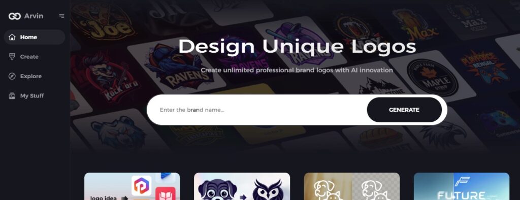
Step 2: Enter your brand details
Fill in the crucial information that would include the name of your brand, slogan, and industry, as well as any design preferences, such as preferred font styles, colors, and visual themes, to help the AI create a logo that resonates with your brand’s identity.
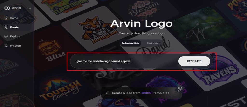
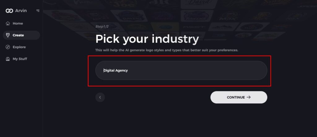
Step 3: Choose Your Industry
Select your industry or niche to help the AI generate logo styles and concepts that are specifically tailored to your sector, ensuring the emblem logo reflects the values and essence of your business.
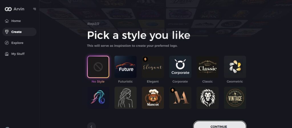
Step 4: Choose Your Preferred Style
Explore and select the style that you feel best suits you. Whether you are looking to achieve a classic, modern, or minimalist look, this step will define the general direction of your emblem logo design.
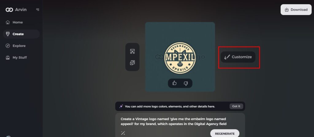
Step 5: Personalize the Design Using Arvin AI Tools
Once Arvin AI generates logo options, customize them using the built-in tools. Tweak font styles, adjust layout, and reposition symbols to refine your emblem logo.
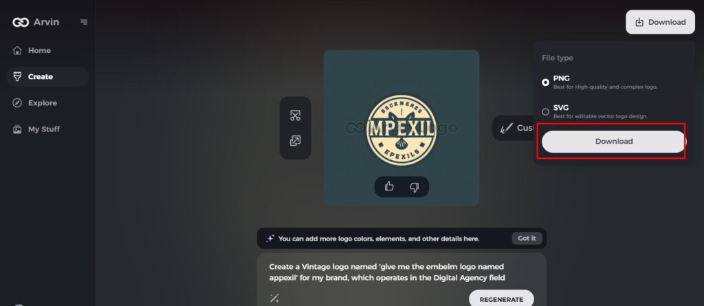
Step 6: Save and Download Your Final Logo
After finalizing your design, preview your logo in its entirety. Once satisfied, save and download it in a high-resolution format for both print and digital applications.
Part 6: Tips for Choosing the Best Emblem Logo Design for Your Brand
Selecting the right emblem logo entails aligning the design to the brand values, testing its scalability across mediums, and gathering feedback from stakeholders. These steps ensure that your logo communicates the essence of your brand while maintaining clarity and appeal in all applications.
Aligning the Design to Your Brand Values
Your emblem logo should act as a visual representation of your brand’s identity and core values. Start by understanding your brand’s mission, vision, and target audience. A cohesive brand image that resonates with your audience comes about when you ensure your brand is aligned with your values.
Testing Scalability and Readability Across Mediums
An effective emblem logo should look good on any platform – a billboard or a digital icon. Scale down your design to test, the readability and clarity of your details, text and imagery. Ensure that the smallest scale will not make details such as text and imagery fuzzy or illegible.
Seeking feedback from stakeholders and target audiences
Before finalizing your emblem logo, gather feedback from all stakeholders, team members, and target audiences for better insights into areas that still require improvement or elements to focus on. Use surveys or informal discussions to gauge what other people think about your design.
Conclusion
Emblems remain strong options for any brand, looking for timelessness, authority, and authenticity that their designs provide. Not only is creating a killer emblem logo with AI-based tools like Arvin AI possible, but also this provides the opportunity to design your logos in such a manner that they are likely to resonate with your target market. Let your creativity begin with Arvin AI and make the vision of your brand a reality!
FAQs
What makes an emblem logo unique?
An emblem logo stands out as a design that puts symbols and text together in one unit, often framed within. The integration of these two elements creates a united and professional look that communicates authority, tradition, and a strong brand.
Can small businesses use emblem logos effectively?
Absolutely! Emblem logos are highly scalable and work both in the digital and print media. Being timeless also means less redesign often, so it is quite cost-effective. Small business houses could as well use them to greatly in propounding themselves as a branded presence.
How does AI simplify emblem logo design?
AI tools like Arvin AI make logo design quick and accessible by offering templates, customization options, and real-time previews. These tools eliminate the need for extensive design experience, allowing businesses to create professional logos with minimal effort.
What file formats are best for emblem logos?
PNG is best for digital applications, with high-quality transparency. SVG is best for scalable vector designs. For printing, EPS will ensure the best resolution and compatibility with professional printing processes. Keeping several formats will ensure versatility across platforms.

