For any company, the logo is an important element of the brand image. Companies will be cautious when creating logo designs to reflect companies and images they want to show. Everything from color scheme to font selection to image design is carefully considered. The Dutch Bros logo design has been given such consideration, the company name is clearly indicated, and the business impression is clearly given. Here we introduce the history and back story of the Dutch Bros logo.
Part 1: The birth of the Dutch Bros logo
Dutch Bros’ logo is not just a picture it tells of a famous coffee company planted solidly in society. With its iconic image and strategic evolution, Dutch Bros’ cool logo designs expresses more than the visual identity. But why this signature logo? During the first half of the article, let’s do an analysis at the manner by which the logo was created, from what elicited inspiration to what it performs differently.
Founding Philosophy
Founded in 1992 by brothers Dane and Travis Boersma, Dutch Bros started as a modest coffee shop in Grants Pass, Oregon. From its inception, the brand had a vision of creating a community hub rather than just a coffee shop. The first Dutch Bros logo, featuring handwritten letters and windmills, was the foundation for the brand’s priority on personal touch and quality.
Windmill Icon
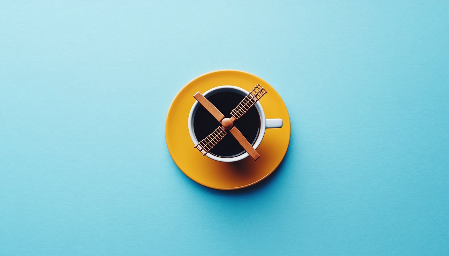
At the heart of the Dutch Bros logo is a windmill, a symbol deeply rooted in the brand’s Dutch tradition. The windmill serves both aesthetically as well as symbolizing the brand’s emphasis on diligence and innovation and unique coffee culture development. Loyal customers experience memories when they see the windmill design that has become the signature trademark of the Dutch Broth brand.
Modern adaptation
As Dutch Bros expanded beyond its modest starting point, the logo underwent a subtle modernization. The handwritten characters evolved into more sophisticated fonts, and the windmill maintained a central position representing continuity with the brand’s traditions while embracing growth and innovation.
Part 2: Meaning and History of Dutch Bros logo
History of the A Dutch Bros coffee founded in 1992. At first, it started humbly by providing espresso to the locals. Their vision was simple but profound. To provide special coffee while fostering community connections. This concept quickly attracted support. The business expanded by emphasizing not only high-quality beverages but also an unforgettable and energetic service experience.
1992 – 1993
The Dutch Bros logo gives off the charm of casual hand-drawn, expressing the relaxed but energetic atmosphere of the brand. Written in the freehand style, the character “Dutch Bros” looks like a personal whim, implying warmth and familiarity. It enhances the core service of the brand without emphasizing the main name. This logo communicates individuality and friendliness and conforms to a community-centered corporate philosophy.
1999 – 2016
The Dutch Bros logo incorporates a windmill graphic from the Dutch tradition, adding visual accents. The typeface of Dutch Bros is more sophisticated and unified, enhancing readability and professionalism. “Coffee” remains the dynamic form of the writing body, but is arranged to be held on the pedestal of the windmill, each element is integrated into a single unit. This design shift suggests a fusion of tradition and brand energetic personality.
2016 – 2021
In this logo, Dutch Bros adopted a minimalist aesthetic, throwing away the details of the windmill and making it a simple icon. The text “Dutch Bros Coffee” reflects the modern design trend and migrates to a modern, unified font. The color palette is narrowed into a blue monochrome that symbolizes a more mature and sophisticated brand identity. Overall, this logo reflects the shift towards minimalism and efficiency in brand expression.
2021 – Present
Returning to a more colorful palette, the Dutch Bros logo reappears vivid stripes and adds playful characters. The letter Coffee is lively and warm yellow. While maintaining simplicity, the added logo colors reflect the brand’s fun and engaging character, echoing its commitment to a cheerful, community-driven experience.
Part 3: Design elements of the Dutch Bros logo
The Dutch Bros brand feature a high-profile logo. Its bright color, big lettering, and simple design make it recognizable. All of them reflect the kind and playful personalities of the company. Dutch Bros stands apart from other coffee businesses by its exceptional features which bring in customers.
Font Selection
The handwritten script used in the early Dutch Bros logo conveyed a personal and friendly atmosphere. In modern times, the essence of friendliness and warmth remains intact and evolves into a more stylish and readable font. The selection of these logo fonts contributes to the attractive and comprehensive atmosphere of the entire logo.
Color palette
The Dutch Bros logo consists of a bright color palette of blue, orange and white. This combination coincides with the brand’s commitment to exuding energy, friendliness, and warmth to create a positive and uplifting atmosphere in coffee shops.
Part 4: The story about the Dutch Bros logo
Beyond being a simple symbol, the Dutch Bros logo serves to showcase both the brand history and its core principles and cultural heritage. This legendary symbol has gained popularity as a familiar symbol to everyone who adores coffee across the United States for many years of history. As Dutch Bros made a great progress over the year so it is one of the cute logos for your brand.
1. Community Symbols
The Dutch Bros logo is not just a visual identifier but a symbol of community connection. Dutch Bros stands apart from other coffee businesses by its exceptional features which bring in customers.
2. Tradition and Heritage
The windmill on the Dutch Bros logo is named after the brand’s roots, the Netherlands. Dutch Bros stands apart from other coffee businesses by its exceptional features which bring in customers.
3. Craftsmanship and quality
In the Dutch Bros logo, windmills express craftsmanship and quality. This means a meticulous process of grinding fresh beans, underscoring the brand’s commitment to providing customers with an excellent coffee experience.
Part 5: Maintaining consistency and Correct usage of Dutch Bros logo
As the vital branding component of Dutch Bros the logo embodies both brand cultural attributes and customer product recognition. Conservation of Dutch Bros professional brand name entails appropriate and continuous logo application to all firm platforms. The document contains mandatory instructions that serve to ensure Dutch Bros branding remains distinct, standardized and effective on all its usage.
Brand Guidelines
To ensure the integrity of the Dutch Bros logo, the brand has established comprehensive brand guidelines. This guideline sets out how to use the logo, color code, and clear space requirements, and promotes consistent professional representation across various platforms.
Products and Packages
The Dutch Bros logo stands out among goods and packages. From T-shirts to coffee cups, the consistent application of the logo increases the brand identity and acts as a visual cue for Dutch Bros’s distinctive coffee culture.
Digital Platform
In an era dominated by digital interaction, the Dutch Bros logo extends its reach to various online platforms. The brand’s websites, social media profiles and digital ads feature prominently placed logos to create a unified online presence that echoes a high-tech audience.
Part 6: Brand Identity of Dutch Bros
The Dutch Blossom brand identity calls for the empathy of those targeted. Dutch Bros is energizing to provide customers with a positive and uplifting experience. From the moment you encounter the lively logo and friendly employees of Dutch Bros, your customers are surrounded by a unique brand atmosphere that connects with warmth.
From Passion to Popularity
The story of Dutch Bros’ brand identity begins with its founders, Dane and Travis Boersma. In 1992, the brothers started a coffee venture in Grants Pass, Oregon, with a push car. Their passion to create exceptional coffee and develop true connections between people quickly gained popularity and led to the establishment of the first Dutch Broth coffee stand.
Corporate Culture as a Marketing Strategy
One important aspect of Dutch Bros brand identity is its corporate culture and plays an important role in marketing strategies. Dutch Bros employees are referred to as “Broisters” and educated to prioritize creating memorable experiences for their customers. This positive and enthusiastic corporate culture is reflected in every aspect of the customer’s contact with Dutch Bros employees.
Continuous Training for Excellence
In the background, Dutch Bros committed to employee personal and professional development. Through ongoing training and capacity building opportunities, we enable our employees to perform to the best of their abilities. Such corporate culture focus not restricted to individual store levels. Dutch Bros also ensures employee well-being and wellbeing and fosters employee dedication and loyalty. The outcome improved customer service and positive word of mouth.
Part 7: Variations of Dutch Bros Logo
The Dutch Bros logo has multiple variations. One variation is the same in general design, but the character DUTCH BROS ‘ drawn in white and the logo placed in a dark blue background. Another variation of the main logo is the blue windmill mark above the blue letter “DUTCH BROS,” but the yellow and red letters “Coffee” lined up under the name, and there is no horizontal line.
Simplified Logo Design
In the simplified version of the logo, the letters and horizontal lines of “Coffee” omitted. The simpler logo only written “DUTCH BROS” in blue under the blue windmill design. In addition, more elaborate design variations have appeared in disposable coffee cups. According to Logo Lynx, the windmill of this logo design is not a simple block color design of the main logo, but more attention to detail. Blue and white images include sail details.
Visual Balance and Branding
The roof of the windmill is light blue, which is also used for the vertical stripes of the windows and doors. To emphasize the shape of the “X” of the windmill sail, the vertical stripes of the windmill body and the arched windows on the pale blue stripes use dark blue. The letter “DUTCH BROS” is written over two lines, the letter “D” is written between the upper two sails of the windmill, and the letter “BROS” is written next to the sail in the upper right.
Unique Tulip Design in the Logo
Yellow outline to black. Below it is the letter “Coffee” written in red, surrounded by a yellow outline. Under the letters, the lower right of the windmill body is designed with tulips that are not found in other logos. This design has red and yellow tulips, both of which have green stems and leaves. Tulips are alternately colored and red flowers are taller than yellow flowers. Like windmills, tulips are symbols of Dutch and Dutch culture.
Design Adaptations in Coffee Cups
Similar variations of this design are also depicted in the company’s coffee cups. The character and tulip design remain unchanged, but the windmill is only white and dark blue, and there is no light blue part. Details such as windows on the torso of the windmill have been lost, and the design has become somewhat simpler.
Part 8: The impact of logo on brand identity
The evolution of the Dutch Bros logo greatly influenced the company’s brand identity. Strong visual identity helped the Dutch Bros to have a clear presence in the crowded coffee market. The logo represents the company’s values, such as its dedication to quality, community involvement, and vibrant culture.
- Brand Recognition: As Dutch Bros expanded its operations across multiple states, the easy-to-recognize and impressive logo helped establish brand recognition in different markets. The clear logo makes it easy for customers to identify Dutch Bros locations and products.
- Cultural symbols: logos have evolved into cultural symbols, especially among younger consumers. The logo symbolized a dynamic, upbeat and social way of life. This brand attracted not just coffee, but also individuals looking for social experience and belongingness.
- Marketing and Merchandising: The evolution of marketing and merchandising logos has expanded the opportunities for merchandising. Dutch Bros utilized logos on a variety of products, from apparel to accessories.
Part 9: Introducing Arvin AI for Logo Branding and Design Insights
Branding trends in the present world are giving a new sense to the structures of making and settling logos. Arvin AI is providing sharp visions to enterprise-level business regarding effective logos by giving data-based recommendations for repositioning of branding methodology. Analyzing all the various features of a logo, from color to shape and alignment, Arvin AI guides businesses to align their designs with the values of the brand and the hopes of their target audience.
Key Features of Arvin AI
- Design Analysis: It analyses the color, shape, and composition of a logo.
- Variety Arrangement: It measures if a logo portrays a company’s values and mission.
- Customization Suggestions: It provides actionable recommendations for improving logo appeal and effectiveness.
- Performance Metrics: It tracks how logos perform across different platforms and mediums.
- Trend Insights: It identifies current design trends and benchmarks your logo against competitors.
Steps to Use Arvin AI for making Logo
Step 1: Access the Arvin AI Logo Maker
Open your web browser and navigate to the Arvin AI logo maker page to begin designing a logo that resonates with your brand’s identity.
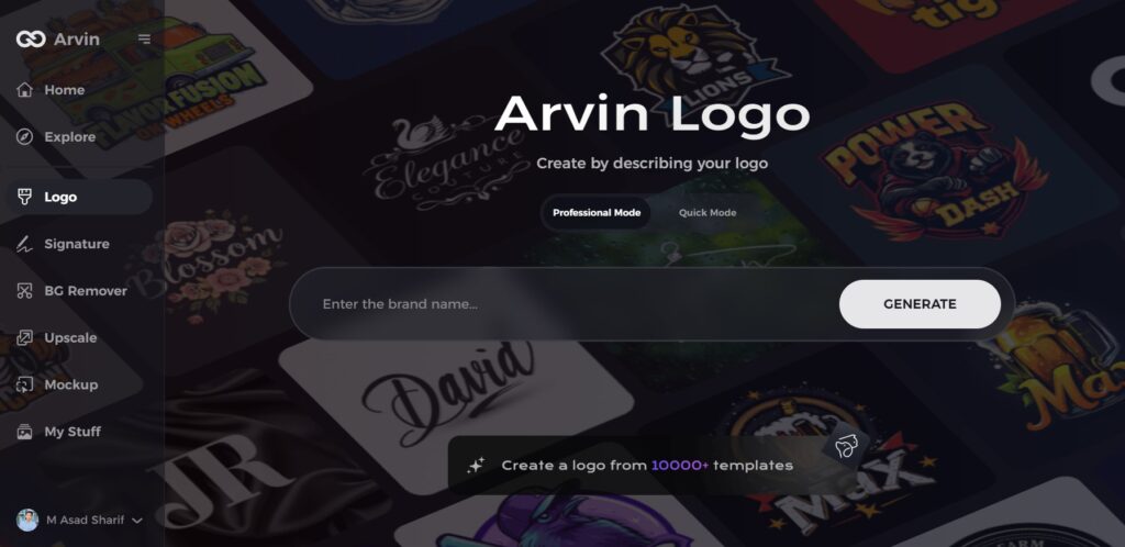
Step 2: Input Your Business Details
Provide essential business information, such as your business name and category. This allows the AI to generate logo designs tailored to your brand.
Step 3: Specify Your Industry
Select your industry from the provided list. This step helps the AI refine the design options, drawing inspiration from styles relevant to your business.
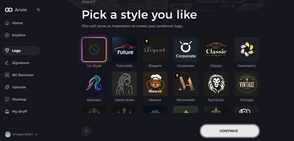
Step 4: Choose a Design Style
Explore the available design styles and select one that aligns with your brand’s vision. If you’re unsure, you can skip this step, and the AI will create designs based on its default inspiration.
Step 5: Explore Logo Concepts
Arvin AI will generate multiple logo concepts based on your inputs. Review these designs and identify the ones that best represent your brand’s image.
Step 6: Customize Your Design
Personalize your chosen logo by adjusting colors, fonts, icons, and layouts to reflect your brand’s unique style and values.
Step 7: Download Your Final Logo
Once you’ve perfected the design, download your logo in versatile formats like PNG or SVG. These formats ensure your logo looks great across websites, social media, and print materials.
Conclusion
Not merely a visual emblem, the Dutch Bros logo represents a rich historical icon that intersects themes of culture, heritage and attention to excellent workmanship. Windmills stand for Dutch origins and values and commitment in honoring the quintessential Dutch values as seen within their coffee society. In this industry that works on trust and consistency, a Dutch Bros logo serves as a stability and innovation indicator. Tools like Arvin AI make it easier and more exciting to analyze and improve logo design for branding.
FAQs
What inspired the original Dutch Bros logo design?
The hand-drawn nature of the original logo was a reflection of the company’s humble beginnings and founders’ intention to create a warm, genuine brand image.
What font is the Dutch Bros logo?
The typeface used in the Dutch Bros. logo is Peignot bold. It features uppercase letter forms in place of lowercase.
How has the Dutch Bros logo evolved over the years?
The logo has progressed from loose hand-drawn to more structured and colorful designs incorporating the windmill icon and clean looks.
What are the key features of Arvin AI in logo design?
Arvin AI provides AI-aided design support, customizable templates, simple interface, collaboration in real time, and usage of a gigantic library of assets for creating business logos.