Speaking of iconic branding, there is no image that can be understood as quickly as the logo design of Dunkin Donuts. From playful fonts to attractive colors, this logo is a symbol of peace in the morning and in the cup. As graphic designers, we tend to look up the history of some famous brands; however, for Dunkin Donuts, the logo design is not any different. All this is a combination of history, art, and business sense that will create something simply unique. Here, I’ll closely look at the changes in the Dunkin Donuts logo design.
Part 1: History of Dunkin’ Donuts Logo
The Dunkin Donuts is one of the iconic logos in the world of coffee and baked goods. The company’s logo reflects growth, values, and branding. The company was started many years ago and has evolved since then. This article tries to discuss the history of Dunkin Donuts logos and goes through the story of its development, meaning, and transformation.
1950 – 1967
In a whimsical and wide logo world, the transition of the brand’s visual identity becomes an interesting story. The first logo design of Dunkin Donuts, especially from 1950 to 1967, is a nostalgic journey. How the logo evolves according to the changing brand philosophy, graphic designers do not need to look for clear examples beyond this stage of Dunkin Donuts logo design journey.
1967 – 1976
Dunkin Donut’s logo design from 1967 to 1976 was attractive to graphic designers and brand lovers. In this era, changes that formed the visual identity of the brand were introduced, and the spirit was embodied in a resonant form even today. One of the most striking changes of this era was the introduction of pink shades, which are now familiar with candy.
1976 – 2019
The Dunkin’ Donuts logo design from 1976 to 2019 differs greatly from the previous logo, creating new confidence and confidence in the identity of the brand. Graphic designers and enthusiastic fans of branding will appreciate the thoughtful and innovative steps taken in this era. An important change in this era is the abolition of the picture part of the logo. The cup, which had previously been a symbol of the brand.
2002 – 2007
In the multifaceted world of branding, design decisions are particularly insightful, reflecting the evolution of the brand and its keen understanding of the audience. It is prominent in the logo design of Dunkin Donuts from 2002 to 2007. During this period, in the Dunkin’ Donuts logo design, a Styrofoam coffee cup was added to the left of the company name in a conceived form.
2007 – 2019
The Dunkin Donuts logo design from 2007 to 2019 is a fun way to teach the art of refinement. During the last few years, the logo appears to be on minimal change. However, it has left a significant impact on the visual identity of the brand. To graphic designers seeking insight into the subtlety that characterizes the evolution of logos, this era is very rich with how small adjustments can make loud visual statements.
2019 – 2022
In the story of the evolving Dunkin Donuts logo design, 2019-2022 is considered an important chapter. This was the bold transformational period that portrayed not only changing visual identity but also the main change in recognition of the brand and communication with audiences. This is the day the company changed its name as well as logo for compliance reasons to the very wide range of products it offered.
2022 – Present
In the world of dynamic graphic design, longevity and relevance often depend on adaptability and sharp attention to detail. This is evident in the Dunkin ‘Donuts logo design from 2022 to present. The design at the core of the current Dunkin logo was established half a century ago, but it is still remarkably relevant.
Part 2: Dunkin Donut Logo Design Element
The symbol mark Dunkin Doughnut logo first adopted hot pink in 1960. The symbol itself depicts a stylized coffee mug with the circular “Dunkin ‘Donuts” character sunk in half. In 1976, orange first appeared on the logo. This wordmark consisted only of brand names written in orange and hot pink.
Color
The combination of orange and hot pink logo colors on the white area brings a cheerful and happy mood.
Font
The logo fonts used for the font word mark is very similar to the Debussy font and Frankfurter font. Suitable for a brand that specializes in selling coffee and doughnuts.
Part 3: Change in Logo Design of Dunkin Donuts
The evolution of Dunkin’ Donuts logo design is not just a visual change, but also a fascinating journey that traces the history of the brand, reflecting the evolution of marketing strategies, customer preferences and design trends. Here, we will comprehensively analyze the evolution of the Dunkin Donuts logo design and divide it into five important aspects that formed this iconic brand identity.
1. Emphasis on main products
The early Dunkin Donuts logo design featured a symbol of coffee and doughnuts. From a handwritten letter to a hot cup of coffee, these elements presented the brand’s major offerings and created an unmistakable connection with the product.
2. Adaptation to modern aesthetics
The changes in the logo during this period marked the transition to a more contemporary and versatile visual identity. Elements such as stylized coffee cups and the introduction of brown and orange accents reflect the brand’s desire to stay relevant and appeal to more people.
3. Simplification and inclusivity
During this phase, the Dunkin Donuts logo design was greatly simplified, removing certain expressions about coffee and doughnuts. This allows us to be able to interpret a wider array of products which the brand offers while also expanding the appeal without compromising the core base of the customers.
4. A casual tribute to tradition
Recent logo adjustments such as orange shades like pumpkins and dark apostrophes are a casual tribute to the brand’s original design. Through this, the current logo connects with its rich history and creates continuity while incorporating contemporary senses.
5. Timeless relevance through thoughtful evolution
The most fascinating thing about the evolution of the Dunkin’ Donuts logo design is that thoughtfully calculated changes can preserve timeless relevance. At each stage of evolution, the logo is characterized by its sensitivity to current trends and customer preferences, so that customers can always get empathy.
Part 4: Philosophy and meaning of Dunkin Donuts logo design
When the layers of Dunkin Doughnut logo design are chewed, not only aesthetics, but also rich philosophy and various meanings woven into the visual. The logo is just not a symbol; it is a story saying what the brand values, culture, and identity stand for. This section explains the philosophy and meaning behind the logo design of Dunkin Donuts and will cover the five essential aspects of the symbolic emblem.
Warmth and comfort
Dunkin Donuts logo design has consistently used colors and shapes that make you feel warm and comfortable. Pumpkin-like orange shades and plump familiar typefaces create a welcoming atmosphere that is synonymous with a cozy coffee shop by choosing this design.
Friendliness and Accessibility
Dunkin’ Donuts logo design uses simple, unadorned typography and clear images to represent accessibility. Dunkin Donuts’ logo seeks to initiate everyone towards enjoying Dunkin Donuts product experiences. The brand philosophy centers on this approach to welcome customers.
Tradition and Innovation
In its history, the Dunkin Donuts logo design has developed an exquisite line of incorporating innovation while emphasizing tradition. By casually tracing the original brown logo and making it modern and simple, this logo reflects the brand that always looks forward while respecting its roots
Inclusivity and diversity
The transition from product-specific logos to more abstract designs indicates that Dunkin now offers a wider range of products. It recognizes not only coffee and donuts, but also the diversity of customers and the diversity of products.
Simplicity and differentiation
The logo design of Dunkin Donuts stands out for its high memory. A distinctive color palette and symbolic elements such as a stylized coffee cup make it visible at a glance. This uniqueness is essential because the brand is competitive in the market.
Part 5: Impact of the Dunkin Donuts Logo
The Dunkin Donuts logo is the one that has resulted in the success of the brand. It is a visual icon synonymous with taste – doughnuts, and coffee characteristics. The evaluation investigates how Dunkin Donuts’s logo affects consumer brand understanding through its market-based promotional strategies.e.
Brand Recognition
The Dunkin Donuts logo is one of the most recognizable in the world. Vivid orange and pink caught the eye and memorable. The logo has evolved with the times, but the core elements of the coffee cup and brand name remain the same. Through its distinctive logo Dunkin Donuts maintains its strong corporate brand identity. Emotional connections form between customers because of the brand’s usage of bright colors in their logo.
Marketing Impact
The Dunkin Donuts logo is an important component of the brand’s marketing activities. It is majestically displayed on each of the products of the brand, ranging from cups of coffee to boxes of donuts. Due to its reputation building efforts the company stands as an industry founder alongside others within coffee and doughnut production.
Part 6: What to Learn from Dunkin Donuts Logo Design?
Beyond its visual appeal the Dunkin Donuts logo provides multiple lessons for successful branding together with effective design methodologies. Color and symbolism condense principles that work way beyond just the food business. Everyone working in graphic design may benefit from what this Dunkin Donuts logo teaches us. Five critical experiences provide guidance to our creative activities.
Consistency and Flexibility
Dunkin Donuts logo design teaches us the importance of maintaining consistency and flexibility. Even with a variety of variations, the identity at the core of the logo is not compromised, and it is evolving meaningfully without losing its essence. This balance is essential to create a strong and flexible brand image.
Emotional Connections by Color
Dunkin’s consistent use of warm colors, such as pumpkin-like shades of orange, shows how color can evoke specific emotions and connections to the audience. Learning this valuable principle means designers should apply color psychology between matching brand identity and customer response dynamics for product design success.
Simplicity and Clarity
Throughout its history, the Dunkin Donuts logo design has pursued simplicity. Whether typography or image, a clean approach ensures clear communication and immediate recognition. It reminds me of the fact that “there are so many things.”
Understand your Audience
The changes in the logo over the years show a deep understanding of customer base and market trends. From responding to coffee lovers to diversifying product offerings, the design choices clearly show an eye for the needs and wants of the customer. This particularly emphasizes that there is a strong demand for designers to research and empathize with their target audience.
Part 7: Fun Facts About the Dunkin’ Donuts Logo
The Dunkin’ Donuts logo is more than just a brand symbol—it’s a reflection of the company’s vibrant personality and iconic status. Let’s explore what makes the Dunkin’ Donuts logo so unforgettable.
Image Source is Here
We have seen both the logo of this famous brand and the strong history behind it, but we do not know everything. The brand has an interesting fact that even those who self-identify experts with respect to Dunkin Donuts and what they offer do not know much. For those who do not know about the Dunkin Donut brand, let us introduce that interesting fact. Let’s see some of the most interesting facts about Dunkin Donuts!
The First Store is Still Open
Do you remember talking about where Dunkin Donuts 1 opened? The first store is still in Quincy, reviving its glory. This restaurant has been open since the 1950s and can still be visited.
Every Country has its Own Doughnuts.
Dunkin Donut is international and decides to keep its footprint in every country with its stores. The franchise makes special doughnuts that reflect the local cuisine in every country. These donuts are original and unique, and there are also mochi donuts in Asian countries.
Sell Billions of Coffee
Dunkin Donut sells about 60 cups of coffee every second and 1 billion cups of coffee every year. America is moving with Dunkin’ Donuts. ” This franchise is used by people whenever coffee is needed.
Part 8: Arvin AI: Your Path to Timeless Branding
The Dunkin’ Donuts Logo stands as proof to the work of thoughtful design and brand constancy. Its harmony in simplicity, uniqueness, and relevance has put it on top of the symbols of innovative fitness. Creating such a bridge between creativity and precision, the core mission and value of the company can be conveyed via this logo over time. For everyone inspired by similar excellence in branding, tools such as Arvin AI offer that chance to give equal birth to such iconic logos.
Key Features of Arvin AI
- Custom Logo Making: Design a logo to meet the uniqueness of your brand.
- Ease-of-Use Interface: Start designing like a pro using an intuitive interface.
- Creative Precision: Join creativity with data-informed design guidelines.
- Brand Cohesion: Harmonize logos into the broader vision of your branding.
- Inspiration Library: Seek iconic examples and templates for ideas.
- Flexible Outputs: Design to accommodate all platforms and media types.
Steps to Use Arvin AI for making Logo
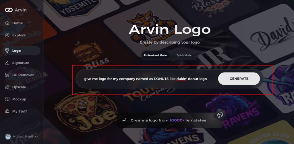
Step 1: Visit the Arvin AI Website
Open your web browser and navigate to the Arvin AI logo maker’s design page to kick off your logo creation journey.
Step 2: Provide Business Information
Enter essential details about your business, such as its name and category, to help the AI generate designs tailored to your brand.
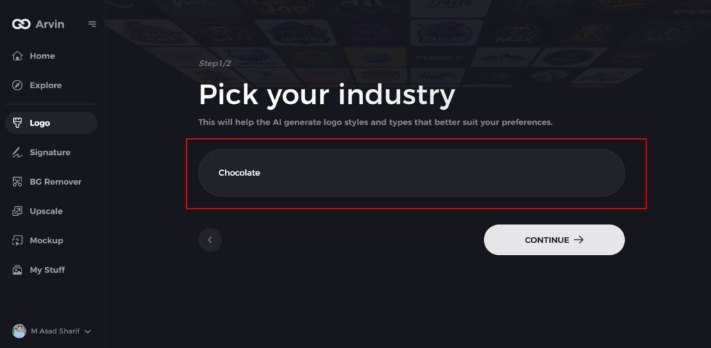
Step 3: Specify Your Industry
Choose an industry from the available list to help the AI focus on styles and concepts that align with your sector.
Step 4: Choose a Style
Explore the presented style options and select one that resonates with your brand’s identity. If none fit, you can skip this step and let the AI take creative direction.
Step 5: Review Logo Ideas
Based on the details you’ve provided; the AI will generate multiple logo designs. Browse through the options and identify those that best represent your brand.
Step 6: Customize Your Logo
Fine-tune your selected design by adjusting elements such as colors, fonts, icons, and layouts to better match your brand’s vision.
Step 7: Download Your Final Design
Once you’re happy with the result, download your logo in formats like PNG or SVG. These file types ensure flexibility for digital and print use, including websites and social media platforms.
Conclusion
The Dunkin’ Donuts logo evolution is a work in itself, giving testimony to the beauty that a design and its responsiveness can make for branding; it is perhaps one of the most inspiring cases in the world of designing. Every phase shows values of the brand, aspects preferred by customers, and the sharper idea of trends and what can work better. From colors to simplicity and inclusiveness the blend of tradition and innovation is evident in this logo. For new brands, tools such as Arvin AI are irreplaceable because they create logos that speak for mission and creativity, which eventually open the gates to iconic and timeless designs.
FAQs
What makes the Dunkin’ Donuts logo iconic?
People instantly recognize brand identity because vibrant colors and playful fonts evolve within an element of simplicity which creates emotional connections.
How has the Dunkin’ Donuts logo evolved over time?
From illustrations to modern designs, the logos have changed significantly with the branding strategy and changing needs of the customers.
What is the symbol for Dunkin Donuts?
In January 2002, the wordmark was cleaned up using the standard Frankfurter typeface, and an orange rough-hewn illustration of a tilted Dunkin Donuts cup above a rounded pink rectangle was placed to its left.
What is Arvin AI and how does it help in designing a logo?
Using Arvin AI users can develop customized expert-level logos through data-driven synthesis while preserving creative effectiveness via this distinctive creative design application.
