
Duke logo is a renowned emblem among university sports and scholarship that is extremely respectable. What is interesting about Duke is that as a prestigious institution in education, it has maintained the historical and symbolic value of its logo while making effective adjustments throughout the years. Its timeless design and versatility have made it relevant without sacrificing any of its inherent identity. In this article, we explain the history and development of the Duke logo and its influence.
Part 1: The History and Evolution of the Duke Logo
The Duke logo has changed over time, reflecting the university’s growth and identity. From early devil-themed designs to the modern block “D,” each version has played a role in shaping Duke’s strong and recognizable brand.
1936 – 1955: The First Blue Devil Logo
The first official Duke logo, developed in 1936, had a mascot-oriented design inspired by the Blue Devils, the nickname for Duke’s athletic teams. The Blue Devil was one of the figures included, featuring an evil set of horns and a sharp smirk, reflecting the team’s competitive nature. It was primarily used for sports branding at this time (especially basketball and football). The blue and white color scheme that is an indelible part of Duke’s identity today was first adopted during this era.
From Mid-Century Redesigns (1955 – 1978)
In 1955, Duke revised its logo to give the Blue Devil crisper, more refined look. This more aggressive approach had a sharper outline and more pronounced details, plus a more daunting expression for an aura of power and competition. As Duke was more successful in college sports, the logo was made with subtle changes to reflect its growing ability. By the late 1970s, many schools, including Duke, adopted simpler logos to develop a more professional and easily identifiable brand.
Major Rebranding (1978 – Present)
In 1978, Duke decided to remove the figure of the Blue Devil from the logo altogether. Instead, the university launched a contemporary, stylized “D,” that has stayed at the forefront of Duke’s logos since. The change reflected Duke’s growing prominence in academics and athletics. It was more than a new logo for sports — it was prestige and excellence, national recognition.
Symbolism and Meaning Behind the Logo
The evolution of the Duke logo captured an important time of the university’s history. The original Blue Devil mascot embodied competitiveness and athletic superiority. The mascot was refined through a mid-century redesign while retaining its fiery essence. The addition of the Bros. line to the transition into the modern “D” monogram symbolizes Duke’s global reputation, academic excellence, and strong branding. This evolution demonstrates Duke’s agility in embracing change while achieving a consistent and recognizable identity in both athletics and academics.
Part 2: The Modern Duke Logo (1978 – today)
The Duke logo is more than just a letter—it symbolizes tradition, excellence, and pride. Its clean, bold design makes it easy to recognize, and the blue and white color combination symbolizes the university’s strong academic and athletic identity.
Transitioning to a Branded, Clean Design
The 1978 rebranding embraced a minimalistic aesthetic in keeping with the times, and such was the fashion logo in higher education. The block-style “D” became an emblem with punch and widespread recognizability that resided in places ranging from athletics and academics at Duke. It was a change that aligned with the university’s goals of being simple, professional, and timeless. The Blue Devil mascot is still one of the most recognizable symbols of the Duke’s athletics.
Significance of the Iconic Block “D”
Block “D” letter represents strength, tradition, and pride. Its confident and excellent look and feel reflects the bold and geometric lines of the Duke brand which makes it a perfect match for the prestigious brand of Duke. Its clean lines and the combination of white and blue provide a certain elegance while also making it easy to recognize. Apart from aesthetics, the letter “D” has a profound legacy: it stands for Duke University as an institution and timeless, universal symbol of its everlasting excellence.
Use of typography and minimalistic design
The block-style typography for the Duke logo brings about memorability for a brand. “Designing a monogram like this as part of an identity mark for an elite institution feels like it carries a lot of authority.” The minimalistic logo approach to branding taken by Duke guarantees that the logo is versatile and adaptable. And within the confines of that successful institutional branding, the Duke logo manages to maintain a stable identity at the same time it is able to adapt to changing branding fashions.
Part 3: Duke Emblem in Athletics (Basketball, Soccer, Etc.)
So why the nickname “Duke”? That logo is a strong symbol in college sports, evoking excellence, history, and an imposing address. In basketball, football, soccer and other athletic programs, the logo is widely recognized and is an important part of Duke University’s sports identity.
Duke Logo in Athletic Programs
Duke University’s athletic teams, collectively called the Duke Blue Devils, are some of the most successful teams in NCAA history. The bold “D” logo, created in 1978, has become ubiquitous in university sports culture. The logo is featured prominently on jerseys, helmets, banners and stadiums, instilling Duke’s competitive spirit. One program that has especially popularized the logo at the college level is the Duke basketball team, which is among the most successful programs in NCAA history.
How Logo is Adapted for Duke Sports Teams
For individual sports teams, there are minor variations, but the underlying Duke logo remains the same. The basketball team’s design is clean, and the classic “D” remains on jerseys and courts. The football team might add bold blue stripes on helmets or special typefaces for numbers. The Duke logo is displayed on the jerseys of men’s and women’s soccer teams, reflecting team unity. Even club and intramural sports use the logo on their gear, which helps bolster Duke’s overall brand identity.
Iconic Scenes with the Duke Brand Front and Center
For the past several years the Duke logo has shared space in some of the most iconic and historic moments in college sports. Some key examples include:
- 1991, 1992, 2001, 2010, and 2015 NCAA Basketball Championships, in which Duke basketball, under legendary coach Mike Krzyzewski (Coach K), donned the iconic Duke logo as they claimed their national titles.
- The “Miracle Minute” in 2001, when Duke pulled off a miraculous comeback against Maryland in the Final Four.
- Duke Football’s 2013 ACC Coastal Division championship, the moment when Duke’s college football program was reintroduced on the national stage.
These moments aren’t just about Duke’s success; they’re also about cementing the Duke logo’s place in sports history.
Part 4— Duke Logo & Branding Strategy
The Duke logo is an important part of the university’s athletic and academic branding. Duke University has established a global brand identity and the logo helps unify and align a consistent visual approach in multiple spaces.
How Duke University Consistently Reinforces a Brand
Duke is also very careful across departments to keep its logo the same to maintain a strong brand identity. The logo follows a strict style guide to maintain consistency of use on athletic events, marketing materials, websites, and promotional merchandise. The branding maintains Duke Blue and white with purposeful typography and standardized size options to keep it professional and recognizable Duke’s consistent presence over time is a factor in its good reputation, making the logo a symbol of excellence.
Use of the Logo in Marketing, Merchandise, and Digital Platforms
Duke logo appears on official university websites, on the social media profiles including Twitter, Instagram and Facebook for athletics and academics. It can also be found on official merchandise such as jerseys, hoodies, caps and stationery. This trademark is also widely utilized in online advertisements and marketing campaigns and helps to reinforce Duke public’s global presence and visibility. The logo also serves a larger function by providing consistent branding, preserving it as a symbol of excellence.
Part 5: Design Your Professional Club Logo
Designing a professional and appealing logo requires experience and knowledge. But thanks to Arvin AI, you can create a Duke logo in minutes. Arvin AI is an AI-based logo maker that enables users to design stunning logos with ease. No matter what design you need — sports teams, academic institution logos, or businesses — Arvin AI gives you customization capability, so you can make creating a logo easy and professional.
Key Features of Arvin AI
- AI-Powered Logo Customization: Automatically generates logos based on user preferences.
- Pre-Designed Templates: Choose from a wide variety of sports-related and university-style logo templates.
- High-Resolution Exports: Download logos in SVG, PNG, and vector formats for print and digital use.
- Instant Brand Color and Typography Matching: Ensures color accuracy and font consistency.
- Easy Editing and Refinement Options: Customize every aspect, from font style to symbol placement.
Steps to Use Arvin AI for making Logo
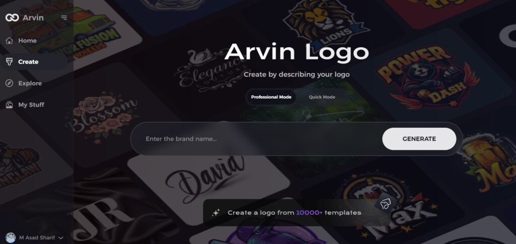
Step 1: Visit the Arvin AI Website
Begin by opening your web browser and navigating to the logo creation page on logo.arvin.chat to start crafting your bird-themed logo.
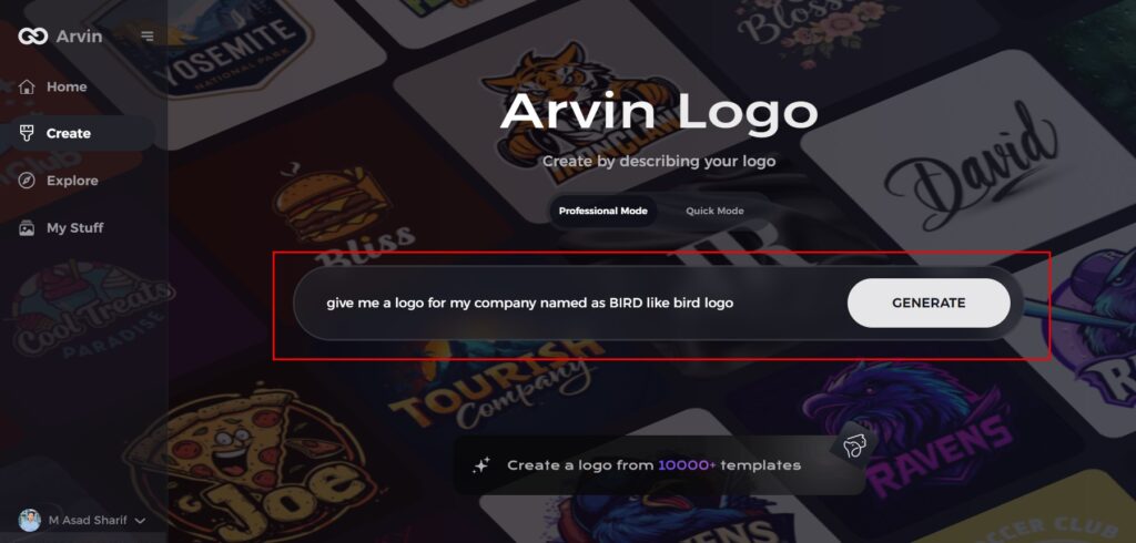
Step 2: Enter Your Business Details
Provide essential business information such as your company name and industry. This step helps the AI generate logo designs tailored to your brand’s identity.
Step 3: Select Your Industry
Choose the relevant industry from a list of options. This allows the AI to narrow down design styles and offer ideas that best match your sector.

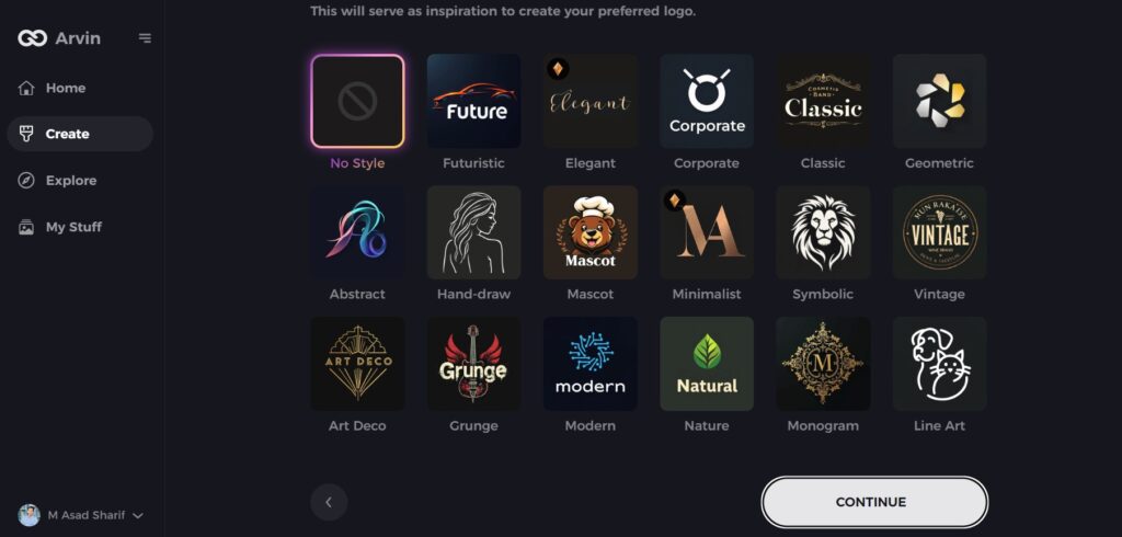
Step 4: Choose a Style
Browse through the available style options and select one that aligns with your brand’s vision. If you’re unsure, simply skip this step, and let the AI suggest a style based on default preferences.
Step 5: Explore Logo Concepts
The AI will generate a variety of bird-inspired logo concepts based on your inputs. Review the designs that resonate with your brand’s image and goals.
Step 6: Customize Your Logo
Personalize your selected design by adjusting elements such as colors, fonts, icons, and layout to make the logo truly your own.
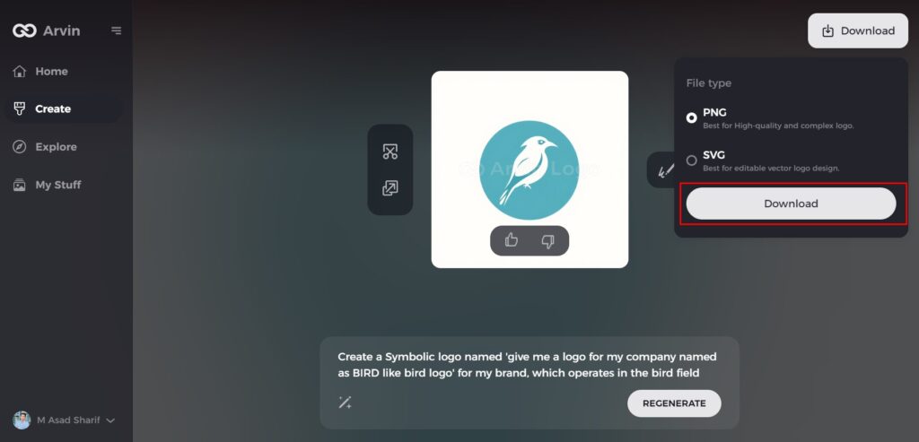
Step 7: Download Your Logo
Once satisfied with your customized bird logo, download it in formats like PNG or SVG, ideal for use on websites, social media, and print materials.
Conclusion
Duke’s logo symbolizes legacy, achievement, and loyalty to school, a very important aspect of academics and sports. Its straightforward but powerful design has enabled Duke to develop an identity known across the globe. Having a good logo is key to success for any organization. Designed for professionals who would like to create a professional logo on their own, Arvin AI also has AI-enabled tools, ready-made templates, and high-resolution downloads. Create a custom logo inspired by the proud Duke heritage in minutes, with a few clicks from Arvin AI.
FAQs
What is the logo of Duke?
The Duke logo represents the university’s tradition, excellence, and athletic pride, evolving from a devil-themed design to the current bold “D.”
Why was the devil image removed from the Duke logo?
In 1978, Duke University decided to simplify its branding and adopted the stylized “D” for a more modern and professional appearance.
What are the official colors of the Duke logo?
The Duke logo primarily uses Duke Blue (#003087) and white, reflecting the university’s official colors.
Can I create a Duke-style logo for my brand?
Yes, you can use Arvin AI to design a custom Duke-inspired logo with AI-generated templates and editing tools.
