This quality, with the combination of the word “DORITOS” remains in our memory. Since its initial launch by Frito-Lay in 1964, strategic branding efforts played a huge role in positioning Doritos as a household name. An eye-catching logo plays a significant role in creating an impact on the customers and adorning them. Over the years, the logo has been remodeled several times, each time getting in line with the up-to-date trends, but retaining its loud and vibrant character. The following article takes a look at the history, evolution, and impact of the Doritos logo.
PART 1: A logo design represents the identity of a brand
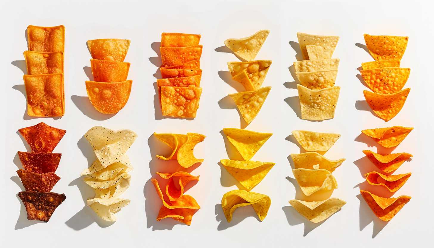
The logo design of Doritos has been one of the most vital aspects of brand success. The Doritos logo has seen several iterations over the years, all of which echoed the brand evolution, preferences of consumers, and latest design trends. Each and every redesign has been meticulously designed to strengthen brand recognition, through colours, typography and movement of elements. Among them, the triangle shape is one of the most unique characteristic which symbolizes both the tortilla chip itself and the brand’s bold, energetic personality.
PART 2: History And Evolution of Doritos Logo
Over the years, the Doritos logo has undergone considerable changes to keep up with the latest trends and consumer preferences. With each redesign, the brand shows its dedication to freshness, relevance, good looks, and its own strong identity in the snack food world.
Birth of Doritos and First Logo (1964-1973)
In 1964, when Doritos launched, the brand logo was simple and bold, aimed at establishing a snack food brand. It was a simple typography of all caps for that authoritative and trustworthy effect. The primary colors used were red and yellow, representing energy and flavor, making it popular among snack enthusiasts. This first design emphasized clarity and easy recognition, as Doritos would need to compete with newer brands like Utz. Also, the first logo set a precedent for the future logos, making the brand recognizable.
The Logo of 1973-1979
Doritos introduced a new, more colorful and playful logo in 1973 to boost the brand appeal. The design, which was inspired by traditional Mexican culture to cement its connection to tortilla chips, featured orange, yellow and brown rectangles. This update rendered the logo eye-catching, allowing Doritos to capture attention on store shelves. The vibrant colors used were consistent with the brand’s bold and spicy flavors, reinforcing consumer recognition. The new, younger orientation was welcomed, helping to position Doritos as an active snack brand with a fun and lively spirit behind it.
The 1979-1985 Logo
In 1979 Doritos simplified its logo to more successfully establish a clean, structured look. The new design incorporated a modern font with sharper edges, lending a more professional and structured appearance to the overall look. It kept the rectangular elements more visually balanced, adding polish and unity to the overall look. With its updated logo, Doritos was then able to focus on strengthening its branding efforts, appealing both to its existing fan base, the brand faithful, as well as the all-important new consumer.
1985-1994 Logo
In 1985, Doritos made a daring move by creating a triangle in its logo that alluded its tortilla chip. This also contributed in easing the gap between the brand’s visual identity and product. It had edges that were sharper and a colour palette more in line with the modern period. This triangle concept became an integral part of the Doritos branding which enabled instant recognition. Thus shape allowed Doritos to contrasted from other chips and enforce its identity as a bold, full of flavor snack.
The 1994-1999 Logo
The playful, vibrant logo first appeared in the 1990s. It was simple and unpolished, looking both playful and unplanned, with messy red and yellow elements. It had bold and slightly haphazard typography that was playful and edgy. The redesign aimed at attracting a younger audience to the product, which is in keeping with Doritos’ adventurous brand personality. Although the logo was promotional, they ultimately changed it to a more structured style to remain consistent and allow more visibility on different marketing sites.
The 1999–2000 logo
In 1999, the logo given a radical design change with a black background which made the logo even bolder and louder. The type was stretched and brawn, conveying authority and power. However, this version only stuck around for a short while, due to the dark background making the packaging seem too heavy and uninviting. Consumers didn’t connect with the new look and preferred the bright, bold design that had become a signature of Doritos.
The Logo 2000-2006
The 2000 redesign brought back the triangle idea in a sharper, more defined appearance. It got a slicker typography, creating a more modern and high-impact brand. The triangle formed an important part of the lettering, and the association between the brand and its product was established thereby. This redesign enabled Doritos to strengthen its branding and made the logo more visually adaptable for digital and print marketing. However, the triangle shape was soon refined, with Doritos then making the move to be a trend-setter in terms of snack branding.
The 2007-2013 Logo
In 2007, they reshaped their logo into something sharper and bold to stand out more and drive engagement. They were given shadows and depth effects so the logo took on a dimensional quality, making it more visually compelling. The style was italicised; the letters were shown as seated on an edge, leading an athletic pursuit. These changes were intended to reflect the brand’s bold flavors and sensational marketing. Doritos incorporated a more action-oriented look that weaves its logo into the fabric of culture and society of the time.
The 2013-Present
In 2013, Doritos simplified its logo to fit with the modern trend style. The new design uses a simple, lightning-bolt triangle, making sure it is recognized on both digital and physical surfaces. The typography will still be bold, but clean enough that the brand commands authority. The new logo design is a reflection of the increasing trend of minimalism in branding, enabling the brand to communicate more effectively through design. The design is likely to endure for years to come, finding a logical balance between tradition and contemporary times.
PART 3: Key Elements of the Doritos Logo Design
Just like the Doritos logo: Another great example of strategic branding, strategic use of shapes, colors, and typography to create an identity. In attracting consumers and establishing brand identity, each element is important. From the daring triangle shape to the vibrant color palette and impactful typography, every element is crafted to make a statement. And applying the logo on packaging and advertising shows how effective it as a product for the snack industry can really be, as people are able to see it and connect with it.
The Triangle Shape – Representing the Product
Finding the right geometry is very important for brand image, as shapes form strong visual associations in consumer mind. The triangle symbolizes energy, excitement and boldness, and so it fits naturally with the dynamic personality of Doritos.” This logo is generalized, because the sharp angles provide distinctive features such as increase brand recognition. This triangle shape in marketing symbolizes action and movement. Which gives a nudge to the consumers to act on it, thus go for the product.
The Palette – Vibrant and Dynamic Colors
Doritos logo is a highly colorful logo that has a blend of red, orange, yellow, and black. These types of colors are related to energy, passion, and excitement, so these types of colors are perfect for a snack brand. Red and orange are colors of spice and heat, evoking the bold flavors of Doritos chips. Black symbolizes strength and modernity, while yellow feels warm and happy. The psychology of color in branding is strong. Because vivid colors naturally draw the eye and various products appear more attractive because of it.
Typography
In their typography, Doritos has maintained a strong and youthful identity. The brand uses fonts that are bold and slightly italicized, giving an overall feel of energy and momentum. Over the years the typography has grown bolder and punchier, reinforcing the adventurous spirit of the brand. Bold, modern fonts might make snack brands even more attractive, and the typography used by Doritos effectively communicates fun, excitement and playfulness. Its staccato letterforms make the logo easily identifiable, from packaging to billboards and digital media.
Logo Adaptation for Packaging and Advertising
You need a great logo to be effective in multiple platforms, and the Doritos logo does that oh-so smoothly. The logo is displayed prominently on packaging to maximize visibility. It is animated for impact in TV commercials, and for digital marketing. By using the same logo across all the marketing mediums it helps to strengthen the brand recall as consumers can remember Doritos whenever they see the logo. By adapting this way they make sure that Doritos does not get lost in the clutter in the competitive world of snacks.
Part 4 The logo impact on marketing of the Doritos
The Doritos logo is an important marketing aspect, having an effect on company perception and consumer actions. A strong logo has a high impact on brand identity, advertising and customer retention. Doritos has used its logo in advertising campaigns so they have a presence in pop culture such as Super Bowl ads or digital branding efforts.
The Logo and Its Effect on the Doritos’ Brand Identity
Proper positioning of your product needs strong brand identity and hence a strong Doritos logo can forge (or break) consumer perception. An eye-catching logo with its bold form, vibrant colors and heavy lettering. This unique identity allows them to stand out in the snack industry so they can become recognizable immedietly against similar products. The prominent display of a logo on packaging and in advertising reinforces brand awareness and encourages consumers to choose Doritos as a familiar and trustworthy product.
The Role of the Logo in Pop Culture
Doritos even became a Super Bowl advertising staple, where the brand used its logo and design to grab people’s attention. In high-budget commercials, the logo is prominently featured having fun, serving up that playful brand voice. Doritos also uses viral marketing techniques to keep the logo in popular culture. The brand often releases limited-edition packaging and collaborations with variations of its logo that resonate with collectors and fans. These endeavors allow consumers to discover and experiment with the Doritos brand.
Doritos Logo In the Digital Age
In the digital eraThe Doritos logo plays an important role in social media marketing and selling products. As a known and widely recognized brand, their logo appears throughout such platforms as Instagram, TikTok, and YouTube, where they run creative campaigns that aim to engage their audiences. Fans enjoy wearing or carrying things that have the iconic logo on them. And the branding features prominently on various items of Doritos-branded merchandise, creating even more brand loyalty.
PART 5: Why Brands Redesign Their Logos
Brands need to change with times to stay relevant. Logos get updated for a fresh yet modern look but always to maintain that brand recognition. Working successfully where the past meets the future, Doritos has demonstrated that even small design adjustments can elevate a brand’s relevance while preserving its essence.
In order to be relevant in a competitive market
In the consumer market today, not evolving means being outpaced by your competitors. A logo is the visual identity of a brand, and it can negatively affect consumer perception if it looks outdated. Updating a logo with time also helps you stay relevant with the current market trends and attracts new customers and gives engaging experience to the existing customers with the freshness of the brand.
Narrative History Of The Doritos Logo Evolution
Over several decades, Doritos has modified its logo several times, optimizing its design to suit the evolving aesthetics and tastes of consumers. They all kept important elements of the original brand while updating it for modern times. Training on data until October 2023This constant evolution has supported Doritos to strengthen its market position, carefully balancing the need for the logo to stay relevant with the need for recognition and brand loyalty among consumers worldwide.
The Power of Small Changes to Your Logo
A brand doesn’t need a total re-haul to remain contemporary. Often just small, intentional tweaks (a new font, a simplified color scheme, or a different shape to the top of the logo, for instance) can be incredibly impactful. Doritos used these slight alterations to enhance its appearance, yet remained consistent, presenting the brand with a new, contemporary look that didn’t repel loyal customers.
Fusing Tradition with the Modern
The success of a logo update or logo redesign projects depends on how perfectly this balance is maintained between retaining brand heritage and the evolution of modern design trends. A redesign can be an extensive process, but avoiding drastic changes avoids losing touch with brand pillars and can catch a contemporary audience with gradual improvements. Doritos has successfully done just that, bringing its iconic typography and triangular theming but updating things like shading, depth and color vibrancy.
PART 6: What Should We Make of the Future of the Doritos Logo?
As far as design trends continue to adapt, Doritos might adopt minimalism, digital-first branding and interactive logos. Modernization of the brand is important, but could also see a return to styles driven by nostalgia. Updates that follow will probably seek a balance between innovation and brand heritage to keep the global audience.
Minimalist Designs: The Move Towards Simplicity
As branding trends continue toward simplicity, we could see Doritos clean up its logo with tighter and sleeker elements while retaining their recognizable triangle. Minimalism is also a trend for many global brands, which want to give themselves a timeless identity. A simplistic, easier design could prove to be more recognizable online, in today’s digital world, it is more valuable than extensive advertising and marketing methods.
Digital-First Branding
As digital marketing grows, logos need to work across multiple platforms, from social media to mobile apps. A logo that is digital-friendly means keeping Doritos relevant in the fast-paced world of today’s internet. Moving forward, it’s critical that brands optimize their logos for various screen dimensions, digital website layouts, and interactive material to preserve a stable and distinctive brand image.
Animated and Interactive Logo
With the evolution of the technologies, brands are also experimenting with motion graphics and dynamic elements in their logos. Doritos might embrace animated or kicking logos to make its image more dynamic on digital terrain. Implementing an ever-changing logo in commercials, social media content, and videos can help create an enjoyable and immersive experience, while simultaneously having a memorable and unique brand characteristic that helps Doritos stand out in an extremely competitive field.
Revisiting Vintage Styles
Brands are repositioning, with components of old logos making a return, particularly engaging with nostalgia-led marketing. Doritos might bring back some classic design elements while giving them a modern spin. Describing many of the aspects and design trends of that time, the retro-inspired logo could further strengthen its identity among longtime fans, but would resonate with a younger audience, forcing the brand to retain a strong legacy but remain fresh and relevant.
PART 7: Design Your Professional Brand Logo
Modern logo design has been revolutionized by artificial intelligence making it more efficient and creative. Traditional logo design involves many times, skill, and manual work, while Arvin AI is an AI graphic tool that goes straight to the point and delivers high quality and fast results. A lot of businesses nowadays use AI to do branding without hiring an expensive designer. AI-designed logos can have a tremendous effect on your brand, providing you with that ideal combination of creativity, personalization, and efficiency to launch your logo.
Key Features Of Arvin Ai
Arvin AI gives you an Overflow of tools designed for users to Create Amazing Logos Easily. Some key features include:
- AI-Powered Creativity: The tool examines brand themes and creates logo designs that fit the company’s vision.
- Customizable Template: Modify fonts, colors, and icons based on brand identity
- Instant Previews: Users can visualize their changes before completing their logo, ensuring perfection.
- High-Resolution Downloads: Logos deliver in high-quality formats for digital and print marketing.
- User-Friendly Interface: Arvin AI does not require any design experience, which gives access to both beginners and professionals.
Steps to Use Arvin AI for making Logo
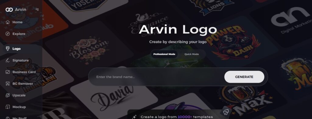
Step 1: Create an account and log in on Arvin AI
Visit the website of Arvin logo maker, open an account, and log in for the logo design feature.
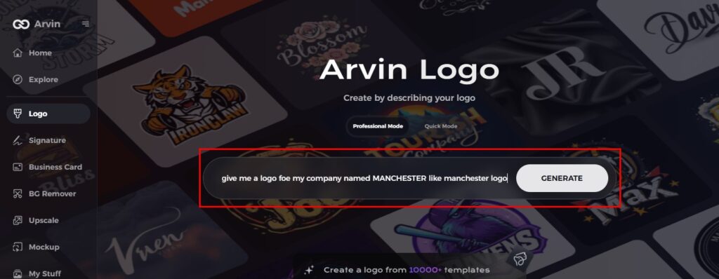
Step 2: Input your brand information and preferences
Input your brand name, slogan, and industry. Specify all your design preferences, which may include font styles or images themes.
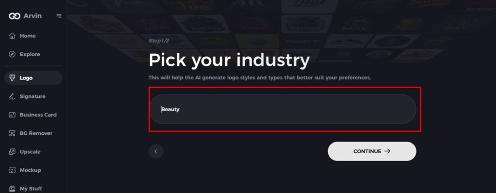
Step 3: Pick your industry
Now select your industry related to your niche. This will help the AI generate logo styles and types that better suit your preferences.
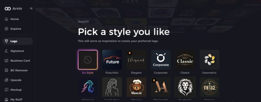
Step 4: Select Style
Now select a style which you would like and continue. This will serve as inspiration to create your preferred logo.
Step 5: Design Personalize through the tools of Arvin AI
After Arvin AI gives create your logo, you can customize those logos with the tools that have elements such as font style, layout, and the positioning of symbols. Experiment on different designs until you like what you see.
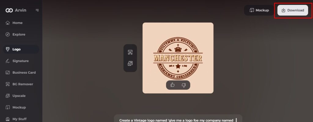
Step 6: Save and download the final logo
Preview the finished logo and save it in a high-resolution format for both print and digital uses.
Conclusion
Over the decades, the Doritos brand logo has undergone a number of transformations, keeping pace with trendy popularities on the market but remaining true to its bold nature. Snack brands rely heavily on strong, recognizable branding to succeed and as a result logo design is an important aspect of marketing. As brands change and evolve, Doritos might refine its logo even further to keep with future trends. Try Arvin AI now to design a unique and professional brand identity if you want to develop a powerful and dynamic logo!
FAQs
What does the Dorito logo represent?
The logo of Doritos signifies the brand’s dynamic and vibrant personality. The triangle indicates the chip’s shape, and the colors express excitement and taste.
Why has the Doritos logo changed so many times?
Doritos redesigns its logo to stay ahead in the snack category while maintaining a bold visual identity that will appeal to younger generations.
What colors are used in the current Doritos logo?
The present logo includes black, red, orange, and yellow with a gradient effect to symbolize spice and boldness.
How can I create a logo like Doritos for my brand?
You can use Arvin AI, an AI-powered logo maker, to design a bold and dynamic logo similar to Doritos by customizing colors, typography, and shapes., and shapes.