The Kansas City Chiefs logo has changed considerably over the years from the standard of American football. The Kansas City Chiefs logo, founded in 1959, is readily visible to those who do not know the NFL very well. It is also because of the chief tight end Travis Kels’ association with superstar singer Taylor Swift. As a result, the opportunity to see the current logo of the team is increasing. But what was the original chief logo? Let’s go back to the times. Also, if you want to make your own logo, please see the guide of the best logo designer.
Part 1: The Story Behind the Kansas City Chiefs’ Identity
The Kansas City Chiefs are a Missouri professional American football club founded in 1959. He is a member of the National Football League’s American Football Conference and Western Division. Since 2016, when the Rams moved to LA, California, the Chiefs have remained the only NFL club in Missouri. Home games are played at Arrowhead Stadium Arena.
Origins of the Kansas City Chiefs
The Kansas City Chiefs were founded as the Dallas Texans by American football legend Lamar Hunt. Hunt decided to revive the name of Texans, a former Dallas team that had only been in the NFL for one season in 1952. However, the Texas era did not last long, and in 1962, it became clear that Dallas could not maintain two NFL teams, so Hunt began searching for a new place in the club.
Kansas City Emerges
Lamar Hunt’s options were Miami, Atlanta, Seattle and New Orleans. However, negotiations with local stadiums did not work, and Hunt, who received an offer from the mayor of Kansas City in 1963, did not think long.
Naming of the Kansas City Chiefs
Shortly after the move, the Texans changed their name to the Kansas City Chiefs. This name, like many other NFL names, was chosen in the contest, a tribute to former Mayor Harold Bartle, who was also called “Chief,” because he created a Native American community known as the “Mick-o-Sei” within the Boy Scouts organization in the United States.
Lamar Hunt and the AFL-NFL Merger
Lamar Hunt, the owner of the Chiefs, was the one who moved See behind the formation of the AFL. In 1966, he embarked on a merger between the AFL and the NFL, and after the regular season, the two leagues agreed to hold the World Championship and achieved new success.
Part 2: Meaning and History Chiefs logo
The Kansas City Chiefs started in 1960. A gunslinger was drawn with a gun and a pig skin in his hand, and a Texas map was drawn in the background. In fact, this was the Dallas Texas logo and the team logos at the time. In 1963, the logo was changed to a logo featuring Native Americans running in the same manner as gunmen with tomahawks and pigskins against the backdrop of Oklahoma, Nebraska, Arkansas, Iowa, Kansas and Missouri. The logo was used until 1971.
1960
The logo introduced before the opening depicted a cowboy running with a gun in his hand. A red map can seen in the background. The character “Texans” on the cowboy’s chest reminds us that the team’s original name was Dallas Texans.
1963
When it became the current team name, the design renewed. The current Kansas City Chiefs logo depicts a Native American running with a tomahawk. The background is a white map.
1970
The design has hardly changed. There were also some very subtle changes. All shapes and colors remained intact, but the tomahawk drawn a little larger and the overall balance slightly better. However, this version of the Kansas City Chiefs logo used in less than two years.
1972
The Kansas City Chiefs logo redesigned in 1972. The new concept was much more radical than the previous one. The Indian theme almost disappeared from the emblem. Only the tip of the arrow with the letters K “and C was reminiscent of the Indians. The unevenness of the Yajaira is similar to the outline of the map drawn on the background of the logo of the advance team.
Memorial Chiefs Logos
There have been several memorable days for the team in the history of the Kansas City Chiefs Football Club. There was the AFC Championship in January 1994. If the Chiefs had won, he promised to take Chris and I out of school and participate in the pre-Super Bowl parade. There was also the 1994 season when his uncle rented a big screen TV to watch. (Not everyone had a big screen TV.) In the ’90s, the Chiefs graced the cover of Sports Illustrated magazine and won all of their wins.
1984
In 1984, a special badge designed for members including the Kansas City Chiefs logo at the silver founding anniversary of the NFL’s predecessor, the American Football League. The badge is white, gray and blue. The central part of the badge decorated in red with the image of the team’s helmet.
1994
The emblem was designed in 1994 to celebrate the 35th anniversary of the professional football club. In a dramatic tone of black, yellow and red, the medallion was placed in a wide white frame with a lease of green leaves. The enlarged “35” occupied almost all the space of the badge. The top of the logo decorated with the official AFL emblem.
1999
To celebrate the 40th anniversary of the team, another anniversary logo appeared in 1999. The four corners of the badge with a light gold and black contrast decorated with five-pointed stars, the top decorated with blue and red AFL emblems, and the center had a thick, enlarged “40” character with white outline red beta numerals. The emblem of the franchise drawn at the bottom of the composition.
2009
A new emblem appeared in 2009 to mark the 50th anniversary of the Kansas City Chiefs franchise. The tasteful white crest of the red and gold double outlines had a central enlarged golden letter of “50,” surrounded by three golden horizontal lines with a state outline and two stars at the top, and a date mark with the club’s official logo at the bottom.
2019
Celebrating the 60th anniversary of the founding of the Football Club, the emblem looked very elegant, with its smooth yet eye-catching tones consisting of cream and red. The circular badge edged with a red frame, the date written at the top, the emblem of the football club engraved at the bottom of the frame, and the catchphrase of the enlarged “60” and the blue “Seasons” attached.
Part 3: Design Elements of Kansas City Chiefs Logo
Today’s KC Chiefs symbol is a much simpler image than previous designs and is much more likely to appear in team merchandise. More recently, Kansas City Chiefs fans have access to all kinds of brand products, from three-piece tailgate kits to throws to keep them warm in winter. Almost all KC Chiefs products feature yellow/gold, red, white and black center colors.
Color
The logo colors of the KC Chiefs logo are usually red, yellow, white and black. As mentioned above, there may be some differences in the use of shades and colors for each football season. However, most of the colors of KC Chiefs are usually the same.
Color Code
| Color | Hex Code | RGB | CMYK | Pantone |
| Red | #E31837 | (227, 24, 55) | (0, 92, 77, 22) | PMS 186 C |
| Gold | #FFB81C | (255, 184, 28) | (0, 31, 98, 0) | PMS 1235 C |
Font
The font of the KC logo was inspired by the San Francisco 49ers, and is linked by S and F. The typography itself is a bold serif logo fonts used in all capital letters. There is a theory that C derives from the design that Hunt graffitied in the 1960s.
Helmet
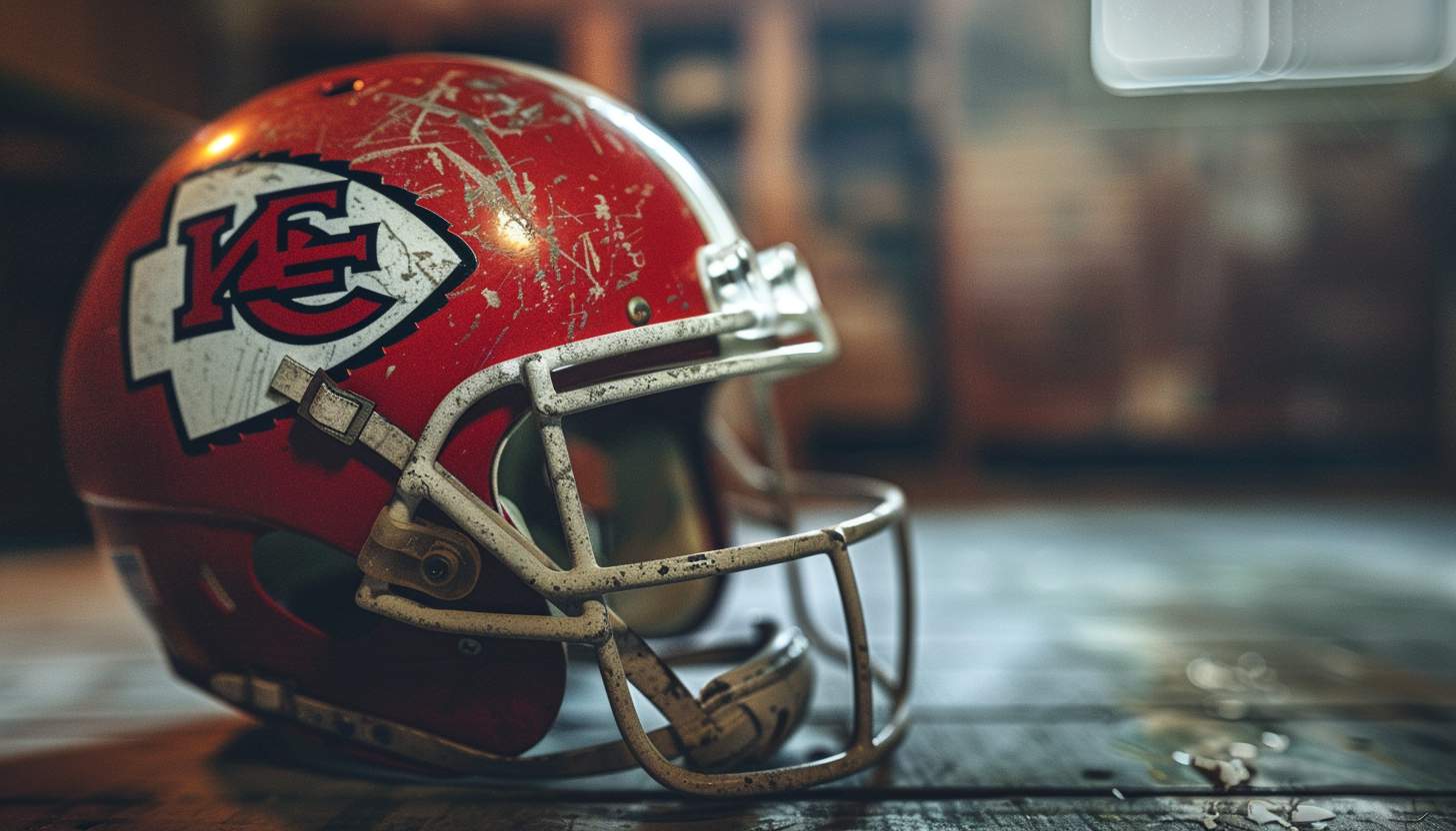
The helmet design of the Kansas City Chief Club has not changed for quite a long time, as there is no point to be improved, to be honest. The club players’ bright red helmet features a white emblem in the shape of an arrow, a black, thick and uneven outline, a giant red “KC” monogram is placed in the font of the serif body, “K” is placed on top of “C,” both characters are black and contoured It is.
Uniform
Kansas City’s professional football club has the brightest uniform color palette in the NFL. The combination of red, white and golden yellow is basic, with black outlines and small accents. In home games, Chiefs wear red jerseys and white pants decorated with yellow, white and red stripes. The road uniform consists of white jerseys and red pants with colorful accents.
Part 4: Arvin AI: Revolutionizing Sports Logo Analysis
Technology is now being used to study and predict trends in logo design. Arvin AI is a powerful tool that helps analyze sports logos and branding by collecting data from various sources, evaluating fan engagement, and recognizing design elements that influence branding success. It studies how logos evolve, identifies trends that shape modern logo designs, and helps teams make informed branding decisions. Arvin AI also examines public sentiment towards logo changes and predicts how adjustments might impact fan loyalty.
Key Features of Arvin AI
- Fan insights: Analyzes fan reactions and engagement with logos.
- Trend prediction: Identifies emerging design trends in sports branding.
- Branding decisions: Assists teams in making informed logo changes.
- Public sentiment analysis: Examines how logo updates impact fan loyalty.
- Competitor analysis: Compares logo effectiveness across different teams.
Steps to Create a Logo Using Arvin AI
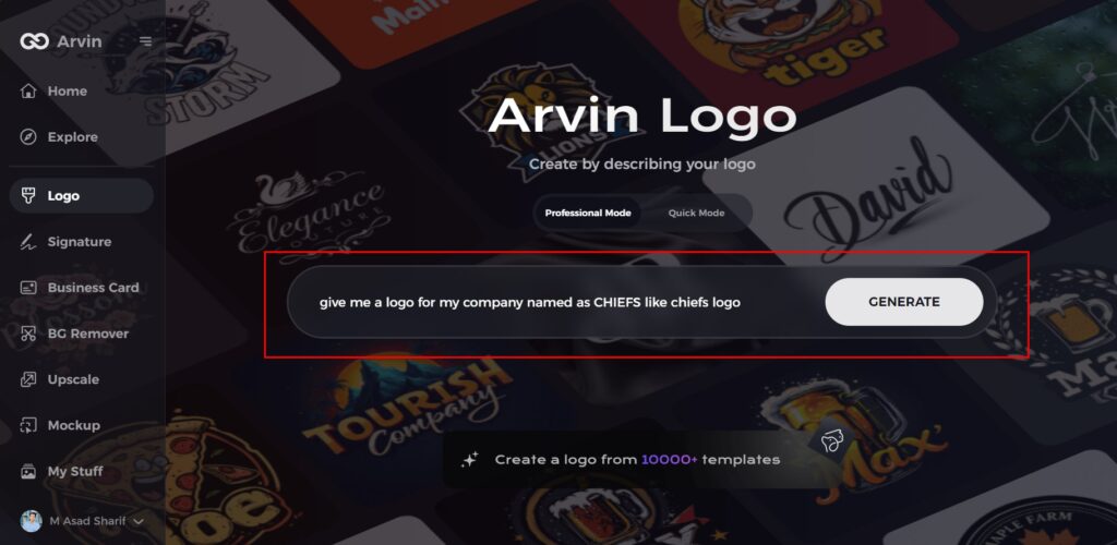
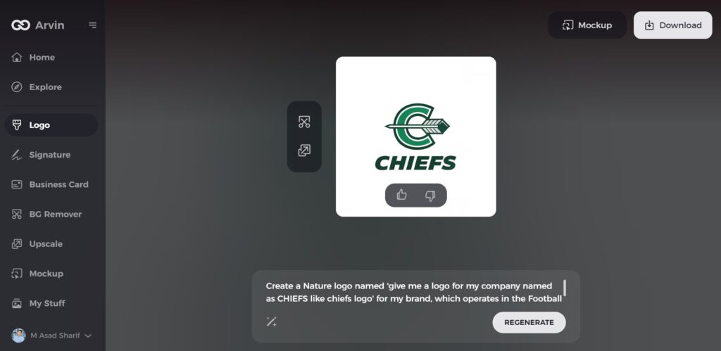
Step 1: Visit the Arvin AI Website
Go to the Arvin AI logo maker page using your web browser to start designing your logo. It will appear the page of Arvin AI logo maker.

Step 2: Enter Your Business Details
Provide your key information as like your business name and category. This helps the AI generate designs custom-made for your brand identity.
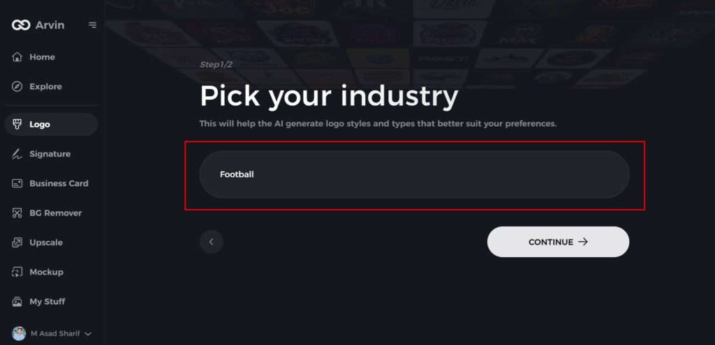
Step 3: Choose Your Industry
Select an industry from the given options in Arvin AI logo maker process. This helps to the AI to refine the logo styles to match your business type and needs.
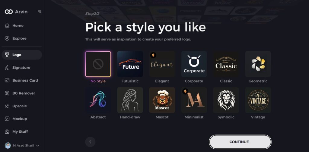
Step 4: Select a Style
Browse through the available styles and pick one that fits your brand’s vision. If you’re unsure, skip this step, and the AI will choose a default style.
Step 5: Explore Logo Ideas
Arvin AI will generate multiple logo concepts based on your information given to it. Review the options and choose the ones that best represent your brand identity.
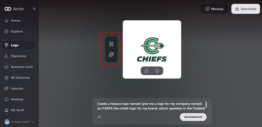
Step 6: Customize Your Logo
Adjust colors, fonts, icons, and layout to match your brand identity. Make changes until you satisfied with the design.
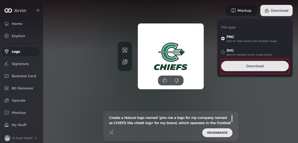
Step 7: Download Your Logo
Once finalized, download your logo in PNG or SVG format for use on websites, social media, and printed materials.
Conclusion
The Kansas City Chiefs logo has a long and meaningful history. From its original Native American-inspired design to the modern arrowhead look, the logo has stayed strong over time. It represents the team’s strength, tradition, and deep connection with fans. While some have criticized the use of Native American imagery, the Chiefs have taken steps to be respectful. The logo remains popular on merchandise, and its impact on branding is undeniable. For teams looking to create or refine their logos, Arvin AI is the best logo maker. It provides data-driven insights, predicts design trends, and helps teams build a strong and lasting brand identity.
FAQs
Why has the Kansas City Chiefs logo remained largely unchanged?
The Chiefs logo has stayed consistent to maintain brand identity and strong fan recognition.
Why is the Chiefs logo an arrow?
But rather than an oval, the ‘K’ and ‘C’ of Kansas City sit inside an arrowhead – the team play at Arrowhead Stadium, and have done so since 1972. This is the last aspect of Native American imagery that remains in the current logo.
Has the Kansas City Chiefs logo faced any redesign proposals?
There have been discussions, but no official redesigns have announced. The team has mostly made minor refinements.
How does Arvin AI help in sports logo analysis?
Arvin AI uses advanced algorithms to analyze logo trends, predict design changes, and evaluate branding effectiveness.
