DoorDash is a global food delivery service based internationally with a focus in the U.S., Canada, and Australia. Established in 2013, it has become a major player in the food delivery service arena, with millions of users. The logo went through various phases over the years, and each of those stages mirrors the vision and growth of the company. The DoorDash logo has transformed from a word mark to an iconic logo, but has always kept its pulse.
Part 1: DoorDash Food Delivery Giant
DoorDash is an online door-to-door food ordering and delivery service that connects users with nearby restaurants and independent couriers, also known as “Dashers.” DoorDash is a leader in the food delivery space, operating in more than 4,000 cities. It’s the biggest food delivery service in the country, with a 56% market share in the United States. It is no lie that the DoorDash logo is one of the elements that helps give DoorDash its identity and distinguishes it from other food delivery services. The design and color in the logo represent the guarantee of the brand for quick and reliable deliveries.
Part 2: The Evolution of the DoorDash Logo
The DoorDash logo has changed several times since the company was founded in 2013. This constant innovation also provides an insight into how the brand, faster and efficient in terms of positioning it in an extremely competitive segment of food delivery and also a chance of a facelift.
The Origin of the DoorDash Logo (2013 -2014)
When DoorDash first launched in 2013 its first logo and wordmark was simple yet effective. It featured the company name in lowercase letters in a sans-serif typeface. The color scheme split “Door” in black and “Dash” in red, invoking speed and urgency in deliveries. We took this minimalist approach in order to keep the look clean and professional. Although the redesign did not include any visual symbols, the contrasting colors helped establish the brand’s identity. At this phase, the DoorDash logo was practical, if not quite reflective of the brand’s dynamic personality.
2014 – 2018
In 2014, the order and delivery company presented an updated logo, featuring a more elaborate emblem combined with the wordmark. The badge path was outlined in red wings, representing a sense of speed and movement. The shapes were inspired by the speed and precision of the Japanese Shinkansen bullet train. The double “D” impact from the logo also reinforced the identity of the company while still achieving a sense of movement. In contrast to the original DoorDash logo, this one was minimalist and smooth, which suited a company that specializes in fast food and dependable service.
2018 – Today
In 2018, DoorDash teamed up with the San Francisco-based branding agency Character to finesse its logo even more. The redesign kept the red emblem but simplified its design, making it more contemporary and elegant. Its bright, bold color creates a sense of speed and direction. The font was also updated to a more polished sans-serif typeface, improving readability. This type of logo is very scalable, meaning that it works well on a wide variety of mediums, from phone apps to billboards. The updated style continues to emphasize the company’s priorities of efficiency and innovation.
Part 3: DoorDash Logo Meaning and Symbolism
DoorDash logo shows to convey the company’s values, which include speed, efficiency, and reliability. It has a moving logic through an logo is its red sign, which is like a wing and a road at the same time. This design choice allows DoorDash to drive home its commitment to speedy service. The negative space inside the emblem gently suggests dashing, affirming the brand. The single bold color gives the logo visual power which results in easy recognition. Every part of the DoorDash logo is intentionally designed to represent the brand mission and values in the best way.
Part 4: DoorDash Logo Colors and Font.
The DoorDash typographic logo features a highly saturated red color with simple typography, reinforcing its brand identity as a business. These design elements help to increase visibility, sense of urgency, and contribute to the perception that the company is a fast and reliable source for food delivery
The Meaning of Red in the DoorDash Logo
Red pre-dominates the DoorDash logo, and its choice is not a mere coincidence. In food, red is stimulating, stimulating, and action-initiating, and thus suitable for food businesses. Studies have revealed that red can stimulate appetite and prompt decision-making, perfect for DoorDash’s driving of food orders. Many fast-food brands — including McDonald’s, KFC and Pizza Hut — use red in their branding for similar reasons. Red is also great for getting attention fast, helping DoorDash reinforce its brand identity as a company that’s fast and reliable at getting food delivered to its customers.
DoorDash’s Color Choice
Color psychology is a big aspect of branding, and DoorDash uses red to establish urgency and hunger. Used to excite the mind, red is proven to also make consumers more impulsive, driving purchases. For this reason, it is a perfect choice for a food delivery service, when people are shopping for quick and easy meal solutions. Moreover, red differentiates itself effectively from various backgrounds, allowing the DoorDash logo to be prominent and memorable throughout mobile apps, websites, and advertisements.
Typography of DoorDash Logo
The DoorDash logo is also characterized by its clean, sans-serif typeface that promotes readability. A clean and contemporary font helps make the brand name recognizable and ensures scalability across various digital and physical platforms. Sans serif fonts are very common in tech and service-based companies as they create a modernized look. The logo font style used in the DoorDash logo exudes efficiency, professionalism, and trust, which reinforces the company’s image as a prominent food delivery service.
PART 5: Impact of DoorDash Logo on Brand Recognition
A good logo is a powerful tool in terms of brand recall, and DoorDash’s is no different. It is easily recognizable because of its very vibrant red color and moving emblem which makes customer trust and loyalty. Branding must remain consistent, and the online order delivery service DoorDash has maintained a recognizable visual in its logo. DoorDash logo logo embedded in the culinary world as a symbol of convenience, reliability and speed helping the company consolidate a foothold in the fast-growing food delivery sector.
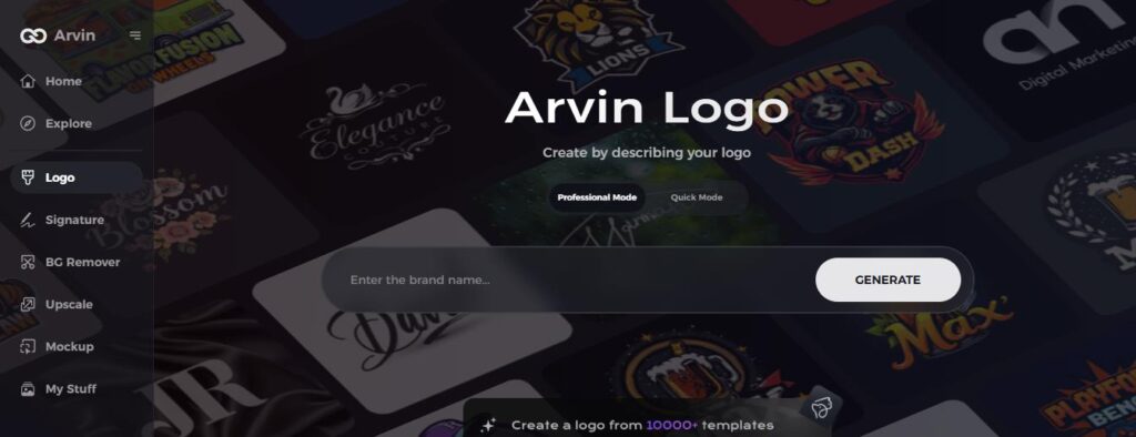
PART 6: Design your professional logo
The DoorDash logo Recent post Creating a logo can be a daunting task. Arvin AI makes this easy, creating pristine logos that mirror a brand’s ethos. Moving from the launch of a new agency to the rebranding of an existing businessthey create logos as well as distinctive, clean designs in seconds, bringing professional branding to businesses — from small businesses to the corporate space, with no need for any experience.
Key Features of Arvin AI
- AI-Powered Logo Creation: Instantly generates high-quality logos using advanced artificial intelligence, making the design process effortless and efficient.
- Customizable Color and Fonts: Allows users to modify logo colors and typography to match their brand identity. It ensure a unique and professional look.
- Minimalistic and Modern Designs: Offers sleek, visually appealing logo templates that align with contemporary branding trends, similar to the DoorDash logo.
- High-Resolution Export Options: Provides multiple file formats, including PNG, SVG, and PDF, for digital and print use without losing quality.
- User-Friendly and Fast: Delivers professional logos in minutes with an intuitive interface. It eliminate the need for complex design software or professional designers.
Steps to Using Arvin AI in Creating Your Logo
Step 1: Register and Login
Access the logo-making tool at the site of Arvin AI and create your account then login for use.
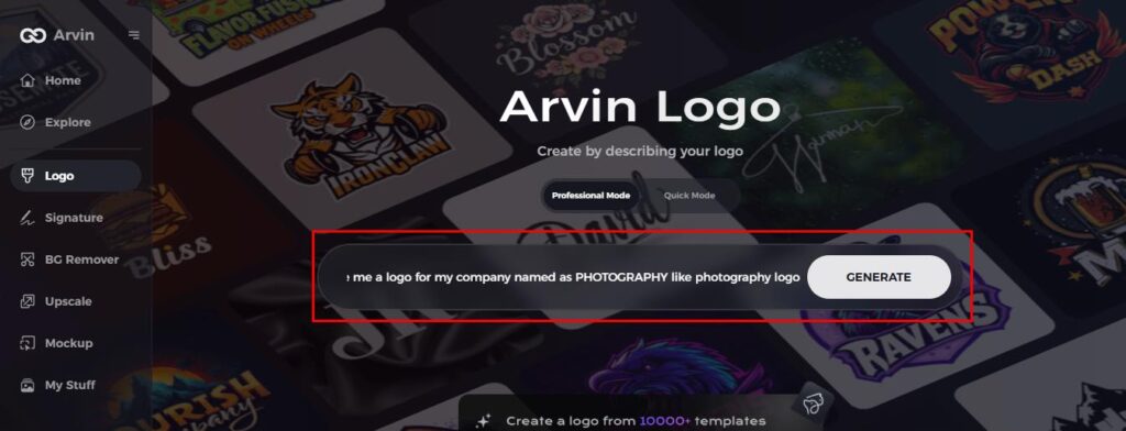
Step 2: Provide Information about the Brand and Your Desire
Write in the space available the name of your brand, tagline and line of industry, your font choice, image idea, and other.
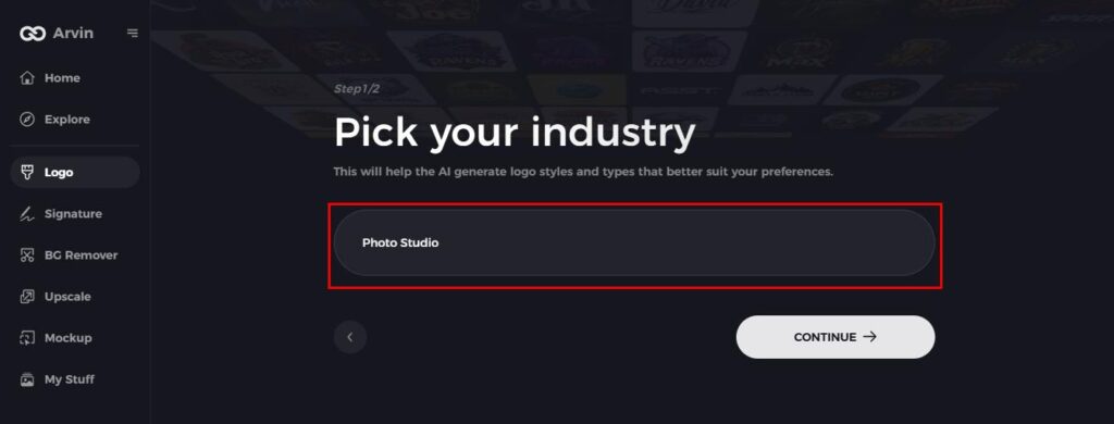
Step 3: Select your industry
Choose your niche, whether it’s portraits, events, or nature, to help AI generate the most fitting logo options.
Step 4: Choose Your Logo Style
Pick a logo style that matches your vision. This will guide AI in creating a logo inspired by your preferences.
Step 5: Personalize Your Logo with Arvin AI Tools
After Arvin AI generates your logo, customize it using available tools. Adjust font styles, layout, and icon positions until you’re happy with the result.
Step 6: Save and Download Your Logo
Preview your logo, then save it in a high-resolution format suitable for both print and digital use.
Conclusion
Over the years, the DoorDash logo has changed as the company has grown and the market has changed. Its simple wordmark in 2013 slowly evolved into the sleek, fiery emblem we know today, embodying power, speed, and efficiency in one powerful image. When it comes to branding, it is so essential for the company’s success and the DoorDash logo fits this criteria by enhancing brand recognition. This making the company memorable for its audiences. Give Arvin AI a try and bring your brand identity to life seamlessly if you want to create a professional and impactful logo.
FAQs
What is the meaning of the DoorDash logo?
The DoorDash emblem represents speed, efficiency, and motion, highlighting the brand’s pledge to prompt and trustworthy cuisine delivery.
What is DoorDash used for?
DoorDash, Inc. is an American company operating online food ordering and food delivery. It trades under the symbol DASH.
Who owns DoorDash now?
Tony Xu cofounded restaurant delivery service DoorDash in 2013 and became a billionaire after its 2020 IPO. He owns 4.6% plus options.
Is it possible for me to generate a logo similar to that of DoorDash using AI?
Yes! A new way to create professional & custom logo is available — create a logo with ease using Arvin AI, an advanced AI-powered logo designers.
