If you are familiar with the financial industry, you may know the logo of the Deutsche Bank. The Deutsche Bank established in 1870 and is the largest and most reputable banking organization in Germany. It has bank offices and companies in over 70 countries. The Deutsche Bank is a financial institution that offers investment, corporate banking, private banking, commercial banking, set management, and financial consulting services among many others. Today, we will discuss the history and changing of the iconic Deutsche Bank logo.
Part 1: Why is the Deutsche Bank famous?
Before discussing the components and history of the Deutsche Bank logo, it is a good idea to make a general introduction to this brand. The Deutsche Bank, known as “Deutsche” sometimes, is a German financial services company and bank headquartered in Frankfurt.
Legacy of Over 150 Years in Banking
It was first established in 1869, more than 150 years ago, and has continued to grow through many acquisitions. As of 2018, the bank has a network of 58 countries. However, the Deutsche Bank has a particularly strong presence in Europe.
Why Deutsche Bank Matters in the Financial World?
Deutsche Bank defined as a “systemically important” bank by the Financial Stability Board. However, the company has been under intense scrutiny for decades.
Part 2: History and Evolution of Deutsche Bank Logo
The Deutsche Bank, like many financial companies that have been around for a long time, has several symbols associated with its name. The logo of the early Deutsche Bank was a relatively complex design resembling a coat of arms. Let us now take a closer look at the history of the Deutsche Bank logo.
1870 – 1918
One of the earliest variations of the Deutsche Bank logo appeared in the 1800s. Like many traditional banks, the Deutsche Bank also used emblem-like symbols around this time. The emblem painted with the emperor’s eagle, and the Deutsche Bank used it for almost half a century. But the shield on the breast of an eagle modified from time to time.
1919 – 1928
Deutsche Bank logo created in 1919 which is a bold and elegant circular medallion with intertwined monograms in the center. The letter “DG” was a fancy special order form, and the tail of “G” was slightly elongated and pointed, balanced by a double circular frame. The tail of “G” was similar to an arrow, pointing to the future and indicating the bank’s progressive approach and readiness to move forward.
1929 – 1930
When the Deutsche Bank merged with the Discomte Gesellschaft in 1929, the eagle was revamped. This bird has become a cleaner and minimalist shape. It did not look like an eagle on a medieval emblem. Little known about the impact of Discont-Gesellschaft’s visual identity.
1930 – 1946
In the 1930s, the Deutsche Bank again eliminated the image of the eagle and restored it to a simple icon with a circular border. In this design, the circle became a little more elongated oval, and the monogram font renewed also. From the 1940s to the 50s, banks experimented with the placement of letters in various designs. This design is one of the cool logo designs in the world.
1947 – 1952
During World War II, the Deutsche Bank took several banks from Eastern Europe, which fell into the hands of Germany. He also provided banking services to Gestapo. In 1948, the Deutsche Bank was divided into ten lines, each of which was responsible for a particular region. Each logotype was based on the oval shape of “DB” used in the 1930s. Four of the logos use two letters. In this case, one letter was placed in front and the other in back.
1952 – 1973
The Deutsche Bank logo, introduced in 2010, fully follows the previous version designed in 2010, but is more talkative and cheerful. This includes a square emblem with an outline that is thick and the color is blue, and a line inside an oblique with a draw in the color blue. The emblem is already symbolic, and it doesn’t even need lettering to be recognized and remembered.
1974 – 2009
In 1974, the Deutsche Bank introduced something similar to the current logo. The image contained the company’s full-name, written in English, and a sans-serif font chosen. The design also involved the use of a graphic that had a box with a diagonal in the middle.
2010-Present
The logo of the Deutsche Bank, introduced in 2010, fully follows the previous version designed in 2010, but it is more talkative and brighter. The logo represented as a square emblem, outlined by a thick blue line and filled with the same color on the inside. It has an oblique inner line. Such an emblem is full of strength, stability, and professionalism. The colors of the logo of the bank, being blue and white, symbolize reliability and loyalty-the strongest features of the financial organization.
Part 3: Elements of Deutsche Bank Logo
No matter how you feel about the reputation of the Deutsche Bank, the impact of its iconic logo cannot ignored. The slash symbol in the blue frame became very symbolic, and some marketing materials no longer need to associated with the Deutsche Bank’s wordmark.
Emblem
The current logo was created between 1972 and 1974 by artist and graphic artist Anton Stankowski. The Deutsche Bank chose the logo from a variety of emblem logos developed by eight graphic artists. Initially, the emblem consisted of slashes in a square with a word mark, but in 2010 the lettering was removed.
Color
The Deutsche logo’s color palette has long been simple in white and black. It is only recently that the company has begun experimenting with new German logo colors. At present, the design of the company has the image of dark blue on a white background.
Font
As mentioned earlier, Deutsche logo fonts do not always exist in all branding assets created by the company. However, it still remained as part of the company’s core visual identity. Deutsche Bank’s typeface is a simple sans serif and is written in standard capital letters. The logo fonts used is similar to the Universe Next 630, and is used in thick and straight variations.
Part 5: Introducing Arvin AI for Logo Analysis and Design Insights
Branding trends in the present world are giving a new meaning to the methods of making and finalizing logos. Arvin AI is providing sharp insights to enterprise-level business regarding effective logos by giving data-based recommendations for repositioning of branding methodology. Analyzing all the various aspects of a logo, from color to shape and composition, Arvin AI guides businesses to align their designs with the values of the brand and the expectations of their target audience.
Key Features of Arvin AI
- Design Analysis: It analyses the color, shape, and composition of a logo.
- Brand Alignment: It measures if a logo portrays a company’s values and mission.
- Customer Perception: It gathers feedback to understand public perception of a logo.
- Performance Metrics: It tracks how logos perform across different platforms and mediums.
- Trend Insights: It identifies current design trends and benchmarks your logo against competitors.
- Customization Suggestions: It provides actionable recommendations for improving logo appeal and effectiveness.
Steps to Use Arvin AI for making Logo
Step 1: Access the Arvin AI Website
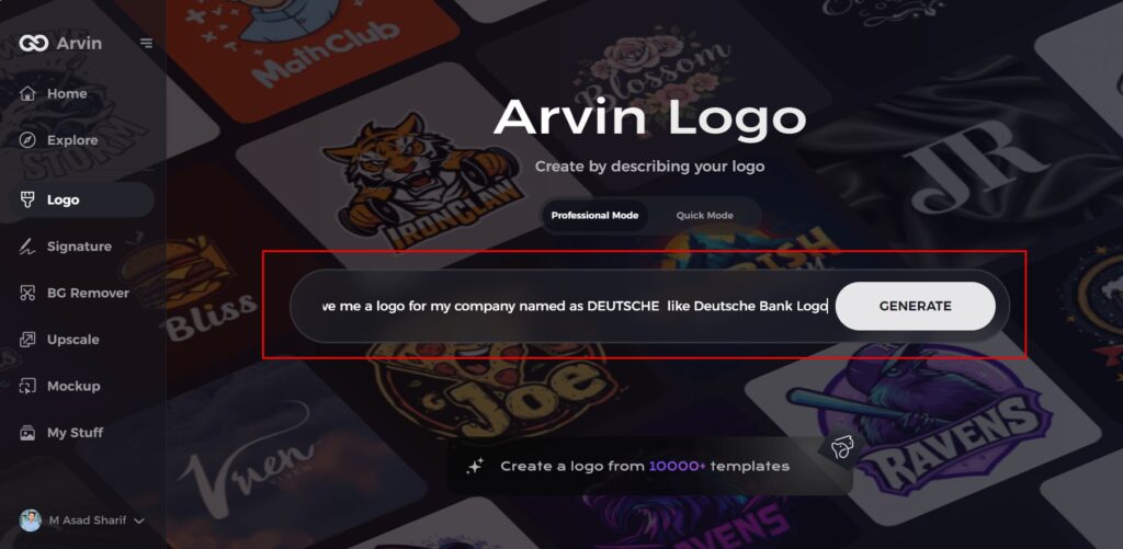
Open your preferred web browser and navigate to the logo design section of the Arvin AI platform at Arvin AI Logo Maker.

Step 2: Enter Your Business Details
Provide essential information about your business, such as its name and category. This step helps the AI create logo designs tailored to your brand’s identity.
Step 3: Select Your Industry
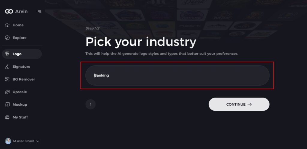
Choose your industry from the provided list. This selection allows the AI to focus on styles and designs that align with your specific business sector.
Step 4: Choose a Style
Explore the available style options and select one that matches your brand’s vision. If you’re unsure, you can skip this step, and the AI will use its default inspiration.

Step 5: Explore Logo Suggestions
Based on your inputs, the AI will generate a variety of logo designs. Review the options and identify the ones that best reflect your brand’s image.
Step 6: Customize Your Logo
Fine-tune your selected design by adjusting elements like colors, fonts, icons, and layouts to ensure it aligns perfectly with your style and vision.
Step 7: Download Your Final Design
Once you’re happy with the final logo, download it in formats like PNG or SVG. These formats are versatile and suitable for websites, social media, and print materials.
Conclusion
The Deutsche Bank logo evolves as proof to good design. From difficult early logos to minimalist symbolic design in 1974, this reflects the branding of the bank from one place to another. In this industry that works on trust and reliability, a Deutsche Bank logo serves as a stability and innovation indicator. Tools like Arvin AI make it easier and more exciting to analyze and improve logo design for branding. A possible logo design in the future will be a combination of creativity and technology.
FAQs about Deutsche Bank Logo
What is the significance of the diagonal line in the Deutsche Bank logo?
The diagonal line signifies progress, development, and innovation, thus in line with the vision of Deutsche Bank.
What does the Deutsche Bank logo mean?
Deutsche Bank’s logo stands for dynamic growth within a stable environment. The slash symbolising growth and the square-shaped frame standing for security and stability.
What is the symbol for Deutsche Bank?
Since reunification in 1957: The “DB in an oval” was used again. recognized that a prominent, globally viable, unique appearance is of particular importance for an institution such as the Deutsche Bank.
What is Deutsche Bank known for?
A Corporate Bank as hub for corporate, institutional and commercial clients. At the core of the new division is the transaction banking business which is an established market leader in Europe, The Investment Bank focuses on its traditional strengths in financing, advisory, fixed income and currencies.
