Contrast in design is a cornerstone of art and design, bringing life and depth to any visual creation. It’s the artful play of opposites—light versus dark, smooth against rough, or bold alongside subtle—that captivates the viewer’s attention and conveys meaning.
Think about Nike’s iconic swoosh, or even the bold red and yellow colors of McDonald’s. These intentional artistic contrasts helps to tell a story, evoke emotions and guides the audience’s focus. In this article, we’ll explore the various types of contrast in design and art, illustrating how they transform visuals into powerful messages.
Contrast brings logos to life. Discover how to integrate this powerful design principle with the Arvin AI Logo Maker or check out modern logos to inspire your next logo!
What Does Contrast Mean in Art?
In art, contrast refers to the arrangement of opposite or differing elements to create visual interest, drama, or emphasis. These elements might include colors, textures, shapes, values (light and dark), or even concepts like stillness versus movement. Essentially, contrast is what makes certain parts of an artwork stand out and grab your attention.
Types of Contrast in Design
1. Color Contrast
Color contrast is one of the most powerful tools in design, and few brands have leveraged it as effectively as McDonald’s. By pairing red and yellow—two colors with high visibility and emotional impact—the fast-food giant created a branding powerhouse that’s instantly recognizable worldwide.

The Power of Red and Yellow
The color contrast isn’t just visually effective; it’s emotionally resonant. Red creates a sense of urgency, encouraging quick decision-making—ideal for a fast-food chain. Yellow, on the other hand, evokes happiness, reinforcing the joy of indulging in a meal.
Inspired by McDonald’s? With Arvin AI’s Logo Maker, you can experiment with bold color combinations and craft a logo that stands out. Try it today and see how color contrast can elevate your brand’s identity!
2. Value Contrast
Nike’s mastery of design lies in its ability to use value contrast to create a powerful and lasting impact. The iconic swoosh logo, often rendered in stark black or white, gains prominence through its thoughtful placement against contrasting backgrounds. For instance, embossed on the pristine white surface of their sneakers or stitched boldly onto black sportswear, the contrast ensures the swoosh becomes the unmistakable focal point.
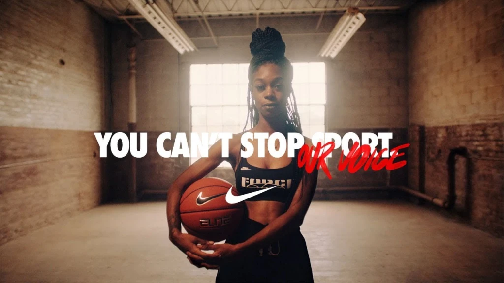
Furthermore, Nike extends this design philosophy into its advertising campaigns, using value contrast to evoke emotion and captivate audiences. Take the “You Can’t Stop Us” campaign, for example. Here, athletes are spotlighted in dramatic lighting, with bright highlights set against deep shadows. This interplay of light and dark emphasizes the athletes’ strength and determination while aligning seamlessly with Nike’s narrative of resilience and triumph.
3. Texture Contrast
The Warner Bros. logo is a prime example of texture contrast in branding, showcasing how a logo can effectively use visual elements to convey depth, history, and dynamism. Over the decades, the iconic shield has undergone multiple redesigns, yet it consistently leverages texture contrast to maintain its identity while staying relevant.

In recent iterations, Warner Bros. introduced a sleek, modernized version of its logo, incorporating texture contrast to create visual depth and sophistication. The updated design features a polished, metallic finish on the shield, contrasted with matte sections that provide a tactile illusion. This contrast draws attention to the emblem’s contours, enhancing its dimensionality and making it appear dynamic even in static form.

For instance, during the studio’s centennial celebration, the logo was animated with textures of old film reels, grainy footage, and a glowing metallic overlay.
In practice, texture contrast in the Warner Bros. logo translates effectively across mediums. On movie screens, the textured finishes shimmer and shift, creating an almost 3D effect that commands attention. On print materials like posters or merchandise, the contrast between the smooth and rough finishes ensures the logo remains visually impactful and recognizable, even without animation.
4. Shape and Size Contrast
This form of contrast emphasizes differences in the size or shape of objects to create hierarchy or focus.
Target’s logo is a textbook example of size and shape contrast. The design features concentric circles—a bold red outer ring and a smaller red dot at the center, separated by a white ring. The simplicity of the shapes is striking, but it’s the size contrast between the rings and the dot that draws the viewer’s attention.
This balance of proportions creates a focal point—the bullseye—which is both memorable and universally recognizable. The logo’s minimalistic design ensures clarity at any scale, whether on a billboard or a tiny price tag. Furthermore, the use of circles reinforces the brand’s inclusivity and unity, symbolizing a place where everyone can find what they need. The contrast in size is a subtle but effective way to guide the viewer’s eye directly to the core of the design, much like how the brand positions itself as a one-stop shopping destination.
5. Conceptual Contrast
This is less about visuals and more about ideas.
At first glance, it seems simple—a lowercase wordmark with an orange arrow underneath. However, the arrow cleverly conveys two contrasting ideas: breadth and joy.

The arrow stretches from “A” to “Z,” subtly communicating Amazon’s promise to offer everything a customer might need, from the first item on their shopping list to the last.
What Is the Basic Purpose of Contrast?
Contrast doesn’t just make art visually appealing—it also conveys meaning and emotion. It’s how artists create emphasis, set a mood, or tell a story. Imagine a painting with no contrast: it would feel flat, dull, and lifeless. By incorporating contrast, artists can:
- Guide the viewer’s eye to the focal point.
- Create tension or harmony within the artwork.
- Evoke emotions by balancing opposing elements.
Final Words
Contrast is more than just a design principle—it’s a storytelling tool that breathes life into art and branding.
As you create your next masterpiece or refine your brand identity, think about how contrast can elevate your work. From guiding attention to evoking emotion, it’s a powerful way to make your designs unforgettable.

And remember, design isn’t just about creativity—it’s also about consistency. Ensuring that your brand’s identity shines across every platform is essential to building trust and recognition. With tools like Arvin AI’s Logo Maker, you can craft designs that leverage contrast and make your brand stand out, or get inspiration from our brand bible guide.
FAQ
Contrast in design refers to the use of differing elements to create visual interest and hierarchy. For example, pairing bold headlines with lighter body text or using dark colors against light backgrounds helps make the design more engaging and readable.
Contrast is vital in design because it enhances readability, draws attention to key elements, and creates a dynamic, visually appealing layout. Without contrast, designs can feel flat and uninteresting, making it hard to communicate the intended message.
In art, contrast refers to the juxtaposition of opposing elements such as light vs. dark, textured vs. smooth, or large vs. small. It’s used to create depth, emphasize focal points, and evoke emotions within a composition.
The primary purpose of contrast is to make elements stand out and guide the viewer’s attention. It helps establish a visual hierarchy, ensuring that the most important aspects of a design or artwork are noticed first.
Emphasis in design refers to the intentional focus on a specific element to draw the viewer’s attention. This is achieved through techniques such as contrast, size, color, or placement. For example, in an ad, a bold headline or a brightly colored call-to-action button can emphasize the most critical part of the message.
Repetition in design involves reusing certain elements—such as colors, shapes, or patterns—throughout a composition to create consistency and unity. It helps reinforce a theme or brand identity. For instance, using the same logo color and font across a website ensures visual cohesion and brand recognition.
The principles of design are the foundational guidelines that dictate how elements of a design are organized and work together to create harmony and effectiveness. These include balance, contrast, emphasis, repetition, alignment, movement, proportion, and unity. For example, the balanced use of text and images in a layout ensures it’s visually appealing and easy to navigate.

