When it comes to circle logo design, few shapes carry as much versatility and meaning as the circle. Whether it’s symbolizing unity, harmony, or wholeness, the circle has long been a favorite among brands aiming to create a lasting impression. Think about some of the world’s most iconic logos—from Starbucks to BMW—they’ve all harnessed the power of this timeless shape. Why? Because circles naturally draw the eye, evoke trust, and create a sense of balance that resonates with audiences.
But designing the perfect circle logo design isn’t just about choosing a shape and calling it a day. It’s about understanding what the circle represents and how it can amplify your brand’s message. Whether your business is all about connection, innovation, or stability, the right circle logo design can tie it all together.
Spotify

In 2023, Spotify decided it was time for a visual refresh, and honestly, they made some smart choices. The iconic green we all recognize stayed, but they turned up the vibrancy, making it feel fresh and full of energy. To me, it’s a great way of showing how Spotify keeps evolving to meet the needs of millions of users like us, all while staying true to its roots.
What really stands out is how simple yet meaningful the design is. Those three curved lines? They’re not just decorative—they’re a clever nod to sound waves and everything Spotify represents: music, connection, and accessibility.
Timberland

The original Timberland logo perfectly captures the brand’s essence with its depiction of a tree featuring a broad crown, intertwined branches, and a sturdy trunk. It’s a fitting choice for a company whose name directly translates to “land covered with trees.” To me, this logo isn’t just a design—it’s a thoughtful metaphor that connects the brand’s identity to its name, emphasizing its deep-rooted relationship with nature and the outdoors.
Target

In 2018, Target gave its brand identity a bold update, and I think the changes really hit the mark. They switched all the letters in “target” to lowercase, giving the logo a more approachable and modern vibe. What’s interesting, though, is that they kept the same bold geometric font, which maintains the strong, recognizable feel of the brand.
And of course, the concentric circles above the word remain front and center. It’s such a simple yet clever design—a visual representation of the word “target” itself. To me, it’s a perfect example of how a logo can be both iconic and meaningful while staying minimal.
Also, check out the power of red logos. What makes them so special?
iTunes

Later that same year, iTunes unveiled a refreshed emblem that brought a lighter and more vibrant look. The musical note and outer border were softened, while the background exploded with a mix of colorful hues. Interestingly, there’s been chatter that this redesign took inspiration from Apple’s classic rainbow logo. Some say designers borrowed the three bottom colors from the original Apple emblem, toned them down, and blended them randomly within the circle. Whether it’s true or not, the result is a playful and dynamic design that feels perfectly in sync with the iTunes brand.
BMW

To mark its 50th anniversary, BMW M brought back a piece of history by reviving the circular logo from the 1970s. When I first saw the updated design, it felt like a perfect blend of nostalgia and modernity. Released on cars in March 2022, this emblem replaced the classic white and blue circles on wheel hubs and the front and rear bumpers, giving the cars a fresh yet familiar look.
What’s interesting about the new version is how it reimagines the old design with a darker, more sophisticated color palette. The letters “B,” “M,” and “W” shifted from white to gray, while the semicircle transitioned from a soft pink to a bold burgundy. Even the inner circle and black outer ring got an upgrade, becoming larger and more prominent. To me, this redesign isn’t just a nod to BMW’s heritage—it’s a celebration of its evolution while staying rooted in its iconic identity.
Tide

Tide’s original formula was so groundbreaking that it earned a spot in the Smithsonian National Museum of American History—a true testament to its impact. From being the first synthetic detergent to becoming a global household name, Tide’s journey is all about pushing boundaries. What I love most is how the brand has stayed committed to innovation, whether it’s improving cleaning performance, supporting environmental initiatives, or engaging with communities. It’s not just about clean clothes; it’s about consistently meeting our needs and setting new standards for excellence.
Pepsi

The Pepsi logo has come a long way from its early days, when it closely resembled Coca-Cola’s red script design. Over time, designers gave it a unique identity with the creation of the now-iconic red, white, and blue circle, originally inspired by a bottle cap. What I find fascinating is how this multicolored circle does more than just look good—it symbolizes Pepsi’s global reach. While it doesn’t mimic a globe’s colors, its shape subtly reinforces the brand’s worldwide popularity.
What makes the logo so effective, though, is how it plays with both shape and color. The circular design feels like you’re looking at a bottle cap from above, inviting you to imagine that satisfying moment of opening a Pepsi. And the patriotic red, white, and blue hues? They’re not just visually appealing—they connect to the U.S. national flag, sparking a sense of familiarity and pride for American customers. It’s a logo that’s simple, meaningful, and instantly recognizable.
Nivea

The Nivea logo is a timeless nod to its origins, perfectly mirroring the shape of the lid from the brand’s very first product—a round jar of cream introduced in 1911. Even as Nivea’s product line has grown, the wordmark remains inside the circle, staying true to its iconic design. What I love about this logo is how it connects to the brand’s history while evolving with the times.
In 2021, Nivea refreshed its look, making the blue circle lighter and brighter to grab the attention of potential buyers. While the inscription stayed white, the font received a subtle upgrade. The new thinner, more elegant letters add a modern touch while retaining the bold, sharp edges of the original grotesque typeface.
Volkswagen

The VW logo has always been iconic, instantly reminding us of Volkswagen, which translates to “People’s Car” in German. It’s such a simple yet meaningful design that’s stood the test of time.
Recently, Volkswagen decided to give its emblem a fresh update, taking inspiration from the classic 1967 version. The changes were subtle but impactful—designers slimmed down the lines, added some space between the bottom of the “W” and the circle, and ditched the 3D effect. By flattening the logo, they’ve embraced the modern trend of minimalism, making it feel more streamlined and contemporary.
Alfa Romeo

To me, this logo isn’t just a design—it’s a piece of Milan’s soul, deeply connected to its history and culture. Split into two distinct halves, each element carries a story that reflects Milan’s identity.
On the left side, the red cross, also known as St. George’s Cross, symbolizes Milan’s bravery and military strength. It’s not just a nod to the city’s patron saint but also a powerful reminder of its storied past and resilience.
On the right, there’s the Biscione, a snake that’s steeped in Milanese legend. Some say it commemorates Milan’s victory over the Saracens, while others believe it represents a tale where Uberto, a Visconti ancestor, slays a dragon, symbolizing triumph over great challenges. To me, it’s fascinating how this emblem blends historical significance with myth, creating a rich narrative that’s uniquely Milanese.

In 2016, Pinterest made a bold move by ditching its logo of five years and introducing a redesigned version. While the changes weren’t drastic, they made a significant impact by refining the font and pairing the platform’s name with its well-known circular icon.
What stands out to me about the new look is the font choice. The clean, grotesque style gives the logo a polished, professional vibe. By streamlining the letters into a uniform shape, the design feels strict yet harmonious, signaling a shift in how Pinterest wanted to position itself. It seems like an intentional effort to present the platform as a serious player for businesses—competing with Instagram, Facebook, and Twitter—rather than just a fun space for younger audiences.
Circle Logo Design Templates
These circle logo templates are a curated selection that I think you’ll love, as they showcase the perfect balance of creativity and functionality. Whether you’re going for a bold, modern vibe or something more playful and approachable, there’s definitely something here to spark your inspiration and get those creative ideas flowing.
So, why not take it a step further? With Arvin AI Logo Maker, you can not only customize these ideas but also create something completely unique to your style. Let’s bring your vision to life, one design at a time, and craft a logo that feels authentically you!


Free Circle Logo Design Maker
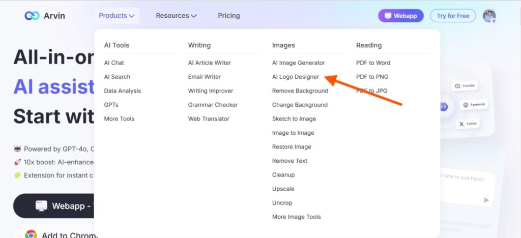
One of the best free circle logo design makers is Arvin AI.

Whether you’re launching your business for the first time or giving your brand a much-needed refresh, having a unique and memorable logo is absolutely essential. After all, it’s often the first thing people notice about your brand, and it speaks volumes about who you are. With Arvin AI, even if you don’t have a design background, you can create a professional logo effortlessly. It’s the kind of tool that takes the stress out of branding and leaves you with a design you can truly be proud of. So, why wait?
How to Create AI-based Logos?

First, you get to choose your creation method. Whether you want to enter your brand name, describe the look you’re going for, or modify an existing template, you’re in control from the start. The interface is so user-friendly that even if you’re new to logo design, you’ll feel right at home.
Next, with a single click on the “Generate” button, Arvin’s AI works its magic. It creates a logo tailored to your input, complete with stunning visuals and customization options. You’re not just stuck with one look—you can tweak the design to make it uniquely yours, ensuring it perfectly represents your brand.
Finally, when your logo is ready, the one-click download option makes it hassle-free to save your design. You’ll get high-resolution PNG files and editable SVG formats, which means your logo is ready for any platform—whether it’s your website, social media, or print materials.
AI Design Tools Collection

Arvin AI’s Design Tools Collection makes enhancing your designs easier than ever. Whether you’re looking to remove a background, change colors, or generate new visuals, these tools work like magic—saving you time and effort at every step.
And it doesn’t stop there. If you’ve ever wanted to tweak the mood of your image or experiment with new color palettes, the Background Changer lets you transform colors or effects instantly. On top of that, the Image-to-Image tool is a game-changer—it allows you to recreate images with a similar style or feel while keeping the original charm intact. Imagine having a tool that not only enhances but also expands your creative possibilities!
Tips for Creating a Circle Logo Design
Keep It Simple
The most effective logos are simple yet impactful. Avoid cluttered designs or overly complicated elements. A minimalist approach not only makes your logo more versatile but also ensures it’s memorable.
Choose Fonts for Brand Consistency
Typography plays a crucial role in logo design. Modern sans-serif fonts, like Montserrat or Avenir, offer a clean and contemporary feel, while serif fonts like ITC Slimbach exude elegance and tradition. If you’re creating a circle logo design, consider curving your text to match the circular shape for balance and cohesion.
To learn about what modern font will suit you and your brand, check out our blog!
Pay Attention to Scalability
Your logo should look great everywhere, whether it’s on a billboard or a business card. Test your design at various sizes to ensure it’s legible and visually appealing, even when scaled down to favicon size.
Final Words
Your creativity deserves tools that work as seamlessly as your imagination. With Arvin AI’s powerful design features, creating, customizing, and elevating your designs has never been so effortless—or so fun. Whether you’re crafting a logo, editing images, or exploring new styles, Arvin AI ensures that your vision comes to life exactly as you envisioned it.

FAQ
Simple circle logo designs often use clean and minimalist styles. Think of logos that incorporate basic shapes, clear typography, or monograms. Examples include the Starbucks logo or Headspace’s orange circle.
Designing a circle logo can be surprisingly easy with tools like Arvin AI’s Logo Maker. Start by choosing a circle as your base. Add your business name, pick fonts that align with your brand’s personality, and consider incorporating symbols or colors that resonate with your message.
You can find curated circle logo templates on platforms like Arvin AI. They offer ready-made options that you can personalize to suit your needs, saving you time while ensuring your design looks professional and unique. Whether you need something modern, playful, or classic, there’s a template waiting for you.
Many global brands use circle logo designs to convey unity, completeness, or connection. Examples include BMW’s iconic roundel, Nivea’s classic blue circle, and Pepsi’s vibrant globe-inspired logo.


