Chevrolet is a famous car brand. It is part of General Motors and has a history of more than 100 years. It is one of the most successful automobile companies to date. The company started by William Durant. The company’s owner, GMC, is one of the best-selling automotive brands in the United States. Chevrolet is a unique case. To this day, there are several interpretations of the meaning and appearance of this famous Chevy logo. Officially, the brand itself calls the emblem “bow tie”.
Part 1: Chevrolet Brand Overview
However, he did not name his name like most founders. Instead, it was named after Lewis Joseph Chevrolet. Louis was a famous racing driver for Buick (under General Motors). Durant asked Louis to help make the car.
| Founded | November 3, 1911 |
| Founder | Arthur and Louis Chevrolet, William C. Durant |
| Headquarters | Detroit, Michigan, U.S. |
| Website | chevrolet.com |
Part 2: Meaning and History of Chevy Logo
Chevrolet, known worldwide as Chevrolet, has an iconic logo with a rich history. The Chevrolet logo is one of the most recognized logos in the world and is considered a classic of brand identity design. This is one of the iconic logos which is nicknamed “Bowtai,” has not changed much throughout history. It was designed in 1913 by Willian Durant, founder of the brand. There are three theories about the birth of this Chevy logo.The first was inspired by the wallpaper of the Paris hotel where Durant once stayed.
1911 – 1913
The first Chevy logo consisted of a black sign by founder Louis Chevrolet, drawn in a bold and unique handwritten typeface.
1913 – 1914
A 1913 design change introduced Chevrolet’s first geometric logo. The horizontal cross cuts the horizontal part diagonally, and the vertical ends are straight. The bold capital letters on the cross expressed with fancy lines, creating elegant emphasis. Later, this emblem gets the nickname of the iconic “bow tie.”
1914 – 1934
The famous Chevy logo was born. The color scheme of the first emblem was light blue and gold, and the letters were white and gold. This combination made the logo elegant and luxurious. The wordmark placed on the horizontal line of the Chevrolet cross.
1934 – 1940
The color scheme of the logo changed to monochrome, the typeface became more modern and the letters were larger. The logo became more masculine and powerful.
1940 – 1950
Chevrolet decided to revert to the original blue and gold tones, but at this time Chevrolet Blue was brighter and more intense, giving a good contrast to the white font on the nameplate and the gold frame on the cross.
1940 – 1945
The Chevy logo of the 1940s was a simple, uppercase black letter of an elegant serif typeface, enlarged the letter “V” in the center of the nameplate and looked like a stylized victory sign or bird. This was the simplest Chevrolet badge, with no additional graphics and no framing.
1950 – 1964
The most rapidly changing Chevy logo in Chevrolet history. The logo colors scheme changed to red and white, and the emblem was placed on a rounded red ground. The cross became white, with a red italic wordmark on it.
1964 – 1976
The era of the most minimal Chevy logo. It is represented in monochrome and features thin lines of bow ties and thick word marks of italics.
1976 – 1988
The Chevy logo painted blue again, but now it has a thin white edge inside the bow and a black shadow. The letters are smaller and placed in the center of the horizontal line.
1988 – 2002
The Chevrolet logo now consists of a single emblem and no longer has a word mark. The color scheme of the cross is blue and red in black.
1994 – 2001
The 1994 redesign introduced a modern three-dimensional version of the Chevrolet emblem. The bow is gradient blue, expressed with a shiny surface and a voluminous silver edge. Under the emblem, the logotype “Genuine Chevrolet” was written in surplus, and a slightly expanded line typeface was used, featuring smooth lines and delicate lines.
2001 – 2002
The cross became three-dimensional with dark red. Currently only outlines on white ground. It became a modern and confident logo.
2002 – 2008
The logo version made for Chevorlet in 2002 is probably the most recognizable. This black logotype is a custom typeface that connects smooth thick lines with several letters, and is chic to almost any background, and can be seen in metal on brand cars, and in black on posters and prints.
2008 – 2010
In 2002, Chevrolet began using gold bowties for visual identity. The company emblem embodies firmness and assertive position maintaining. Chevrolet obtained increased power due to its logo modification while maintaining its existing global market recognition.
2010 – 2013
The design change in 2010 added texture to the iconic bow. The gold pattern gained several small dots and was placed in a thick silver frame. The logotype was placed under the bow and became a slightly thin black typeface.
2013 – Present
The latest redesign, released in 2011 to celebrate its 100th anniversary, made the emblem’s gold color more luxurious by making the silver frame thicker. The logo became more dynamic and powerful.
Part 3: Design Elements of Chevy Logo
Design elements play a special role in the uplift of logo branding. Following are the main elements for Chevy Logo:
Emblem
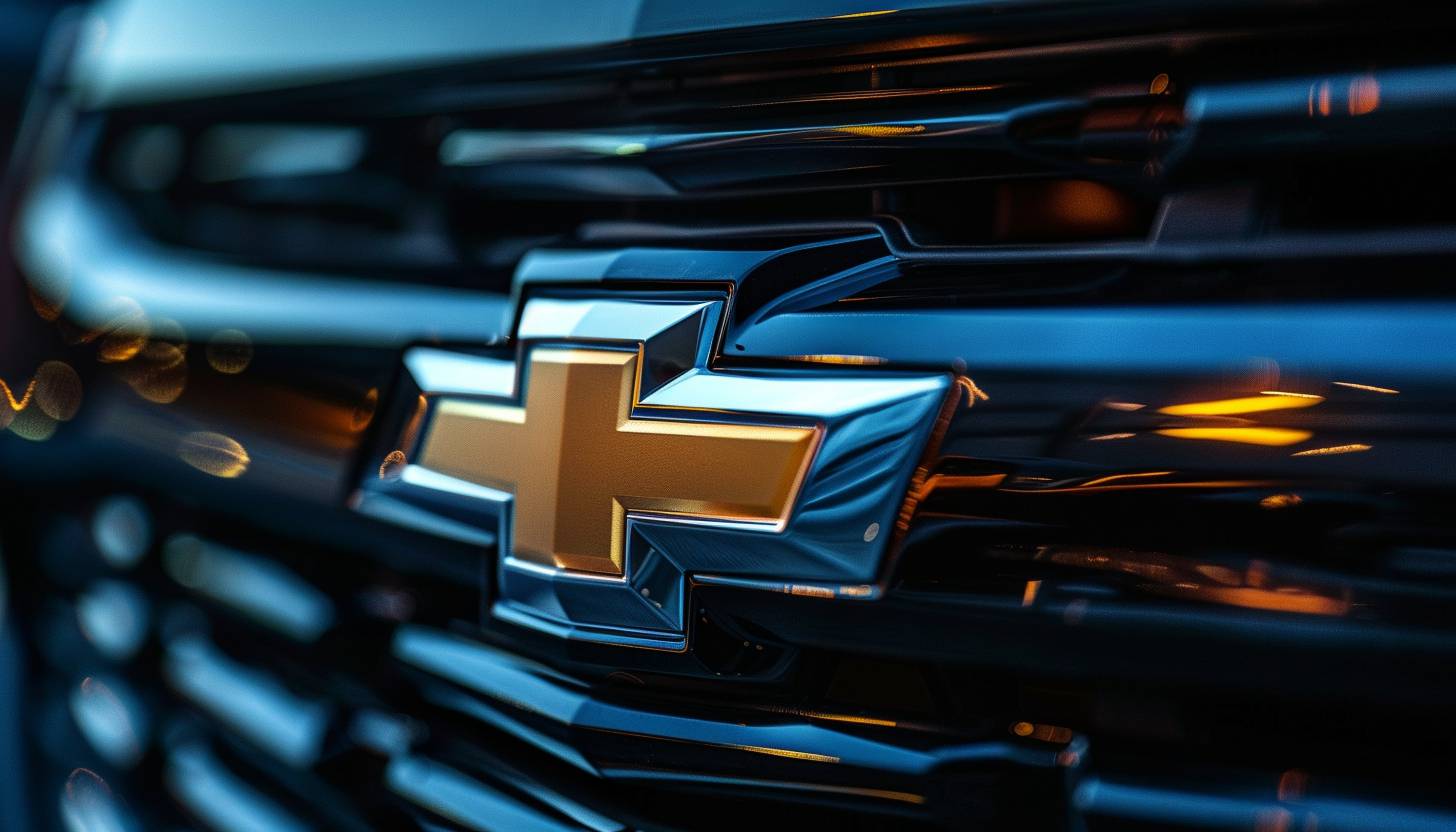
A wide stylized cross Chevrolet Bowtie Emblem use. A rectangle overlaps the horizontal parallel quadrangle and forms a cross. Since its appearance, many variations in coloring and detail have disappeared, but the essential shape has never changed. The Chevrolet associated with this emblem since 1914, when the iconic Bowtie emblem first appeared, making it one of the longest logos in history.
Color
The bow-tie emblem of Chevrolet serves as a widely recognized symbol which through its evolutions now represents product quality together with innovative manufacturing and dedicated support for American automotive history. The historical emblem expresses both the founder’s vision and the essence of a lively community which connects people through their Chevrolet car affection.
Font
The Chevrolet logo, which is famous as a bow tie, is characteristic of a design that condenses the history and innovation of automobiles for over a century. The logo fonts, created after being a brand that travels the world with an awareness of infinity, embodies the essence of creative products, combining special and kind products in all curves and lines. Its timeless appeal is not only a testament to the timeless legacy of Chevrolet.
Part 4: Arvin AI: Revolutionizing Logo Design and Branding
Arvin AI is an advanced AI-powered logo design tool that helps users create top-notch, professional logos with less effort. It uses advanced AI algorithms to produce beautiful-looking logos that are custom-made to different brand identities. Arvin AI gives smart design suggestions, which means every logo is unique and harmonious. It provides features like colors, fonts, and icon selection to meet branding needs. For companies or even personal projects. Arvin AI is the best solution for creating logos that count.
Key Features of Arvin AI
- Advanced AI Algorithms: Uses AI to design beautiful logo images.
- Smart Design Recommendations: Provides logo recommendations based on brand personality and style.
- Scalability: Makes logos look great on all platforms, from business cards to billboards.
- High-Resolution Output: Provides professional-grade logos in various formats for diverse uses.
- Instant Previews: Enables users to see how their logos will appear on real applications.
Steps to Use Arvin AI for Logo Creation
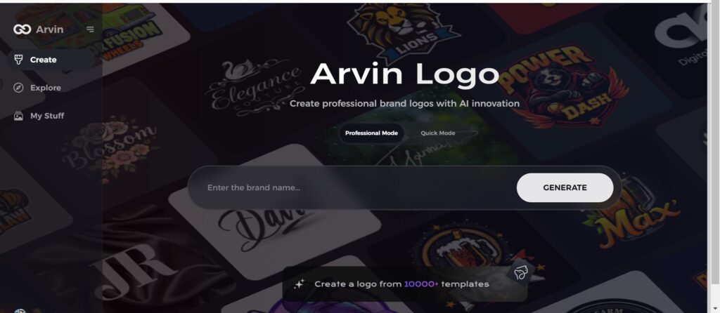
Step 1: Visit the Arvin AI Website
Open your web browser and go to the Arvin AI logo maker page to begin designing your logo.
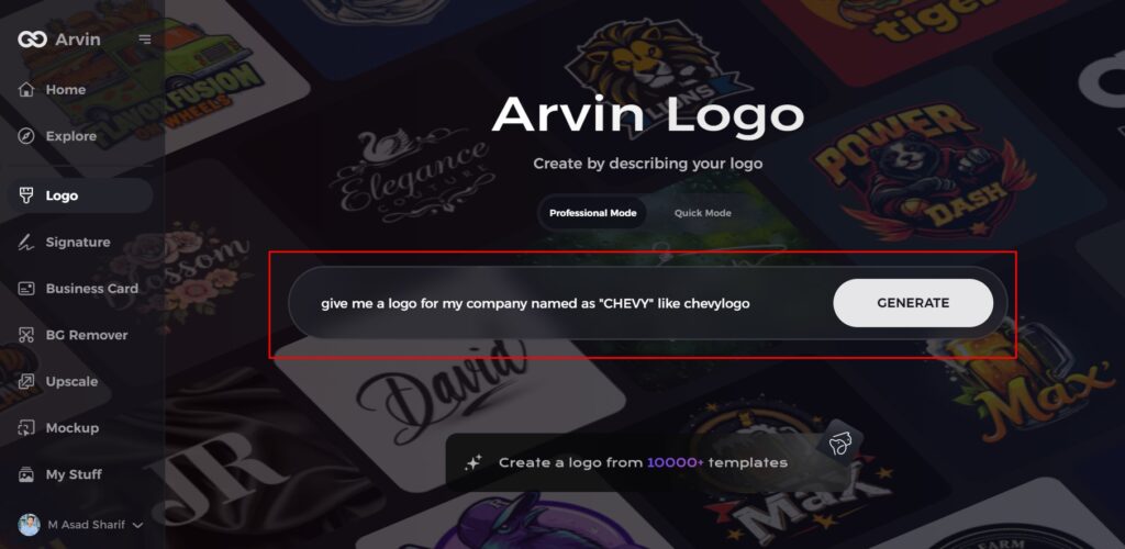
Step 2: Enter Your Business Details
Provide essential information like your business name and category. This helps the AI generate logos tailored to your brand.
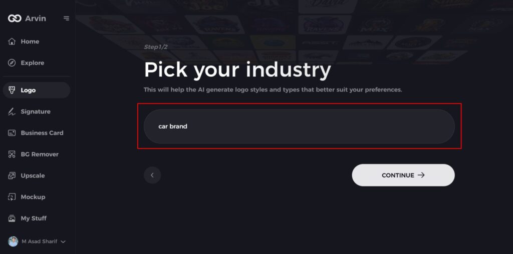
Step 3: Select Your Industry
Choose an industry from the available options. This helps the AI refine logo styles based on your business type.
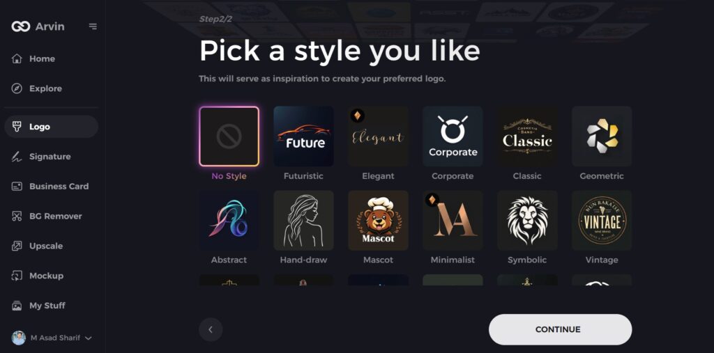
Step 4: Choose a Style
Browse through different logo styles and select one that matches your brand’s identity. If unsure, skip this step, and the AI will generate a design based on default inspiration.
Step 5: Explore Logo Ideas
Arvin AI will create multiple logo concepts based on your inputs. Review the options and pick one that fits your brand image.
Step 6: Customize Your Logo
Adjust colors, fonts, icons, and layouts to align the logo with your brand’s style.
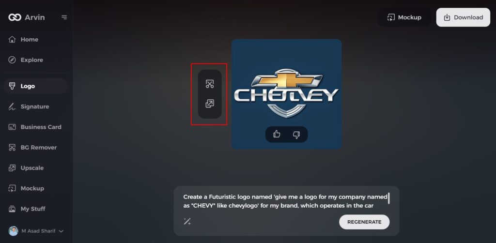
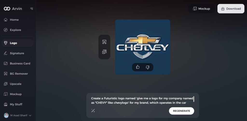
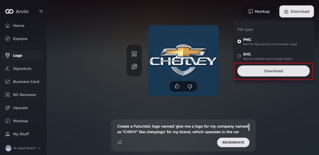
Step 7: Download Your Logo
Once satisfied with the design, download your logo in formats like PNG or SVG for use on websites, social media, and marketing materials.
Conclusion
The Chevy logo with its bowtie design dominates American automotive logos in historical significance. The company logo developed throughout the time to symbolize Chevrolet’s upgoing growth together with their technological progress and manufacturing excellence. For anyone looking to design successful logos such as Chevrolet’s, Arvin AI is the ideal tool to utilize. It provides cutting-edge AI-powered design solutions, guaranteeing expert, high-quality logos that are specific to your business’s identity.
FAQs
What was the inspiration for the Chevy logo?
The exact inspiration is lost, but candidates are a French hotel wallpaper, a newspaper advertisement, and the Swiss cross.
What does the Chevy logo mean?
The most common theory about its origin is that William C. Durant, co-founder of the Chevrolet brand, was inspired by a wallpaper design he saw in a French hotel. Another suggests that he saw it in a newspaper advertisement. Whatever its origin, the iconic bowtie was born.
What does the contemporary Chevy bowtie symbolize?
A gold bowtie bearing chrome accents symbolizes both Chevrolet’s historic roots alongside its innovative nature together with its dedication to top-quality products.
How does Arvin AI assist in logo design?
Arvin AI helps users design unique and professional logos, provides design suggestions, allows full customization, and provides high-quality output for various branding needs.
