The first Cartoon Network logo was designed in 1992 and began as the Cartoon Network. The original logo was fun and playful. The Cartoon character is above and the “Network” character is below it. This character was placed on a white and black background. Both characters are arranged horizontally, and each of the squares in the checkered pattern has its own characters. When the letter is black, the square becomes white, and vice versa.
Part 1: History and evolution of cartoon network logo
The cartoon network symbol mark has a simple and stylish visual identity. These iconic logos have been modified three times since it was designed in 1992. However, the logo always maintains its original style and black and white color scheme.
1992-2004
In 1992, Cory McPherson Nash designed the Cartoon Network logo. A rectangle of horizontal length placed on the background of a black and white checkered pattern, and each square contained thick letters written in sans serif logo fonts. The black letters arranged in white squares, and the white characters in black squares.
2004-2010
In 2004, the Cartoon Network logo redesigned in-house with the Sydney-based graphic design company Animal Logic Studio. From the bright and heavy emblem, two squares overlap and a grey shadow comes in. The black square on the left has a white “C” and the white square on the right has a black “N.” Underneath is the letter “Cartoon Network” in bold capital letters.
2010 – Present
In 2020, Cartoon Network internal design team and Brand New School jointly designed a new visual identity. This revived the network of well-known chess themes. This design was first used for advertising screensavers using Chewbacca images. In this version, “N” is written in a different style.
Part 2: Design Elements of Cartoon Network Logo
Following are the main elements of the cartoon network logo design:
Shape
The current logo was announced in 2004. It consists of two squares containing the initial letters of the network, with the full name below it. Cartoon Network’s in-house designers have re-designed it with the famous Australian graphic design company Animal Logic Studio.
Font
The font company name and its initial character have been written in the network’s distinctive playful custom font since its inception.
Color
Cartoon Network logo is designed with eternal black and white logo colors scheme. Black represents courage, decisiveness, excellence and prestige, while white symbolizes purity, tenderness and positive attitude.
Part 3: Analysis of Cartoon Network Logo Design Evolution
Cartoon Network’s logo represents more than just imagery since it demonstrates the rich history of this television channel’s beloved past. Various stories about creativity and innovation regarding brand identity and design flow through the historical development of the logo.
Simplicity Adoption
One of the timeless qualities of the cartoon network logo design is its acceptance of simplicity. From original checker patterns to rational two square designs, the evolution of the logo shows that simplicity can transformes into a powerful and memorable visual identity.
New and old balance
In the process of its evolution, the Cartoon Network logo has maintained a subtle balance of incorporating new features while retaining elements of previous designs. With this balance, such as consistent use of eagle fonts and repetitive color scheme of black and white, we respect the history of the brand while also incorporating modern design trends.
Part 4: The philosophy and meaning of the cartoon network logo design
The logo design of the cartoon network is not just a graphic, but a profound statement that condenses the philosophy, meaning and spirit of the brand. The Cartoon Network logo has changed over the years, but its core essence is consistent and reflects the channel’s values, personality, and connections with viewers.
Symbolism of creativity
The logo design of the Cartoon network has always been a sign of creativity. Its dynamic shape, contrasting colors and bold fonts honor the channel’s dedication to innovation, artistry and storytelling.
Connections with viewers
One of the distinctive features of the cartoon network logo design is its ability to resonate with viewers. As viewers mature their tastes evolve thus showing a deep bond between them and the logo.
Consistency and brand identity
The logo design of the Cartoon Network remains consistent despite its changes. Repeated elements, such as eagle fonts and white and black colors, are the lines that spin the history of the brand.
Inclusivity and universal appeal
The logo design of the cartoon network is simple and minimal, so it has universal appeal. Its design eliminates complexity, making it accessible and comprehensive. It does not give a sense of alienation, but invites and creates a sense of belonging.
Reflecting the evolution of the brand
The logo design of the cartoon network is a visual representation of the evolution of the brand. Every time you change your design, you start a new chapter showing important milestones and growth.
Part 5: What to learn from Cartoon network logo design
The Cartoon Network logo design is more than a nostalgia for our childhood, and is a textbook example of intelligent and empathetic design. Due to its evolution the cosmetics brand preserves its core essence as it adopts modern trends.
Adapt without losing identity
The logo design of the Cartoon Network teaches us how to change without losing identity. Whenever a design changes, a new one got birth, while the essence remains intact. This ability to evolve while retaining core features shows that change does not mean abandoning the old, but a thoughtful integration between the new and the existing.
Simplicity as a powerful tool
In the world of design, where complexity is prone to attention, the logo design of the cartoon network shows us the modest power of simplicity. The refreshing lines, bold colors and refreshing designs create the sympathy of viewers of all ages. The lesson here is clear. Less or more, simplicity can be transformed into timeless charm.
Strategic use of color and typography
Consistent use of black and white, strategic selection of Eagle fonts and consideration for color psychology play an important role in the success of the logo. The Cartoon Network logo design tells us that color and typography are not arbitrary choices, but strategic decisions that convey brand value, personality, and message.
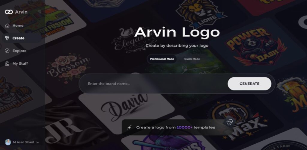
Part 6: Arvin AI – Transforming Logo Design with AI Innovation
Having an incredible logo is crucial for every brand as it builds familiarity and trust. Arvin AI is an excellent tool that enables businesses and artists to professionally create logos with the help of artificial intelligence. It enables customization of the design, selection of colors, and rapid development of logos.
Key Features of Arvin AI
- AI-Driven Logo Design: Arvin AI designs logos according to user choice.
- Customization Flexibility: Users can personalize colors, fonts, and designs according to brand preference.
- Efficient and Fast: The website accelerates logo design and makes it easy.
- Variety of Design Templates: Select from a wide collection of pre-made templates to get started with your design.
- Scalability: The logos generated by the AI can be resized and modified for various platforms without compromising on quality.
Steps to Use Arvin AI for making Logo
Step 1: Visit the Arvin AI Website
Open your web browser and head to the logo design page on Arvin AI to begin creating your custom bike logo.
Step 2: Enter Your Business Information
Provide essential business details such as your bike shop’s name and category. This helps the AI tailor logo designs that align with your brand’s identity.
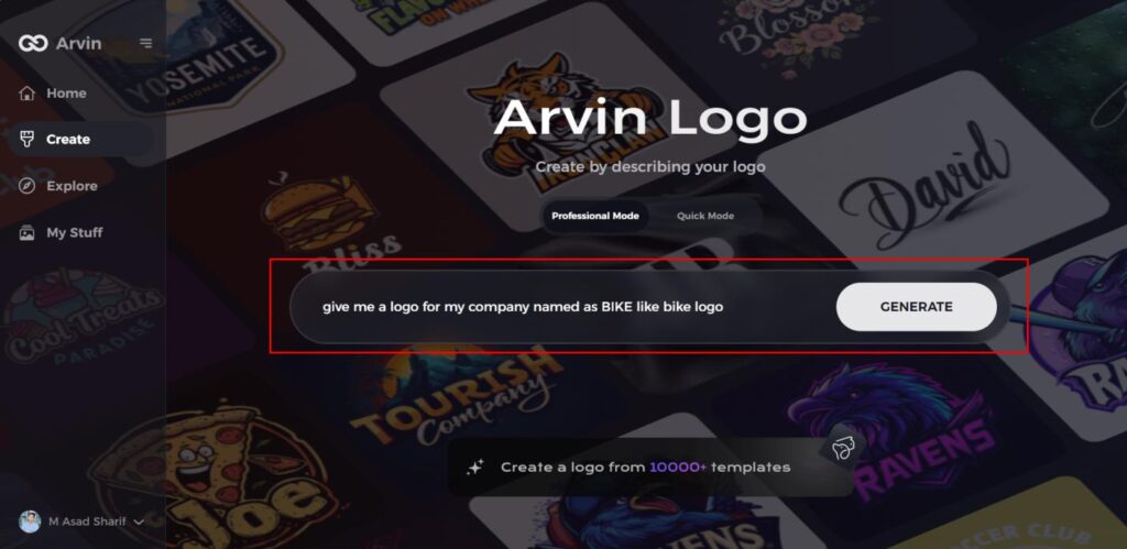
Step 3: Select Your Industry
Choose the “Bike” industry from the options available. This step refines the design process by focusing the AI on bike-related logo styles.
Step 4: Choose Your Design Style
Browse the list of styles and select one that best represents your bike brand’s vision. If unsure, simply skip this step and let the AI select a default style based on your inputs.
Step 5: Explore Logo Ideas
The AI will generate several logo designs based on the information you’ve provided. Review the concepts to find one that fits your brand’s image.
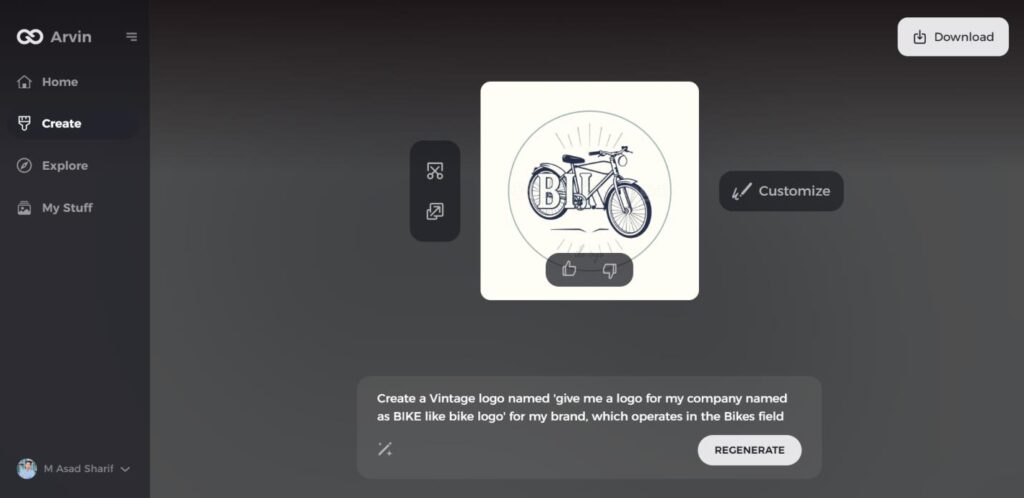
Step 6: Customize Your Logo
Personalize your chosen design by adjusting elements such as color, font, icon, and layout to better reflect your unique brand style.
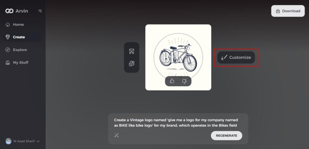
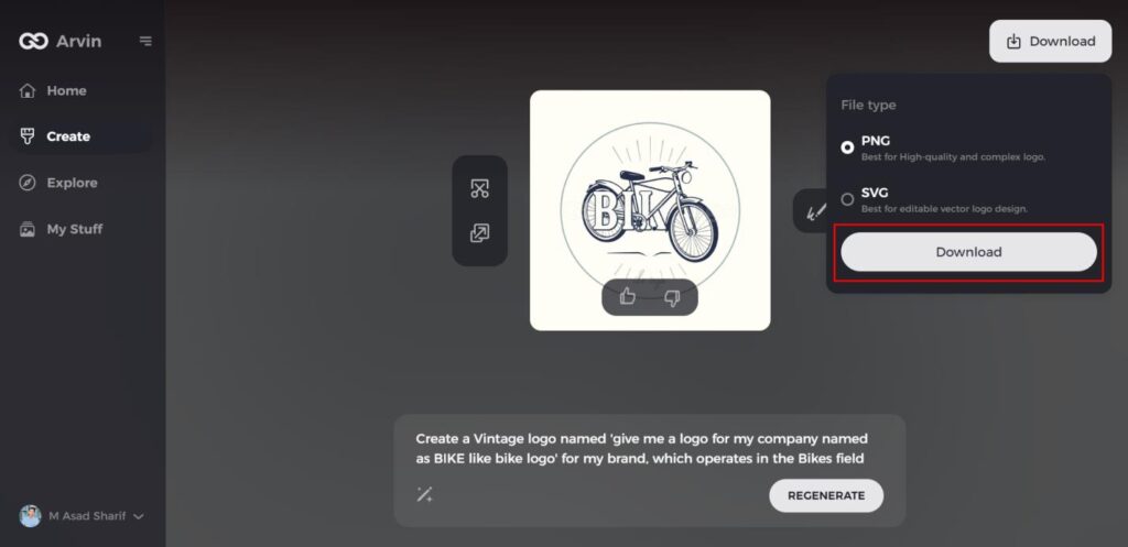
Step 7: Download Your Logo
Once you’re happy with the final result, download your logo in formats like PNG or SVG, ensuring it works seamlessly across digital and print platforms.
Conclusion
The Cartoon Network logo updated over time in order to remain modern and new. The design quality of a logo determines how well people recognize the brand. Cartoon Network achieved footprint in contemporary entertainment due to the evolution of its branding identity. Arvin AI provides creative designers with a platform to use for generating innovative logos which display exceptional maturity.
FAQs
Why did Cartoon Network change its logo?
Cartoon Network redesigned its logo to remain up-to-date and flexible in accordance with the development of digital media and viewers’ tastes.
What does the “CN” logo stand for?
The “CN” logo is a Cartoon Network abbreviation that is minimalist and easy to utilize. It symbolizes the network’s devotion to new and original content.
How has the Cartoon Network logo influenced other brands?
It set a trend for simple but strong branding in the entertainment industry. A number of other brands have been influenced by the trend.
Can I create a similar modern logo using Arvin AI?
Yes! Arvin AI offers tools to create professional and innovative logos in no time. Through its AI-driven system, the users are able to create customized logos within minutes.
