
The Cadillac logo is more than just a badge; it’s a symbol of prestige, innovation, and enduring heritage. Rooted in the coat of arms of Antoine de la Mothe Cadillac, the French explorer who founded Detroit, the emblem reflects the brand’s rich history and commitment to excellence. Over its long journey since 1902, the Cadillac logo has undergone more than 30 redesigns, evolving to align with changing aesthetics while maintaining its core symbolism.
From Cadillac’s heraldic roots to its modern minimalism, every logo tells a story. Begin yours today with Arvin AI’s Logo Designer.
Who Created Cadillac?
Cadillac
Cadillac was established on August 22, 1902, following the dissolution of the Henry Ford Company.
A dispute between Henry Ford and his financial backers, William Murphy and Lemuel Bowen, led Ford to leave the company. Seeking to appraise the company’s assets for liquidation, Murphy and Bowen brought in Henry M. Leland, an engineer from Leland & Faulconer Manufacturing Company. Instead of dismantling the company, Leland proposed using his proven single-cylinder engine to manufacture automobiles.
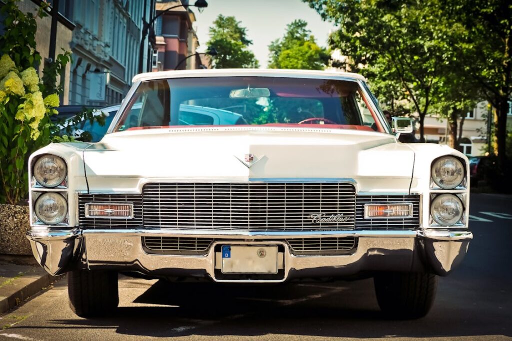
As a result, the Cadillac Automobile Company was born, utilizing the factory on Cass Street and Amsterdam Avenue in Detroit. The brand was named in honor of French explorer Antoine Laumet de La Mothe, sieur de Cadillac, the founder of Detroit in 1701.
Cadillac’s logo tells a story of greatness. What will yours say? Design it with Arvin AI’s Logo Designer.
Cadillac Logo Old: New Cadillac Logo vs Old
The First Cadillac Logo (1902)
The first Cadillac logo, introduced in 1902, was a highly detailed design inspired by the coat of arms of Antoine Laumet de La Mothe, Sieur de Cadillac, the founder of Detroit. It featured an ornate crest adorned with what looked like swans, ducks, and parallel lines, symbolizing leadership, purity, and balance. Encased in a laurel wreath to represent victory and excellence, the crest was crowned with a regal crown, emphasizing prestige and aristocracy. Below the emblem, the words “La Mothe Cadillac” highlighted the brand’s homage to its namesake, while the intricate design reflected the luxurious and heritage-rich image Cadillac aimed to project at its inception.
The Last Cadillac Logo (2021)
In stark contrast, the 2021 Cadillac logo is a minimalist and modern reinterpretation of the brand’s identity. Stripped of the wreath, crown, and animal symbolism, the logo focuses solely on a simplified crest, rendered in a sleek black-and-white color palette. The geometric shapes within the crest, now bold and angular, aligning with contemporary trends in design.
Cadillac Logo History
1902–1925
During the heraldic era of Cadillac’s logos, the designs were rich with elements that symbolized luxury, tradition, and aristocratic values, drawing heavily from Antoine de la Mothe Cadillac’s coat of arms.
What is “heraldic”?
Heraldry is the practice of designing, displaying, and documenting coats of arms and heraldic symbols, originating in medieval Europe. It was initially used to identify individuals, families, or organizations during battles and formal occasions. Over time, heraldry grew into a symbolic and ceremonial art form, reflecting heritage, status, and accomplishments.
What does “heraldry” comprise?
The key components of heraldry include shields, crests, crowns, and decorative elements like floral patterns, wreaths, and banners. These elements often symbolize values such as nobility, power, honor, and legacy. Heraldry is steeped in tradition and follows specific rules and designs to convey meaning, with every color, symbol, and shape chosen for a particular purpose. For example:
- Crests represent personal or familial identity.
- Colors like gold signify generosity, while blue often stands for loyalty.
- Animals like lions or swans symbolize bravery or purity.
Image from 1000logos.net
This period emphasized a connection to European nobility, as evident in the use of crests, shields, crowns, and intricate ornamental flourishes. Additionally, many designs incorporated taglines and lettering, such as “La Mothe Cadillac” or “Standard of the World,” written in serif fonts with arched or circular placements around the crest, further enhancing the heraldic and prestigious feel.
Image from 1000logos.net
The crest, a consistent centerpiece of every design, featured checkered patterns, swans, and ducks—symbols of balance, purity, and leadership—reflecting Cadillac’s commitment to excellence and refinement.
Image from 1000logos.net
Crowns, often placed above the crest, varied in style from simple and sleek to elaborate and regal, highlighting authority, craftsmanship, and the brand’s dominance in the automotive industry. Ornamental borders such as floral patterns, decorative circles, and laurel wreaths added a regal touch, reinforcing the company’s focus on tradition and artistry. The color palette of these early logos was predominantly monochromatic, using black-and-white tones to ensure clarity and elegance, in line with printing capabilities of the time.
Image from 1000logos.net
Image from 1000logos.ne
These symmetrical designs conveyed a sense of harmony and dependability, aligning with Cadillac’s positioning as a luxury brand steeped in tradition and innovation. The logos during this era served not only as visual identifiers but as representations of legacy, heritage, and aspirations to be synonymous with timelessness and quality.
1926–1947
Between 1926 and 1947, Cadillac’s logos underwent a significant transformation, marking a departure from the elaborate and heraldic designs of earlier years. During this era, the brand embraced the Art Deco and modernist movements, which were reflective of broader societal shifts toward innovation, industrialization, and sleek aesthetics.
Image from 1000logos.net
Image from 1000logos.net
Image from 1000logos.net
As a result, Cadillac’s visual identity began to prioritize streamlined forms and geometric precision, aligning perfectly with its technological advancements and forward-looking ethos.
One of the most notable changes during this period was the simplification of the iconic crest. While the crest remained central to Cadillac’s identity, it became noticeably sleeker and more geometric.
Image from 1000logos.net
Gone were the intricate patterns and ornate details that defined the earlier designs; instead, the focus shifted to clean lines and modern forms. To complement this shift, angular shapes such as elongated shields and triangles replaced the traditional circular frames.
Image from 1000logos.net
Moreover, the logos of this time adopted a refined monochrome and metallic color palette, featuring shades of black, silver, and gold. These restrained hues enhanced the professional and sophisticated image of the brand, mirroring the industrial design trends of the era. In addition to the minimalist palette, crowns and laurel wreaths; though less prominent, occasionally made appearances in simplified forms.
Image from 1000logos.net
Symmetry also played a pivotal role in this era’s logo designs, maintaining a connection to both heraldic traditions and the balanced aesthetics of Art Deco. This symmetry conveyed stability and dependability, which were essential qualities for an automotive brand during a period of significant global economic changes. Additionally, Cadillac experimented with wing-like elements in some logos, introducing a sense of speed, motion, and aerodynamic efficiency.
1947-1963
From 1947 to 1963, Cadillac logos reflected a significant shift toward bold, powerful, and refined aesthetics.
Image from 1000logos.net
This period marked the transition into modern automotive luxury, with designs emphasizing sleekness, dynamism, and the introduction of elements that became staples of Cadillac’s visual identity for decades to come. The logos during this era embodied the post-war optimism and industrial boom in the luxury car market.
Image from 1000logos.net
Post-war affluence and the booming American economy also played a role in shaping Cadillac’s visual identity. The 1950s saw the widespread adoption of color in logos, with Cadillac incorporating gold to signify wealth, red for boldness, and black for sophistication. The logos became brighter and more eye-catching, reflecting the era’s consumer-driven culture. Furthermore, the crown above the crest, a hallmark of Cadillac’s aristocratic heritage, was given a more dominant presence.
Image from 1000logos.net
The golden anniversary logo of 1952–1953 commemorated its legacy with a clean, celebratory design.
Image from 1000logos.net
Image from 1000logos.net
By the late 1950s, as the space race and advancements in technology captured the public imagination, Cadillac’s logos mirrored these futuristic aspirations. The crest and “V” combination evolved to adopt wider, sharper angles, evoking a sense of motion and progress. This shift was in line with the tailfin designs on Cadillac cars, which became iconic symbols of the brand and the decade’s automotive styling. By 1960, the logo had transitioned to a sleek horizontal layout.
Image from 1000logos.net
The wreath, introduced in 1963, symbolized refinement, legacy, and tradition, acting as a bridge between Cadillac’s historical roots and its modern aspirations. This addition highlighted Cadillac’s ability to honor its past while pushing boundaries in automotive design and engineering.
1963-2000
The period between 1963 and 2000 marked a transitional era for Cadillac.
Image from 1000logos.net
Beginning in 1963, the logo introduced a wreath as a key element framing the crest. The crest itself was colorful and vibrant, incorporating a combination of red, gold, blue, and black hues that spoke of sophistication and heritage. This version of the logo maintained symmetry and balance, adhering to the classic heraldic inspiration.
Image from 1000logos.net
Image from 1000logos.net
By the mid-1960s, Cadillac began experimenting with more minimalistic approaches. From 1965 to 1971, the crest was paired with a sleek “V” shape beneath it, a nod to the streamlined, aerodynamic designs of Cadillac vehicles during this time. This pairing of the crest and “V” became iconic, serving as a recognizable emblem of Cadillac.
Image from 1000logos.net
Image from 1000logos.net
Image from 1000logos.net
The logos introduced in the 1970s and 1980s continued this trend of simplifying elements while emphasizing the crest’s prominence. By the 1980s, the crest was placed within a silver or gold wreath, signifying opulence and heritage.
Image from 1000logos.net
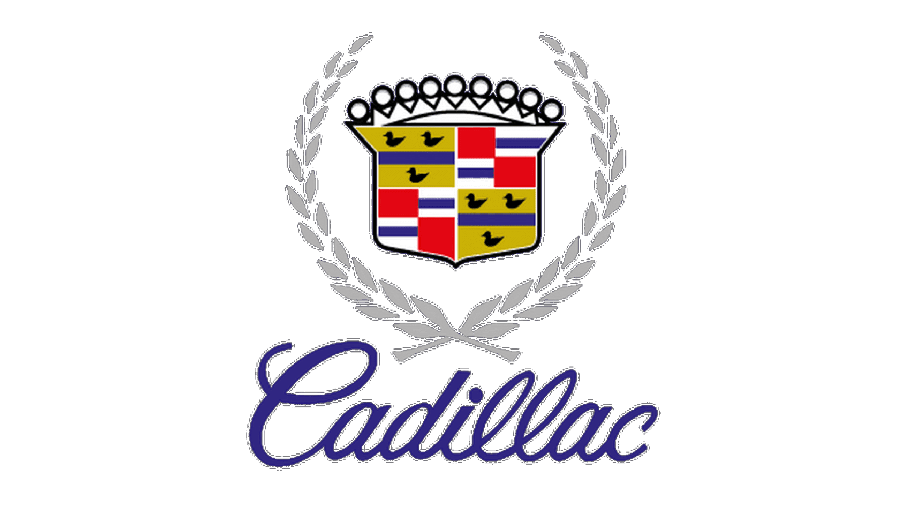
As the brand entered the 1990s, Cadillac added subtle updates to keep pace with evolving design aesthetics. The wreath remained a defining feature, often rendered in metallic textures that aligned with the futuristic styling of Cadillac’s vehicle lineup. The crest itself saw refinements in its detailing, maintaining its connection to the company’s historical roots while reflecting a more contemporary identity. During this period, Cadillac also introduced a script-style wordmark, which added a personal, bespoke touch to its logo. This typographical addition balanced the crest’s traditional design with a modern flair, appealing to both legacy customers and a younger, style-conscious demographic.
2000-2021
The period from 2000 to 2021 marks a its pivot toward sleek, contemporary aesthetics while maintaining a connection to its storied past.
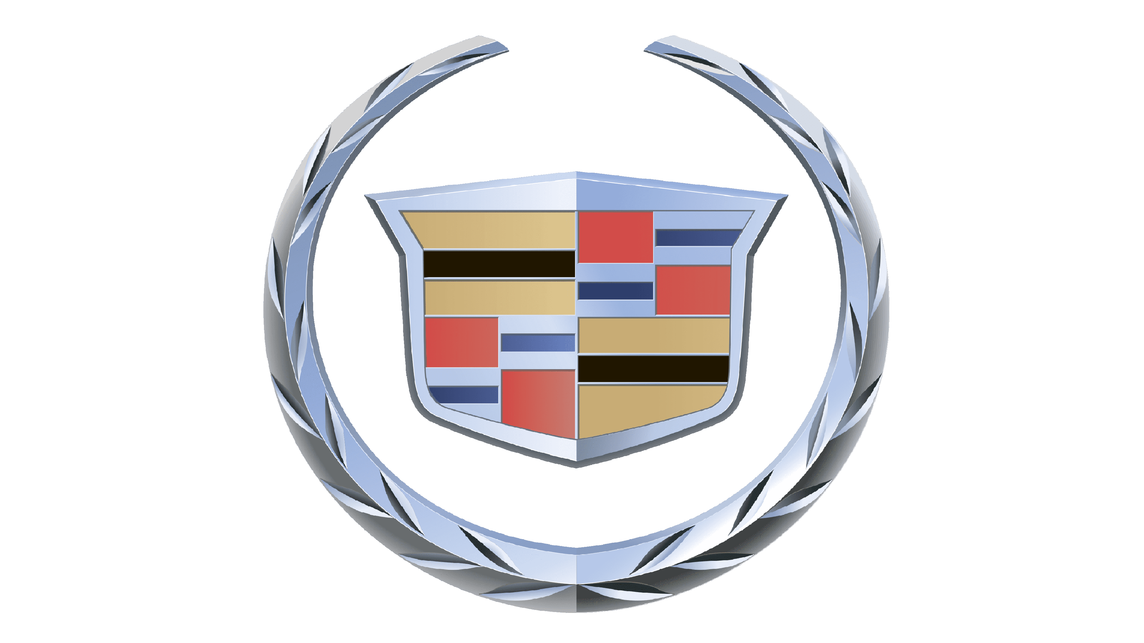
From 2000 to 2009, the Cadillac logo saw the introduction of a three-dimensional crest framed by a silver laurel wreath. The crest retained its vibrant colors, including shades of red, gold, and blue, symbolizing luxury, sophistication, and tradition. The introduction of a 3D effect gave the emblem a dynamic and modern appearance.
Image from 1000logos.net
The 2009 to 2014 redesign kept the same core elements but emphasized sharper details and an updated wreath design. The metallic texture of the wreath became more pronounced, and the crest was subtly refined to enhance its modernity. These updates were a nod to Cadillac’s push toward technological innovation and a more polished brand image.
Image from 1000logos.net
In 2014, Cadillac unveiled a significant redesign, removing the laurel wreath that had accompanied its emblem for decades. This decision reflected a clean, streamlined aesthetic, focusing entirely on the crest itself. The crest was elongated and made sleeker, while its vibrant colors were maintained, symbolizing boldness and innovation.
Finally, in 2021, Cadillac transitioned to a monochromatic black-and-white version of the crest, marking a new minimalistic phase for the brand. The redesign eliminated the wordmark and reduced the logo to its bare essentials, focusing on clean lines and geometric shapes.
Cadillac’s logo evolution isn’t just about aesthetics—it’s about storytelling. Each detail, from the early heraldic crests to today’s sleek geometric design, reflects a commitment to excellence and innovation. Your brand deserves the same iconic presence. Arvin AI’s Logo Designer gives you the tools to craft a logo that defines your journey, celebrates your values, and sets you apart in any market. Start designing the emblem of your success today.
Cadillac Logo Ducks
The “Cadillac logo ducks” technically refer to the merlettes—heraldic, footless birds—featured prominently in the earlier iterations of Cadillac’s crest.
These merlettes were derived from the coat of arms of Antoine de la Mothe Cadillac, the French explorer after whom the brand is named. In traditional heraldry, merlettes often symbolize virtues such as purity, leadership, and a noble lineage, aligning with Cadillac’s image that they wanted to advertise.
In the early designs, the merlettes were stylized and integrated within the crest, often alongside other heraldic elements such as crowns, shields, and checkered patterns. Their inclusion served as a visual reminder of its connection with European aristocracy.
Cadillac’s 2021 logo proves minimalism is powerful. Build your bold and modern logo with Arvin AI’s Logo Designer.
Final Words
Being one of the logos with the most rebrands, the emblem has evolved over more than a century, reflecting the shifts in societal trends and design aesthetics during the period of time. However, despite the changes, it remains true to the original design and its connection with the European aristocracy.

For over a century, Cadillac’s logo has symbolized prestige, power, and refinement. Every redesign has been a step forward, honoring its roots while embracing innovation. Why not apply the same principle to your own brand? With Arvin AI’s Logo Designer, you can design a logo that speaks of your values and ambitions, one that captures your essence and resonates with your audience. Whether you’re building a legacy or starting anew, your crest of excellence is just a click away.
FAQ
The Cadillac logo symbolizes prestige, innovation, and heritage. Derived from Antoine de la Mothe Cadillac’s coat of arms, the emblem reflects the brand’s noble lineage, leadership, and commitment to quality. Its elements—such as crowns, laurel wreaths, and vibrant colors—convey luxury, tradition, and modernity.
Cadillac was established on August 22, 1902, by William Murphy, Lemuel Bowen, and Henry M. Leland after the dissolution of the Henry Ford Company. Leland, an engineer, proposed creating cars with his advanced single-cylinder engine, laying the foundation for Cadillac’s legacy.
Yes, Cadillac is an American luxury automobile brand, headquartered in Detroit, Michigan. It has been a division of General Motors (GM) since 1909, manufacturing vehicles primarily in the United States and other select locations worldwide.
No, Cadillac is not a German-made car. It is an American luxury car brand. However, Cadillac vehicles compete with German luxury brands such as Mercedes-Benz, BMW, and Audi in the global automotive market.
