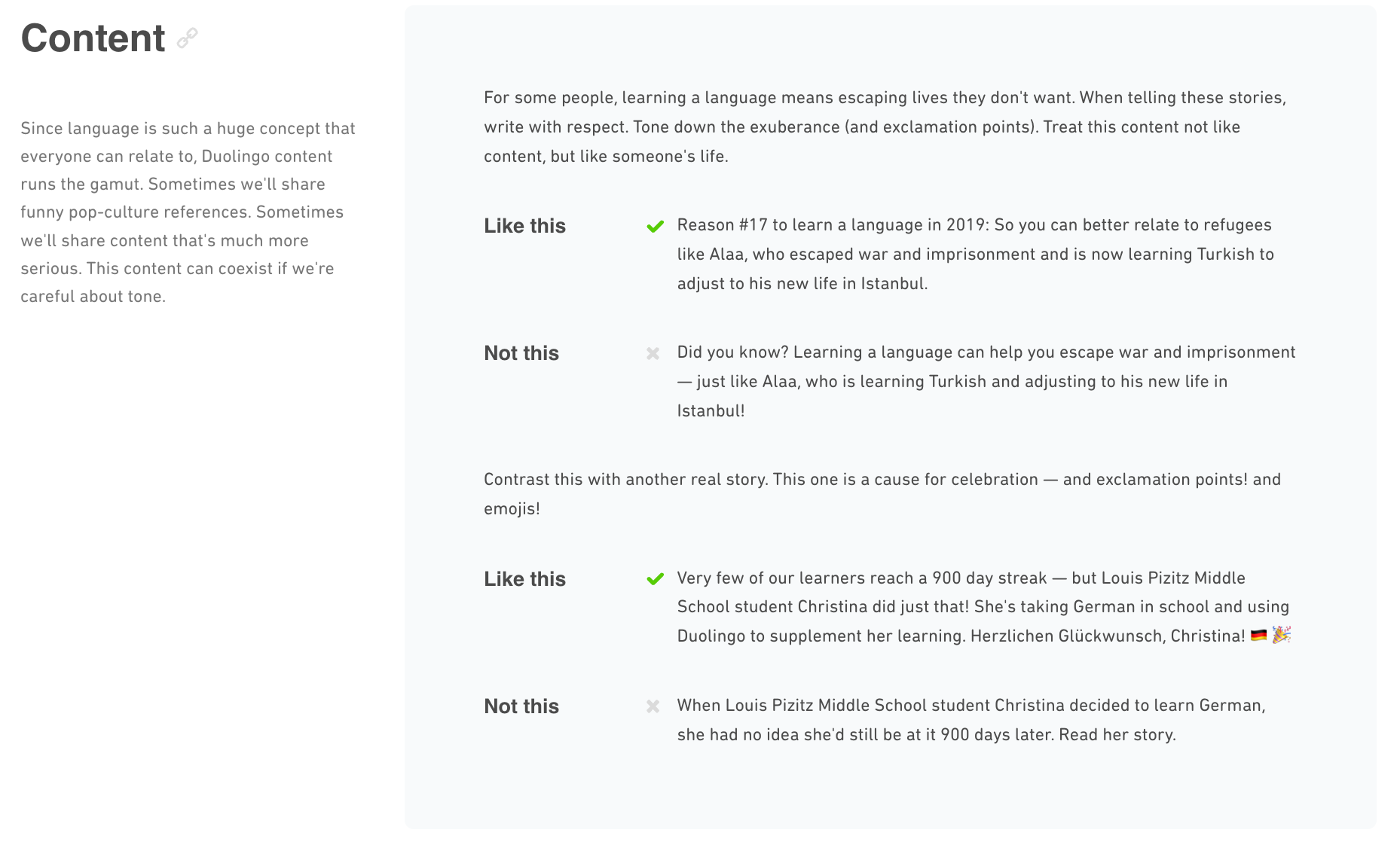
Trying to scale a brand without a brand bible is risky at best. Things may hold up for a while, but over time, inconsistencies show, confusion spreads and the overall structure weakens. A good brand bible is what keeps everything aligned, and outlines how your brand should look, sound, and operate to make your brand identity consistent.
In this guide, we will:
- Go over what a brand bible actually includes
- Why it matters more than most people think
- How to build one that actually works for your business (and not just sit in a folder somewhere)
We’ll also share a free template (below) to get you started and a few practical insights you won’t get from just Googling around. If you’re still in the early stages of building your visual identity, you might also want to check out this list of Best Logo Makers. They are especially useful if you are not a marketing industry professional, but still want a successful brand system.
What Is a Brand Bible?
A brand bible is a reference guide that outlines how a brand should be presented across visuals and messaging.
A brand bible:
- Ensures brand consistency across different situations, teams and platforms
- Translates brand essence into clear, repeatable guidelines
- Protects brand recognition, reflects brand thinking
- Builds a successful brand system grounded in brand design fundamentals
- Supports long-term growth by creating a scalable foundation
What Should a Brand Bible Contain?
A strong brand bible brings together all the elements needed to keep a brand consistent as the company grows. At minimum, it should include:
- Mission, Vision, and Values
- The purpose, goals, and guiding principles of the brand
- Visual Identity
- Logos, colours, typography and layout rules for visual consistency
- Voice and Tone
- How the brand sounds across different platforms and audiences
- Writing Style
- Grammar, formatting and language preferences for cohesive content
- Dos and Don’ts
- Clear examples of what’s on brand (and what’s not)
Together, these create a comprehensive guide for teams, graphic designers, and partners to build a brand system that supports consistency, efficiency, and long-term brand recognition.
1. Mission, Vision, and Values
Every great brand starts with purpose. If you’ve ever flipped through the brand guide of some of the world’s largest brands (Adidas, Spotify, Google), you’ll notice that they always have “Purpose” right at the top.
This explains why your brand exists (mission), where it’s heading (vision), and the principles guiding its actions (values).
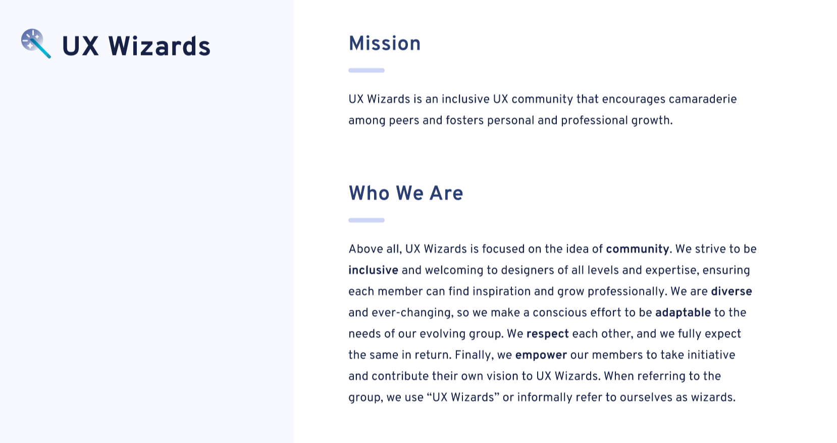
Take UX Wizards for example. Their brand guide opens with a strong mission and vision that explains why they do what they do, and how they make ‘design’ more accessible, inclusive and fun.
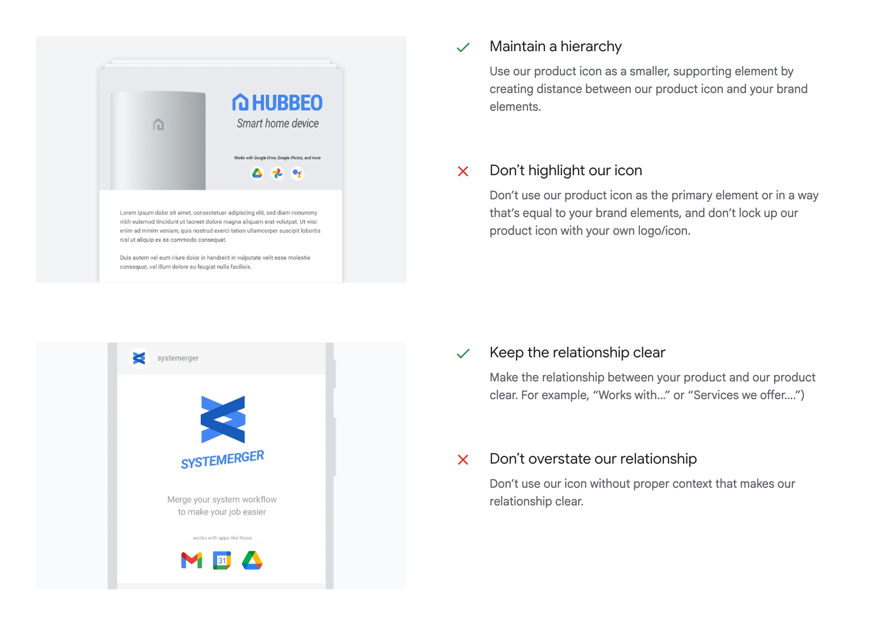
2. Visual Identity
Visual brand identity refers to the set of design elements that represent a brand across its materials and platforms. It plats a critical role in maintaining a visual brand identity. This is extremely essential as brands scale and engage with different audiences, through marketing materials or digital platforms, a clear visual system becomes essential.
A well-documented visual identity supports sustaining brands over time as they create a shared design language that helps the brand remain distinct, cohesive, and responsive to change. It is also how brands stand out in spaces especially in fields where differentiation is driven by clarity, and aesthetics, such as tech, lifestyle and visual arts.
a) Logos
The logo is the most direct and widely used representation of a brand. However, due to the frequency of use, it can also be one of the most susceptible to misuse. Here’s how to use them without stretching or squishing (yes, we’ve all seen that happen) them too much.
Note: If you’re still in the process of developing your logo, the Arvin AI Logo Maker is a practical solution for generating professional, scalable designs without prior design experience.
Things to take note:
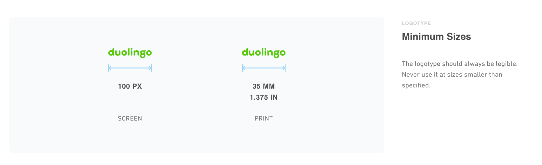
i) Minimum sizing
Specify exact minimum dimensions for both print and digital use.
- Example: Apple’s brand guidelines mandate a minimum width of 10mm for print and 40px for digital.
ii) Proportions
The logo must maintain its original proportions at all times. No stretching, compressing, or skewing is permitted.
- Example: Slack, during its 2019 rebrand, implemented strict ratio rules after previous versions of the logo were repeatedly distorted across third-party slides and partner platforms, resulting in an inconsistent brand presence.
iii) Clear space
Maintain a designated clear space around the logo, free of any text or imagery or graphic elements.
- Example: Spotify requires a minimum clear space on all sides equivalent to 50% of the logo’s height.
iv) Variants
Only allow the use of official logo formats provided. Ensure that each has a defined usage context.
- Example: Google restricts its partners from using modified or recoloured versions of its logo.
b) Typography
The font you choose and how you apply it must reflect the tone, industry, and values of your brand.
i) Brand Typeface
Select one primary and one secondary typeface that reflects the brand’s tone.
Example: Netflix created their own custom typeface, Netflix Sans, to avoid licensing costs, and put a unique twist to their font.
ii) Font Hierarchy
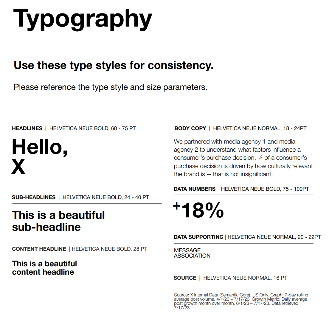
Define a clear font hierarchy. Headings, subheadings, body copy, captions etc. They should all be labelled with their weights, sizes and spacing.
c) Colors
Your colour palette should be accessible and consistently applied across all media.
i) Primary and Secondary Colors
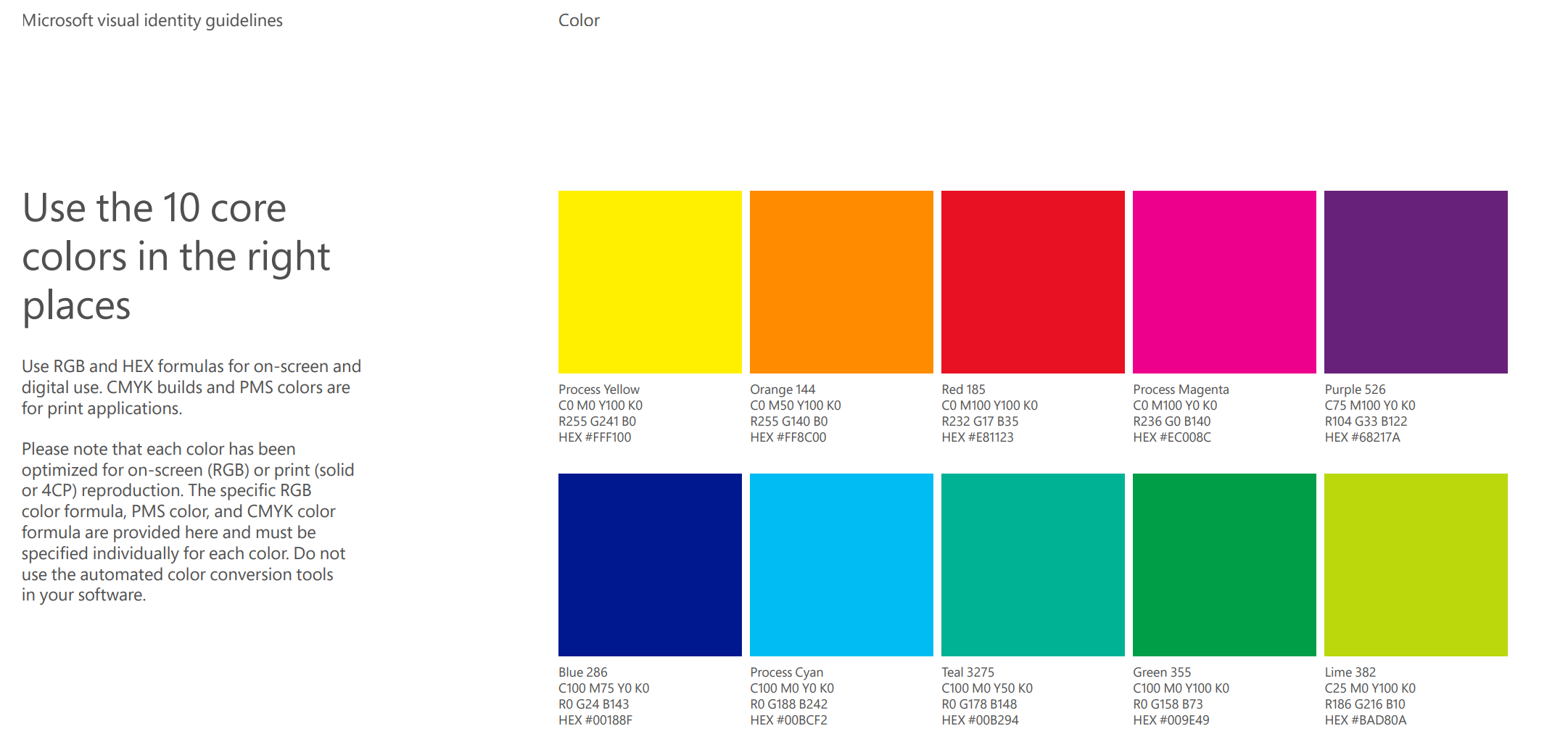
Primary colors are defined as your core brand’s most frequently used colors, and secondary colors are used for accents or secondary messaging.
ii) Color Codes
List HEX (web), RGB (digital) and CMYK (print) values for each color.
d) Imagery Style
The imagery style is extremely individual to what the brand identity. For example, AirBNB’s IS (imagery style), explicitly avoids overly staged or sterile content, and rather focuses on warmth, natural light and lived in environments.

Take note of:
- Mood and tone
- Compositio
- Diversity/Representation
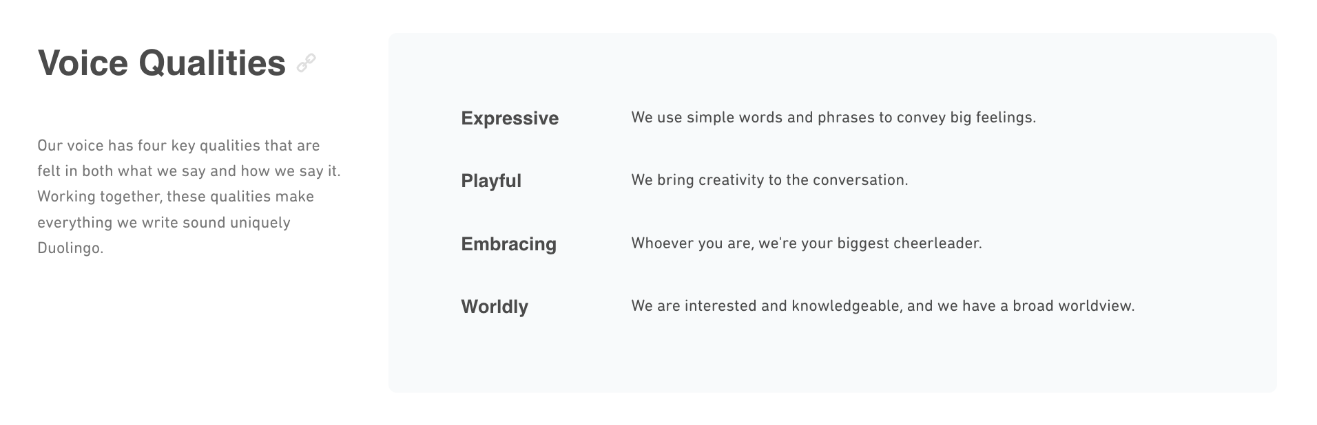
3. Voice and Tone
Here’s where things get personal. This section outlines how your brand “talks” to its audience. Try to narrow down your brand’s characteristics by using adjectives, and then use those information to decide on the tone of your brand.
4. Writing Style
Effective brand writings with the precise understanding your audience. Demographics, communication preferences, and behavioural tendencies must inform tone, vocabulary and structure.
a) Brand Narrative
Developing a coherent brand narrative requires answering 6 fundamental questions:
- Who is the brand?
- What does it do?
- When did it begin, and how has it evolved?
- Where does it operate or serve?
- Why does it exist?
- How does it deliver value?
A strong brand narrative can keep everyone (from the Chief Marketing Officer to the new Intern) on the same page and make the brand remain consistent.
b) Brand Personality
The brand personality is somewhat of a set of human traits that inform tone and word choice. We should clearly define these traits using adjectives that contrast what the brand is with what it wants to be.
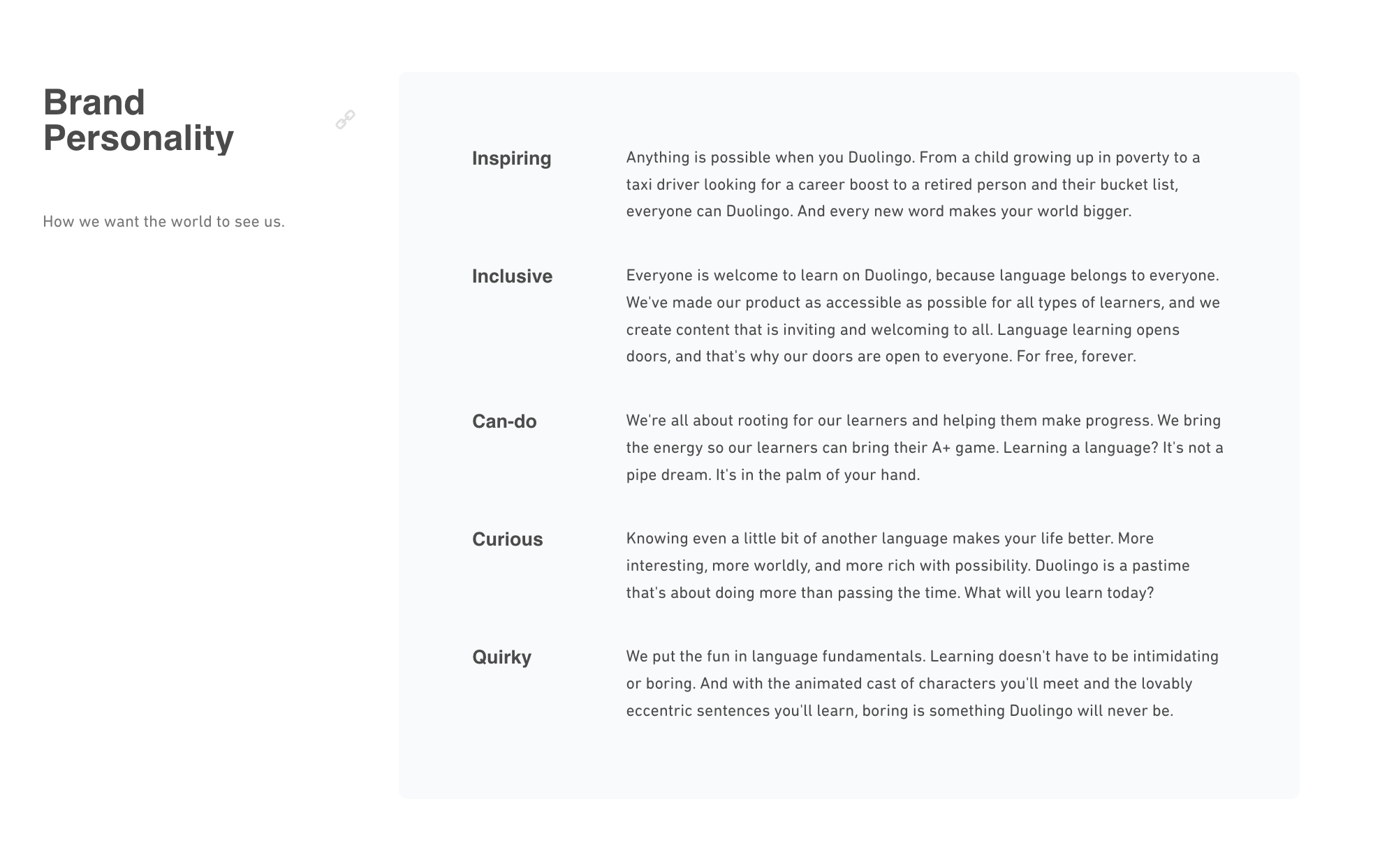
The brand bible should be able to translate these traits into everyday usage, and adjust for channel, audience and context.
| Trait | Avoid |
|---|---|
| Confident | Overconfident or arrogant |
| Approachable | Informal or unprofessional |
| Informed | Overly academic or dense |
| Direct | Abrasive or insensitive |
5. Do’s and Don’ts
This section sets boundaries. For example, it might say, “Always use our logo in full color” or “Never use Comic Sans (please).”
Here is a table of dos and don’ts you can use to check against your brand bible:
| Characteristic | Do | Don’t |
|---|---|---|
| Logo Usage | Use the official logo in full color on approved backgrounds | Stretch, distort, recolor, or apply shadows or effects to the logo |
| Logo Spacing | Maintain required clear space around the logo | Place text, images, or graphics too close to the logo |
| Typography | Use approved brand typefaces with correct weights and hierarchy | Use unapproved fonts (e.g., Comic Sans, Papyrus) or mix fonts inconsistently |
| Color Palette | Use exact HEX, RGB, or CMYK codes from the brand palette | Approximate brand colors or apply unapproved shades |
| Tone of Voice | Write in the defined brand tone (consistent, clear, and audience-aware) | Shift tone inappropriately between formal, casual, or off-brand language |
| Imagery | Use high-quality, inclusive, and on-brand imagery or illustrations | Use cliché stock photos, low-res visuals, or off-style illustrations |
| Copywriting Style | Write clearly and with purpose; tailor messages to the audience | Use vague, technical, or bloated language |
| Channel Adaptation | Adjust tone appropriately for each platform (e.g., social vs. website) | Use one-size-fits-all messaging across all communication channels |
6. Content and Messaging Guidelines
The goal is to maintain a unified voice and messaging approach across all brand touchpoints.
Things to take note of:
a) Tagline usage
Define where and when to use the brand tagline.
b) Tone by channel
Specify how the brand voice should adapt across email, web, social, print, etc.
c) Copy length
Provides the best practices for copy density (short-form vs long-form)
Why Is a Brand Bible Important?
In practice, brand bibles are used by graphic designers, marketing teams, brand consultants, agencies, and sometimes even clients. They’re especially useful for:
- Developing campaigns
- Launching new products
- Onboarding new team members
Together, these standards create a unified brand system that can be applied across different situations and media formats. This also ensures that all brand treatments, from logo design to tone of voice, reflect the brand’s core personality and strategic intent.
a) Consistency
No matter who’s creating content, your designer, your intern, or even a third-party agency, your brand’s look and feel remain the same. A brand bible codifies the rules governing the type, color, layout, tone and usage across applications.
Organizations such as Spotify and Google employ tightly controlled brand systems to maintain consistency across geographic markets and digital environments.
Consistency not only reinforces brand recognition but also improves the clarity and credibility of brand communication across time and context.
b) Identity Retention
Over time, a consistent brand behaviour contributes to public recognition and retention.
Nike’s strict adherence to its “Just Do It” ethos and minimalist typographic style enables it to remain both adaptable and recognizable across campaigns.
This type of discipline supports long-term sustaining brand efforts even in competitive or saturated markets.
c) Operational Efficiency
Moreover, a strong brand bible contributes directly to operational efficiency. It helps to maintain alignment between internal teams and external collaborators, reduces unnecessary revisions and ultimately protects the brand’ integrity over time. It’s also a cost effective tool that prevents expensive miscommunications and ensures that money spend on design and marketing aligns with strategic goals.
Well-defined visual standards reduce unnecessary iterations, ensure faster production cycles, and prevent costly errors related to misaligned messaging or visual execution.
d) Adaptability
As your brand grows, this guide ensures your core identity stays intact while adapting to new trends and audiences.
Free Brand Bible Complete Guide Template
A ready-to-use structure for documenting your brand system clearly and consistently.
1. Cover Page
- Brand Name: [Insert Logo and Name]
- Tagline: [Optional]
- Date Created: [Month, Year]
- Version: [e.g., v1.0]
2. Introduction
This section outlines the foundational elements of your brand.
- Mission Statement: What is the brand’s purpose?
- Vision Statement: What does the brand aspire to achieve?
- Core Values: List 3–5 key principles (e.g., innovation, transparency).
- Brand Story: Brief origin story that highlights uniqueness.
3. Audience Profile
Understanding your audience ensures relevant and consistent communication.
- Target Audience: Who are they? Demographics and psychographics.
- Personas: (Optional) Include a few fictional profiles representing key audience segments.
- Tone and Voice: Describe the brand’s communication style (e.g., friendly, professional).
4. Logo Guidelines
Provides standards for how the logo should and should not be used.
- Primary Logo: Display with specifications (size, placement, proportions).
- Alternate Logos: Any variations (monochrome, stacked versions, etc.).
- Clear Space: Define spacing rules around the logo.
- Usage Do’s and Don’ts: Examples of correct and incorrect logo usage.
No design experience? No problem!
Use the Arvin AI Logo Maker to craft a professional logo in minutes. For creating personalized digital signatures, try our Free AI Signature Generator.
5. Typography
Defines your type system to ensure visual consistency in text-based communication.
- Primary Fonts: Name of the font(s) for headings and body text.
- Secondary Fonts: If applicable, for accents or emphasis.
- Font Usage: Examples of font hierarchy (headings, subheadings, body).
6. Color Palette
A defined color system is key to brand recognition.
- Primary Colors: Include HEX, RGB, and CMYK codes.
- Secondary Colors: Supporting colors for accents or backgrounds.
- Neutral Colors: For text, backgrounds, etc.
- Usage Guidelines: Specify which colors to use for what purposes.
7. Visual Style
Outlines the aesthetic standards for all branded visuals.
- Photography Guidelines: Tone (e.g., bright, moody), subjects, filters, etc.
- Illustrations: Style, if applicable.
- Icons: Preferred style and use cases.
- Patterns or Textures: Include if part of the brand.
8. Messaging and Copywriting
Defines how the brand communicates in writing.
- Taglines and Slogans: Official phrases for campaigns.
- Voice Guidelines: E.g., casual but knowledgeable.
- Content Types: How to approach different content (social media, ads, blogs).
9. Brand Applications
This section shows how brand elements are applied in real-world formats.
- Print Materials: Business cards, brochures, flyers, etc.
- Digital Presence: Website, email, social media visuals.
- Product Packaging: Mockups or examples.
- Uniforms or Merchandise: Any branded apparel.
10. Contact Information
Include key points of contact and access instructions for brand assets.
- Brand Manager: Name, email, and phone number.
- Creative Agency: (If applicable).
- Assets Access: Links to download logos, templates, and more.
Brand Bible Examples
These are brands that have got their branding down pat and are globally recognised as an icon.
1. Airbnb – Belong Anywhere
- Core Idea: Focuses on their ethos of creating a global community.
- Highlights:
- Logo Design: Simplistic “Bélo” symbol representing people, places, love, and Airbnb.
- Typography: Custom font (“Airbnb Cereal”) that is approachable yet clean.
- Voice: Friendly, inclusive, and conversational, catering to travellers and hosts alike.
- Color Palette: Warm, human tones like coral, white, and greys to evoke trust and inclusivity.
2. Coca-Cola – Icon of Happiness
- Core Idea: “Open Happiness” drives their brand communication.
- Highlights:
- Logo Design: Timeless cursive script, emphasising consistency over decades.
- Color Palette: Signature red and white dominate.
- Visuals: Energetic and optimistic imagery, often featuring people sharing joyful moments.
- Voice: Uplifting and aspirational, with a focus on togetherness.
3. Google – Simplicity Meets Innovation

- Core Idea: Seamless and functional design.
- Highlights:
- Logo Design: Dynamic, with colors representing diversity and approachability.
- Typography: Google Sans for a clean and modern aesthetic.
- Voice: Direct yet playful, always customer-focused.
- Applications: Websites, mobile apps, and branding across all platforms use the same clean design language.
4. Nike – Just Do It
- Core Idea: Empowerment through sports and movement.
- Highlights:
- Logo: The iconic “Swoosh” conveys motion and energy.
- Typography: Bold and impactful fonts that match their motivational tone.
- Voice: Inspirational, often featuring athletes and stories of perseverance.
- Visuals: High-contrast, dynamic imagery showcasing action.
5. Spotify – Music for Everyone
- Core Idea: Democratizing music through accessible design.
- Highlights:
- Logo: Simple green circle with waves, representing streaming.
- Color Palette: Signature green, black, and white, with vibrant accents for playlists.
- Typography: Rounded sans-serif fonts to convey modernity and friendliness.
- Visual Style: Engaging, featuring abstract patterns and artist-focused graphics.
6. Apple – Design Meets Functionality
- Core Idea: Seamless integration of design and technology.
- Highlights:
- Logo: The minimalistic Apple symbol.
- Typography: San Francisco font, sleek and clean.
- Color Palette: White, grey, and black for premium sophistication.
- Voice: Clean and aspirational, focusing on simplicity and user empowerment.
Free Brand Bible Designer
The Arvin AI Logo Designer is the perfect companion for building your Brand Bible and finding inspiration.
Here’s why:
1. It Is Intuitive and Effortless
Designing a logo has never been easier. With a clean and user-friendly interface, Arvin ensures that anyone, even without design experience, can create a stunning logo. All it takes is entering your brand name, selecting a style, and adding a few descriptive keywords. In seconds, you’ll have multiple custom designs to choose from.
A logo is more than just an image. It’s your brand’s identity. Read more in What Is a Logo?
2. It Has Diverse Design Options
Not all brands are the same, and Arvin celebrates that with a wide range of styles. From sleek and modern to classic and vintage, you can find the perfect aesthetic to match your brand’s personality, whether you’re a tech company or a boutique coffee shop, Arvin has you covered.
3. It Gives High-Quality Outputs
Quality is key, and Arvin delivers logos that are polished and professional. The designs are high-resolution and versatile, making them ideal for use across digital platforms, print materials, and merchandise.
Ready to bring your brand to life? Try the Arvin AI Logo Designer and craft a stunning logo in just a few clicks. Explore additional AI-powered functionalities with Arvin AI for a comprehensive creative experience.
4. You Can Do Limitless Customisation
Arvin’s tool doesn’t stop at generating logos; you can customize them as well. Adjust colors, fonts, layouts, and more to make sure your logo is an accurate reflection of your brand. This flexibility ensures every detail aligns with your vision.
Don’t let the wrong dimensions ruin your brand’s first impression. Get tips on resizing in Logo Size.
5. Ownership Without Restrictions
Unlike some tools, Arvin gives you full ownership of the logos you create. There are no copyright worries, meaning you can use your design freely and adapt it as your brand grows.
Brand Guidelines vs Brand Bible: Key Differences
Here are some key differences between brand guidelines and brand bibles.
| Aspect | Brand Guidelines | Brand Bible |
|---|---|---|
| Scope | Focused on design and technical rules | Broad, including mission, values, and identity |
| Audience | Designers, marketers, external vendors | Internal teams, partners, stakeholders |
| Depth | Concise and actionable | Comprehensive and narrative-driven |
| Tone | Practical | Inspirational and philosophical |
| Applications | Day-to-day branding tasks | Strategic alignment and vision sharing |
Final Words
Consistency is the backbone of a successful brand. Whether you’re running a small business or scaling a startup, a well-defined Brand Bible is essential to ensure every element of your brand logo, tone, visuals, and messaging aligns perfectly. And the best part?
You can create your Brand Bible for free while utilizing tools like the Arvin AI Logo Designer to kickstart your branding journey. Check out the 25 Best Modern Fonts for Your Logos in 2025.
FAQ
What should a brand bible contain?
Mission, vision, core values, target audience, logo rules, color palette, typography, tone of voice, and branding applications.
What is the difference between brand guidelines and brand bible?
Brand guidelines focus on visual and technical aspects, while a brand bible includes the brand’s philosophy, story, and broader identity.
What is the brand guideline bible?
A detailed reference for consistent use of visual elements like logos, fonts, colors, and imagery across platforms.
Is brand bible worth it?
Yes. A brand bible is not only for major brands, but for small business as well as it can help you overcome particular challenges like inconsistencies in branding, brand personality or even service. Having a brand bible will give your clients a more memorable brand identity of your business.
