Serif fonts distinguished by the small strokes or lines regularly added at the end of a letter’s main strokes, have been an essential component in typography for centuries. They have value for their beauty, legibility, and timeless appeal. Even in the digital age, serif fonts remain to be a staple choice for professional design projects due to their connotation of tradition and sophistication. The article’s purpose is to find out the best serif fonts that will be in use in the year 2025 while demonstrating how Arvin AI can help one to select the appropriate serif fonts for his designs and how they should be applied.
Part 1: What Are Serif Fonts?
Serif fonts are a group of typefaces that have small lines or decorations at the end of their strokes. The decorative elements are called “serifs.” Serif fonts are differentiated from sans-serif fonts. Serif fonts can be divided into different styles, such as old-style, transitional, modern, and slab serif. Old-style serifs are more curved, while modern serifs are more straight and sharp.
History and Evolution of Serif Fonts
The roots of best serif fonts are traced back to ancient Rome where stone inscriptions were engraved with serifs. It was in the 15th century that recognizable serif typefaces were developed with the introduction of the printing press. It can be stated that Aldus Manutius and Francesco Griffo worked to produce some of the first serifs that were necessary to develop the current typography. They remain an excellent example of how long-lasting some of these early methods are and how relevant they even are now.
Differences Between Serif and Sans-Serif Fonts
The difference between serif and sans-serif fonts mainly lies in the fact that the serif fonts have these tiny ornamental strokes at the end of letterforms, while sans-serif fonts are clean-cut without any added strokes. The general perception of serif is traditional and formal, and of sans-serif is modern and minimalist. The choice between these two depends on the purpose of the design: serif fonts are ideal for more formal, professional designs, while sans-serif fonts suit modern, informal projects.
Common Applications of Serif Fonts
Serif fonts are widely used in various design contexts, particularly where readability and a sense of tradition are paramount. They are commonly found in writing books, newspapers, and magazines due to their ability to guide the eye along lines of text. Serif fonts are also preferred in branding, especially when the company intends to project trust and authority. Also, in law, finance, and academia, best serif fonts are used to give a professional look and sense of reliability to the communications.
Part 2: Why Choose Serif Fonts?
Serif fonts convey a sort of formality and professionalism and can be used well to convey authority, trust, and ‘perceived’ sophistication. The serifs in the two font designs do point to an old relationship though. These establish the crave for the reliable image which is the foundation of the stable financial state. It is used in a formality or in prestige, for instance in legal fields, in research papers and journals, in the sphere of luxury products and services etc. It is psychological that these serif fonts cause the audience to perceive the brand or content in a certain manner, as these two make things to appear serious.
Benefits of Serif Fonts in Readability and Professional Aesthetics
The most significant advantage of serif fonts is their ability to contribute to readability, especially in printed material. It can easily be seen that serifs link the eye from one letter to another and this is particularly helpful with large texts. This is why serif fonts are particularly good for body text in books, articles and, other printed media. In addition to their readability, the use of serif to design any font is always professional looking and easier to locate. The style it provides heightens class and form to logos, websites, as well as advertisements making it perfect for brands that targeted at projecting polished images.
Examples of Industries That Prefer best Serif Fonts
Serifs are mainly favored in industries where professionalism, tradition, and readability must be paramount. Some of the major sectors that frequently apply best serif fonts include:
- Publishing: Books, newspapers, and magazines frequently use serif for body text because of superior legibility and a history dating back to the early days of printing.
- Academia: The use of serif fonts is very prevalent in the context of academic papers, academic journals, and textbooks; hence, communication should be clear and believable.
- Legal and Finance: The seriousness and reliability that can be communicated using best serif fonts are ideal in the context of contracts, official documents, and corporate communications.
- Luxury Brands: Many high-end fashion, jewelry, and luxury car brands use serif fonts to suggest elegance, exclusivity, and a long-standing tradition of quality.
Part 3: Top 12 Best Serif Fonts to Use in 2025
Serif fonts are classic and ageless, so often relating to professionalism, readability, and sophistication. Be it in print or digital, the serifs give your content that air of authority, elegance, and clarity. Below is the list of some of the best serif fonts in 2025, grouped under different uses.
For Professional Use
Times New Roman
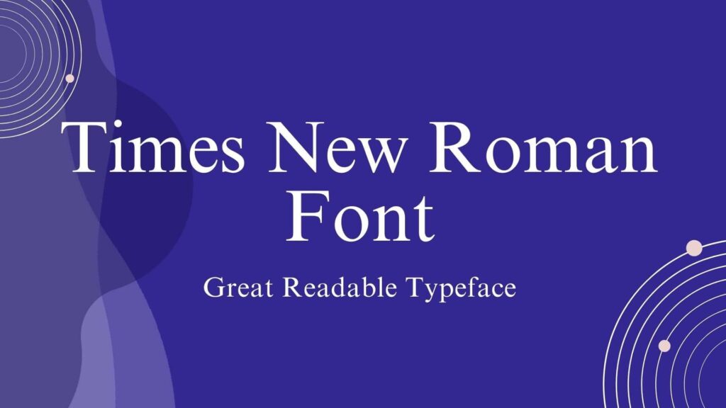
It is a quintessential serif font famous for its legibility and timelessness. The narrow letters and balanced spacing make it perfect for body text in books, newspapers, and academic papers. Designed by Stanley Morison and Victor Lardent in 1931 for The Times of London, it has become the standard for professional documents. It is widely used in academic writing, newspapers, and professional documents where clarity and formality.
Georgia
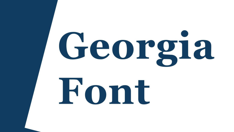
A strong and readable font with somewhat larger letterforms than Times New Roman, it stands out on screen. Designed by Matthew Carter in 1993 for Microsoft, Georgia was designed to be legible even on low-resolution displays. Suitable for Web design, online content and printed materials that need to be legible at smaller sizes.
Baskerville
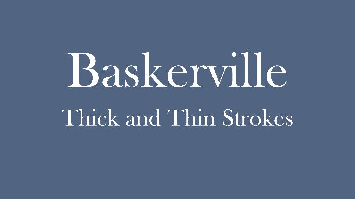
It is characterized by a high contrast between the heavy and thin strokes with its elegant and refined appearance. This font has readability and sophistication, thus it becomes an ideal for formal purposes. John Baskerville introduced this typeface in the 1750s which was in demand with printed materials from the Enlightenment period. Such types of font are appropriate for the following; academic journals, formal invitation, high-end editorial contents.
For Creative Purposes
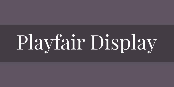
Playfair Display
Playfair Display is a modern serif with high contrast and distinctive curves, giving it an artistic and stylish flair. Inspired by 18th-century letterforms, it brings historical influences into a contemporary context. So, Often used in fashion, lifestyle blogs, and creative branding for its sophisticated yet modern feel.
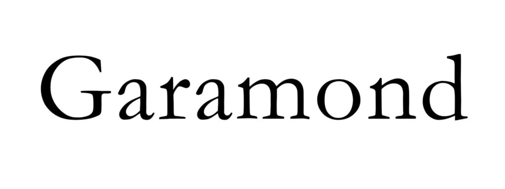
Garamond
Garamond is characterized by flowing elegance and readability. Its lightness of design makes it versatile for prints and web projects. It was first designed by Claude Garamond in the 16th century. So, It is a classic in typography and is perfect for books, editorial designs, and creative marketing materials.
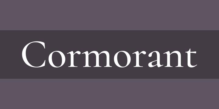
Cormorant
Cormorant is a graceful serif font with delicate proportions and elegant curves. It works well in display text and large headings. A modern revival of traditional best serif fonts, Cormorant was designed by Christian Thalmann in 2013. Great for creative projects, such as posters, book covers, and invitations.
For Branding and Logos
Merriweather
It is a strong and readable serif font that balances personality with functionality, making it perfect for branding. Designed by Eben Sorkin in 2010, Merriweather has become a popular choice for digital and print media. It is ideal for branding, logos, and website headings, where a balance of readability and uniqueness is required.

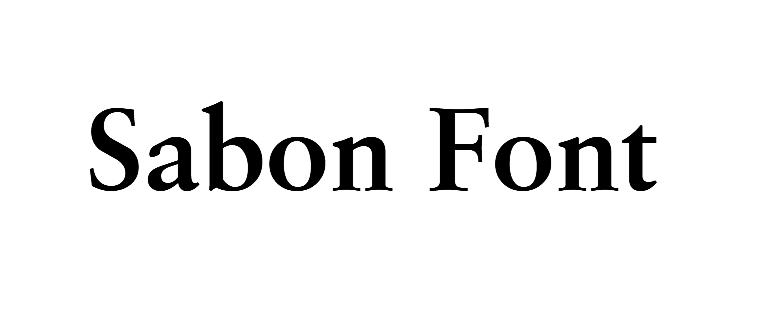
Sabon
Sabon is refined serif font with clear lines and balanced proportions, conveying timeless style and readability. It was designed by Jan Tschichold in the 1960s from the classical designs of the 16th century. Thus, It is ideal for luxury branding, high-end logos, and formal advertising materials.
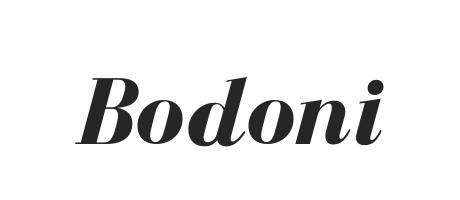
Bodoni
Bodoni is known for its high contrast and thick and thin strokes of its design. This shows a bold, refined look from the designer, Giambattista Bodoni himself, in the late 18th century. Indeed, it is best designed for luxury brands, logo fashion, and any project that strongly requires a stylish statement.
Modern and Versatile Choices
Source Serif Pro
It is a modern serif font with clean, balanced lines that convey elegance and functionality. Source Serif Pro was designed by Frank R. E. Walbaum early in the 2000s. It has been optimized for digital reading. Thus, it’s ideal for web design and digital media editorial work where both modernity and readability are considerations.

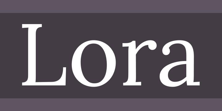
Lora
Lora is a serif with balanced proportions and a slightly italic feel, giving it a stylish, approachable look. Designed by Olga and Viktor Kharichkin, Lora was made to be versatile for both web and print use. Great for blogs, websites, and branding materials that need a warm yet modern aesthetic.
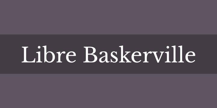
Libre Baskerville
A more modern take on the classic Baskerville, Libre Baskerville has a higher x-height and improved readability. A digital revival of Baskerville, Libre Baskerville was optimized for web use by Impallari Type in 2010. It is ideal for blogs, online content, and websites that prioritize readability without compromising on elegance.
Part 4: How to Choose the Right Serif Font for Your Project
Selecting the right serif font is very essential to ensure that your message hits the target while still being clear and stylish. Here is how to select the appropriate serif font for your design.
Factors to Consider When Selecting a Serif Font
Readability:
The most important factor when choosing any font is readability. Make sure the serif font you choose is readable at different sizes. Fonts with too much contrast or overly ornate serifs may look great in headings but become unreadable in body copy.
Mood and Tone:
Different best serif fonts will give off different kinds of moods. A font like Bodoni and Baskerville looks formal-classic, whereas a playfulness and elegance can be shown by Playfair Display and Garamond, so choose the one who has the same mood and tone to your project.
Branding Alignment:
The personality of your brand and its values should match the font. A technology company would, for example, avoid heavy ornate serifs like Sabon for something cleaner and more modern, such as Source Serif Pro or Lora.
Scalability:
Think of how well the font will be scalable in various mediums. A font that looks really nice on a print brochure won’t work so well on a mobile screen, so make sure your serif font works well in large and small sizes.
Compatibility:
Ensure that the serif font pairs well with other fonts, especially if you’re using it alongside sans- best serif fonts. Some fonts pair more harmoniously than others, so it’s important to test out different combinations.
Tips for Pairing Serif Fonts with Other Typefaces
- Complementary Sans-Serif Fonts: Pair a bold serif font with a clean, minimalist sans-serif font. For example, pairing Bodoni with Helvetica or Merriweather with Arial creates a harmonious contrast.
- Contrast in Weight: If you’re opting for a heavy serif for headlines, balance it by using a lighter, simple sans-serif for body text. In this way, you create the perfect visual hierarchy.
- Spacing and Size: When using a serif and a sans-serif typeface, make sure that letter spacing and size should not be so big in size that the design does not make sense.
Dos and Don’ts When Using Serif Fonts in Designs
Do:
- Serif fonts should be used for printed matter such as books, magazines, and newspapers where the reading needs to be clear.
- More decorative best serif fonts should be used for big headings or logos where visual impact is necessary.
- Think of the target audience and the reason behind the project. For instance, Times New Roman is a classic serif font suitable for professional use, whereas for creative projects, one would be using fonts like Playfair Display.
Do not:
- Use serif fonts too lavishly in the body text because they make the text less readable.
- Mix too many best serif fonts in one design. One or two should be sufficient to maintain visual harmony.
- Use serif fonts that are not optimized for digital screens in web design. It makes them hard to read on low-resolution displays.
Part 5: Create Professional Logos with Arvin AI in Different Fonts
Arvin AI is a cutting-edge design tool that transforms the way logo designs are made. It is using artificial intelligence to make suggestions for the most fitting fonts in logos, thus creating an efficient and effective designing process. Whether you’re a professional designer or just a business owner looking for something new to create a one-of-a-kind brand identity, Arvin AI streamlines font selection and enriches the creative experience. Arvin AI is the best friend for designers and entrepreneurs who have an intuitive interface, smart font suggestions, and smooth integration with popular design platforms.
Key Features of Arvin AI for Logo Design
- AI-Powered Font Suggestions: Automatically recommends the best serif and sans-serif fonts based on your logo’s style and purpose.
- Real-Time Previews: Instantly visualize how different font combinations look in your logo design.
- Logo Design Templates: Provides editable templates to get your creative juices flowing.
- Seamless Integration: Works perfectly with leading design applications, including Adobe Illustrator and Canva.
- Extensive Font Library: Offers an enormous library of serif and sans-serif fonts for every business and style.
Steps to Use Arvin AI for making Logo
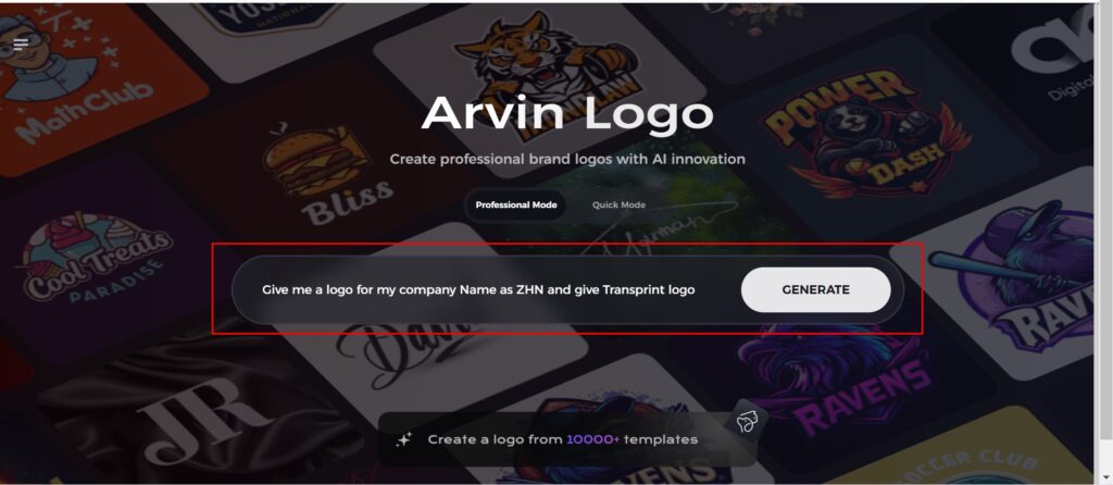
Step 1: Visit the Arvin AI Website
Open your web browser and access the design page of the Arvin Logo Maker site to start creating your logos.

Step 2: Fill out Your Business Information
Fill in necessary business details like your business name and category. This information allows the AI to create designs specific to your brand.
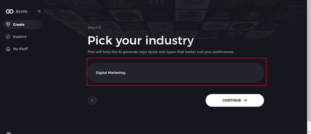
Step 3: Give Industry Name
Select an industry from the list provided. This process narrows down the logo styles and types for the AI to fine-tune based on your choice.
Step 4: Pick the Style
Browse through the style list presented and choose one that is relevant to your brand’s vision. If you still don’t like it, just skip this step and let the AI take its default inspiration.

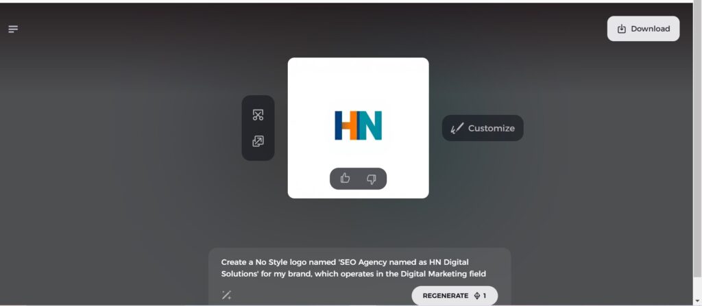
Step 5: Logo Ideas
The AI will create various logo designs according to the inputs provided by you. Review the ideas that appeal to your brand image.
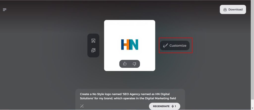
Step 6: Personalize Your Logo
Refine your chosen design by making some changes such as colors, font, icon, and layouts to resemble your style.
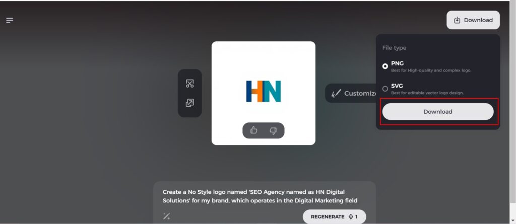
Step 7: Download Your Logo
Once you’re satisfied with the final design, download your logo in formats like PNG or SVG. These formats ensure compatibility for use on websites, social media, and print materials.
Conclusion
Serif fonts have been popular for ages because of their classic look and readability. Thus, they are a good option for professional designs. A good Arvin AI source for professional logos in unique fonts is very useful for creation. Intelligent font suggestions by the software, real-time previews, and vast selections of serif and best serif fonts make it easy to achieve logos that express the identity of your brand. So, Try Arvin AI now and get the perfect serif fonts to create amazing logos!
FAQs on Best Serif Fonts
What is the significant difference between serif and sans-serif fonts?
This font include decorative strokes, also called “serifs”, at the ends of letters; hence they have a more classic and formal feel. The best serif fonts do not have such strokes and present a clean, modernistic look; therefore, most of them are used on digital content and in contemporary designs.
Which serif font is best for professional documents?
Fonts such as Times New Roman and Georgia are among the most popular choices for professional and formal documents. These fonts are designed to be readable and have a classic, sophisticated look.
Can I use serif fonts in combination with other font types?
Yes, combining best serif fonts with sans-serif fonts is a common design practice. This pairing creates visual contrast and hierarchy, allowing the designer to emphasize certain elements. However, it’s important to ensure that the fonts complement each other in terms of style and tone.
How can Arvin AI help me choose the perfect serif font?
Arvin AI can make logos easier to make by personally recommending best serif fonts based on your project needs. An AI analyzes your logo type and purpose, and then comes up with suggestions that fit well with what your brand is about.

