Think about an iPhone, or even Twitter (unfortunately named X now). Other than their products, the next immediate thing that anyone can think about would be their company’s logo. From a bitten apple to a bird emblem, the best logos can stand the test of time and are a legacy in their own right.
What Is a Good Brand Logo?
A good brand logo effectively captures the essence of the business it represents. It should be simple, memorable, versatile, and relevant to the brand’s mission. The logo should work well across different mediums, be easy to scale, and resonate with the target audience. Here is a list of the 30 best logos for a small business looking for inspiration!
1. Cocomelon
As one of the most iconic logos on YouTube, Cocomelon is a famous channel targeted at kids. Originally started by a company called Treasure Studio, Inc., it was later acquired by Moonbug Entertainment in 2020.
Moonbug refined the brand visually after acquisition, so while the concept began with a small team, the logo design’s final form as seen today was likely polished by Moonbug’s in-house design and marketing teams, focusing heavily on global appeal and educational charm.
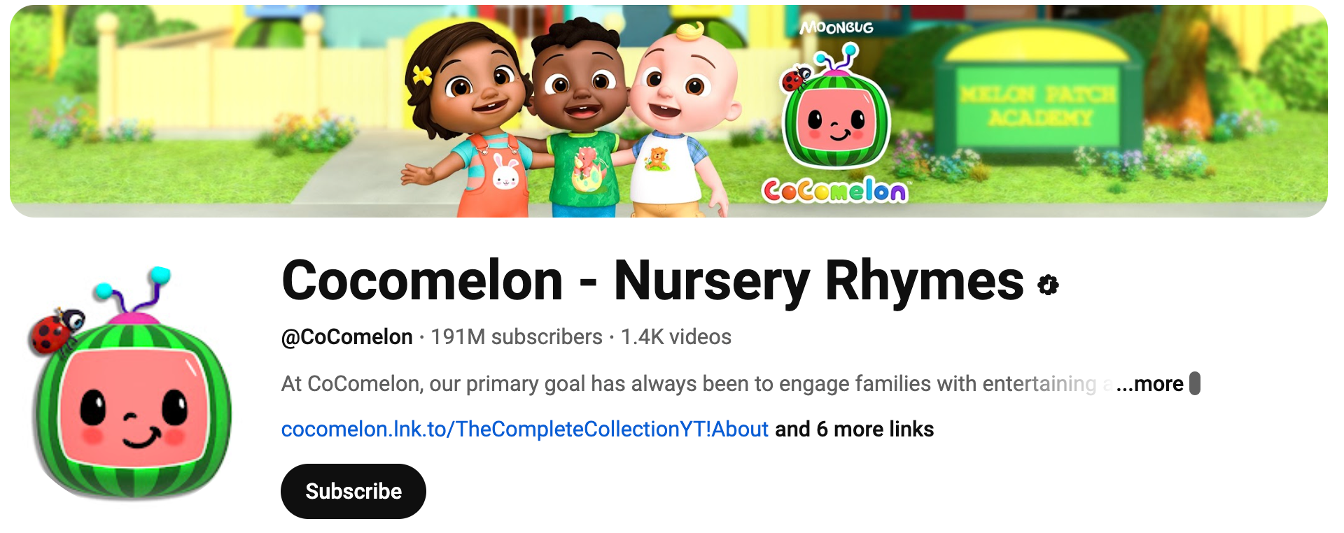
The design’s body: A rounded, green-striped watermelon forms the design’s body, reminiscent of an old-style television. Because of its shape, the rind is easily scalable for use as a favicon, icon, or thumbnail, and its familiar appearance appeals to children. The pinkish-red “screen” of the watermelon functions as a face, featuring two expressive black eyes and a sweet smile, fostering an emotional connection with young viewers. Sitting on the watermelon’s top corner, this adds a playful, nature-friendly detail to the brand personality. The ladybug also functions as a recurring character in the show, which subtly ties branding into the animation.
2. Pewdiepie
PewDiePie, whose real name is Felix Kjellberg, built his brand on YouTube through chaotic humour, gaming content, and sharp commentary that evolved into a multi-genre empire.
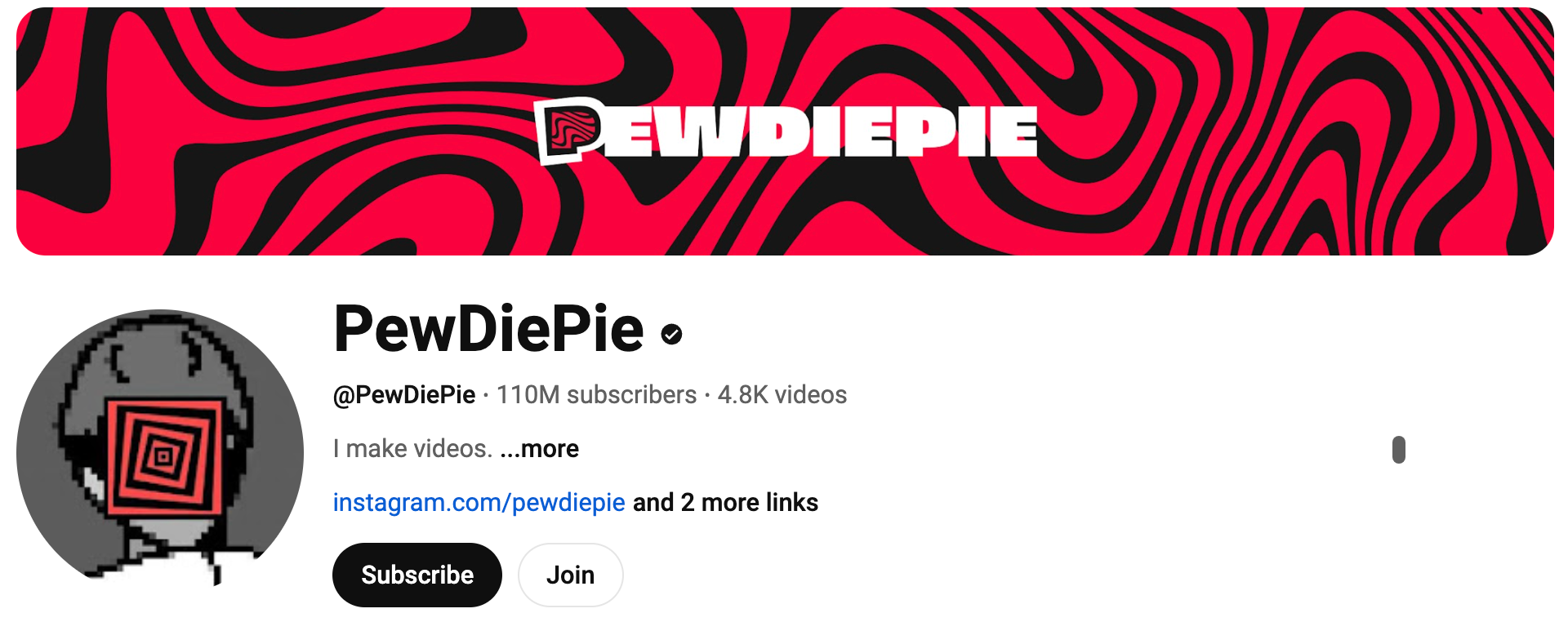
The most recognized PewDiePie logo, one with the red and black wavy background and the stylized “P” fist, was designed in collaboration with visual designers, but the exact artist isn’t widely credited publicly. Felix himself has often taken an active role in his visuals, even dabbling in design elements himself. The wavy background is part of the “Brofist” branding era during PewDiePie’s early days of building an identity tied to his fans and gaming culture.
Being a personality-driven brand, the red and black colours and bold lines make for notable contrast and visual intensity, channelling energy and movement.
3. Dude Perfect
Dude Perfect is a YouTube channel made by five college roommates and best friends from Texas A&M University. Their content is family-friendly, competitive, and fun, often centred around teamwork and over-the-top challenges.
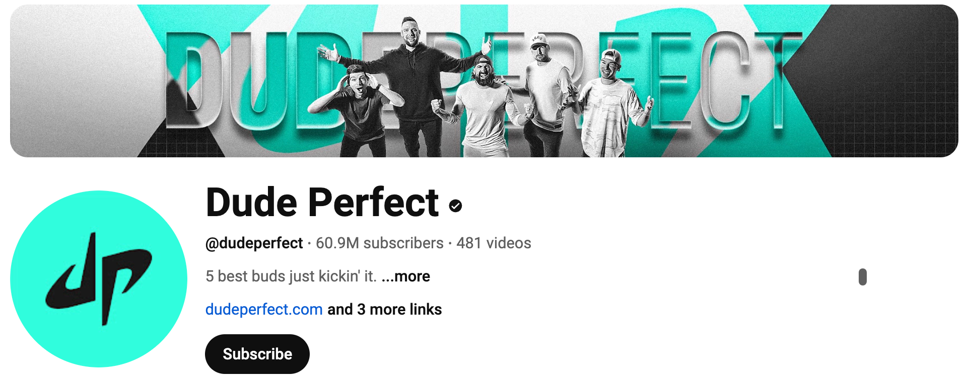
The current logo design uses a bright, vibrant mint green or teal background with black text. The logo features a stylized black “dp” monogram, where the “d” and “p” are interconnected. This is a symbolic logo with slight descriptive elements, perfect for their energetic PG-13 brand personality.
4. 5 Minute Crafts
The visual identity of 5-Minute Crafts was developed in-house by TheSoul Publishing, the same company behind other viral content channels like Bright Side. While specific designer credits aren’t publicly listed, the branding is part of a larger in-house content strategy that revolves around simple shapes, vibrant colors, and easily recognizable icons.
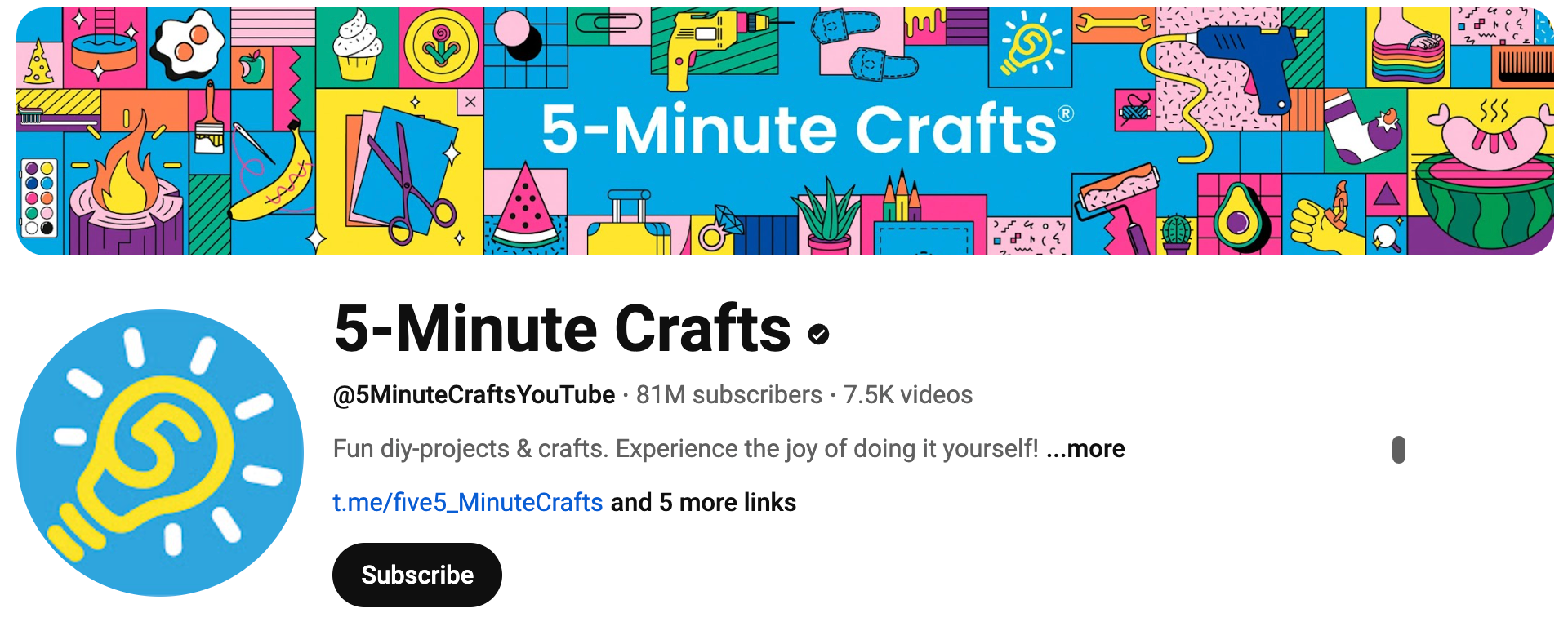
The lightbulb is a universal symbol for ideas and innovation as a DIY hack channel. The looping line inside the bulb feels spontaneous and sketchy, reflecting the experimental, hands-on nature of their videos. The yellow color inspires optimism, creativity, playfulness, and blue represents trust, approachability, calm.
5. Mr Beast
This brand thrives on extravagant challenges, record-breaking giveaways, and over-the-top generosity. Jimmy Donaldson dares to do what others wouldn’t: give away private islands, tip servers $10,000, and build real-life “Squid Game” arenas.
His brand voice is equal parts hype-driven, high-stakes, and human-centered.
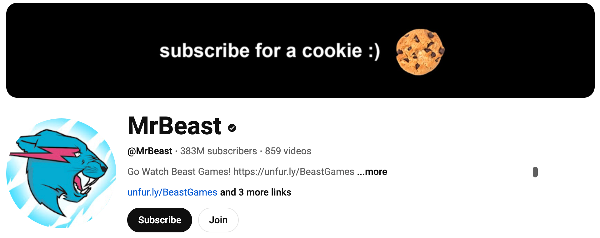
The logo uses sharp, angular lines and aggressive movement to convey energy, speed, and dominance. The colours used, cyan blue, suggest confidence, youthfulness, and digital savvy. The hot pink lightning bolt adds disruption, power, and attention-grabbing contrast. The color contrasts represent the surprise or “shock value” of his videos.
6. Hartford Whalers
The Hartford Whalers were a professional ice hockey team based in Hartford, Connecticut. They were part of the NHL from 1979 until 1997, when the franchise relocated and became the Carolina Hurricanes.
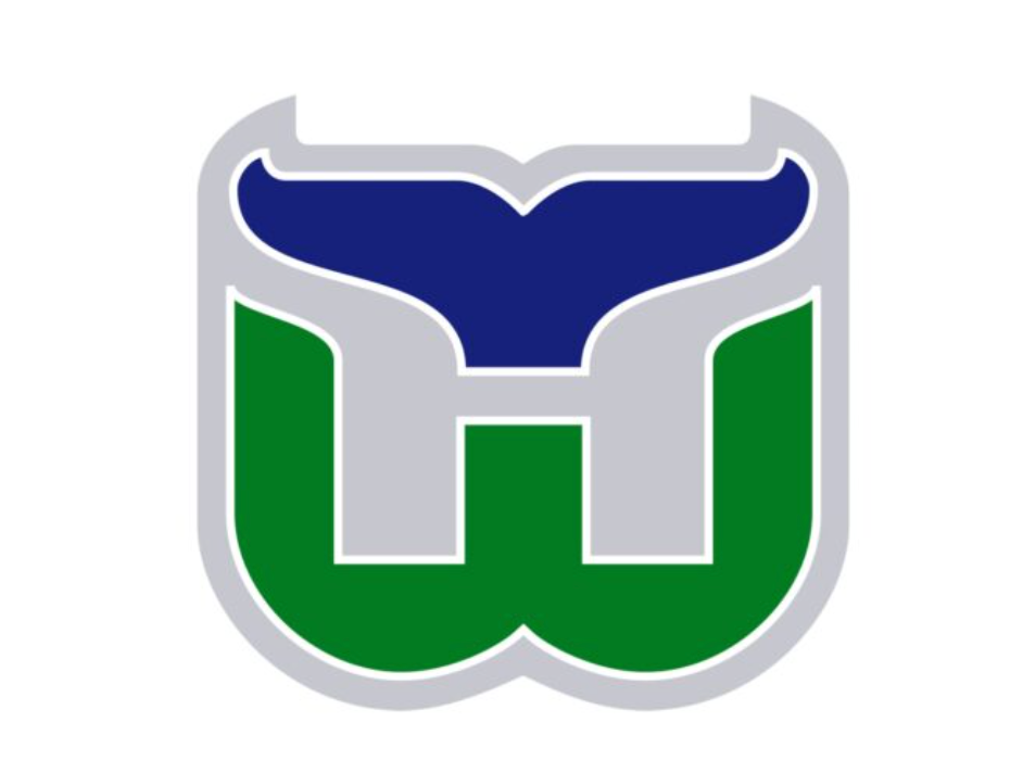
The iconic Hartford Whalers logo was designed by Peter Good, a renowned graphic designer based in Connecticut. Commissioned in the late 1970s, Good’s mission was to make a design that captured the team’s identity in a clean, timeless, and meaningful way.
This logo is a clever optical illusion of triple symbolism:
- The “W” for Whalers is bold and green at the base.
- The whale tail (in navy) is placed at the top, forming a semi-circular, stylized fluke.
- The “H” for Hartford is revealed in between the whale tail and the W.
This is a symbolic logo, but with subtle descriptive cues: the whale tail communicates the team name and maritime vibe, while the letters ground it in identity.
7. Yamato Transport
Yamato Transport Co., Ltd. is a leading Japanese logistics and delivery company, widely recognized by its affectionate nickname: Kuroneko, meaning “Black Cat”. Established in 1919, it has grown to become one of the most trusted delivery services in Japan and across Asia.

The black cat design was introduced in 1957 by Yamato’s then-president Yasuomi Ogura. The design was made with the help of an advertising agency, aiming to humanize the brand and communicate care, especially for families sending delicate parcels. Over time, it evolved into one of the most beloved corporate identities in Japan, often compared to Coca-Cola’s script or Apple’s bitten apple in terms of national brand recognition.
The image conveys care, security, and gentleness, just like how Yamato wants customers to feel about their parcels. The mother cat ensures safe delivery, while the kitten symbolizes the contents being precious and fragile, conveying the importance of customer satisfaction.
8. Sun Microsystems
Sun Microsystems, founded in 1982, was a major player in computer systems, software, and workstations. It helped pioneer technologies like Java, Solaris, and networked computing before being acquired by Oracle in 2010.
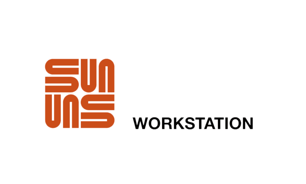
Professor Vaughan Pratt, a computer scientist at Stanford designed the logo. It was later stylized and finalized by designer David Kelley, company’s founder of the design consultancy IDEO. The word “SUN” is repeated and rotated to form a square, but the real magic is in the letterplay. Each “U” is rotated in such a way that it can be read as part of an “S” and an “N” depending on your perspective.
9. NASA
One of the best qualities of a great logo design is one that inspires people across generations. And one such logo that comes to mind is the NASA logo.
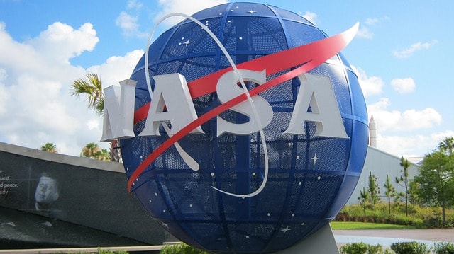
Splashed over vintage t-shirts and astronomy magazines, the NASA “meatball”, designed in 1959, has become an iconic symbol of space exploration, innovation, and authority. It features a circular shape representing the Earth, which, in turn, symbolizes NASA’s global impact and its planetary research and space exploration.
A red chevron, or “vector,” cuts diagonally across the circle, representing a spacecraft’s trajectory or emphasizing NASA’s forward momentum. Additionally, the small stars scattered across not only reflect the vastness of space but also symbolize NASA’s endless pursuit of exploration. These stars, therefore, connect to the organization’s desire to “reach for the stars.” The central blue globe, a stylized depiction of Earth, highlights NASA’s focus on space missions, scientific research, and environmental monitoring from our planet’s perspective.
The font used is Helvetica, a clean, sans-serif typeface known for its modernity and precision, which aligns perfectly with NASA’s mission of clarity and efficiency. The uppercase, bold letters evenly space to ensure legibility and a professional, scientific look. The color palette—red, blue, and white—symbolizes energy, passion, and action through red, trust, calmness, and the infinite expanse of space through blue. White contrasts sharply against the dark background, ensuring that the stars and text remain visible and vibrant in various sizes and formats.
Just like NASA’s iconic logo has motivated generations of space explorers, you can make a something that captures the imagination and spirit of your brand. Ready to design something as timeless as the NASA “meatball” ? Start creating now with Arvin AI Logo Designer and craft a logo!
10. YouTube
As one of the most iconic logos, the YouTube logo has undergone significant changes over the years, the heart of it remains somewhat similar; being the play button.

The design is a red triangle inside a white rectangular background. This play button instantly communicates YouTube’s core purpose: watching and sharing videos. The angled triangle points right, symbolizing progress, action, and entertainment, encouraging users to press play and engage with content.
The font used in the YouTube word mark is Roboto, a clean, modern, and highly legible sans-serif typeface. The simplicity of the typography, without any additional flourishes, reflects the platform’s accessibility and user-focused experience. Over the years, YouTube has transitioned from using a more complex design with a red “tube” symbol to the current design, which places more emphasis on the play button and the brand’s name.
The color palette, primarily red, black, and white, conveys excitement (red), reliability (black), and simplicity (white).
11. Guinness
Just like how the perfect pint of Guinness takes 119 seconds for the perfect pour (a considerably long time for a beverage), the Guinness brand is one that stands the test of time. The Guinness logo is a masterful combination of strong, traditional branding and a sleek, modern design.
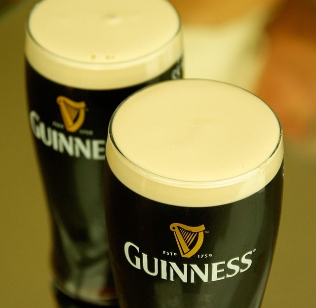
The design features a stylized harp, an image deeply rooted in Irish culture and history. The harp symbolizes Ireland itself and is a visual representation of the brand’s Irish heritage.
The typography in the Guinness logo is equally important in shaping its identity. Its designers display the word “Guinness” in a custom serif font, giving the logo a classic, timeless feel. The typeface is bold and elegant, with slight curves that soften the strong, angular edges of the serif design.
Like Guinness’s harp, which perfectly represents its rich heritage and quality, your logo should evoke tradition, elegance, and timeless appeal. If you’re ready to build something that stands the test of time, begin your journey with Arvin AI Logo Designer and make your mark in style!
12. Super Mario
One of many people’s fondest memories include playing Mario Kart, which is a lighthearted albeit challenging game for some. At the start screen, “Super Mario” greets users, prompting the excitement of the game to begin.
The font used for the design is playful and rounded, which reflects the lighthearted, friendly tone of the games. The typography often features bright red or yellow, evoking energy, excitement, and positivity, which are key themes in the Mario games. The rounded nature of the font suggests friendliness and accessibility, making the logo instantly appealing and easy to recognize.
The word “Super” is typically smaller than “Mario,” emphasizing the character himself as the focal point of the design. The use of (many) bright colors is also an essential part of its design. Red is the dominant color, a reference to Mario’s iconic red cap and overalls. Red also symbolizes strength and excitement, perfectly aligning with Mario’s character as a hero who conquers challenges in a vibrant, imaginative world. Yellow, often used for the outline or in contrast with red, adds optimism, warmth, and energy, helping the “Super Mario” stand out across various media.
13. Hot Wheels
A defining technical feature of the Hot Wheels logo is the flame graphic design that often appears integrated with the word mark text. This visual element renders in a stylized, simplified form, using angular lines and sharp edges to align with the geometric typeface. The flame graphic adds an extra layer of dynamism and forward motion, evoking the image of high-performance cars racing at full speed.
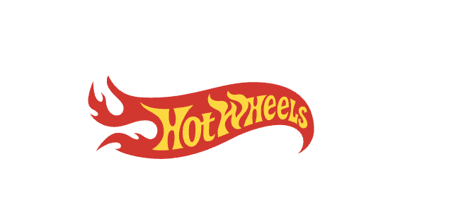
From a design perspective, the design makes use of symmetry in the form of balanced letter spacing, making the text feel grounded and stable. However, the asymmetry introduced by the flame element provides an intentional contrast, emphasizing the idea of speed and the constant acceleration of the Hot Wheels vehicles. The designers use bold and tightly kerned letters for “Hot Wheels,” and the typeface features elongated, italicized forms that suggest motion and speed. This choice aligns with Hot Wheel’s focus on high-speed cars and racing.
The logo’s color palette is key to its technical effectiveness. Red dominates the design, symbolizing power, excitement, and intensity. Designers also combined it with yellow and orange accents, using gradients or highlights to evoke flames or heat, which further emphasize the theme of speed. These colors are high-contrast, ensuring that the design stands out across various applications, such as on packaging, advertisements, and merchandise.
14. PlayStation
The PlayStation logo is a sophisticated and technically refined design that symbolizes the brand’s identity as a leader in the gaming industry. It features a distinctive, stylized “P” and “S” combined in an abstract form, creating a recognizable and impactful mark. The design evokes playfulness, innovation, and creativity, reflecting key qualities of the PlayStation brand.

A geometric shape that incorporates a dynamic angular swoop to its design forms the “P”. The clean, sharp edges of the “P” make a modern, forward-looking feel that suggests precision and technology. The “S” in the PlayStation design is slightly overlapping the “P” and features softer, rounder curves, which contrasts with the sharpness of the red “P” and introduces a balance of fluidity and movement. This interplay between the geometric sharpness of the “P” and the organic, flowing lines of the “S” adds depth and sophistication to the design.
One of the most defining characteristics is the design’s use of color. Blue is used in the PlayStation logo to symbolize trust, technology, and innovation. The sleek and modern feel of the blue also adds a sense of professionalism and credibility while keeping it playful and youthful.
From a typographic perspective, the PlayStation logo is paired with a sans-serif typeface that is clean and highly legible. The font is modern and simple, complementing the abstract “P” and “S” while ensuring that the brand name is easily recognizable. The text spacing and alignment ensure clarity and balance, making the logo visually pleasing while effectively communicating the brand’s message.
PlayStation’s designs reflects innovation, creativity, and a modernity—everything you want in a logo. If you’re looking to make something that speaks to technology, forward-thinking, and playfulness, start designing today with Arvin AI Logo Designer and bring your brand’s vision to life.
15. Metallica
Made in 1981 by the band’s bassist Cliff Burton, the logo has remained virtually unchanged. It reflects the energy and intensity that the band’s music brings to its fans.
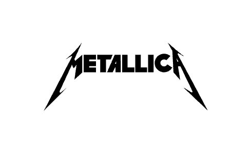
The design features angular, sharp-edged lettering that reflects the band’s raw, aggressive sound. The stylized font, with pointed serifs and jagged lines resembling lightning or shards of metal, emphasizes destruction, intensity, and chaos, aligning with the themes of the band’s music. These jagged edges convey forceful energy, further connecting the design to Metallica’s heavy, distorted sound.
The word mark design typically features the name “Metallica” in all capital letters, similar to the boldness and dominance of the brand. The serif typeface adds a sense of stability, while the sharp lines break away from traditional, more rounded designs, creating a sense of rebellion against the mainstream. This unique typography is part of what makes the design memorable and visually powerful, standing out in the crowded world of rock band logos.
16. Lidl
The Lidl logo is a distinct and simple design that reflects the emphasis on affordable pricing, quality, and efficiency in the retail market. Established in 1930 in Germany, Lidl’s wordmark has undergone several transformations but has always maintained its clean, bold, and easily recognizable identity.
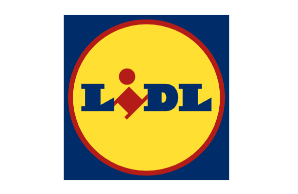
The current version of the Lidl wordmark, introduced in 2004, features a circular design with a combination of blue and yellow color. The bold blue background symbolizes trust and reliability, two key values the Lidl wants to convey to its customers. The yellow color used communicates affordability, energy, and optimism. These colors are not only eye-catching but also represent Lidl’s core business model of offering high-quality goods at low prices.
The Lidl word mark in the center is rendered in a bold, serif font, which gives a sense of solidity and authority. Readability and visual appeal result from the strong contrast of the serif typeface against the rounded circle and the yellow background’s warm tones. The simplicity of the typeface helps emphasize clarity and directness, key traits of Lidl’s business philosophy of providing no-frills, high-value products to customers.
The circular shape gives a sense of unity and inclusivity, representing the Lidl’s global reach and ability to adapt to various markets.
17. Singapore Airlines
The Singapore Airlines logo prominently features a crane bird figure. The crane symbolizes grace and elegance, depicted with clean, simple lines that convey sophistication while suggesting motion and freedom. This design reflects SIA’s exceptional flight experience, with a focus on fluidity, stability, and global reach.
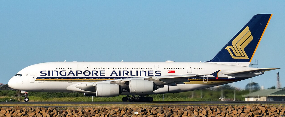
The font used in the Singapore Airlines logo is a custom-designed sans-serif font. The choice of a sleek, modern sans-serif typeface for the SIA name contributes to the overall clean and refined aesthetic. The font’s letterforms are proportional and balanced, enhancing readability while maintaining an elegant, professional appearance.
The color palette of the design plays a crucial role in enhancing its high-end perception. The colors are deep navy blue and gold, which together, evoke a sense of luxury, trust, and sophistication. Navy blue is associated with professionalism, security, and global presence, while gold represents premium quality, prestige, and service excellence.
18. Python
The Python logo, as one of the best logos made, is a visually striking and technically deliberate design with the same core values of simplicity, clarity, and versatility.

Central to the design is two stylized interlocking snakes, which directly reference the language’s name, “Python,”. A symmetrical, almost circular arrangement of the snakes results in a balanced, harmonious design. The dual serpents not only represent the versatility of the language but also highlight its ability to serve both small-scale scripts and large, complex systems. The designers carefully chose the bright blue and yellow color scheme, with the blue symbolizing trust, reliability, and clarity. The yellow adds energy, optimism, and creativity. The design’s geometric, clean lines reflect Python’s structured yet approachable nature, aligning with its design philosophy of minimalism and ease of understanding.
Python’s logo represents adaptability, clarity, and simplicity—qualities that are essential to its function and appeal. If you want your logo to be just as versatile and easy to understand, get started with Arvin AI Logo Designer and design something that adapts effortlessly to all your needs.
19. Apple Logo
As one of the best logos made, Apple has one of the most iconic and instantly recognizable logos in the world. It features a sleek, minimalist apple shape with a bite taken out of the right side, which adds a unique and memorable twist to the design. The apple shape symbolizes knowledge, innovation, and creativity, aligning perfectly with Apple Inc.’s core values of technological advancement and forward-thinking design outlined by Steve Jobs. The bite (or “byte”) taken out of the apple serves as a clever nod to the tech industry, particularly the digital realm, where the term “byte” is used in computing, thus merging both literal and figurative meanings.
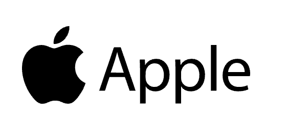
The logo is rendered in a solid monochrome color, which has evolved over time, from its initial rainbow-colored variant to its current all-black or all-white versions used on most products. The monochromatic design reflects the sleek, high-end nature of Apple’s product lineup, contributing to the premium aesthetic. The Apple’s clean lines and simple form ensure that it is highly scalable and works effectively across a range of media and product sizes. The font, when used, complements this design with a simple sans-serif typeface, ensuring the focus remains on the iconic apple itself, cementing itself as one of the best symbols made.
20. IKEA
As one of the best logos made, the IKEA logo is a well-known symbol that represents the global furniture and home goods retailer. The logo features the IKEA’s name in bold, uppercase sans-serif letters, set in a bright yellow color against a blue oval background.
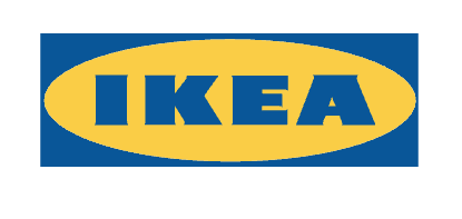
This circular form also symbolizes unity and completeness, which reflects the IKEA’s holistic approach to home furnishings and lifestyle products. The boldness of the letters against the blue and yellow backdrop enhances the logo’s overall impact. This color combination is not only striking but also highly recognizable, with blue evoking feelings of trust, stability, and reliability, while yellow adds a sense of warmth, optimism, and energy. The choice of primary colors also makes the logo versatile, ensuring it stands out in various marketing materials and product packaging.
21. Nike Logo
The Nike logo, often referred to as the Swoosh, is one of the most iconic and widely recognized logos in the world. Created in 1971 by graphic designer Carolyn Davidson, the Swoosh consists of a simple, curved checkmark-like shape. It represents the wing of the Greek goddess Nike, who is the goddess of victory, aligning perfectly with the Nike’s mission to achieve greatness.
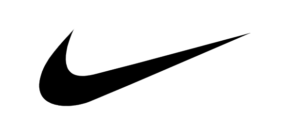
Its fluid, dynamic form, evoking a sense of movement and progress characterizes the design of the Swoosh. It conveys energy and. power reflecting Nike’s focus on performance and innovation in the sportswear industry. The design is asymmetrical, with the thicker end on the left gradually tapering toward a sharp point on the right, which creates a sense of momentum and speed. The sleek, minimalist design improves the logo’s versatility, enabling easy application across various products and advertising media.
Nike primarily uses a bold black or white version of the logo, depending on the background color, which helps maintain its visual impact and clarity. The design is often paired with the name Nike, though the logo is frequently used without the accompanying text, thanks to its instant recognizability.
The font used for the wordmark in conjunction with the Swoosh, typically a clean, sans-serif typeface, complements the logo’s sleek and modern feel. Together, the Swoosh and wordmark form a powerful visual identity that is synonymous with athleticism, performance, and excellence.
22. Tesla
As one of the best logos created, the Tesla logo is a sleek and modern design. It was created in 2003 by Tesla Motors (now simply Tesla, Inc.), and the logo is primarily known for its minimalist aesthetic and symbolic meaning. The logo features a stylized letter “T” that resembles a cross-section of an electric motor, specifically the rotor of a motor, which is central to Tesla’s electric vehicle technology.
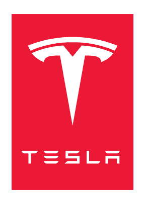
The clean, symmetrical lines of Tesla’s sharp, yet fluid lines also give a sense of speed, dynamism, and progress, aligning with Tesla’s ethos of pushing the boundaries of automotive design and technology.
In terms of font, the Tesla wordmark often accompanies the logo in a clean, modern sans-serif typeface, further reinforcing Tesla’s identity as a technology-driven company that leads in innovation.
23. FedEx Logo
Designed by Lindon Leader in 1994, the FedEx logo features a clean, modern, and geometric design. The logo consists of the word “FedEx” in bold, uppercase letters, with two distinctive font styles and a powerful hidden arrow between the “E” and “x” in the wordmark.
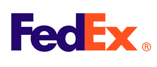
The most distinctive feature of the FedEx logo is the arrow, which points forward and to the right, symbolizing movement, direction, and progress. The use of negative space here is a brilliant design choice, as it highlights the their core mission: getting packages from point A to point B as quickly and efficiently as possible.
The design features two contrasting fonts. “Fed” is rendered in a bold, sans-serif font, while “Ex” uses a slightly lighter, italicized serif font. This contrast gives the design a modern look and also helps differentiate the company’s identity. The bold sans-serif typeface used for “Fed” represents strength and stability, while the italicized font for “Ex” conveys motion, agility, and speed, aligning with the company’s emphasis on fast, reliable service.
The color palette used in the FedEx logo is equally thoughtful, with the use of purple and orange. Purple is associated with professionalism and trustworthiness, while orange evokes a sense of energy, excitement, and urgency. The balance of these two colors reflects the dual nature of the company, reliable, yet dynamic.
24. Google
Designed by Ruth Kedar in 1998, the first logo has undergone several changes throughout the years but has retained its distinctive colorful and minimalistic nature. The most recent iteration, introduced in 2015, features a geometric sans-serif typeface called Product Sans, designed specifically for Google, giving Google a more modern and clean appearance.
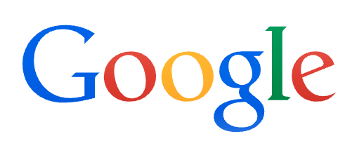
The logo’s design is built on the foundation of a bold, multi-colored wordmark.
The Product Sans font, used in the current version, is clean, easily legible, and balanced. It is a custom-designed sans-serif font that remains highly readable across all devices and platforms. The rounded shapes of the letters add a friendly, approachable vibe, while the slight geometric influence adds structure and balance to the overall design. The lack of sharp edges in the letters further emphasizes the company’s desire to be user-friendly and approachable.
The color palette used in the Google logo, while primarily based on the colors of the standard red, blue, yellow, and green, also serves a deeper purpose. The specific order of colors in the logo reflects the dynamic and evolving nature of the company. By using a simple and consistent palette across their branding and services, Google maintains a strong visual identity that can easily adapt to any digital or physical space.
While the colors and typeface have modernized, the essence of the Google logo remains rooted in the company’s core values of innovation, user-centric design, and simplicity. It continues to be a symbol of both global reach and approachability, capturing the Google’s mission to provide information and services that are both useful and accessible to people all over the world.
25. London Symphony Orchestra
The London Symphony Orchestra is one of the world’s most prestigious orchestras, founded in 1904 and based at the Barbican Centre in London.
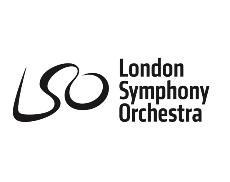
The LSO logo was designed in 2004 by the creative agency The Partners. The logo spells out “LSO” in one fluid, continuous line. The “L” swoops up like a conductor’s baton rising before the first note. The “S” flows like a treble clef or a ribbon of melody. The “O” finishes in a tight, precise loop.
26. McDonald’s Logo
While their fast food menu has evolved over time, the one constant has been its iconic golden arches, which have grown from a basic architectural feature into one of the most iconic corporate logos in history.
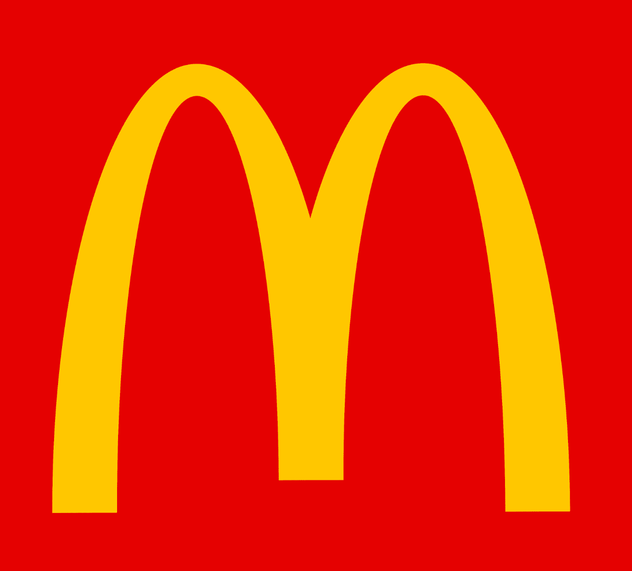
The original concept of the arches came from Richard McDonald, one of the two founding brothers, who designed the restaurant architecture in the 1950s to include two large yellow arches. The logo, however, was designed in 1962 by Jim Schindler, McDonald’s head of engineering and design.
27. Coca Cola Logo
Born in 1886, Coca-Cola is one of the oldest and most recognizable companies on the planet.
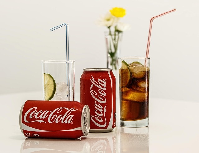
The Coca-Cola logo was created by Frank M. Robinson, the company’s bookkeeper, in the very same year the drink was invented. Robinson believed that the two “C” letters would look great in advertising and chose the Spencerian script, a popular handwriting style in the U.S. during the late 19th century.
What’s remarkable? That original design featured has remained largely unchanged in over a century.
28. Shell Logo
In 1971, the famous industrial designer Raymond Loewy designed the Pecten scallop shell that is recognisable today.
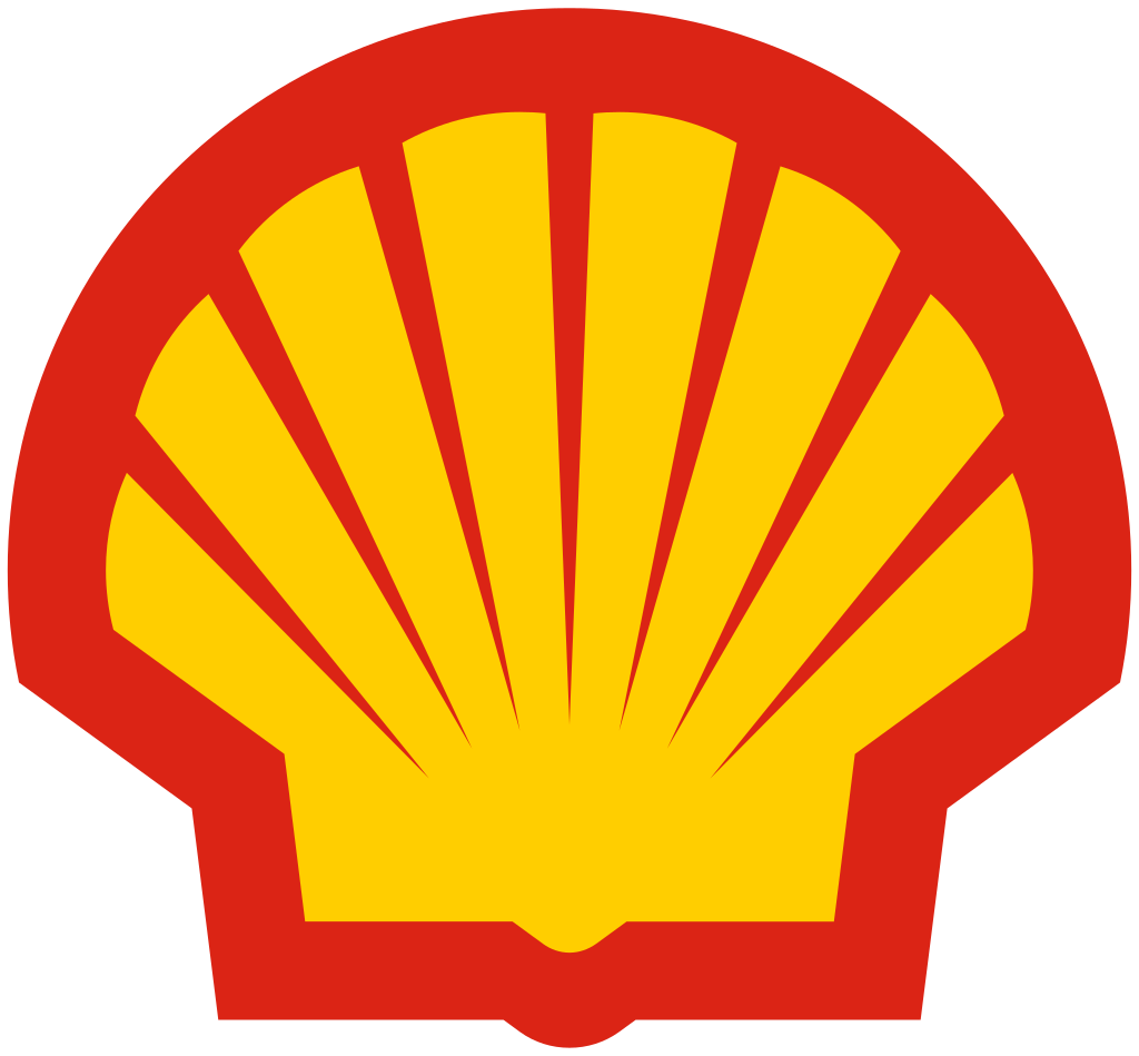
This newer design has omitted the “Shell” company name, which was once imposed onto the design itself.
29. Starbucks Logo
Terry Heckler, co-founder of Heckler Associates, designed the original logo, which the design firm hired to brand Starbucks in the early days.
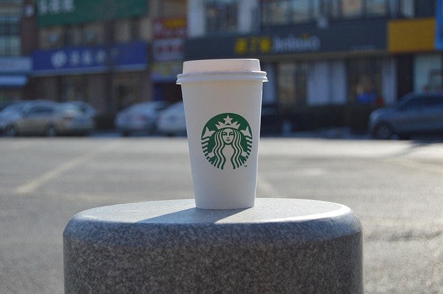
A perfect example of maritime history and seafaring lore (fitting for a port city like Seattle), Heckler chose a 16th-century Norse woodcut of a twin-tailed mermaid, or siren. The iconic mermaid is meant to represent his vision of Starbucks being an unresistible coffee for consumers. Even in 2025, this design remains relevant as its still being used all around the world across their chains.
30. World Wildlife Fund
The original panda logo was designed by Sir Peter Scott, one of WWF’s co-founders and a renowned conservationist and artist. It was inspired by Chi-Chi, a giant panda that had recently arrived at the London Zoo.
The WWF logo is a stylized giant panda, drawn with clever use of “white space”.
Which Appeal Is the Best for Logos?
Descriptive and symbolic logos are the best type of logos to have when making a logo. When searching for inspiration, especially as a small business owner or a marketing manager, you might think that minimalism is or following the new trends of design is enough for you. However, a recent study conducted by Harvard Business Review explains what type of logo is best for your audience, with a few exceptions.
For small businesses or new brands, adopting a descriptive logo can be particularly advantageous, as it facilitates brand recognition and conveys the company’s offerings more effectively.
A descriptive logo uses either (or both) text and visual design elements to communicate a type of product or service a company is marketing.
However, the study also notes that for brands associated with products or services that might evoke negative connotations (e.g., funeral homes or bug repellents), a nondescriptive logo might be more appropriate to avoid reinforcing those associations.
Plus, if you are already established, try using symbolic logos instead to shape your brand’s identity.
Symbolic logos are those that are made with symbols or emblems (like the Chanel logo).
In summary, while trendy and minimalistic designs are visually appealing, integrating descriptive elements into a logo can offer significant benefits, especially for emerging brands aiming to establish a strong market presence.
How to Make the Best Logo?
The design process is a crucial element to get a great logo. First, start with identifying your brand values, tone and audience. Secondly, create a rough idea of what you want your logo to have, and what type of logo design you will like to use. Pick colors that align with your brand, make tweaks, and you’ll have your new logo!
Final Words
The best logos of all time we’ve explored here serve as a testament to the power of visual branding. They are simple yet profound, with every design choice carefully crafted to evoke emotions and communicate brand values. Whether through clever use of font, color schemes, or symbolism, each logo stands out as a perfect representation of its brand.
As we move into the future, it’s clear that the best logos don’t just capture attention. They inspire and leave a lasting impact. So, take inspiration from these logos and apply it to your own brand identity. Remember, having the best logos that you can create is the cornerstone of memorable branding, so get started with Arvin AI Logo Designer!
FAQ
Nike, Coca Cola, Adidas (three stripes) McDonald’s, Google, BMW, Pepsi, Mercedes Benz, Amazon, Disney.What is the best ai logo generator?
ChatGPT for very simple designs that do not require customization, Arvin AI logo maker for logos that are tailored to your niche, and Canva for editing with a drag and drop function.
Adobe Illustrator. It’s the industry standard because it lets you create vector-based graphics, which means you can scale your logo up to a billboard or shrink it down to a business card without losing quality.
SVG is best for websites and editing (vector, scalable, lightweight), PNG is best for web/social media (supports transparency), PDF is good for printing, and EPS is the gold standard for vector logos in professional print and design environments
The title for the oldest unchanged design is Stella Artois (made in 1366). Runners-up include Twinnings Tea (1706) and Shell (since early 1900).
The standard sizes are 500x500px or 1000x1000px for square logos. 1000x400px or vice versa for horizontal and vertical logo sizes respectively.
Futura, Gotham, Bebas Neue are great for modern designs, and Monserrat and Roboto for tech companies or minimalist designs.
