Fonts are one of the crucial elements in design and communication that make messages understandable or unacceptable by audiences. With a chosen font, its visual beauty will strengthen a brand’s essence and value of the project itself. Beautiful fonts add that glossy, professional finish in the design and branding or the content of your creation when they are used in graphic design. This article takes to the pages what makes a font beautiful and the emotional resonance that accompanies different styles of font; at the same time, offers recommendations on top fonts for bettering graphic design projects.
Part 1: What Makes a Font Beautiful?
Readability is the core base of any successful font. Whichever extent its aesthetic value is irrespective if the message conveyed fails because readers are not able to decipher the text. Sharp shape character, same width and careful spacing between words gives out the intended meaning into any medium that can make sense to it.
Achieving Balance and Proportion
A beautiful font will come into harmony through balance and proportion. There is a precision of creating every letterform which provides an opportunity for aesthetic balance among the height, width, and spacing. Through such a proportion, beauty becomes aligned with rhythm pleasing the eyes as well as promoting effective reading. One good thing about a perfectly balanced font is that functionality may mix well with its aesthetic aspects to fit any type of design.
Unique Design Elements
In such a context, the only differentiating quality of a great font is some distinctive feature about it that makes it appear like no one else’s: subtle serifs, strong geometric form, or more general play. These design details allow your font to embody certain qualities or moods, a creative edge beyond most other features. The particular and beautiful fonts create a tone to a brand, making a brand become memorable and even impressive.
Part 2: The Emotional Impact of Font Styles
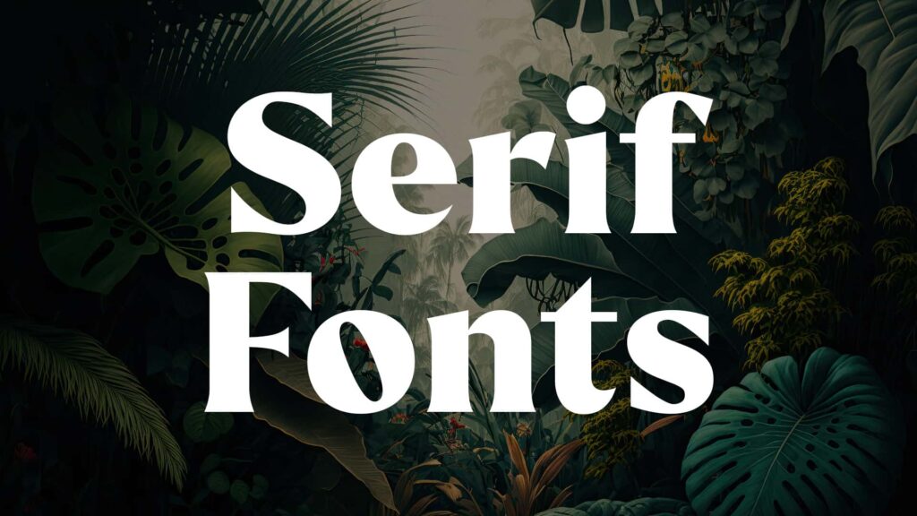
Serif Fonts: Tradition and Elegance
Serif fonts symbolize tradition, professionalism, and reliability. The gentle curving lines at the end of characters add a level of sophistication, making it very suitable for projects with a message of authority and timelessness. Examples are the classic beautiful fonts Times New Roman and Garamond that are commonly used in formal documents, editorial layouts, and luxury branding.
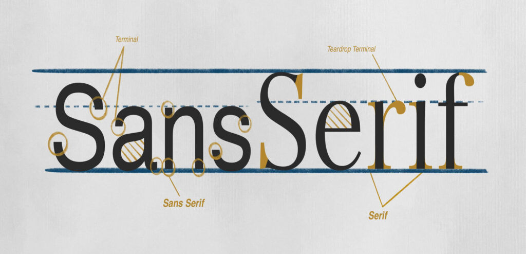
Sans Serif Fonts: Modernity and Simplicity
In contrast, sans serif fonts represent modernity and simplicity. These fonts are clean and minimal, without decorative strokes, which gives them a contemporary and approachable feel. Perfect for tech companies, startups, and creative industries, sans serif beautiful fonts like Helvetica and Futura emphasize clarity and functionality while maintaining a sleek aesthetic.
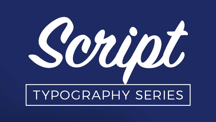
Script Fonts: Creativity and Emotion
Script fonts tend to reflect the fluidity of handwriting. They are very emotive and creative. Because of this, their elegant, puffed up shapes lend themselves well to both customization and the creation of something sentimental, like weddings or branding for small businesses. A Brush Script, and even Pacifico, example, however, gives an idea of “cozy” or “friendy” treatment to anything in designs. It is best to try and develop an emotional bond with your listeners.
The Psychology of beautiful fonts
Fonts are not only aesthetical; they also become strong instruments of influencing the viewer’s perception. They determine how one might feel by looking at the message. In turn, serif fonts reflect tradition and trustworthiness, sans serif font expresses innovation, and a script font conveys closeness. The designer who takes into account the psychological features of different styles can choose wisely for the realization of their idea.
Part 3: Categories of Beautiful Fonts
Typography plays an essential role in design, shaping how a message is interpreted. The right font can be the difference between personality, clarity, and visual appeal. Below, we explore five popular categories of beautiful fonts, their unique characteristics, examples, and ideal applications.
Elegant Serif Fonts
Serif fonts are characterized by small decorative strokes at the end of letters. They are timelessly elegant and sophisticated. These are used to convey formality and prestige. Times New Roman is a staple in formal documents and admired for balance and legibility. Baskerville, with its high contrast and refined details, is the best choice for luxury designs. Elegant serif fonts are best used in magazines to give a professional look and in luxury branding to convey class and exclusivity.
Modern Sans-Serif Fonts
Sans-serif fonts are very simple and minimalist in nature. It is devoid of ornate strokes. Modern sans-serif beautiful fonts are versatile and thus popular for modern designs. For instance, Helvetica is known to be very clear and neutral. Futura is famous for its geometric look and futuristic feel. Sans-serif works wonderfully on websites for readability and clean user experience as well as for tech brands, where their streamlined appearance reflects innovation and progress.
Charming Script and Handwritten Fonts
Script and hand-written fonts give personal, as well as creative feel to a design. They replicate like a natural handwriting which brings along warmth and charm. Pacifio with casual style is full of flowing beauty giving friendliness. Dancing script has playfulness mixed into elegance, perfect for such artistic projects. Such beautiful fonts highlight in invitations, particularly weddings and celebrations where the fine strokes resonate with romance.
Bold and Decorative Fonts
The use of bold and decorative fonts is attention-grabbing and gives an expression. Their striking design makes them ideal for highly visible graphics. Lobster, for example, is bold and playful and often found in logos and branding; Impact lives up to its name, delivering a powerful, commanding presence. The fonts are often used on posters, where they capture the viewer’s eye, and also in logo designs, in which unique typography can really make a brand stand out.
Minimalist Fonts for Contemporary Design
Minimalist are very simple and functional, making them a favorite in modern design. They prioritize clean lines and easy readability. Lato offers a harmonious blend of warmth and professionalism, while Raleway stands out for its elegant and lightweight structure. Minimalist beautiful fonts are very common in UI/UX design, where clarity and usability are paramount, as well as in minimal branding, where their understated elegance communicates sophistication and modernity.
Part 4: Common Mistakes to Avoid When Choosing Fonts
The right font can elevate the design of any project, but mistakes are easily made that can undermine the overall effect. Here are some of the most common errors to avoid when selecting fonts for your project:
Overusing Decorative Fonts
Among the most common errors, you find that reliance on overly ornate or even calligraphic fonts. Decorative fonts are meant to add a bit of sparkle; however, the abuse of decorative fonts often hinders readability and brings unnecessary distraction away from your intended message. They should only be used as accents or highlights instead of body text, lest they become overpowering to the reader’s eyes.
Choosing Fonts That Lack Readability
Readability is the priority for choosing a font. Even though a font is very attractive in design, it loses its purpose if it’s difficult to read. Some intricately detailed or uniquely formed letterforms may look very pleasing at large sizes but at reduced sizes can become difficult to read on smaller mobile screens or for visually impaired readers. Always check your chosen beautiful fonts in different sizes to make sure it remains readable and clear.
Using Too Many Fonts
Another common mistake is to use too many fonts within one design. While one wants to experiment with lots of typefaces, too many lead to a chaotic look, with no consistency to speak of. A general guideline is to limit your design to two or three: headings, body text, and possibly a third for highlights or other accents. This keeps your visual design cohesive and helps keep it from becoming too busy.
Ignoring Font Pairing Principles
Font pairing is an art that requires careful consideration of contrast and harmony. Some fonts just don’t work well together. Pairing two fonts that are too similar makes the design look flat, while fonts that are too different create visual dissonance. For instance, two highly decorative fonts can clash and confuse the viewer. To avoid this, aim for balance—pairing a serif font for headings with a sans-serif font for body text is a tried-and-true method.
Not Considering Context and Audience
Fonts convey more than just words—they communicate tone, personality, and even emotion. A font that works well in one context may be completely inappropriate in another. For instance, fun cursive beautiful fonts might be great for a child’s birthday invitation but dreadful for a professional business presentation. Consider the context of your project and the expectations of your target audience. A chosen font that is familiar or resonates with your target audience will set the tone and enhance the experience.
Part 5: Bonus: Make Professional Logos with Arvin AI
Arvin AI is a revolutionary platform designed for creators and designers who want to streamline the design process. Through the power of artificial intelligence, Arvin AI delivers tools that streamline font management, so that easier ways to discover, contrast, and implement elegant fonts for design applications can be found. When it comes to logo design, website design, or brand identity, Arvin AI streamlines your workflow through smart font suggestion as well as customizable user options in sync with your creative vision.
Key Features of Arvin AI
Superb Font Search and Discovery
Arvin AI enables users to easily find the best font by its advanced intelligent search feature. From its comprehensive collection of fonts, one can narrow down using a particular style, mood, or type of project in search for the perfect design font. AI that knows design context enables users to find better fits in the fonts needed.
Font Pairing Suggestions Using AI
Arvin AI excels at pairing these fonts by analyzing thousands of combinations to recommend optimal pairings for your design. By understanding the balance between typefaces, it ensures that your fonts work harmoniously together—whether you’re pairing a modern sans-serif with a classic serif or mixing decorative fonts with minimalistic options.
Easy Integration into Design Workflows
Arvin AI is designed to fit right into your workflow. If you use Adobe Creative Cloud, Figma, or any other design software popularly used, Arvin AI integrates with those services, and the beautiful fonts as well as the recommendations appear directly within your design tool. This means smooth transition from the idea phase all the way to final execution.
Steps to Use Arvin AI for making Logo
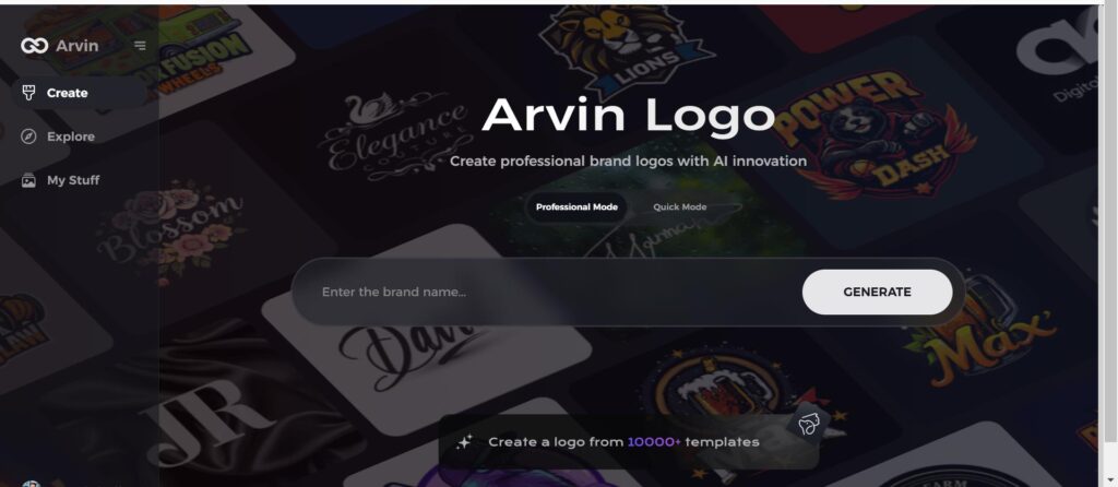
Step 1: Go to the Arvin AI Website
Open a browser window and head over to Arvin Logo Maker for designing your new, unique, and how to make a logo transparent company logo.
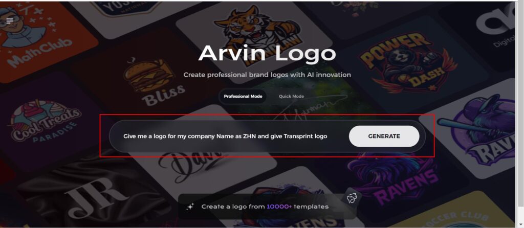
Step 2: Fill Up Your Company Details
Just enter the name of your company and pick its category and ask for transparent logo. All the details enable the AI to find the designs that would serve your needs and are representative for your company.
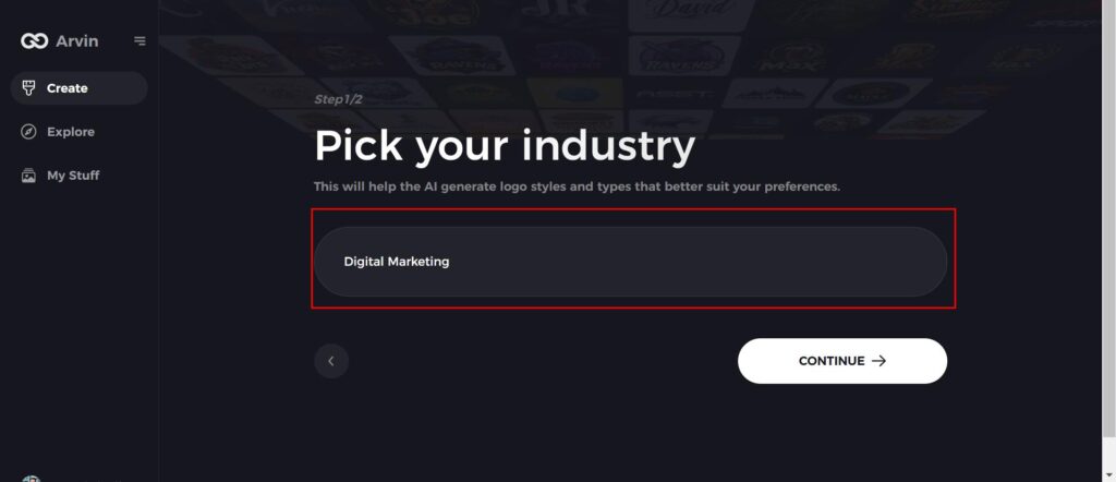
Step 3: Choose Your Industry
Pick an industry that best suits your business. This process guarantees the AI is making styles and themes that align best with your brand’s core value and niche in the market.
Step 4: Style Select
Pick a design style from the available ones. Leave it to “no style” if you’d want the AI to surprise you. The selected style shall provide a guideline for the final logon designs created.

Step 5: Explore Logo Concepts
Arvin AI will produce different types of logo designs according to the information provided. Simply scroll through the suggestions for a design that matches your brand identity.
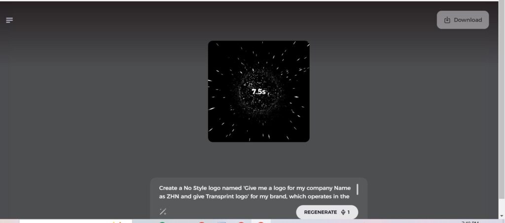
Step 6: Finalize the Logo
Fine-tune the chosen logo by adjusting colors, fonts, and icons to meet your brand personality and aesthetic. This way, your final logo is perfect and completely in line with your brand’s personality and style.
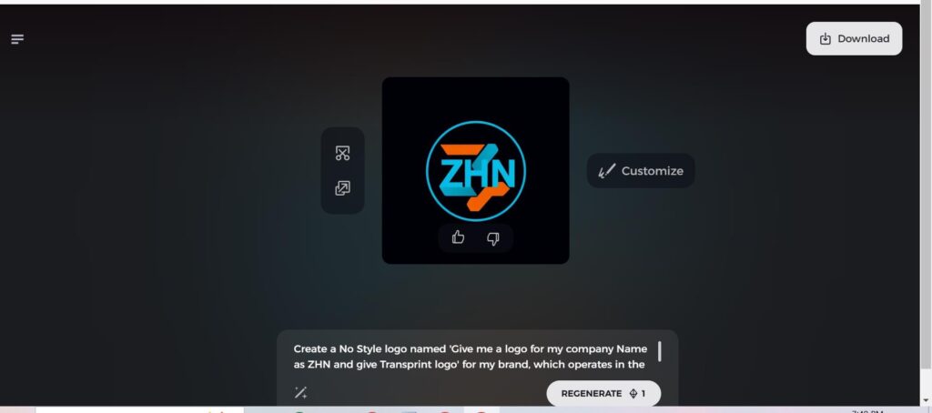
Step 7: Download Your Logo
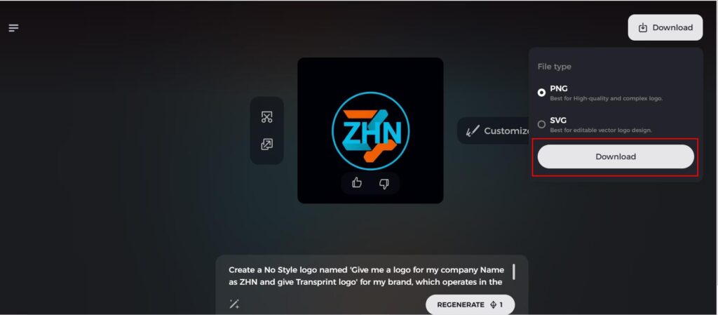
Once satisfied with your final design, download your logo in versatile formats such as PNG or SVG that would be perfect for various media. Websites, social media, print, and so much more-these logos will give a professional look across every platform.
Conclusion
Beautiful fonts make a point in design, mainly because the tone, mood, and how readable a project is entirely depends on them. They mean more than the text since they are essential parts of communication that can both make and break a design. A new solution with Arvin AI is how to easily manage and select beautiful fonts since it allows designers to optimize their ways and be as creative. Keep both aesthetics and functionality in your sight as you explore and try out different beautiful fonts, one that would best suit the unique style of your designs.
FAQs
Which are the most versatile font types for all design necessities?
Some of the top picks for versatile fonts include those who are highly readable, adjustable, and suitable for lots of designing projects, whether it may be digital or print designs -Helvetica, Lato, Times New Roman.
How do I work in pairing fonts?
Pair contrasting beautiful fonts, such as serif with sans-serif, aligning them with the tone of the project. Experiment in styles that are visually harmonious yet readable.
Can I use free fonts for commercial projects?
Some free fonts have commercial licenses, so be sure to check out the licensing terms on websites like Google Fonts or Font Squirrel to ensure correct usage in commercial work.
What makes Arvin AI special when it comes to font management?
Arvin AI uses artificial intelligence to streamline the discovery, pairing, and integration of fonts, saving designers’ time while ensuring that beautiful font’s selections are aligned with the desired project style and professionalism.

