The Beatles are icons of innovation, artistry, and most essentially for their existence, effect in terms of sound. Well, something that involves all aspects is their visual identity, symbolized by the simple yet culturally iconic logo of the Beatles. From small beginnings to world recognition, the story of the Beatles logo is one of artistic genius and cultural sensitivity. Follow along as this article traces the evolution, meaning, and enduring legacy of a simple design which seems to have become a pop culture phenomenon.
Part 1: Meaning and History of The Beatles Logo
From its humble origins as a symbol of musical creativity, the Beatles logo had modest roots. The product of 1963 was informed by the shift in identity the band was going through and the visit to the London music shop, which provided an unforgettable design.
How the Beatles Logo Came to Life
It all began on what seemed to be a normal visit to Drum City, a music store in London, back in 1963. Brian Epstein, the manager of the band, had gone to Drum City to buy a new drum kit for Ringo Starr. He asked them for a logo design for the bass drum during the sale. Ivor Arbiter was an owner of a store and was an experienced designer; thus, he took on the challenge and created the design which would later be one of the most iconic logos in the history of music.
Part 2: Evolution of The Beatles Logo (1960-1970)
The evolution from concept to the most recognized emblem in the world was a developmental process that took ten years and was comprised of a decade of experimentation and refinement.
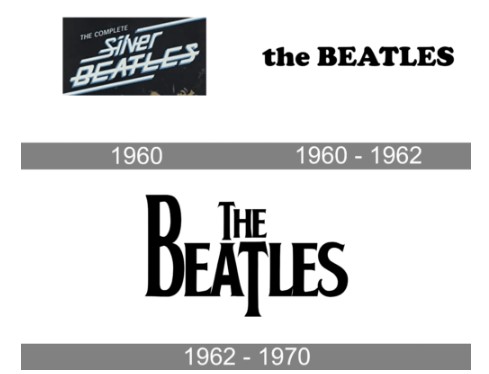
1960: The First Concept
Before the “Drop-T” logo, The Beatles tried a futuristic and geometric logo. The 1960 version was in gradient lettering and bold, experimental shapes, which epitomized modernist aesthetic. This was an early attempt at the desire to break the conventions and to be the trendsetters in music and art.

1960-1962: The Black and White Era
When The Beatles gained fame, the logo transformed into a minimalist black-and-white design. It was straightforward yet impactful in terms of clean lines and contrasts. The typography used “The” and “BEATLES” in a different kind of capitalization. It looked sophisticated and modern, and helped to solidify a visual identity for the band.

1962-1970: The Birth of the “Drop-T” Logo
The “Drop-T” logo introduced in 1963 was another landmark moment for the band. The elongation of the “T” by Arbiter was innovative and symbolic. The word “beat” is cleverly highlighted within the logo to connect the name of the band with the rhythmic nature of its music. It was instantly synonymous with The Beatles and appeared mainly on Ringo Starr’s drum kit at most of their concerts.
Part 3: Symbolism in The Beatles Logo
This section dissects the symbol of The Beatles logo, revealing unique design attributes that make this logo different as well as providing an analysis regarding the ways by which its simpleness, the iconic “Drop-T”, can be said to have contributed toward lasting cultural influence.
The “Drop-T” Logo: What Makes It Unique?
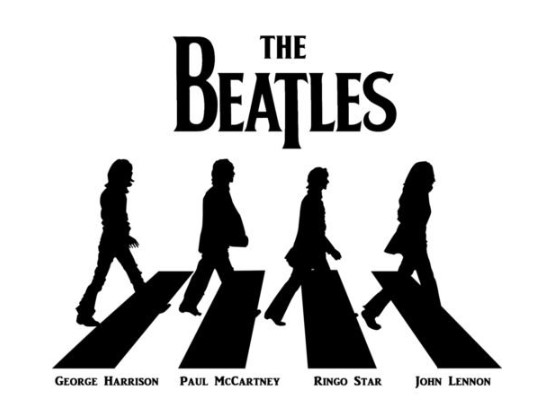
The first blush of this Beatle logo may make it look deceptively simple: the elongation of the word “T” in “The Beatles” proves it to be nothing short of design genius- a minor modification on this word actually draws one’s attention away from the obvious fact that The Beatles are playing rhythms and straight towards the sense that they play on beats. This brilliant design element transformed the logotype from the mere wordmark into a symbol of The Beatles’ cultural and musical importance.
Role of Simplicity in the Logo’s Popularity
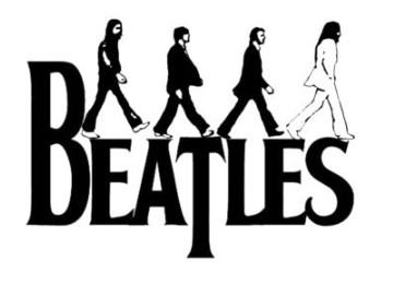
Without a doubt, one of the most important elements that define the timelessness of the Beatles’ logo is its simplicity. The black-and-white color scheme makes it timeless; hence, not prone to the trends and fad features of a certain design. Unlike full-fledged designs, the Beatles logo rests on clean lines with a simple layout, which makes the symbolic components remain prominent. Things such as an extended “T” and balanced typography feature the kind of add-ups to elegance and innovation.
Part 4: The Beatles Logo as an Emblem of Legacy
Part 4 explores how The Beatles logo transcended its initial role, becoming more than just a design. It evolved into a symbol of the band’s legacy, shaping their identity and leaving a lasting cultural impact.
A Design Beyond Album Covers
It was interesting that the logo of the Beatles was nowhere to be found in the original UK album covers for the band, but its prime use was seen on Ringo Starr’s drum kits during concerts. In this way, it became the centerpiece of the concert visuals of the band where it captured the imagination of millions. The logo is synonymous with the concerts The Beatles performed, hence terrifically connecting with the audience emotionally.
Trademarking the Icon
By the 1990s, The Beatles logo had become a legend. The representatives of the band realized that it had cultural and commercial value and initiated the process for the trademarking of the design. This way, they would ensure the great branding tool that would be attained, and the logo would not be allowed to be used without permission. Currently, it adorns everything available to the masses: clothing, accessories, collectibles, and memorabilia. The fact that it endures gives an indication that this has, in fact been one of those iconic marks transcending time that have meaning to any generation.
Part 5: The Font Behind the Magic
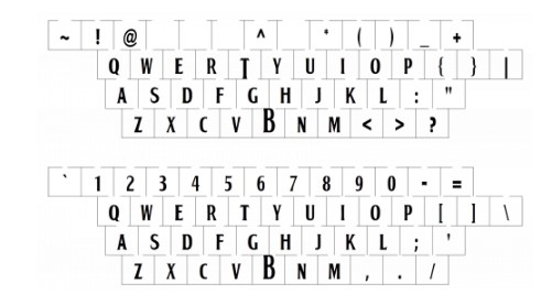
The custom font of The Beatles logo later dubbed “Bootle,” but the name made exclusively by Ivor Arbiter for the band. Its clear, bold lettering aptly embodied The Beatles’ inventive sensibility and style of modernity. It was in the Bootle typeface that the success of the logo rested. It remained readable and potent at distance as its clarity and distinction. The design made such an important statement by not overlooking a minute detail which pointed towards the intention of making the logo to stand for centuries.
Part 6: Arvin AI: Your Ultimate Design Partner
Modern designers have the perfect opportunities to design logos that strike a harmony with people as well as The Beatles logo. As an advanced design and creative assistant, Arvin logo maker gives the user a very easy and precise way of bringing their artistic vision to life.
Key Features of Arvin AI
- Custom Logo Design: Come up with creative and meaningful logos that are an identity of your brand.
- AI-Driven Creativity: Create an infinite realm of creative potential through the best AI technology available.
- Ease of Use: Design process becomes very simple through intuitive tools and easy interface.
- Learn from History: Take inspiration from famous designs like the Beatles logo and create something for the ages.
Steps to Use Arvin AI for making Logo
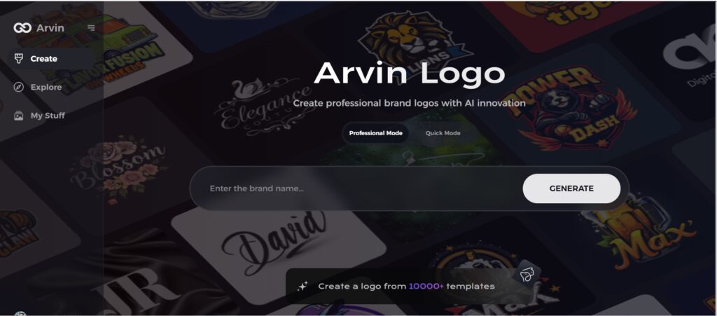
Step 1: Visit the Arvin AI Website
Open your web browser and access the design page of the Arvin AI site to start creating your logos.
Step 2: Fill out Your Business Information
Fill in necessary business details like your business name and category. This information allows the AI to create designs specific to your brand.

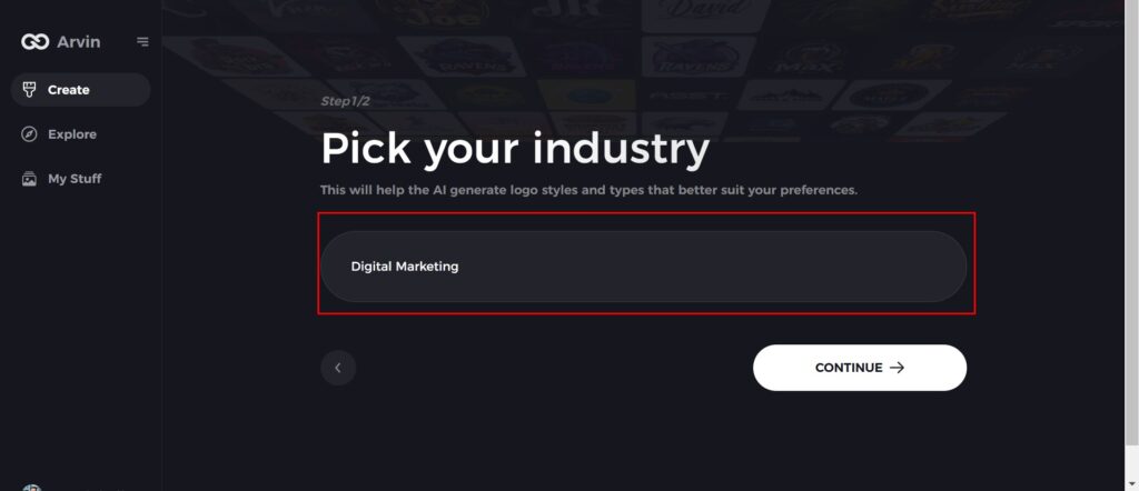
Step 3: Give Industry Name
Select an industry from the list provided. This process narrows down the logo styles and types for the AI to fine-tune based on your choice.
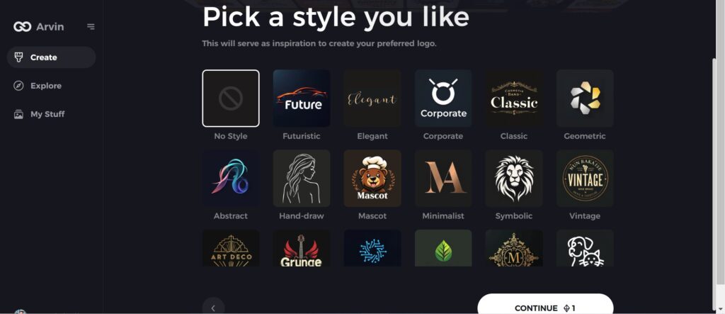
Step 4: Pick the Style
Browse through the style list presented and choose one that is relevant to your brand’s vision. If you still don’t like it, just skip this step and let the AI take its default inspiration.
Step 5: Logo Ideas
The AI will create various logo designs according to the inputs provided by you. Review the ideas that appeal to your brand image.
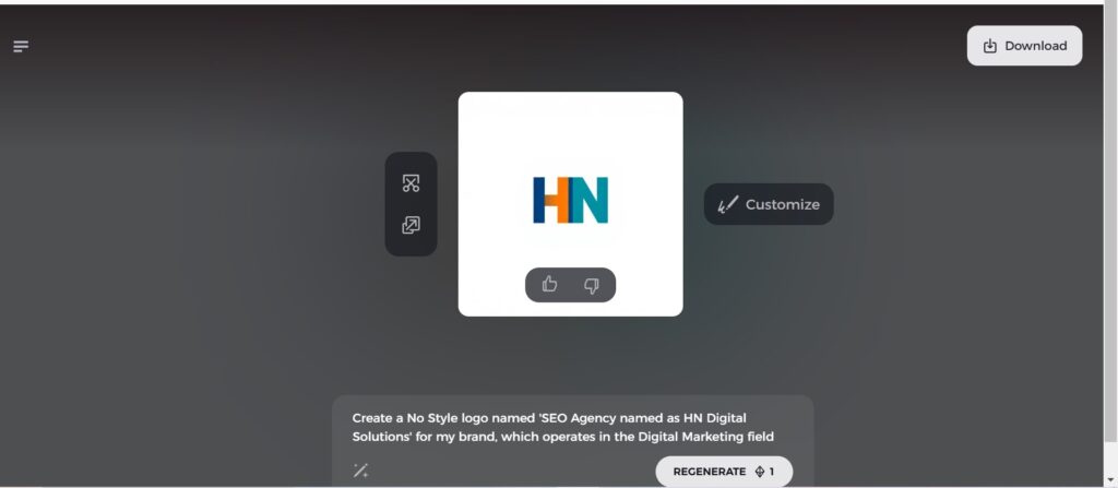
Step 6: Personalize Your Logo
Refine your chosen design by making some changes such as colors, font, icon, and layouts to resemble your style.

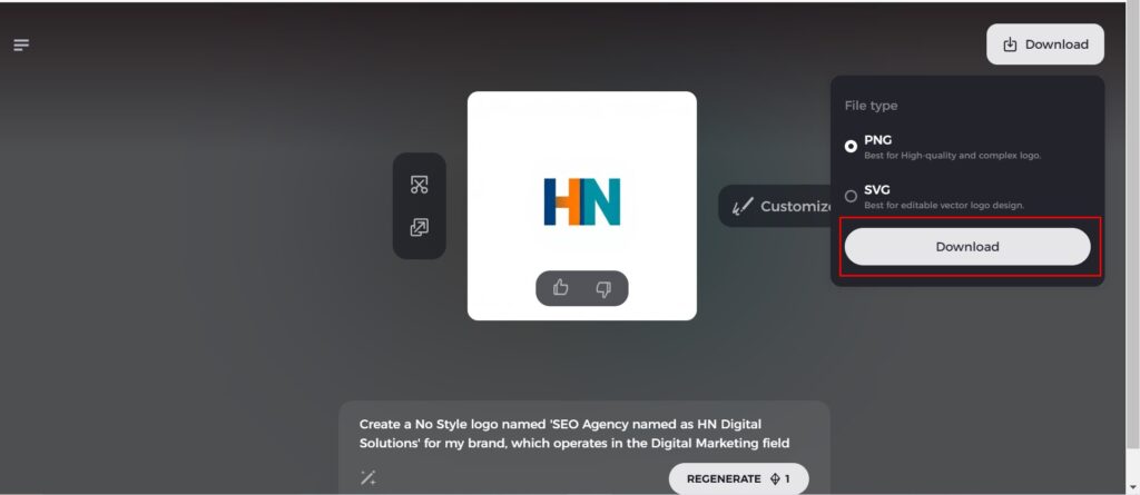
Step 7: Download Your Logo
Once you satisfy with the final design, download your logo in formats like PNG or SVG. These formats ensure compatibility for use on websites, social media, and print materials.
Conclusion
The Beatles logo means more than invention, creativity, and tradition. Starting from when it was an easy drawing inside a music shop in London to turning out to be a pop icon, this mark signifies what proper design could actually do. In simple terms and with the right amount of symbolism, the logo remained relevant for years; inspiring both the designers and the fans. If you are looking to create a professional logo for your brand, Arvin AI logo maker can provide the tools and insights needed to bring your vision to life.
FAQs on The Beatles Logo
Why is the T longer in The Beatles logo?
The shop’s owner, Ivor Arbiter, sketched the drop-T logo on the spot. The larger B and T were to emphasise the word “Beat”. Indeed, that drum kit is the only place the logo appeared for a long time.
Who designed the original Beatles logo?
Ivor Arbiter designed and Eddie Stokes then painted it inside Ringo Starr’s drumming kit, whereby the idea actualized.
What is the Drop-T Logo?
famous Beatles logo is a wonder of understatement which known as “the drop-T”. Beacuse it’s design based on a sketch made by instrument retailer ” Ivor Arbiter” in 1963.
What font is used in The Beatles logo?
The Bootle typeface, which is a custom-made by Ivor Arbiter, matches the bold, modern image of the band.

