We all love ice cream. So today, let’s explore the meaning of the Baskin Robbins logo. The Baskin Robbins logo only looks like a colorful “BR,” but that’s not all. Behind this simple design is a fascinating story full of meaning and history. By understanding the symbolism hidden in the Baskin Robbins logo, you can learn about the brand’s values and origins. There is something hidden in this logo, and this is not the only one with a hidden image. Take a closer look at the hidden meaning of Baskin Robbins.
Part 2: The Origins of Baskin Robbins and the First Logo (1945 – 1953)
It all began in 1945 when two ice cream enthusiasts, Bert Baskin and Arve Robbins, decided to join forces to create something special. They opened their first ice cream shop in Glendale, California. It started with the dream of delivering delicious and novel flavors to people. Baskin Robbins distinguished himself by offering 31 flavored ice creams. This idea was revolutionary for its time and captured the hearts (and taste) of customers all over the world.
Part 3: The Evolution of the Baskin Robbins Logo (1953 – 2020)
The history of Baskin Robbins begins with the opening of Burton’s Ice Cream Shop in Glendale, California in 1945. A year later, his brother-in-law Arve Robbins founded another ice cream parlor in Pasadina. Two years later, his brother-in-law joined hands. They worked closely together, but each worked for their own brand for the next few years.
1953 – 1980
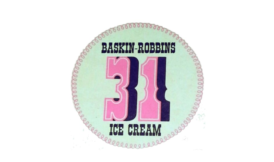
Carson Roberts choose a unified brand identity in 1953 for a local advertising company under Oglevy & Maiser. Carson Roberts also created the slogan “31 flavors” (meaning one flavor changes each day) and the early Baskin Robbins logo. The logo was a thin mint green round background with stitches on the edge. The pink number “31” was the main role of the logo.
1980 – 1990
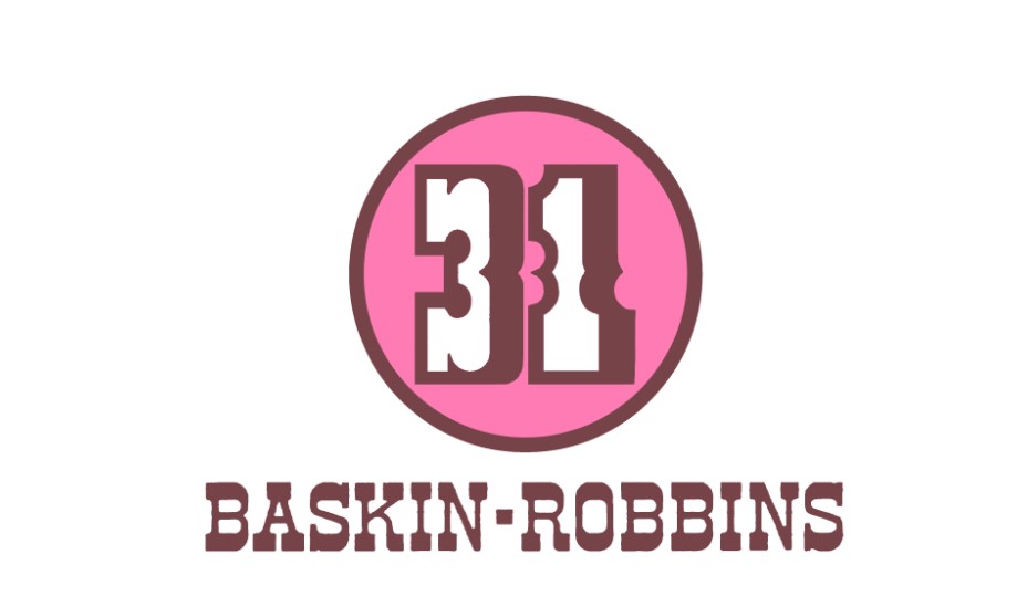
The pink color is reminiscent of happy, sweet and playful. Therefore, it is not surprising that the company chose pink for the main logo color of the round foundation. In the latter, only 31 numbers were drawn in white with brown shadows and outlines. The name was placed under it, and the ice cream part was completely removed.
1991 – 2006
Baskin Robbins Logo The second emblem, adopted in 1991, was more effectively fused with the word mark by placing the letters “Baskin” and “Robbins” on the left and right, respectively, with the number “31” at the core. The color scheme is pink and blue.
2006 – 2020
The new logo was introduced as part of a brand-wide refresh. In the 1950s, it was impressive to provide flavors per month, but no one would be surprised now. Interestingly, the company has released more than 1,000 flavors since 1945. Nevertheless, the ice cream chain decided to leave symbolic numbers as part of its identity.
2020-2022
The Baskin Robbins logo from 2020 to 2022 remained close to the previous logo with only minor adjustments. In particular, the color palette is slightly more saturated and has a dark color tone that enhances the vivid and visual impact of iconic design while maintaining brand awareness and beloved identity.
2022 – Today
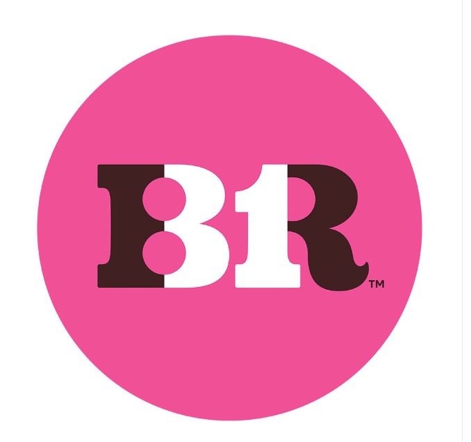
Baskin Robbins logo of 2022 redesign is a tribute to the original Baskin Robbins iconic logo made in 1947. The chocolate and pink color palettes of the original badge were slightly deepened, strengthened, and the style became modern, but the similarity of the two emblems can still be seen. Today, the band badge is painted with a brown, bold and elegant monogram of “BR,” the interior is colored pink and looks like “31.”
Part 4: Reflects a wide range of branding and design trends
The evolution of the Baskin Robbins logo reflects a wide range of trends in the world of branding and design. The transition from complex and brilliant designs to cleaner and easier-to-understand logos reflects the general trend of corporate branding for minimalism and functionality. The vivid color palette all show trends that prioritize brand awareness, simplicity and emotional connections with consumers.
Symbolism and brand identity
The Baskin Robbins logo is a good example of how brands can effectively use symbolism. The number 31 is not just a number, but rather a commitment to the diversity and innovation of the products offered by the brand. The above information represents that using the application of bright colors like pink and blue, which symbolize fun, youthfulness, and creativity, forming the Baskin Robbins brand.
Part 5: Baskin Robbins Design Elements
The design elements of Baskin Robbins have evolved while combining tradition and innovation, creating a visual identity that is as rich and fun as ice cream flavors. See the design elements that made the iconic Baskin Robbins logo:
Font
Baskin Robbins’ new logo font is very similar to a commercial font known as Variex Regular. Characterized by zigzag characters, this typeface perfectly matches the brand’s commitment to exuding playfulness and joy and providing a fun ice cream experience.
Color
Colors play an important role in Baskin Robbins’ brand identity, and Pink has been a permanent and a vital element since the logo’s history began in 1953. With the incorporation of blue in 1991, the current logo shows a sophisticated palette featuring subtly different shades of these iconic colors.
Shape
Baskin Robbins’ logo selected as a circle, which embodies the psychology of the shape in branding. The circle represents unity, harmony, and inclusiveness as a form of timeless and universal appeal and reflects the brand’s mission to provide diverse flavors for all.
Part 5: Use Arvin AI for Customized Logo Design
In this corporate world, that has been quite competitive nowadays, an influential logo is of prime importance. This represents the firm and also a medium through which one can won through the way. Arvin AI brings out that revolutionary approach which really delivers the core vision of the firm. Arvin AI gives you the tools to make fantastic, professional logos fast, whether you are a small startup or a large and established business looking for a refresh.
Key Features of Arvin AI
- Easy Customization: Design logos aligned to your brand’s personality in just a few clicks.
- AI-Powered Tools: Have AI-generated intelligent suggestions and designs ideas.
- High-Quality Graphics: Get a professionally designed logo with the best high-resolution design.
- Low Price: On the bright side, designing logos is well-priced and done with professional results.
- Quick Turnaround: Just minutes in logo creation.
Steps to Use Arvin AI for making Logo
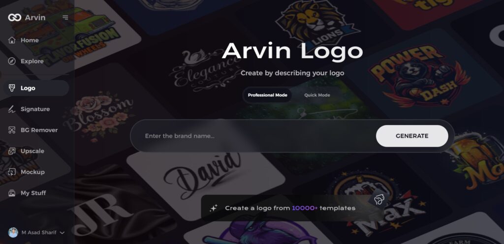
Step 1: Visit the Arvin AI Website
Open your browser and navigate to the logo design page at Arvin AI to begin your logo creation process.
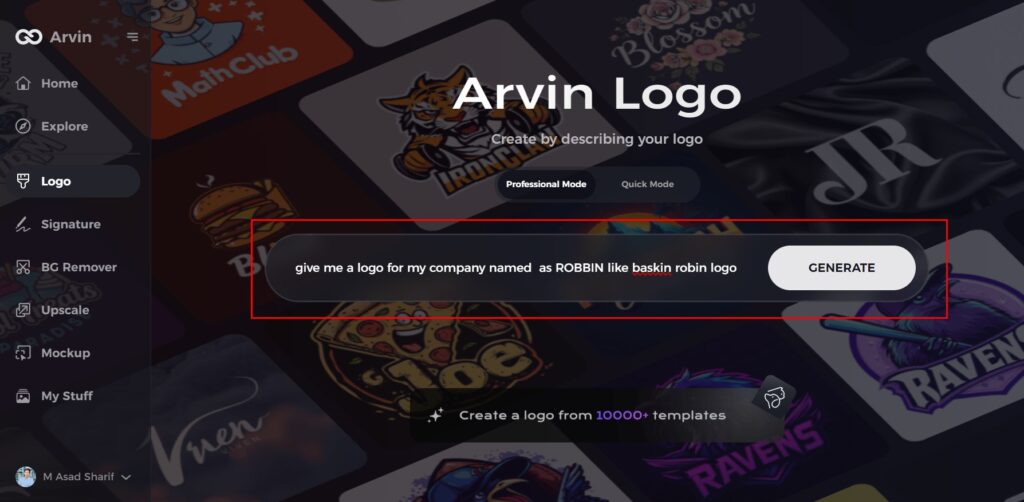
Step 2: Input Your Business Information
Provide essential details such as your business name and category. This helps the AI tailor logo designs to match your brand’s identity.
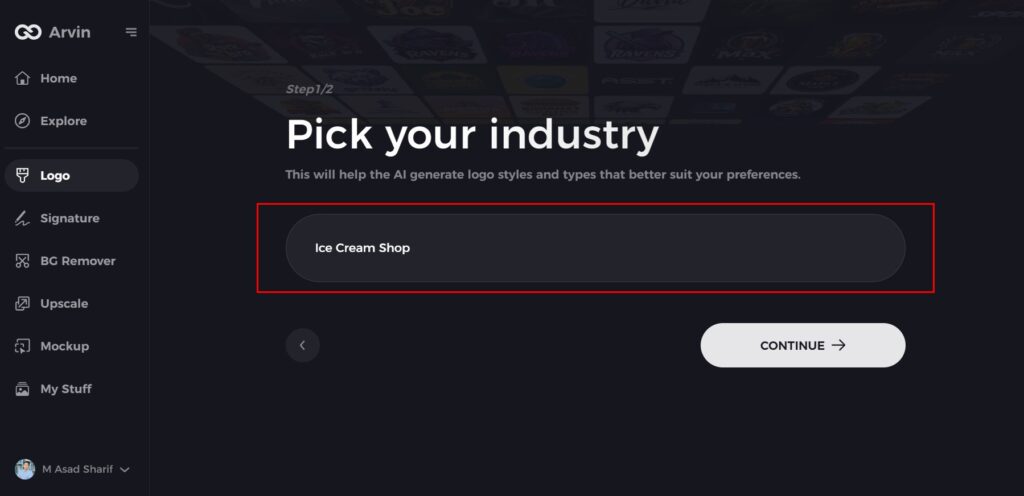
Step 3: Choose Your Industry
Select your industry from the provided list to guide the AI in generating logo styles and themes relevant to your business.
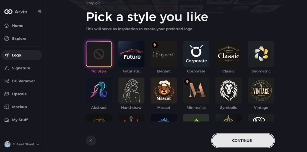
Step 4: Select a Style
Browse the available style options and pick one that aligns with your brand’s vision. If unsure, skip this step, and let the AI use its default design inspiration.
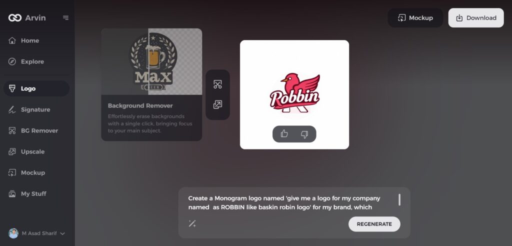
Step 5: Explore Logo Ideas
Review the logo concepts created by the AI based on your inputs. Choose the designs that best reflect your brand image.
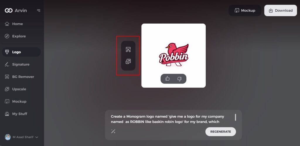
Step 6: Customize Your Logo
Personalize your selected logo by adjusting colors, fonts, icons, and layouts to create a design that perfectly suits your style.
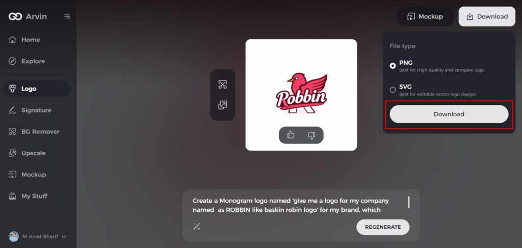
Step 7: Download Your Final Logo
Once satisfied with the design, download your logo in formats like PNG or SVG. These formats are ideal for websites, social media, and print materials, ensuring versatility and quality.
Conclusion
The Baskin Robbins logo has changed from a simple design to modern one we can see today, by reflecting the company’s history and values. The transformation of logo showcases the brand’s growth and adaptability over the years. In the case of Baskin Robbins, a strong logo influences customer loyalty as well as identity. Branding is more vital in today’s times, where everything changes fast. Tools like Arvin AI help in creating unique and memorable logos, setting up the foundation for a long-term success.
FAQs
Why is 31 in the Baskin Robbins logo?
What was once a selection of 31 flavors—Baskin-Robbins “31®” stands for a different ice cream flavor for each day of the month—has grown to more than 1,400 in its flavor library.
How has the Baskin Robbins logo changed over the years?
The change of logos from simple brown and pink coloring to modernity, interactivity designed contains hidden features such as the “31”.
What does the Baskin Robbins logo symbolize?
The pink in the Baskin Robbins logo may seem artistic, but the different colors are actually supposed to reveal the number 31 signifying their original number of flavors of ice cream that the company offered.
How do I use Arvin AI to create a logo for my business?
Sign up for the service, input the brand information and style, then make any other design changes that you would like. Then downloaded at high resolution.

