Barbie is among the most well-known dolls brands by people in the world. The logo of the brand has contributed to a great extent in its success. The Barbie logo is simple but at the same time eye-catching and thus memorable to any person at any age. Through the years, the logo has changed according to trends yet kept its appeal. This paper discusses changes over time about the Barbie logo, changes in design, and contribution to popular culture. Herein, shows how a logo can shape brand identity and its ability to relate to people.
Part 1: The Birth of the Barbie Logo
The Barbie logo designed by Ruth Handler, the co-founder of Mattel and the Barbie doll itself! Ruth wanted to create a toy that symbolized a woman with a choice. A woman with freedom, independence and severe femininity. It was different from the traditional baby dolls on the market at the time. So she designed the Barbie logo with the same intention! The iconic display script font and playful yet stylish Barbie Logo’s pink color conveyed both playfulness and the potential of modern women.
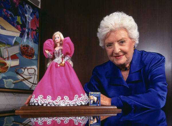
Fun fact: Did you know Barbie’s full name was Barbara Millicent Roberts? The doll was named after Barbara, the daughter of a handler. Ken is named after her son Kenneth.
Part 2: The Barbie logo evolution
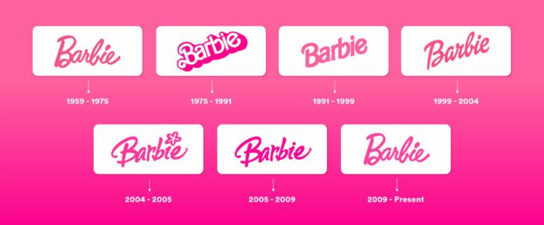
From the playful modernity of the pink wordmarks logo of the 1950s to the stylish simplicity of the modern era, each era of the evolution of the Barbie logo brilliantly reflects the shift of design aesthetics and culture of each era. Let’s see!
The Origin of the Barbie Logo (1959-1975)
The first Barbie logo, published in 1959, featured delicate script fonts and a soft pink logo color. Both these elegant designs personified the complexity and charm that Ruth Handler envisioned in the brand.
Logo Redesign: 1975-1991
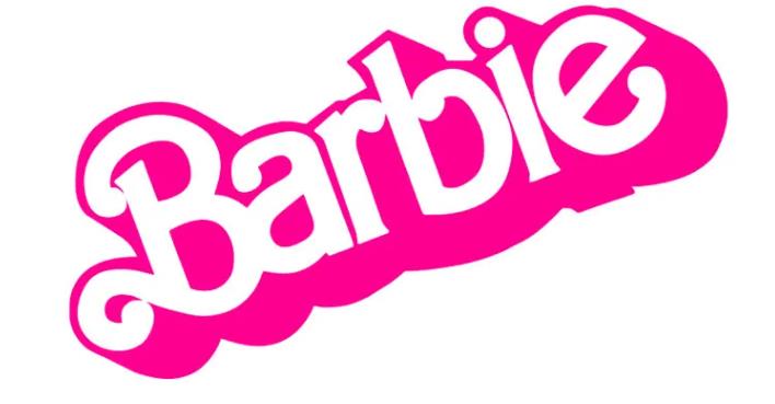
In 1975, the Barbie logo underwent its first major design change, moving to a more bold and modern font and introducing a bright pink shadow for 3D effects. This design change highlighted the brand’s strong connection to the fashion world and aimed to reflect the diversity of the Barbie doll collection.
Bold Modernization: 1991-1999
In the 1990s, a distinct design appeared from the Barbie logo. It is more edgy, bold, and accidental to the bare design trend of the 90’s. This change reflected the brand’s desire to appeal to a wider audience by incorporating modern design trends.
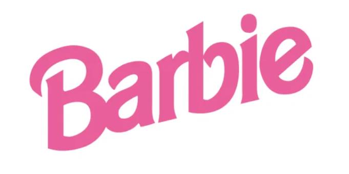
Fun Fact: This period was a testament to the wider and more diverse collection of Barbie dolls, reflecting the evolving social norms and expectations.
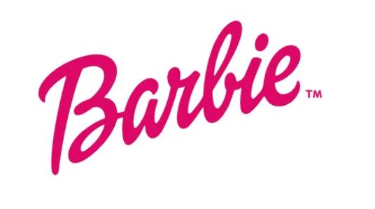
Return of Original: 1999 to 2004
In 1999, the Barbie logo returned to its original script font, but by setting the logo angle to 45 degrees, it created a more manual-style unique appearance and incorporated playfulness. Like a sign! The color of the logo is also dark pink, reflecting the color trend of the time.
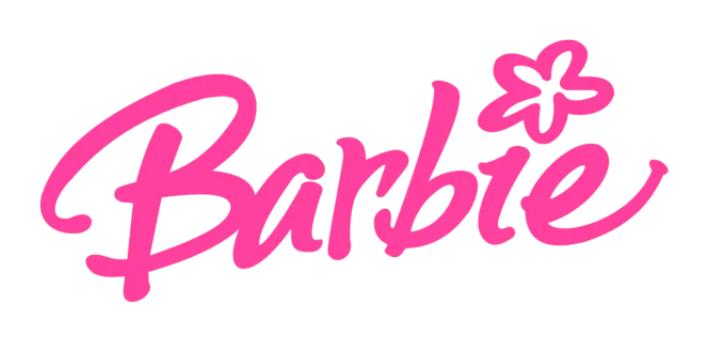
Impact of Y2K and Flower: 2004-2005
During this short period, Barbie’s logo was influenced by Y2K logo aesthetics that highlighted futuristic and classy design elements. The addition of five petal flowers on the “I” symbolized the stronger experimental posture within the brand. This logo design also revived the iconic Barbie Pink, but with a brighter color. It was the beginning of the 2000s!
Bolder and Simple: 2005-2009
In 2005, the Barbie logo was changed again, this time focusing on boldness and simplicity. The restored design highlighted the font of the previous logo, removed the elements of the flower and replaced it with a classic dot. This reflects the brand’s demand for a more sophisticated, childless and more rational logo. The bold pink color embodies Barbie’s modern, confident and excited spirit and supports his image as a brand that supports all forms of femininity.
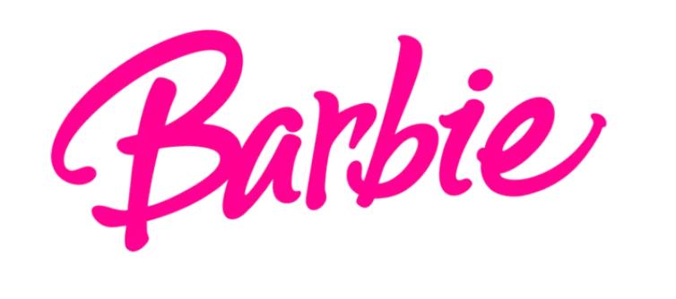
Revival of Vintage Style: 2009-Present
Since 2009, the Barbie logo reflects the original design of 1959, returning to a classic script font and soft pink color. This return to roots emphasizes Barbie’s stable appeal and relevance. In all logo designs, Barbie always preferred single and multi-color palettes. The consistency of the logo emphasizes the brand’s innovation, while also respecting its symbolic origins and maintaining customer interest.
Part 3: Cultural Impact of the Barbie Logo
The Barbie logo is more than just a design. It symbolizes the influence of the brand on culture over the years. This part discusses how the logo has been shaping perceptions on fashion, criticizing it, and embracing diversity.
A Symbol of Fashion and Fantasy
The Barbie logo has long been a style and imagination symbol. However, for the American ideologist, Barbie is a fashionable, iconic figure who, apart from being a doll, personifies fashion. A logo also served to market Barbie as a leader; it focused children’s attention on beautiful forms and creativity through this fashion icon.
Criticism and Controversies
In due course, the Barbie logo became controversial as a representation of femininity. People believed it reflected a narrow beauty ideal. The brand was called upon by the debates to review the brand. The parent company, Mattel, attempted to get in line with social values as they evolved while not losing its appeal.
Diversity Inclusion
Recently, the Barbie logo modify that reflect a more inclusive brand. Mattel introduced diverse dolls, celebrating different body types, skin tones, and abilities. The logo finely changed to show that Barbie now represents everyone. This shift in design and branding highlights enabling and inclusivity, ensuring Barbie remains relevant and loved by all.
Part 4: Barbie Logo Design Elements
The Barbie logo, with its iconic display script font and playful pink color, aims to convey fun and the possibilities of modern women. Here we analyze each design element in detail:
Barbie Logo font?
The Barbie logo consistently uses elegant display script fonts that convey sophistication and playfulness. Current Barbie fonts are very similar to customized Brush Script Std Medium. Over the years, variations such as Dollie Script and Barbie Medium have been used, but the handwriting style of the logo continues to be a trademark of Barbie Brand.
What is the color of Barbie’s logo?
The Barbie logo is characterized by its iconic pink color, specifically PMS 219 C, known as “Barbie Pink.” This vivid, saturated color evokes feminine charm and homesickness, and is central to brand identity. Over the years, various pink shades have been used to reflect the different aspects of Barbie, from playful and vibrant to sophisticated and modern.

Part 5: Enhancing Logo Design with Arvin AI
Arvin AI is a good logo maker, which uses artificial intelligence to create unique and customizable logos for businesses or personal projects. With Arvin AI, one is assured of creating logos that match the style and needs of the user. It assesses preferences and creates designs that are creative and professional. It saves time and much effort while providing infinite design possibilities. Whether it’s launching a new brand or just revitalizing an existing one, Arvin AI contributes to the process of creating great logos that impress and linger in the memory.
Key Features of Arvin AI
There are following key features of Arvin AI:
- Logo Design Abilities: With advanced design tools, Arvin AI makes creating logos very easy. It is also suitable for businesses and personal projects.
- Customization Powered by AI: It generates unique, customized logos through the use of artificial intelligence and it adapts according to user preference for professional outcomes.
- Friendly interface: Arvin AI is friendly even to novices. It’s a design process that does not take so much time to create anything.
- Time Saver: Saves the time in the making of logos since one gets ready-to-use templates, as well as suggestions from AI.
- Multiple Styles: This tool avails numerous designs and styles for one to suit his brand.
- Quality Results: Arvin AI gives the impression that the logos will be so professional and quality in appearance and use.
Steps to Use Arvin AI for Creating Your Logo
Step 1: Sign Up and Log In
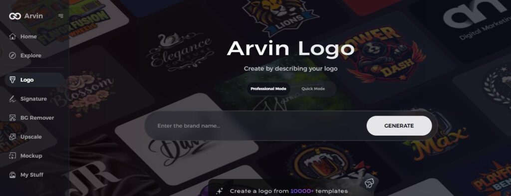
Visit the Arvin AI website, create an account, and log in to start designing your logo.
Step 2: Enter Your Brand Information
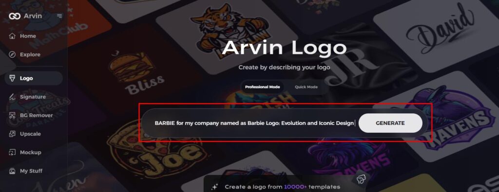
Provide your brand name, slogan, and industry. Include your design preferences, such as font style and image themes.
Step 3: Choose Your Industry
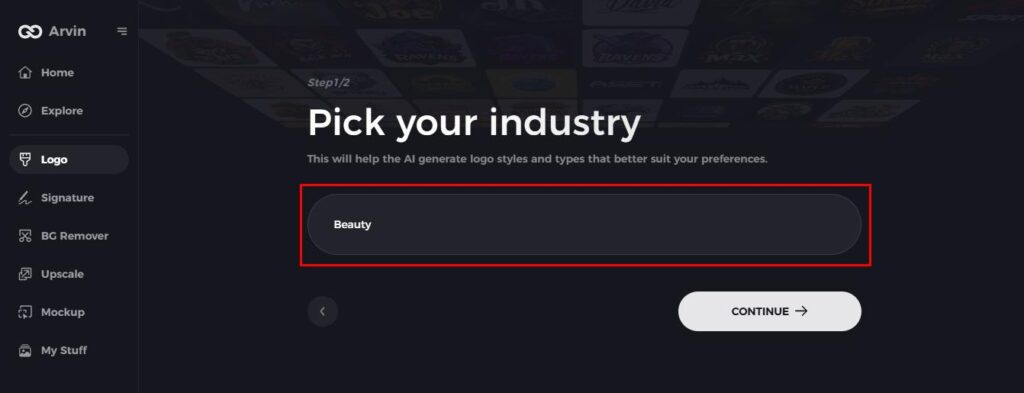
Select the industry related to your brand. This will help the AI suggest logo styles that match your niche.
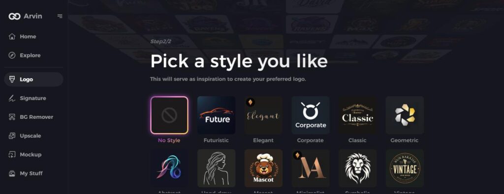
Step 4: Pick a Style
Choose a style that reflects your brand’s personality. This will guide the AI in generating logo designs for you.
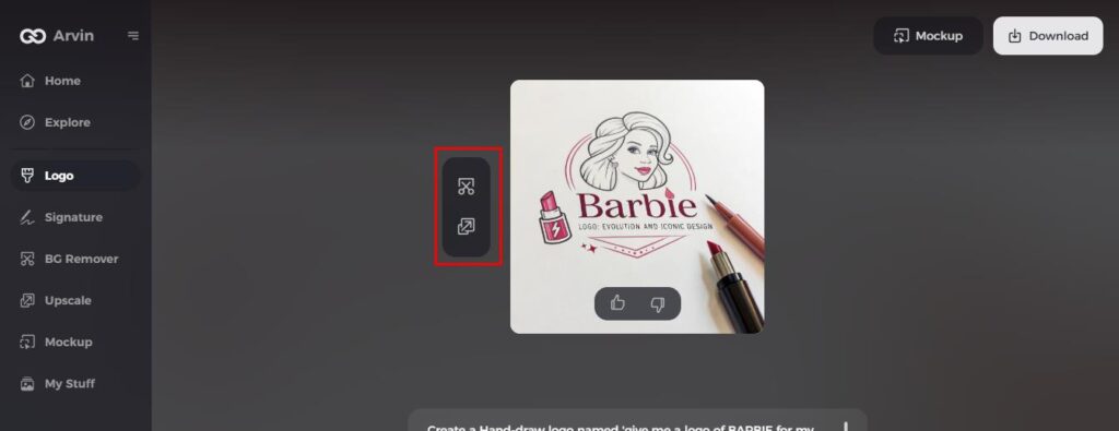
Step 5: Customize Your Design
Once Arvin AI creates your logo, use its tools to personalize it. Adjust fonts, layout, and positioning of elements until you’re happy with the result.
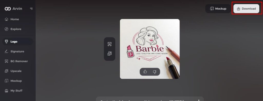
Step 6: Save and Download
Preview your logo and save a high-resolution copy that can be used in printing as well as for digital.
Conclusion
The evolution of Barbie logo gives a very clear and strong indication on how branding and designing took place. Since its stylishly designed origin and embracing diversity to changing times without losing its icon status, this logo has contributed to Barbie’s image and interaction with the people, thereby depicting its cultural influence. In the aspect of popular culture, the Barbie logo is possibly the identity as well as creativity. According to the focus, Arvin AI is one of the best tools that can utilize by any brand that intends to design good logos. It is easy, smart, and unique in logo designs that help the brands stand out.
FAQs
How has the Barbie logo changed over the years?
The Barbie logo was developed to update changes in fashion without losing the old charm.
What inspired the original design of the Barbie logo?
The design inspiration for the original logo came about from ideas about fun, style, and fashionable appeal of Barbie.
How does Arvin AI assist in modern logo design?
Arvin AI will help one make unique, professional logos by simply using simple tools with AI technology.
Why the Barbie logo is considered iconic in the fashion industry?
Iconic because it represents style, creativity and mostly influence of Barbie on fashion.

