Balance is one of the most fundamental aspects of design. It gives way to harmonization in the eyes, thus enhancing the looks while making them less complicated to work with. A balance in design is so smooth for the viewer’s eye to go through because it feels stable and natural. An unbalanced design looks quite chaotic and disorganized, hence unable to deliver its message. This article provides a guide on different types of balance, why they matter, and the best way to apply them. Understanding balance allows someone to make appealing, professional, and communicative visuals.
Part 1: Understanding Balance in Design
A well-balanced design represents traditional marketing that the elements arranged in a way that feels stable and is visually pleasing. It provides the least chance of looking chaotic or even incomplete if there’s no balance. This section learns about what designing balance really means and why it is important for effective communication.
Definition of Balance
In design, balance refers to arranging visual elements so they feel stable. It prevents one side of a composition from looking too heavy compared to another. This achieved through visual weight, which is how much attention an element attracts, and visual direction, which is how elements guide the viewer’s eye. Without balance, designs can feel uncomfortable or difficult to navigate. A good balance ensures that the viewing experience is smooth.
Role of Balance
A balance in design is an effective way to enhance user experience. It makes content easy to read and understand. If a design unbalanced, it feels chaotic or confusing. For instance, a webpage that has too much content on one side can feel overwhelming, but a well-balanced page feels natural and comfortable. Balance also impacts the mood—ordered and organized compositions evoke a feeling of serenity and professionalism.
Part 2: Types of Balance in Design
There are several kinds of balance in design and produce various visual results. Some works employ symmetry in the sake of order, whereas others apply asymmetry for dynamic and energy feeling. Radial and mosaic balance play also such an extremely crucial role in all those creative professions. The paper focuses on four types of balances with their respective uses in the field of designing.
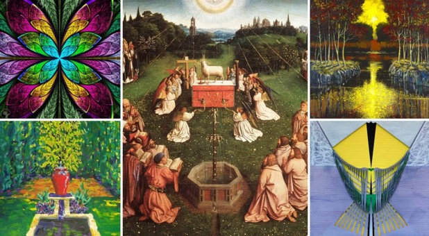
Symmetrical Balance
When the sides look identical or virtually the same then that is a case of symmetrical balance. This applies order and stability. The human face is an example of symmetry, butterfly wings, or styles in classic architecture. Symmetry use in the logo of business, formal design because it looks professionally trustworthy. It traditionally apply or high-end designs that give an idea of formality and reliability.
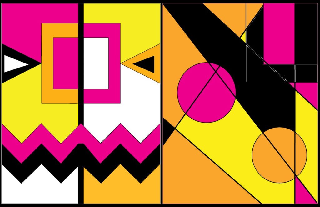
Asymmetrical Balance
Asymmetrical balance in design is an element in which the components vary but are yet to harmonize. This form of balance is more dynamic and interesting. Different shapes, sizes, colors can use to create asymmetrical balance in design with an overall stable composition. Most contemporary designs incorporate asymmetry for making a sensation of motion and movement. This shows that how to use contrast in design to stand out.
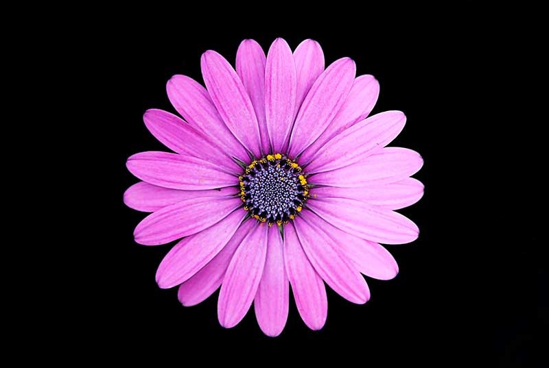
Radial Balance
Directly put, radial balance in design occurs where elements are given in a circular arrangement around an axis point. Some examples involve flowers, mandalas and spiral stairways. This style of balance takes attention to the center and apply satisfactorily even to logos and ornaments as well as architectural forms. Radial balance in design is highly dynamic and has the impression of centralization, which makes a design more appealing.
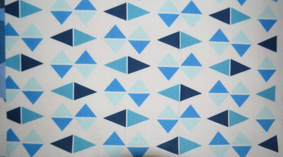
Mosaic (Crystallographic) Balance
This is the usage of repeated elements without any recognizable focus point. Think of the patterned wallpapers, of tiled floors, of abstract art. Even though the central focus is not there, repetition creates an effect that is balanced and pleasing to the eyes. This balance in design makes designs rich and detailed yet not overwhelming for the viewer’s eyes. It widely apply in textile design, graphic patterns, and decorative surfaces.
Part 3: Elements Influencing Balance
Another basic element of balance in design is what makes up a design in itself. Color, shape, size, and texture all add up to making a design ‘feel’ and ‘function’. This chapter discusses how these elements affect balance and how best to use them.
1. Color and Tone
Colors have weight. Darker tones are heavier, and lighter tones will be lighter. Balance in design can also be achieved through a blend of colors. A very large dark object can easily balance a smaller object that is brightly colored. A contrast in the color can further serve to assist in guiding one’s attention through it. That effectiveness in regard to directing an observer’s attention is established with the use of color placement implemented in designing.
2. Form and Shape
Shapes carry weight inside them. So geometric forms with simple boundaries create the feeling of stability, whereas organic shapes carrying complex boundaries create the feeling of dynamism. Hence the balanced composition can achieved by using a mix of both. Shapes also decide how something is going to be perceived; soft curves evoke gentle and welcoming feelings and sharp edges convey bold, powerful or angry emotions.
3. Size and Proportion
As more focus is likely to be drawn on any large elements, so must there be some small elements too. An image which could be big on one side of a design is balanced by a piece of small text or some smaller images on the other side. Proportion is what will make your design look scaled right. In this, it makes sure that the elements look just the right size in comparison to each other.
4. Texture and Pattern
Texture and pattern are added to give depth. Too much texture makes the design look messy, and too little texture gives it a flat look. The more simple and detailed balance of textures, the more appealing to the eye is the design. Texture also determines mood because rough texture is rugged and bold while smooth texture is elegant and soft.
Part 4: Methods for Balance
Balancing aspects in designing occur through proper techniques and planning. Gridding, visual hierarchy, and white spaces can also control the look in a given arrangement. The proceeding section describes such practical techniques when balancing in your design.
Grid Systems
The grids help the designers align things in the right manner. They present order and consistency hence making it easy to achieve balance. Most of the websites and magazines use the grids in order to line up the texts and images. A good grid system makes designing easy if all elements are well aligned. If the guidelines of the grid follow, the designers make sure that it is orderly and creative.
Visual Hierarchy
A visual hierarchy leads a viewer’s eye through a design. Important information needs to dominate, and minor information subordinates to it. Proper use of size, color, and positioning assures one balance and readability. A strong hierarchy eliminates clutter and ambiguity since the attention is drawn toward what is most critical in the design. Strategic positioning of elements is the way in which designers achieve an intuitive and user-friendly layout.
Negative Space – White Space
White space is the white area between the elements. It removes clutter and brings a clean professional look to the design. Use of appropriate quantities of white space provides sufficient room for breathing elements for proper balance in design. The creation of white space enhances readability by bringing key elements forward, lowering the distraction level for the reader. A well-balanced design will have appropriate amounts of white space in the layout and brings clarity with openness to it.
Part 5: Common Mistakes and How to Avoid Them
Even the best designers get wrapped up by an issue or another: balance can be tricky, especially for old pros. Cultural perceptions might cause confusion; design might get complicated. Common errors that compromise with balance are dealt with here; tips are shared on not creating those common errors.
Over-complicating a Design
Over-accessorizing of a design is confusing; too much, too much. If there are many colors, fonts, or images, it does not focus viewers on the message of the design. Simplicity is a key to well-balanced design. A simple layout with visible spacing makes a design easy for users to access. Designers should focus only on the necessities and eliminate those that are of no use. A minimalist lead to something more aesthetically pleasing as well as user-friendly design.
Cultural Perceptions
Design balance varies in different cultures. What appears natural in one culture may be perceived as unbalanced in another. For instance, left-to-right flow is the favorite of most Western designs, while some Eastern cultures prefer right-to-left arrangements. Cultural preferences must understand so that a design will resonate with its target audience. Designers should research and test their work across different demographics.
Part 6: Case Studies of Balanced Designs
Real-life examples show how balance applies in designs. From magnificent masterpieces to contemporary branding, the essence that brings out designs find in balance. This section looks at case studies on well-balanced designs and its performance.
Classic Examples
Great designs like the Apple logo and the Mona Lisa are an example of great balance in a composition. Symmetry and proportion make the Apple logo simple yet powerful in visual identity. Balanced composition, harmony in logo colors, and the golden ratio can be seen in a painting like Mona Lisa by Leonardo da Vinci. That’s why designs are timelessness-to create stability and harmony using very basic design principles.
Contemporary Usage
Modern brands and digital platforms adopt balance in design to create better user experiences and aesthetics. Take Instagram as an example- the interface follows a balanced grid format that provides an aesthetic to content and enables navigation. Again, Google uses whitespace and aligns its webpage in a neat and balanced layout. The product pages of Apple also ensure balance in design between images, text, and spacing to give it an interesting flow.
Part 7: Introducing Arvin AI: Your Design Assistant
Arvin AI use in the making of designs to easily achieve balance. Some of its features include the AI-powered logo creation, real-time collaboration, and customizable interface. Arvin AI simplifies the design process by providing smart suggestions and automated adjustments, ensuring elements are well-balanced. Whether you’re building a website, branding, or graphics, Arvin AI harmonizes compositions. With the huge support for various plugins.
Key Features of Arvin AI
- Easy to Use Templates: Access the rich templates, which will make your projects balanced from the starting.
- AI-Assisted Logo Making: Make distinctive and professional logos with the assistance of AI.
- Custom Interface: Set according to the requirement of design settings.
- Rich Plugin Support: Integrate the design tool that will allow smooth workflow
- Smart Design Recommendation: AI powered suggestions which easily enhance designs.
Steps to Use Arvin AI for making Logo
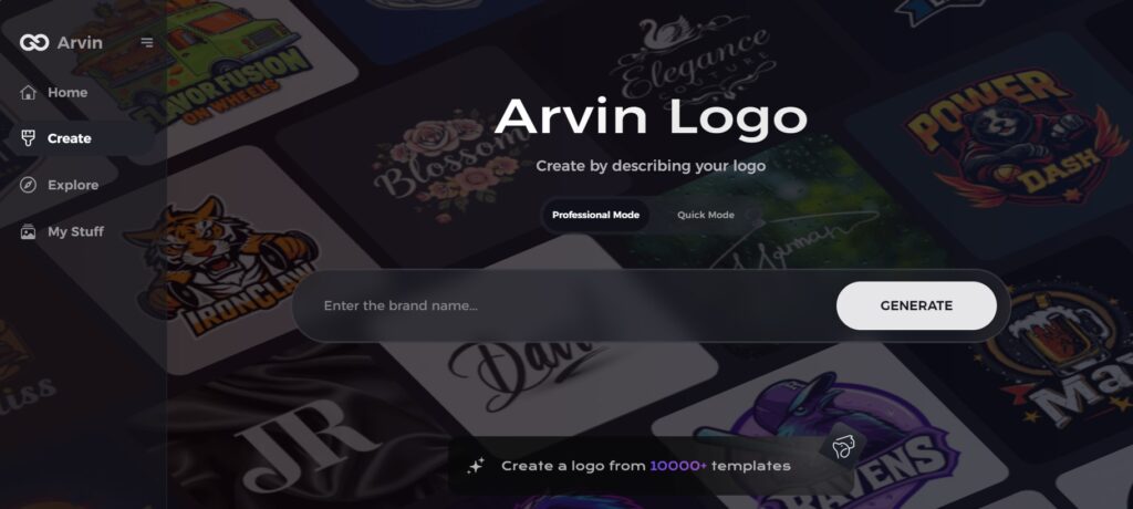
Step 1: Visit the Arvin AI Website
Start by opening your web browser and navigating to the logo design page at logo.arvin.chat. This is where you can begin creating your custom beer brand logo.
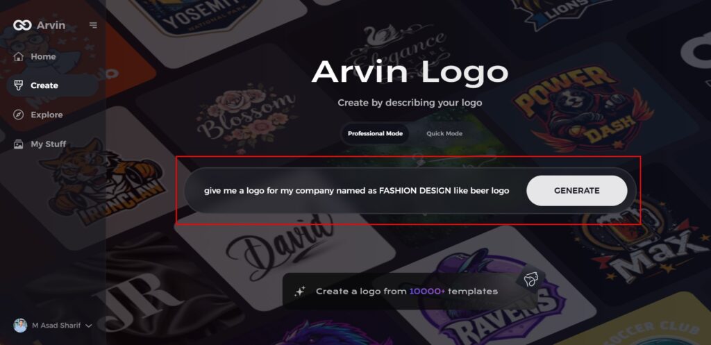
Step 2: Enter Your Beer Brand Information
Provide essential details about your beer brand, such as the name and category. This will help the AI generate logo designs that tailor to your specific brand.
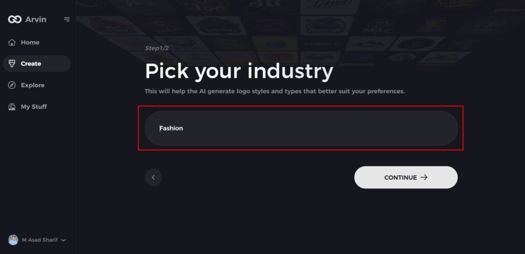
Step 3: Choose Your Industry
Select the beer or beverage industry from the list of options. This ensures that the AI will focus on logo styles that are relevant to the beer market.
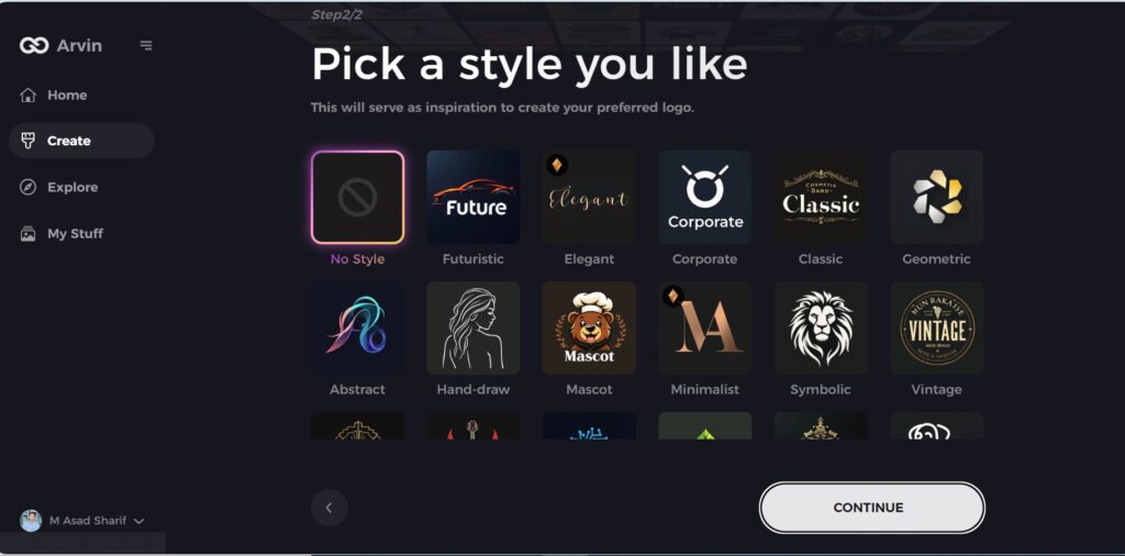
Step 4: Pick a Design Style
Browse through the available design styles and pick one that aligns with your beer brand’s identity. If none of the styles suit you, simply skip this step and let the AI create something unique based on its default design inspiration.
Step 5: Review Logo Concepts
The AI will generate a selection of logo ideas based on your inputs. Take the time to review and choose the designs that best reflect the essence of your beer brand.
Step 6: Customize Your Logo
Refine your chosen logo design by adjusting elements like colors, fonts, icons, and layout. This is your opportunity to make the logo truly representative of your beer brand.
Step 7: Download Your Logo
Once you’re happy with your final design, download your logo in high-quality formats such as PNG or SVG.
Conclusion
Understanding balance types and how the elements work through them creates beauty and effectiveness to the design. Whichever way it is, whether creating a website, logo, or poster, balance enhances the level of clarity and impact. A balanced design will actually improve user experience and allow content to view much easier. For those designers that want the best tools, Arvin AI is the best logo maker. With its AI feature, it creates well-balanced and harmonious designs; therefore, it becomes one of the most important tools to find a balance in any project.
FAQs
What is balance in design?
Balance is the orderly manner in which elements arranged to create stability and harmony in a design.
Why is balance important in design?
Balance enhances designs to make them more appealing visually and easy to understand. The user experience will improve in this way.
What are the major types of balance in design?
The major types are symmetrical, asymmetrical, radial, and mosaic (crystallographic) balance.
How can Arvin AI help in achieving balanced designs?
Arvin AI has AI-based logo creation, collaboration, and customized interface options for designers to quickly and effectively achieve balanced designs.
