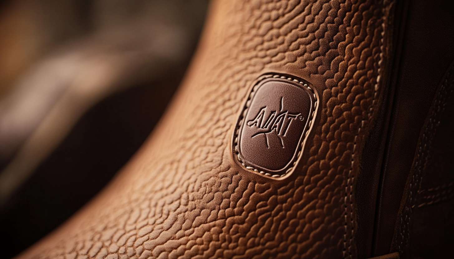
The Ariat logo serves as a performance and innovation emblem in horseback riding yet the brand expanded as it adapted its logo to newer periods. Born out of a desire to revolutionize riding footwear, Ariat, founded in 1993, has developed a strong brand identity, closely intertwined with iconic logos. This powerful symbol mark embodies the core value of the brand: strength, endurance, and fortune. Communicate the sense of quality, performance and tradition, establish strong ties with consumers, and build brand loyalty.
Part 1: What is Ariat?
Ariat produces wear and accessories for horse riding sports. Ariat Shoes often has a unique, controversial, or utterly pretentious design that is particularly influential in cowboy classics. Ariat’s shoes, clothes and accessories are loved by people of all ages.
Part 2: Meaning and History
Ariart was founded in the early 90’s and quite young compared to competitors. Two visionary designers and businesswomen, Beth Cross and Pam Parker, supported the founding. They developed entirely new shoes for men and women based on the state-of-the-art technology called Duratred. This design is one of the cool logo designs in the world.
1993 – 2005
Three horses are intertwined, creating a symmetry and complex pattern in the center of the coat of arms. The coat of arms is triangular, with black edges brown to match the black lines used to draw horses. Considering being a shoe brand, Horseshoe was a great symbol choice. The logo also had the actual brand name printed on the outside of the coat of arms, with the arch on it.
2005 – 2015
The Ariat logo became a modern design by shading the coat of arms. The central symbol remains flat, but the surrounding border also has volume. The letter “Ariat” not only changed “R” from a curve to a straight line, but also moved to the right of the emblem. Also, by moving to the right of the emblem, it became a balanced design.
2015 – Today
The brand is even more minimal. Brown disappears and turns white. Unlike previous versions, the logo became a flat impression. The logo, based on black and white, became more universal because it reflects any background. The logo’s timeless appearance granted the company unrestricted use of this version because it did not become outdated.
Font
The original logo use bold sans serif logo fonts similar to Flexible H200 W700. The designer changed the font to Organetto Extra Bold Semi Ext or ITC Blair Pro Bold font to print the company name with the logo created since 2005. Both font versions were characterized by linear and clean thick cuts with no lines, and had much in common.
Color
Black and brown logo colors appear rare to me. Brown provides a natural and neutral appearance through which people experience positive healthy feelings while bringing associations of warmth and comforting elements. The business transitioned to a sophisticated gilded brown color scheme and added upscale elements after that initial change. The current logo presents a simplified design that uses black and white color tones.
Part 3: Impact of Ariat Logo
The Ariat logo must be seen as a direct contributor to the brand’s achievements. Outdoor enthusiasts immediately recognize the strong visual emblem that riders call the Ariat logo. The logo delivers core brand values about performance along with tradition through innovation and gains immediate sympathy from its target audience.
Building Trust and Recognition
In addition, Ariat’s logo has contributed to the brand’s strong brand equity. This logo is a symbol of quality, reliability and commitment to excellence in the riding and outdoor industries. Consistently using logos across all marketing channels, from product packages to online platforms, enhances brand identity and builds a strong brand image.
Changing Face of the Logo
The evolution of the logo reflects the growth and adaptation of the brand at times while maintaining the essence of the brand and gaining the empathy of those who target it. The logo of Ariat will transform as the company advances with new innovations while maintaining brand success and entity appropriateness.
Part 4: Arvin AI – The Best Logo Maker for Your Brand
A well-designed logo helps a company stand out and build trust with its audience. It represents the brand’s values and leaves a lasting impression. With Arvin AI, you can create a unique, high-quality logo in minutes. Whether you need a modern or traditional design, our AI-powered tool tailors it to your brand. Ready to make your mark? Try Arvin AI today and design a professional, recognizable logo with ease.
Key Features of Arvin AI
- AI-driven content creation: Produce quality SEO content efficiently and fast, saving effort and time.
- Branding assistance: Create brand plans and advertising ideas to make a strong presence.
- Easy-to-use tools: Easy and simple features that suit every business, whether small startups or large corporations.
- Customizable Designs: Select from multiple templates and editing tools to design a logo that suits your brand. Make it original and unique with simple customization.
- Instant Preview & Feedback: Enables real-time preview and adjustments, allowing you to get the ideal design before finalizing, making the process smooth and efficient.
Steps to Use Arvin AI for making Logo
Step 1: Access the Arvin AI Website
Open your preferred web browser and navigate to the logo design section of the Arvin AI platform at Arvin AI Logo Maker.
Step 2: Enter Your Business Details
Provide essential information about your business, such as its name and category. This step helps the AI create logo designs tailored to your brand’s identity.
Step 3: Select Your Industry
Choose your industry from the provided list. This selection allows the AI to focus on styles and designs that align with your specific business sector.
Step 4: Choose a Style
Explore the available style options and select one that matches your brand’s vision. If you’re unsure, you can skip this step, and the AI will use its default inspiration.
Step 5: Explore Logo Suggestions
Based on your inputs, the AI will generate a variety of logo designs. Review the options and identify the ones that best reflect your brand’s image.
Step 6: Customize Your Logo
Fine-tune your selected design by adjusting elements like colors, fonts, icons, and layouts to ensure it aligns perfectly with your style and vision.
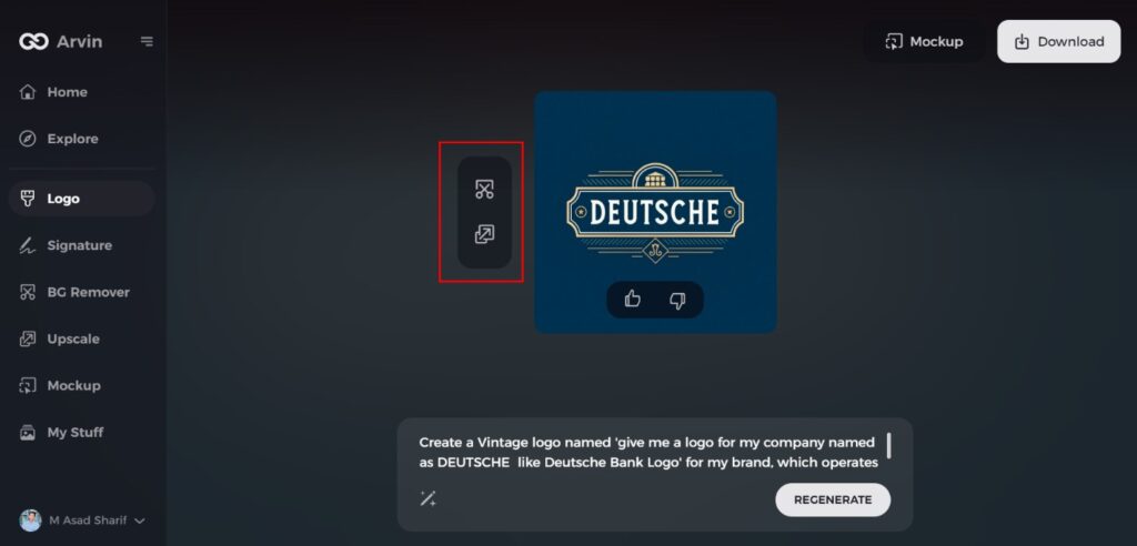
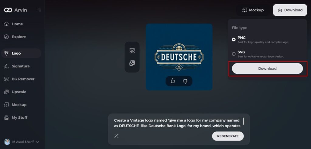
Step 7: Download Your Final Design
Once you’re happy with the final logo, download it in formats like PNG or SVG. These formats are versatile and suitable for websites, social media, and print materials.
Conclusion
Ariat’s logo is an integral component of the brand identity. It represents strength, heritage, and innovation. It has remained largely unchanged over the years, with occasional tweaks to make it contemporary. A good logo makes a brand recognizable and credible, and Ariat’s logo does exactly that. If you want a robust and powerful logo such as Ariat’s, Arvin AI is the ideal solution. It enables instant generation of excellent quality, professional-looking logos in minutes, and branding becomes simple yet effective.
FAQs
What does the Ariat logo symbolize?
The Ariat logo signifies strength, innovation, and its strong equestrian background, having the appearance of a horseshoe.
Has the Ariat logo changed over the years?
Though the original design remains unchanged, some minor modifications have been incorporated in order to retain its current state and be fashionable.
Why is the Ariat logo important for the brand?
It serves as the core element of brand identity, enabling customers to recognize and believe in Ariat’s products globally.
How does Arvin AI help businesses with branding?
Arvin AI offers AI-based solutions for creating quality content and branding campaigns, enabling businesses to establish a robust online presence.
