Airline logos are one of the most significant identity factors of an airline. It tells about the culture, values, and idea of the company. A well-designed logo creates a strong connection with customers. A trusted market extremely competition, it helps build this as well as loyalty. Beyond being symbols, airline logos tell a story. There is skill, consistency and excellence. In the Aviation industry, first impressions will always matter. A Logo is usually the first contact customers have with an airlines. This makes it highly effective for branding and helping to stand out from all the other airlines.
Part 1: The Evolution of Airline Logos
Airline logos have changed a lot over time to reflect the industry’s progress. They show how airlines adjust to new trends, customer expectations, and technology. From simple beginnings to modern designs, logos help tell an airline’s story and strengthen its identity.
The Early Days
In the early 1900s, airline logos were simple and straightforward. Airlines weren’t as focused on creating creative or stylish designs. They, however wanted to express the idea that they are a safe and reliable one. Designs would often employ very simple shapes such as circles or wings, easily identified by any person. Strong letters also dominated, where the name of the airline would pop out.
Modern Trends
Today, airline logos are much more stylish and modern compared to the past. Many airlines now use simple designs, which means the logos have fewer details and are simpler. This approach makes the logos look professional and clean. Simple shapes and readable fonts are popular because they’re readable and look good on websites and apps. The choice of colors and designs reflects the airlines’ fastness, efficiency, and being global.
Iconic Renovations
Over the years, many airlines have changed their logos to reflect important changes in their business. It often occurs when an airline combines with another or if it wants to update its image. A new logo can help show that the airline is modern, innovative, or more focused on meeting customer needs. These updates are not only about making the logo look good but also say something about where the airline is going in the future.
| Era | Time Period | Design Characteristics | Notable Examples |
| 1. The Early Years | 1900s – 1950s | Simple shapes, bold letters, and negligible decoration. Focused on safety and reliability. | – American Airlines (1930): Early strong logo. – Pan Am (1927): Globe symbol representing global reach. |
| 2. The Mid-Century Transformation | 1960s – 1980s | Smoother lines, more abstract designs, emphasis on global identity. | – British Airways (1968): Union Jack symbol. – Delta Airlines (1962): Delta symbol reflecting major US carrier. |
| 3. The Digital Age & Simplification | 1990s – 2010s | Simplified shapes, flatter designs, focus on adaptability for digital platforms. | – American Airlines (2013): Modernized eagle symbol. – Singapore Airlines (2015): Simplified “bird of paradise.” |
| 4. The Latest Trends | 2020s – Present | Dynamic designs, bold simplicity, focus on brand identity and storytelling. | – Qantas (2020): Simplified “Flying Kangaroo.” – Emirates (2020): Modernized premium logo. |
Part 2: Key Elements of Airline Logo Design
Airline logos are very well designed to make a statement. Everything from the color to the shape is picked for a reason. Learn about the Brand Marketing Strategies: Boost Your Business Visibility Today. These all contribute to making logos not only beautifully attractive but meaningful and memorable.
Color Psychology
Colors play a critical role in the airline’s logo because they pass several messages to customers. Most of them use blue, red, and white. Since the sky represents blue, a big proportion of airlines applies for it, because they promise to deliver services with absolute safety, thus customers find peace of mind. This energy, passion, and excitement represented by red will create dynamic and bold characteristics of an airline. White is added to most airlines because it symbolizes simplicity, cleanliness, and professionalism.
Design
The fonts in a logo are considered important as it helps the brand tone setting. In the case of airlines, it usually employs bold simple fonts, making it easily readable, giving the feel of the airline as solid and dependable. Some airlines take it further by using unique or custom fonts, which make their logos stand out and memorable. The font should complement the overall style of the brand of the airline.
Symbolism and Imagery
Many airlines make use of symbols or pictures representing either flying or travel. Many of the most commonly found symbols are wings, birds, and globes. Wings are often chosen since they represent freedom as well as the ability to fly. Birds are frequently chosen because they are an object of beauty and speed that is connected with the sky. Globes show worldwide service and that an airline touches every corner of the earth.
Part 3: Trends in Airline Logo Design
With the changing aviation industry, logos of airlines change with time. Today, logos are not only functional but also beautifully attractive. They must be suitable for various platforms, from websites to airplanes. Here we have compiled a guide about Snapchat Logo: A Look at the Symbol That Defines the App. Trends these days show how airlines balance between style, functionality, and tradition.
Simplicity Rules
Simplicity is a trend in airline logo design. The logo designs today are much simpler and cleaner, making them look professional and modern. Simple designs use less detail, and the focus lies on bold and clear shapes or letters. This kind of design is very applicable to screens, which would be important because most of the people view logos at websites and apps.
Geometric Shapes
Geometric shapes such as circles, triangles, and lines are gaining popularity in airline logos. These shapes give a clean, modern, and balanced appearance. Symmetrical patterns, where both sides are identical, and sharp lines give the logo a sleek and professional look. Geometric designs are also very flexible, meaning they can be scaled or changed easily.
Historical Mixture
Many of the airlines are taking history and mixing it with a modern design trend. This means they retain some old symbols or colors from the old days but update the rest of the look to have a more modern feel to it. For instance, an airline might keep an old logo or symbol, but pair it with something simple and plain for its font.
Part 4: Iconic Airline Logos and Their Stories
Some airline logos stand out because of their unique designs and the stories behind them. These logos are not just symbols; they represent the values, history, and vision of the airlines. Here’s a closer look at a few well-known logos and what makes them special.
Emirates
The Emirates logo should symbolize luxury and high-end superiority. It will incorporate bold red letters with a specific, unique Arabic calligraphy to distinguish it. It’s going to be about that Middle Eastern heritage with these top-of-the-range services that the airline can be proud of. Energy, passion, and excitement were reasons why the color red was chosen.
Qantas
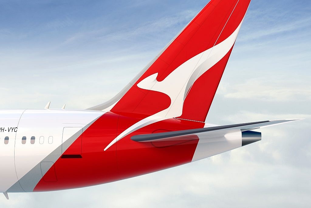
Qantas is also represented by a kangaroo logo, which also represents the country, Australia, in a very powerful manner. The kangaroo has been the symbol of the airline for many decades. It symbolizes that the company is well bonded to the land and its importance in representing the country globally. Although the logo changes with time, the kangaroo is always at the center. This symbol is ageless; it does not become old or outdated. It shows that Qantas respects its culture while being prepared for the future.
Lufthansa
Lufthansa’s logo is simple yet strong. It is an artificial bird within a circle, which means flying and freedom, so this connects with the airline business of traveling. Clean lines and simple design make it timeless, meaning that however much time passes, the logo looks good. It has been mostly the same for years, and that shows stability and trust in Lufthansa. The blue and yellow colors are chosen because blue represents calmness and trust, while yellow adds warmth. These two colors complement the professional and reliable image of the airline.

Delta Air Lines
The delta shape is very recognizable as a triangle, and it not only fits the name of the airline but also symbolizes strength and moving forward. This image matches the theme of growth and innovation behind the airline. The bright red vibrancy brings in a feeling of vigor and confidence into the logo, making it bold as well as powerful. If a perfect font and clean lines find a place together, it displays that Delta cares not only about excellence but about development also.

Part 5: Design Your Own Airline Logo with Arvin AI
With Arvin AI, designing an airline logo is very easy. It is a high-tech tool with features powered by AI to design great logos. You can easily create professional designs using the user interface of Arvin AI. You can come up with the vision of your brand by using all your favorite colors, shapes, and fonts. The AI also makes sure that smart suggestions come your way so that your logo looks modern and unique. If you want something with a simple style or just detailed, Arvin AI will deliver. This powerful solution is for whoever plans to build a powerful airline brand in the world market.
Key Features of Arvin AI
There are following key features:
- Customizable Templates: Choose from a wide range of templates to match your brand’s style and needs.
- AI-Driven Recommendations: Get smart suggestions for colors, fonts, and shapes to create a unique and professional logo.
- User-Friendly Interface: Easily design your logo with simple tools that anyone can use, even without design experience.
- Quick Edits: Make changes to your design in seconds, saving time and effort.
- High Resolution: Receive logos in high resolution and are ideal for digital as well as print usage.
- Flexibility: Design can be done for various applications ranging from website to livery of airplanes.
Steps to Use Arvin AI for Designing Airline Logos
Creating a custom airline logo with Arvin AI is easy and efficient. Follow these steps to design a logo that embodies your brand’s values and industry trends:
Step 1: Create an Account and Log In
Visit Arvin AI official website, sign up for an account, and log in to access its logo design features.
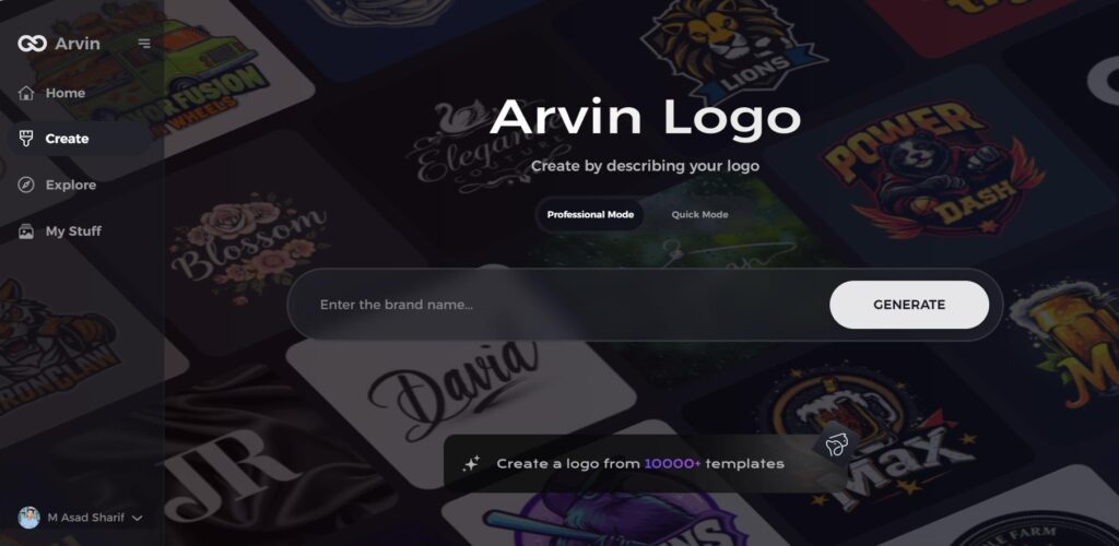
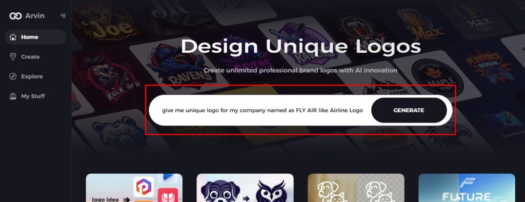
Step 2: Provide Brand Details and Preferences
Enter basic information about your airline, including its name, slogan, and niche. Inform the AI of your design preferences, including specific fonts, colors, or themes that reflect your airline’s identity.
Step 3: Select Your Industry
Select the airline or aviation industry from the drop-down menu. This allows the AI to understand your niche and suggest styles suitable for your needs.

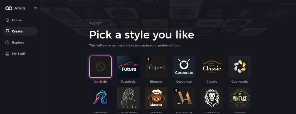
Step 4: Pick a Design Style
Browse and choose a design style that resonates with your airline’s brand. This choice will inspire the AI to create logos that match your vision.
Step 5: Customize Your Logo
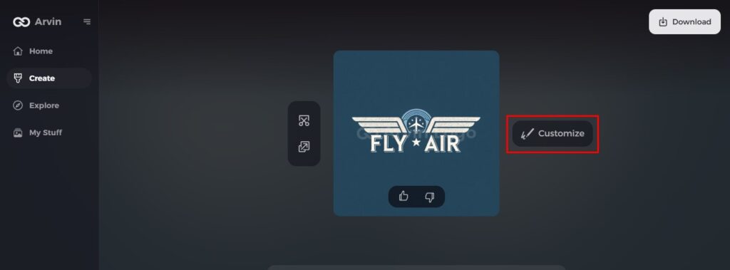
Once Arvin AI generates logo options, use the platform’s tools to personalize the design. Adjust elements like font style, layout, colors, and symbol positioning to refine the look. Experiment until the logo feels just right.
Step 6: Save and Download
Preview the final logo to make sure it suits your expectations. Save the final logo in high resolution for use in aircraft branding, digital platforms, and promotional materials.

Conclusion
Airline logos can be very effective in building up a strong brand and reaching the customers. Through airline logos, values, culture, and vision of the airlines can be denoted and also help in building trust and loyalty. A well-designed logo is guaranteed to distinguish the airline in a very competitive market. This is because of the aid of tools like Arvin AI, through which any person can create a professional and distinctive logo that produces innovative ideas which will be time-saving and labor-friendly. A great investment in one’s logo would guarantee last success in aviation.
FAQs
Why are blue and white common colors in airline logos?
Blue represents trust, stability, and the sky. White stands for purity and cleanliness. These meanings are fitting for the aviation industry.
How often do airlines redesign their logos?
The logos of airlines are usually updated after 10-15 years. This helps them to maintain their modernity and update their brand identity.
Can small airlines benefit from professional logo design?
Absolutely! A good logo helps small airlines gain the trust of customers, attract more clients, and stand out in a competitive market.
How does Arvin AI simplify logo creation?
Arvin AI provides users with easy-to-use tools, pre-made templates, and helpful guidance to design professional logos very quickly.
Read More:
