ABC stands for American Broadcasting Company and a major American television station. ABC started in 1940s and is home to some of the most iconic programs in television history, including Brady Bunch, Happy Days and Modern Family. The brand stands out in the industry due to its long history of delivering quality programs, a wide range of types and diversity. ABC logo has always led the industry and produced content that appeals a wide range of viewers. The network is also a developer in removing barriers in the entertainment industry.
Part 1: The Origin of the ABC Logo
Before explaining changes, there is a huge need to get into the minds from where it started. Its design was nothing sudden that day would pop in; behind simplicity was a clearer association with a broadcasting world.
Early Design and Their Aims
The idea behind the creation of ABC was a logo that everyone would easily identify and, at the same time, be sufficiently simple to be unique on the screen. The first logo, created for ABC in the 1940s, was designed with the goal of making the brand immediately identifiable.
Key Figures Behind its Creation
Several creative minds came together to provide design expertise in the creation of the network’s identity, and thus the ABC logo influenced by these creative minds. The most significant figures who came on board had a vision and skills to shape the logo into an iconic symbol of the ABC brand.
- Paul Rand: Famous American graphic designer in the 1960s whose minimalist approach helped create the design for the ABC logo.
- William Golden: Executive at CBS whose media branding ideas shaped ABC’s design orientation.
- Herb Lubalin: Typography expert whose modernist concepts about design also affected the design style of ABC.
- George Lois: Creative director and advertising executive whose bold ideas about branding worked to create bold ABC branding ideas.
Part 2: Why logo is important to ABC?
For any company, a strong logo that makes a difference between competitors is essential, and ABC is no exception. The logo is a symbol of the company and also represents the company’s values, mission and identity. The ABC logo differentiate ABC from competitors and establish a strong brand identity, contributing significantly to the company’s success.
Impact on Sales and Brand Loyality
The logo created an image and a sense of trust recognized by customers. This increases sales and brand loyalty, as customers are more likely to buy from companies they recognize and trust. The logo create a sense of unity between employees and customers as a reminder of the company’s basic values and mission.
Part 3: Meaning and History of ABC Logo
ABC’s visual identity was always rigorous and serious, based on monochrome tones. The current round logo introduced in 1962, based on the shape of the previous version, but with fresh locks and modern touches.
1945 – 1952
The original ABC logo created in 1945 and features a black three-tiered word mark on a white background. The letters of the American Broadcasting Company written in the title case and in traditional lines.
1952 – 1953
The second logo resembled buttons in different shades of white, gray and black. This round shape divided into several ring-shaped layers, with a gray core in the center. There was an acronym (three white lines).
1953 – 1956
In 1953, the logo was completely redesigned and the character-based badge was replaced by a fancy emblem consisting of a circular badge with a wide frame and a stylish, detailed bird with elongated wings placed at the top of the logo.
1956 – 1962
In 1956, ABC’s visual identity evolved into a modern, minimalist logo. The new logo is bold with the lowercase “A,” with the letters “ABC” inscribed inside it. The word mark was also lowercase and a flashy sans-serif typeface.
1958 – 1962
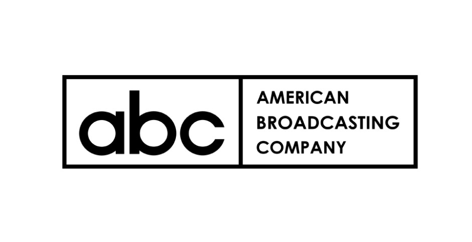
The 1958 logo has a very wide white rectangle with black edges. It is divided into two equal sections. On the left, the initial letter of the network is written in black. There is a translation on the right, all written in black in three lines.
1962 – 1988
Paul Rand designed a logo for broadcasting company in 1962. The white lowercase word mark was placed on a black circle. The rounded characters had bold and smooth lines, looked balanced and powerful on the round badge.
1988 – 2007
In 1988, this iconic badge was slightly modified by making the lines of the letters thinner and lighter, making the whole badge more delicate and softer, but the composition, style and color palette remained intact, and the new logo became more fresh and airy.
2007 – 2013
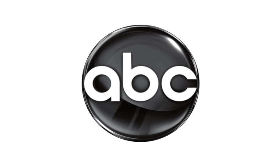
The 2007 redesign of the Troika Design Group brought a three-dimensional emblem to ABC’s visual identity. Three white letters are embossed in the shiny gradient badge.
2013 – 2021
In 2013, another logo that we now see was born. It combines the original badge from 1962 with the badge from 2007. The smooth circle with gradation has a more matte texture, but the three-dimensional feeling still remains. Badge lettering repeats Paul Rand’s logotype, showing a strong connection to tradition and legacy.
2021 – Current
In 2021 redesign, the flat ABC logo of the 1960s was revived, but the outline was slightly refined. The black circle was removed with gloss and gradient, and it became plain again with solid. The lettering remains white and thick with a rounded sans-serif, like the middle of the 1962 font and the 1988 logo.
Part 4: Font and Color Evolution in ABC Logo
For quite a long period, the font and color usage of the ABC logo have managed well to put the brand in a good visible identity. Originating from time to time with the change of typology, the color combination in the logos has changed from time to time with the respective design trend of the time. In this chapter, we would explain how typology and the color used within the ABC logo have evolved, and how it enhances the appeal value and the recognition value for the brand.
Font
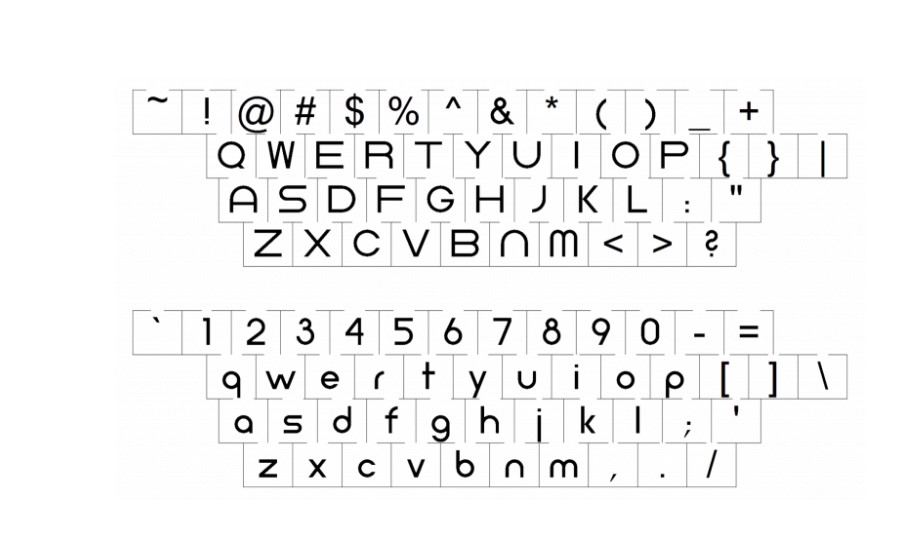
The font used by the logo is important and greatly affects the brand and its success. The ABC logo is a classic minimal design and uses a thick sans serif font called Univers. Univers has a strong and modern impression, and it looks good in black and white, so it is perfect for ABC logo. By choosing perfect logo fonts you can make your logo a memorable logo.
Shape and Color
The initial letter of the lowercase letter “abc” is enclosed in a black circle. The logo was painted on a variety of different colors. In 2007, a shiny 3D version appeared, expressing elegance and modernity. The current logo design has almost inherited the original message expressed in its dazzling simplicity after 50 years. Psychology behind choosing a perfect logo color is very essential for branding.
Part 4: The ABC Logo in the Media and Culture
The ABC logo has an enormous influence. It is the mark of quality programming, professionalism, and entertainment. This ABC logo has also, in its way, been a culture phenomenon in general for mainstream media-since referenced by movies, even TV shows and ads.
ABC Studio Logo
The ABC studio logo is a regular ABC emblem logo consisting on the letters “abc” in the black circle and also contains the letters “studios” in the black. At least “d” appears to have reversed the “b” character of “abc.”

ABC Family Logo
Before it was renamed to the ABC Family logo Freeform, the ABC Family TV channel had several logotypes. The last one used from 2003 to 2016 was a “family” character in black next to the regular ABC logo. The ABC Family logo had large characters and different typefaces.
ABC News Logo
The American Broadcasting Company’s news logotype is based on the network’s main round emblem. Next to it, you can see the letter “NEWS.” It writes in black in a traditional typeface. All letters are uppercase and larger than those of “ABC.”
Part 5: Arvin AI: Professional Tool for Logo Design
In the fast world of the digital era, individuals and businesses need more professional tools for themselves to make a difference. An innovative platform known as Arvin AI, which offers a very easy way of using artificial intelligence for logo design. Whether it is a small business owner, a startup owner, or even an individual who wants to create a personal brand, Arvin AI has got the logo design process on its way.
Key Features of Arvin AI
- Easy-to-use interface: This is a simple, intuitive platform that enables anyone to create a logo without design experience.
- Large number of templates: Choose from many templates for various industries, so finding a starting point is easy.
- Customization: Features are fully customizable, allowing you to change the fonts, colors, and layouts to fit your brand.
- AI-generated suggestions: The AI generates suggestions for logos based on what you input, making the entire process easier.
- Export quality: Download logos in multiple formats for use on websites, business cards, social media, and much more.
Steps to Use Arvin AI for making Logo
Step 1: Visit the Arvin AI Website
Start by opening your browser and heading to the Arvin AI design page at Arvin AI to begin your logo creation journey.

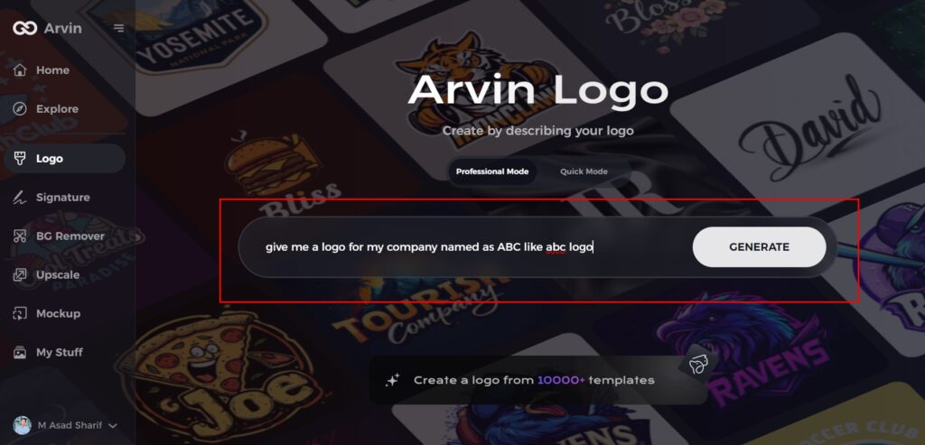
Step 2: Provide Your Business Information
Enter your business name and category to help the AI generate logo designs that reflect your brand’s identity and purpose.
Step 3: Choose Your Industry
Select your industry from the list. This helps the AI narrow down logo styles that match the trends and needs of your specific field.

Step 4: Select a Design Style
Browse through the available style options and choose one that aligns with your brand vision. If you’re unsure, simply skip this step and let the AI generate ideas based on default inspiration.

Step 5: Review Logo Concepts
The AI will present various logo concepts tailored to your preferences. Take a look at the designs and see which one resonates with your brand image.
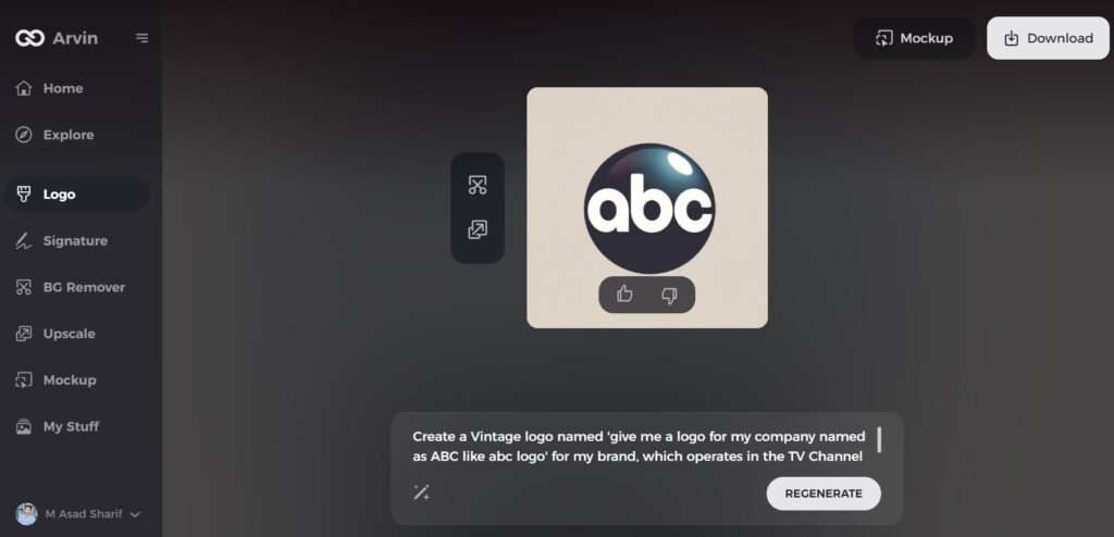
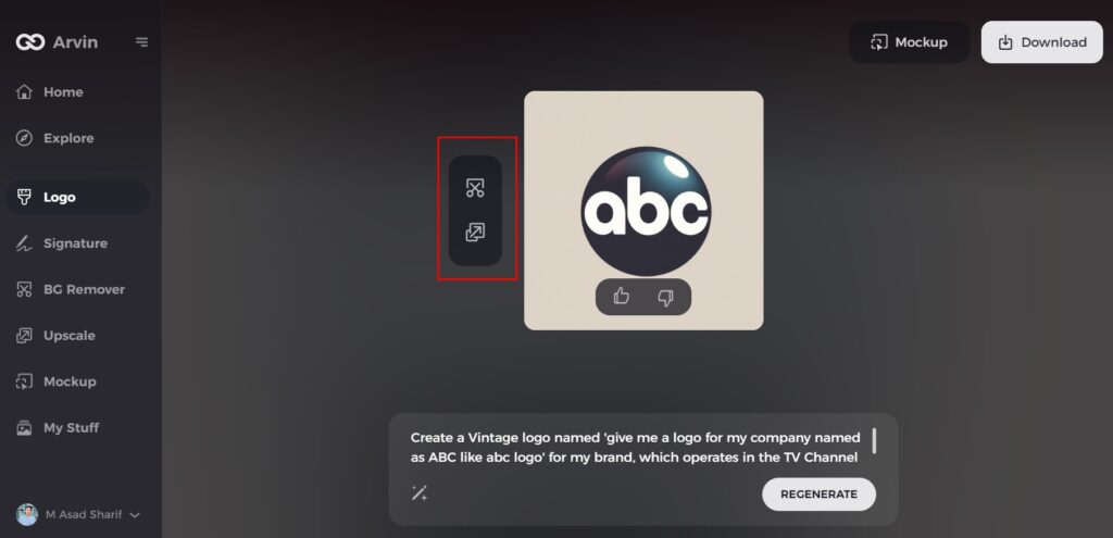
Step 6: Customize Your Logo
Refine the chosen design by adjusting elements like color, font, icons, and layout to make it uniquely yours.
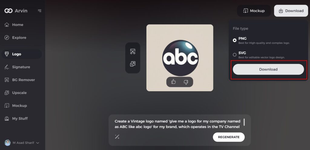
Step 7: Download Your Logo
Once you’re happy with the final logo, download it in formats such as PNG or SVG. These file types are ready for use across websites, social media, and print.
Conclusion
Development of ABC logo symbolizes that of simplicity and timelessness. Starting from very primitive to now, the logos undergo several changes within years because it followed natures of change in media technology, yet this has been upheld to some sort of integrity. As innovation within technology is progressive, companies such as Arvin AI help in preservation of long-lived logos for businesses. Whether it is a new business logo or an update for an existing one, Arvin AI provides the tools to help you create something iconic.
FAQs
what is abc logo?
ABC stands for American Broadcasting Company and a major American television station. ABC started in 1940s and is home to some of the most iconic programs in television history, including Brady Bunch, Happy Days and Modern Family.
What is the significance of the ABC logo?
The ABC logo is a symbol of simplicity, professionalism, and adaptability, which makes it an iconic symbol in media branding.
How has the ABC logo evolved over the years?
The logo redesigned several times in order to follow new trends and technological advancements but not losing its basic identity.
Can Arvin AI help me design a professional logo?
Absolutely, Arvin AI provides simple features and tools to create logos that would represent your brand’s identity.

