The 1980s was an era of very bold cultural and aesthetic changes; vibrant colors, new technology, and media influence was increasing. It was the period when logos helped brands create a lot of differentiation in their minds among the consumers and with the customers. Companies started to understand that the strong, memorable logo would serve as a brand’s difference. This article will explore how 80s logos shaped design, showcasing iconic examples and looking at how their influence is still seen in modern branding today.
Part 1. Defining the 80s Aesthetic
The 1980s was a time of great change, and its visual style, from fashion to logos, reflected that. Bold colors, interesting shapes, and creative fonts were all used to capture attention and stand out. This section will explain the main features of 80s design that made logos so memorable.
Geometric shapes and bright colors
The most outstanding feature of 80s logos was the use of bright, bold colors. Companies employed neon pink, green, and yellow colors to attract the audience and come out prominently in a crowded marketplace. Besides these colors, geometric shapes like squares, triangles, and circles were used often to create solid, complex, and easily remembered designs.
Typography of the Decade
Typography logos, which is the writing style used on logos, was more of a deal in the 1980s. The texts were often in bold, huge, and easily readable fonts. Most logo fonts had very sharp, pointed fonts that are energetic. Branding companies did use custom font styles to allow brands to look unique.
Pop Culture and Technology Impacts
Influence of the pop culture, and new emerging technology was strongly felt in logo design in 80s. TV shows and movies were massive influences, while music also made its way as an influence that designers would work with. Use of neon colors, futuristic shapes partly because of new tech industries being established and due to the huge popularity of science fiction movies and films.
Part 2. Iconic Logos of the 1980s
The creative nature of their design and their effective ability to communicate with the mass public distinguished such brands as NBC, CNN, and Apple, as well as several other leaders. Let us now analyze what went into these logos and how they could come about so profoundly in order to remain within public consciousness to date.
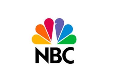
1. NBC
The NBC logo has two notable elements. The first is the study of how to use negative space in logo design. If you look carefully, you will see the outline of the peacock in the white space between the colorful wings. Second, sometimes it is meaningful to break the rules. According to the best practice of logo design, it is best to keep up to 2-3 colors.
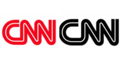
2. CNN
Founded in 1980 by Ted Turner, CNN began with a simple monochrome to mimic the black-and-white television programs that were broadcast at the time. In the mid-1980s, CNN made small but significant changes to its logo to reflect the times: it decided to use colors. It’s not just a color! According to color psychology, red means motivation, passion and leadership.
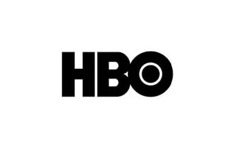
3. HBO
HBO’s word mark logo has been almost identical since its establishment in 1972. The design team drew a small circle in the letter “O” and expressed the camera lens. Are you smart? I would like to thank HBO for creating celebrities like Ellen DeGeneres, Bill Mare and Martin Lawrence. HBO’s stand-up series “One Night Stand” aimed to spotlight up up-and-coming comedians at the time.
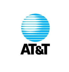
4. AT&T
Even if you are not an AT&T customer, you can see the blue and white stripe globe icon. The AT&T logo in the 80s appears to be no different from the current design. In the 80s, the atmosphere attracted attention and stood out. However, many companies that want to arouse professionalism like AT&T use geometric shapes and bold colors.
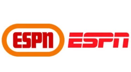
5. ESPN
Although it looks like a basic design, the red and orange color palette of the ESPN logo has a symbolic meaning. Red symbolizes power and passion, and orange symbolizes thrill, success and determination. Red is also known to increase heart rate and increase appetite. This shows why this color matches the ESPN logo most.
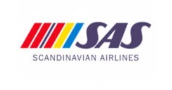
6. Scandinavian Airlines
It is a bright color scheme inspired by the flags of Scandinavian countries, just as with many corporate logos of the 1980s. Color is booming in this logo, making it easily noticeable. Furthermore, instead of having bands of color placed straight up and down, they are skewed to one side.
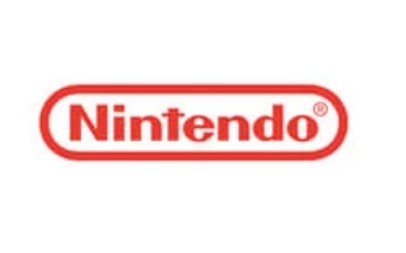
7. Nintendo
You might be surprised to learn that this beloved video game company initially started selling cards. Despite the company’s success, the brand logo has not changed much since 1967, with only minor changes to the original. Like makeup that was popular in the 1980s, Nintendo’s red is unnaturally bold and colorful.
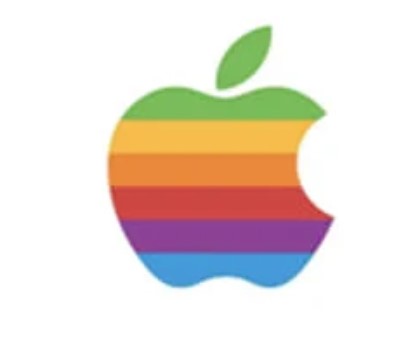
8. Apple
We all know the Apple’s half-bitten apple, but most people (like me) would probably forget the colorful rainbow apple from the 1980s. Rainbow colors were very appropriate for that time, since what could be more 80s than bright, bold, and colorful designs? The logo’s color palette was not only for style, but also to pay homage to the world’s first computer with a color display.
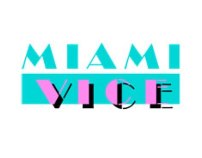
9. Miami Vice
Most people would say “Miami Vice” if they asked someone who watched TV in the 1980s what they liked. NBC’s mega hit was an atmosphere that made me imagine excessive gems, funny packs and neon colors. The Miami Vice logo perfectly represents the essence of the 80s. Two different fonts (Broadway Regular at the top and Broadway Stencil at the bottom) vary between thick and thin lines.
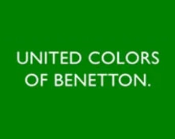
10. United Colors of Benetton
United Colors of Benetton is a very popular Italian fashion brand that was established in 1965. Its logo is very simple and clean with an uppercase sans-serif font. The letters are therefore clear and easy to read. The text is placed on a green rectangle background, giving it a straightforward, no-frills look.
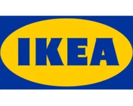
11. IKEA
Even though the logo has a retro ’80s look, it still remains highly visible today, even with the removal of the wordmark. The overall design does mirror the brand’s Swedish heritage with these iconic blue and yellow colors for the ’80s. The very bold, blocky lettering is something which stands out well in the open; hence, visibility from a distance isn’t an issue.
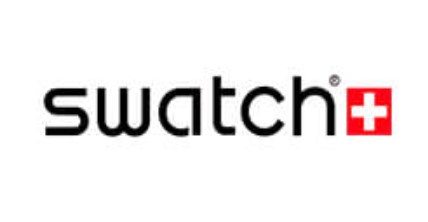
12. Swatch
Founded in Switzerland in 1983, Swatch is a world-renowned watchmaker. The brand is renowned for its affordable price, higher quality and unique watch design, and is sold in hundreds of stores around the world. Swatch’s visual identity is of great importance to the brand and has not changed since 1983, despite continuing to present colorful new designs every year.
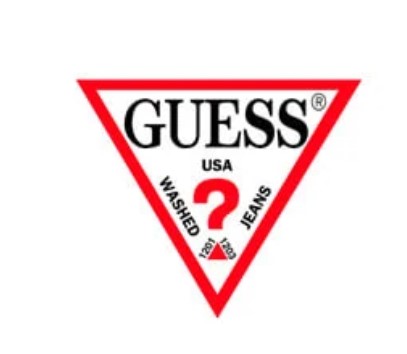
13. Guess
Guess is probably the most popular apparel brand in the United States of America. The company offers multiple products to customers across its product range. Among these, clothes, watches, jewelry, and shoes are offered. The business logo of Guess has one reverse triangle and there is a tale behind its development.
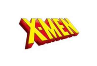
14. X-Men
One of the most popular superhero comic series, known and loved all over the world, is Marvel’s X-Men. The mutants were first printed in the comics in 1963, but the official logo of the X-Men was first used in 1987, using a one-word mark that had bright yellow and red color schemes. The letters themselves were 3D, featuring straight lines and sharp angles for a strong and powerful look in the logo.
Part 3: The Impact of 80s Logos Design on Modern Branding
Many logo designs still find inspiration from the 1980s’ style. Various organizations conduct logo reviews to explore revitalized bold and colorful energetic design styles for refreshing their nostalgic appearances.
Revival of Retro Design Elements
Most companies are now reviving elements of the 80s in their logos. These include bold colors, geometric shapes, and unique fonts. Retro design is popular because people love the nostalgia it brings. These elements do not only grab attention but also give brands a timeless, fun, and energetic look.
Lessons from 80s Logos for Today’s Brands
Businesses learned essential principles about simplistic branding through eye-catching designs in logos during the 1980s. The notion is to bring something to your attention right off the bat in bold colors with unique designs. Today’s brands can take heed and concentrate on logos that are strong, simple, and direct, easily recognizable to the masses.
Case Studies of Brands Adopting 80s Styling
This lesson can be clearly seen in many contemporary companies which have drawn inspiration from the look of the 80s to revamp their branding. Coca-Cola together with Pepsi and Nike modified their logos through vibrant color combinations and improved font styles and adding neon features.
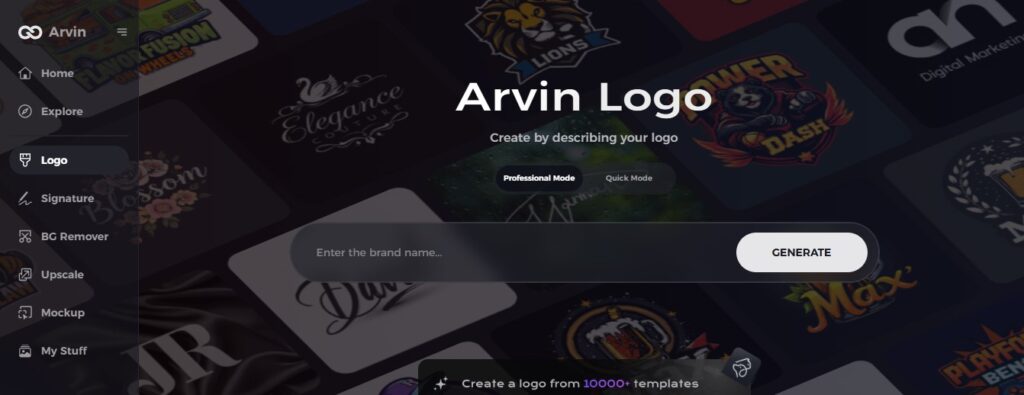
Part 4: Designing Your Own 80s-inspired Logo with Arvin AI
Arvin AI logo maker is a user-friendly tool that allows you to create your own logos, even if you don’t have design experience. Its use of smart technology to offer design elements as per your choice makes logo creation simple and enjoyable. If you want a 80s logos-inspired look, Arvin AI can help you choose bold colors, geometric shapes, and unique fonts that fit that style. With just a few clicks, you can get that logo created which captures the energy and spirit of the 1980s. Let’s take a tour to see how an AI logo maker can bring your creative ideas to life!
Key Features of Arvin AI
There are following key features of Arvin AI:
- Easy-to-Use Interface: Arvin AI makes logo design simple with a user-friendly platform.
- AI-Powered Suggestions: The tool suggests design elements based on your preferences and needs.
- Customizable Templates: Choose from a variety of templates that you can easily personalize.
- Wide Range of Fonts: Arvin AI offers a large selection of fonts, perfect for any style, including 80s-inspired ones.
- Color Palette Options: Pick from different color schemes, including bold, vibrant colors that were popular in the 80s.
- Instant Previews: See your logo in real-time as you make changes, so you can perfect your design quickly.
Steps to Create a 80s-Inspired Logo with Arvin AI
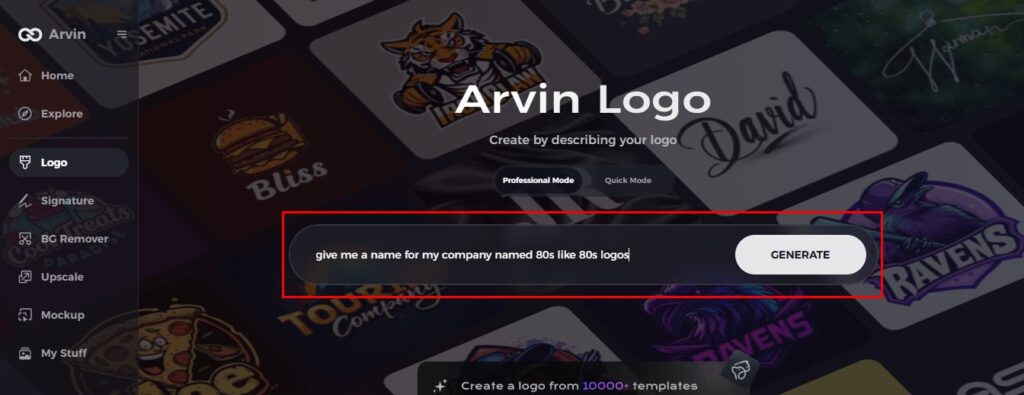
Step 1: Sign Up and Log In to Arvin AI
Go to the Arvin AI website, sign up, and log in for the logo designing feature.
Step 2: Input Your Brand Information
Input your brand name, slogan, and industry. Describe any design preferences you have in terms of colors, font styles, or themes reminiscent of the 80s.
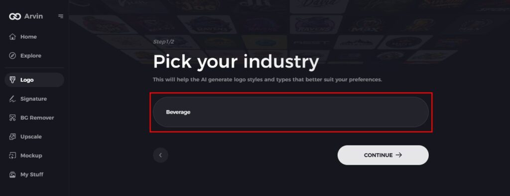
Step 3: Choose your Industry
Choose an industry associated with your brand. This way, Arvin AI will suggest styles of logos inspired by the 80s that fit your niche.
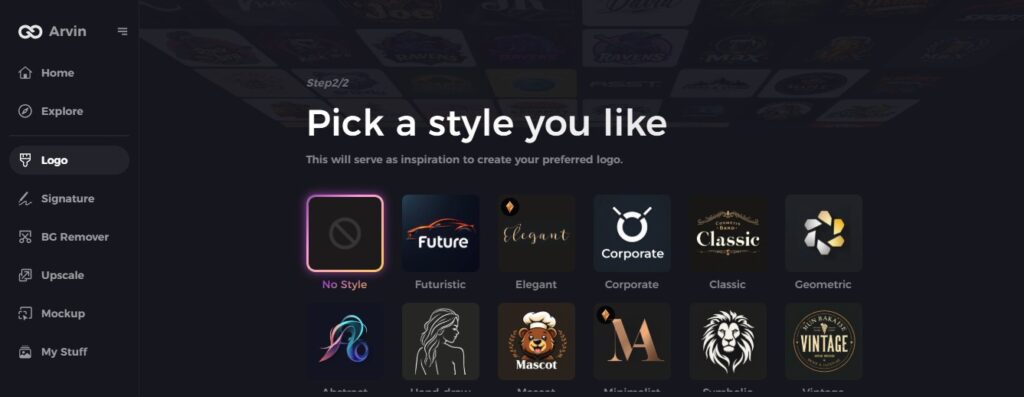
Step 4: Select Your Favorite Style
Explore many 80s-inspired styles. Choose one that best fits your vision for your retro logo.
Step 5: Customize Your Design
When Arvin AI creates a logo, you can use the editing tools to refine it. You can change the fonts, layouts, and colors to bring bold, vibrant elements of the 80s.
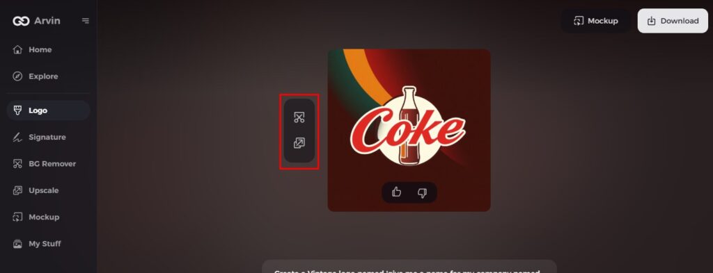
Step 6: Download Your Logo
Preview your final logo and save it in high-resolution format for both print and digital use. Ready to show off your retro-inspired 80s logo!
Conclusion
80s logo designs are still in love today for their bold colors and unique shapes that stand out. These designs have a timeless appeal that continues to inspire new brands. If you are planning to create a logo, then the retro-inspired style is a good choice. With the blending of past trends and modern ideas, you can make something fresh. Just like 80s logos, if you ever need a perfect logo for your brand, you can use Arvin AI, which is your best bet at creating a personalized design.
FAQs
What were the logo trends in the 80s?
The 80s logos brought a fascination with technology and all things digital. Logos became more geometric, with straight lines, squares, and other shapes. During this time relaxed business practices combined with neon colors together with chrome finishes and 3D effects reflected the rising dominance of digital technologies.
Why do 80s logos remain so popular today?
Their powerful, distinctive designs are still in use today to inspire current branding and represent a balance of nostalgia and creativity.
How can I create a 80s-inspired logo for my brand?
Use design tools such as Arvin AI to experiment with bright colors, geometric shapes, and fonts that reflect the 80s style.
What is Arvin AI, and how does it help in logo design?
Arvin AI is an easy tool to use which will help you create amazing logos. It gives you the most customizable templates along with a very simple interface which will make you design without a hassle.
