Gradient Logo Ideas
Looking for a gradient logo for your business? From tech startups to creative studios, many modern brands are using gradients to add depth and movement to their visual identity. Whether you're creating a new brand or refreshing your brand identity, our logo maker tools can help you experiment with bold transitions, subtle gradients, and everything in between. If you're just starting out, you might be wondering whether a gradient is too trendy or hard to work with. This page tries to help you choose what fits your brand’s personality, not just what looks cool on Instagram. It’s meant to give practical tips, and let you decide if a gradient adds the right amount of voice to your visual identity.


Create a gradient logo for free!
Color
When designing your logo, avoid defaulting to the loudest option. A linear gradient with just two colors, like blue fading into violet, can already feel modern and visually engaging, especially on digital screens. If you're working on an app icon or something for online purposes, saturated transitions work well, but test them on light and dark backgrounds too. Limit your color ramp to a few steps, and always check how it looks when converted to grayscale. A strong logo should still be recognizable without the gradient effect.

Layout
A good gradient logo works in more than one layout. Try to create a version that fits both square and horizontal spaces, because this matters when your logo is shown in a Social Media Profile or resized for small screens. Consider whether your gradient lives inside a symbol, wraps around a monogram, or follows the flow of a wordmark. Symmetry can help keep your design feeling grounded even with dynamic effects, and thoughtful spacing can prevent visual clutter, especially if your brand identity leans toward the minimalist side.

Typography
Both fonts and gradients need attention, so designers must avoid conflicts between them. If your logo contains text, use clear and legible fonts. Many brands use simple sans-serif fonts to balance the complexity of gradients. Use gradient colors to skillfully enhance the glyphs rather than overshadowing them. If the gradient sits behind the text or is part of the type itself, keep contrast in mind. it is important to note that a gradient between similar tones (such as coral and peach) often works better than a jump across the entire color wheel.

How to use Arvin's free logo creator?
Choose a creation method
There are 3 ways to create logos: enter the brand name, describe the logo, or modify templates.
Generate your logo
Just 1 click on the "GENERATE", AI will create an exquisite logo, and you can customize for logo optimization.
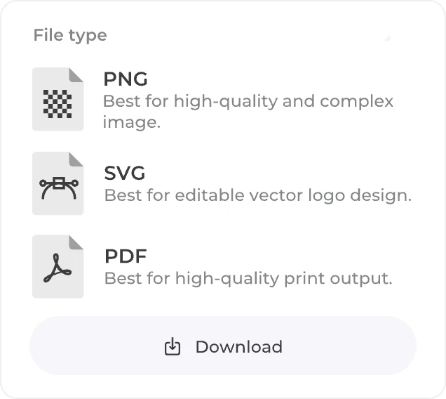
Download your logo files
High-resolution PNG format, editable SVG format, and PDF format are supported for download.
Logo designs by industry
Try the gradient logo maker trusted by over 10 million users
Frequently asked questions (FAQ) about gradient logos
A gradient logo uses one or more gradient types, like a linear or a radial blend, to move smoothly from one color to another. That trick can give a feeling of depth or motion, a little shine that flat color can’t reach.
 Arvin
ArvinArvin is the AI web application and browser extension powered by GPT, Claude, Gemini, etc. Chat with Arvin from anywhere online for instant research, reading and creativity.
Arvin Logo Maker is a professional AI-powered logo generator that offers features such as logo and signature generation, etc.