Best Midjourney Prompts for Website Design
Start your prompt with “web design for...” or “modern web design for...” and then go from there. Describe your business or brand.
Negative Prompting
Use “--no” in your prompts. This is a very powerful command that people don’t use nearly enough.
--no tells Midjourney what you don’t want. Anything typed after --no will not appear in your image. This is called a negative prompt.
Midjourney’s default style leans towards ‘realistic and detailed’. But that may not fit your brand.
For example, if you are a more tech-oriented brand, you’re likely going to want simpler graphics and illustrations, as these have become the hallmarks of modern brands.
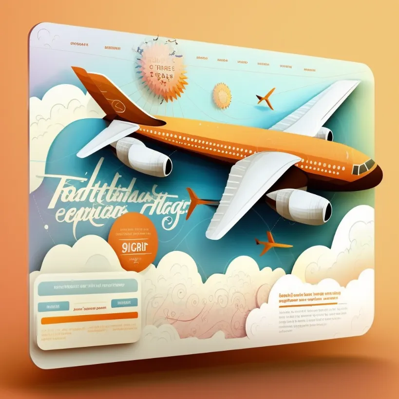
web design for a flight discount service
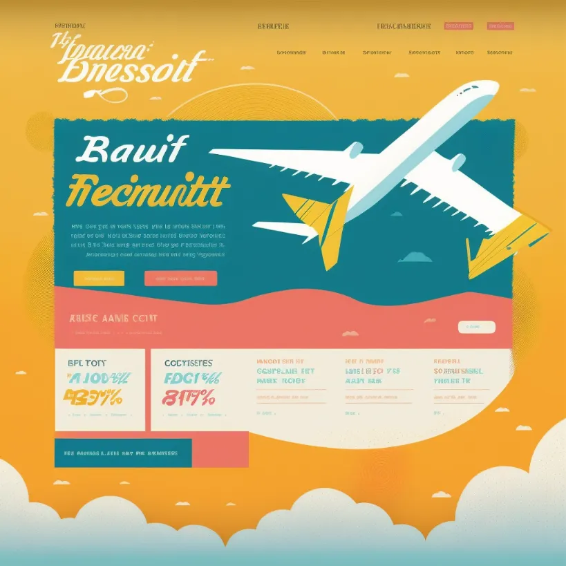
web design for a flight discount service –no shading realism photo details
Left: Midjourney’s default style, lots of details and shading. Right: same prompt, but with a negative prompt so Midjourney does not lean on its default!
Aspect Ratio
Use “--ar 3:2” if you are creating web designs. This command sets a 3:2 aspect ratio, which will push your results look more like ‘web designs’.
Compare these results that use the same prompt but different aspect ratios. The square compositions look more like infographics. When the aspect ratio is increased, the content of the image changes.
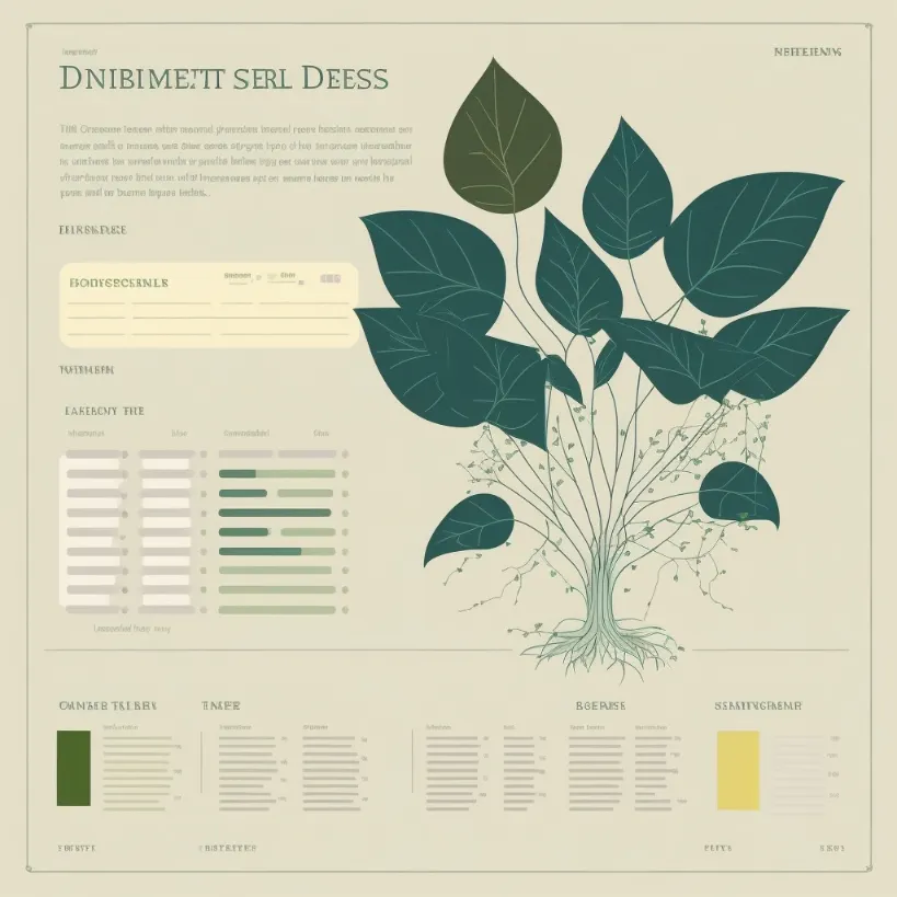
web design for a plant database, minimal vector flat –no photo detail realistic
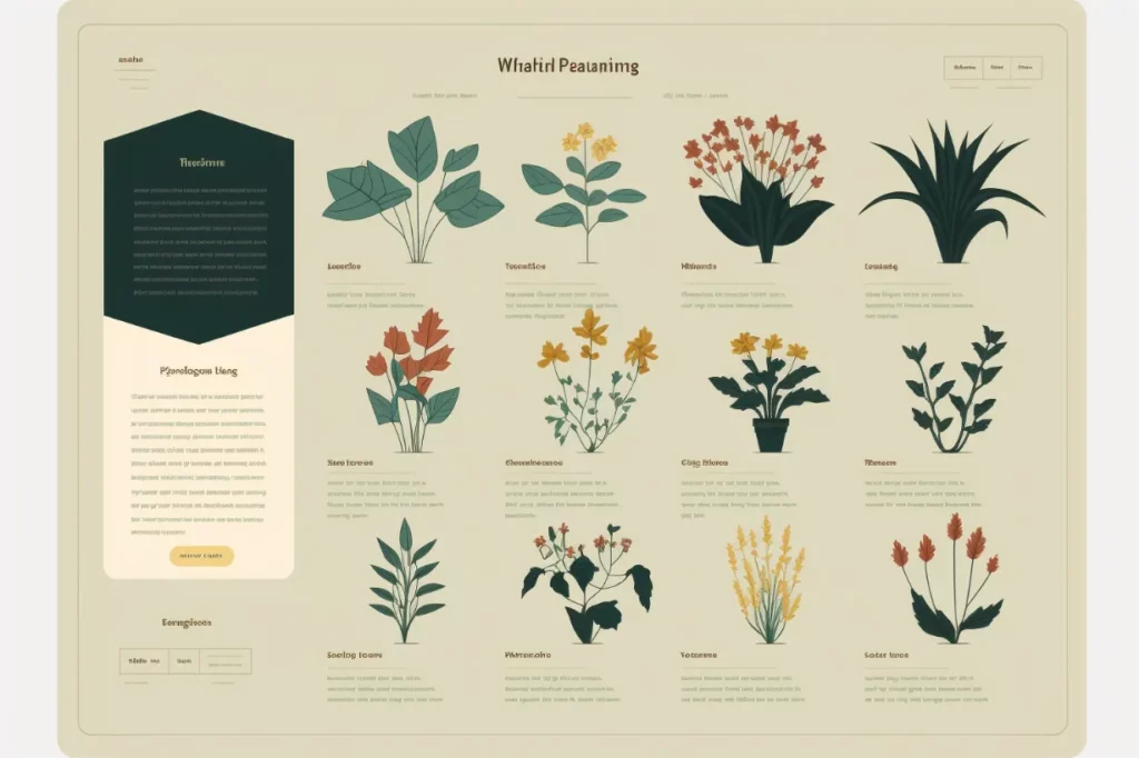
web design for a plant database, minimal vector flat –no photo detail realistic –ar 3:2
Use “–ar 2:3” if you are creating designs for mobile websites or apps.
To frame or not to frame?
You’ll notice that Midjourney will sometimes randomly show the design inside a device. If you want this, you can be more explicit:
Show with laptop/desktop
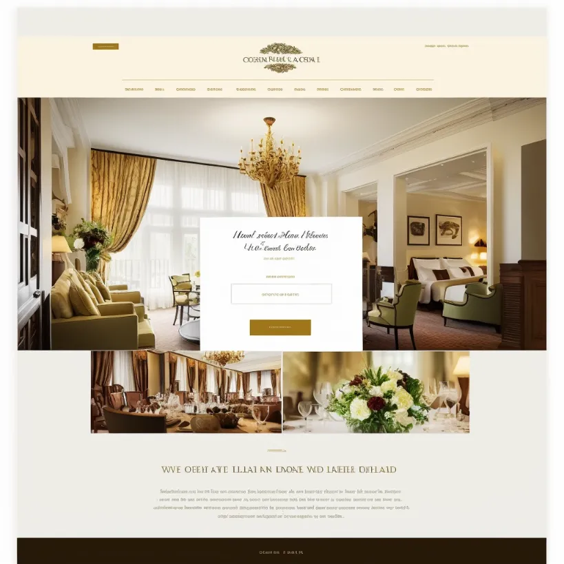
web design for a hotel website –no shading realism details –seed 1024912
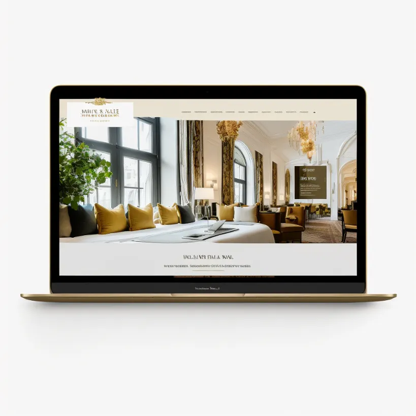
web design for a hotel website macbook m1 mockup –no shading realism details –seed 1024912
Design only
If you don’t to show your designs in a device or browser window and only want the design itself, you can be explicit about this too:
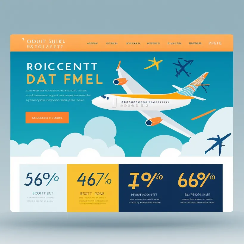
web design for a flight discount service –no shading realism photo details –seed 1024912
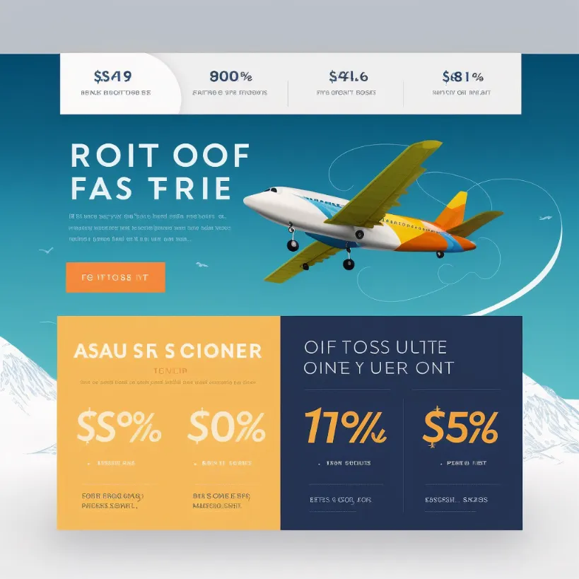
web design for a flight discount service –no shading realism photo details device computer window –seed 1024912
Note: In these images, you can use the --seed command to make your comparisons more consistent with each other.
Other Midjourney Prompts for Web Design
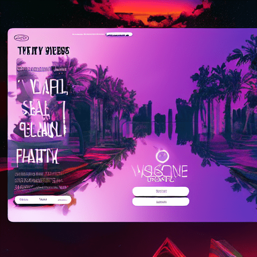
beatiful content website, website page, website, blog, glassmorphism, vaporwave style, ux, ui, ux/ui, detailed,
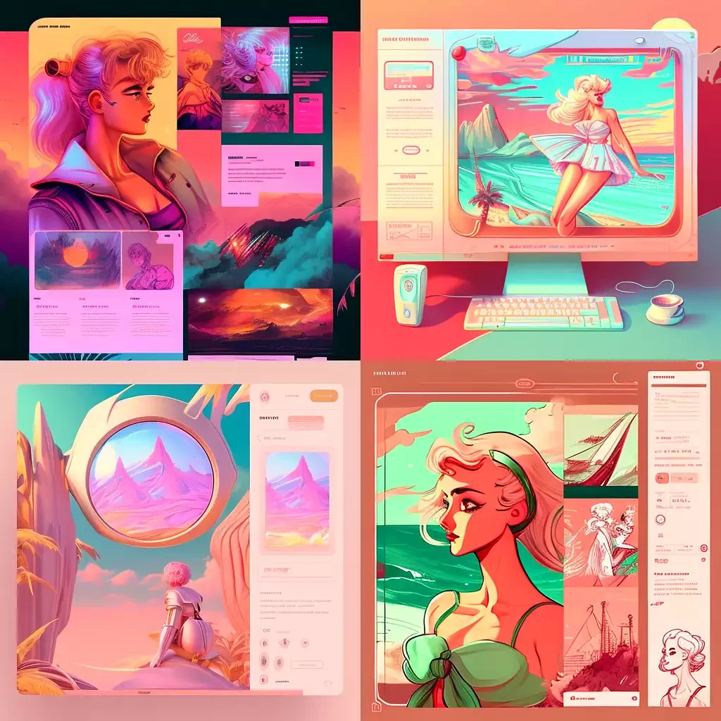
beatiful content website, website page, website, blog, glassmorphism, USSR, vaporwave style, ux, ui, ux/ui, detailed
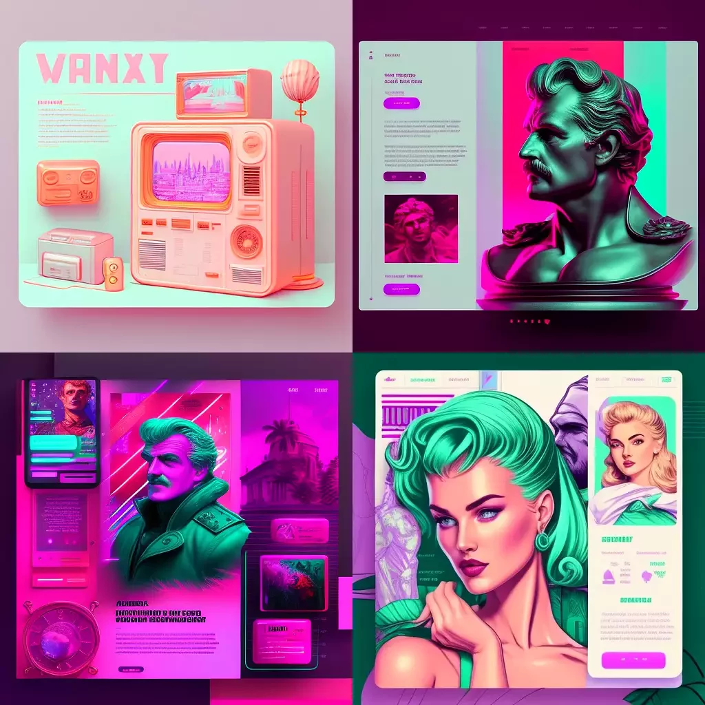
beatiful content website, website page, website, blog, glassmorphism, USSR, vaporwave style, ux, ui, ux/ui, detailed
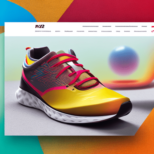
Beautiful website for a sport shoe ((((ui)))), ((((ux)))), ((((ui/ux)))), red, blye, teal, yellow, running person, ((((2023 style ui/ux)))), website –v 4 – stylize 750 –q 2 –s 20000 – upbeat
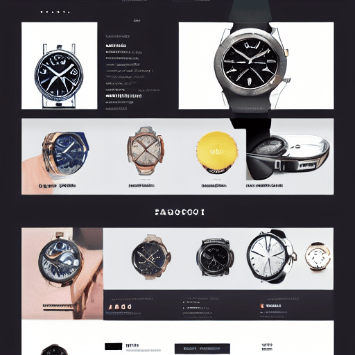
watch sales website, ui, ux, front page, e-commercer
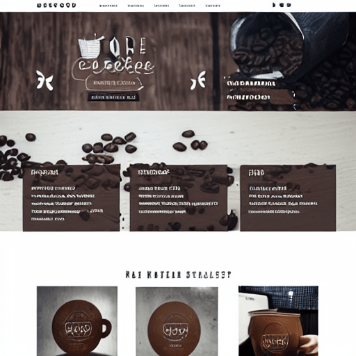
website design idea, dribble trend, coffee roastery company –v 4
