The Wonder Woman logo is one of the most iconic figures in the comic book scene. Wonder Woman: An Icon of Power & Justice (DC Comics) as a classic superhero from DC Comics, Wonder Woman embodies strength, justice, and equality. Over the decades, this superhero logo for Wonder Woman has changed to reflect not only the character’s updates as she was reinvented but also trends in comic book storytelling. In this article, we will search the history, meaning, and evolution of the Wonder Woman logo.
Part 1: Wonder Woman Logo Meaning & History
Wonder Woman and Wonder Woman logo reflect a love of uniform retribution in the richness of their implications. Her journey as a superhero inspires millions all over the world and its obvious evolution is a evidence to that.
Wonder Woman Logo Symbolism
Wonder Woman Logo is not just a design — it is a symbol of female empowerment, strength, and heroism. The “WW” gold emblem signifies Wonder Woman’s never-ending quest for justice. Each of the logo’s elements are inspired by Greek mythology — specifically the Amazon warrior heritage that is at the heart of her story.
The Logo’s Impact on Pop Culture
Wonder Woman has been a cultural icon since her debut in 1941. Its logo is recognized near and far and is one of the most potent symbols of the superhero genre. Its presence in DC comics, television series, movies, and merchandise shows its importance in pop culture.
Part 2: The Wonder Woman Logo Evolution
Over the years since 1941 the Wonder Woman logo has gone through several redesigns, adapting to changing art styles but keeping its core identity intact. Each version has a tale of metamorphosis and triumph.
1941 – 1942: Wonder Woman’s First Logo
The first Wonder Woman logo appeared over a red background, and showed a stylized golden eagle with outstretched wings. This design, inspired by Art Deco, exuded elegance and assertiveness. It was meant to symbolize Wonder Woman’s warrior spirit and Greek mythology origins.
1942 – 1949: Improving on the First Design
The wings were also rendered in greater detail with a more potent golden hue at this time. So it was given the glamorous treatment with emphasis around the feathers to make the eagle appear more realistic. This iteration reflected Wonder Woman’s evolution as a comics character.
A More Abstract Approach: 1949 – 1959
True to the redesign, the wings of the livery were also given a curved and arched shape, reflecting the new logo of a modernized, abstract design. We formed the outline of butterfly wings, symbolizing freedom and transformation.
1959 – 1968: Wonder Woman emblem based on fairy tales
This is the period when the Wonder Woman logo became a trophy-shaped W. Its wings became circular and looked like an ancient fan, and the overall design was in gold. This one highlighted her mythical, warrior-like quality.
1972–1981: Transformation into a More Feminine Look
The Wonder Woman logo finally transitioned into the stylized female figure in a big way. The wings turned into sleeves, and the bottom half resembled an elegant gown. This redesign mirrored the growing attention to Wonder Woman’s stature as a feminist icon.
1981 – Present: The Coinage of the WW Monogram
This same logo, the most famous logo of all time, was introduced in 1981! It substituted the bird logo for a double “W” monogram stacked with long, outspread wings. This design became the bedrock for most versions that followed, cementing Wonder Woman’s brand identity.
Part 3: Updated Variations on the Wonder Woman Logo
With these refined designs and color updates the Wonder Woman logo looks much sharper and powerful. Recent modifications highlight its contemporary, daring, and heroic charm.”
1994: Polished and Simplistic Adjustments
The 1994 Wonder Woman logo kept the WW monogram but added smoother curves and better symmetry for a more elegant look. This version tried to update the emblem while keeping its iconic status, although it was only used briefly before another redesign appeared.
1995 – 1998: More of a Geometric Style
The 1995 Wonder Woman logo added triangular extensions to the wings, improving its geometric accuracy and structural balance. The incorporation of a filled triangle at the bottom added to the stability of the emblem, making it a more balanced, dynamic, and visually appealing symbol that expressed strength and authority.
1998 – 2006: A New Palette
The Wonder Woman logo then added a copper-to-beige color scheme for the first time, which also broke from the classic gold. The new version had more angular wings and an overall sleeker shape, projecting a modern, sophisticated, and elegant look but still keeping the classic WW monogram.
2006–2011
In 2006, the Wonder Woman logo went back to its original red and gold colors, strengthening its bold image. The bird’s head was added in the double-W design, strengthening its association with the original eagle emblem. The simple, sharp lines provided the logo with a strong, contemporary, and authoritative image, making it current in today’s superhero logos.
2011 – 2016: A Feminine But Powerful Style
The 2011 Wonder Woman logo incorporated sharper and arched wings, providing it with a more dynamic and bold look. The design was just right in balancing femininity and power, portraying Wonder Woman’s strong yet graceful character and making it the perfect symbol for her modernized character.
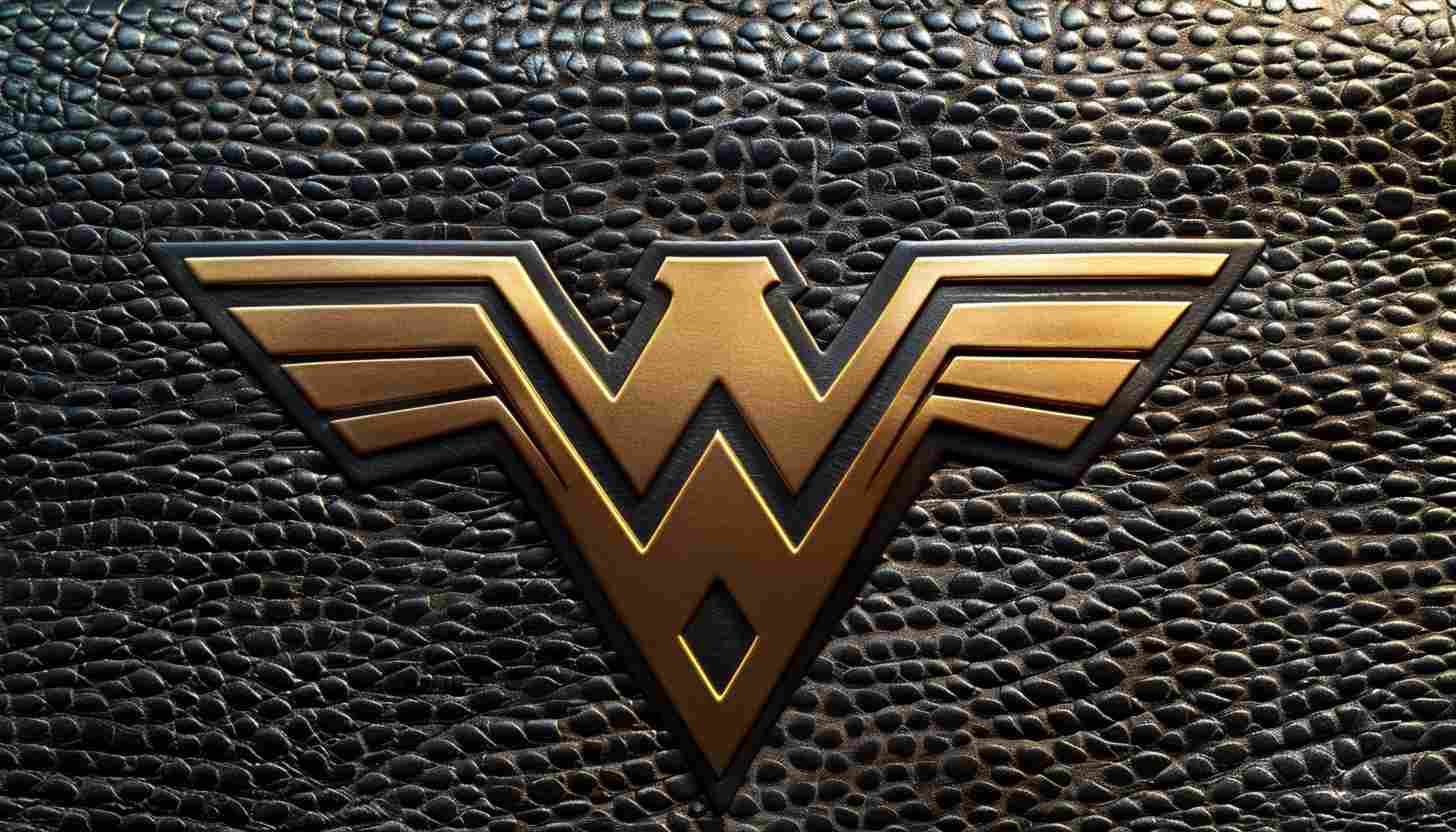
2016 — Present: The 3D Wonder Woman Symbol
The latest Wonder Woman logo, unveiled in 2016, is a three-dimensional golden logo with darker tones used to achieve depth. It maintains the classic WW monogram, but its straight, bold lines convey a sense of strong, heroic, and commanding presence, which makes it even more timeless.
Part 4: Type and Color Palette of the Wonder Woman Logo
The Wonder Woman logo was custom-crafted for maximum impact. Golden shades, referencing Greek mythology and patriotism, amplify the iconic logo.
Unique Lettering Style
The font used is not part of any existing typeface. Designed and refined over many iterations for legibility, uniqueness, and impact. Note on each revamp has refined the lettering to match Wonder Woman’s ever-evolving brand identity, balancing boldness with elegance. Set in a custom font that echoes the strength and iconic nature of the character, allowing for immediate recognition wherever he appears in comics, films and merchandise.
Color Meaning
The strength, royalty, and heroism represented by the color gold make it the ideal accompaniment for Wonder Woman’s iconic image. Red and blue, reminiscent of the American flag, symbolize her commitment to justice and patriotic service. Of course, dark gold tones were added in the modern age, which gives it a sense of timeless sophistication ensuring that it’s in your face throughout all periods of comic book history.
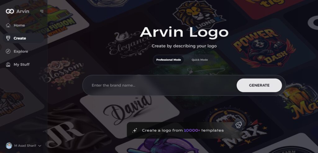
PART 5: Design Your Professional Super Hero Logo
So if you are looking to design a strong, unique logo, Arvin AI might be the tool for you. Logo Maker AI is an intelligent logo generator that enables enterprises, users, and creators to easily generate high-quality logos. With its advanced AI-driven customization features, you can select from a variety of templates, adjust colors and typography, and generate high-quality logos instantly. Comes with a superhero inspiration or a sleek modern design with Arvin AI — and create emblems of your dreams with ease and accuracy.
Key Features of Arvin AI
- AI Logo Design: Creates logos at an excellent quality level with intelligent AI help.
- Customizable Templates: Provides numerous professional templates to fit various styles
- Branding Flexibility: Adjustable colors, fonts, and layouts for branding
- High-Resolution Downloads: Access logos in clear, high-quality formats for both digital and print applications.
- Easy to Use: Effortless designing using simple drag-and-drop tools
- Superhero-Inspired Logos: Create bold, iconic logos similar to famous superhero emblems.
Steps to Use Arvin AI for making Logo
Step 1: Visit the Arvin AI Website
Open your web browser and navigate to the design page at Arvin AI to begin the process of creating your band’s logo.
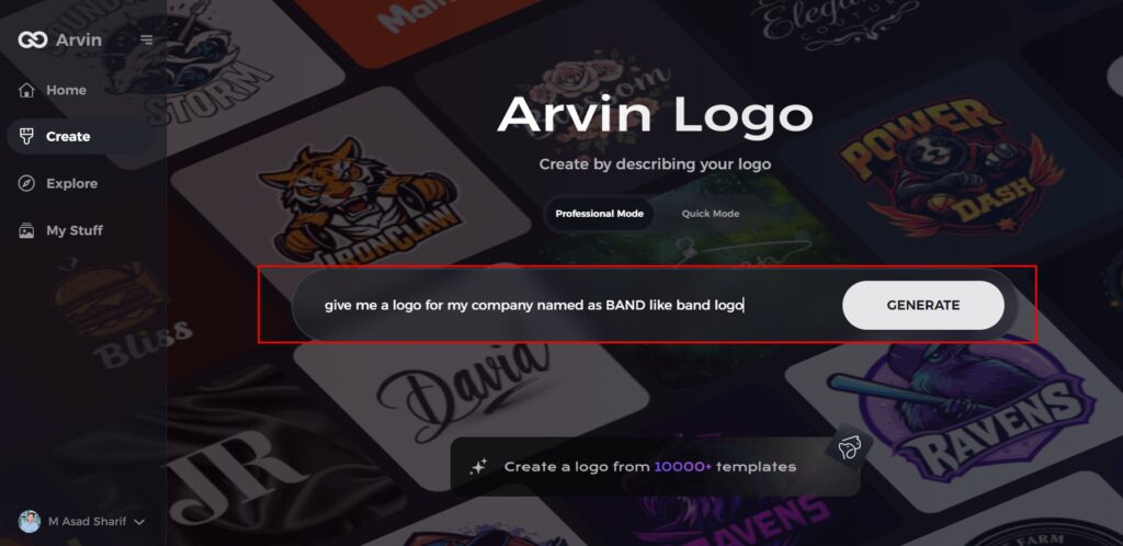
Step 2: Fill Out Your Band Information
Enter essential details such as your band’s name and music genre. This information helps the AI generate logo designs that align with your band’s identity and style.
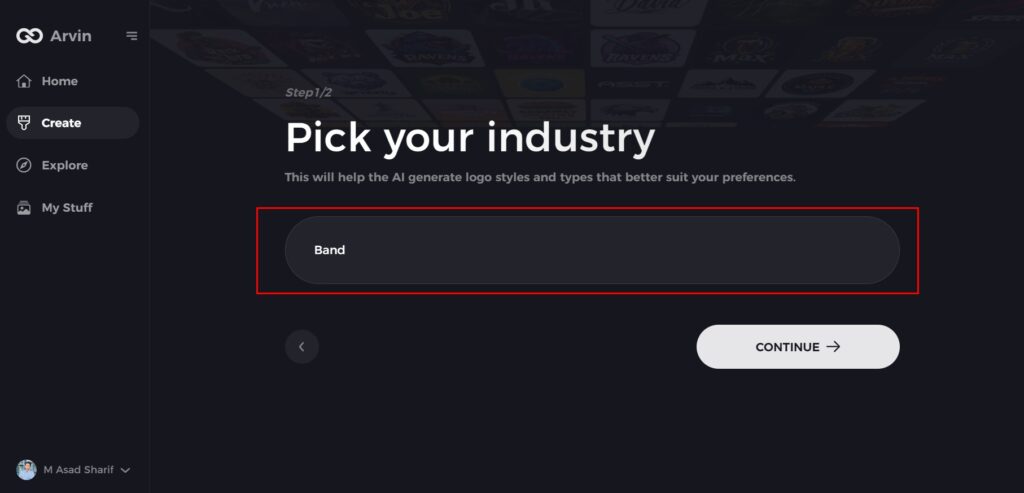
Step 3: Choose Your Genre
Select a genre from the list provided. This helps the AI refine the logo styles and designs based on your band’s specific genre and aesthetic.
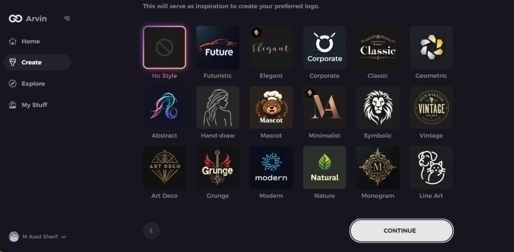
Step 4: Pick the Design Style
Browse through the available styles and choose one that best represents your band’s image. If you’re unsure, you can skip this step, and the AI will generate designs based on default inspiration.
Step 5: Review Logo Ideas
The AI will generate a variety of logo concepts based on the information you’ve provided. Review the ideas and select the ones that best capture your band’s spirit.
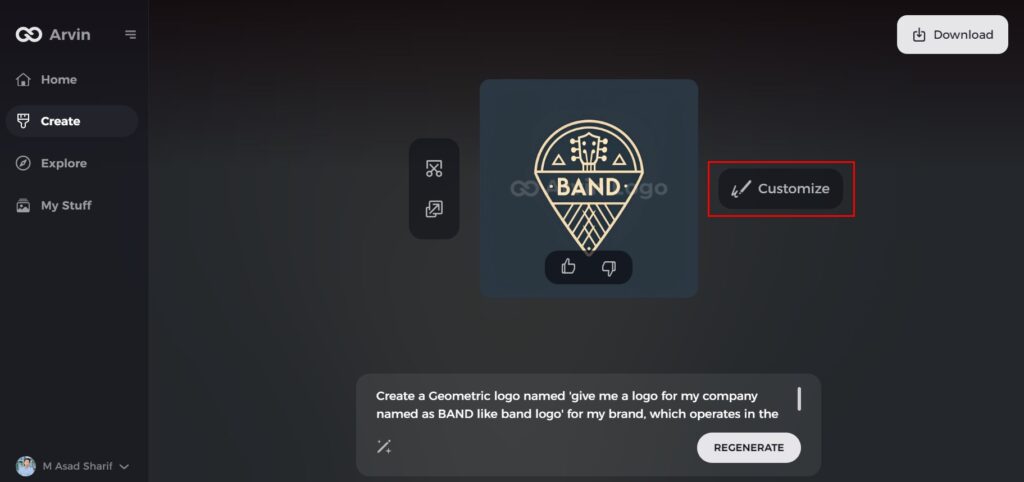
Step 6: Personalize Your Logo
Refine the selected design by adjusting elements such as colors, fonts, icons, and layout to match your band’s unique style.
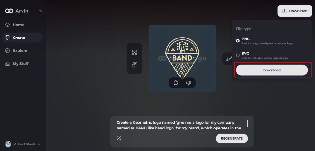
Step 7: Download Your Logo
Once you satisfy with your logo, download it in formats like PNG or SVG. These formats ensure compatibility for use across websites, social media platforms, and print materials.
Conclusion
Wonder Woman has had several logos over the years, but they have all embodied the same spirit of strength, justice, and heroism. Just as each variation on the early eagle design change into the modern WW monogram, each one offers its own story of transformation. Start with Arvin AI today if you want to make a simple yet incredible logo. With Arvin AI, you can create anything from a superhero-inspired emblem to a sleek business logo, all in a matter of moments, guaranteeing your business will shine with professional-quality logos that truly catch the eye.
FAQs
What does the Wonder Woman logo represent?
The Wonder Woman logo symbolizes strength, empowerment, and heroism, inspired by Greek mythology and feminist ideals.
How has the Wonder Woman logo changed over the years?
The logo has evolved from an Art Deco-inspired bird emblem to the iconic WW monogram, with various refinements in shape, color, and depth.
What colors are most associated with the Wonder Woman logo?
The primary colors are gold, red, and blue, representing heroism, courage, and patriotism.
Can I create a logo similar to Wonder Woman’s using Arvin AI?
Yes! Arvin AI offers customizable templates to design superhero-inspired logos with various fonts, colors, and effects.
