
The Wells Fargo logo is amongst the best-known symbols within the American banking system. Symbolizing trust, safety, and the rich historical past, the symbol has been continuously evolving throughout time while never give up its foundational identity. Evolving from the initial representation through a stagecoach to its current minimalist logo, the Wells Fargo logo encapsulates the corporation’s dedication to history and advancement. This article discusses the history, symbolism, and development of the Wells Fargo logo and its importance in the banking sector.
PART 1: The History and Evolution of the Wells Fargo Logo
The Wells Fargo logo has seen several modifications over the years, both to suit the expansion of the company and to maintain its heritage. From its initial stagecoach symbol to the contemporary wordmark, each variation reflects the adherence of Wells Fargo to trust and innovation
1852 – Wells Fargo Logo Origins
The original Wells Fargo logo published in the company’s past as a bank and transportation company during the Gold Rush era. It consisted of a six-horse stagecoach and symbolized speed, safety and the commitment of the firm to provide valuable financial products. Black-and-white logo in color was appropriate to the gritty American West, representing dependability in an era of torrid economic expansion. And soon it became synonymous with Wells Fargo’s concentration on safely shipping cash and goods across the nation.
2009 – A Contemporary Revamp
After its merger with Wachovia in 2009, Wells Fargo unveiled a sleeker logo that blended tradition with a contemporary look. The traditional red and yellow color palette was retained, but the logo received a more streamlined look. A dark red square background was added, with a yellow bold serif wordmark. The classic stagecoach symbol, previously a focal point in prior designs, was streamlined to look sleeker and more sophisticated This update aligned Wells Fargo’s brand with present-day financial institutions yet retained an appropriate touch for its historical significance.
2019 – The Modern Wells Fargo Logo
Wells Fargo introduced its latest logo redesign in 2019, showcasing simplicity and boldness. The sleeker design of iconic logo retained the red and yellow hues but used a more prominent typeface that was easier to read and more contemporary in appearance. Although the stagecoach continued to be part of the company’s heritage, it took a backseat to the streamlined wordmark. This change was indicative of the bank’s emphasis on digital branding, where the Wells Fargo logo would be just as effective on mobile banking apps as it was on traditional signage.
PART 2: The Symbolism of the Wells Fargo Logo
Apart from aesthetics, the Wells Fargo logo is deeply symbolic. Its visual, typographic, and color elements reinforce the company’s credibility, heritage, and leadership within the financial sector.
The Symbolism of the Stagecoach
The stagecoach has served as one of Wells Fargo’s oldest brands, reinforcing the company’s legacy of transporting gold and financial services. It’s a testament to the company’s commitment to security, reliability and customer trust. In the 19th century, Wells Fargo employed stagecoaches to carry money and commodities between the growing American frontier. Presently, though banking has changed much, the stagecoach remains an emblem of the company’s guarantee of secure and reliable financial services.
The Significance of Red and Yellow in the Logo
The Wells Fargo logo is recognizable at first glance because of its striking red and yellow color scheme. Red symbolizes power, passion, and energy — traits that speak to Wells Fargo’s identity as a bank holding company. The yellow signifying optimism, wealth, and abundance reinforces the position of the bank in securing its clients financial success. Using these two colors creates a bright visual identity that helps Wells Fargo stand out among other banks.
The Selection of Font in the Logo
Typography is one of the fundamental elements in branding, the typeface in the Wells Fargo Logo is a custom serif typeface that encompasses professionalism, authority, and trust. Serif fonts are usually associated with tradition and stability, which renders them a common choice for financial institutions. The typeface was redesigned to be bolder and streamline for modern-day reading, but still very much in keeping with the classic style of the brand. Also, this refined typeface enables the Wells Fargo logo to be application-friendly across multiple digital and printing surfaces.
PART 3: The Stagecoach Emblem – A Legacy of Trust
Although logos have been changed, the stagecoach remains an important part of Wells Fargo’s heritage. It continues to represent the company’s dedication to fiscal stability and customer service.
How the Stagecoach Became Wells Fargo’s Icon
The stagecoach has been an integral component of Wells Fargo’s image since the bank was founded in 1852. Initially used to represent the bank’s position in speedy and safe financial transfers, it soon turned into an emblem of reliability and trust As the bank industry moved into the computer age, the stagecoach continued as a central element of Wells Fargo’s image, reminding customers about the bank’s heritage and core emphasis on service.
Where the Stagecoach Appears Today
Although the stagecoach emblem is no longer the primary logo, it still plays a significant role in Wells Fargo’s branding. It appears in advertising, marketing, and promotion, reminding the company of its heritage. Whether placed into commemorative designs or featured in corporate lore, the stagecoach is a sentimental yet powerful reminder of Wells Fargo’s heritage.
PART 4: The New Wells Fargo Logo – Strength in Simplicity
In the current digital age, simple branding enhances visibility and recognition. The new logo of Wells Fargo is a balance of simplicity and strength is consistent in all platforms.
Why the Company Went for a Simple Design
Over the last few years, minimalist branding has gained popularity in financial institutions for better visibility and uniformity in both digital and print media. Wells Fargo’s logo redesign in 2019 fits this mold as it introduces a streamlined, contemporary appearance with the preservation of the brand’s fundamental aspects. Wells Fargo guarantees the effectiveness of its branding by keeping the logo simple and clean so that it performs well in mobile apps, websites, and in-branch signage.
The Effect of the 2019 Redesign on Brand Awareness
Even with the streamlined design, the 2019 redesign maintained the fundamental visual elements that characterize Wells Fargo The red background square and heavy serif font drive brand recognition, ensuring that customers recognize the logo. The stylish strategy supports the company’s image, ensuring its flexibility for the future growth and technology.
PART 5: The Wells Fargo Logo in Banking and Finance
Logos in the financial sector have a major role to play in building trust. The Wells Fargo logo is unique in blending tradition with contemporary branding, leaving a lasting impression.
How Wells Fargo’s Logo Builds Consumer Trust
A strong visual identity is particularly important in banking, and a big part of creating trust with customers is the Wells Fargo logo. This double punch of red and yellow and a traditional serif font instills a sense of trust in the customer that the bank is a trusted one. A Good logo inspires confidence and makes the customer feel like interacting more with the brand.
Comparison with Other Banking Logos
The Wells Fargo logo is also distinct from competitors because of the bold color use and historical weight. Blue colors are often associated with financial institutions like Chase and Citibank to symbolize stability, but Wells Fargo’s red and yellow branding establishes a more vibrant and authoritative image. The mix of tradition and newness provides Wells Fargo with an original visual character in banking.
PART 6: Design Your Professional Business Logo
Artificial intelligence-based design tools such as Arvin AI are revolutionizing business logo creation. These tools allow startups, banks, and others to make decent-quality logos quickly and efficiently. With complex algorithms, AI can evaluate industry trends and make suggestions for best designs for a brand’s personality.
Key Features of Arvin AI for Creating Logos
- Smart Design Ideas: AI scans trends in the finance sector to produce logo concepts.
- Personalization Choices: Users are able to customize fonts, colors, and icons to suit their brand.
- Top-Notch Formats: Logos come in SVG, PNG, and vector formats for web and print use.
- Quick and Affordable: A cost-effective alternative to outsourcing designers.
- Customizable Elements: Modify fonts, colors, and icons to align with your brand identity.
Steps to Use Arvin AI for Logo Creation
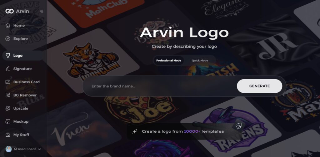
Step 1: Visit the Arvin AI Website
Open your web browser and go to the Arvin AI logo maker page to begin designing your logo.
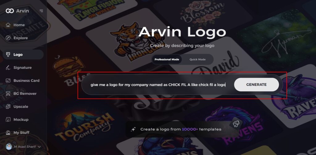
Step 2: Enter Your Business Details
Provide essential information like your business name and category. This helps the AI generate logos tailored to your brand.
Step 3: Select Your Industry
Choose an industry from the available options. This helps the AI refine logo styles based on your business type.

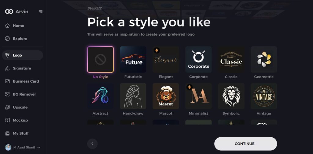
Step 4: Choose a Style
Browse through different logo styles and select one that matches your brand’s identity. If unsure, skip this step, and the AI will generate a design based on default inspiration.
Step 5: Explore Logo Ideas
Arvin AI will create multiple logo concepts based on your inputs. Review the options and pick one that fits your brand image.
Step 6: Customize Your Logo
Adjust colors, fonts, icons, and layouts to align the logo with your brand’s style.
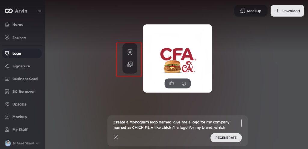
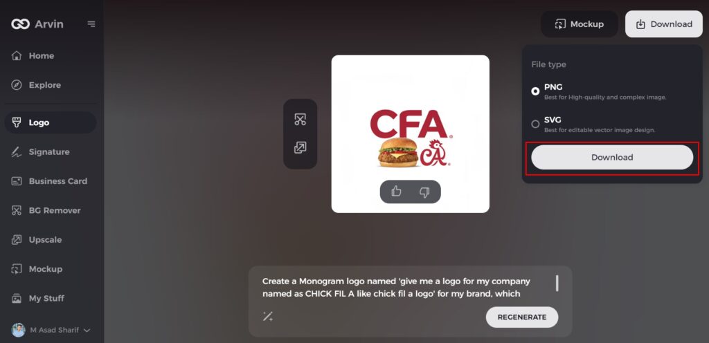
Step 7: Download Your Logo
Once satisfied with the design, download your logo in formats like PNG or SVG for use on websites, social media, and marketing materials.
Conclusion
The Wells Fargo logo has also experienced tremendous change while remaining faithful to its spirit of trust and reliability. From the stagecoach of 1852 to the sleek, contemporary look of 2019, each alteration is a reflection of the company’s commitment to financial solidity and innovation. Red and yellow stand for power and prosperity, whereas serif font boosts credibility. For businesses in need of a professional logo, Arvin AI provides AI-powered design tools with customization, smart suggestions, and high-resolution output to help you develop a distinctive brand identity.
FAQs About the Wells Fargo Logo
What does the Wells Fargo logo symbolize?
The logo represents trust, financial security, and the company’s historical role in banking. The stagecoach is a nod to its gold transport legacy.
Why did Wells Fargo change their logo?
The redesign was intended to make the logo more contemporary while still retaining its essential identity. The new font and streamlined color palette made it more adaptable.
What font is used in the Wells Fargo logo?
The Wells Fargo logo contains a proprietary serif font that symbolizes professionalism, trustworthiness, and authority.
Can I create a similar banking logo with AI?
Yes! Arvin AI allows you to generate a professional banking logo with customizable fonts, colors, and industry-specific symbols.
