UPS is a giant shipping company of the world, having a brand well established and regular service. The UPS Logo has been changed dozens of times as the company evolved, keeping up with the changes in design and branding. Through this modernization shift the company maintains both its original identity and a commitment to present-day practices. The article outlines UPS’s evolution of its brand signature and explains marketing approaches that strengthen corporate visibility.
Part 1: Understand the UPS logo
Before you can really appreciate the UPS logo, you should know what it signifies and symbolizes. An image serves as the official representative of what the company stands for and its key objectives and fundamental principles. Through silent representation he delivers trust and reliability and professional services. The UPS logo reveals several hidden meanings which appear when viewers examine it carefully.
Symbolism hidden in the UPS logo
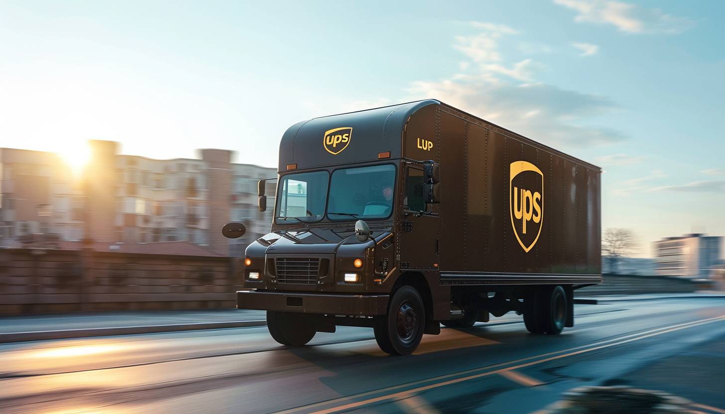
Every element of the UPS symbol is thoughtfully designed to convey certain messages. There is a shield in the center of the logo, symbolizing protection and reliability. A crown made of gold is placed upon the shield, signifying excellence and leadership. Written below the shield is “UPS” in upper-case bold letters. The type of logo fonts used is the sign of UPS’s drive to create confidence and authority and deliver packages intact on schedule.
The importance of the logo in branding
Logo design plays an important role in the branding process. The well-trained logo will instantly communicate the value of the company, increase brand awareness, and differentiate itself from competitors. A visual touchpoint within the logo enables customers to generate a lasting image which sticks in their minds. UPS showcases its reliable delivery service performance to customers by using its logo across its business operations. The company logo safeguards quality standards by focusing on unparalleled service quality and premium delivery services.
Part 2: Meaning and History of the UPS logo
Today, UPS, the world’s largest delivery company, begins in 1907 when Claude Ryan, 18, and Jim Casey, 19, founded the American Messenger Company in Seattle, Washington. Already in 1908, it merged with major competitors to purchase the first Ford T-type car. After that, the founders decided to focus on delivering packages from groceries and changed the company name to Merchant Purcell Delivery.
1916 – 1937
In 1916, the United Purcell Service of America adopted the first logotype. This logo depicts the baggage tied to the eagle’s claw. The character of the luggage was a bronze shield with a golden outline in the background of “safe, quick and reliable.” The bird itself was brown. James E. Casey, the founder of UPS, chose the shield as the official emblem shortly after the company merged with a local rival company.
1937 – 1961
The current company name UPS appeared on the logo in 1937. The character was a noble gold shade. The shape of the shield changed a little and the letters changed: “Delivery system for quality stores.” In addition to this, there was a letter of “Since 1907,” meaning the year of company establishment.
1961 – 2003
When you look at the symbol mark designed in 1961, you can’t help but notice the mysterious combination of a package tied with a medieval shield and a fun string above it. Paul Rand, who created the logo, said, “I am not conscious and use humor, but naturally.” The 1961 logo was noted not only for its sense of humor but also for its entirely new color palette. It was the only logo that did not use brown or gold. Black and white used instead.
2003 – 2014
The 2003 UPS logo Redesign revived the brownish tint. The shield looks uncompromisingly modern with minimalist lines and sophisticated lettering.
2014 – Present
In the 2014 redesign of IPS visual identity, the emblem changed from a three-dimensional, gradient emblem to a flat, simple one, with the style and shape of the previous version intact. Currently, the main color of the emblem is dark chocolate, and the contrast between the dark and strong yellow of the upper line and the letters of “UPS” written in lower case stylish sans serif font looks calm and cozy.
Part 3: Design Elements of the UPS logo
The UPS logo has several definitive features such as typeface, color, and symbolic shield design.
Typeface
The symbol of the UPS font is not only because it is part of their characteristic log, but because it had its own typeface specifically made for a brand called “UPS Sans.” This sans-serif typeface is used not only for logos but also for marketing materials. This typeface is known to be derived from or similar to FF Dax or Yanone Kaffeesatz and is commonly used in bold. UPS Sans is a sans-serif typeface.
Shield Design
The shield in the UPS logo was first made by Casey with the iconic logos, and has remained in some form since then. It is heavily linked to today’s brands and represents the strength of the company and the protection and consideration for all the packages they handle. While giving the brand a reliable image, it also helped to remain loyal to the original branding and easily recognizable.
Color
For many years, UPS was never out of its original logo colors scheme. The logo mainly uses gold and brown. Logo includes occasional black, bronze and white touches. The logo created by Paul Rand in 1961 was a simpler approach. The next logo returns to a more colorful appearance, and has been so ever since. Despite what many believe, the brown used in UPS vehicles is not simply to hide dirt.
Part 4: Influences on UPS logo design
Logo design influenced by various factors such as design trends, cultural influences and historical events. Validating these impacts gives you insight into the evolution of the UPS logo and its lasting impact.
Design trends and their impact
The UPS logo has been influenced by popular design trends for many years. From the brilliant details of the early 20th century to modern sophisticated and simple designs, the UPS logo has adapted to the ever-evolving design scene. By not delaying the design trend, the UPS logo can continue to appeal to customers up-to-date and visually while maintaining the core message of trust and trust.
Cultural and historical influences
Cultural and historical events also affect logo design. As UPS expands globally, the logo has changed to connect with diverse cultures and empathize with diverse audiences. For example, the golden crown of the UPS logo is reminiscent of the symbols of historical kingship and nobility, and makes you feel prestige and authority beyond the boundaries of culture.
Part 5: Current UPS logo and its significance
The current UPS logo is a testament to UPS’s enduring values and commitment to customer satisfaction. Take a closer look at the design and its role in shaping UPS’s brand identity.
Analysis of current logo design
The current UPS logo combines tradition and modernity. The shield together with the crown tells customers about UPS’s historical richness thus creating a feeling of continual connection. By carefully using typography, color and symbolism, the current logo expresses the core message of UPS: trust, trust, and service excellence.
The role of logos in today’s brand identity
In today’s fast-moving world, a solid brand image is crucial to business success. Customers will never be unable to identify UPS as a service leader that provides superior solutions using its copyrighted logo design.
Part 6: Facts About UPS Logo
- In return, UPS began hiring bicycle delivery workers in Washington, Vancouver, and Oregon cities in 2008.
- UPS created software to plan the route of the truck to reduce the left turn during delivery. This decision reduced fuel consumption by about 510 gallons annually in Washington, DC alone. This fuel reduction resulted from no longer having to wait for the driver to turn left with a red signal.
- When UPS entered West Germany, we changed UPS Brown’s plain uniform shirt to light brown and white pinstripes.
- UPS has its own font known as UPS Sans. This is a little improved FF Dax.
- UPS uses a brown color called UPS brown.
- UPS founder Jim Casey initially hoped to paint the truck red and yellow instead of black. Eventually, he was persuaded by Soderstrum, who claimed that the yellow track was too flashy, and suggested a more delicate and elegant deep brown (now UPS Brown).
Part 7: Arvin AI: Your Logo Design Assistant for Creative Branding
Very challenging to do especially if the UPS logos are just newly founded. With high technology and ease of usage in Arvin AI, that stress can be removed. Modernly smooth, classy, elegant and so many other styles it has everything. Arvin AI makes sure that imagination and common sense to express a logo representing a brand and attracting audiences.
Key Feature
- Customizable Templates: Over a thousand templates fitting your label style.
- AI-driven Suggestion: Suggestions based on the heart and soul of your brand
- Color Pallet: Choose from thousands of color combinations that resonate with your audience.
- Typography option: Find the right font that will make your brand stand out from the rest
- User Friendly Interface: Design your logo easily without any technical skill.
- instant previews: See instant previews of how your logo will look on album covers, merchandise, and much more.
Steps to Create a Logo Using Arvin AI
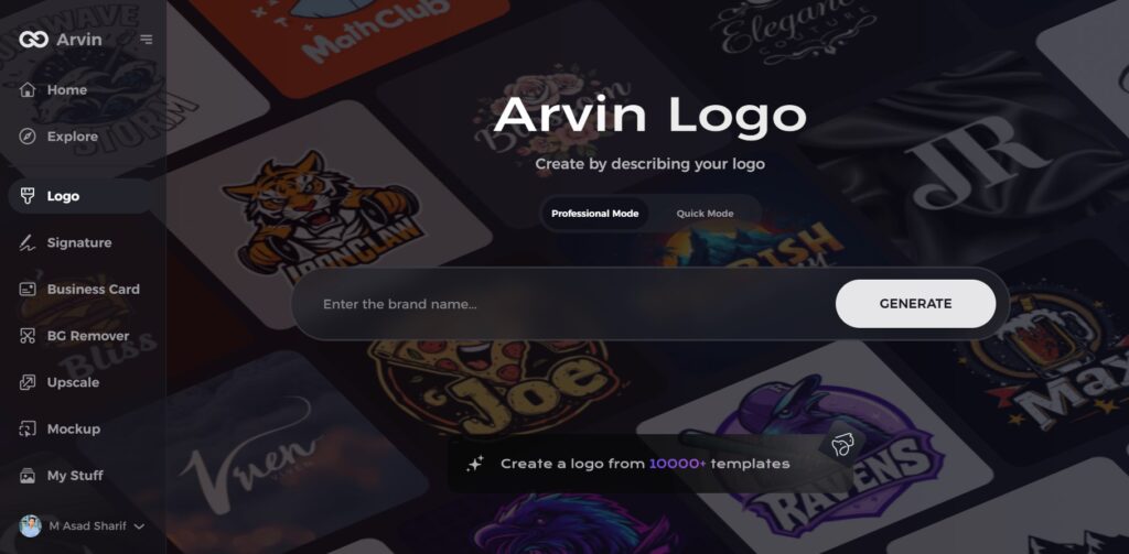
Step 1: Visit the Arvin AI Website
Go to the Arvin AI logo maker page using your web browser to start designing your logo.
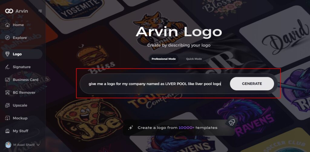
Step 2: Enter Your Business Details
Provide key information like your business name and category. This helps the AI generate designs tailored to your brand.
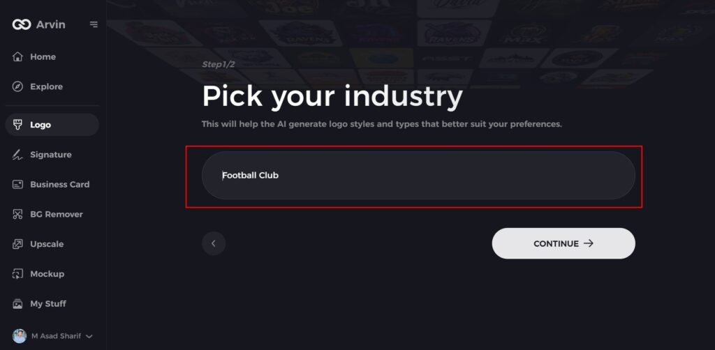
Step 3: Choose Your Industry
Select an industry from the given options. This helps the AI refine the logo styles to match your business type.
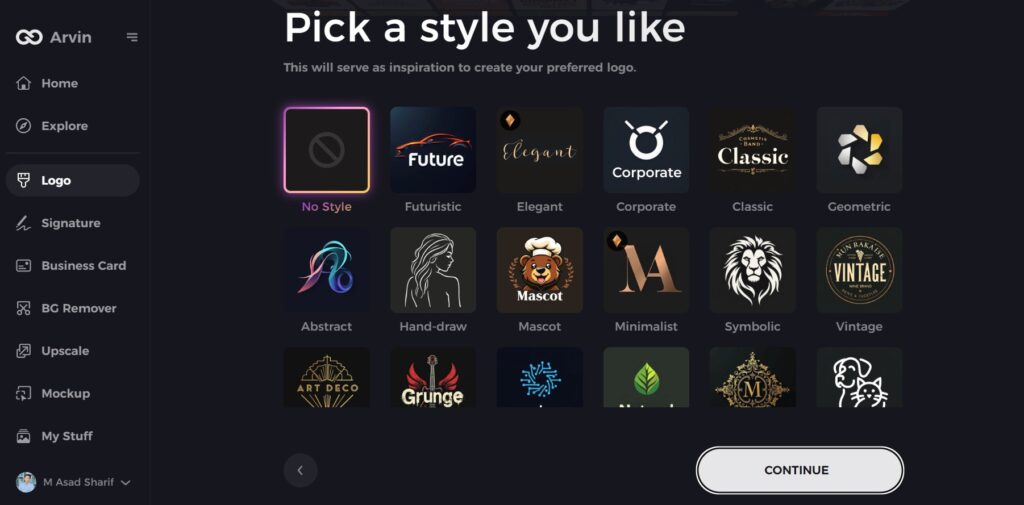
Step 4: Select a Style
Browse through the available styles and pick one that fits your brand’s vision. If you’re unsure, skip this step, and the AI will choose a default style.
Step 5: Explore Logo Ideas
Arvin AI will generate multiple logo concepts based on your inputs. Review the options and choose the ones that best represent your brand.
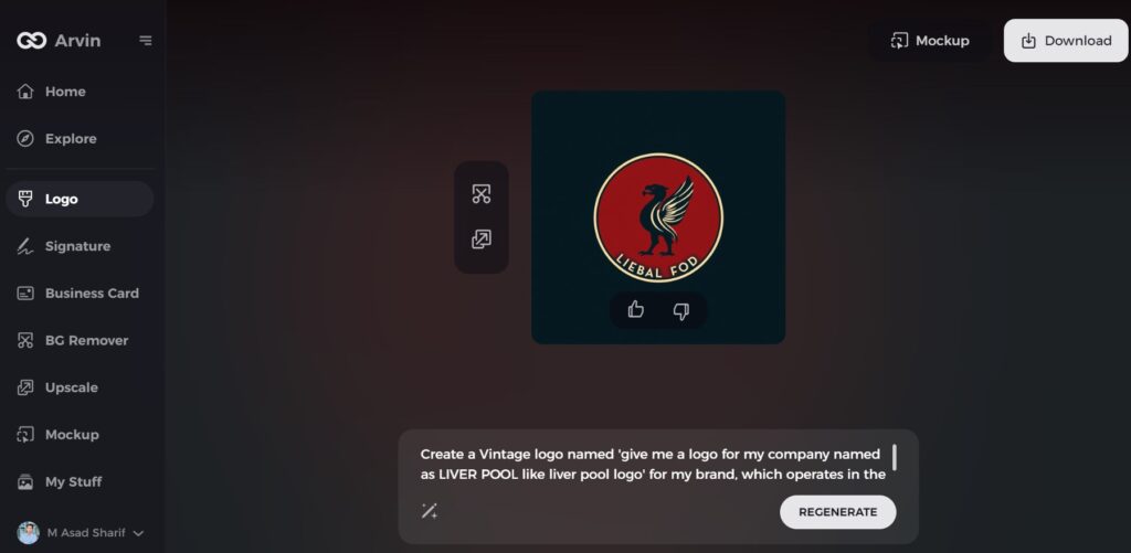
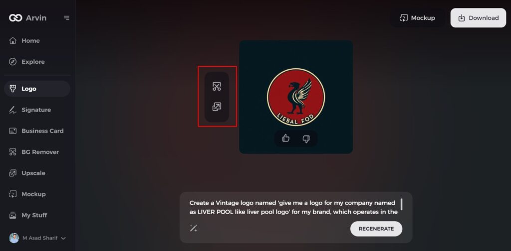
Step 6: Customize Your Logo
Adjust colors, fonts, icons, and layout to match your brand identity. Make changes until you satisfied with the design.
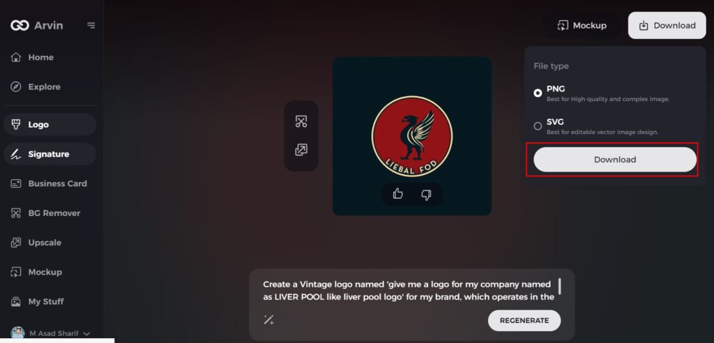
Step 7: Download Your Logo
Once finalized, download your logo in PNG or SVG format for use on websites, social media, and printed materials.
Conclusion
The UPS logo has been re-designed several times throughout the years, staying current with the fashion of the times and still conveying its trust, reliability, and excellence philosophies. The re-designs indicate UPS’s vision to be a modern company and have a strong and visible brand. The color scheme, typography, and icons utilized in the logo assist in projecting the company’s goal of delivering on time and securely. you need a killer business logo, then you are in the right place with Arvin AI. It provides editable templates, intelligent AI ideas, and an easy interface.
FAQs
How many times has the UPS logo changed?
The UPS logo has been updated numerous times since 1916 to adapt to modern trends in branding while maintaining its basic essence.
What does the shield in the UPS logo symbolize?
Through its protective symbol UPS demonstrates both reliability and trustworthiness which aligns with its quality commitment to secure on-time package delivery.
Why does UPS use brown as its signature color?
UPS utilized brown as the color for its logo and trucks to represent professionalism, sophistication, and functionality since brown hides dirt and appears clean.
How can I create a professional logo like UPS?
You can utilize Arvin AI, an advanced logo creator with AI-driven suggestions, editable templates, and color palettes to create a unique brand identity.
