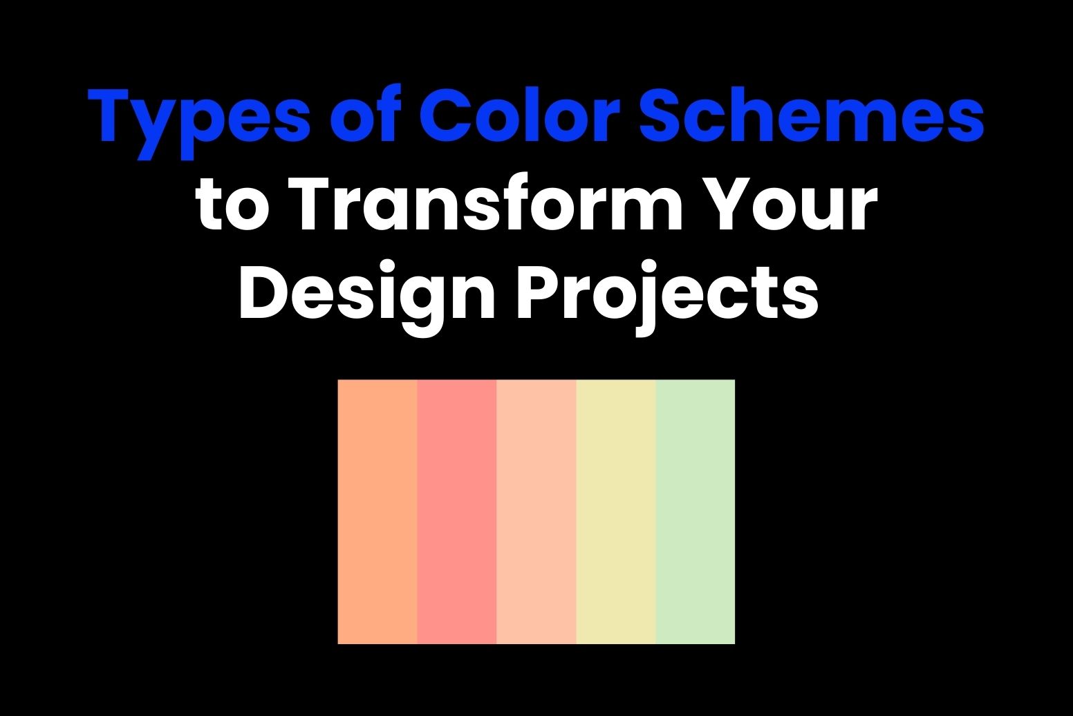
Color schemes are used to determine the visual communication with audiences through the design. Color schemes make websites look great and have a great appeal for any graphic artwork or interior design. Mastering the use of color combinations can help one transform design projects into wonderful ones. It is the correct use of color schemes which brings about beauty, defines mood, enhances branding, and creates a better user experience. This guide covers many types of color schemes providing insight into their application advantages and challenges.
Part 1: What is a Color Scheme?
A color scheme is a deliberately chosen group of colors in a design to evoke a particular look or atmosphere. It is actually defines the visual identity that defines. Branding, web design, or artwork, color schemes can build harmony, contrast, and emotional effect. Knowing about types of color schemes and how colors should be combined is a necessary skill to make cohesive, attractive designs.

Importance of Color Schemes in Design
Color schemes unify the visual, enhance readability, and provide ambiance; hence, they form a major part of both web and graphic design as well as even interior design. Well-designed color schemes ensure cohesiveness, communicate ideas perfectly, and capture the audiences’ eye.
Effect of Color Scheme on User Experience
Colors influence moods and behaviors. Warm colors create energy and passion, whereas cool colors bring about a feeling of calmness and trust. In branding, consistent use of palettes will only strengthen recognition and identity. For user experience, harmonious colors will make navigation easier, while clashing palettes confuse or repel users.
Part 2: Types of Color Schemes
Color schemes are crucial when it comes to designing visually rich and harmonious designs. Whether novice or an experienced designer, recognition of the various types of color schemes will allow you to make informed decisions that contribute to enhancing your work, from minimalist fonts designs to big, high contrast visuals. Each types of color schemes has distinct characteristics, pros and cons, and the best uses for it; thus, let’s go through the most widely used ones and consider their best application in different design contexts.
Monochromatic Color Scheme
The variation of the use of single type’s colors, shades, and tones would result in monochromatic. This simple and coherent scheme will be perfectly suitable for minimal designs. However, on the other side, some benefits such as coherence and easy usability may go with an insignificant lack of contrast and interest. For minimalist fonts web design, art, or branding, such schemes may best represent clean unified aesthetics which would not shock the audience’s eyes with too many images and colors.

Analogous Color Scheme
Analogous color scheme is that which uses colors next to each other on the color wheel. These types of color schemes can give a harmonious soothing effect because they have almost similar tones, which therefore give a unified and balanced look. It gives a calm, natural feel; however, it can be monotonous easily. This scheme is quite common in designs that are trying to be natural, earthy, like with nature-themed websites, wellness branding, or soothing color palettes for interior design.

Complementary Color Scheme
Complementary color schemes utilize colors opposite each other in the color wheel, including blue and orange or red and green. Such types of color schemes combinations cause a high contrast and strong visual interest. The benefit to complementary colors is that it provides a dramatic, ‘grabbing your attention’ effect, but sometimes does clash visually unless balanced right. Complementary color schemes are best suited for designs that have to make a statement, such as in bold cool logos, high-contrast advertisements, or designs meant to stand out and grab attention.

Split-Complementary Color Scheme
The split-complementary color scheme is a variation of the complementary scheme. Instead of using two opposite colors, it combines one base color with the two colors adjacent to its complementary color. It is friendly for beginners since it gives a high contrast but not the intensity of opposite colors. It is popularly used in logos, posters, and digital art where there is a requirement for a beautiful and balanced design without the harshness of complementary pairing.

Triadic Color Scheme
Triadic types of color schemes have three colors that are evenly positioned on the color wheel and often give a bright yet well-balanced look. Such a scheme provides diversity in color while maintaining harmony. The benefits include a dynamic design that is still cohesive in the eyes, though it requires careful balancing not to overpower the colors one over the other. It is ideal for projects which need vibrant and balanced designs such as branding, modern art, and lively websites.

Tetradic (Double Complementary) Color Scheme
The tetradic color scheme uses four colors, consisting of two complementary pairs. This is a rather complex, rich scheme which can produce highly exciting and beautiful designs. The danger lies in achieving balance among four colors to prevent the picture from becoming messy, yet, when successfully done, it will provide an excellent balance of harmony and appeal for the palette. This palette is perfect for creative and experimental projects – for example, illustrations, graphic design, or packaging.

Part 3: How to Choose the Right Color Scheme
Color schemes happen to be the heart of designs, as color effects, directly or indirectly influences aspects such as aesthetics and UX. The correct selection requires the proper strategy for its ability to suit your purpose and help find a good relationship with a desired target audience to branding. Some key points, tools, and guidelines in making harmonious color palettes with substantial influence are discussed below:
Factors to consider:
Purpose of Design:
The purpose of a design decides the tone of its color palette. For instance, while a healthcare website might require gentle blues and greens, the same sports brand could take up bold and energetic hues like red or yellow for its website. Knowing what the design intends to achieve in terms of educating, entertaining, or persuading will help decide your selection.
Target audience:
Audience demographics and preferences are also crucial in color schemes. Age, culture, and personal tastes play a role in how people perceive colors. Bright and playful colors are appealing to children, while muted and sophisticated hues may appeal to more mature audiences. For example, cultural differences in the symbolic meaning types of color schemes such as red, which means luck in China but danger in Western cultures, need to be taken into account.
Branding and Identity:
The selected colors are those that fit the brand character and identity. Uniform color usage on different media channels means greater recognition and trust. Thus, an eco-friendly branded organization would use green to suggest nature, while a brand associated with luxury would settle on black and gold suggesting exclusivity.
Tools For Selecting and Testing of Color Scheme
Selecting and finding the right color is quite a challenge, and different tools make it easier for selection and testing. For instance, you could find the right combination by checking for contrast and making a harmonious color palette for logo design, a website, or branding project. Inspiration and precision can be yours to create appealing and coherent designs that work well within your brand’s goals. Color schemes are now easier to try out with modern tools and technology.
- Adobe Color: A strong tool for generating color schemes based on different rules, such as complementary or analogous. Adobe Color also works well with other Adobe software, making the design process easier.
- Canva Color Palette Generator: This application allows designers to upload an image and then derive a color scheme from that image. It is quite handy for inspiration and to make sure that the designs go along with the visuals already present.
- Coolors: One of the best tools to make, save and share custom palettes is Coolors. Its features are user-friendly in checking out various combinations and testing their harmony.
- Paletton: It makes for a perfect tool to try different color schemes. Interactive options are available in checking complementary, triadic, and tetradic combinations.
Tips for Achieving Balance in Designs
A good design involves the balancing of colors to elicit the right emotions and ensure readability. Here are some practical tips:
- Using no more than three primary colors in a design keeps it simple and coherent. You can add depth using tints, shades, and tones of these colors.
- High contrast between text and background makes reading easier. For instance, black text on a white background is clear, while low-contrast combinations make the viewer’s eyes work.
- Neutral colors like white, gray, and beige serve as balancing elements in busy designs. They provide visual relief and draw attention to focal points.
- Colors may appear differently on screens, print, and under varying lighting conditions. Testing your palette ensures consistency and effectiveness across all formats.
Part 5: Common Mistakes to Avoid with Color Schemes
Although understanding how to choose a color scheme is important, knowing common mistakes will save time and frustration. Below, we discuss common pitfalls and how to avoid them.
Overuse of Bright Colors
Bright colors can be very attention-grabbing; however, too much use will overwhelm the viewer and distract from the message of the design. For instance, a site full of neon colors can lead to visual fatigue and will scare users away. Bright types of color schemes should be used only where they are really needed to emphasize call-to-action buttons, for example, and the rest of the design should be well-balanced and comfortable.
Ignoring Cultural and Psychological Meanings of Colors
Colors carry cultural and psychological meanings that affect perception. Failure to consider these can lead to unwanted effects. For example, while the suggestion of white is purity in many Western cultures, sadness symbolizes it in others; red can bring up exciting passion in one but aggression in another. For this reason, looking for the cultural meaning or, more importantly, how each color will be felt is essential to achieving impact amongst your target audience.
Lack of Contrast and Readability
Poor contrast between elements results in designs that lack clarity and accessibility. Light gray text on a white background might look great, but it is basically impossible to read for most visually impaired users. Use contrast checking tools to avoid such problems, making sure that foreground and background elements are differentiated proper. Accessibility guidelines like the WCAG standards help one benchmark the readability improvements that need to be done.
Overcomplicating Designs with Too Many Colors
Using too many colors makes a design look confused and not professional. As much as it is tempting to try different palettes, working with a few, consistent hues will give better results.
For instance, a simple website with three selected types of color schemes will probably have more of an impact than a site overloaded with ten conflicting colors.
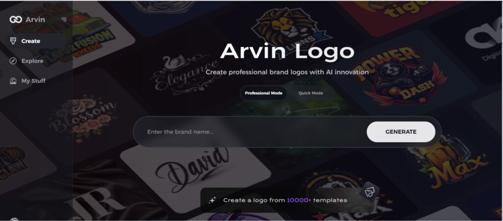
Part 4: Meet Arvin AI – Your Partner in Professional Logo Creation
A professional and unique logo is a must for a business to stand out in the crowd. Our platform, Arvin AI, is a super tool powered by AI giving businesses and designers the exact logos to reflect their brand properly. Whether you are new or a professional designer, Arvin AI is that one ultimate tool to make stunning logos easy to make.
Key Features of Arvin AI
- AI logo concepts: With Arvin AI, get creative and unique professional logo designs based on your brand vision.
- Customizable templates: You can fine-tune your fonts, colors, and icons after generating a logo to suit your brand’s specific identity. Whether modern or classic, customization options abound.
- Live previews: See how your logo looks on business cards, websites, and social media pages instantly.
- User-friendly platform: Arvin AI is designed to be intuitive, making it easy for both beginners and experienced designers to navigate.
- Export ready: After perfecting that dream logo, Arvin AI lets you export those creations into various formats, including for websites, social media, and print media without breaking a sweat.
Steps to create logo with best color schemes
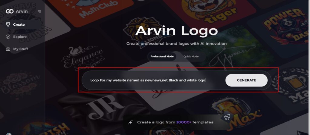
Step 1: Sign Up and Log In to Arvin AI
Go to the Arvin AI website, sign up, and log in to access its design tools.
Step 2: Provide Brand Details and Preferences
Enter your brand name, slogan, and industry. Share your design preferences, including font styles and visual themes, to guide the process.
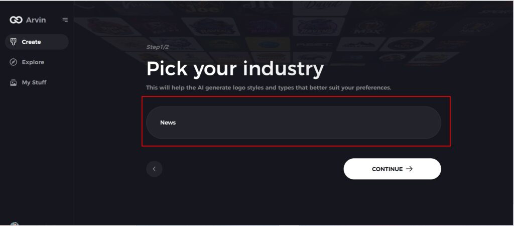
Step 3: Choose Your Industry
Select the industry or niche your brand belongs to. This helps Arvin AI tailor logo styles and color schemes that suit your specific needs.
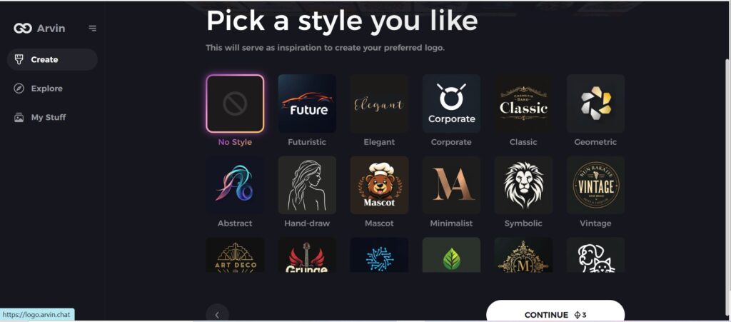
Step 4: Select a Design Style
Pick a style that aligns with your vision. This choice will inspire the AI to create logo options that reflect your desired aesthetic.
Step 5: Personalize Your Logo with Arvin AI Tools
Once the AI has provided logo suggestions, customize the logos using the tools on Arvin AI. The font styles, layouts, symbols, and color scheme should be able to mirror your brand’s identity.
Step 6: Save and Download Your Final Design
Review your finalized logo design, save it, and download it in high-resolution formats for print and digital use.
Conclusion
Types of color schemes are a very dramatic role in determining a brand’s identity and visual effect. A color palette, well chosen, may make users feel a certain emotion, improve your brand recognition, and ensure for all users in terms of accessibility. Arvin AI tools like AI powered logo creation, real time preview and customized templates ease designing whether you are a beginner or are a pro. You get to craft logos that truly represent your brands’ vision, and with Arvin AI it’s effortless and takes time and effort out of the designing process.
FAQS
What is the recommended color scheme for beginner designer?
Analogous or monochromatic are good schemes because these color schemes are balanced so much easier, making less efforts with a harmonious-looking look.
How do I ensure my color scheme is accessible?
You can use tools like to test the readability of your types of color schemes, so it works for people with color blindness and other visual impairments.
Can Arvin AI help with branding-specific color schemes?
Yes, Arvin AI gives you customized color palettes based on your brand values and target audience so that your color scheme aligns with your business identity and goals.
