Believe it or not, a good logo is that balance is important. Design speaks a lot. Draw reactions from potential customers and tell them who and what you are doing. The right layout, the right color and the right style are the core of symmetrical logos and can make a strong impression on the audience. There are many styles and design formats that can be used to visually express a brand in the form of a logo. Choosing the right logo type involves different elements depending on the brand’s characteristics, industry and audience.
Part 1: What is symmetrical logo?
Symmetry means to reflect half the design in half or in a mirror. In other words, both sides look the same. When it comes to logo design, symmetry may include the entire design, or may include a part of the design. Symmetrical design is very satisfying. Some experts believe that the brain is attracted to the order and repetition that symmetry brings, especially in design. Here we have compiled the guide about Logo Shapes and Impact on Brand Identity: Design Trends and Tips. Symmetry design may be worthy of the logo of your company that wants to draw a trusted brand.

Part 2: Why choose symmetrical logo?
However, symmetry is not the only tool that designers can use to communicate complex information to their customers. The Nintendo Switch logo is not completely symmetrical, but still looks balanced and symmetrical. Learn more about the Wordmark Logo: Design Principles for Brand Success. The symmetry logo has several attractive benefits that are perfect for brand expression:
- Timeless charm: The balance and harmony of the symmetry logo is timeless and lasting. It will not easily become an epidemic delay, and it will not lose its appeal after many years.
- Professional and reliable: Symmetry conveys professionalism and trust. Show accuracy and attention to detail, and call for consumer empathy.
- Easy to recognize: Symmetry logos are easy to recognize, allowing customers to quickly recognize and connect brands.
- Flexible branding: The symmetry logo works effectively on a variety of platforms, from business cards to signage, for consistent branding.
Part 3: Types of Symmetrical Logos
If you are thinking about symmetrical logo design, there are various approaches. Here are four types of symmetry logos and the most popular brands with logos that fall within the design category.
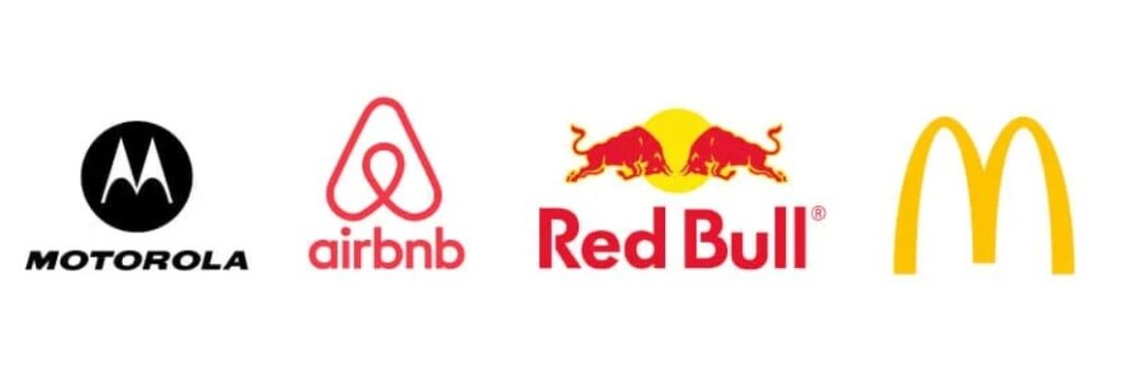
Reflective symmetry logo
If you can divide the logo in half and both halves are the same, the logo is reflective. When the reflective design is folded vertically, it becomes a mirror image. It is the simplest logo design, but it can make a big impact.
- McDonalds: The famous Golden Arch of this fast food store is equally distinctive as a monogram representing McDonald‘s “m.”
- Motorola: Another “m” monogram logo, the symmetrical letters of Motorola wrap an arch like the top of a mirror image in a circle.
- Airbnb: Design combining four symbols: location icon, upside-down heart, reach.
- Redbull: Two bulls fighting in front of the sunset represent the energy drink logo expressing the vitality and power of the brand.
Rotational symmetrical logos
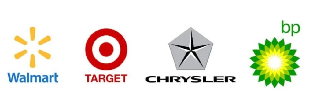
When the logo is rotated, it looks exactly the same shape every time it rotates. Think of hexagons and starfish – whatever direction they rotate, they always look the same.
- Walmart: All six spokes of Walmart’s spark are identical at equal intervals, creating the rotational symmetry of the mark.
- Target: The target bullseye target symbol literally represents the name of the beloved retail store. A simple circle is surrounded by an outer ring, creating the same icon no matter how you turn it.
- BP: Flowers symbolize the natural and energy of gas companies. White, yellow, light green, green and various colors are used, but they are completely symmetrical.
- Chrysler: The Chrysler star on the pentagon shield has no complete rotational symmetry, as in other examples, but can still be counted.
Parallel symmetry logos
Translational symmetry is not an accurate reflection that can be divided as in the first two examples, but it provides repeated design elements. Here you many know about Vintage Fonts: Best Free & Premium Fonts for Timeless Designs. Translational symmetry is to move one design element in the logo to another area without changing its symmetry.
- Audi: The silver ring of this automotive brand is the same four iterations as the interlocking chain logo.
- PBS: The logo of the public broadcaster is repeated in the shape of three horizontal faces in the circular emblem.
- Exxon Mobile: This logo of the Exxon Mobil Natural Gas Company uses repeated “x” as an eye-catching example of a parallel symmetrical logotype.
- Olympics: The five repeated Olympic rings represent the five major regions of the world that participated in the competition when the Olympic logo was designed in 1913.
Glide Reflective Symmetry Logo
This is not the most common logo symmetry because it is a little complicated. Glide reflection symmetry means reversing half of the image, creating reverse symmetry on the other side, and moving forward so that those reflections are not aligned. For example, if one of the bulls in the Red Bull logo is flipped up or down, and the other bull hangs under the standing horizon, it becomes gliding reflective symmetry rather than reflective symmetry.
- Feetsutra shoes: One of the best examples of glide reflection symmetry is footprints. Each footprint is reflected forward, creating an inverted symmetry pattern.
- BMW: The shape of the BMW logo is rotational symmetrical, but the coloring is inverted. For this reason, the BMW logo is a glide reflection symmetry with blue above one half and blue below the other half.
- Hyundai: The oblique “h” in the ellipse of the Hyundai logo is diagonal, and when the logo is divided vertically and horizontally, it becomes a reverse reflection.
Part 4: Benefits of symmetrical logo design
The balance of symmetrical logo design is comfortable, calm, and a basic relationship of trust is established with nature. Many people are attracted to symmetry design because it has a sense of balance. Symmetry logo brings some visual benefits:
- Balance: Balancing is not stagnant. Reflective symmetry has a firm balance, and rotational symmetry and glide reflection symmetry simulate fluid movement in the design.
- Aesthetically beautiful: The visually balanced design is aesthetically beautiful. I feel beautiful and attractive because it makes sense to our hearts.
- Reliable: Symmetric design gives meaning to the mind at the subconscious level. Therefore, it feels like a logical design choice, and you can show your company on the ground.
- Predictable: Symmetrical designs (especially reflective and parallel symmetry) provide predictable design patterns.
- Stability: The above benefits of symmetry design ultimately bring a sense of stability. When a brand shows stability, people try to follow that sense of trust and believe.
Part 5: The Future of Symmetrical Logos in Branding
Symmetry is an age-old element in design, but its application in branding just keeps on increasing. Given the increasing competitive landscape of a business, there has been immense demand for universally resonated logos. The symmetric logos stand to remain in the future as the demand for symmetric logos increases, owing to a single glance at the logo-ability to create trust and balance clarity.
Emerging Trends:
Minimalism continues to lead the way in logo design, with symmetry playing a role in creating clean and modern visuals. This trend focuses on simplicity, where everything has a purpose and nothing unnecessary is included. With businesses looking to make an impression without distractions, symmetrical minimalistic logos are emerging as the gold standard.
Role of AI:
Arvin AI is revolutionizing the field of logo design, and this transformation is largely in terms of automation and accuracy. Therefore, such technologies make symmetrical logos creation easier to achieve in impact. Secondly, simplification aside, AI aids creativity by proposing various alternatives for designers.
Why Symmetry Will Stay Relevant?
Symmetry will always be in fashion with its connection to balance and stability. The more a brand strives for simplicity and clarity, the more symmetrical logos will be used. Other than aesthetic appeal, symmetry designs are flexible, easily transferred to different media, and worldwide, recognized as symbols of trust and professionalism.
Part 6: Arvin AI: A Tool for Perfecting Symmetry in Logos
Symmetry is a characteristic of good logo design, but perfect balance is hard to attain. This is where Arvin AI comes in. Arvin AI is a new design tool that generates an easy and precise way towards symmetrical logos. Using Arvin AI would thus make the process of coming up with symmetrical logos more streamlined and user friendly. Whether you are a professional designer or a beginner, Arvin AI makes the process easier and guarantees you professional results every time.
Key Features of Arvin AI:
- AI-Driven Assistance: Provides real-time suggestions to enhance symmetry and balance in logo designs.
- Industry-Specific Insights: Design Elements According to Your Industry and Target Group
- Live Adjustments: Instant modifications with a preview, so your design looks perfect and professional.
- Template Library: Libraries of templates that can be customized according to the uniqueness of your brand.
- Tools for Precision Alignment: To ensure every element is in the proper position without being unbalanced on the design side.
- Color Palette Optimization: Suggests harmonious color schemes to enhance the logo’s visual appeal.
Steps to Use Arvin AI for making Logo
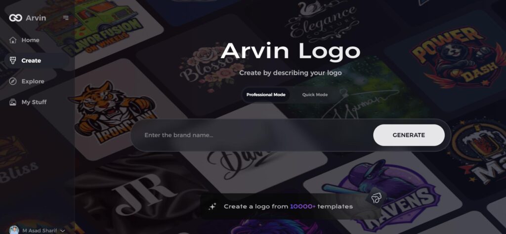
Step 1: Visit the Arvin AI Logo Design Tool
Go to the logo creation page on the Arvin Logo Maker website to begin designing your symmetrical logo.
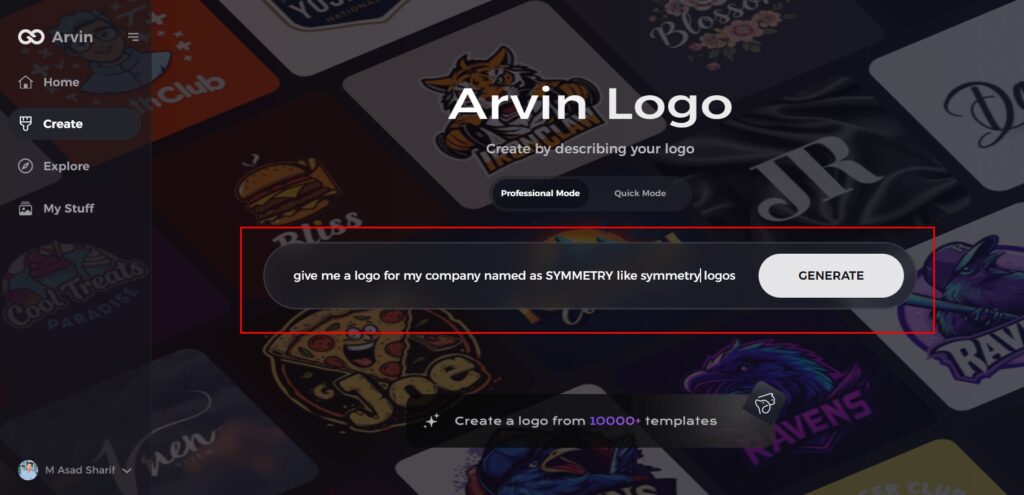
Step 2: Enter Your Business Details
Provide essential information about your business, such as its name and category, so that Arvin AI can generate logos tailored to your brand’s identity.
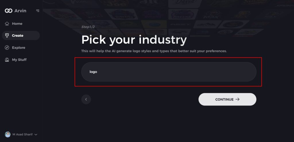
Step 3: Select Your Industry
Choose your industry from the list. This step helps refine the logo styles and design elements to better match your business sector.
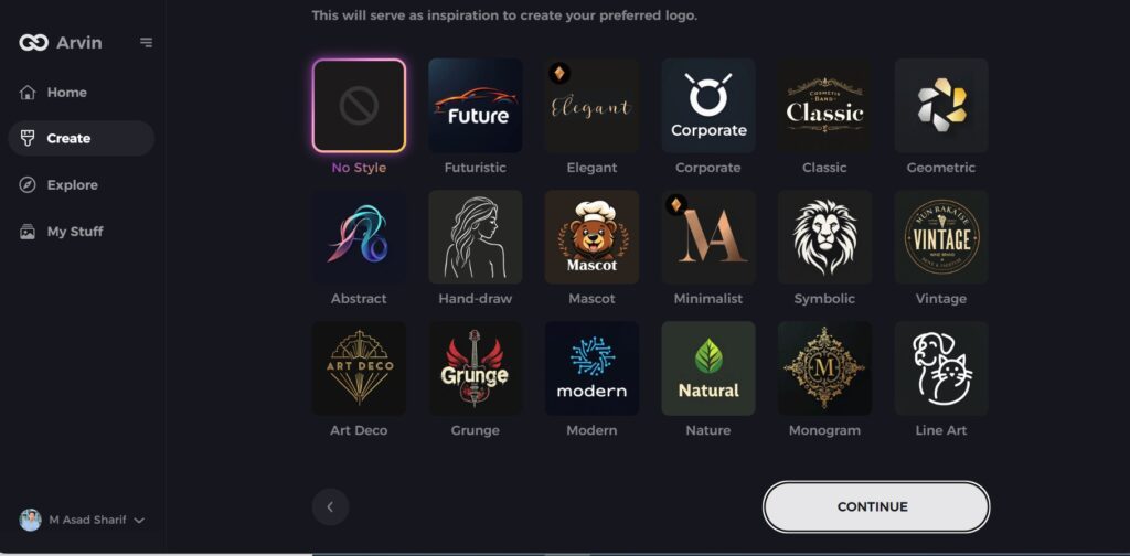
Step 4: Choose a Logo Style
Browse through available design styles and pick one that aligns with your brand’s vision. If unsure, you can skip this step and let Arvin AI generate a logo based on default inspirations.
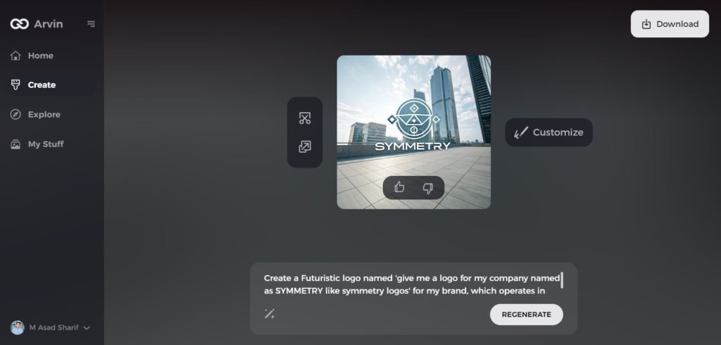
Step 5: Review Logo Ideas
Arvin AI will create several logo concepts based on the information you provided. Review the options and select the designs that best reflect your brand’s image.
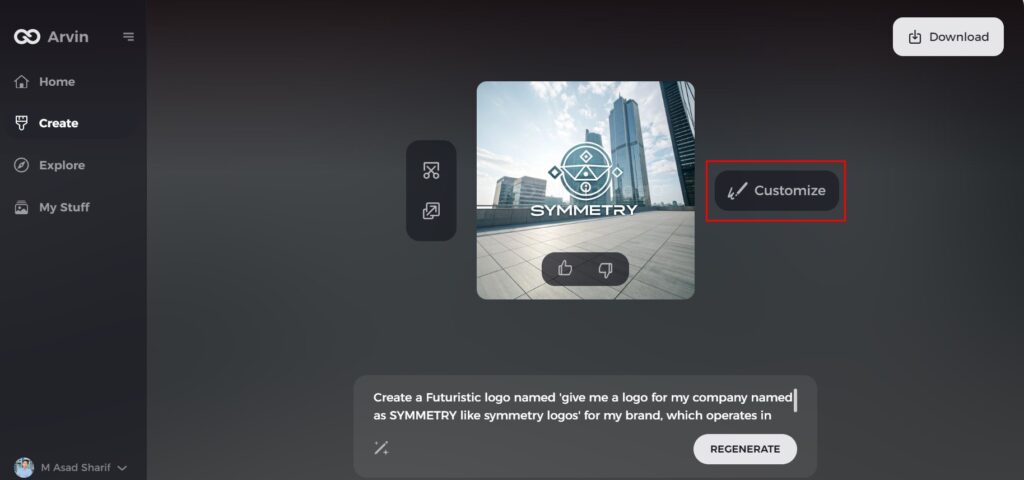
Step 6: Customize Your Logo
Make adjustments to your chosen design, including colors, fonts, icons, and layouts, to further personalize it according to your brand’s unique style.
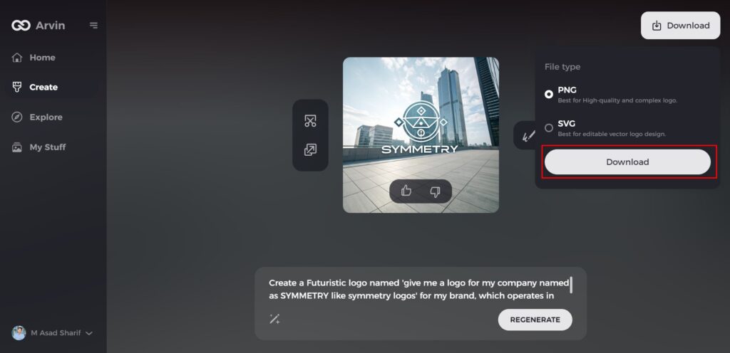
Step 7: Download Your Logo
Once satisfied with the final logo design, download it in high-quality formats like PNG or SVG, ensuring it’s ready for use on your website, social media, or printed materials.
Part 7: Avoid Common Mistakes in Symmetrical Logo Design
A symmetrical logo can be very striking and pleasing to the eye, but it does require a lot of detail. Even the slightest misstep may disturb the balance and effect of your design that may finally compromise its quality at the professional level. Let’s discuss the commonest mistakes by designers during symmetrical logo creation.
- Overcomplication of the Design: Too many elements make the logo too busy. Keep it simple for better recognition.
- Not Considering the Brand’s Message: Make sure the design’s symmetry fits the brand’s values and goals.
- Not Testing Across Formats: Always test the logo across various sizes and formats for effectiveness across different mediums from business cards to billboards.
Conclusion
The symmetrical logo is always an attractive aspect, and thus, is favored by businesses seeking permanent impressions. The latest emerging trends such as minimalism and AI-driven design tools like Arvin AI redefine the possibilities of creativity. In this scenario, the concept of symmetry still speaks of clarity and professionalism. With symmetry, brands can craft logos that speak to their audiences on the deepest possible levels while ensuring they are unique in competitive markets and relevant for years to come.
FAQs
What is the main advantage of using symmetrical logos in branding?
Symmetrical logos create a sense of balance, stability, and trust, making them more memorable and visually appealing to consumers.
Can a logo still be effective without symmetry?
Yes, logos without symmetry can be effective if they convey the brand message clearly. However, symmetry often adds a professional and trustworthy element to a brand.
How do I know if a symmetrical logo is right for my brand?
Consider your brand’s values: if your brand emphasizes stability, trust, and professionalism, a symmetrical logo is an excellent choice.
Can Arvin AI help me design a symmetrical logo?
Yes! Arvin AI uses advanced algorithms to help you create perfectly symmetrical logos with personalized adjustments to suit your brand’s identity.
