Sony has made its mark in various domains, consistently pushing the envelope across a broad spectrum of industries. Sony revolutionized portable music with its groundbreaking personal audio device, the Walkman, changing the way people listen to music on the go. Moreover, Sony’s influence stretches into the digital entertainment sphere with its PlayStation consoles, which have become a staple in the gaming community, offering immersive gaming experiences and driving innovations in interactive entertainment. Needless to say, the Sony logo is one of the most recognised in the world.
Beyond entertainment technology, Sony’s expertise extends into professional audio and filmmaking equipment, enhancing the creative capabilities of professionals around the world. Both amateur and professional photographers favor Sony’s Alpha range cameras for their cutting-edge technology.
Logos evolve, and so should yours! Just as Sony continues to refine its branding for new technologies, your business needs a modern, future-proof logo. AI-powered design makes it fast, simple, and professional. Get started with Arvin AI Logo Designer today!
History of Sony
Founded in post-war Japan in 1946 by Masaru Ibuka and Akio Morita, the company originally named Tokyo Tsushin Kogyo (Tokyo Telecommunications Engineering Corporation) started in a bomb-damaged department store building in Tokyo. It began with a start-up capital of only 190,000 yen and approximately 20 employees.

Sony’s first product was a rice cooker. Although not particularly successful, it marked the beginning of the company’s innovative ventures. The real breakthrough came in 1950 with the production of Japan’s first tape recorder, the Type-G. However, the world had yet to recognize Sony’s name.
1955-1979
In 1955, Sony produced the first Japanese transistor radio, the TR-55, marking its entry into the portable electronics market. This move was significant. It began to set Sony apart as a company capable of miniaturizing electronic devices. This trait that would become one of its hallmarks. Recognizing the limitations of its original name in the global market, the company officially changed its name to Sony in 1958. It is a neutral term easy to pronounce in many languages. It reflected sound and sonic experience, hinting at its audio technology focus.

The 1960s and 70s were a period of rapid expansion and innovation for Sony. In 1960, it introduced the world to the first direct-view portable transistor TV, the TV8-301. The company continued to innovate with the launch of the first Videocassette Recorder (VCR) in 1969 and the famous Walkman in 1979, revolutionizing the way people listened to music on the go.
1979- Now
The 1980s and 1990s saw Sony embracing the digital revolution. It was instrumental in developing CD technology. Along with Philips, it launched the PlayStation in 1994. This would become one of the most successful gaming consoles in history. The introduction of the PlayStation marked Sony’s significant entry into the gaming industry.
Entering the new millennium, Sony faced several challenges, including intense competition in all its major sectors and financial struggles. In response, the company underwent various restructurings and focused more on its core competencies—electronics, entertainment, and gaming.
Need a logo? Let AI do the work! Try Arvin AI Logo Designer now!
Sony Logo History
Sony Logo Old
1946-1954
One of Sony’s earlier designs, used from 1946 until the mid-1950s. This emblem is quite distinctive compared to the simple typographic logo that Sony is known for today. The design features a bold geometric shape within a circle. It consists of a trapezoid with a longer base at the top and an inverted triangle beneath it. They both connect at a single point.
Sony designed this logo while operating as Tokyo Tsushin Kogyo (Tokyo Telecommunications Engineering Corporation). The abstract and somewhat industrial design reflects the innovative and forward-thinking approach of the company during its early years.
This logo predates the more well-known Sony logo designed by Yasuo Kuroki. The logo came into use in the late 1950s when the company adopted the name “Sony.”
1955-1956
This design leverages a sharp, angular typeface, arranged within a geometrically constrained, vertically oriented rectangular frame. The typeface itself is particularly notable for its dynamic, slanted lines which evoke a sense of motion and progress.
From a technical design perspective, the logo uses high contrast with stark black text against a plain background. This optimizes its visibility and impact. The designer stylized the text with sharp vertices at the junctions of the letters. It enhances readability but also injects a modern, tech-savvy feel into the overall design.
The use of a rectangular frame adds an additional layer of structure. It frames the text to focus the viewer’s attention directly on the brand name. This is a clever technique as it creates a contained space. It makes the logo more versatile and easily recognizable across various media platforms.
The angularity of the typeface in this logo suggests a departure from traditional, rounded typefaces. People often perceived these as softer and more approachable. Instead, Sony opted for an edgier presentation in this iteration. This possibly aimed to appeal to a more contemporary audience or to stand out in the competitive electronics and entertainment industries.
1969
The Sony logo uses a custom, sans-serif typeface that has been meticulously designed for high readability and brand recall. The letters are uniform, with subtle optical corrections to ensure that each character appears balanced within the overall wordmark.
Typically rendered in black, the logo uses a monochromatic scheme that lends versatility. This allows for use across various media without losing its impact.
The boldness of the typeface ensures that the logo remains legible. Even when viewed from a distance, or when scaled down for smaller applications. The simplicity of the design suggests transparency and reliability—traits that resonate well with consumers in the technology sector.
Think about the most memorable brands. What do they all have in common? A strong, recognizable logo. Sony, PlayStation, and countless other top brands have invested in logos that stand out and tell a story. Now, you can do the same without hiring a designer. With Arvin AI Logo Designer, you get a professional logo in minutes—no design skills needed! Try it today.
Sony Logo Design
This particular rendition of the logo features the word “SONY” in a distinctive, bold typeface that is instantly recognizable worldwide. The logo’s history traces back to the company’s post-World War II. It was founded in 1946 when Sony was originally known as Tokyo Tsushin Kogyo.
The transformation from a company logo to the emblematic Sony brand as we know it today was driven by co-founders Akio Morita and Masaru Ibuka. They sought a universal appeal that transcended linguistic barriers, leading to the adoption of the name “Sony” in 1958. This name was chosen for its simplicity, ease of pronunciation, and the positive connotation of “sonus”. This, in Latin, meant sound, reflecting the company’s origin in sound engineering.
Over the years, the Sony logo has undergone several refinements to align with contemporary aesthetics while maintaining its core identity.
Yasuo Kuroki was a noted graphic designer for Sony. He played a pivotal role in the evolution of the logo’s design during the mid-20th century. His contributions ensured that the logo not only represented the technological ethos of Sony but also its forward-thinking philosophy.
Despite subtle changes over the decades to adapt to evolving design trends, the fundamental aspects have remained unchanged.
Sony Logo Meaning
Co-founders Masaru Ibuka and Akio Morita chose to register “Sony” as the company’s global brand in 1955. They were keenly aware of the challenges Japanese products faced in Western markets, particularly post-World War II. This was a period when Japanese goods were often perceived as cheap and of low quality. The founders wanted a logo that conveyed a different narrative. A symbol of quality, reliability, and cutting-edge technology.

The iconic bold typeface used in the Sony logo was designed to be immediately recognizable. Its unembellished lettering was intended to communicate strength and reliability. This was crucial for a company striving to establish itself globally amidst prevailing stereotypes about Japanese manufacturing.

Interestingly, the design choices around the Sony logo also reflect a minimalist aesthetic. It has its roots in Japanese art and design, emphasizing simplicity and the elimination of unnecessary features. This is aligned with the Japanese philosophy of “less is more” or “Ma”. This is a concept that values the empty space between things as much as the things themselves. This philosophy influenced Sony’s logo and its product design, which tends to favor clean lines and user-friendly interfaces.
The PlayStation, Sony Interactive Entertainment’s flagship innovation, stands as a monumental figure in digital entertainment, transcending mere gaming to become a cultural phenomenon that has significantly shaped interactive media landscapes. Born from the visionary mind of Ken Kutaragi, often heralded as the “Father of PlayStation,” this powerhouse brand made its debut in 1994 under Sony’s banner. Since its inception, PlayStation has not only revolutionized gaming technology but also expanded its domain to encompass a comprehensive suite of consoles that have consistently set new industry standards.
Sony’s Success
Over the years, PlayStation has introduced several iterations, each more advanced than the last, with the PlayStation Network (PSN) emerging as a pivotal development in 2006. As of December 2024, PSN boasts approximately 129 million monthly active users, underscoring its massive global impact and enduring appeal. This robust network serves as a digital playground for gamers to purchase the latest games and engage in online play, further enriched by PlayStation Plus, which reported an impressive 47.4 million subscribers as of spring 2023.
Sony’s PlayStation 5, the latest in its line of state-of-the-art consoles released in November 2020, continues to uphold the brand’s legacy of innovation and superior gaming experience. With over 74.9 million units sold by the end of 2024, the PlayStation 5 exemplifies Sony’s dominance in the console market, starkly contrasting with competitors like Microsoft’s Xbox One, which has lagged behind with fewer than 50 million units sold. The PlayStation 4, launched in 2013, remains significant in the market, having surpassed 117 million units sold by mid-2022, showcasing the lasting popularity and high demand for Sony’s gaming products.
The PlayStation’s influence extends beyond hardware; its software sales are equally staggering. By the end of 2024, PlayStation 4 and PlayStation 5 software unit sales reached a combined total of 264.2 million units, emphasizing the expansive and thriving ecosystem Sony has cultivated. This ecosystem not only fuels the global gaming industry but also sets the pace for the future of gaming, continuing to innovate and adapt in a rapidly evolving digital world.
Sony Logo Playstation
The Sony PlayStation logo was designed by Manabu Sakamoto, a Japanese graphic designer known for his work on various Sony branding projects. Created in the early 1990s, the logo was intended to embody the three-dimensional gaming revolution that the PlayStation console introduced. The design consists of a bold, red “P” standing upright, combined with an abstract “S” rendered in blue, yellow, and green, creating an optical illusion of depth. This interplay of colors and shapes gives the logo a dynamic and futuristic feel, reinforcing Sony’s emphasis on cutting-edge technology and immersive gaming experiences.

The typography of the PlayStation wordmark is a custom sans-serif font with rounded letterforms and slightly condensed spacing, selected for its modern and highly legible appearance. The color scheme—red, blue, yellow, and green—was carefully chosen to signify diversity, creativity, and excitement, aligning with Sony’s vision of gaming as an engaging and varied entertainment medium. The spatial design of the symbol is particularly notable, as the stylized “S” appears to wrap around or lie beneath the “P,” creating an illusion of three-dimensionality without relying on shading or gradients. This was a direct nod to the 3D graphics capabilities of the original PlayStation, which set it apart from previous gaming consoles.
The Design Process
The development process for the logo involved extensive iteration, with Sony exploring over 20 different design concepts before finalizing the iconic version. Early prototypes experimented with monochrome schemes, alternative arrangements of the P and S, and various typographic treatments. The final choice struck a balance between visual impact, brand clarity, and adaptability across different mediums, ensuring that it would be instantly recognizable on game cases, consoles, and promotional materials. The logo was most likely created using vector-based design software such as Adobe Illustrator or CorelDRAW, which were standard tools in the early 1990s. This allowed for scalability without loss of quality, ensuring that the emblem could be effectively applied across a range of branding materials, from high-resolution print to screen displays.

Despite Sony transitioning to monochromatic wordmark-based logos with the PlayStation 2 and subsequent consoles, the original multi-colored PlayStation logo remains one of the most iconic designs in gaming history. It is still used in retro branding, anniversary editions, and nostalgic marketing campaigns, maintaining its status as a symbol of innovation and gaming excellence. The PlayStation logo is a prime example of a well-engineered brand identity that blends technical precision, artistic vision, and psychological impact, solidifying its place in the world of graphic design and entertainment branding.
Sony’s Influence
Sony’s core brand identity has remained largely unchanged since 1973 when it adopted its simple, bold sans-serif wordmark. Designed by Yasuo Kuroki, this logo was chosen through an internal competition, reflecting Sony’s belief in in-house creativity. The typography and design philosophy behind the PlayStation branding have evolved to maintain clarity, balance, and scalability. The PS1 and PS2 used a proprietary sans-serif font, designed to remain highly legible on low-resolution CRT screens. The PS3’s original Spencerian script-inspired font was later replaced due to readability concerns. The PS4 and PS5 adopted a standardized typeface based on the PS2’s design, ensuring visual continuity across generations. Sony has adhered to a geometric alignment system in its branding, ensuring letterforms and spacing remain optically balanced. The monochrome color scheme, combined with high contrast, maintains adaptability across different media, reinforcing Sony’s design consistency.
Sony has significantly influenced modern graphic design trends, particularly in the gaming and tech industries. During the early 2000s, Sony was among the first companies to adopt a minimalist, all-caps logotype, a trend that later influenced brands such as Microsoft Xbox, Samsung, and LG. The company’s branding consistency across PlayStation generations has set a benchmark for corporate identity in entertainment. Unlike Nintendo, which frequently changes its logo styles, Sony has maintained a recognizable visual language that strengthens brand recall. The PlayStation logo’s use of depth perception effects was an early example of branding that emphasized three-dimensional gaming, influencing later game industry visual identities.

Sony Logo Meaning
Sony’s logos often contain subtle visual symbolism. The PlayStation logo’s optical illusion was intentionally designed to emphasize the spatial depth of gaming worlds. Another example of hidden meaning in Sony’s branding is the VAIO logo, introduced in 1996, which integrates an analog waveform into the “VA” while using the “IO” to resemble binary code, signifying Sony’s role in bridging analog and digital technology. Additionally, the PlayStation button symbols—triangle, circle, X, and square—each hold specific meanings. The triangle represents a viewpoint or camera perspective, the circle and X signify decision-making functions like “yes” and “no,” and the square relates to menu and inventory navigation in gaming interfaces. These design choices reflect Sony’s attention to intuitive user experience in branding.
The PlayStation logo’s optical illusion and the Sony VAIO’s digital-analog fusion prove that smart design enhances brand perception. Your logo should be more than just an image—it should represent your brand’s essence. Create a meaningful logo effortlessly with Arvin AI Logo Maker!
Sony has strategically leveraged its logo in advertising to reinforce PlayStation as a lifestyle brand. Some of its most iconic campaigns include “Live in Your World. Play in Ours.” from 1999 to 2006, emphasizing PlayStation as an immersive entertainment platform. Later, the slogan “For the Players” shifted focus to gaming culture and community engagement. Sony has also adapted its marketing regionally, tailoring branding strategies for different markets in Japan, North America, and Europe. The PlayStation logo’s association with exclusivity and premium gaming has helped Sony establish a strong competitive advantage in the gaming industry.
Sony in Internet Pop Culture
Beyond gaming, Sony’s branding has influenced popular culture, appearing in esports, Hollywood movies, and even fashion collaborations. The PlayStation startup sound has been sampled in music, while PlayStation-themed fashion collaborations, such as the 2018 Nike x PlayStation sneakers, have further cemented the brand’s cultural relevance. PlayStation branding has been prominently featured in gaming-related films like Marvel’s Spider-Man (PS5), Uncharted, and Gran Turismo, reinforcing its status beyond gaming consoles. Sony has also embraced digital collectibles and blockchain-based PlayStation assets, positioning itself for the future of branding in the metaverse.
Looking ahead, Sony’s branding is expected to evolve with emerging technologies. Future PlayStation logos may incorporate AI-generated designs, adaptive branding elements, and holographic visuals optimized for virtual and augmented reality gaming. The shift toward cloud gaming and decentralized digital assets could further influence how Sony integrates its branding into next-generation interactive experiences. While the PlayStation logo may undergo stylistic refinements, it is likely to retain its core identity, emphasizing technological innovation, brand recognition, and a commitment to immersive entertainment.
Stay ahead of design trends! Sony’s bold, modern, and minimalist branding has shaped industry standards for decades. If you’re building a tech, creative, or entertainment brand, your logo should reflect innovation. Let AI do the work—design a logo that stands out with Arvin AI Logo Designer!
Final Words
From its early days as Tokyo Tsushin Kogyo to becoming a household name with products like the Walkman, PlayStation, and Alpha cameras, Sony has continuously adapted to changing consumer demands while maintaining a strong brand identity. Its logos, particularly the PlayStation emblem, have become iconic symbols in gaming culture, embodying creativity, technological advancement, and immersive entertainment.

If you’re looking to create a professional and impactful logo for your business, Arvin AI Logo Designer can help you achieve a sleek and memorable design. Arvin AI Logo Maker uses advanced artificial intelligence to generate high-quality logos tailored to your brand’s unique identity. Whether you need a logo for a tech startup, gaming brand, or creative business, Arvin AI simplifies the design process with intelligent recommendations and customization options.
Much like how Sony’s branding evolved strategically to align with new trends and technologies, your brand’s logo should reflect growth, innovation, and market relevance. Arvin AI provides an easy-to-use, efficient way to design logos that communicate trust, professionalism, and modern appeal—all without requiring extensive design experience.
Ready to create a stunning logo that stands out? Visit Arvin AI Logo Designer and bring your brand vision to life with the power of AI-driven design.
FAQ
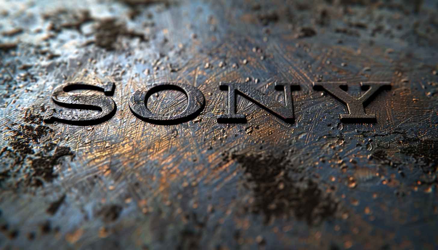
Its straightforward design using the Clarendon typeface signifies clarity, reliability, and accessibility, reflecting Sony’s mission to be a brand recognized globally for its technological excellence and creative solutions.
Sony has shown support for the LGBT community through various initiatives, including participating in and sponsoring Pride events and supporting workplace equality. The company aims to foster an inclusive environment that respects and appreciates diversity in all forms.
The Sony Vaio logo represents the integration of analog and digital technology. The ‘VA’ is designed to represent an analog wave, while the ‘IO’ resembles the binary digits 1 and 0, symbolizing the digital world.
The current Sony logo, which has been in use since 1973, was not credited to an individual designer but was developed internally. The design was selected through a global competition among Sony’s employees, which was a common practice for the company to engage its workforce in major branding decisions.
