A well-designed softball logo can be crucial for creating a good team identity and improving visibility. Through its logo the team achieves instant team identification and immediate recognition from supporters. Every team along with club and organization operating in today’s competitive sports sector needs a logo which represents its core values and organizational mission. Game supporters develop trust and team pride through a remarkable logo which serves as a fundamental component of team branding and achievement success.
Part 1: Understanding the Importance of a Softball Logo
The softball logo symbolizes much more than visual shape since it acts as an expression of collective character. The softball logo determines the basic perception that both the players and the audiences will hold regarding the team. This section explains why a good logo plays a critical role for teams.
Role of a logo in a team’s identity and branding
A logo is a first impression most people have on a team. It is almost like the face of the team, symbolizing its identity. A good logo helps fans connect with the players and vice versa, reflecting what the team feels about itself or its mission as well as something unique about them. It represents a big deal in the entire branding of a team logo since a logo is everywhere: on their uniforms, in merchandise, or on promotional stuff.
Logos represent a team’s values
The more beautiful the design of a logo, the better it is representing the core values, strengths, and goals of the team. For instance, a logo that uses bold colors and sharp lines may symbolize power and determination, while softer colors and rounded shapes may signify teamwork and unity. Every little detail in a logo is it color, font, or any other attribute, represents what the team is all about.
Memorable logo encourage team spirit
A logo that is memorable can help a team feel proud and part of something. After creating an atmosphere of belonging the organization can strengthen itself while better promoting team spirit within its members. A recognizable identity sign of the team produces positive fan reactions that create dedication and enhance team enthusiasm.
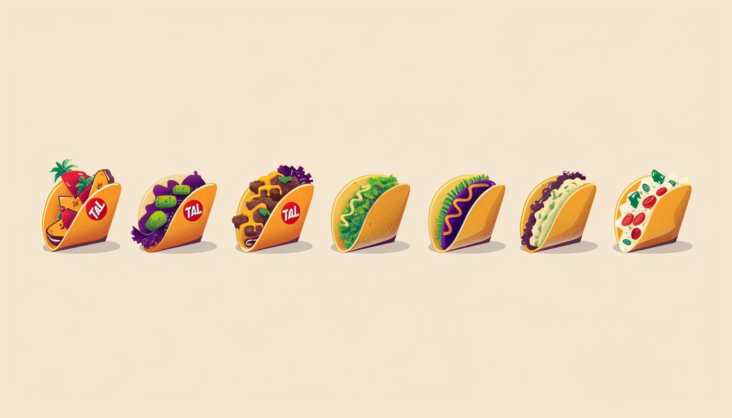
Examples of softball logos
Examples of softball logos that are popular and impact team identity – Sometimes, there are very catchy logos created for softball teams, especially national teams or successful clubs. The USA Softball logo is bold and features a clear icon that stands for the competitive nature of the sport.
Part 2: Key Elements of a Softball Logo Design
This doesn’t simply include putting together the picture for designing a softball logo. Certain details help create and make the connection between a logo and its intended audience. The key elements to a softball logo will be described in this portion of the lesson, ranging from the font style to colors. How these can help develop the right kind of story the logo is going to tell for a team.
Typography
It seems to be also greatly influential upon setting the overall feel of the logo: an obtrusively bold or heavy font suggests the idea of toughness and strength; a very round or light and playful type suggests a feeling of fun or you delicate youthfulness. The kind of font one will choose must always be based upon the nature of the personality which the team intends to establish in its market.
Iconography
Iconography refers to the images or symbols used in the logo. For a softball team, this could include things like a softball, bat, glove, or even a part of the field, like the base or the diamond. These symbols instantly connect the logo to the sport and help make it easily recognizable. By choosing the right icons, a logo can reflect the team’s focus and passion for the game.
Color Scheme
Colors scheme are great in logo designs. Different colors make people feel differently. For instance, red might indicate energy, power, and passion. Blue might represent trust and calmness. Yellow feels cheerful and bright, whereas green might be representing nature or growth. It is very important to choose the right colors since they help in making a connection between the team and its fans and influence how the team is perceived.
Shape and style
The shape and feel of a logo affect the general impression of the company. Round logos look friendly and cozy, whereas angular shapes could give that very sharp, aggressive look. Logos with less detailed things look sleek and recognizable, but a more detailed logo may represent the story of the firm. The shape and style must match the image of the team, if they want to look bold and fierce or simple and classic.
Examples of successful logos
Examining examples of successful softball logos can help show how these elements come together. For instance, a logo of a professional team may have strong typography, the baseball icon, bold colors, red and black, and an angular shape that suggests power.
Part 3: Trends in Softball Logo Design
Like any other field, logo design in softball undergoes changes. Something that was trendy a few years ago may not be trending now. In the following section, we’ll consider the modern trends regarding softball logo design- bold styles, from the retro, to the use of actions that show team energy, and how understanding those will help you to have a fresh, in-tune logo with what people love today.
Current Softball Logos Design Trends
Softball logos nowadays are moving in the direction of bold, dynamic designs. As more and more teams want modern, clean, and recognizable logos, bright colors with sharp lines and strong typographies are gradually becoming popular because they give energy to the whole logo.
Bold, dynamic, and modern styles
Bold, modern styles are becoming popular among the younger teams. The logos succeed as straightforward visual elements that use bold lettering and sharp geometric shapes combined with red and black color schemes as well as bright neon shades. The design style emphasizes fast visual captures along with an energetic impression and active movement.
Vintage/retro designs
While modern logos are trendy, retro and vintage styles are now resurfacing. Teams with a century of history or those who have thousands of years of tradition behind them tend to wear logos that touch the historic past. Classic fonts, nostalgic color schemes, and even patterns such as baseball stitching or super-retro mascot designs are characteristic of these logos.
Incorporating action in logos
The trend is also the addition of motion to logos. This might mean using lines or shapes to hint at a moving quality or dynamic symbol around a fast-moving softball, player in action, and such things. Those logos are designed to show that power, agility, and energy, which are qualities that many softball teams rely on. That is, the feeling of being action-packed and lively is induced by including action in the design.
Part 4: Best Softball Logo Inspirations
If you need ideas for a softball team logo, keep reading to find examples from different teams around the world. In this section, we will discuss the best softball logos that different teams have used around the world.
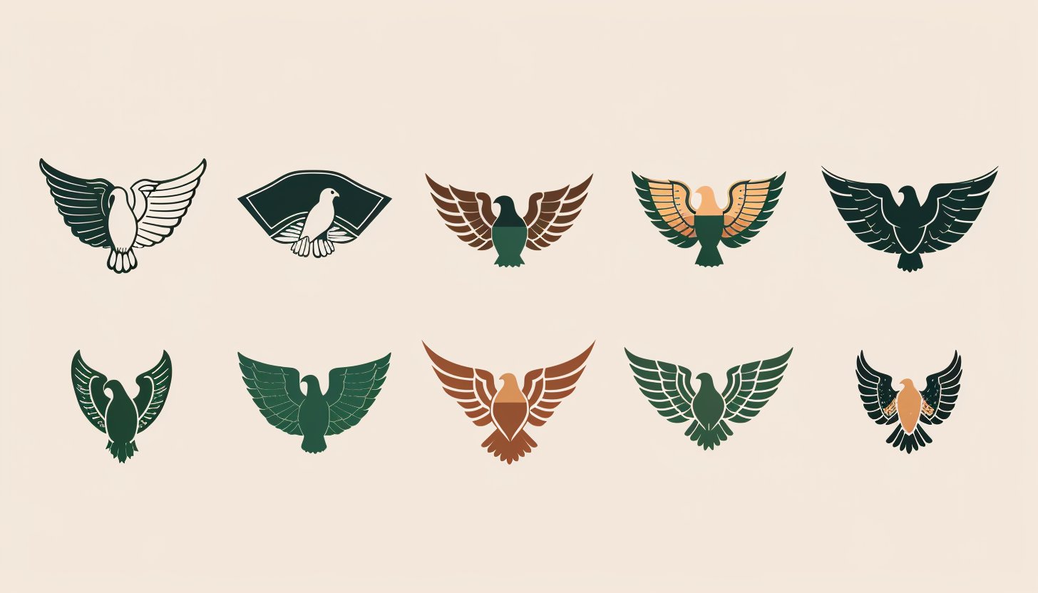
North Texas Mean Green
The logo of the North Texas Mean Green has a green eagle flying upwards and open winged, which makes it look energetic and strong. It also has sharp lines, thus looking powerful and bold, exactly like the energy of the team. On top of the eagle are big, bold letters in white background that reads “North Texas”.
Iowa State Cyclones
The logo of the Iowa State Cyclones is very symbolic of the identity of the team. The word “I” is made with a strong, bold red letter with outlines of gold that stands out and captures attention. On the word “State”, there is an interlocking across the “I” in a 3D gold font, red highlighted for extra depth and motion. Red and gold symbolize the team’s energy, passion, and excellence.
Auburn Tigers
The Auburn Tigers logo displays the interlocking “AU” element using bold navy blue design which has an orange outline. The design is very simple yet effectively brilliant, with the “A” and “U” forming an image in their clever combination. The traditional team colors navy blue and orange embody both strength and determination together with excellent performance.
Kentucky Wildcats
The Kentucky Wildcats logo contains a strong, well-balanced “UK” in bold blue letters. The project displays letters that show internal self-assurance and external steadiness. The team recognizes blue as its official color while it symbolizes loyalty combined with trust and strength.
South Carolina Gamecocks
The South Carolina Gamecocks identity stands powerful and aggressive through its main emblem. A gamecock in the fighting stance features at the middle of the logo, with its color being maroon and all details in black and white. The large letter “C” framing the gamecock gives an impression of strong and bold symbols.
Virginia Tech Hokies
The Virginia Tech Hokies have a logo characterized by a massive, stylized “VT” in maroon with an outline of orange color. The simple yet strong logo design combines “V” and “T” to create one unique and very recognizable symbol for the team. The maroon and orange represent the official team colors, synonymous with passion and energy and drive.
Florida Gators
The Florida Gators logo is the bold, energetic symbol of team identity. In it, the fierce green head of an alligator is exposed with its mouth open, bearing sharp teeth. The alligator is framed inside an oval blue and orange structure, which happens to be the official colors for the team. The design here is very strong and aggressive as it captures the competitive spirit for the Florida Gators softball team.
Washington Huskies
The Washington Huskies logo uses a bold, purple “W” with an outline of gold, which depicts the official colors of the team. The logo is simple but powerful, where the “W” is a block style with clean, sharp edges. These colors, that is, purple and gold, represent royalty, excellence, and tradition, representing the pride in the Washington Huskies softball team.
Oregon Ducks
The Oregon Ducks’ logo is the simplest and yet boldest logos that exist-the large, prominent “O” in deep green. The stylized, simple, modern interpretation of the word makes it instantly clear and quite powerful. Because it’s relatively simple, its impact is clear, with great recognition, an excellent team image, and speed. Green as a color shows Oregon’s state natural environment-a sign of growing, energetic life.
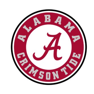
Alabama Crimson Tide
The Alabama Crimson Tide logo is a classic design featuring a bold, smooth script font in the shape of a large “A.” The word “Alabama Crimson Tide” is written around that circle in gray. The High School stands as the physical manifestation of all tradition and pride which was established when the Alabama softball program began.
Texas A&M Aggies
The Texas A&M Aggies logo is a powerful and distinctive design with interlocking letters “ATM” in maroon. The artwork displays strength and stability through its bold lines and geometric as well as clean-cut edges which represent the qualities embodying the team. The maroon color within the logo carries determination at the same time as demonstrating resilience and excellence.
Georgia Bulldogs
The Georgia Bulldogs logo features a bold black “G” with a white center, and it is bordered by red. The design is placed inside an oval shape to give it that unique and memorable look. It represents the colors of the official team, in black, white, and red, which represent strength, focus, and passion.
Marist Red Foxes
A red fox representing agility and quickness is printed with clean detail. The pose is ready, with the overall shape alert; therefore, showing how agile a fox is to quickly move towards anything. Printed on the opposite side of the fox is “Marist.” These letters, being bold with black outline red print, symbolize the power, determination, and intensity represented by the energy given off when playing with either the red and black colors on their team.
Rutgers Scarlet Knights
The Rutgers Scarlet Knights logo is a strong design with a large red “R” in a strong, modern style. The “R” is black-lined, providing contrast and depth. This simple yet striking logo is easy to recognize and symbolizes the strength and toughness of the Rutgers Scarlet Knights softball team.
Clemson Tigers
This lively, natural-colored paw print from the Clemson Tigers features rough and textured edges; orange is its bright color to denote the team’s official colors that represent energy, excitement, and boldness. This is an easy way to recognize while offering a lot of strength and identity to the Clemson Tigers softball team.
LSU Tigers
The LSU Tigers logo is written with the letters “LSU” in large, bold letters. The letters are purple with a gold outline. The team colors symbolize royal authority alongside excellence and distinction because the LSU Tigers softball team demands exceptional achievements from its athletes. Because the design is very simple, it is instantly recognizable and memorable.
Ole Miss Rebels
The Ole Miss Rebels logo includes the words “Ole Miss” in bold, red script font. The letters are in smooth flowing style and are energetic as well as elegant. The dark navy blue has outlined the text to give a contrasting and deeper impression. Strength alongside tradition and superior accomplishment appear through the team colors red and navy blue.
Oklahoma Sooners
The Oklahoma Sooners logo has the interlocking letters “OU” in bold crimson. The font design of the logo shows a contemporary style which adds equilibrium to the overall visual appearance. The color is that of the official team, signifying passion, energy, and determination. The interlocking design signifies unity and teamwork, which are very big values held in Oklahoma Sooners softball.
Pittsburgh Panthers
The word “Pitt” is printed in a bright blue script with a bold gold outline. This is a fun yet strong cursive style of writing, so the logo really looks unique and lively. The team’s official colors consist of blue and gold and carry meanings of loyalty alongside excellence and energy. Traditional script writing enhances the Pittsburgh Panthers softball team’s spiritual features in the design.
Nebraska Cornhuskers
Nebraska Cornhuskers logos carry a gigantic red “N” with simple modern touch on a white outlining that creates some relief to look more distinctive and stronger, standing as one representative image for a robust Nebraska Cornhuskers softball team, all representing the idea of passion and determination as characterized by redness, as the outline white leaves everything looking quite clean and straightforward.
Saint Joseph’s Hawks
The logo of Saint Joseph’s Hawks shows a fierce, energetic image: a maroon and black head of a hawk. This one is placed head-on to its direction; hence, with its sharp lines it has movement power. On the lower half are bold block letters with an outlined white version stating the letters “SJU,” the abbreviation of the school, thus establishing team initials.
Fresno State Bulldogs
The Fresno State Bulldogs logo shows the words “Fresno State” in bold, red block letters highlighted with a blue outline. The text is arched in a collegiate style and thus bears a very traditional and proud look. The colors red and blue are the official colors of the team representing passion, energy, and excellence.
Part 5: Common Mistakes to Avoid When Designing a Softball Logo
When designing a softball logo, it’s important to keep things simple and effective. In this section, we’ll talk about some common mistakes to avoid to ensure your logo looks great and works well for the team.
- Too many details added to the design: A good logo should be free of clutter and easily recognizable. If you have too much detail or elements going into the design.
- Using too many colors: Although colors play an important role, too many colors might clutter the logo.
- Failure to scale up the design: a logo should always appear good at whatever size in whatever application is required, for instance, from the t-shirt, website to the billboard.
- It does not serve the target audience: A logo is supposed to represent the team and connect with its fans. If the design does not make sense with regard to the team’s values or spirit.
- Choosing trendy designs: It is true that one always wants to look trendy, so following the trends in design, which can date very soon.
Part 6: How Arvin AI Can Help You Design the Perfect Softball Logo
Arvin AI allows users to generate professional logos easily in a short time. Its specialty is customizing designs that are especially in line with everyone’s needs, team, or business. The use of Arvin AI can provide a logo that is professional-looking without the wait and at a low price. Its smart tools allow the online platform to propose designs that fit your style and vision. Whether to create logos for sports-related items, businesses, or even personal use, it makes it simple and fast through Arvin AI.
Key features of Arvin AI
There are following key features of Arvin AI:
- Easy-to-use interface: Simplifies the logo creation process.
- AI-powered suggestions: Provides customized ideas based on style, colors, and team input.
- Automatic resizing: Adjusts logos for use on jerseys, merchandise, and banners.
- High-quality output: Ensures logos are suitable for both digital and print formats.
- Quick and affordable design: Delivers professional results without the need for design expertise.
Steps to Create a Softball Logo Using Arvin AI
Step 1: Sign up and log in to Arvin AI
Go to the website of Arvin AI logo maker, sign up for an account, and then log in to start creating your softball logo.
Step 2: Inputting Brand Information and Preferences
Give me the name of your brand, tagline, and industry. For the AI, choose design preference such as types of font used or a general theme for logo creation.
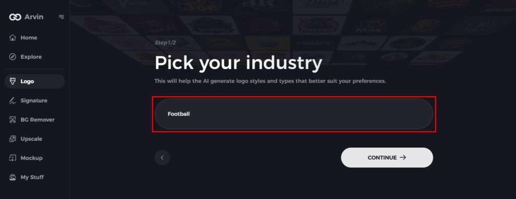
Step 3: Select the niche
Choose to select sports industries or a specialized niche of softball. This step helps the AI create styles on logos which the brand may emphasize.
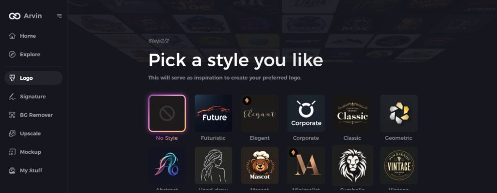
Step 4: Choose a style
Select a style of logo you want. It will be an inspiration to influence the final product of your softball logo.
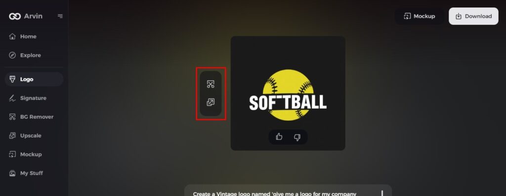
Step 5: Personalize using Arvin AI tools
When the AI comes up with a logo for you, use the tools provided to customize the style of the fonts, layout, and positioning of the symbols or icons. Feel free to play around with it until you’re satisfied with its appearance.
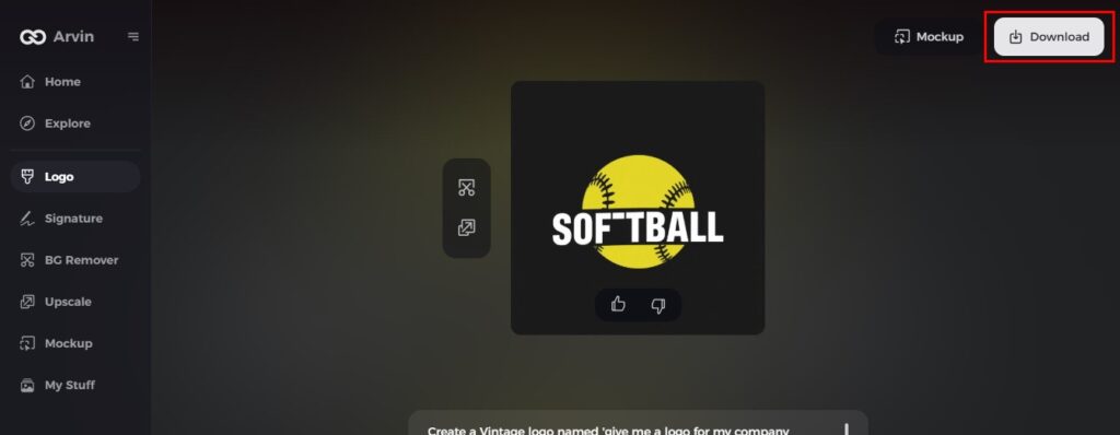
Step 6: Save and download your final logo
Preview your softball logo and save it in a high-resolution format, suitable for both digital and print use.
Conclusion
A good logo related to softball will give strong support and foster team identity. It creates brand value for the team. A well-designed logo must reflect the spirit of the team. It should unique so that it distinguish or connect to fans. Arvin AI is best for perfect logo designing according to a team’s vision and goals. This consistency in the logo on all materials, from jerseys to merchandise, ensures a unified brand image that enhances your team’s presence both online and offline.
FAQs
What makes a good softball logo?
A good softball logo is simple, easy to remember, and shows the team’s spirit, energy, and values.
Can I create a softball logo without professional design software?
Yes, with tools like Arvin AI, you can create high-quality logos without needing expensive software.
How do I make sure my softball logo will be scalable for use in various applications?
Design your logo in the vector, and test it at every size so it is clear to view everywhere.
How long does it take to design a softball logo with Arvin AI?
It is fast, with logos generate within minutes with AI, and there are ways to customize to have a one-of-a-kind design.