Reebok is a global brand, which specializes in manufacturing of athletic footwear, apparel and sports equipment. It has been leading the change in sports and fitness culture for decades. Logo design of Reebok is one of the key success factors of the company which cannot be overestimated. In this paper, Reebok logo evolution process, the hidden meanings behind the logos and their impact on the brand’s relationship with the target consumers and position in the sports shoes industry will be discussed.
Part 1: History of the Reebok Logo
The history of Reebok logos can also be expressed as a history closely linked with the origin of the company from a small-scale business to an international sports empire.
Reebok’s Origins
Founded in 1958, Bolton, England, Reebok began as a small sports shoe company. Believing that the athletes required specialty footwear for their performance, Reebok emerged from that thinking. While it was growing and spreading its arms to showcase a visual identity. It tells people that Reebok had been there in the world to deliver innovative ideas and quality goods.
The First Logo
The first logo of Reebok was simple and had a Union Jack symbol in the center. It signify the British origin of the company. It was simple but carried a sense of tradition and heritage, which was very important for Reebok in its early years. This logo was used mainly in the 1960s and 1970s, when Reebok was famous for its running shoes.
Key Milestones in Logo Evolution
The Reebok logo has experienced changes over its years, of which each expressed the direction in the brand, coupled with an upward trend of growth in the marketplace:
- 1980s: With a boom in fitness culture and a more popular aerobics lifestyle, Reebok redesigned to depict its growth into a fitter lifestyle. In this period came the bold “Reebok” text in more modern font.
- 2000s: The Company, due to changes in design trends and the global market, continued to develop its logo. In this decade, the logo became more streamlined and stylized.
- Present Day: The modern logo is one that was created in the 2010s. It’s the delta symbol, which reflects Reebok’s focus on change and exercise. This modern version of the logo is a far cry from the text-based logos that Reebok used previously.
Part 2: The Symbolism Behind the Reebok Logo
More than a corporate mark, the Reebok logo has meanings that go deeper, being connected to the philosophy that surrounds the brand as well as its clientele.
The “Delta” Symbol
The present Reebok logo retains the delta, which has been used to symbolize the brand name for the past few years. The delta consists of three triangles to signify a pillar of each element of the Reebok philosophy: fitness, strength, and performance. This design is modern, bold, and easily remembered, which fits in with Reebok’s need to help each individual attain his or her goal of personal change through fitness.
Meaning of the Delta
What the delta symbol connotes is transformation, literally and psychologically. If transformation is possible for the Reebok brand. This only holds if it is supported by commitment, and it is hard work that provokes personal change. This had been part of the greater communications of Reebok-saying that fitness must be a portal to empowerment of the person; resilience, wellness, and others. This indicates a balanced and integrated state, through the delta form as described in the inner triangles.
Reebok’s Message to the Consumer
This is far from being merely a design it is an act call. Here’s how Reebok logo communicates that they are truly committed to athletes. And to those fitness people encouraging them to get ahead in the life of body and mental fitness. The focus of the logo is on the performance of Reebok that pushes boundaries, achieves new heights, and keeps going. The logo is a visual representation of what the brand stands for as it supports and helps people excel in their work.
Part 3: The Reebok Logo Design Elements
In this section, we will discuss the major design elements of the Reebok logo. The logo, over time, has evolved and reflected not only the athletic history of the brand but also modern appeal. All the elements in the logo were designed to provide a visual identity and convey values of strength, performance, and innovation.
1. Typography
The most important design elements that contribute a lot to the visual identity of the Reebok logo are typography used in the Reebok logo. Reebok uses bold, clean sans-serif typefaces that are usually custom-made to add a few unique flourishes reflecting athletic performance. The font is very readable and exudes a robust feel, clarity that resonates with the user, who sees the need for minimalism in sportswear.
2. Color Palette
This is one of the ways in which Reebok implements color into its branding as well as into its general visual schema. The Reebok Company is most associated with three tones of the logo: red, white, and black. Each color has a different meaning. Red stands for energy, passion and motivation which are the belief systems to empower athletes. Black give the logo the aura of professionalism and it timeless look while white symbolizes cleanness and innocent looks.
3. Visual Simplicity and Modern Appeal
Due to the evolution of designs, Reebok was able to change with the demands of modernistic designs. Therefore, the logo can be spoken in terms of a grace, thin, and lean design. Simplicity and minimalism made the logo accessible to all types and media through which it appears, from being on product tags to digital websites.
Part 4: The Impact of the Reebok Logo on Branding
There is no doubt that the Reebok logo has played a great role in its success story, which is why in this chapter, we are going to give details of the subject. The logo has been effective in brand building from the creation of a brand image, reaching across the international markets. The logo has been perfect in identifying Reebok in the pool of other companies dealing with athletic wear around the world.
Brand Recognition
One of the most important implications of the Reebok logo is its help in making this brand a familiar name across the globe. Due to the progression of time. The logo represents quality athletic products, and due to this similarity. The association between the company and its true followers has a very strong graphic impression. Hence, consistency in logotypes, along with strategic marketing, has turned this brand into the most trusted names in sports and fitness wear.
Cultural Influence
Again, cultural influence, this time particularly through the logo, was notable for sports and fitness. As a result, associations with elite athletes, influencers, and other celebrities have also helped link up the Reebok logo to a very diverse audience from various parts of the world. In fact, such affiliations with promotions of Reebok products made the logo turn into an emblem of victory and strength as well as tenacity among even those serious players who wouldn’t take themselves too seriously not to mention serious athletes.
Reebok’s Market Position
The Reebok logo has helped to foreground the brand in this competitive and highly aggressive athletic wear market. In an industry where giant global players such as Nike and Adidas dominate the market, the Reebok logo helps brand it out with a sense of heritage and modernity. The logo provides credibility regarding the quality of Reebok sportswear. While portraying it as the challenger brand, hence ensuring it can attain new generations of athletes and fitness enthusiasts.
Part 5: Arvin AI: Enhancing Logo Design and Branding
Branding has become a very vital part of building an identity for any company in the fast-paced digital world of today. Advanced tools from Arvin AI improve logo design and branding strategies so that businesses can create meaningful and impactful brand representations. In this section, we will explore how Arvin AI helps businesses to improve their logos and stand out in the competitive market while discussing the evolution of the Reebok logo.
Key Features of Arvin AI
- AI-Powered Design Tools: Arvin AI employs the most advanced artificial intelligence to develop innovative logo designs inspired by the values and objectives of your company.
- Customization Options: It offers a range of customization options so that companies can personalize their logos according to a specific color palette, fonts, and icons.
- Intuitive User Interface: Simple, user-friendly interface which makes creating a logo very smooth and effortless for all users.
- Brand Consistency: The outcome will be such that the final logo design merges into your entire brand branding, bringing cohesiveness in all the varied media and platforms.
- Time-Efficient Design Process: Arvin AI will drastically reduce the time taken to build a professional quality logo for businesses.
Steps to Use Arvin AI for making Logo
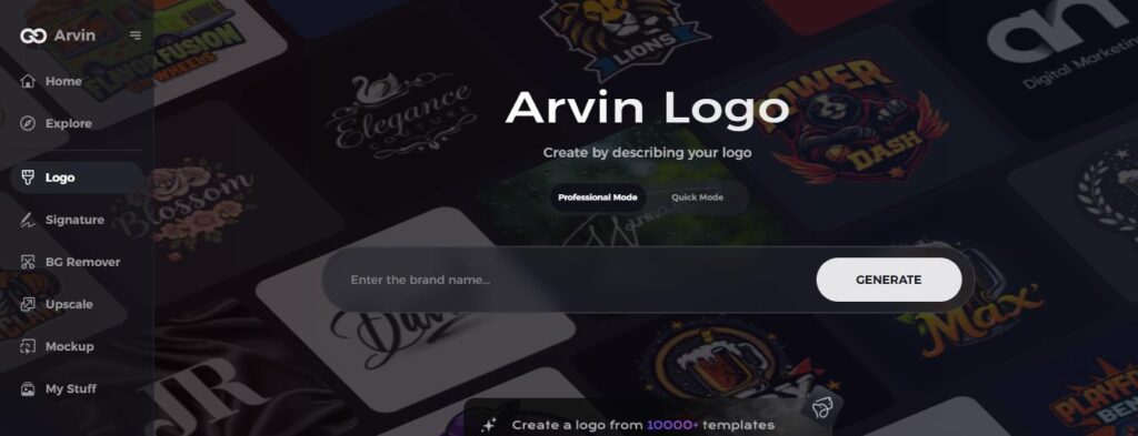
Step 1: Go to the Arvin AI Website
Open your browser and go to Arvin AI to start designing a unique, transparent company logo.
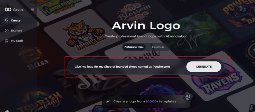
Step 2: Enter Your Company Details
Provide your company’s name and select its category. Request a transparent logo to let the AI generate designs tailored to your specific needs and business representation.
Step 3: Choose Your Industry
Select the industry that you do business in. This selects the AI to create logotypes that fit your brands values and market niche as well.
Step 4: Select a Design Theme
Select a design style that you like. You can leave it on “no style” if you haven’t decided yet. It creates some amazing designs for you without any input from you.
Step 5: View Logo Concepts
Review the logo designs created by Arvin AI. Scroll through the options to find one that resonates with your brand identity.
Step 6: Customize Your Logo
Refine the selected logo by tweaking colors, fonts, and icons to align perfectly with your brand’s personality and aesthetics.
Step 7: Download Your Final Logo
Once you satisfy, download your logo in versatile formats like PNG or SVG. It looks professional across websites, social media, print, and other media platforms.
Conclusion
Reebok has had a journey, which was immense with respect to its evolution, transformation, and growth to be a world brand. The logo always depicted strength and change in its designs from the original delta symbol. Now that Reebok Logo continues to redefine its image, Arvin AI comes in with a revolutionary solution for brands interested in developing logos which signify modernity and strength. Through the incorporation of AI design solutions. Companies can make sure their branding remains prominent and up-to-date within today’s competitive landscape.
FAQs about Reebok Logo
Why Reebok has two logos?
The original Reebok logo depicts the Union Jack, portraying the company’s humble beginnings in Bolton, England in 1895. In 1986, Reebok unveiled a second emblem, often termed as “the vector”. The emblem was introduced to symbolize a new era of “performance” product.
When did Reebok update its logo?
Reebok has redesigned its logo multiple times. The largest change occurred in 2014 when it changed the logo to include the delta symbol.
How would you create a logo to look like this?
To design a logo that looks like the Reebok logo, you could use Arvin AI. You can input elements such as modern typography and symbols of strength and transformation.
What is the meaning of the delta symbol in Reebok’s brand?
The delta symbol represents change, evolution, and transformation—values that promote both physical and mental growth.
