The principles of design, balance, contrast, emphasis, rhythm, proportion, unity, and movement, serve as the foundation for visual storytelling across art, architecture, branding, and digital media.

These principles have evolved over centuries, shaping everything from Renaissance masterpieces to modern-day marketing strategies. Whether designing a website, crafting a brand identity, or creating a compelling advertisement, understanding these principles ensures that compositions are visually appealing, functional, and emotionally resonant.
Brands like Apple, Nike, and Louis Vuitton seamlessly integrate these design fundamentals into their marketing, reinforcing recognition and engagement across platforms, so how can you do the same?
This article explores the historical evolution and contemporary application of design principles, offering insights into how they continue to influence the way we experience the world around us.
History of Principles of Design
The principles of design, balance, contrast, emphasis, rhythm, proportion, unity, and movement, serve as the foundation for creating visually compelling and functional compositions. Their development reflects humanity’s quest to express beauty, order, and meaning through art, architecture, and design.
The origins of design principles can be traced back to Ancient Greece and Rome, where balance, proportion, and harmony were central to artistic and architectural theory.
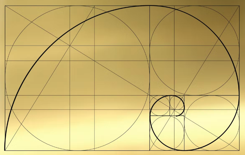
The Golden Ratio (1:1.618), discovered by Pythagoras and later documented by Euclid, was seen as a divine proportion, believed to create beauty in both nature and human-made structures. The Parthenon in Athens, designed by Ictinus and Callicrates, is a testament to this principle, with its columns and dimensions meticulously following this mathematical proportion.
Vitruvius, a Roman architect and engineer, further developed these ideas in De Architectura (c. 15 BC), asserting that “beauty will be produced when the components of the work are in harmonious proportion to the whole.” His principles of firmitas, utilitas, and venustas (strength, utility, and beauty) influenced Renaissance and modern architects, reinforcing balance and unity as essential to effective design.
Is your brand identity visually balanced? Use Arvin AI Logo Designer to create a logo that maintains harmony and professionalism in just minutes!
Medieval Art
During the Medieval period, particularly in Gothic architecture, the principles of rhythm and unity took precedence. Notre Dame de Paris (1163–1345) exemplifies these principles through its vertical emphasis, repeated arches, and stained-glass windows, which create a rhythmic, almost musical composition leading the eye toward the heavens.
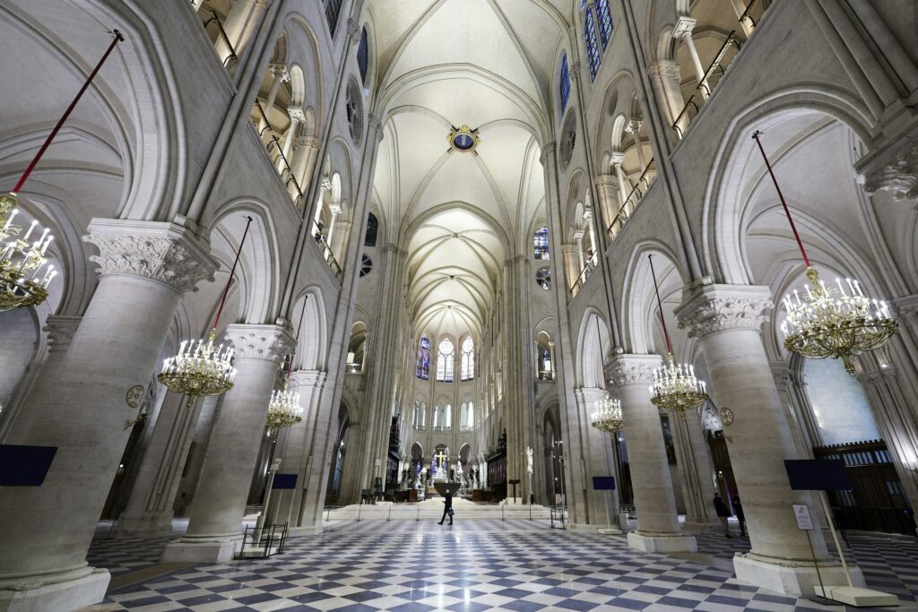
The use of pointed arches and flying buttresses added a sense of movement and lightness, illustrating how balance and rhythm contributed to both aesthetic appeal and structural innovation.
Manuscript illumination, such as the Lindisfarne Gospels (c. 700 AD), applied contrast and emphasis to guide the viewer’s eye across intricate Celtic knotwork and gold embellishments, ensuring religious messages were both visually striking and symbolically profound.
The Renaissance
The Renaissance (14th–17th century) marked a return to classical ideals but with greater emphasis on realism and perspective, revolutionizing the use of balance, proportion, and emphasis in composition. Leonardo da Vinci’s Vitruvian Man (c. 1490) embodied the belief that human anatomy, art, and architecture should follow geometric harmony.
Filippo Brunelleschi, the architect behind Florence’s Dome (1420–1436), pioneered linear perspective, enabling artists to create depth and movement within a balanced framework. Raphael’s The School of Athens (1509–1511) exemplifies unity and symmetry, with figures arranged in a balanced composition leading the viewer toward the central focal point—Plato and Aristotle—illustrating the Renaissance commitment to rationality and idealized proportion.
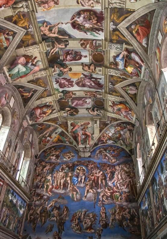
In painting, Michelangelo’s Sistine Chapel Ceiling (1508–1512) used contrast, emphasis, and movement to guide the eye across its complex narratives. His use of foreshortening, as seen in The Creation of Adam, brought dynamism and depth to religious storytelling.
The Baroque Period
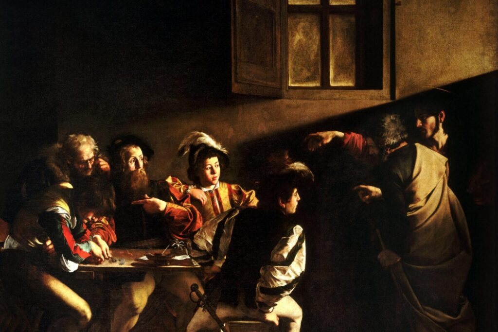
The Baroque era (17th–18th century) introduced heightened drama, theatricality, and movement in both art and architecture. Unlike the restrained balance of the Renaissance, Baroque artists such as Caravaggio used chiaroscuro (strong contrast between light and dark) to create intense emotional impact, as seen in The Calling of Saint Matthew (1599–1600). This painting exemplifies contrast and emphasis, with Christ’s outstretched hand and the stark lighting directing the viewer’s gaze.
Architecturally, Gian Lorenzo Bernini’s St. Peter’s Square (1656–1667) embodies unity and movement, with its colonnades forming an embracing gesture toward visitors. His Ecstasy of Saint Teresa (1647–1652) uses swirling drapery and theatrical lighting to heighten emotion, demonstrating how movement and contrast shape viewer engagement.
Postmodernism
Postmodernism (1960s–1990s) rejected rigid structures, embracing eclecticism and irony. Frank Gehry’s Guggenheim Museum Bilbao (1997) defies traditional balance, using fragmented forms to create a sense of movement and unpredictability.
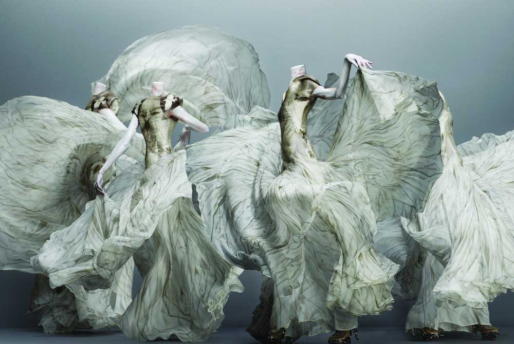
In branding and advertising, contrast and emphasis are key. Apple’s minimalist designs, influenced by Bauhaus simplicity, use white space and contrast to create sleek, user-friendly interfaces. In fashion, Alexander McQueen’s dramatic collections used exaggerated proportions and asymmetry to challenge conventional design.
Today, digital media introduces new interpretations of design principles. UI/UX design emphasizes user-friendly balance, with platforms like Instagram using contrast and rhythm in interface layouts. Virtual and augmented reality experiences manipulate movement and proportion, pushing the boundaries of traditional design.
7 Principles of Design
1. Balance
Balance is a fundamental principle of design that ensures a composition feels visually stable and cohesive. It refers to how elements are arranged to create a sense of equilibrium, preventing any one part from overpowering the rest. Without balance, a design can feel chaotic or unstructured, making it difficult for the viewer to engage with the content effectively. There are three main types of balance, each with its own unique impact on composition:
- Symmetrical Balance: Equal visual weight on both sides of the composition, often creating a formal and structured look.
- Asymmetrical Balance: Unequal distribution of elements that still feels harmonious and dynamic.
- Radial Balance: Elements radiate outward from a central point, common in circular or spiral designs.
Symmetrical Balance
Symmetrical balance, also known as formal balance, occurs when elements on either side of an axis are evenly distributed, mirroring each other. This type of balance conveys a sense of order, stability, and tradition, making it a popular choice in architecture, religious art, and corporate branding.
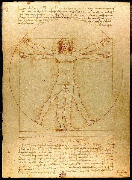
A classic example is Leonardo da Vinci’s Vitruvian Man, where the human figure is perfectly symmetrical, emphasizing proportion and harmony. In architecture, Taj Mahal exemplifies symmetrical balance, with identical structures flanking a central dome, reinforcing its sense of grandeur and serenity.
Asymmetrical Balance
Unlike symmetrical balance, asymmetrical balance creates harmony by distributing elements of different sizes, shapes, and textures in a way that feels dynamic yet visually stable. This technique is often seen in modern art, editorial layouts, and photography, where designers use varying weights of elements to guide the viewer’s eye across the composition. Vincent van Gogh’s Starry Night demonstrates asymmetrical balance with swirling skies and off-center elements that still feel cohesive.
In web design, companies like Apple use asymmetry to emphasize focal points, such as placing a bold product image on one side and minimal text on the other.
Radial Balance
Radial balance occurs when elements radiate from a central point, creating a circular flow of movement. This technique is common in mandalas, stained-glass windows, and spiral galaxies in space photography. The Rose Window at Notre Dame Cathedral is a prime example of radial balance, where intricate patterns revolve around a central focal point, drawing the viewer’s gaze outward in a rhythmic motion.

Graphic designers also use radial balance in branding, such as the Pepsi logo, which features concentric curves that create a dynamic yet balanced composition.
2. Contrast
Contrast is one of the most essential principles of design, used to create visual interest, direct attention, and establish hierarchy within a composition. By emphasizing differences between elements—whether in color, size, shape, texture, or value—contrast ensures that designs are engaging and effective in communication. Without contrast, a composition can appear flat or monotonous, making it difficult for the viewer to distinguish important elements. Designers, artists, and brands all rely on contrast to create compelling visuals that stand out.
- Uses: Helps draw attention to focal points and adds depth to a design.
Color Contrast
Color contrast is one of the most striking ways to create emphasis in a design. The juxtaposition of light and dark colors, complementary hues, or warm and cool tones can create strong visual impact. This technique is widely used in both fine art and branding. For example, Yves Klein’s IKB 79 (1959) features a deep ultramarine blue set against neutral backgrounds, intensifying its vibrancy.
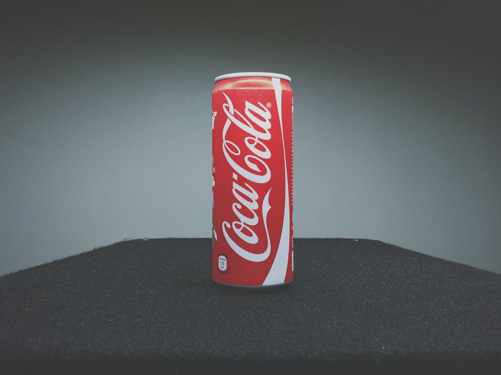
In branding, Coca-Cola’s red and white logo exemplifies high color contrast, making it instantly recognizable and easy to read from a distance. This strategic use of color contrast ensures that a design remains visually engaging and memorable.
Size Contrast
Size contrast plays a crucial role in establishing visual hierarchy within a design. By incorporating elements of different sizes, designers can guide the viewer’s eye toward the most important features of a composition. Large elements naturally attract more attention than smaller ones, making this an effective technique in both art and advertising. Diego Rivera’s murals, for example, often feature oversized human figures that dominate the viewer’s perception, ensuring the subjects remain the focal point of the piece.
Similarly, Apple’s product advertisements rely on large images of their devices contrasted with minimal, smaller text, emphasizing the sleekness of the product while keeping the focus on its design.
Shape Contrast
Shape contrast occurs when different forms, such as organic curves and rigid geometric structures, are placed together to create an engaging visual dynamic. This technique enhances the movement and rhythm within a design, preventing it from appearing too uniform. Henri Matisse’s The Snail (1953) effectively utilizes shape contrast by combining geometric color blocks with freeform, organic edges, resulting in a vibrant and energetic composition.

In web design, rounded call-to-action buttons often stand out against sharp-edged backgrounds, subtly drawing the viewer’s attention to interactive elements. This approach helps ensure that important information or actions are emphasized in digital spaces.
Texture Contrast
The interplay between smooth and rough textures can add depth and dimension to a design. Texture contrast can be particularly impactful in painting, fashion, and interior design.
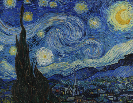
In fine art, Vincent van Gogh’s The Starry Night (1889) uses thick, expressive brushstrokes in the sky, contrasting with the smoother, more structured village below. This variance in texture creates a sense of movement and intensity. In the fashion industry, designers frequently pair contrasting fabrics, such as rough denim with delicate silk or lace, to create striking visual and tactile contrasts. This method is not only visually engaging but also appeals to the sense of touch, adding another layer to the viewer’s experience.
Value Contrast (Light vs. Dark)
Value contrast, or the difference between light and dark, is one of the most powerful tools for creating dramatic and eye-catching compositions. This principle is especially prominent in black-and-white photography, chiaroscuro painting techniques, and graphic design. Caravaggio’s The Calling of Saint Matthew (1599) masterfully employs chiaroscuro, using deep shadows and bright highlights to direct attention to key subjects, heightening the emotional intensity of the scene. In modern graphic design, high-contrast movie posters for horror films utilize deep blacks against bright highlights to evoke suspense and mystery. The stark contrast not only grabs attention but also enhances the overall mood and storytelling of the piece.
Uses of Contrast in Design
Contrast is an invaluable tool for directing attention, improving readability, adding depth, and evoking emotions. One of its most practical uses is directing attention toward key elements in a design. In an infographic, for example, bold, high-contrast headlines ensure that the most important information is seen first. Creating readability is another essential function of contrast—text that stands out against its background improves comprehension, making high contrast between text and background (such as black text on a white background) a common practice in print and digital formats.
3. Emphasis
Emphasis highlights the most important part of a composition, guiding the viewer’s attention to a focal point.
- Techniques: Use size, color, placement, or contrast to make specific elements stand out.
Using Size to Create Emphasis
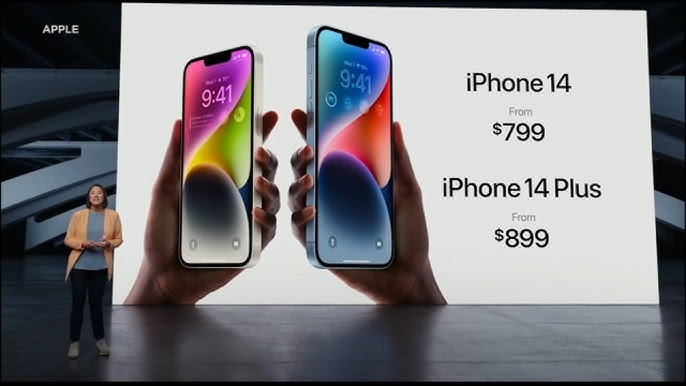
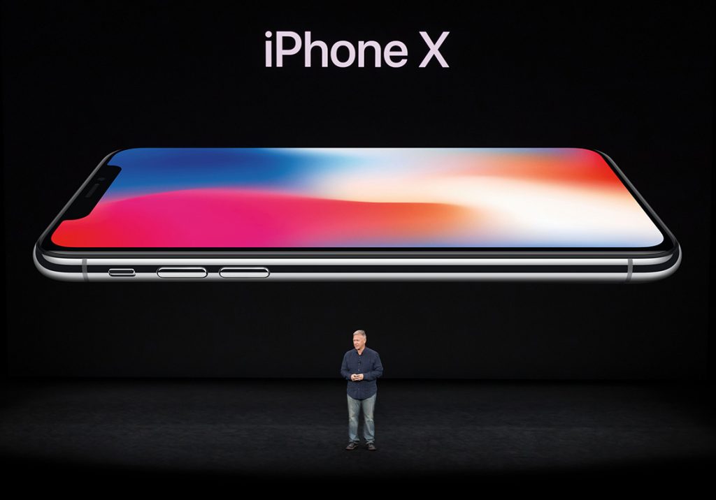
One of the most effective ways to establish emphasis is through size. Larger elements naturally draw more attention than smaller ones, making them focal points within a composition. Auguste Rodin’s The Thinker (1904) exemplifies this principle in sculpture—its oversized form and muscular definition command attention, compelling viewers to focus on its introspective nature. Similarly, in advertising, Apple’s iPhone billboards often feature an enlarged, high-resolution image of the phone against a minimal background. By making the product the largest and most detailed element in the design, Apple ensures that the viewer’s eye goes straight to it.

In digital media, websites often use bold headlines and large call-to-action buttons to direct user attention. For instance, streaming platforms like Netflix emphasize newly released movies or shows by making their thumbnails significantly larger than the surrounding content. This ensures that viewers are immediately drawn to what the company wants them to watch first.
Color as a Tool for Emphasis
Color contrast is another powerful way to create emphasis. When a particular color strongly contrasts with its surroundings, it immediately grabs attention. Mark Rothko’s color field paintings, such as No. 61 (Rust and Blue) (1953), rely on the intensity of color relationships to create a striking focal point within an abstract canvas.
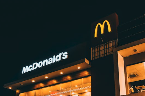
In branding, McDonald’s golden arches pop against a red background, reinforcing brand recognition and ensuring visibility from a distance. This same principle is seen in website design, where CTA buttons (Call-To-Action), like “Buy Now” or “Subscribe,” are often in bright, contrasting colors like red, orange, or green to stand out against a neutral interface.
Does your logo have a strong focal point? Test different design elements with Arvin AI Logo Designer and create a logo that captures attention instantly.
Placement and Composition in Emphasis
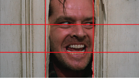
Where an element is positioned within a composition significantly impacts how much attention it receives. The rule of thirds, a foundational concept in photography and visual design, suggests placing the focal point slightly off-center rather than in the middle. This technique is frequently used in cinematography—in films like Blade Runner 2049 (2017), cinematographer Roger Deakins expertly places key subjects along the intersections of the rule of thirds grid, making scenes visually compelling and intentional.
In branding and print advertising, magazine covers often place the main subject’s face near the top third of the page, ensuring immediate eye contact with the audience. Fashion magazines like Vogue and GQ consistently employ this strategy, making celebrities the focal point while surrounding elements (text, headlines, colors) enhance their presence rather than compete for attention.
Contrast as an Emphasis Strategy
Emphasizing an element through contrast makes it stand out from the rest of the composition. This can be achieved through differences in texture, brightness, or form. Rembrandt’s use of chiaroscuro (strong contrasts between light and dark) in paintings like The Night Watch (1642) highlights key figures against shadowy backgrounds, ensuring the viewer’s attention is drawn to their faces and expressions.

In web design, contrast plays a crucial role in readability and navigation. Websites with dark backgrounds often use white or neon-colored text for high contrast, ensuring that key messages are easily seen. Likewise, Spotify’s dark interface makes bright green action buttons (“Play” or “Shuffle”) stand out immediately, directing user engagement effectively.
Typography and Emphasis in Design
Text hierarchy is essential in design, ensuring that the most important messages are seen first. Bold typography, underlines, or all-caps text are common ways to emphasize key information.
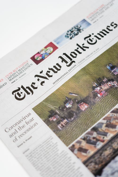
The New York Times uses bold, serif headlines for major news stories, while subheadings and body text are smaller and less prominent.
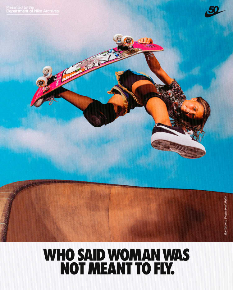
In marketing, typography plays a major role in grabbing attention. Nike’s “Just Do It” slogan is short, bold, and placed against minimal backgrounds, ensuring the message remains the center of focus. Similarly, movie posters use large, bold titles at the top, followed by smaller credits and taglines at the bottom.
4. Movement
Movement in design refers to how a viewer’s eye travels across a composition, creating a sense of visual flow or implied action. Whether in painting, photography, graphic design, cinematography, or branding, movement ensures that elements are arranged in a way that naturally directs attention, keeping the audience engaged. Designers use leading lines, curves, repetition, and sequential patterns to create this sense of motion, making a design feel dynamic rather than static.
- Techniques: Use leading lines, curves, or sequential patterns to direct attention.
Leading Lines: Drawing the Eye to a Focal Point
Leading lines are one of the most effective ways to create movement. These are natural or artificial lines within a composition that guide the viewer’s gaze toward a specific subject. Leonardo da Vinci’s The Last Supper (1495–1498)** is a classic example—perspective lines in the architecture lead directly to the central figure of Jesus, making Him the undisputed focal point.
In photography, leading lines are used to direct attention to a subject. Street photographers often use sidewalks, bridges, or railway tracks to create depth, leading the viewer’s gaze through the image. Steve McCurry’s photography, particularly in The Afghan Girl (1984), exemplifies this technique, using shadows, folds in fabric, or natural framing to guide the viewer’s focus toward the subject’s piercing gaze.
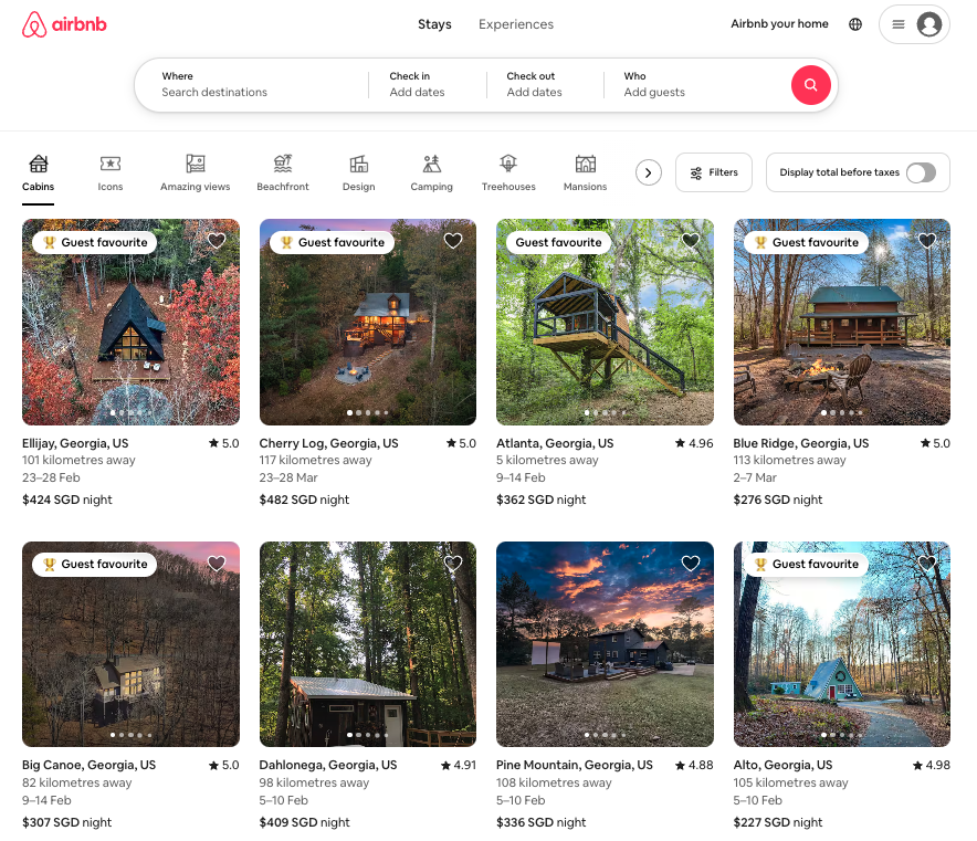
In web and UI/UX design, leading lines manifest in the form of scrolling layouts, navigation bars, or visual pathways that move users toward key interactions. For instance, Airbnb’s homepage uses a structured layout where search bars, images, and text align in a way that naturally directs users from browsing to booking.
Curves and S-Curves: Creating a Natural Flow
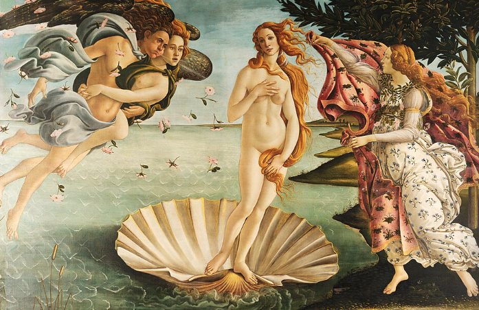
Curves introduce a sense of fluidity and organic movement within a composition. Unlike rigid straight lines, curves evoke softness, elegance, and a feeling of continuous motion. Botticelli’s The Birth of Venus (1486) masterfully demonstrates this—Venus’ flowing hair and the curving forms of the figures create a rhythmic, harmonious movement across the painting.
The S-curve, a shape resembling the letter “S,” is particularly effective in creating movement. This technique is widely used in landscape painting and photography, where winding rivers, pathways, or roads gently lead the eye deeper into a scene. The Baroque painter Peter Paul Rubens frequently used S-curves in his dynamic compositions, ensuring that the viewer’s eye moved seamlessly across the canvas.
Sequential Patterns and Repetition in Movement
Repetition of shapes, colors, or elements can create a rhythmic movement that guides the viewer through a design. M.C. Escher’s tessellations, such as Sky and Water I (1938), are prime examples of movement through repetition. The gradual transformation of birds into fish compels the eye to continuously move back and forth across the image.
In motion graphics and animation, sequential patterns are used to simulate movement. Disney’s 12 principles of animation, particularly “Follow Through and Overlapping Action,” emphasize how elements within a scene move in relation to one another, ensuring smooth transitions. This technique is why Disney films feel fluid and realistic rather than robotic.
Branding also employs repetition to establish rhythm and movement. Coca-Cola’s iconic ribbon-like logo flows smoothly, mimicking the effervescent motion of pouring soda. Similarly, Nike’s swoosh logo visually suggests speed and forward motion, reinforcing its brand identity as energetic and performance-driven.
Implied Motion: Suggesting Action Without Movement
Artists and designers can create a strong sense of motion without actually depicting movement. Futurism, an early 20th-century art movement, focused on speed and dynamism, using repeated forms and blurred lines to suggest action. Giacomo Balla’s Dynamism of a Dog on a Leash (1912), for example, portrays a dog’s legs and tail in overlapping positions, giving the illusion of rapid movement.

In photography, motion blur is a popular technique used to convey speed and energy. Long-exposure photography, such as light trails in cityscapes, captures the passage of time, illustrating movement even in a still image. Sports photography often employs this technique, capturing athletes in mid-stride to emphasize power and speed.
Movement in Film and Digital Media
Cinematography heavily relies on movement to guide the viewer’s focus. Alfred Hitchcock’s use of tracking shots, particularly in Vertigo (1958), manipulates depth perception to create a sense of disorientation. The famous “Vertigo effect” (dolly zoom) shifts the background while keeping the foreground stable, enhancing dramatic tension.
In modern filmmaking, directors like Christopher Nolan (e.g., Inception, Dunkirk) and Denis Villeneuve (Blade Runner 2049) masterfully use camera movement to create immersive storytelling. Slow pans, rapid zooms, or circular tracking shots subtly guide viewers through complex narratives, making movement a crucial visual tool.
Movement in Web and UX/UI Design
Digital platforms use movement to improve navigation and user experience. Websites that incorporate scrolling effects, hover animations, or subtle transitions enhance user engagement. Apple’s product pages, for instance, use parallax scrolling, where foreground elements move at a different speed than the background, creating depth and fluid movement.
Similarly, e-commerce sites like ASOS or Nike use motion-based features such as auto-playing videos and carousel sliders to maintain engagement. This dynamic approach makes browsing feel interactive, keeping users focused and reducing bounce rates.
5. Pattern
Pattern involves the intentional repetition of elements, such as shapes, lines, or colors, to create visual interest or consistency.
- Uses: Patterns can add texture, structure, or rhythm to a design.
- Hierarchy: Not all elements should compete for attention—use a dominant pattern with subtle secondary accents.
- Contrast: Combining patterns with solid colors or negative space prevents overwhelming the viewer.
- Scale Variation: Mixing large and small patterns adds depth and keeps designs engaging.
- Context Awareness: A minimalist website might use subtle textures, while a children’s book cover could embrace playful, colorful patterns.
Patterns in Graphic Design and Branding
In modern branding and advertising, patterns help create recognizable visual identities. Luxury brands often incorporate signature motifs—Louis Vuitton’s monogram canvas, featuring its iconic quatrefoil and LV initials, instantly signals prestige. Similarly, Burberry’s plaid pattern, introduced in the 1920s, has become synonymous with British heritage and craftsmanship.

Patterns also enhance packaging design. Tiffany & Co., for instance, uses its signature robin’s egg blue in a repeated, understated pattern across its packaging, reinforcing brand recognition. Starbucks’ seasonal cups, adorned with festive patterns each holiday season, create anticipation and customer engagement through visual storytelling.
The Role of Patterns in UX/UI and Web Design
In digital design, patterns are used to create intuitive user experiences. Repetitive design elements, such as consistent button shapes, fonts, and layout structures, help users navigate websites and apps effortlessly. Google’s Material Design, for example, uses a pattern-based approach, ensuring visual consistency across different applications.
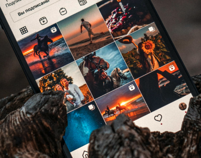
E-commerce websites like Amazon and Shopify employ grid-based patterns, making product displays easy to scan and compare. Social media platforms like Instagram also rely on repetitive content patterns—feed layouts, story highlights, and grid-based image arrangements—to maintain visual order.
Patterns in Fashion and Textile Design
Fashion relies heavily on patterns, from polka dots and stripes to complex ikat weaves and tartan prints.
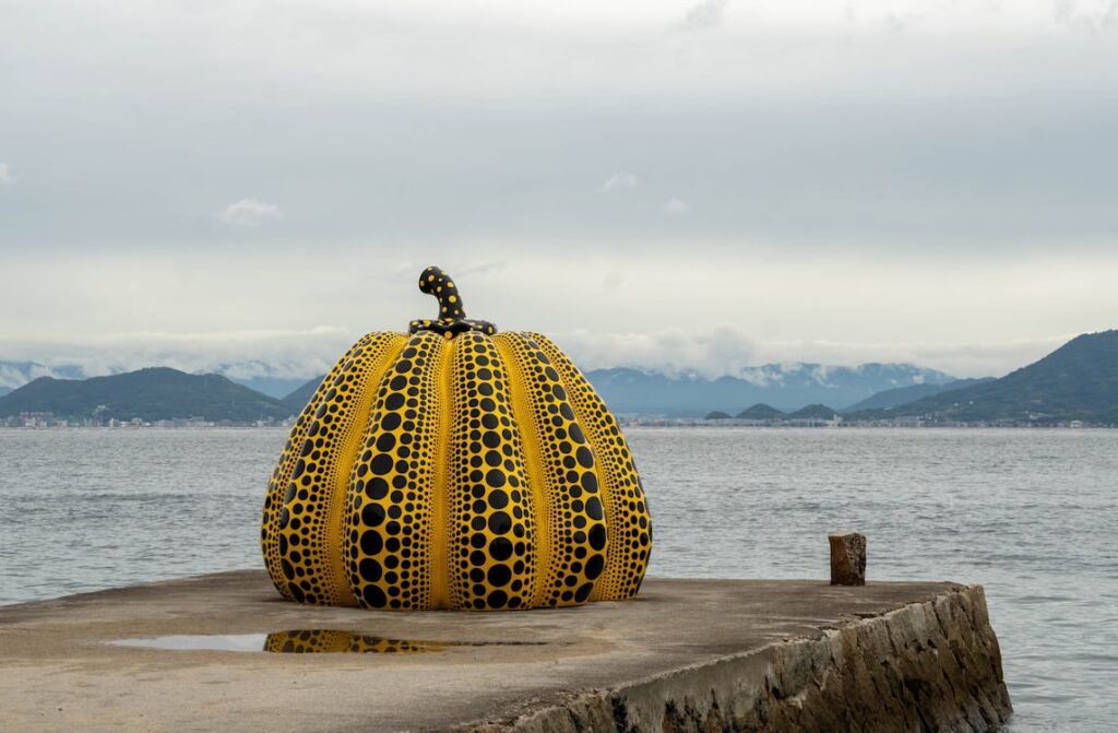
Designers like Yayoi Kusama, known as the “Queen of Polka Dots,” have built entire artistic identities around a single recurring motif. Kusama’s collaboration with Louis Vuitton in 2012 and 2023, featuring bold, oversized polka dots across handbags and clothing, shows how patterns can be a branding powerhouse.
Similarly, Missoni’s zigzag pattern and Versace’s Greek key motif have become signature design elements, reinforcing their brands’ unique aesthetics. Streetwear brands like Supreme leverage pattern repetition—often in the form of logos or typography—to create instantly recognizable designs that drive consumer demand.
6. Rhythm
Rhythm creates a sense of organized movement by repeating elements at regular or varied intervals.
- Types:
- Regular Rhythm: Predictable repetition.
- Flowing Rhythm: Organic, natural repetition (e.g., waves or leaves).
- Progressive Rhythm: Gradual changes in the size or color of repeating elements.
7. Unity
Unity is the principle that brings all elements of a composition together, ensuring a sense of completeness and coherence. Without unity, a design may feel chaotic or disconnected, making it difficult for the viewer to engage with the visual message. By strategically organizing elements—through color, repetition, alignment, or proximity—designers create a harmonious experience that strengthens the overall impact of the piece.
- Color Consistency: Using a unified color palette helps tie different design elements together. For example, in Van Gogh’s Starry Night (1889), swirling blues and yellows create a dreamlike harmony, making the painting feel interconnected.
- Repetition of Elements: Repeating shapes, patterns, or motifs strengthens visual coherence. Piet Mondrian’s abstract works, such as Composition with Red, Blue, and Yellow (1930), rely on repeated geometric forms to achieve structural unity.
- Alignment and Grid Systems: In graphic and web design, a well-defined grid system ensures that text, images, and layout elements remain structured. The New York Times website, for instance, follows a strict column-based layout, making different sections feel organized and unified.
- Proximity: Placing related elements close together enhances unity by showing relationships between them. Museum exhibit layouts often use proximity to group artifacts by era or theme, making historical connections clearer for visitors.
- Typography Harmony: Maintaining a limited set of fonts with complementary styles ensures a unified text hierarchy. Fashion brand Chanel, for instance, exclusively uses elegant sans-serif and serif fonts that align with its luxurious identity.
Unity in Branding
In contemporary design, unity plays a crucial role in branding. Strong brands maintain visual consistency across logos, packaging, social media, and advertisements to build recognition and trust.
A prime example is Apple. From its minimalist logo to the sleek design of its products and website, Apple maintains a clean, cohesive aesthetic across all platforms. The company’s signature monochrome color schemes, smooth typography, and white space utilization reinforce unity, making Apple’s branding instantly recognizable.
Another example is Coca-Cola, whose red-and-white color palette, Spencerian script logo, and curvy bottle shape have remained consistent for decades. This visual unity ensures that whether you see a billboard, a digital ad, or a Coca-Cola can, you immediately recognize the brand.
Principles of Design Examples
1. Balance
Balance in branding ensures that no single element overpowers the design, creating a visually appealing and structured composition.
Example: Nike’s Website & Ad Campaigns
Nike’s website and marketing materials use asymmetrical balance to create energy while maintaining harmony. For example, their product pages often feature a large, dynamic image on one side and concise product information on the other. In ad campaigns, athletes in action shots balance out bold typography and branding elements.
2. Contrast
Contrast is used in branding to make key elements stand out, ensuring instant recognition and memorability.
Example: Spotify’s Color & Typography
Spotify uses bright neon greens against deep black backgrounds for high contrast, making its UI visually striking. Their marketing materials also use contrasting bold typography and vibrant imagery to differentiate artists, playlists, and promotional banners.
3. Emphasis
Emphasis helps brands draw attention to their most critical elements, such as logos, call-to-action buttons, or product features.
Example: Apple’s Product Launch Ads
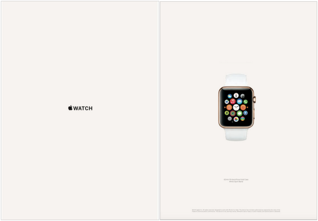
Apple uses minimal backgrounds with high emphasis on the product itself, typically lit with subtle gradients to highlight design details. The white space surrounding the iPhone or MacBook ensures the viewer’s focus is on the product, reinforcing its sleek, premium image.
4. Movement
Movement in branding guides the viewer’s eye across a design, ensuring engagement and interaction.
Example: Instagram Stories & Reels UI
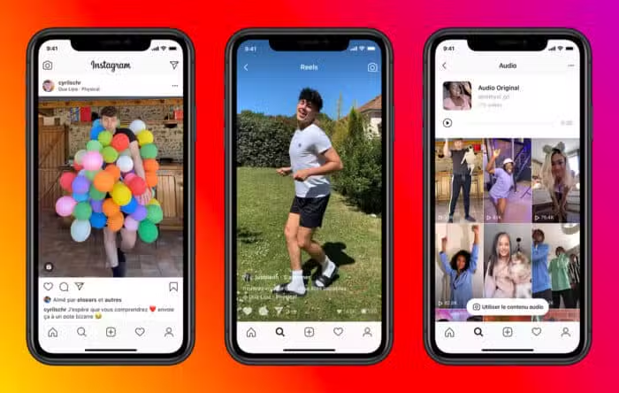
Instagram’s interface encourages natural eye movement through its scrolling Stories bar and vertically swiped Reels. The progress bar at the top of Stories keeps users engaged, leading them from one story to the next.
5. Pattern
Pattern in branding creates visual consistency and helps customers recognize the brand instantly.
Example: Louis Vuitton’s Monogram Pattern
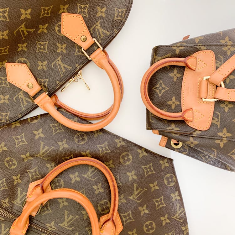
Louis Vuitton’s iconic LV monogram pattern is used across handbags, packaging, and even digital assets. This repetitive design reinforces brand identity, making it one of the most recognizable luxury brand patterns globally.
6. Rhythm
Rhythm in branding involves repetition of elements to create consistency across marketing materials.
Example: Google’s Seasonal Doodles & Branding
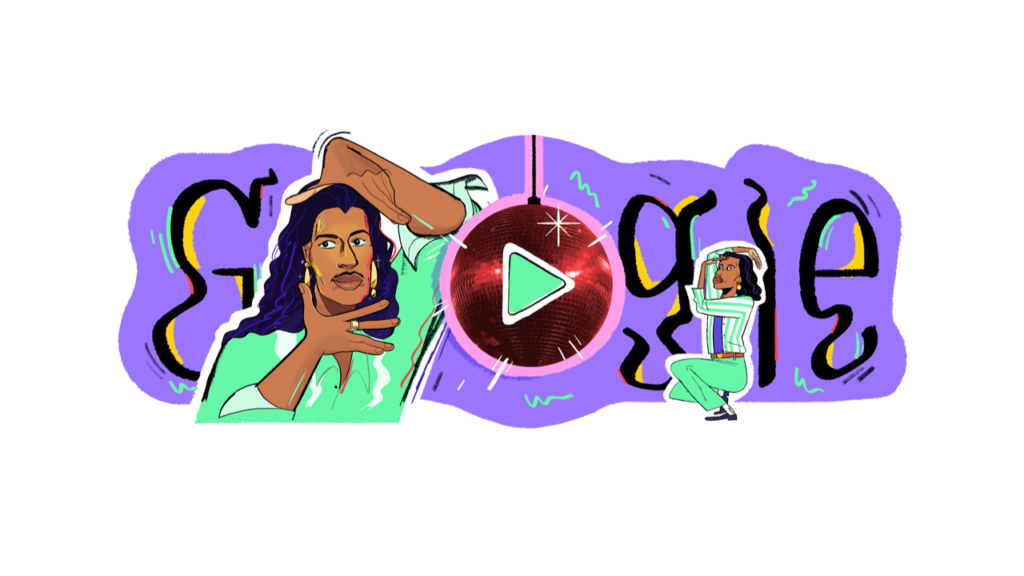
Google maintains a rhythmic pattern with its Google Doodles, changing them for holidays and events while keeping the core logo structure intact. This repetition creates anticipation and engagement while reinforcing brand identity.
7. Unity
Unity ensures that all brand elements, from logo to typography to imagery, create a cohesive and recognizable brand identity.
Example: Coca-Cola’s Red & White Branding
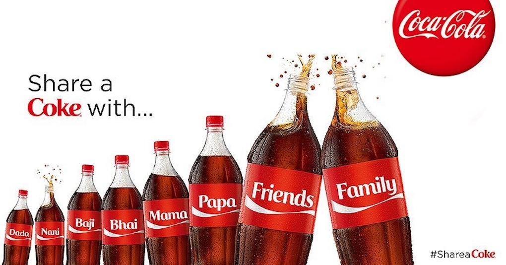
Coca-Cola’s red and white color scheme, uniform logo placement, and consistent typography unify all its marketing efforts. Whether it’s a TV commercial, a vending machine, or a billboard, the visual unity makes it instantly identifiable worldwide.
8. Proportion
Proportion in marketing ensures that elements are sized appropriately for readability, emphasis, and balance.
Example: Tesla’s Minimalist Website Layout
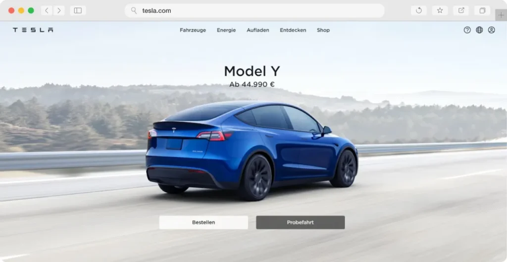
Tesla’s website uses large, bold product images with minimal text. The car images dominate the screen, while essential information remains smaller but well-spaced, ensuring a luxury, uncluttered feel that reflects the brand’s high-end positioning.
Creating a Logo with Arvin AI Logo Designer
A well-designed logo is the foundation of any brand’s identity, embodying its values, personality, and uniqueness in a single visual mark.
Just as the principles of design (balance, contrast, emphasis, and unity) shape effective visual compositions, they also play a crucial role in logo design.
For small business owners, entrepreneurs, or marketers looking to craft a professional logo without hiring a designer, Arvin AI Logo Designer offers a powerful, user-friendly solution. This AI-powered tool simplifies the design process while incorporating essential design principles to ensure a visually balanced, memorable, and effective logo.
Step-by-Step Guide to Designing a Logo
- Visit Arvin AI Logo Designer.
- Enter your business name and select your industry to receive AI-generated logo suggestions tailored to your niche.
- Choose a style that best represents your brand—minimalist, modern, playful, corporate, or luxurious.
- Customize colors, fonts, and icons to match your brand personality. Arvin AI provides a variety of color palettes and typography options, ensuring that your logo aligns with your business’s tone and target audience.
- Preview your logo in different formats, from business cards to websites, to ensure versatility.
- Download high-resolution files ready for use on social media, packaging, merchandise, and more.
By applying the principles of design and leveraging AI-driven tools like Arvin AI Logo Designer, businesses can create professional, impactful logos that capture their identity and leave a lasting impression. Whether launching a new venture or rebranding an existing one, the right logo serves as a powerful symbol of recognition, trust, and brand personality.
Start designing your logo today with Arvin AI Logo Designer and bring your brand vision to life!
Final Words
Modern brands leverage balance, contrast, and rhythm to capture attention, establish identity, and communicate effectively with their audience. By understanding and applying these foundational concepts, designers and marketers alike can create visually compelling work that stands the test of time.
From the grandeur of the Parthenon to the minimalist elegance of Apple’s product launches, the principles of design have guided creative expression for centuries.
FAQ
These principles begin with equitable use, ensuring designs are useful to people with diverse abilities. Flexibility in use allows customization for individual preferences and abilities, while simple and intuitive use ensures designs are easy to understand, regardless of a user’s experience or literacy. Perceptible information is critical, effectively communicating essential details to all users. Additionally, tolerance for error minimizes the risk of unintended actions, and low physical effort ensures designs can be used comfortably and efficiently. Lastly, size and space for approach and use guarantee that designs provide adequate space for all users, regardless of their mobility or abilities.
Balance, contrast, emphasis, proportion, rhythm, unity, pattern.
Balance, contrast, emphasis, proportion, rhythm, unity, movement, pattern, variety, repetition, proximity, white space.
Balance, contrast, emphasis, proportion, rhythm, unity, movement, pattern, variety, repetition, proximity, white space and hierarchy.
